
Don't wanna be here? Send us removal request.
Statistics
We looked inside some of the posts by daisycantiani-blog and here's what we found interesting.
Average Info
Notes Per Post
0
Likes Per Post
0
Reblog Per Post
0
Reply Per Post
0
Time Between Posts
6 days
Number of Posts By Type
Text
17
Last Seen Tumblr Blogs


Fun Fact
Mobile US users spent an average of 115.8 minutes on Tumblr app monthly.
Text
Live Industry Engagment Assignment
For the Live Industries Assignment, me and my classmate Leonardo had the opportunity to collaborate with Amanda Johnston. She is curator and consultant at The Sustainable Angle which is a not for profit organisation that supports the environment and minimizes industries impact. Our goal was to create a multimedia installation about the theme “revealing transparency” in the fashion industries, with the eventuality of an exhibition in the Future Fabrics Expo. The revealing transparency, indeed, was the key of our entire installation.
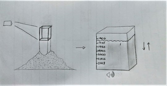
We chose to project a series a dynamic montage of filming concerning the fashion world (fashion shows, clothing processing etc.) on a black tulle towel. This material was the perfect one to represent this topic since is a semi-transparent fabric and it’s fragile and powerful at the same time. As we wrote in the brief, we can see through it and find out what it hides. We chose to focus on the water waste in the fashion industries. We made some researches about it and we found out shocking numbers of litres wasted in the fashion fabrics production process. We learnt about how this happens and why. For this reason, the audio of the projected video is muffled in the first place, giving us the impression of being underwater, to return normal only after, with a very discontinuous course. We wanted to introduce an interactive part in it, setting a switch or button in front of the tulle. Every time someone presses it, a light behind the tulle will turn on and we are able to see something we couldn’t see before. The front projection, because of that more powerful light, seems to disappear (actually it’s still there but we can’t see it). What we can see once the backlight is turned on, depended on the space we would have had on the Expo location. Three options have emerged, each of them is, in their unique way, related to a hypothetical future if this situation won’t never change:
1. A big mound of sand to simulate a desert (fill the space behind the tulle with sand); 2. A fish bowl without water with a (fake) dead goldfish; 3. A hanged empty bottle of water.
What we are trying to communicate is in that pressed button. We would like to make people curios and active about find a meaning behind something in front of their eyes. What they will see behind the tulle (that represent the fashion world) is the waste of water and the future consequences. The aim of this project is inform in the first place since most of the people is not aware of big problems like the waist of water in the Fashion industry. The audience will, hopefully, leave the installation with a conflicting emotions and then, the sustainable angle, will give them the means and information that they’ll need to be useful.
The next step was to send everything to our client Amanda to discuss it together and try to meet each other in person, to better share our ideas. We did it on the 19th of December and, the same day, we received an empty email from her (an automatic answer from her office). On the 3rd on January, since we had not received any answer, we wrote her again, asking for a meeting or a feedback in order to discuss the project together. We finally were able to contact her when she answered us few hours later, saying that she would have loved to see how we would have framed our ideas in relation to the ecological disaster of the Aral Sea in Uzbekistan; In the exchange of few emails, we explained her our idea:
I have to admit I was not aware of the Aral Sea situation. This Sea was the world’s fourth largest saline lake and it’s situated in Central Asia, between Kazakhstan and Uzbekistan. The disaster started on 1960, when the Soviet Union which owned the sea at that time, decided to divert the two rivers that feed the sea, with the purpose to irrigate the desert region surrounding the Sea, to help the agriculture. But the important thing is that the majority of it was being soaked up by the desert and wasted. What happened, obviously, was the water level that started to decreasing from that time onward. Pictures of this decreasing are shocking. We found this topic very interesting and we thought about it, trying to adapt our first idea on it. The first thing we did was to remove the tulle and the button, since they represented the revealing transparency theme. We kept the sand since was perfect also for this new installation, was perfect for waste of water in this situation. We wanted to isolate this problem and emphasize it, putting our installation protagonist, a white cardboard cube, over a stand in the middle of the sand. On the box, we would have projected an aquarium, the perfect Sea home surrogate. In an endless animation, the water inside the aquarium will go down until it's empty and then it will raise up again, until full. On the box there would have been a series of marks with some written years on the side, these years represent the water level from 1960 until now. For what concerned the audio, we would have put a speaker inside the box playing an audio track which would have represented sounds about sea, following the water animation.
She loved the idea and she found it very strong. She also asked for a few paragraphs about ourselves, contact details and eventually, social media where our work is showcased. After that, she set a call for Thursday 10th. Unfortunately, she got sick that day and we set a call for the day after but, she wasn’t able to talk the day after either. For this reason, we wrote her an email, on the 11th, asking for a feedback or some indications about it. She answered us that a week was too short to make the installation possible, but that, as an organization, they are really happy with our concept, and she would have loved Nina, their Director, to see it. She, in the end, invited us to the Expo in order to think about how they can support our idea in a future exhibition.
This leads me to conclude this post trying to explain what this learnt me and how I faced this situation. I have to admit that I would have loved to have the opportunity of doing an exhibition in London, it would have been an important occasion of express myself and collaborate with professionals. But time and unpredictable events weren’t on my side. Since I will come back in Italy on the 20th of January, I won’t be able to attend at the Expo event and this is a pity because I could have had something to confront with and something that could have improved me. Making the acquaintance of Amanda was nice, she’s lovely and I would have loved have the opportunity of meet her in person and share some time together. The installation topic and more in general, this Assignment was truly exciting. We created two installations, adapting them in relation to the situation and the task. They both received a positive feedback from my client and I’m pretty happy of this. I couldn’t be deeply satisfied for the previous reasons but I really enjoyed the outcomes and how I relate to a constant events evolution. Here’s the link for a zip file with the Previous project brief, the email correspondence and the self presentation letter she asked: https://drive.google.com/open?id=1BWywQhEOgdjpFS2Wj8EOvVhQyQHnJDPf
0 notes
Text
Web Art Assignment
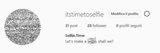
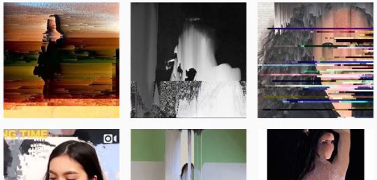
When I started to do some researches about what Glitch is and how it works, I found a blog. While I was scrolling down, one of the first thing I read was: “The best part about glitch art is, you don’t have to be a technology expert”. This sentence impressed me quite favourably. This means that anyone can make this kind of art and I would love to think it’s so simple be an artist. All we need to create some glitch images is a text editor and lots of luck, but what makes our picture a post-digital artistic image, is make the machine do what we want it to do. However, this kind of art works differently: what I read in “ Sabotage! Glitch Politix Man[ual/ifesto]” with Nick Briz, is that “a glitch is less effective when it’s expected”. According to what Lori Emerson says in his website, a glitch is “the other side of intention”, is the celebration of the error. This is deeply true and I verified it during my artwork’s preparation where I destroyed pictures just because I deleted a single “wrong” letter or number. But what is kind of funny is that, today, we consider art what people tried to avoid in every way 60 years ago. Today, we are trying to unveil what a simply image hides, distorting it, we are trying to show the deeper meaning. It’s a real data manipulation, not to change the sense of the image, but to bring out what he has always kept within. And how we tried to hide the truths and our biggest fears nowadays? Just making a selfie. A happy selfie is the best way to sweep things under the carpet. The paradox of keeping the world out of our problems, sharing pictures of our life with him. I just tried to bring to the surface what, most of times, a happy picture could hide. I looked for the hashtag #selfie on Instagram, took some picture I found, I modified them and then, I repost them on a new Instagram account that I created just for this occasion. I chose to call it “itstimetoselfie”. I also glitched some videos, found on Youtube, which talk about how make a good selfie and where we can have some precious tips to reach the best version of ourselves. The pictures and videos descriptions are three simple hashtag: #selfie, #itstimetoselfie and #shallwe. The first one is obviously what allowed me to find the pictures I needed, the second one is my account’s name and the #shallwe is an ironic invitation to make a selfie, but this time, something real. No filter or fake smiles, just something true. The picture’s location like “Somewhere on this earth” or “In the middle of Nowhere” are also a provocation to think about how much a London location, for instance, affects the picture itself rather than a pictures taken in Hatfield. For what concerns the work methods: I used the Pixel Sorting process on Processing, playing with the brightness, black and white values and HxD is the text editor I used for change their structure. I also tried out different image formats (JPG, png, pdf) to reach different outcomes. For instance, the pdf allowed me to control RGB settings, the Jpeg gave me the effect of slip part of the image to the left or right and I noticed that the png is the perfect mix of the two. To conclude, what I tried to do with this artwork is just let people think about how the image of ourselves on Instagram, the most of times, is a sad happy version of us. Here’s the link to Instagram: https://www.instagram.com/itstimetoselfie/?hl=it
0 notes
Text
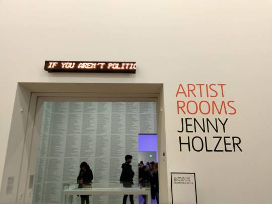
ARTIST ROOMS: Jenny Holzer
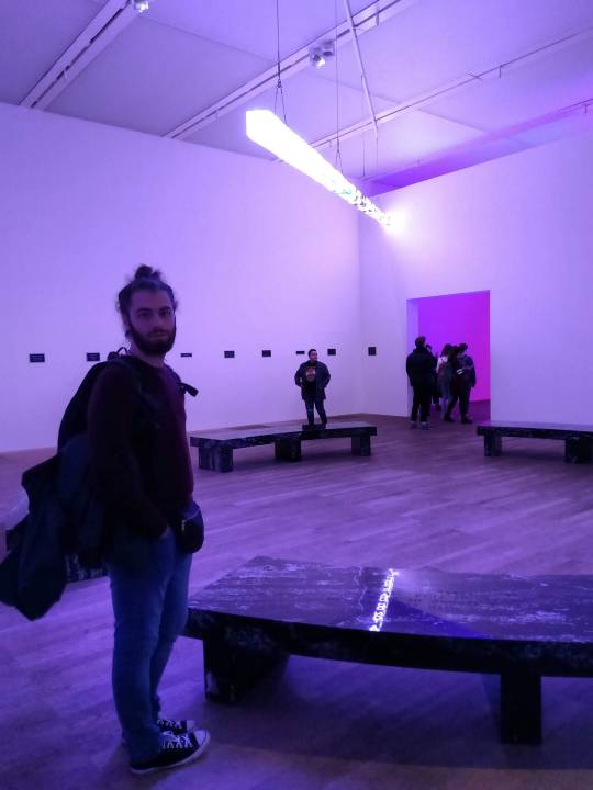
This Learning Journey took place at the Tate Modern of London and it includes the work of Jenny Holzer. She is an artist who really cares about the words, that’s why, in the following pictures, we are going to see lots of them, under several shapes. For this reason, her art takes many form like electronic signs, paintings or posters. Holzer has described her aims: “I wanted a lot simultaneously: to leave art outside for the public, to be a painter of mysterious yet ordered works, to be explicit but not didactic, to find the right subjects, to transform spaces, to disorient and transfix people, to offer up beauty, to be funny and never lie”.
“A great feature of the electronic signs is their capacity to move content. I love that because motion is much like the spoken word: you can emphasize phrases; you can roll and pause, the kinetic equivalent to inflection ... I write my text by saying the words out loud, or I write and then say words, to test them. Having text move is an extension of that process”.
On the top of the main entrance, the artist wanted to put an electronic LED sign where some sentences of encouragement scrolled from right to left. I found this way to talk to people very interesting; the position in the very beginning of the exhibition and next to her name is, in my opinion, a good business card. Ther were sentences like:
“If you live simply, you have nothing to care about” – “If you understand the parts, you’ll understand the whole” – “Ignoring enemies is the best way to fight” – “Imposing order is man’s vocation for” – “Chaos is hell” – “In some instances it’s better to die than to continue” – “Inheritance must be abolished” – “It can be helpful to keep going no matter what” – “It is heroic to try to stop time...” – “It is man’s fate to outsmart himself”.
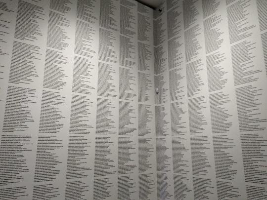
After this introducing work I found a big wall full of text, thousands of words print on the wall. In this artwork, Holzer composed something about 300 slogans with different points of view. It was amazing see so many words and the way in which people were looking for the prefer ones.
BLUE PURPLE TILT consists of seven tall and narrow LED signs, against the wall, showing texts from Holzer’s previous works, but each of them are pro Human Rights. The messages could be messages of hope, sometimes could be conflicting but in any case, for her, the user should complete the thoughts with what he thinks it’s better, she invites us to think and to be active.
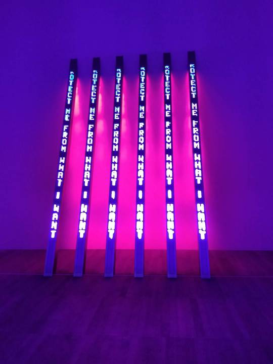
I also loved very much the Survival Series. Aluminium plaques where sentence question or inform us about our reaction to the political or social environment. She writes “Protect me from what I want”, I was impressed from this because it reminds me a sentence from Clive Barnes who, talking about television, said: “It’s the first truly democratic culture, the first culture available to everybody and entirely governed by what the people want. The most terrifying thing is what people do want”.
0 notes
Text
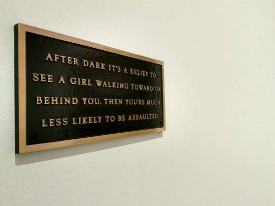
Black Mirror: Art as Social Satire
Black Mirror is an exhibition at the Saatchi Gallery in London about the art as a social satire and how, in the recent years, the art is influenced by politic. It’s composed by artists from all over the world and I had the opportunity to see installation, caricature, photos or collage. I should start talking about the title: it seems that what we are going to see in the exhibition is the society’s mirror and the adjective “Black” speaks for itself. During my visit, I noticed that each artist, showing his artwork, wanted to make me perceive not exactly positive feelings. I noticed anxiety, fears and angry towards the political and historical situations.
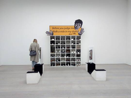
In the very beginning of Saatchi exhibition, I had a wardrobe full of shoes right in front of me. On the top it was written “Before you judge me, Walk a mile in my shoes”. This installation invited people to try the shoes and, obviously, taking picture in front of the mirror. The shoes vary from rich ones to a pair of converse, from boots to a clown style one, each pair of shoes has a personal hidden story to tell us. We just have to wear them and start to walk.
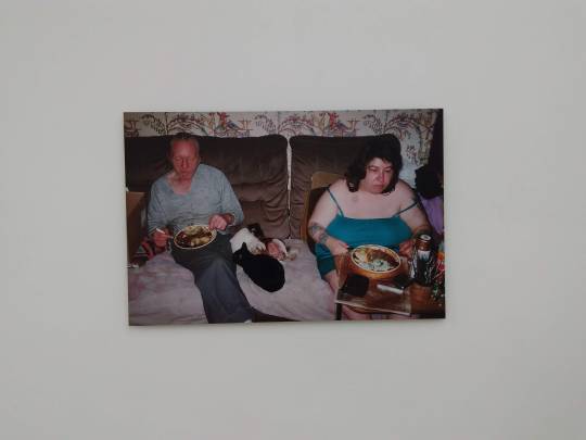
At the exhibition end I found a series of Richard Billingham’s pictures showing a couple married in 1970. These pictures show his family. Raymond, his father, is a chronic alcoholic. Elizabeth, mother, smokes a lot and loves pets. He had a brother, Jason and I was impressed by the author’s description: “Jason says Ray’s a laugh but doesn’t want to be like him”. I found these words very touching and the pictures very disturbing. They show lifes almost devastated. From outside, everything seems to me very sad, but inside those pictures all was perfect and equilibrated. This is destabilizing.
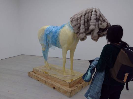
Another contemporany work I liked is “It’s Hard To Make A Stand”. The author used a horse figure and it wrapped it in a blue sheep, as the horse came in from it. Then he draped a fur coat over its head and it looks like a dog’s head. It seems to me a criticism towards what we eat and we decide to eat and the unclear food processing processes. I like it very much because, as Steve Bishop (the maker) said: “I’m interested in this process of readymade assemblage because it’s more powerful to let something operate by itself.
0 notes
Text
3js Workshop
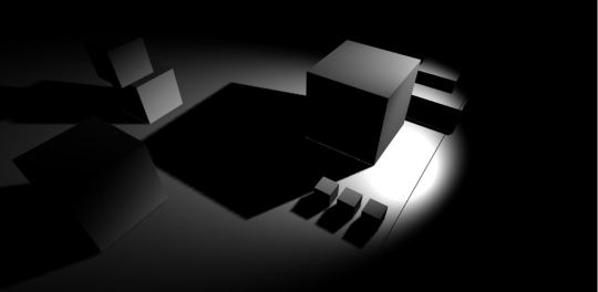
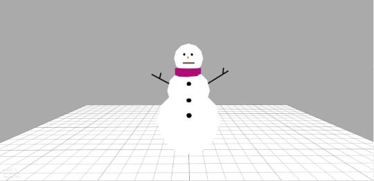
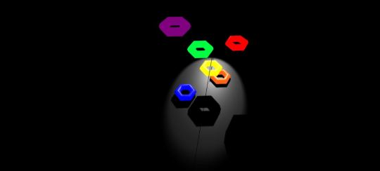
During the Workshop with Mark, I learnt how to relate with the 3D. Here some experiment with 3js Editor. In the first one I played with the box shape and I understood how to use the shadows. In the second one I wanted to create something with the several shapes (I made something for Christmas). In the last one I used colours and shape to create shadows and prospectives.
Here the Google Drive’s link to see my works, importing them on 3js Editor: https://drive.google.com/open?id=1ZzV7Ee-_tjFD9CSeWBfsqCotQe36L5y7
0 notes
Text
Online Video and Transmedia Storytelling - Youku vs. Youtube
Working on the differences between Youtube, the greatest American video-sharing website and Youku, its counterpart in China, I immediately noticed different features about their homepage. While the first one has the menu bar on the left side of the page (it seems more arranged), the second one has his menu under the header. The first visual impact brought me to think Youtube as more clean and professional in his design. It seems that the top banner of Youku, in my opinion, fills the homepage too much and the menu, in that position, is not intuitive. Finding a way to understand the website’s text wasn’t so easy for me since, even with Google Translate, everything was very hardly accessible.
For what concerns the videos I found in these platforms, I should analyze different aspects: if you are looking for high quality videos, you’ll be able to find them in each website, but I noticed that there are many more low quality video recorded by no professional people on Youtube than on Youku where, on the other hand, I found everything very designed and well built, and I couldn’t find anything amateur. This could be related to the amount of advertise on Youku, more than Youtube. It seems like if not everyone can afford (or deserves) to upload contents. Both of them has a large number of views and subscribers.
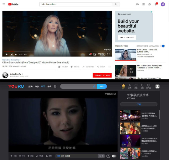
Here’s the link of the videosI watched: Youtube: https://www.youtube.com/watch?v=CX11yw6YL1w Youku: https://v.youku.com/v_show/id_XMTkyMzY5OTA0OA==.html?spm=a2h0k.11417342.soresults.dtitlebut
For the second task, I made a video related to the Art of Cinema doing a montage of films I love. I found out the colour of these movie and how they are used to excite people.
youtube
0 notes
Text
Awkward Narcissism: Social Media Aesthetics in an Age of Trolls
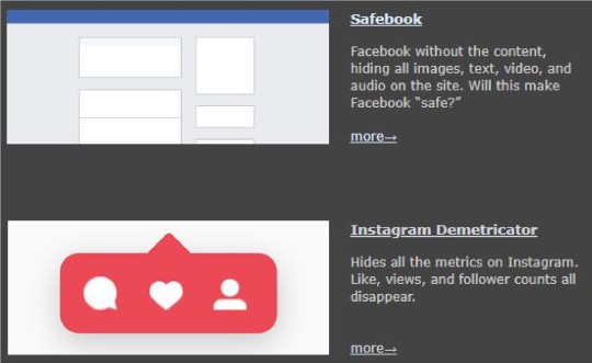
Benjamin Grosser grasped the gaps of the current social media. With plugins like “Safebook”, “Go Rando” or “Instagram Demetricator”, he communicates very well the Narcissism reigning in social media like Facebook or Instagram. He made such a filled place like Facebook in a totally empty world just for prove that only in this way Facebook could be safe. This is deeply true since nothing on the web is safe, even if we would pay attention to what kind of contents we post, we have just exposed ourselves and, as human being,
we are vulnerable. Facebook defined himself as “corrosive for the democracy”, with his disinformation. I think instead, that Facebook is something truly democratic, leaded by what people want, but (like said Clive Barnes about the television), “the most terrifying thing is what people do want”. Grosser gives us as a solution of any anxiety of others’s judgment removing everything can feel us so human. In Instagram Demetricator, he understood that everything revolves around the numbers, they make us more or less important. This browser extension hides them. Likes, comments and followers disappear. This work underline our obsession of have the approval of others. We tend to forget the moment we are living, we got to the point in which taking a picture is more important that enjoying the experience, in which showing a sunset to the Instagram’s folks is more important that see it reflected in the eyes of those next to you.
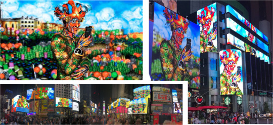
In this artwork, who inspired Carla Gannis is the sixteenth-century mannerist painter Giuseppe Arcimboldo, noted for his portraits composited from images of animals and vegetables. This video animation uses Carla’s own digitally painted emoji to compose the final image. She investigates this new form of communication. I like this fantasy character because she’s holding in her hand a smartphone and she is apparently recording a video or taking a photo to who is looking to her. The location of this installation, or I’d rather call it happening, is Time Square, very smart and powerfull move. This figure is a representation of techological ourselves, of how we are suppost to show our real emotions through a smartphone.
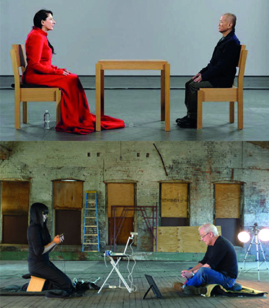
"The artist is kinda present” is a response of
An Xiao
to the marina abramovic performance “The artist is present”. It’s a wonderful tribute to one of my favorite Abramovic’s performance. The title is pretty exhaustive and provocative. The instructions for the visitors are:
_
Sit down with the artist. Find a comfortable position.
_
Be present with the artist in any of the following ways:
_A text message to: [PHONE NUMBER] __A tweet to @anxiaostudio._
The artist will respond in kind.
_When you have reached a satisfactory connection, or you simply grow bored, __you may leave._
While the abramovic was dressed in white, Xiao shows a black uniform. The scene in this happening is build up, nothing is real and there’s no eye contat (because of her black sunglasses) that instead, characterized Abramovic’s performance. Everything is happening through a smartphone. The current social media have totally changed the way in which we communicate. Just think about how many people are more confindent to spitting judgments
behind a screen than in real life or how many can’t be able to look at each other in the eyes anymore.
Thinking about the Social media’s impact on the society and on ourselves, I created this short video to represent my point of view about this. The main aim for me, was communicate the anxiety and the oppression of social media.
youtube
0 notes
Text
Ocado Assignment Self-reflection
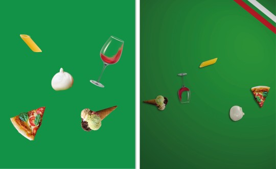
The Ocado assignment was my favourite one so far. Perhaps, it was the one in which I felt more confident. For this project, we had to create a 10-20 second video with the aim to drive more customers to shop on Ocado. Me and my classmate Leonardo wanted to communicate the huge world’s food availability of Ocado using colours, shapes and animations. We showed three representative nations of Asia, Europe and America: China, Italy and U.S.A. for their easily recognizable food. Their movements are just a jump animation and each time the food touch the ground, changes its shape into the food from nation to nation, the background colour will match the colour of the representative flag and a typical music will follow the nation in scene at that moment. In the last jump, the food will turn into the Ocado’s letters, they will move in the middle of the screen and the Ocado Logo will appear. The purpose was to capture the user’s attention in some way and we chose the simplicity that, most of the time, is the most powerful and effective means.
I should start saying that working with Leonardo helped me a lot: we think the same way, we have almost the same vision of art and we have the same work method that is never meticulous enough. We worked together before and this is important to reach better results. I understand that working with strangers or someone who doesn’t agrees with your ideas, would have been more difficult. I have to admit that it was the easier way but thanks to this choice, our idea has built itself. Our work is the perfect union of our respective ideas and we corrected each other during the preparation. This is actually the second idea we thought about. The abandoned idea was represented by a stylized Ocado guy holding a basket full of food who, stumbling, makes the basket explodes, filling the screen with food of every kind and color, to return to walk as if nothing had happened. We finally chose the one we presented because it’s what better contained our key message. I’m pretty proud of our outcome because it matches with the previous storyboard and this is means that we have been able to do what we wanted to do, to make something that was only in our mind real and finally, respect our ambitions and do not change anything.
If I had more time, on the advice of the Ocado’s photographer, I would have changed the size of the food in the foreground to make it more realistic and dynamic. I would also have modified the animation, my main task in this project, because something wasn’t perfect at the temporal level. We had some problems about that: we loved the idea of making the jump and fall animation using a code, an expression that would have made the animation more realistic, bearing in mind gravity, speed and so on. But something went wrong and we spent a full day trying to make it work, without succeed and, since we had no time to waste, we decide to do it by hand making.
In term of regrets, I think we did the right choices. There’s nothing in this project I would have changed except for doing a totally different project; maybe something more complicated like recording a real video with real food. I would have liked to do something more sperimental since we are still studying and we have the right of do mistakes. But like everything, we have to understand the situation in which we are, the context in which we should act and who we are working for. The brief was very clear: “with the ultimate aim to drive more customers to shop at Ocado”, there are not restrictions about being freely creative and being sperimental, however, doing a 360° video, for example, would not have been coherent with the Ocado’s course and style. In my opinion, it would have destabilized the customer and would have obscured the recognisability of their logo. In this sense, we chose to do something that reflected their identity, to give to the customers connections and path to follow, to bring them where I would want.
We received very useful advices from Ocado Team: under their advice, we added the flag’s details on the top right of the screen since the unicolor was not enough to identify the nation taken in consideration. Our first idea was using five Os instead of the five Ocado’s letters and, only after, make them turn in the Logo’s letters, in order to give a plot to follow, something that makes you want to see how it ends. They suggested us to use the five letter from the very beginning. This is because, they explained, people do not have so much brand awareness to recognize it immediately.
Concerning the acquired skills, I feel to have a better mastery of the software. I used After Effects before but every time is like the first time, as there are lots of functions to learn, and it’s always interesting see tutorials about it. Like a said, there were some problems with the animation’s fluidity, we tried to make it smooth as much as possible. I feel more confident in the presentation, talking about the project I create helped me to don’t be nervous and to seem credible.
Having to deal with a real company as Ocado was an amazing experience. It was the first time for me and I appreciated so much the relationship established between them, work team formed by professionals, and us, student team of two. I’m very excited about it because it wasn’t an exercise or a simulation (like ACE experience for instance), everything was real and there was the possibility to be noticed. They assisted us step by step, from the concept to the final project, giving us the feedback and precious advices. For what concerns our feedback, they were impressed from our outcome and we are very happy of this. They like very much the presentation and we are glad they appreciated the simplicity and neatness, we wanted to let the video speak for ourselves. The Ocado’s artistic director liked the idea of add details in the presentation only after saw the video.
Concluding and summing up this experience, I should say that all this will have a positive response in my life. I know better now how to relate with real professionals and how to present them my own project. I’m very proud of what I did, and above all, that what I did was liked by the Ocado’s team. I saw sincere enthusiasm in each of their eyes. I learnt to understand the situation and take a behaviour in response to it and I think I’ve understood what the company wanted from us. For instance, we grasped the concept that they focus a lot on saturated colours, that they prefer stop motion for their promotional video using real food and simple animation. We put all this clues together and we created something that for them was simple, colourful, dynamic, fresh and coherent. We seemed credible and this is the most important thing because means that, with a margin for improvement, we can succeed in our work life. Link to the video:
https://www.youtube.com/watch?v=A8iTLUe03y0&feature=youtu.be&fbclid=IwAR0TYty8_e1bbGH98DHPWVWpr-QeuDV-g_6z_LrOR95CNQsrI7uuv7njZrE
0 notes
Text
Tactical Media
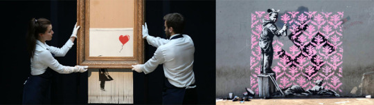
If we talk about modern activism, Bansky with his last appearance, played a decisive role in the history of art. He arranged for one of his best-known works to self-destruct after being sold at auction for over 1 million of pound. Several voices circulate, someone says that everything was true, others that all was planned. For the moment, we have not found out the truth. But the result doesn’t change: he gave a moral slap to the commercial world of art, he did something that, thanks to our current technology, helped to stop the one-way-flow communication of auction houses. Bansky is my favorite street artist. He’s always smartly over the top. He’s against the unfairness and the power and he’s not afraid to show it. I loved also his last work in Paris in support to refugees. He’s shamelessly true in each of his artwork.
I started thinking at my idea of surveillance art from Paul Garrin’s work “Border Patrol”. With this installation, he wanted to criticize the omnipresent surveillance as cause of increases of paranoia. In response to this, I created an installation. What scares me the most is the amount of data we give to Google through our smartphones. Everytime we press “allow”, we agree to let Google know our personal information. Everytime we turn on the location, is like we cry out loud our position and movements. In my mind, the five eyes, colored in Google’s style, are drawn on the wall of an underground station, like a graffiti. The secret is inside the yellow eye where is hidden a camera that spy anyone on the platform. The people can see themselves in a screen positioned above the graffiti. I would be very curios to see how many people would wait for the train right in front of the screen.

I fell in love with the French street artist Zevs as soon as I saw his work “Liquidated Logos”. I really like the way he plays with the visual effect. He “try to investigate the logo’s visual power, reverse the power and change the flow of energy”. These words, from Zevs himself, made me think that the logo still remaines powerfull, recognizable and its meaning didn’t change, but something happened, the energy is flowing differently. In this sense I made an experiment about the logos and their powerfull color. I changed their color and I saw how destabilizing is.
0 notes
Text
Life On Screen
Assuming that I am attracted to the warm light of all kinds, I coldn’t fail to mention Random Screen, a light installation made in 2005 from Aram Bartholl. Random Screen is a mechanical thermodynamic 5x5 pixel screen. Each pixel (basically a square) is illumited by the light of a candle that serves as a source of light but at the same time, the warmth makes move a modified beer can thanks to we can see the light comes and goes. I have something similiar in my bedroom but in smaller dimention and it’s amazing to see. I loved the way in which he made something whose mechanism seems hard to understand and riproduce, but that is actually so easy. I loved the contrast between digital and analog, the pixel leaded by a candle.

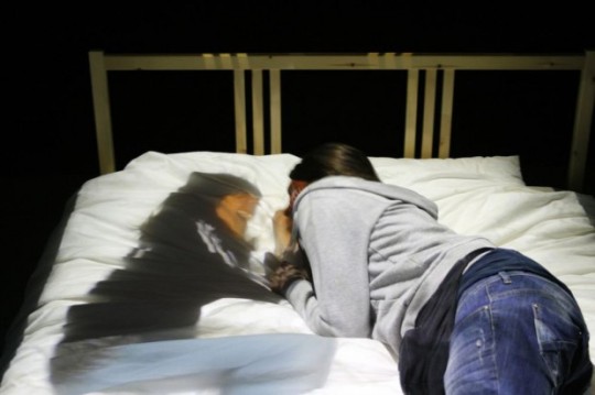
In “Telematic Dreaming”, Paul Sermon turns a bed into a support that could show someone being thousand kilometers away. Sermon aims at expanding the senses of the user, not physically but mentally. I had a situation in which a person I love lived in an other country for 4 months. I know what it feels like and this installation would have helped me to feel like we were in the same place. It’s very charming to see.
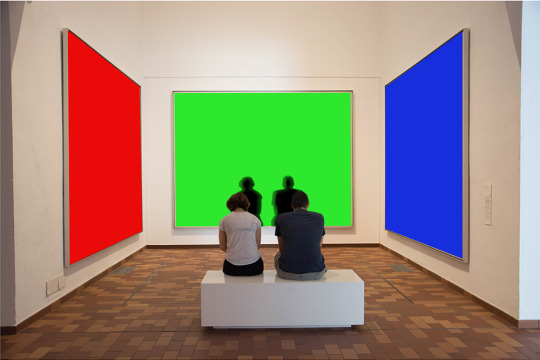
I totally agree with Erkki Huhtumo when he says that, nowadays, “the screens are constantly metamorphosing”. As soon as we look around, we see some lightned screen that enchantes us. From the supermarket to the gym, from the Stadium to the library, they are everywhere and in every size. In spite of this, according to the professor, we are still unable to define them. They are something such as material as ephemeral. They are able to bring us in another dimention, in a place in my opinion, that cuddles us first and then leaves us to our lonlyness. I see the screen as something apparently beautiful, but in which actually we are imprisoned. That’s way I thought about an artwork that helps to explain my point of view: There is a white space in which we can see three big frames, they actually are whether led or projections. As soon as the visitor walk to the center of the space, his shadow appears in the central frame and it moves with him so, when he leave the space, his shadow disappears. But a different thing happens in the lateral frames: here, his shadow rimaine impressed for a while, in order to show us that it trapped. The shadow represents another ourselves in a kind of way, but not as defined as us. I chose to make the screens in RGB style, to symbolize obviously the current technological era.
0 notes
Text
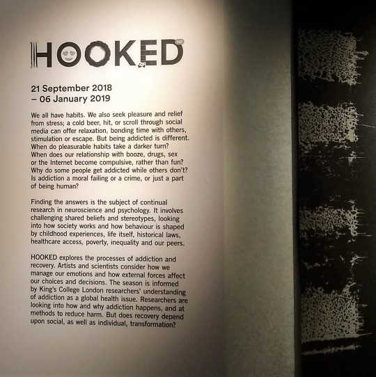
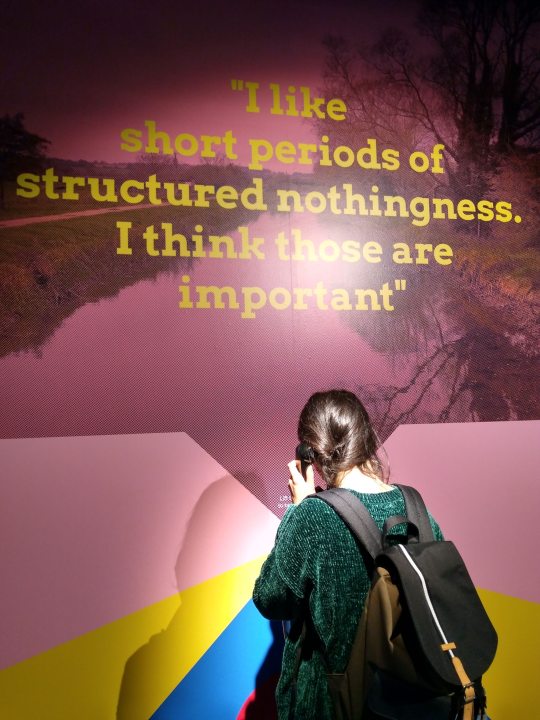
HOOKED: When Want Becomes Need!
I’d suggest this exhibition to everyone who wants to look inward and start to dig. I don’t suggest it to everyone wants answers. This exhibition will help you to understand the risks of become addicted to our habits that, nowadays and in most of the cases, are related to tecnology. It will show you the weaknesses of being human and it will constrain you to review your priorities.
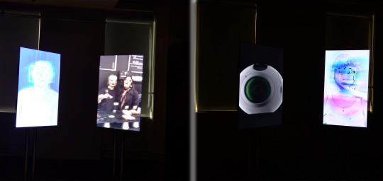
The following picture shows an installation in which I saw part of myself. It’s called “Speed of light” and it’s about how we use the smartphone and the possibility of be addicted to it. It’s composed by two screens: the left one shows us, the real us, a female white entity who speaks directly to the right one that shows our tecnological part, the smartphone (female as well), like was an extension of our body. She accuses the smartphone of having ruined her life while the phone answers that she improved her life instead. And so on. The atmosphere around this installation is very sad and it’s able to bring you inside it as soon as you enter in its orbit. It explaines very well the conflicting emotions inside us and it’s very good to give them back to you.
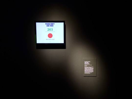
Here we talking about Social media, or better, if we are addicted to the “like”. It’s an interactive installation direct to each one of us and it invites you to don’t press the red button “like”, and with a number counter, shows you the number of people that couldn’t resist to press. This is a very smart way to involving people and to think carefully to our actions. This action in particular concernes us closely because we do this kind of things every day, in every possible way. I didn’t press the like, but I have to admit I was very tempted.
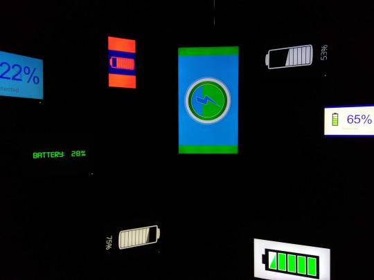
We get to the part of this exhibition I loved the most: a small and dark room full of charging batteries. There are several style of battery, from the oldest ones to the most recent ones, from the slowest one to crazy batteries which go from 0 to 100% in 3 seconds. Everything is dynamic, too dynamic. You are in the dark and surrounded by lit screens that show you how many power is left before the battery dies, before you died. I loved it.
Another interesting interactive installation is formed by just a phone in the wall. When you pick up the phone, a young woman’s voice makes you choose which number press in relation to what you think about alchool, cocaine or other addictions. I liked very much the idea of putting this emotions inside a phone which is symbolizes the friendly conversation, symbolizes being at home and being understood.
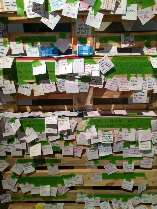
There was no better way to end this exhibition than to make a board available to everyone wants to leave a burden. Anyone can write what is addicted from. And here’s some answers from visitors. I admit, some of them scared me, other made me smile, but all of them made me think about myself as human being, about how many huge things we reached and, at the same time, how many weaknesses make us so small.
0 notes
Text
ACE Experience
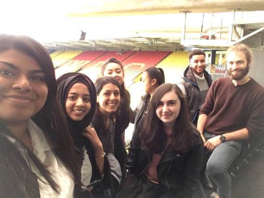
November 6th, at Watford Stadium took place the Assessment Centre Experience and this is the first year that The School of Creative Arts has participated. During this event, we had to complete a group exercise, an interview and a presentation, with the final written feedback from each exercise on the day from the assessors. They gave us a nice welcome in the Sir Elton John Suite where they explained us everything we had to know like the daily programme, the timetable and the map to the rooms. Everything was very clear from the beginning and this was useful to focused only on my exercises. I felt lucky to be there, in the right place of the world, in the right moment of my life. I must say that the structure and the topic of this course are quite far from what I used to do in Italy, and I was pretty sceptic about it. Now that 2 months of my 5 months here are gone, I realized that I need this more than I think and now that this event is gone, I understood the importance of being part of a group to do this kind of job.
I should start saying that I was terrified from Assessment Centre Experience. Everything seemed to me an impassable wall, until a did the first exercise, the presentation. I was glad to start with something that represented me, in which I felt more confident. I chose to talk about the importance of sound design in films and television, a topic I really care about and in which I’m very interested. For the preparation, I did some researches, saw lots of videos, and listening several examples to deeply understand the difference between films and television. As I’m very interested in sound, I read some texts I already had and others I found on Google Books. To support my presentation, I used audio aids as examples and I did an experiment I saw time ago and from which I remained fascinated. I also did a short video to help me in this: I put three videos together and I’ve replaced the audio of one of them, instead of the right sound, I’ve added an audio recorded from me of something totally different from the image. My mates should have guessed which one the clip with the modified audio was, to find out only after that I put my audio in all three videos. The examiner was very kind and friendly from the beginning and makes me and my classmates very comfortable. As soon as I started to talk all the stress disappeared and I felt like if those endless 5 minutes became too few. The feedback of this first exercise was quite good, I didn’t seem nervous as I actually was and this is important to me because it means I was able to handle anxiety situation. The assessor’s questions were about how I worked for my presentation, how I took to prepare all I needed and which researches I made. The question I loved the most was the last one, it was something like: “If you would have had more time available, how would have you used it?”. I was positively impressed because I would have talked hours about that topic, but I couldn’t and this question gave me the possibility to show something more.
The second exercise I went through was the interview one to one: this is the exercise that surprised me the most. I never expected to be so self-confident in such a situation. The Assessor was a very nice and friendly woman and this is helped me to be ready for the imminent interview. I seemed to her very “smiling and warm”, traits of my character I wanted to be noticed. She saw in me also enthusiasm, passion and expression of creativity: nothing better for someone trying to make art. I’m glad that I was able to communicate this part of me. Unfortunately, I appeared nervous and anxious to her throughout the interview exercise, and this is makes me smile because I’ve never been so relaxed, but I evidently did a bad work with my body language. I struggled to explain some ideas during the exercise and I had some problems with the STAR techniques, for this reason, in the feedback she advised me to work on it. I did some exercises about this technique at home but, once I was there, it became hard to explain. I will work on it for sure. Summing up, I was happy of myself and how a manage this situation, a new situation for me, aggravated by my not perfect use of English.
This problem took me to fail the last exercise, the group exercise. We had to find a way to bring new clients to The Galleria, the main shopping centre in Hatfield. The main outcome of the group exercise was a mobile phone application, with the layout, colours and style of The Galleria logo. We had 5 minutes to read the topic and truly understand what we had to do, 25 minutes to discuss it in group and the last 10 minutes to present the final outcome to the assessor. I’m very angry about this, because the topic we had to discuss was very easy and accessible. I know well that place, I’ve been there dozens of times and I had the possibility to express my ideas, but I failed. Unfortunately, the different language represented an obstacle for me in that situation. I was so concentrated on listening my group mates, understanding what they were saying, thinking a way to say what I wanted to say that I wasn’t able to think to my own idea to contribute to the group discussion. I have to admit I was disoriented and I’m sorry about that, I could have done more than just listening. I had what it took to be a success: the topic was easy and inherent, the working group were friendly and above all, were formed by people I knew, and finally, it was an exercise, I could do mistakes, nothing would have happened, I just had to be brave. I need to learn from my mistakes to do better the next time.
In conclusion I have to spend some reflective words about what all this taught me. In the days before this event, I was very worried, I thought I couldn’t do it and that I would have dried up. Despite this I made my preparation trying to not think about it. When the day came, I decided to be brave and give all my best to have a success. I gave myself a challenge. I learnt which my weaknesses are and I understood how to overcome my limits, I just have to work on them. I was surprised by myself in some situations, and disappointed in others contexts. I’m now very happy that I did this experience, it made me strong and more self-confident, despite all my worries. These kind of experience, in my opinion, are very useful for our path out of the University, they let us know how the work environment is, they let us be wrong to improve more and more, they make us aware of ourselves and of others around us. Personally, I found these exercises very useful for everything concerns the group work, I wasn’t so used to work as part of a group, I did lots and more individual projects in Italy. Learn how to interact with my colleagues and gain more awareness of myself were two of my main goals in this Erasmus. I’ve never been good at selling myself as I’ve always thought that my art should have talked for itself but I was wrong, or better, this is partly true. But what a company wants from us first is our ideas, everything starts from an idea and we must be able to tell it as a story, turn it in an experience for who is listening it. In this sense, doing a good practice work isn’t enough. After this event, I know better how to handle a situation in which I have to be the best and where the words are my artwork. I cannot fail to mention my classmates Tamya, Melissa and Anja, they were fantastic mates and I learnt lots of things from them. Obviously, they have more experience than me, and even if they are still learning like me as students, I had the opportunity to listening their presentations and “steal” some attitudes. Between the exercises, we could share our worries but also lots of laughs to reduce the tension. We talked about our work and preparation and we encouraged each other. Summing up, I’m quite happy of what I did, I could do more and better of course, but I learnt more than I expected, I found out my limits and now I know how to overcome them. Experience that, for better or for worse, I will hardly forget.
Here’s the link to the folder in which are my CV, Cover letter, the feedback of the day, the material’s presentation and the evidences od the training sessions.
https://drive.google.com/open?id=1A5aN6KHnMwnVjpP11sZKGxEXFaCitOKO
0 notes
Text
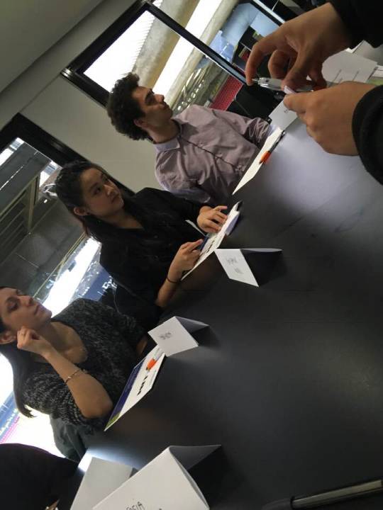
ACE Training Sessions
The training sessions with Jo were very useful, she helped me to deeply understand everything: she explained us how to behave when we work in a group and gave us very interesting tips. She reassured us about the presentation telling that it should have been a pleasure speaking for 5 minutes about a topic we are interested in. She explained us the importance of choosing the role we need and in which we feel very confident, she did that doing an exercise in which we had to underline what we think were the main request from the company for us. We also did an exercise in which we had to shake hands with our classmates, in order to be prepared to the interview, to keep a good eye contact and a strong, but not too much, handshake. The Application Form exercise was very useful for me, thanks to this, during the interview exercise I was able to answer the questions in a short time and with self-confident. The evidences of the training sessions are in the folder linked in the full report.
0 notes
Text
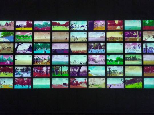
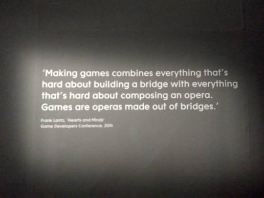
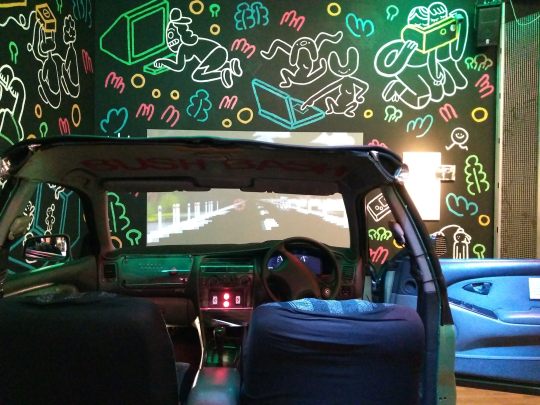
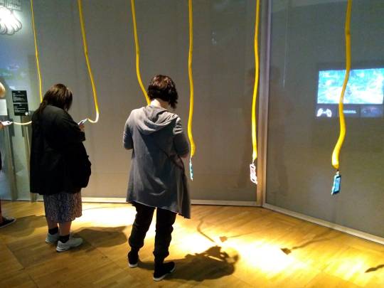
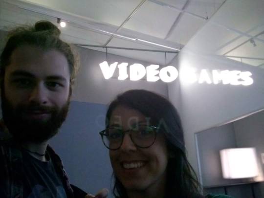
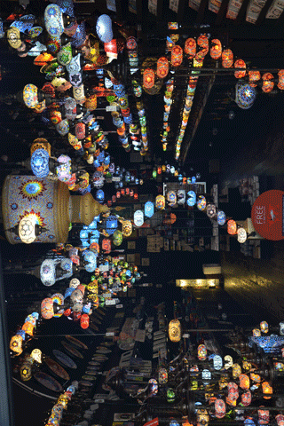
Videogames: Design/Play/Disrupt
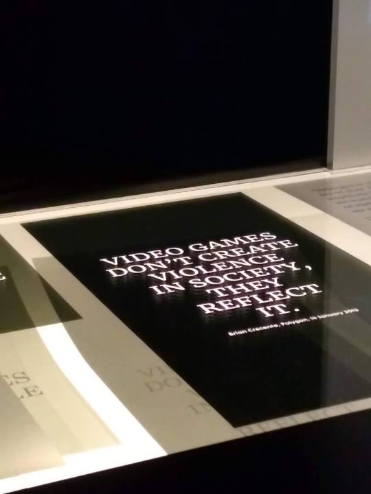
I went to this exhibition in London last week, it’s about the design and culture of contemporary videogames and I found it very interesting. Some time ago, I wouldn’t have apprecieted it, I was skeptic about videogames in general, I had never played and I thought it was a waste of time, until my boyfriend showed me what is hidden behind the game. Only then, I started to see the videogame as an artwork. I still don’t play but I really understand the emotions that a game can give you. In this exhibition I could see the production of what became a success, the draft in pencil of what earned millions. I was able to see the creators as normal people, just like me, who followed their passion and make it come true. Here’s some pictures:
0 notes
Text
Hackathon
I attended the Hackathon lecture given by Mark this week and I enjoyed very much learning things I didn’t know. I found p5.js very interesting and I did some experiments with shapes and colors. For this example I mainly used the function "dist()"
I then tried to create a piano and in this one I used "for" to create my shape:
Finally I made something more abstract and I used the function "mouseIsPressed":
0 notes
Text
Net Art
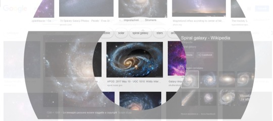
When I saw Constat Dullart’s net art work called “oooooooooooooooooooooooooooooooooooooo” (no, my keyboard is not broken) for the first time, I was impressed by the first confusing situation and the following strange visual impact. An apparent web page started to split in different circles which, from the centre, expanded more and more, until they disappear. All of this in loop. The interesting thing for me, is that the page’s scrolling still works but only in the different moving sections. When I opened the web site, a pop-up explained their artistic intentions: in the nature everything can be considered to be connected, but also as separated. They took two items from what they call “store of natural things”: the Wikipedia’s home page and the Google Images page of the Galaxy (showing the space and the Samsung Galaxy mobile phone). This ambiguity shows, in my opinion, the helpful links system but also the confusion it brings in a page like Wikipedia in which everyone can insert information. Everything is connected but still remains separated.
The second artist I would like to talk about is Leah Schrager. She’s an artist interested in the female body and she made a work called “Infinity Selfie”. A series of Selfie in which she’s naked and in which she adds the same picture to cover the naked parts of her body, endlessly. It’s a manifesto of freedom and against all the prejudices about a women using their sexy bodies in their art”. She fights the hypocrisy that reigns in the male chauvinist’s world. Here’s the link: http://www.leahschrager.com/
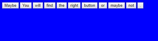
I also had a look at the Alexei Shulgin’s work “Form Art”: a website where we are invited to navigate by clicking buttons and links, each boxe is an access to forms and hyperlinks. I felt like I was lost in a labyrinth and I wanted to do an experiment about html form. I did some research and I started to set up a html web site where each button closes the page.
0 notes
Text
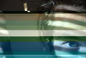
Glitch
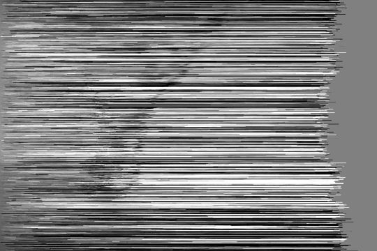
I did some experiments to try to understand what the Glitch art is and what are its infinite potentialities: I tried both in a black and white picture and in a color one, I used HxD as TextEditor for the three pictures and Processing for the Gif below. Through a Pixel Sorting I progressively modified the white value from -12million to 0.
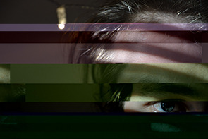
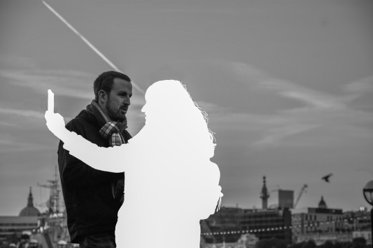
While the following one is has been inspired by “Woman, 2″ an advertisement created by Y&R, United Arab Emirates for Harvey Nichols. I wanted to recreate the feeling I felt when I saw it for the first time. I remembered that I took a picture of a woman who was taking a selfie while, what seems to be her boyfriend looks her badly. What I thought was “look at her, she completly absent”.
At last, I created on other Gif after seeing the cover image of the book “Postdigital Artisans”. I started thinking art in relationship with the human body.

0 notes