#the art exist within the two dimensional plane of the canvas surface and includes the canvas itself
Explore tagged Tumblr posts
Visit Tumblr Blog
Explore Tumblr blogs with no restrictions, modern design and the best experience.
Last Seen Tumblr Blogs


Fun Fact
In Q3 of 2020, 31% of US users access the Tumblr app daily.
Note
I have a headcanon that Alucard is actually a really good artist. It's just a side of him no-one sees or expects, with him being so murder happy and unhinged all the time. He's usually too bored by it though, and is only really motivated to draw when something catches his attention enough for him to capture it. So, when Integra ages into an elderly woman, he draws her. This is because he find old age, and Integra's old age, very beautiful (we've seen him express that a few times in canon). So he patiently and lovingly captures her in great detail, making Integra feel happy and comfortable with her age :-)
OH HOW ADORABLE ... I have thought that he would've loved to trace his fingers over her wrinkles, not to smoothen them over, but to know and memorize the time maps of her years he lost now laid across her skin. Integra might have felt silly at first, that he is always touching her faces at her permission, or stroking over the hardened lines and lumps from her knuckles to each bump of her fingers, and he would always be so fascinated with eyes rounded and focused and everything. She would blushed over the attention and tried to brush it off that there was nothing attractive over an old hag like her and he would've looked at her a bit bewildered as if she wounded him. I don't think he would have to wax poetry about how well she wore time. The evidence was clear for all to see but her, and he often jests so much i fear she can only laugh at his theatrics. She was well over 50 and while she still blush, just his words wouldn not ruffled her feathers the way it did when she was 22-23ish something. But him painting? That's new! Definitely VERY new for her! Oh and he's painting Her ??? His eyes hold her face while his fingers stride across the pages, and he was uncharacteristically still when he draws. She obviously have to get on with her daily works and doesn't have time to dally around trying to sneak a peek. And she had learned to stood her ground against him watching her like a hawk years before, because predators chase preys who run, so she could only blame the years of absence, or his presence, that pricked goosebumps on her skins whenever his eyes landed on her again, every stroke across the canvas was a brush she physically feel, and just from his eyes alone. I figured the attention was not unpleasant to her, because it was a very visible message, that she was desired, she was looked at, was touched and reimagined. It would've convinced her of Alucard's sincerity about her age and his feelings. And given her time to examine her feelings as well.
I have thought of Integra as a painter too. How she would've done still life and scenery at young age as basic etiquette training, maybe some sketches of the people around her, maybe she stopped doing portraits for a while when Arthur died. If she draw him then it would've been his sickest days she had to see, and that wouldn't be what she want to remember him as. After then her profession was too stacked for paintings. And then Walter and Alucard was gone too, she would've started drawing Walter, her old butler that she remembered by folds of wrinkles and not whatever she had seen his last day. And she drew Seras, the same face every years passed by, same consistent smile and same bright eyes even if her colours changed. There are more people coming into her life. They changed of course, most people do, but none was too sudden for her. If asked, she could picture them in her head and draft out something from her memory. But I fear it was not as easy for her when it comes to Alucard. He was fleeting, everchanging, his features flunctuate outside of time. Nothing she had drawn could've captured what he was. But she could pin down the weight of his presence seeped off her memory onto the canvas as if he was there, physically, beneath her, between her thighs as she crawled over the canvas laid flatback on the cold tiled floor and striked black over white. One canvas, two and then ten concentratedly black doused canvas scattered across her room like her casted shadows he so oftenly resides in, each is a dog crate, or cat, her Schrodinger's cat. If she could childishly pretend he was her placid little sheep, soundlessly asleep inside her hand-drawn boxes, then he was.
On a side note, I have always think this painting reminded me of their relationship:
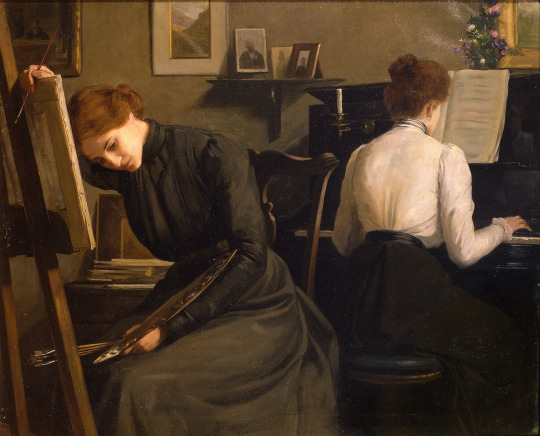
"The Painter and the Pianist (Pittrice e Pianista)", 1910 By Lionello Balestrieri
The Pianist was engrossed in their own play and The painter was struggling with their progress, slumped fowards the canvas and all. Both have their back on each other, the Pianist couldn't have seen what the Painter had painted but surely the Painter could've heard the Pianist just fine. Will the Painter turn back to the Pianist or will the Pianist's music could anyhow inspired the Painter. To me, Alucard was the Pianist, neck deep in his own endeavours between death, of his own or others. Integra was the Painter, she struggled with herself, of not knowing what she wanted and what she would choose. She was aware of Alucard and possibly her feeling for him, which was burdening her, but he was not or pretend not to be aware of his feeling for her. Whether the case, it would've been the Painter, Integra, choice to initiate contact. She could confronted him about it, as the Painter turn to the Pianist, or, inspired by the Pianist's music enough that the Painter continues their solitary affair, she could've resigned to keep sending him on little suicide missions he always begs of her and by thus, keep fulfilling her duty, even if he might've dropped anytime.
#hellsing#anon ask#ask#alutegra#alucard x integra#got carried away into writing#i LOVE art-painting themed writings#im kinda drafting out a fic in the theme tooo hyhy#painting themed fics are really interesting because there are so much to talk about#the art exist within the two dimensional plane of the canvas surface and includes the canvas itself#as well as the artist interaction with the canvas and their subject#overally much to think about#did anyone catch the reference to the little prince#in a way i think the prince's sheep shares similarity with a schrodinger's cat
18 notes
·
View notes
Text
Donald Judd: Some Aspects of Color in General and Red and Black in Particular (1994)
Material, space, and color are the main aspects of visual art. Everyone knows that there is material that can be picked up and sold, but no one sees space and color. Two of the main aspects of art are invisible; the basic nature of art is invisible. The integrity of visual art is not seen. The unseen nature and integrity of art, the development of its aspects, the irreducibility of thought, can be replaced by falsifications, and by verbiage about the material, itself in reality unseen. The discussion of science is scientific; the discussion of art is superstitious. There is no history.
There has been some discussion of space, usually of proportion, by past architects, and some by historians of architecture. There is some by recent architects: practical by Alexander, practical and actual by Kahn, a little by van Doesburg, by Mies van der Rohe, by Le Corbusier, and by Wright. There is some in Japanese and Korean literature, mixed with an astrology of place, called Pung-su in Korean and Feng-shui in Chinese, both meaning “wind and water,” classed vaguely in English as “geomancy.” But the subject of space in architecture, the nature of architecture, is not developed. Judging from the evidence of the buildings by recent well-known architects, space in architecture is no longer known. It’s not unseen; it’s not there. Within the clothes there is no Emperor. There has been almost no discussion of space in art, nor in the present. The most important and developed aspect of present art is unknown. This concern, my main concern, has no history. There is no context; there are no terms; there are not any theories. There is only the visible work invisible. Space is made by an artist or architect; it is not found and packaged. It is made by thought. Therefore most buildings have no space. Most people are not aware of this absence. They are not bothered by a confusion and a nothingness that is enclosed. Of course they don’t miss real space and don’t desire it. Sometimes when they are traveling they enter a cathedral, recognize space, and thank God instead of the architect. Some people recognize and want what they never knew existed. A few people have said to me, and one written, that my work together made space of a room, made architecture, and even that it made a “spiritual” space. Space is so unknown that the only comparison is to the beliefs of the past. After a few thousand years space is so unknown that a discussion of it would have to begin with a rock. How large is it? Is it on a level surface? Does it rest on the surface or does it perch? If it isn’t on a level surface, the tilted surface approaches a second entity. Is the rock symmetrical? If not, does it face away or toward the tilted surface? Is the top of the rock pointed, rounded, flat but symmetrical with the sides, flat but broader than the sides, so that the rock is a thick plane parallel to the surface, level or tilted? That is, in general, in what way does the rock create space around itself? It is a definition of space, a center of space, in one way a core of space. I’m not interested in skinny figures, but they are Giacometti’s early and unusual creation of space. A related creation made earlier and by many architects is the scheme of the old Russian churches. The base, the church itself, is a hollow block, which is a form so far in advance of this discussion that I will never get to it. The top of the church, a single onion dome if the church is small, or one large dome and four smaller ones if the church is large, is like the pointed rock, but of course is definite, a core of space in the sky, developing from the solidly enclosed space below, contracting above the roof, swelling into a light volume and contracting to a point. The Kimbell Museum is like the rock on a tilted surface. It is at the foot of a long slope and instead of facing ahead in continuation of the slope, as is expected, it faces the slope, which becomes a secondary, half-defined space. In exception to the meager discussion of space Michael Benedikt describes the slope toward the Kimbell and relates it to geomancy. Then, what if a second rock is placed nearby? I’m not describing how a primitive discussion of space began thousands of years ago, but how a primitive discussion might begin tomorrow, if this civilization were advanced enough to bear it. How far apart are the two rocks? Is one larger than the other? Two rocks of equal size and the space between them is a situation which is very different from that of a small rock and a large rock with the same space between. Do the rocks have the same shape or is one pointed and the other round? If they are on a slope, which is higher, which joins the plane as an entity? If two objects are close together they define the space in between. These definitions are infinite until the two objects are so far apart that the distance in between is no longer space. But then the passerby remembers that one was there and another here. The space between can even be more definite than the two objects which establish it; it can be a single space more than the two objects are a pair. Of course I can’t continue, I can’t mention what would happen if a stick were put across the two stones. Over two hundred years ago Samuel Johnson kicked a rock to prove its existence; fifty years ago Wallace Stevens described the effect of a jar upon the wilderness; this year there are two rocks; obviously this leisurely pace is too fast. In this century, since the decline before its beginning of the traditional art of the diverse civilizations, within the subsequent art meant to be international, the development of space is only thirty years old. Until then an interest in space was not one of the main characteristics of international contemporary art. This was of course because the great change at the turn of the century occurred conservatively in painting. The contradictions of simulated space were primary. All sculpture, except for Giacometti’s, before and including David Smith’s–that of Rodin and Maillol and Brancusi and Arp, both of whose work I like better than Giacometti’s–is traditional sculpture, which is primarily one rock with complications, or is low relief, one plane with complications. However, a new aspect begins in the work of Brancusi and Arp, which is that of the work as a whole. Art does not change in one line, not from A to B to C, but from V to 5 to L. But it does change; it has to change, unless science becomes immobilized into religion. I was not completely alone in the early ‘60s in developing space as a main aspect of art, but few artists were interested and then usually within an earlier context, the imagery in Bontecou’s work and the remnants of Smith’s, the standing position and the compositional elements, in Chamberlain’s work. Later the interest in three-dimensionality and in space developed quickly, all kinds, a little, a lot. The most developed were the canvas works by Oldenburg, enclosing a soft space, a flexible space, and the glass works by Larry Bell, which contained a visible space, modified by a phenomenological aspect that has become an important new aspect, which Dan Flavin began somewhat earlier and Bob Irwin somewhat later. This aspect was begun by Pollock in his specific use of color and material. I think that I developed space as a main aspect of art. This aspect is now widespread at a low level, which wouldn’t matter much if anyone mentioned that, and is the primary aspect in the work of the few very good younger artists, who, since space is invisible, are insufficiently recognized. Space is now a main aspect of present art, comparable only to color as a force. The other artist who has thoroughly developed space is of course Richard Serra. The development of space is within the last thirty years. For one hundred years the most powerful aspect has been color. The one hundred years of the primacy of color is still only a beginning. Basically the present international art developed from the traditional representational art of Europe. The necessities of representation inhibited the use of color. An object is pale in the light and dark in the shade, allowing full color only in between, usually in smaller areas than the light and shade and usually well back from the frontal plane of the picture, to where the full color is subdued by aerial perspective. Chinese, Korean, and Japanese painting is also representational, but without the simulation of unified space, and is usually subdued to depict space. Japanese prints are an important exception to the attrition of color, as well as paintings on screens and the illustration of novels, all flat and bright. Goya said: “In art there is no need for color; I see only light and shade.” The simulation of appearance, the depiction of objects in their space, upon a flat surface, a simulation of reality that must be believed by the viewer, is not compatible with a developed interest in colon The painting by Zeuxis that the birds pecked at could not have been like the painting on Attic vases, flat areas of red and black. It had to be a better version or the kind of depiction in the frescoes of Pompeii. The red and black of the vase painting is color; the color in the frescoes is an accompaniment. Romanesque painting, which has clear and strong and well organized areas of color, has always been safe from birds. I can imagine a Romanesque painter being horrified by Cimabue’s modulation into representation of the areas of color. Since the painter represented the universe, he must have thought it decadent (at the beginning of the Renaissance) to represent an individual. The areas of color in Giotto’s paintings are due to the past and are more important than the newly modeled faces, feet, and hands. Despite the high quality of the subsequent painting, color was a declining interest. But it is too particular and especially too important in organization to become minor, just secondary. The discussion of space has been leisurely, like the exploration in Marvell’s poem, or like the lawsuit over who owned the snow on Popocatepetl, which took two hundred years, while the knowledge of space which I’ve made grew swiftly. This is a great deal of knowledge, but not written, knowledge of a peculiar kind as visual art, made by a person, sometimes intelligible to other persons, not made by snakes or owls, probably not intelligible to intelligent beings elsewhere, perhaps not to our descendants in ten thousand years. The work is a great deal of knowledge about space, which is necessarily related to the space of architecture. This knowledge is, to me, particular and plentifully diverse; to almost everyone it doesn’t exist; it’s invisible. I feel that I have the steam engine, but no tracks, or the gasoline engine, but no wheels. The Mexicans invented the wheel for toys but never thought to use the idea for transportation. Plenty of good ideas in so-called early civilizations were never developed. Civilizations, like art, do not change in a line; it’s best to avoid the word “progress.” Good ideas that were developed are now ignored in the industrial transition, such as the knowledge of space in traditional Korean and Japanese architecture or the knowledge of urban space in 18th-century European cities and 19th-century Paris. None of this quantity of knowledge, built, not written, is used in new construction. Seoul and Osaka are wastelands in which there are monuments and Paris is a curiosity surrounded by a desert. The earlier knowledge isn’t regarded as knowledge, but as appearance, as style, and so cannot continue, cannot accumulate, as scientific knowledge does. There are books with plans about earlier architecture and cities but these plans are regarded as only history and not as relevant. There is no discussion of space in art and architecture in the present. In 1962 I made a right angle of wood placed directly on the floor. This was preceded by another freely placed work and that by a work which I considered then to be high relief, but which I consider now to be the first three-dimensional work to be on the wall. For a long time it was on the floor. The size of the right angle is determined by the right angle of a black pipe, whose two open ends are the centers of the outer planes of the right angle, which is painted cadmium red light; red and black, and black as space. The right angle doesn’t stand or sit and although it is vertical, 122 centimeters high, there is no way to believe it to be an abstracted figure, or an abstracted object. All sides are equal. There is scarcely an inside and an outside, only the space within the angle and the space beyond the angle. The only enclosed space is inside the pipe. This slight linear space determines the dimensions of the broad planes. The shell of this narrow space passes through the breadth of the inner angle, a definite space through a general space. Before the right angle and its predecessor, all “sculpture” was placed on a pedestal or, finally, in David Smith’s work, stood like a figure. Nothing had ever been placed directly on the floor. As I’ve written before, I think there was a small flat work on the floor by Lucas Samaras done at the same time or earlier. Since now it is common for work to be placed anywhere in a room, it is impossible for people to understand that placement on the floor and the absence of a pedestal were inventions. I invented them. But there is no history. One of the many destructive assumptions now is that all ideas have no originators; they are mutations in the public domain. The use and meaning of the ideas are vague. But someone invents ideas. Someone wants something new. In its invention an idea is clear and in its diffusion it is vague. This is easy to see. It’s easy to see that Chamberlain invented Stella’s reliefs. A new idea is quickly debased, often before the originator has time and money to continue it. In general I think this has happened to all of my work, but especially to the use of the whole room, which is now called an installation, which basically I began. Oldenburg’s Store was a store but it could be called an installation. Bob Whitman’s performances occurred in installations. Several years later Yayoi Kusama made a free-standing room and Lucas Samaras also. In 1967 in Los Angeles a work of Carl Andre’s, 8 Cuts, covered the floor of the gallery. Of course in 1923 Lissitzky built the Proun Raum and in the late '20s Schwitters built the Merzbau. One work occupying a whole room is still alive and new in the work of a few artists–Roni Horn, Michael Schulz, Ilya Kabakov–but many artists degrade the idea, for example Barbara Kruger, who is my favorite, because she also degrades red and black. Again there is no discussion and criticism of works that occupy rooms, which is a reason why it is possible to have bland and trite work, with one or two meager and obvious ideas spread over a whole room, usually in writing, without space, which is after all the origin of the form. My work with the whole room began with part of it. In 1965 I made a work that extended from the floor to the ceiling. This extended the definite space between the units to those below and above. In 1966 I made six galvanized-iron units which extended from wall to wall, so that the comers became definite and the whole end of the room articulated. In 1969 there was an anodized-aluminum work, now destroyed, which was on the floor and against the wall, also wall to wall. And in the same year a work made of cold-rolled steel, now destroyed, with 11 units that extended from corner to corner the length of the room. Also in that year I made a work of many galvanized-iron units which occupied about a third of an otherwise empty room, a work in relation to the whole room. This is now in Texas. In 1970 I made what is usually described as a galvanized-iron wall which went around three sides of a room. This is a whole room. It’s in Texas. In Portland in 1974 we built a very large voluminous plywood work around three sides of the space. In 1960 very little that was traditionally three-dimensional was placed on the wall, only the low reliefs by Arp, which are better than usually thought. None of the large reliefs by Schwitters were in New York City. Later, Oldenburg made low reliefs of plaster for his Store and later Bontecou made high reliefs and later again Chamberlain made high reliefs. No one is interested in this sequence of development, as no one is interested in the development of a whole room as one work. Art historians of the past are at least interested in chronology. Art historians of the present are not. It’s too real and interferes with treating the present as the past, but with less substance, a subject of their speculation. Low and high relief are basically painting, possessing the same problems, as well as some of their own. After I made the first works placed on the floor, knowing the new relationship to a surface, through at least 1963 I didn’t think anything could be made which could be placed on the wall. Then I realized that the relationship to the wall could be the same as that to the floor. The work on the floor was not lying flat upon it, therefore it was not low relief on the floor, nor heaped upon it, therefore it was not high relief on the floor. This discussion seems long but it’s brief. Most relationships and exceptions can’t be mentioned, but one exception is that I don’t consider Carl Andre’s works on the floor to be low relief, regardless of being flat. My work on the floor was a new form, creating space amply and strongly. The relationship could be the same to the wall. It was necessary for the work to project sufficiently, at least as much as its height and width. I never made this minimum, which would be a cube. The first such work, in 1964, was horizontal, made of leftover plywood semicircles, and it projected further than its height. The same year a small work that projects was constructed by a nearby factory. In 1965, the factory made, then and now a condemnation to hell, a vertical work of ten units, each short in relation to its depth, all together long, and, as I said, with spaces equal to those between the units at the floor and at the ceiling, with luck. The necessary difference was that the work not be flattened, low or high, to the wall, whether it be small or large. This invention is still not understood, or rather it is completely lost Derivations are everywhere, but are always low or high relief, new in appearance only. The small- and medium-sized works on the wall have been those in which it has been most possible to develop color. The discussion of color is greater than the discussion of space, and unlike the missing particularities of space, it describes to redundancy the particularities of color. Primarily this has been because with the creation of science in the 17th century the study of color has been part of science. And like astronomy it has been cursed with its own astrology. The discussion of color has not been leisurely, like that of space. Instead of millennia, the speed has been in generations. There is a history of color, first in philosophy and then in science. Aristotle said that there was in the category of substance an entity that might have an aspect of the category of quality: material was primary, color was secondary. He also said, to quote Copleston, that “matter is at once the principle of individuation and unknowable in itself.” There is a history of color in art. Every other generation has a new idea of color. However, this is a generation without ideas. At the present space and color have in common complete neglect. Despite the primary importance of color for more than a hundred years there are now no theories. The last philosophy of color, which is what it was, as well as being factual, and the mixture may be unavoidable, at least in art, was that of Josef Albers in The Interaction of Color of 1963. In Part I, Albers begins: If one says “Red” (the name of a color) and there are 50 people listening, it can be expected that there will be 50 reds in their minds. And one can be sure that all these reds will be very different. That is a philosophy and it does not agree with what Albers was taught in the Bauhaus. I knew as a child that certain colors were supposed to produce certain feelings. I didn’t understand why a bull should be mad at red. Johannes Itten and Kandinsky taught in their important color courses at the Bauhaus that colors always produce the same emotions, and also that colors always correspond to certain shapes, the two together agreeing on the emotion. The idea that I like best is Kandinsky’s that a pentagon combines a square, which is red, with triangles, which are yellow, to make orange. The idea should be sent to Washington so that the newly painted Pentagon could be the first to use color in war. The square is death; the triangle is vehemence. The circle is blue and is infinite and peaceful. As with God and patriotism, I didn’t take the attributions of color seriously enough to contemplate. I don’t remember such ideas being discussed in the '50s or after. In contrast, the terms “warm” and “cool” are still used as description, but also as thermometers of feeling. The more vague an idea, the longer it lasts; in decay it becomes even more vague and lasting. A basic problem for an artist at the beginning is that while color is crucial in their work, its development being a force, the information about color is extensive and occurs in many forms, partly technical and partly philosophical. The technical information is irrelevant and uninteresting until it is needed. The philosophy seldom fits. There is a limit to how much an artist can learn in advance. An artist works only step by step into the unknown while the particular knowledge of color exists and is vast; the particulars of the world are infinite. This is overwhelming in an urgent situation. Color is very hard to learn, since it is hard to know what is useful. The particulars must be the artist’s own. Nevertheless, color should be taught to the beginning artist, first, as knowledge which may be relevant, second, as knowledge of the history of art, which is the history of the activity and of the history of color in that activity, and third, as day-to-day new knowledge for the new artist, who should only be taught from the beginning as an artist. That help should be step by step as it is needed in a completely individual effort. This sounds obvious but few understand how much of a process it is to make art. It is very much building, as I said, step by step. These remarks about art education seem innocuous but they imply a revolution. For example, no one but a daily, actual, working artist of some worldly standing, as things are now, should teach art. Otherwise it’s like a non-plumber teaching plumbing. No one but someone who is beginning as an artist should be taught. Why learn to plumb, if you’re not going to? Artists cannot teach the history of their activity. They seldom can teach the activity of their own activity. They have no connections with those interested in art and with the public. They cannot explain their activity. This is part of what is wrong. This is partly why the integrity of art is steadily less. There cannot be an education of artists that is distant, distorted, and institutionalized with the expectation that in five or ten years a good artist will result. The result is another institutionalized new teacher. The last real picture of real objects in a real world was painted by Courbet. After that no one was so sure about the real world, so that when it came to keeping a color or an undescriptive shape at the cost of accurate representation, the latter lost. From Manet onward the concerns of painting itself developed quickly. This is the conventional history of recent painting. Nothing like this happened in sculpture, since being in space there was no conflict, and there was no color. It was conservative and was not bothered by the problem of how the world is known. The trouble and cost of its making had to have been a factor. The history of the increasing emphasis on the means of painting is very large and detailed. More than the so-called form, or the shapes, color is the most powerful force. In retrospect, and only so, the expansion of color is logical until the 1960s, concluding with the painting of Pollock, Newman, Still, and Rothko. The need for color, the meaning of that need, more than anything, destroyed the earlier representational painting, whether in Europe or Asia. In the work of all of the well-known painters, color is amplified beyond anything seen for centuries, even in the work of Munch, whose work is not considered abstract. In the work of most–Matisse, Mondrian, Malevich, Leger, the four just mentioned–color is the dominant aspect, as black and white photographs show. Color is an immediate sensation, a phenomenon, and in that leads to the work of Flavin, Bell, and Irwin. All experience is knowledge: subjective experience is knowledge; objective experience, which is science, is obviously knowledge. Color is knowledge. As Albers says, it is very subjective, even hard to remember. Color is also objective. In Part VIII Albers says to paste a red circle and a white circle on a black sheet of paper and then stare at the red circle. Then, look at the white circle: it is green or blue-green, the complementary of red. Allowing for everything human being subjective, this is absolutely objective. Color as knowledge is very durable. I find it difficult, maybe impossible, to forget. A considerable effort in the painted sheet, aluminum work that I made was to forget the colors and their combinations that I had liked and used in my first paintings, those in turn sometimes derived from Mondrian, Leger, or Matisse, or earlier European painters. Newman of course faced this definition and durability when he painted the three paintings he called Who’s Afraid of Red, Yellow and Blue. He didn’t go so far as to challenge red, yellow, blue, and white. Mondrian’s colors are one of the facts and wonders of the world; there aren’t seven anymore. Perhaps if the four colors were equal in extent they would no longer belong to Mondrian. The preponderance of white to the bright colors is of course the determining ratio. It’s a shame to provide arguments in support of museums, but in 1947 I lived in Philadelphia where there is one. In it there is the left panel, the crucifixion, by Roger van der Weyden. The colors I remember are blue, not soft, and red, high and slightly rosy. In my present vocabulary they are similar to RAL-Farben 3027, Himbeerrot, and RAL-5013, Kobaltblau. In art school I used them in a little painting and they remained van der Weyden’s. I painted over them. I don’t know where I saw, perhaps only in books, Gerard David’s light gray and cobalt blue, which is not 5013. Giorgione’s and Titian’s deep blue and orange brown is vast and inescapable. El Greco is interesting of course because he was from Crete, from which Theophanes earlier went to Russia, and so because of the influence of the Romanesque use of color in large areas. El Greco’s colors are of one type, often glazed, and match where nothing is suspected to exist: alizarin crimson, viridian, a clear yellow and ultramarine blue. Except for the yellow these are all dark, but they are all clear, like stained glass. The Philadelphia Museum of Art also has many paintings by Mondrian. The first museum that I loved for art and hated for architecture was the Nelson Gallery and Atkins Museum in Kansas City, which has one of the best collections of Chinese art. The gray-green celadon from Korea is another durable color, of course a glaze, which is another important aspect. Also virtually glazed, but by oil, is the brown-black of the trees and the high green-blue of the sky in Ralph Blakelock’s paintings. Color in architecture began and ended with De Stijl. Earlier and later it is decoration or it is the usually quiet colors of materials. The colors of the bronze and the tinted glass of the building by Mies van der Rohe in New York City form as definite a scheme as any with bright colors. The question is whether architecture should always be quiet, with natural materials, usually gray or tan, or whether it should always be brightly colored or partly colored. In the present noisy and cluttered society, urban and rural, the obvious recommendation is to avoid color. As seen in bright signs everywhere, color becomes further junk. But without color, which is almost always on signs, most cities are junk anyway, the newest the worst. Within De Stijl, van Doesburg was by far the most interested in color in architecture. He wanted a new activity, that of “colorist,” to apply to architecture, which was always more conservative, as in the “collaboration,” as van Doesburg conceived it between himself and J. J. P. Oud in De Vonk in 1917 and '18 and with Jan Wils in De Lange in 1917. But Oud said that van Doesburg was not being practical, which meant that the neighbors would be offended. Van Doesburg designed the interior of the Cafe Aubette in Strasbourg from 1926 to '28 within what he now considered a “collective” with Jean Arp, Sophie Taeuberg-Arp, and Paul Horn as architect, but the owners modified it to the public’s complaints within two years. Basically van Doesburg was applying planes of color, at an angle, which he thought harmonious and dynamic, to the orthogonal structure of the architecture, which he thought ordinary. Aside from the ever discouraging public, this division could not continue. Color has to be part of the usually right-angular architecture. So far this has not been done. The use of color by Rietveld is very nice but does not exceed decoration by much. The work of Luis Baragan is a possibility but I haven’t seen it and the photographs are more pretty than informative. Van Doesburg thought of the painted window frames of De Lange as planes of color moving across the facade. He was wishful, but this and others are still good ideas. Mondrian, Malevich, van Doesburg, and others made or tried to make art and architecture as part of a new civilization, which obviously it was, and obviously still is. They are generally disparaged as being idealistic and utopian, Mondrian’s philosophy aside. Why is it idealistic–even what does that mean?–to want to do something new and beneficial, practical also, in a new civilization? Is it practical to let the civilization become as gross as it is becoming, to let it become stagnant, and then in a few hundred years try to aerate it? By then it will be completely inert, so that nothing can be done and nothing even imagined to be done. No one will realize that there isn’t a civilization. As usual the civilization will be convinced of not being one by its collapse. Why should everything be commercial? Just existing, even well, is not supposed to be civilized. And again, what does commercial mean? That has a wide range. As I mentioned, Oud argued to van Doesburg that he was being practical, that he was building what could be built in the circumstances, part of which were the neighbors. This is not practical, but conventional. The judgment of the neighbors is based upon meager knowledge and is determined by their narrow time and place and especially by their idea of status in the society, part of the narrowness, which is the greatest myth of this time. Anyway, the ignorance of the neighbors has a wide range, from that of the few rich to the not as rich to what is now called the middle class in the United States, but is lower, to those who know only a thousand words and can’t read, again in the United States. Should art and architecture be made for a class or for each class? The neighbors have formed a taste among themselves, strangely world-wide, which is exploited by business. A town nearby in West Texas, which has a well-restored fort, is visited by tourists, who sometimes remain. These are all of a class and they slowly remake the town into what their scanty and sentimental knowledge makes them think a town of the Old West should look like. Should they be encouraged? If the knowledge of artists and architects is discredited, and of science, and only the very slowly growing knowledge of the great mass, if it grows, narrow class by class, is to be acted upon then it will be hundreds of years before a real civilization develops, if ever, because commerce, in accordance with the neighbors’ taste, will have designed everything in the world and the people as well. Clinton said recently, “You have to change the behavior of the whole country. People have to change their lives.” Frank Lloyd Wright wrote that a house with a view should be built below the top of a hill, not on the top, out of the wind, primarily to be unobtrusive in the landscape. The same advice applies to color. In new and empty land, in well-cultivated land, as in Tuscany, and even in suburban land approaching visual misery, it is wrong to construct obtrusive buildings. Whether they are obtrusive or not depends on the presence or absence of trees and on whether the land is flat or high. A bright building in the desert seems a mistake. In the polders perhaps not. The best argument for brightly colored buildings are those of St. Petersburg and Pushkin or Tsarskoe Selo, pink or turquoise. The white of the old churches in Russia is conspicuous in summer, like the large white rabbits without snow which I once saw in January in the archipelago off Stockholm, and then the churches are evanescent in winter. The color is not disagreeable partly because it is on isolated buildings and partly because it occurs on flat land among trees or among yellow and tan buildings, where it cannot be seen from far away, except for the Winter Palace. The buildings of the city of St. Petersburg improve the land, which is seldom the case. In Tuscany, the cultivation improves the land, which is also rare. The yellow ocher and red ocher of the buildings fits very well and the land even tolerates castles on the hilltops. In Korea an old village is beautiful, with thatched roofs, or with black tiles on the roofs, and with tiles on the adobe walls, lying quietly in the land, looking like the land. In both Korea and Japan the tiles on the roof are often red or blue plastic. In Japan the traditional high thatched roof is often replaced by the same shape in colored metal, including the old crosspieces at the ends of the peak. In general, bright color adds to the bedlam. But then, just as the continuous noise in some cities, especially New York, is thoughtless, so is the use of color and materials. It is usual for a building to have half a dozen materials on the facade or in the lobby, which is as excruciating as the garbage truck beeping backwards and grinding. What if someone thought about the color of a building or of the colors of a town or city as a whole? But the answer to this question will not arrive. There is no sign of real color in present architecture, most of it called “post-Modern,” in which, if there is a little more color, it is small decoration become larger. Color is misused in this architecture, as is its more or less prefabricated construction, the source of the style. Many cities are built within a few years, or areas of cities are built that are so huge as to be cities themselves, usually built brutally in regard to the land. In Hong Kong not just a hillside is bulldozed, as in Los Angeles, it’s the whole hill that is remade. The scale of everything in East Asia is greater; it’s what New York must have seemed like in the '20s. Of course the buildings are mindlessly repetitive, relieved by kitsch when there is money. Along the southern shore of the Han River in Seoul there must be a hundred huge slabs of apartment buildings, identical, numbered, probably because it seems exotic, in huge Arabic numbers. The dwellers must like this. I think it’s hell. They can’t desire diversity. But this is one of the most important and difficult problems in architecture and urban planning. Diversity was created in small projects in the '20s and '30s, for example that by Bruder Frank in Hamburg, built from 1929 to 1931. The greatest diversity built deliberately and at once that I have seen is the Zeche Zollverein near Essen, built in the early '30s. But, like color, diversity disappeared in commercialism, even when the money was public. Primarily diversity should be produced by the plan of the streets and buildings, which make the fundamental structure, which includes the questions of where to live, to work, go to school, and where to ignore art and music. But secondarily, not just as decoration, not even as large decoration, not even as a parallel activity, color should be part of the necessary diversity. In architecture color is part of architecture; it isn’t part of art. The integrity of each is damaged by being mixed. In the Gesamtkunstwerk more is less. Itten wrote in 1916: “Form is also color. Without color there is no form. Form and color are one.” It never occurred to me to make three-dimensional work without color. I took Itten’s premise, which I had not read, for granted. Sculpture itself was a distant idea to me, that it be only white or gray was a notion of the academy. This is why so much of this essay is about space. Color and space occur together. I consider black, gray, and white to be color, as Leonardo did, despite, as he says, philosophers, and despite Mondrian and van Doesburg. Aside from the scientific view of light as color and its absence as the absence of color, which is true of course, it is also true that the whole range from white through the colors to black can be seen in light. Color as the spectrum and color as material, so to speak, are not the same. Black can be seen in the light. And also, again, all materials, gray and tan, are colored. I did not study sculpture; I studied painting and made paintings until 1961. I liked David Smith’s sculpture but considered it a very different aspect of art. Sculpture in North America never reached the invention of painting. Even Smith’s work was somewhat backward, backward even in relation to the sculpture by Arp, although he was older. Tony Smith’s supposed influence is an instance of the ignorance of chronology. The first work that I saw of his was four-by-four-by-eight-foot black boxes which were separate but could be placed together to form a cube. These were plywood mock-ups for welded metal. This was in March 1964 at the Wadsworth Athenaeum. The work was not interesting and the black contradicted, by making vague, the volume of the work. Before 1964 Smith was known only as a friend of Pollock and Newman and as an architect on Long Island. The three-dimensional work that I began in 1962 was new and the complete use of color was new. While I was making the first two works and the right angle I realized that there had been no such work before. I was puzzled by them, especially the first, the relief that isn’t a relief. I had made what I wanted. The paintings were difficult: each one had aspects that I wanted and aspects that I didn’t, usually opposed. The three-dimensional work eliminated or solved the contradictions. For example, the paintings were large rectangles of color, usually cadmium red light, with lines, painted or sometimes incised. The lines, cut or not, were an element on top of the rectangle, an addition to it, a second lesser element within the rectangle. The breadth of the colored rectangle and the narrowness of the lines could never become only one element, one whole. The right angle and the subsequent rectangular volumes on the floor, all the same red, were large planes, more than one, whose edges were definite lines. Their edges were not the boundaries of one plane on a wall but were the quiet transition from one plane to another, quiet but more definite than the boundaries, since it was undeniable that they were at 90 degrees to each other. The new work seemed to be the beginning of my own freedom, with possibilities for a lifetime. The possibilities and the lifetime are now well along. The narrow and lazy nature of art criticism makes it difficult to know the diversity of my work, or of anyone’s, but if the list of exhibitions at the back of the catalogues is related to what the exhibitions contained, the diversity is obvious and the substantial prior invention proven. In 1904 Julius Meier-Graefe wrote: “The incomprehensibility of painting and sculpture to the general public has been shrouded in a veil of pretentious exposition.” All of the works in the many exhibitions were difficult and expensive to construct. Artists are not supposed to think about money, but I paid for the work, either directly or finally because an advance was a debt to the gallery. To construct work in three dimensions is to be damned to ambivalence within the society. I had intended to be like Albert Pinkham Ryder, working quietly and cheaply alone. Almost all of the best work now is three-dimensional, as I said before. I don’t see how the artists can pay for their work; which means, how can art continue? The situation seems hopeless. To repeat in some detail, color and three-dimensional space were placed directly on the floor, as one. Neither existed before. A direct relationship to the supporting structure had not existed before. Despite some geometric painting in New York related to Mondrian, which was ignored, despite Albers and Reinhardt, who were disparaged, despite Noland, who was praised, the geometry, color, space, and the relationship to the support were completely new. My attitude toward geometry was new. It was not at all related to Mondrian’s attitude, which was so clear and developed, like red, yellow, blue, and white, that I long thought that all geometry belonged to Mondrian. Geometry and mathematics are human inventions. I use a small, simple portion in my work for my purposes. Four units in a row are only that. They are not part of infinity, either endless or above or within. They are a small, finite order that I am interested in. They are not the turtle that supports the world. There are a lot of rectangles in the world and one that I have made exists as one of them. The idea of a rectangle exists only as an idea, which is easy for rectangles and difficult for most ideas. The idea of an automobile becomes uncertain; the idea of the society can’t be clarified as an idea; the idea of the universe is pretty much a collection of facts. This is why Plato proposed the Forms. When I was making the paintings and the first three-dimensional works I knew how far I had to go and how new the work had to be to be my own. Pollock, Newman, Mondrian, and all first-rate artists establish that distance. The negative force, like Locke’s “uneasiness,” is that it is not possible to understand borrowed colors and forms sufficiently to make new first-rate work. Many artists in the '60s and at the present think that it is enough to go next door, even to the neighbors. Some in New York in the '60s looked at Pollock and the others and made passable work for a years and then once secure did what they wanted to do in the first place, as did Warhol, or they didn’t know what to do, as Stella doesn’t. They were made by the high situation in New York and then they helped to destroy it, which in general is the story of art appreciation in New York. Earlier, for example, but better, the work of Guston and Kline was made by the situation. Most work was not unusual enough to be anyone’s; most was not sufficient. It was not enough to vary the predictable; it was not enough to renovate old brushwork. Pollock, Newman, Rothko, and Still were the best artists and could not be matched in painting, which therefore could not continue at that level. Noland and especially Louis are good artists but their work is not equal. I didn’t think when I said thirty years ago that painting was finished that it would be so thoroughly finished. The achievement of Pollock and the others meant that century’s development of color could continue no further on a flat surface. Its adventitious capacity to destroy naturalism also could not continue. Perhaps Pollock, Newman, Rothko, and Still were the last painters. I like Agnes Martin’s paintings. Someday, not soon, there will be another kind of painting, far from the easel, far from beyond the easel, since our environment indoors is four walls, usually flat. Color to continue had to occur in space. The subject of color in regard to myself and to everyone else is obviously too large for this essay. I think now that I intended to write a particular book, instead this is a general essay. I wanted to begin with Aristotle and to continue with Newton and discuss all the color theories and circles. I wanted to discuss Goethe and M. E. Chevreul, whose book I’ve had for thirty years, inadvertently on loan from Ed Clark, and Adolf Hoelzel, who taught at the Stuttgart academy when Itten was a student there, who taught that colors have feelings. Like the history of the nation taught in school, which never continues beyond the glorious beginning, I would never have reached the inglorious present, in which there is my own work, which is of more interest to me. I’m going to neglect all of my word until some of 1983 which is made of aluminum sheet painted on colors. Color will always be interpreted in a new way, so that I hardly think my use is final, in fact I thick it is a beginning. Infinite change may be its constant nature. Color is opposite to the projection of feeling described to Goethe, Hoelzel and Itten. The idealism of Mondrian is very different. The attitude of Albers is different again. No immediate feeling can be attributed to color. Nothing can be identified. If it seems otherwise, usually the association is cultural, for example, the light blue and white, supposedly the colors of peace, of the cops and the United Nations. If there were an identifiable feeling to red or to red and black together they would not be usable to me. Color is like material. It is one way or another, but is obdurately exists. Its existence as it is is the main fact and not what it might mean, which may be nothing. Or rather, color does not connect alone to any of the several states of the mind. I mention the word “epistemology” and stop. Color, like material, is what art is made from. It alone is not art. Itten confused the components with the whole. Other that the spectrum, there is no pure color. It always occurs on a surface which has no texture or which has a texture or which is beneath a transparent surface. In the sheet-aluminum works I wanted to use more and diverse bright colors than before. As I will describe later, there are many combinations, some old as I listed, and some my own from earlier work. I wanted to avoid both of these. I especially didn’t want the combinations to be harmonious, an old and implicative idea, which is the easiest to avoid, or to be inharmonious in reaction, which is harder to avoid. I wanted all of the colors to be present at once. I didn’t want them to combine. I wanted a multiplicity all at once that I had not known before. This was very difficult. The construction of the work in panels limited the use of ratio, the extent of one color to another, but this is perhaps just as well. After a few decades the discussion of color is so unknown that it would have to begin with a spot. How large is it? Is it on a flat surface? How large is that? What color is that? What color is the spot? Red. If a second spot is placed on the surface, what color is it? Black? What if both spots were red, or black? How far away is the black spot from the red spot? Enough for these to be two discrete spots, one red and one black? Or near enough for there to be a pair of spots, red and black? Or apart enough for this to be uncertain? What if the red and black spots are next to each other? And of course, which red? cadmium red medium, and which black? ivory black. The red could also be cadmium red light, the medium, cadmium red dark or alizarin crimson. In a way, side by side, the red and the black become one color. They become a two-color monochrome. Red and black together are so familiar that they almost form a new unity. Every easily known color paired with either black or white forms such a monochrome: orange, yellow, blue, green. Because of the black and white, also a pair, these pairs have a somewhat flat quality, are somewhat monochromatic. The contrasting pairs are just as well known: red and blue, red and green, red and yellow, blue and green, blue and yellow. Some are not: red and orange, yellow and orange. This list is finite, since it is of primaries and secondaries. The other possible pairs are infinite, as is color, whether in the spectrum or materially mixed. All colors of the same value, such as light yellow and light green, make pairs. All values of the same color make pairs. Full colors pair, such as cadmium red medium, cadmium orange medium, and cadmium yellow medium. A group of colors, without an adjective like “full,” that I especially like is of course cadmium red light, cerulean blue, chartreuse, and permanent green. In 1964 another work on the floor was painted chartreuse with half of an inset iron pipe sprayed cream yellow, a somewhat sharp and acid color opposed to one white and full. Words to describe colors are scarce. The really acid colors, clear, sharp, and dark, are pthalocyanine blue and green. Also clear and sharp and not as dark are the seemingly stained colors like those used by El Greco: alizarin crimson, ultramarine blue, and viridian. These also occur in the Hours of Jeanne D'Evreux opposed to grisaille. The somewhat soft colors correspond. These are full but seem to have white mixed in them, which they don’t: cadmium red medium, cadmium yellow light, emerald green, and especially cobalt blue. Dull or grayed colors, the ochers, the oxides, all form pairs, united by value. And, as in the chartreuse work, there are pairs opposed: cobalt blue and cerulean blue, cobalt blue and cadmium red light. There are also monochromatic triads, red and black and white, and there are contrasting triads. There are sequential triads of color and value: cadmium red light, medium, and dark. And then color becomes complicated: red, Black, and cadmium yellow light, medium, or dark. Then perhaps red and black and the pair (A B) or (B C) or (A B) (B C) (C D) or (A B) (C D) (E F). The schemes for the large works with colored panels are very complicated. Often they require all possible combinations of four colors or eight colors. The colors cannot touch side by side or end to end. In the work the relationships of the colors are differently intelligible. One above another they are easy to see as a pair; diagonally they are not. Basically I want the pairs and the sequences and the possibilities to be only color. The structure is part of the whole. Chaos would not achieve what I want. It requires a greater number, which if great enough becomes order. First, the parts would touch, and second, the colors would not be distributed more or less evenly. But mainly the initial selection of colors prohibits randomness. In a note of 1965 I wrote that form, which I don’t like so much as a word, and color should be “intelligent without being ordered.” Color of course can be an image or a symbol, as is the peaceful blue and white, often combined with olive drab, but these are no longer present in the best art. By definition, images and symbols are made by institutions. A pair of colors that I knew of as a child in Nebraska was red and black, which a book said was the “favorite” of the Lakota. In the codices of the Maya, red and black signify wisdom and are the colors of scholars. The painting of the generation in Europe after Mondrian and Matisse was obscured by World War II, as everything civilized is obscured by war, which is a consequence delightful to soldiers, so that the continuity and the innovation of the new art was not considered. The artist who especially developed color were Olle Baerling, who also developed space in his sculpture, and Richard Paul Lohse. In the United States, where art is always obscure, partly because of the permanent military, in addition to Albers, from Bottrop, and Reinhardt, there was especially Al Jensen, form Guatemala, from among the Maya. © Judd Foundation
8 notes
·
View notes
Quote
With Ryan Bishop we wrote the following short oral presentation as part of the opening panel of the Earth/Sky exhibition that is on at the Calit2 gallery at UC San Diego! Please visit the show if you are in the region and for those interested, below the short opening introduction. Ryan Bishop and Jussi Parikka March 7, 2019, UC San Diego Earth/Sky exhibition – introductory remarks Where the vertical X line meets the horizontal Y line in the X/Y axis is called the origin. Although we are not going to pursue myths of origins in this panel, that intersection is certainly the origin of inspiration for our exhibition and the works that comprise it. What is the relationship between the X/Y axis and the horizon? Where is the horizon in the X/Y axis and how is it constructed, reconstituted, erased, or negated by the visualizing technologies these artists deploy, explore, exploit and query? The question of the horizon in relation to technology emerged in its contemporary guise in the aftermath of WWII and remains with us, cast by Martin Heidegger as “the age of the world picture “. The telecommunications technologies developed to provide constant real-time surveillance of the earth necessary to conduct the Cold War and enforce the Truman Doctrine simultaneously converted the earth into a globe (a bounded sphere visible at all times) as well as into a flattened world without horizon (due to the use of “over the horizon” visualizing technologies and complete surveillance of the entire planet all at the same time). It found visual form in two works produced about the same time as Heidegger was writing: Buckminster Fuller’s Dymaxion Air-Ocean World Map, and Jasper Johns’ large-scale painting for the Montreal Expo ’67 inspired by Fuller’s map (and installed in Fuller’s massive geodesic dome erected there for the expo). The multi-pieced and multi-shaped canvas painting measures more than 30 feel long and over 15 feet high. As with Fuller’s cartographic vision, the icosahedron Dymaxion map created by Johns could be disassembled or assembled at will. Fuller’s map could be folded together to create a sphere or unfolded, origami-like, to be a flat two-dimensional object. Co-created with Shoji Sadao, Fuller’s map provided the model for the interactive, data-driven version used in his real-time teletechnological teaching tool called the World Game. Fuller and Sadao’s map moved easily, then, between 3-D and 2-D representations of the earth’s continents. These were represented in size based on population distribution and resource usage instead of the standard cartographic nod to physical coverage. While Fuller’s optimistic vision of the map’s pedagogical elements was at odds with Johns’ more pessimistic view of the geopolitical agonism that marked the moment, the map mimetically reproduces fully “the age of the world picture”. The globe as stage for Fuller-inflected neighbourliness also became a site of contiguous land masses locked in Johns-depicted animus: 3-D holistic vision coupled with 2-D Cold War strategically-generated economic inequities. The cultural politics of Heidegger’s interpretation of modernity’s generated metaphysics can be charted in the capacity for representation to equate with both experience and the real, for the map to create the territory and the technological means for cartographic representation to become the tools for human crafting of the earth as globe, as flat observable plane or, as Fuller termed it, Spaceship. The visualizing teletechnologies on display in the Dymaxion Map, as well as the works in our exhibition here, are just such tools, for they chart a trajectory in which the world travelled from being construed as plane to orb to globe to flat, surveilled entity again. Our capacity to see and render the planet whole erased the horizon of the world and made it capable of being held in our collective teletechnological grasp. This is the “negative horizon” theorized by Paul Virilio: the conversion of the surface of the earth to pure surface, pure plane, to salt flat deserts and “mineral cemeteries” (141), a screen for projections and visions, a platform for unfettered terrestrial and aerial acceleration and optical realization. The age of the world picture is evoked in these maps made by Fuller and Johns, and it is so in the means by which we have enframed, delineated and curtailed potential futures, realized or not. This leads us to our works on display in the exhibition (as well as the one screened as part of this opening panel, Susan Schuppli’s vertical cinema piece Atmospheric Feedback Loops). Schuppli’s audiovisual installation “Nature Represents Itself” presents the Deepwater Horizon oil spill in its legal and aesthetic form to propose the ecological site as a material witness capable of representing its own damaged condition. This auto representation of environmental disaster posits a new medium unique to the components of the disaster; in many ways, it is a visual analogue to Reza Negarestani’s philosophical fiction writing that fabulated the non-human revenging force of petroleum in Cyclonopedia. Furthermore, it taps into the multiple camera angles of the Anthropocene: the live feed of the underwater oil leak, the aerial view of the region as a massive size oil painting (as Ubermorgen, art group, coined it), the cultural politics of TV footage, the scientific imagining, and so forth. Concerns about the horizon are omnipresent in the name of the documented disaster: the Deepwater Horizon oil spill, with its connotations of X and Y in itself as well as the dimension of depth as the passage to the underwater realms that link from Jules Verne’s fictional Captain Nemo’s megalomanic world tour to the as megalomanically disastrous seascapes of drilling and deep sea mining. While the melting arctic ice that will flood vast coastal areas and towns presents its own new northern passages as well as oil and mineral opportunities, we are left with the archive of disasters that already took place across the petrocultural century. Deepwater is one where the various axes are again brought together both as its spatial coordinates and as part of visual culture of disasters. The Gulf of Mexico was made an unintentional canvas of human intervention and failure, as seen in the many images of the disaster taken by NASA’s pertinently named Terra satellite. The visual register on screen in Schuppli’s work is that of the accident, which is a recurring feature of that axis where visual culture and technological infrastructure and political decision-making meet. As Paul Virilio reminded us, the invention of any technology is also the invention of its failure, of its accidents. The technology in its operation and its failure provide equally fodder for planning, speculation and aesthetic production. This also applies to the speculative side in more ways than one: not merely inventing technologies, but inventing their accidents around which technological systems can be laid out as large scale systems. Virilio in fact posited that the history of technology could better be queried and understood through a Museum of Disasters than our usual technolophillic celebratory institutions. If such a site were to be built, Schuppli’s work could take a proud place there as one example of the long term legacy of petroculture as itself an invention of an accident around which modern culture takes place, from transport to industry, from lifestyle to the variety of materials that sustain our sense of the everyday. Another kind of an accident lurks in Herregraven’s “Sprawling Swamps,” a series of fictional infrastructures dispersed within the cracks of the contemporary financial geography that operate on a technological, legal and social level. Herregraven’s focus is on the littorals, the ambiguous shifting zones where sea and land interact, the port and the portal interface. These ambiguous and ambivalent spaces, gaps between economic and environmental certitudes, speak to Paul Gilroy’s arguments for a “critique at sea level”. Picking up from Gilroy, Francoise Verges asks: how do we develop cultural theory that starts from water, the sea, the oceans – from the middle passage, but then also the northern passages, the various forms of colonial and other kinds of disasters, including contemporary ones that take place across liquid and swampy landscapes? What is sea level in the current moment and in this moment of warming currents? Increasingly land can become water, arable land can become desert, etc. in the weird mixes of the classical four elements; as Gary Genosko puts it, these four elements are not however anymore the stable sort of earth-water-fire- air. A longer quote from Genosko (in the Posthuman Glossary) gives a clear picture of the new synthetics of elements: The new fundamental elements… EARTH : dust; WATER : blood; AIR : lethal fogs; FIRE :flammables. Wrapped around these elements is the planetary phylum, a great tellurian cable bunch with its own products: EARTH : electronics; WATER : liquidities like water bottled in plastic, which throws forward diagrammatic intensities in the explosion of plastic debris; AIR : gases (green house); and FIRE : smouldering car tyres, slashed rainforests and seasonal wild fires in the great northern forests. However, as we have seen, the new elements combine both in existing directly – blood mixed with dust in the extraction of conflict minerals and oil fields, or methane, a flammable unnaturally mingled with the water supply, and which contributes to the green house gas effect – and by means of especially communicative matters, like microscopic fragments of plastics that perfuse the oceans and get into the food chain, and constitute fine dusts that affect respiration, settling among the fogs, gases and lethal clouds. The Ovid-like metamorphoses of nature, of bodies changed, operates in pre-socratic thought in relation to the elements with the universe composed of these elements battling or playfully transforming into one another, as Empedocles theorized. But from Empedocles, we should move further to the chemical period of the past 200 years of chemistry and its multiple forms of interaction and escalation of planetary deposits. What we are witnessing now is a rapid reshaping of the elements of the planet, some by design but most not, some by human actors and some by technological systems working autonomously or in tandem with others in unintended ways. The dynamic nature of matter, and of nature, finds form in precarious legal, financial and governmental infrastructures poised along the liminal littorals. Nonetheless urban human forms as a guiding set of imaginaries are seemingly impervious to the vicissitudes of unstable ecologies, in spite of high winds, hurricanes, typhoons, floods and drought. Visualizations of the XY axis rarely show the air or the sky. The seeming transparency of atmospheres is however a source for another sort of “light media” and “sky media” that is often crystallised in technological figures such as drones or satellite infrastructures or then in the toxic legacies such as smog. It also includes the longer legacy of the aerial perspective – sightlines lifted from the ground. We most often see the earth as surface (with the X line being the literal line of sight). The horizon is usually implied, what we know lies beyond the frame. Heba Amin’s lyrical and witty projection piece, “As Birds Flying,” allows views of the sky, the earth, the horizon, savannahs and wetlands, settlements and aviary migrations, which in turn allude to human migrations on the rise throughout the world. Her use of found footage and non-human surveillance techniques, in this case mistakenly believed to be strapped to a migrating stork, reveals horizons of visualization, tracking and the continual geopolitical struggle for contested terrain. This view is not stable but one in movement; a survey of landscapes and velocity, of movement and tracking, of cinematic visions projected onto daily existence. It is worth noting in closing that the aerial views on view in the show now are visible by humans but the majority of the images of the earth’s surface being produced today are by machines for machines: they are not representational but informational and automated; this is what Harun Farocki coined as the world of operational, or operative, images, which also includes an increasing amount of environmental imaging. These are also a dominant strand of the Earth/Sky and X/Y axis visualizations of the present that expands from aerial views to soil analysis, and to interplanetary visual cultures as with the recent Mars Rover images too. These images as measurements are used for their data despite the at times glamorous views we get a glimpse of. That which isn’t visible can be translated into data visualizations that help feed a vast machine of charting, control and most importantly prediction. In so doing the X-Y axis extends to include the Z axis, and enters into predictive temporalities: planning, investment, policing, and so forth. The role of AI techniques of prediction in the futures markets results in manipulation and prediction that links governmental sovereignty to data visualization technologies and their capacity to shape and generate financial systems and markets. The particular surfaces that are catered as massive datasets are the past archive for the hypothetical future-nows that open up a new horizon. Questions surrounding the large-scale production of premediated near-future predictive strategies linking geomedia to algotrading speeds up the earth as the manipulation of its materials for control and gain set the data-gathering agenda in spite of the many admirable and altruistic projects that may complement it. In this way, the images and the predictive data scraped from them replicates bureaucratic tools of domination past. Sean Cubitt writes: “That trinity of fundamentally bureaucratic media—databases (filing cabinets), spreadsheets (ledgers) and GIS (maps)—still operates, not least at the level of companies and institutions, where it continues to provide the backbone of a residual early-modern biopolitics.” These instances of administration , Cubitt continues, “were the dominant media of the early 21st century, because they were the media of domination.” The techniques and technologies have changed but the larger cultural technics and their ontological rationale have not. The origin of the X/Y axis remains literally and figuratively in place, if not accelerated and exacerbated by our visualizing technologies. by Jussi Parikka https://ift.tt/2VNbHvg March 09, 2019 at 11:17AM
https://jussiparikka.net/2019/03/09/earth-sky-exhibition-opening-talk/
0 notes