#the desktop nav is also updated!
Text
STAGHUNTERS NEOCITIES WEEE
Figured I should make a new post at this point because the other one is getting too long to keep reblogging. I've been tinkering away at the site and it is shaping up! Here's a lil page by page tour under the cut
you can view the site here!

Splash screen!
It's a little bumper so the css can load without it scrabling the home page. It looks alright, but to add some more text to the image, I have to make a new one in the death screen generator, which is not ideal.
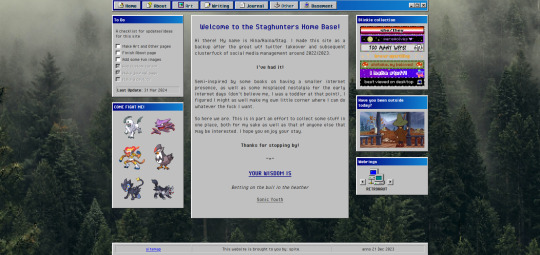
The home page!
I've changed the middle window so it fits in better with the rest. Not very visually exciting there in terms of color, but it is for now the best look imo. Text there is aligned justified, I've condensed it a bit more and added the randomized quote section underneath it instead of it being a seperate window on the side.
To do list needs an update but is still accurate. The team is still there, but on the other side, I have set the blinkies to be a bit larger. The music player has been removed because I couldn't find a way to add songs to it that weren't included on the source site. Snufkin is here now. The webrings will need some more. Retronaut is there, but not functioning as it should. it just forwards you to random sites in the ring instead of where it should be, but I can't find what exactly I'm doing wrong with the code.
Another thing that is not working on neocities itself is the "last updated" part. For some reason it doesn't display there what it does display on my local html. Maybe a bug at neo.
And icons at the top on the nav par! Adds some more flair to the place. The footer has also received a minor update: it now has a sitemap link instead of another back-to-home url.
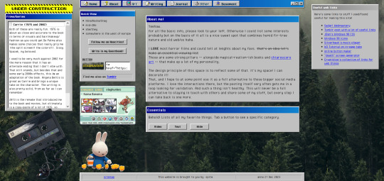
About!
I'm thinking of moving the small window with the short info to the right, but it is here for now. Links that are web-building related are on the right, also for my own referencing. The essentials lists on the left are hidden on load, but can be revealed by tapping the puttons. The lists are in tree-view and the window shouldn't expand over the cassette image once the construction sign is removed. Speaking of, the cassette has a lil playlist.
I might expand on the info a bit more, but that is for me to ponder. I liked including links to tumblr, the guestbook, and a button in case anyone wants to link my site on theirs.

Writing!
Hasn't really changed much. I've been looking at moving the sidebar info to be in the main section upon load, but idk if that would just make things more complicated. Right now it loads to an empty section there, stuff appears once you click a button. PDF support is only available once I'm a supporter of neocities, which i do wanna do but isn't a priority atm just for getting this part running. The links to ao3 will do just fine for now.
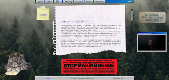
Journal!
The space for my rambling. It can be browsed by entry through the post-it, and all that seems to be functioning alright. Added a kitty and a sticker for decoration. The Stop Making Sense bumper sticker will now load a local video of the performance, but once again I won't be able to add this to the site until I get a supporter thing going. It plays/pauses on click, hehe.

Basement!
Decided to add a page for it. Basic info, schedule, link to the room, my letterboxd, and an overview of past movies. It's a nice spot on the site that is also the most cramped, but I like how it turned out.

BLUE SCREEN OF DEATH
In case any page/url error happens, you can send a movie recommendation to B (their askbox is linked when you open on desktop)


UNDER HEAVY CONSTRUCTION
The art and other pages are very much works in progress. Art can be up and running once I upload art to the site, but I'm not sure if I want to post full pieces here. Maybe I'll make it a space for sketch stuff that I'd otherwise discard.
As for the other page: I might be filing it under the writing page as a section, since the only thing here is WvW atm. It's cool that it has it's own thing, but I'm not sure if something that is basically a fanfic warrants such a space. That, or I keep it and drop all my other-media stuff in here so there's more to look at.
That's it for now! I got some ideas on how to continue, but they're not super-duper set in stone.
#stagcities#it's so much fun ough#takes time out of my other activities but certainly isn't a bore#neocities#web development
9 notes
·
View notes
Text
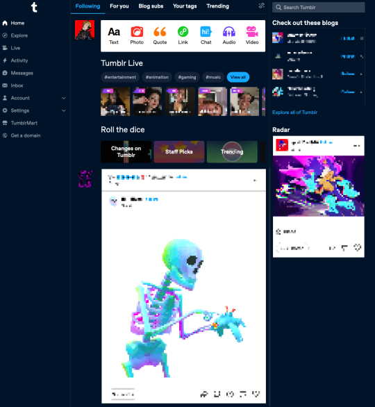
On The New Tumblr Desktop Dash
I've been using the new Tumblr desktop dashboard for a few days now and I have some Thoughts that I thought would be useful to put out in to the wild. Most of the reaction I've seen has been...abnormally harsh about this UI update, so I think it would be interesting to actually go through the changes and point out what I like, what I don't, what I think could use some improvement, and maybe break down a little about why those Twitter comparisons are way off the mark.
More below the fold, but the tldr for me is - I think it's great! At the end of the day, I feel like I use the desktop version of Tumblr more and more since the change. Whereas before I used to just pick up my phone and refresh the app, now I get a hit of dopamine flipping over to the Tumblr tab when I need a work break.
The change is clean and logical, and as someone who came to Tumblr a year ago and still never quite grokked what all the icons at the top meant, having them spelled out is much nicer than guessing what they mean, even for someone who has become more familiar with the site. And to be clear, from what I can tell that's the goal of this change - to make it easier for newer people to use Tumblr and find their way around. Despite all the hate this change is getting, that is an unabashedly good thing.
The Left Nav
It's really, really clean. The old dash had a lot of unused space on the left, it makes sense to carve some of that out to have a menu that actually lays out what each icon means. The font size and style is comfortable without overcrowding. It just feels more...confident? Like these are the features Tumblr has. Use them! It's also just a more familiar web browser experience for anyone who has been using web apps since the dawn of email.
The badges also fit much nicer with the left nav. They don't float above an unclear icon, they're right next to what it says on the tin. You got 20 new posts to read, buddy. 5 new notifications. 1 anon ask. It's just better on my eyes.
I do understand the gut reaction that things are "too" cluttered. One of the first things I did was snooze Tumblr live and that helped me out a lot. Just removing all of the noise of live tags and loading-in thumbnails of people I'm not interested in watching went very far. It brought the post content further up on the screen.
A little before and after snoozing Live:
Explore
I didn't even know what Explore was used for before. It was a compass icon. I think I thought it was some kind of search? I can't remember if I ever clicked on it before. Explore is much more interesting to me. It makes me curious. For a site that struggles with getting new users to find new content, it's a beacon that says "Find some cool new stuff!"
My problem with Explore is that clicking on it...doesn't get me much. The landing page just takes me to a feed from @todayontumblr that almost never has any content that I'm interested in. The "For You" tab on my regular dash is where I go mining for new blogs, along with "Your Tags." If Staff finds this change leads to more Explore click-throughs, I'd love if the tab itself get some love and made it a hub for finding new content easier. Maybe mixing up a feed of any tags you're following, trending posts, and other algorithmically sorted goodies that I'll want to take off the shelf and put in my chronological dash. I want it to be a place with the goal of encouraging me to follow new blogs.
Live
The transition to the Live page doesn't feel good to me. You're taken to a totally different kind of page, and the UI jumps all the way to the left. It feels like you're going to a separate site. At least when you snooze Live it also removes the menu item. That's really nice! But I'll save Live thoughts for another day.
Activity/Messages/Inbox

I never knew how much I suspected these things were a bit redundant, but I'm glad now that they're separated and labeled correctly. I don't have to remember what the face icon/mail/lightning bolt all mean or why they're different. Things are much cleaner in that regard.
I don't really care for the popups when you click on them. Those do feel cluttered to me, like I'm going to lose sight of my dash, or the notifications. I don't have much UX advice here, other than to say I think I prefer how the Inbox is handled, where you're just taken to a full page view of the page. However maybe another solution would be how the Account and Settings icons are conducted...
Account/Settings
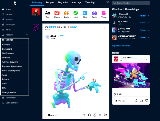
This is the section that sold me on the new dash. On the old dash, I found navigating the Account and Settings options...ephemeral. I was afraid I was going to lose my place if I didn't find the menu I needed. Here, having them slide out as a drawer, keeps me in place and lets me orient myself easier. It's made exploring settings overall frictionless. I've changed dash palettes like ten different times just because I could and it was easy to find. Maybe something similar for inbox/messages/activity would make the UI feel more consistent and less overcluttered-feeling?
I do notice that the Account dropdown adds a new scrollbar which makes things like the t logo and badges jump to the left. That can be a bit disorienting.
TumblrMart/Get a Domain

The Get a Domain menu item is fine, but TumblrMart feels like it needs some love. On a new refresh, clicking the icon loads for a total six seconds before the mart pops up. By this point, if I wasn't intentionally testing, I would have just moved on. Again, I also just don't like pop-ups like this. Feels loosey. Much prefer the full-spread domain page you get.
Create
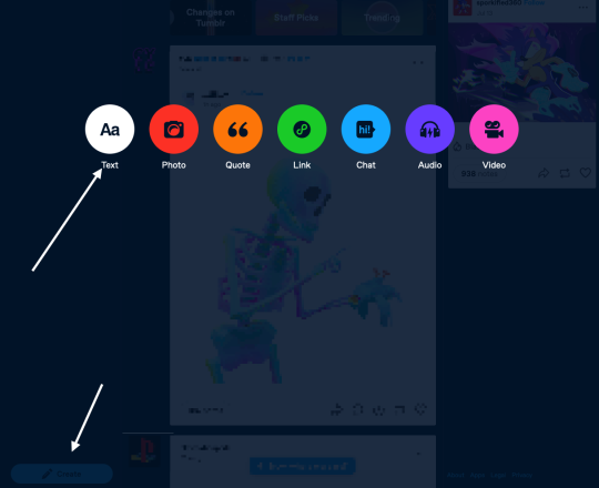
This is maybe my least favorite change. Every time I switch to my Tumblr tab, I see it in the bottom left and think it's the "Where were we?" button. When I do want to create a post, it feels like I have to travel far to get to the button, and then I have to travel again when the dots come up to select what type of post I'm making.
I wonder if just tucking it at the bottom of the menu under "Get a domain" would be better? Or at the top of the menu? Not sure. I feel in my jellies there's a better spot for this one.
On Twitter
If I can address the most frequent criticism I see on this site, which is that @staff are trying hard to "ruin" Tumblr by "turning it into Twitter," I understand that gut reaction.
But I'd encourage folks to think about that for a minute. UIs change, and a left-aligned nav is extremely common for a reason. Since the dawn of email, menu navigation has been relegated to a left sidebar. Twitter is not "burning to the ground" because their nav bar was on the left. Having a left sidebar means literally nothing in the grand scheme of what makes a website what it is.
What, truly, has this nav update changed? It does not change the functionality of the site at its core at all. It doesn't change what you can post, how you can post, what content you find, reblogs, or tags. For a site that struggles with new users "getting" the site and finding their way around, this nav change makes it much easier to settle in with something a bit more ubiquitous to the modern browser-viewing experience.
Thus leading me to believe the only reason people hate on this change so vehemently is they don't want to see new users or any effort at all to attract them at all, and I think that's exclusionary crap. Knock it off.
Change is Scary!
That said, the change is scary! Having your muscle memory interrupted isn't fun and can take a while to get used to. Every change has a growing period. I get that. For me, I got over that period fairly fast, but I recognize this process is different for everyone, especially those who have been around here for a lot longer than I have.
The change is also open for valid criticism. There are usability and likely accessibility concerns for sure. Staff needs time to iterate, and they need to know what problems are actually worth fixing and addressing. "I hate it turn it back" doesn't help anyone - it doesn't help Staff, and it doesn't help new users who are trying find a new place on the internet to call home after *shakes fist at the rest of the internet.*
I really like this change as a starting point, and I can't wait to see it iterated on further.
And on a small end note, if you also have thoughts and opinions that you want to tell Staff, please, please, please remember there are other human beings on the other end of line.
#tumblr#dash#tumblr dashboard#dashboard#I get dispirited when I see prominent blogs reblogging metaphors about sandwich shops and Radio Shack.#They're not being made in good faith.
9 notes
·
View notes
Text
Announcement
The featured tags of this blog have been updated to the following tags:
genshin impact fanfics: for fic posts from the RSS feed and fic reblogs
fanart: reblogs of fan-made illustrations that feature Diluc and Kaeya. Includes fan comics and even animatics
fan comic: reblogs of fan-made comics about Diluc and Kaeya. Can also be found under the #fanart tag
lore*: (in-progress) reblogs regarding the canon in-game lore about Diluc and Kaeya
announcement: for updates/posts from this blog
For mobile users, this should make navigation easier. For desktop users, the blog theme’s nav bar has also been updated for easy access to the fics, fanart, lore, and announcement pages.
(09/28/2022)
*Note:
The #lore tag is meant to cover in-game updates on Diluc and Kaeya’s background/relationship over time. Because this blog began in October of 2021, as of now it only has information revealed in the 2.8 Hidden Strife event. The tag will not cover prior events like the 1.6 Midsummer Island Adventure event.
2 notes
·
View notes
Note
hi i think your navi's desktop html (/creatornav) might be messed up?
Oh dear! Thank you so much for letting us know. We'll get right onto fixing that :)
Edit: On my screen it is looking normal! Is it possible to be sent a SC of what you're seeing so I can better help? We're also looking for a new code to update the nav and bring it up to par!
1 note
·
View note
Text

All comic posts on the Tumblr site now have previous/next buttons added to them. I also added chapter naviagtion to the pinned post to make it easier to find any one chapter.
The desktop version (non-dashboard) should still remain the same. I used some html magic to make the redundant nav links invisible, plus updated the existing buttons to look prettier than the boring plain text they were before.
Tumblr is now a really good place to read the comic on your phone. So if you have practically an entire 12 hour day to waste, go ahead and give it a try.
(Protip: If you want to get back to the navigation page, tap the avatar instead of mashing the back button 20 times)
0 notes
Text
KIND OF IMPORTANT RYO UPDATE!!!!!!1!!
okay to start, i updated the overall look of my blog (esp the web ver)--imo it now look more compact and easier to view both on desktop and mobile
+ I UPDATED MY RULES, something i have been meaning to do for a long time
+ i updated the format of my fics, it's not super noticeable but i like it more now
+ i added new sections on my nav (common tags and most recent works)
+ i made my masterlist slightly more organized + archived/privated work i disliked (sorry if you liked them! i just felt like it didn't reflect the best work i produced so i archived it!)
also guys...I WAS LOOKING AT MY 100 FOLLOWER EVENT FROM LAST YEAR AND BRO HOW COME NONE OF YOU TOLD ME I SPELT MY OWN USERNAME WRONG IN THE TITLE SPAGFEUAGFUOEASFGIFG CRYING IT'S FIXED NOW BUT ILL NEVER FORGET THIS MOMENT
at some point i'll private this too because i don't really see the need to have this up for an extended amount of time but i just wanted to lyk incase i broke my links or other post through the rigorous updating i've done today LMAO
well i hope you guys have a lovely day or night thanks for reading the ryo update!!
1 note
·
View note
Text
Iphone x plane

Iphone x plane update#
Iphone x plane Pc#
ILS symbols with popup information, displayed with Airport data.
Terrain profile view on completion/update of a quick plan.
Select cruise altitude to use in the FSX, FS9 or X-Plane plan.
Total plan distance calculated and displayed on the fly.
Waypoint deletion via the list on the popopver (swipe).
Visual waypoint list on creating a quick plan.
Iphone x plane Pc#
Dropbox feature syncs to the folder "Dropbox/Apps/FSWidgets - QuickPlan" on your Mac or PC.Includes optional Dropbox support for easy transfer of flight plans to Mac or PC.File-Sharing Feature requires iTunes desktop edition.Flight plans can be imported/exported via iTunes File-Sharing feature.Saves flight plans to the apps Documents folder.Generates native FSX (.pln), FS2004 (.pln) and X-Plane (.fms) format flight plans.
Iphone x plane update#
Updated Dropbox SDK, current users please update this app before 30 Sep, 2021.
KSFO, OSI, LV, FABLA).įree update for all current users - thanks for your support! Plans created this way label the waypoints automatically with airport and navigational aid identifiers taken from the Nav Data ( e.g. If you own the FSWidgets Cloud Based World Nav Data product you can create more advanced flight plans by tapping on any of the icons displayed on the map to add them as waypoints - airports, VOR's, NDB's and intersections (data for the KSFO area is included free). Helicopter pilots can also quickly create plans that depart from off-airport locations like building rooftops or land on a road. This is handy for bush pilots who often use unlicensed airfields and small landing strips (or seaplane landing areas). If desired, the entire route from departure to arrival can be created without reference to any navigational aids or official airports. Plans created this way label the waypoints automatically with generic names ( e.g. VFR pilots often use towns, lakes and other unique geographic features and with QuickPlan you can add any geographical location shown on the base map. Simply tap anywhere on the map and QuickPlan will allow you to add it as a generic waypoint. QuickPlan can be used in Freeform Mode, Advanced Mode, or a combination of both: Use your Cloud Key to access any FSWidgets Aero Chart and World Nav Data products you already own. For a more convenient file export solution you can use the built-in Dropbox support to easily transfer flight plans to your Mac or PC.įree demo data includes the Cuba/Puerto Rico WAC and San Francisco Bay area Nav Data. The entire route is generated visually, by tapping the map to add the departure airport, intermediate waypoints and arrival airport in the same order that you intend flying the plan.ĭuring plan creation and after adding the final arrival waypoint you also have the opportunity to remove any of the intermediate waypoints before saving the plan in your preferred format.įlight plans are saved to the app Documents folder and can be exported using the iTunes File Sharing feature. It makes a great companion for our moving map apps for iPad - iGMapHD and FSWidgets EFB. QuickPlan for iPad is a visual touch enabled flight planner that makes it easy to generate flight plans in native FSX, FS2004 or X-Plane formats. Get 40% off in FSWidgets Collection for iPad Latest Release: Version 3.6 (15 Sep, 2021)
0 notes
Text
Free street atlas 2015

Free street atlas 2015 manual#
Free street atlas 2015 pro#
Free street atlas 2015 software#
Free street atlas 2015 plus#
More on United States: United States Geography U.S. All in addition to the new E-Z Nav Search feature.Ĭomprehensive tools for detailed desktop planning of your vacation or sales trip BEFORE you go, AND for on-the-go traveling using the latest electronic gear.In-depth entries covering: Economy, Government, History, Land & People Simply load the Street Atlas USA software, plug the LT-20 into your laptop’s USB port and get started.
Free street atlas 2015 software#
It includes Street Atlas USA 2008 software with updated maps of the U.S., Canada and Mexico. Hosting is supported by UCL, Fastly, Bytemark Hosting, and other partners. The LT-20 features an automatic back on track map and direction updates when you stray off course. Powerful travel planning tools, MapShare, and a wide array of data.Ģ-D and 3-D NavMode voice commands, spoken directions, automatic back-on-track re-routing with offroute distance settings, high contrast mobile map colors, and much more. OpenStreetMap is a map of the world, created by people like you and free to use under an open license.
Free street atlas 2015 plus#
and Canada, plus Mexico highways and main roads. Great for daily and overall trip planning, too.Ĭomprehensive street and places of interest (POI) detail for the U.S. Just search on any category, choose your destination (retailer, hospital, gas station, friend's address, etc), and start real-time navigation with your GPS receiver (not included). Try out the E-Z Nav wizard for on-the-go routing.
Free street atlas 2015 manual#
Atlas Copco brand identity manual for distributors - English. Atlas Copco brand identity manual for distributors - Chinese. Atlas Copco brand identity manual for distributors - Arabic. Comprehensive tools for detailed desktop planning of your vacation or sales trip before you go, and for on-the-go traveling using the. Below you find the distributor manual for donwload in different languages. The product will soon be reviewed by our informers. The name of the program executable file is Streets.exe. The most popular version of this product among our users is 15.1. The 2022 editions also feature 'The National Parks. freeload street atlas usa Files at Software Informer. DeLorme Street Atlas USA 2015 Plus is developed by DeLorme Publishing and is used by 6 users of Software Informer. The 2022 Road Atlas line features fully updated maps, mileage charts, road construction and tourism information, along with more city detail maps. Create ultra-detailed maps for high-impact presentations. For generations, Rand McNally has been compiling accurate, detailed maps and travel information into the ultimate road trip accessory. Print notebook and wall-size maps for strategic planning, trade shows, dispatch, and other needs. Display radius information including acreage, square miles, more. Import, edit, and map your vital contact manager data, or additional data from Excel or other sources. If you’re looking for a Delorme Street Atlas alternative, we highly recommend considering Maptive as an option. Many people are still using the out-dated version of this software and have yet to find a suitable replacement.
Free street atlas 2015 pro#
Upgrade to Pro for unlimited, accurate search, image downloads, no adverts and more. Delorme street atlas was a popular mapping and routing program that Garmin discontinued in 2015. Create databases of your business information. Free users are limited to 20 autocomplete queries per day. Everything you need to create, customize, print, and share detailed maps containing your own contact address locations, and much more.
0 notes
Text
Navigation
updated January 11, 2020
Media
-Headcanon Lists (tagged as hc list)
-Mod Posts (tagged as mod post)
-Fanart (tagged as fanart)
-Icons (tagged as icons)
-Aesthetic Boards (tagged as aes board)
-Characters From Other Shows Included (tagged as other shows)
-Wallpapers (tagged as wallpaper)
-Desktop Wallpapers (tagged as desktop wallpaper)
-Headers (tagged as header)
-Blog Updates (tagged as blog update)
-Halloween Themed Haikyuu (tagged as halloween haikyuu)
-LGBTQ+ Flag Themes (tagged as flag theme)
-LGBTQ+ Confessions (tagged as confessions)
-Edits From Previous Mods
↳mod teanna (tagged as shown)
↳mod dazai (tagged as shown)
Characters by Team
Tagged the way their name is shown
Dateko (tagged as dateko)
-futakuchi kenji
-koganegawa kanji
-sakunami kousuke
-aone takanobu
Fukurodani: (tagged as fukurodani)
-bokuto koutarou
-akaashi keiji
Inarizaki: (tagged as inariaki)
-kita shinsuke
-miya atsumu
-miya osamu
Itachiyama (tagged as itachiyama)
-sakusa kiyoomi
Johzenji (tagged as johzenji)
-terushima yuuji
-misaki hana
Kamomedai (tagged as kamomedai)
-hoshiumi kourai
Karasuno: (tagged as karasuno)
-sugawara koushi
-hinata shouyou
-azumane asahi
-nishinoya yuu
-yamagachi tadashi
-kageyama tobio
-tsukishima kei
-hitoka yachi
-ennoshita chikara
-udai tenma
-tanaka saeko
-kiyoko shimizu
-michimiya yui
-sawamura daichi
-tanaka ryuunosuke
-ukai keishin
-takeda ittetsu
-kazuhito narita
-hisashi kinoshita
-tsukishima akiteru
-makoto shimada
-yuusuke takinoue
Mujinazaka (tagged as mujinaka)
-kiryuu wakatsu
Nekoma: (tagged as nekoma)
-kuroo tetsurou
-kozume kenma
-shibayama yuuki
-haiba lev
-haiba alisa
-yamamoto akane
-inuoka sou
-yaku morisuke
-fukunaga shouhei
Niiyama Joshi (tagged as niiyama joshi)
-niiyama joshi captain
-kanoka amanai
Nohebi Academy (tagged as nohebi academy)
-daishou suguru
Seijoh: (tagged as seijoh and aoba johsai)
-oikawa tooru
-iwaizumi hajime
-yahaba shigeru
-matsukawa issei
-hanamaki takahiro
-kyoutani kentarou
-kunimi akira
-kindaichi yuutarou
Shiratorizawa (tagged as shiratorizawa)
-kawanishi taichi
-tendou satori
-semi eita
-ushijima wakatoshi
-goshiki tsutomu
-shirabu kenjirou
-reon oohira
LGBTQ+
Tagged as shown
-Transgender
-trans lesbian
-trans bi
-trans gay
-trans pan
-ghost trans
-Bisexual / Biromantic
-genderfluid bi
-trans bi
-nb bi
-bi demigirl
-cat bi
-vampire bi
-merfolk bi
-ghost bi
-angel bi
-demon bi
-magic bi
-bi witch
-sun bi
-pastel bi
-Pansexual / Panromantic
-trans pan
-pan aro
-Gay
-trans gay
-genderfluid gay
-nb gay
-she her gay
-monster gay
-vampire gay
-peach gay
-space gay
-Nonbinary
-nb lesbian
-nb ace
-nb bi
-nb gay
-monster nb *
-Demisexual / Demiromantic
-WLW
↳Bubblegum wlw
-Queer
-Polyamorous
-Asexual / Aromantic
-nb ace
-aroace
-ace lesbian
-pan aro
genderfluid ace
-Lesbian
-trans lesbian
-nb lesbian
-butch lesbian
-fairy lesbian
-spooky lesbian
-horror lesbian
-femme lesbian
-ace lesbian
-sunflower lesbian
-punk lesbian
-witch lesbian *
-flower lesbian *
-agender lesbian
-Genderfluid
-genderfluid bi
-genderfluid gay
genderfluid ace
-Agender
-agender lesbian
-Demiboy / Demigirl
-bi demigirl
-Bigender
-Trigender
-Grayromantic / Gray asexual
-Genderqueer
-Lithsexual
-Frayromantic
-Quoiromantic
Pairings
Tagged as shown
-akaken
-akakenkage
-akateru
-asanoya
-asayaku
-bokuaka
-bokuroo
-daisuga
-ennoaka
-ennotana
-hanaoi
-iwakage
-iwaoi
-kagehina
-kawasemi
-kawashira
-kawaten
-kenhina
-kiyoyachi
-kiyoyui
-kuroken
-kurotsuki
-kuroyama
-kyouhaba
-matsuhana
-oikuro
-oiyama
-semishira
-tananoya
-tensemi
-tsukikage
-tsukiyama
-ukatake
-ushiten
-yachihina
-yakunoya
-yamahina
-yamakage
10 notes
·
View notes
Text

Hello my lovelies~, i know i’ve been a bit dead today lol-- and i’m honestly not sure how much longer i’ll be around before heading off to sleep, but--
I just wanted to post a little update to mention that my sorting blog, where i’ve listed all my other muses/blogs, is finally up to date~ well, assuming i’m not forgetting anyone-- so, if you’ve ever wondered what other blogs i’ve been around on, now the picture is a lot more complete~
#{|ooc post|}#something that's not complete are a couple blogs that take up many of the spaces there lol--#and some blogs are outdated on certain pages thanks to being inactive for ages--#but-- i feel kinda proud to have this updated after so long-- so i wanted to share lol#also viewing it only works properly on desktop--#but-- i plan to perhaps do up a mobile nav later once i've had some sleep
0 notes
Text
Hey! Thanks for visiting my blog! For best viewing experience, check it out on desktop. There are a lot of extra features that make finding specific content easier.
Updates
[5.15] I just got java script editing back, so I’ll be updating the navigation pages.
[5.15] Added navigation and FAQ pages in description that are easier to use on mobile. Mobile navigation page to be updated after I finish updating the desktop version.
[7.12] Navigation pages updated: “nav” “party” and “school”.
About
This blog was made to collect any extra material that isn’t the main story of One Piece, so it’s easy to find in one place. This includes SBSes, cover stories and pages, spin offs, activities, etc. The current spin offs aren’t fully translated in English so I’ll also be working to fill in any gaps that I can.
Asks and submissions are always open. This blog is run by @kai-teaa :)
Translation Disclaimer
I am not a native/fluent Japanese speaker nor learning in an academic setting. I just translate for fun and to the best of my ability. Therefore, there will most likely be errors or nuances I miss.
Schedule
Posting four times daily. Translations of One Piece Party and School updated randomly.
Quick Links
Navigation | FAQ | OP Party (tag) | OP School (tag)
39 notes
·
View notes
Text
Site Update 2/25/2020
Hi Pillowfolks! We hope you are having a wonderful Tuesday! Our developers have pushed out a hefty site update. Here is a look at what has been added and improved:
New/Improved Features
*NEW* Community Moderation System Upgrade - Users now have the ability to flag community posts that violate Community Guidelines for Community Moderators to handle rather than Site Moderators. This is so that Community moderators can control what kind of content is posted to their communities, independent of whether or not the content violates the Pillowfort Terms of Service. This will be useful for removing off-topic posts, unnecessary or rude comments, etc.
There’s now a new option when submitting a flag to select if the report needs to go to a Community Moderator or a Site Moderator:

Community Moderators will be able to view all flagged reports for their Communities in the new Flags tab available on the main communities dashboard, or through the new button on each Community nav menu. The flags will look like this:

Moderators can delete a post or comment that’s been flagged, or ban the User that submitted the content from the Community. Moderators also have the ability to escalate community flags to Site Moderators in the event that the flagged content in question is a violation of Pillowfort’s Terms of Service.
New Image Hosting - We’re trying out a new cloud storage service for our uploaded images. You’ll notice that images uploaded after today’s update will have the new subdomain img2.pillowfort.social. Performance should ideally be the same as before, but please let us know if you encounter any differences or problems with uploading images to posts after this update.
Added pagination to the Members List in Communities - Added pagination to improve load times & navigation for Communities with large memberships (this list is visible only to moderators of a Community). Moderators will now also see users that they have banned in the members list, and can choose to un-ban these members from the list.
Avatar Upload - Added a loading spinner to the avatar upload modal.
Added more artwork to the log in page!
Bug Fixes
Log-In Page Display For Mobile & Desktop - Fixed a bug where users were unable to input their username and e-mail address on the log-in page if they had the page settings set at higher than 100% zoom, or on certain mobile devices.
Account Deletion & Release - We have made improvements to account deletion. Previously when a user account was deleted, our team would have to manually release the username and e-mail address in question. Deleted accounts will now be released automatically which allows future accounts to be made with the username and e-mail address. We have also fixed a bug where reblogs from deleted user accounts were not removed entirely from our platform.
Image Uploading - Fixed a bug where users were unable to upload images to both posts and avatar icons. (Note: If you are still receiving an error after this update goes live please respond to this thread and include the following information: image file type, image file size, and what device & browser you are using to access Pillowfort.)
Broken Icons in Communities - Fixed broken member icons in the Communities membership list & added better icons for the other buttons.
152 notes
·
View notes
Note
Hi do you perhaps have a main masterlist? I'm kinda having a hard time reading your fics😣
Hello anon! Sorry I haven't updated my masterlist in a minute since I was reposting fics from my blog that I deactivated ojjasn but it's updated now! The main masterlist is linked in my description, its the second link where it says "WE'RE ALL FICTION", if you check my nav its the one called "BOOK OF STARS", i also have the #masterlist so you can look for it there and if you're on desktop, its at the top in my blog <33 i always forget to update my masterlist asjiadn sorry
1 note
·
View note
Text

I know we’ve been through this and I’m constantly coming back and then I leave a while and then I come back again and so on (although I don’t think many people notice) but damn it I’m trying and I really do want to be active here again if not I wouldn’t be constantly trying to return every so often
To try and force myself to stick to it I’m doing blogrates, compliments and requests (although I wouldn’t get my hopes up with the requests bc I’m just terrible at following through but do take a shot and I might actually finish it!)
• Follow me (@delacourr)
• Reblog this post
• You can check out my creations if you’d like
• Blacklist “ana does shit” if you don’t wanna see these
• Send an ask with what you want (no limit) and write something else! let’s chat: it could be a blog rec, something that makes you happy, a compliment about my blog or someone elses, your favorite character, ship, book, movie, ask me something, do whatever you want!
BR formats + request info under the cut
BLOGRATE
url: /10
icon: /10
mobile theme: /10
desktop theme: /10
creations: /10
content: /10
overall: /10
following: yes/no/+f
DETAILED BLOGRATE
B A S I C
url - dgi sorry | not from my fandoms | could be better | pretty cool | really like it | absolutely incredible!
domain - don’t have one | dgi sorry | not from my fandoms | could be better | pretty cool | really like it | absolutely incredible!
icon - basic yikes | don’t recognize it | poor quality | pretty cute! | omg awesome | tempted to steal it
T H E M E
desktop theme - basic yikes | not my style | kinda pretty | gorgeous | i wanna steal
colour scheme - not my taste | pretty | gorgeous | my fav colours!
updates tab - don’t have one | i think something’s not right | bit basic | lovely | absolutely perfect
nav page - don’t have one | i think something’s not right | incomplete | bit basic | lovely | absolutely perfect
about page - don’t have one | i think something’s not right | incomplete | bit basic | lovely | absolutely perfect
mobile header - nonexistent | i don’t get it | not my fandom | bit blurry | alright | lovely | absolutely gorgeous
mobile colours - kills my eyes | don’t match | looks nice | urgh aes af
P O S T S
activity - you post too much | you post too little | you post the perfect amount
reblogs - urm nonexistant ?? | kinda random | not my fandom | pretty good | wonderful | incredible!
aesthetic - inconsistent | eye pleasing | absolutely perfect
original edits - you don’t have any | not my fandom | great start | not bad | lovely | so original | gorgeous | omg i’m jelly af of your skills
personal - nonexistant | not enough | too many | you seem sweet | omg you make me laugh so much
activities [e.g. botm / awards / rates/ reqs etc] - nonexistant | not enough | good | wonderful | such original ideas
O V E R A L L
overall - meh | pretty nice | lovely | incredible
following - no sorry | not my fandoms | now | how was i not before?! | yes ofc | you’re one of my fav blogs
REQUESTS
this section only exists to clarify that the requests should be of one of my fandoms so if ur not as familiar with my blog maybe scroll down a bit or visit my navigation page, there you can also find films/tv shows you might like and want me to make a gifset/edit/moodboard of (maybe even some icons???
#ana does shit#please signal boost and don't let it flop fam#tagging some people now#tusermillie#userelena#expelumos#ginnypcttcr#dementvr#parkerpete#userpatty#userjamie#and idk who else to tag so that's all folks
24 notes
·
View notes
Text
Deviant Art Update!!

HAUNTED HEARTS is now going to be on Tumblr as well as on Deviant Art!
**The comic won’t be progressing till I upload all the deviant art adaptation onto there so that both places can be updated at the same time when new pages come out. This shouldn’t take long though.**
There’s also a Deviant Art Group for it as well which is operatable right now, but the front page is still working progress. This can be found here!

____
What's the difference and where should I read?
It's really up to preference
Tumblr:
-Best for quicker reading
-Can be read in a scrolling format on desktop and mobile browser (click the first nav on pages for it). Mobile app users and those who prefer it read page by page by clicking the next and previous buttons.
-Images may be slightly blurry on mobile
-Status Updates are more accessible
-Better for asks. Asks can be sent via comments or ask function. An account is not needed to send asks.
-Has more content (artworks, easter eggs, ext.)
Deviant Art:
-Higher quality art
-Can zoom in better
-Best for looking at more details and the artwork itself
-No scrolling format to read, only page by page with next and previous buttons
-Easier to submit fanart
-Has a Deviant Art group where art, as well as writing, can be submitted.
-Comment system is better
-Asks can be sent via comments or notes (if you wish to remain anonymous, say that in your note). An account is needed to send ask.
___
Soo yea hope ya check it out!
____
Deviant Art Version of the comic
Masterpost (Navigator)
Haunted Hearts Wiki
Official Twitter!
Find me on Youtube!
Buy me a Ko-Fi! (Donate)
~By: DespairBreaker
11 notes
·
View notes
Photo

hi guys! so i recently reached 200 followers on this blog! while that may not seem like a lot to people (including me) i am so proud! to celebrate i am hosting a celebration to appreciate you all and to make me edit over the summer. also thank you to all my mutuals who somehow stayed around!
for this celebration, i will be doing blogrates and url edits, and for mutuals only - compliments
FRIENDLY REMINDER: i am a very slow and picky editor and tend to restart a lot, so it may take me some time to get through the url edits, but please be patient with me, i will get to all the edits eventually, i promise!
rules:
mbf this idiot
you must reblog this post (likes do not count, sorry)
please keep blogrates and url edits in one ask.
send me a ✿ for a url edit, a ♛ for a blograte, and for mutuals ☀ for a compliment.
if you don’t want to be spammed, blacklist “aaliya’s 200 celebration″.
blograte format under the cut
B A S I C
url: i don’t get it | not from my fandoms | could be better | pretty cool | really like it | absolutely incredible!
icon: could be better | don’t recognise it | poor quality | pretty cute! | omg awesome | tempted to steal it
T H E M E
desktop theme: basic tumblr theme | not my style | could be better | kinda pretty | gorgeous | i wanna steal it
colour scheme: not my taste | pretty | gorgeous | my fav colours!
updates tab: don’t have one | i think something’s not right | bit basic | lovely | absolutely perfect
nav page: don’t have one | i think something’s not right | incomplete | bit basic | lovely | absolutely perfect
about page: don’t have one | i think something’s not right | incomplete | bit basic | lovely | absolutely perfect
P O S T S
reblogs: um nonexistant?? | kinda random | not my fandom | pretty good | wonderful | incredible!
aesthetic: inconsistent | eye pleasing | absolutely perfect
original edits: you don’t have any | not my fandom | great start | not bad | lovely | so original | gorgeous | what is this magic?
O V E R A L L
overall: meh | pretty nice | lovely | incredible
following: - no sorry | not my fandoms | now | how was i not before?! | yes ofc | you’re one of my fav blogs
66 notes
·
View notes
Last Seen Blogs

201801880caic1920-blog
Contemporary America in Context Blog

richardsongaragedoor-blog
Garage Door Repair Richardson, Dallas

okfloramoscow
OkFlora
Премиум Доставка Цветов

sameerafaridistudio
Sameera Faridi

20170622tds
20170622_ディズニーシー