#they are full color. well readable. really pretty comic i like them
Text
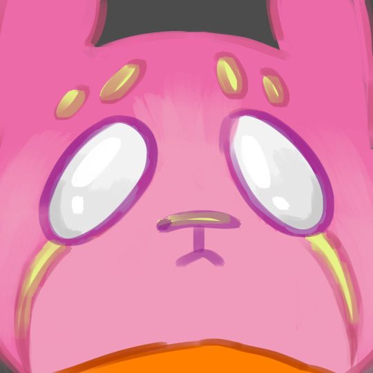

@egpowerful's scugpup bebbles, my beloved <3
such a wet eyes pathetic little guy, my adored <3
#as you can see: i have soft spot for peddles#plus i really like powerful's comics#they are full color. well readable. really pretty comic i like them#rain world#fp#a gift if you will#vulturemimic
234 notes
·
View notes
Note
Well I really love your art, may I ask how do u color? I struggle with coloring turtles and I wasn't to know how do u do that?
Hi anon! That's a very broad question, so you've given me a great excuse to ramble anything I want about my coloring, eehehehee~!
This will be in two parts and I'll start with talking about my simpler coloring style.
As in, when I color characters on a white background, with a limited or light palette.
The driving force behind this style is me being lazy. My time, energy, and attention span are pretty limited, so if I want to finish anything, I gotta do it fast. And with fanart, I'm usually just doing it for fun and relaxation, so there's no need to push myself to polish it too much.
Despite that, I rarely post just black and white sketches or line arts. I always try to add at least a little bit of toning or shading, because that makes the image easier to read. The characters and their shapes pop out and catch the eye of the viewer better.
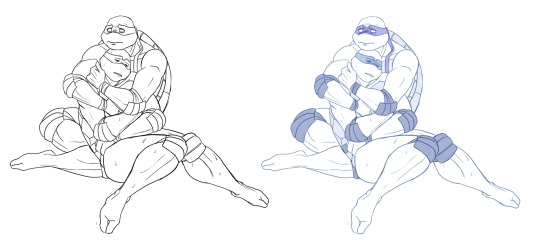
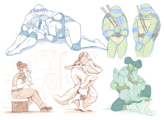
However, in this particular example, just the couple toning colors don't quite do the job. The way Don and Leo are entangled makes the center area of this illustration very busy and hard to read.
As a comparison; this pic has only one tone + mask colors, and it works. This is because all the characters are standing separately and their poses are very stationary and simple.
So for the Don + Leo pic, adding some shadows helps in bringing out shapes and depths. Also in general, if you don't feel like drawing BGs, it's good to at least add a shadow below the characters. It grounds them and makes them feel like they exist within a space.
Sometimes if the posing looks too complex and busy, it might just be best to color in the characters fully.
However, even if I do full flat colors, I tend to use a lighter palette. Putting characters in their neutral/default color on a white BG can look a bit jarring as if they're floating in a void. It feels less immersive and like the picture is unfinished.
Using lighter colors makes the image more cohesive, and fits the characters into the white environment a bit more naturally.
If I'm too lazy to draw a BG, I prefer using stylized and limited colors. It feels deliberate and that the whiteness is just part of the palette, whereas the character-accurate colors on white don't match as well, even if they're more pastel.
That being said, there's nothing wrong with just slapping the flat-colored characters on a white background. As you know, I do it too. I'm just exposing my 'fancy coloring style' for what it is; me being lazy, hah!
Limited and monochromatic palettes are a nice shortcut even when you do actual backgrounds. It's faster and you don't have to worry about clashing colors. And you can still convey atmosphere and mood.
Also, on the topic of conserving your time and efforts; I think it's very common among younger/less experienced artists to think that the amount of time you spend on your art piece = how good and well received that piece will be.
Which has some merit to it of course, but it can lead to putting too much effort into areas where it's not necessary. E.g. filling the piece with tons of details and clutter that don't serve an actual purpose, but rather make the image hard to read. Or doing really complicated shading for a meme/comic, where simplicity would deliver the joke better.
So whenever I'm drawing something I intend to publish, whether it's a quick doodle or a more polished piece, I try to follow these two principles:
Make it easily readable and do the bare minimum that needs to be done to convey what I want to convey.
Putting time into practice is important, but if you draw for work, it's also crucial that you know how to prioritize and use your time efficiently!
Anyway, thanks for reading! In the next part I'll go into how I do my fully colored pieces, so stay tuned for that!
172 notes
·
View notes
Text
Adding a Black Woman to a Small Human Cast With Many Aliens
@blazednarancia69 asked:
Half Alien Black Princess
I’m working on the early stages of a comic idea and I was wondering if you had any tips for people struggling to be as inclusive as they want when they have a small cast to work with- it’s a SciFi piece, and my story involves a lot of alien/human interaction, and there are really only 4-5 ‘main characters’ that are fully human. While they’re all POC, I’ve realised that my main human cast lacks any Black women.
There is a Black man in the main cast, and there are some secondary/tertiary Black women characters who show up throughout the story. One of the other main characters is a half-human, half-alien princess who is a dark skinned Black woman, but I don’t want to contribute to the existing trend of a ton of SciFi casting WOC and Black women in particular in exclusively alien roles but not including them in the human cast.
My proposed solution: Black lesbian and Black Mexican women characters, Black character works for the Black-coded Alien princess
A lot of my human characters are from the American southwest (California, Texas, New Mexico, Arizona, etc), and several of my main human cast have Mexican-American heritage. Two of them are adult siblings, an older brother and a younger sister, with a white dad and a Mexican-American mom. I decided a while ago that I wanted their mom to end up with a girlfriend/wife (in either a healthy polyamory way or a divorce way, NOT a cheating way, to be clear), and I’ve always pictured the girlfriend as a Black lesbian in STEM with a caffeine addiction and a cool shoulder tattoo- I’m thinking, now, that it would make sense to have her be the younger sister’s other bio mom. That way, I have a mixed Black & Mexican woman in the main human cast, plus I get to include a blended family that has half/stepsiblings with a healthy, positive dynamic, which is super important to me as someone who grew up never seeing families like mine except in ‘evil stepfamily’ situations.
Light skin and dark skin power dynamics
That ‘solution’ does make me worried about running into issues with the half-alien princess being darker skinned than the human woman; even though there are other aliens of her species with varying skin tones, I’m worried it might come off as exotifying dark skin. Then again, if I make the Black human woman darker and the half-alien princess lighter, I end up with a darker skinned Black woman working for a lighter skinned Black princess, and there’s some pretty obvious and colorist issues there, especially since the princess is meant to be, like, ethereally beautiful and graceful, as princesses tend to be, and the human woman is (and I mean this endearingly) a walking disaster. It’s probably relevant to mention that the Black man in the main cast is already dark skinned, so it’s not like there wouldn’t be ANY dark skinned Black humans in the main cast if I go with making the human woman lighter, but even that can have problematic connotations- I know a lot of media will feature dark skinned Black men but only light skinned Black women.
[ask redacted and headers added for readability]
First of all, your efforts to include dark-skinned Black women are appreciated! One can’t be expected to represent every race, ethnicity or underrepresented group in one story, as it’s generally just not feasible. Of course, making the full and conscious effort to be inclusive of under and misrepresented races and backgrounds in your current and future works is nice and very welcome in terms of representation - and it’s what we’re all about here!
Now, there are situations where I personally believe that it’s important to make that extra effort, and your story presents such situations.
Men of X race are there; the Women of Color are not
I take special note when there’s a man of a certain race that is included but not Women of Color of that race as well. It’s a trend for Black men / Black women especially or, as you noted, if she’s included and in a romantic way she often needs to be light. Or, if a dark-skinned Black woman makes an appearance, she’s the best friend or comedic relief and not seen as particularly desirable or someone to care about beyond being entertainment or even a punching bag.
Non-humans of X race exist, but humans of X race do not
It’s eyebrow-raising to me when stories include Black-coded aliens and non-humans but no humans in a story where indeed other humans exist. It’s insightful for you to take note of that as well.
A story is set in a region where the population is mostly X race - but they’re not in the story
Now, this situation actually doesn’t seem to be implied in your story, but it’s worth mentioning for others. A story that is featured in, for example, Nigeria or even Fantasy Nigeria that has no Nigerian, Black or African-diaspora people in general in the cast (or are just minor background characters)…..oh no.
So! It’s great that you took notice of the matter and decided to do something about it in your story.
Black mom and Black / Mexican daughter
Your solution to add a Black mom to the story sounds fine. Keep in mind the mammy and your typical tropes that can come from Black mothers in stories.
I may be getting some details cloudy, but it appears there’s a dark-skinned Black Mexican daughter from the relationship? And this Mexican + Black daughter serves a Black-coded alien princess that you’re not sure should be dark or lighter skinned? I hope I got that right!
There’s indeed power dynamics there if you go to the Black-coded princess with light skin. If you’re not wanting to create that dynamic or explore it in the narrative, you could always make them both darker skinned. There are many shades of brown and very brown skin. They don’t need to be the same shade or tone of brown.
Also, I think it’s okay for the alien princess to be graceful and the Black character to be a “walking disaster” as you say, as 1) Black characters need not be perfect 2) There are more Black women characters. And this is, again, made better if the princess doesn’t have to be light skinned.
Also, disclaimer as I’m not Mexican: but having a prominent Mexican character that is not in a servitude role would most likely be welcome! I’ll let Mexican followers comment on that.
Thanks for your thoughtful question.
~Mod Colette
#Black#Black Mexican women#Black women#mixed race#aliens#supernatural beings#Black aliens#power dynamics#asks
251 notes
·
View notes
Note
whats ur ranking of all of clints solos
oh this is tough. i think i’d just place them in like...tiers instead?
at the bottom i'll place hawkeye v2 bc the 90s-ness of it all is just too much. it gets flare points for the widower angst and effort of developing clint's relationship with trick shot. remembering clint had a supporting cast? good job.
idk if this counts as a clint solo since it’s a clint and kate joint, but next i'll put all-new hawkeye. the watercolor flashbacks are beautiful and they really went for the emotional beats in those but it was just. mm. like the kate retcon, forgetting simone's name was simone and then trying to cover that up, even little things like "bobbie"--it all just felt off, like there was a last-minute hawkeye assignment that got caught in the rain and everything got smudged. and the akira kids decision??
avengers: solo: pretty art, “you’re my brothers” moment, but i kinda forget the plot until i reread it every time. do your thing, detective clint
hawkeye v3: the clint character moments are just so enjoyable, and his lip scar is on full display and counteracts his curtain haircut. riding around on a motorcycle helping whoever? initially for chili??? metaphorical onion obsession? librarian romance? that alone would be excellent. BUT the series is bogged down by casual misogyny and racism so i must knock it down. what was even going on in those laos scenes. basically it’s like individual moments and character motivations as a whole shine over the plot, which was, uh. on a side-note, the cover of issue 1 is excellent and currently my wallpaper

hawkeye & mockingbird: not a “clint solo” per se but i just need to say i wanna know what jim mccann's outline of a clintbobbi wedding issue looked like. please
hawkeye v4: an excellent comic obvs but misreadings since hurt me a little. also i still wonder if fraction remembered clint was dating jess when writing issue 3 and then had to retread or if he panned that out from the beginning bc. well. but as a whole--the art, the coloring, c’est magnifique
hawkeye: freefall: clint’s excellent combat skills whooping his teammates’ asses and an entire underground fighting ring? check. inner turmoil with his changing view on his work and methods after a tumultuous few years of traumatic events? check. putting on the hawkeyed duds as he finally recognizes how everything clashing is just him? thunderbolts come through with the followup im begging
hawkeye: blindspot: short, sweet whump, family/team dynamics, retrospection. i love it and it’s very re-readable and a great rec for new readers if they don’t get confused by the blonde clones
hawkeye v1: i must simply respect the og and clintbobbi beginnings
these are not ranked in a definitive order just a general “clumping together” ok. didn’t put in the one-shot, vs., and things like solo avengers but solo avengers is obvs my bronze age goofy baby whom i love
#sometimes they shift around ok!#on another note i just learned you can tip on tumblr now#i am very confused
40 notes
·
View notes
Text
tagged by @skyeventide! BRO THANK YOU <3
Rules: Choose your favorite works you created in the past year (fics, art, edits, etc.) and link them below to reflect on the amazing things you brought into the world in 2020. Tag as many writers/artists/etc. as you want (fan or original) so we can spread the love and link each other to awesome works!
1) Right at the beginning of 2020 (*can we even count the January-February Era as part of 2020? It feels like a separate timeline lol) I designed a homebrew D&D campaign around an extended-universe Watership Down world, where all player characters are rabbits. :3 I designed it over the winter and DM’d my first test game with my family! It was so, so fun, and I had high hopes of continuing to playtest it and refine the rules this year.... ah, the best laid schemes o’ Buns and Men gang aft agley. U_U
Some samples:


2) I got a truly awesome commission from a client on FR to do some stained glass window designs for their D&D campaign’s pantheon of gods. I got 4/6 done with them before my computer staged a revolution amongst our household electronics and went into a coma, taking BF’s laptop, a backup disk, and for some reason the toaster, with it. Then after that, the 2020 vibe got really uhhhhhh, shall we say, intense, and even after I found solution for my computer trouble I basically had zero creative fluid in the tank, so this was the last serious art I did for most of the year. :(
But! I do really like these pieces, and I will eventually get to the remaining two...... sometime. I don’t want to jinx it. >>;

3) Got into a SUPER JUICY and EXTREMELY DENSE long-form RP with @salmaganto over on the Tolkien Blog. It involves so much research into historical and logistical minutiae about running a Big Evil Fortress, surviving sieges, uh... managing thrall labor, transitioning between war and peace... It is absolutely my favorite shit lol, just,,, 100% gratuitous worldbuilding nonsense, with my favorite micro-rarepair ship (or rather, its platonic counterpart). Again, this level of creative output, especially dealing with some controversial topics and in-depth analysis of like, authoritarian regimes, lost a looooooooooootttttttt of its um, escapist appeal. I desperately want to pick it back up, but man, this year was a lot, and I’m still recovering. _( :’| 」∠)_ We’re all still recovering.
4) Did some nerdy fanart for two of my favorite actual-play shows:
5) Attended a Zoom life-drawing session hosted in Perth, and it was a blast!
6) Okay so this is a weird one, but, I edited a font??? I’m disproportionately pleased with this niche accomplishment. I had ZERO working knowledge of font design programs, and I went with a free, super nuts-and-bolts shareware application, taught myself how to use the basic functions, and then muddled my way through editing one of my favorite fonts, HamletOrNot:
“Well, this font isn't really Blackletter, but it has a certain historical touch, so it is welcome on these pages. The typeface Hamlet was designed by Edward Johnston for a Shakespeare edition, Cranach Press, 1929. The award winning book Hamlet was considered “the most beautiful book of the year 1930”. HamletOrNot – digitized by Manfred Klein & CybaPee.“
If you hunt down the mysterious user “CybaPee”, you find typographer Petra Heidorn and her many, many preserved, historical fonts, which have been painstakingly digitized and made available for free on... well, pretty much every free font website ever, which made it a real pain to source.
I love this font with my whole heart, and I very much wanted to use it for parts of my comic (you know, the one) but HamletOrNot has a couple of readability failings that made it a bad match for small dialogue, and worse for ME, SPECIFICALLY: it does not include most diacritic marks. *cries in Tôlkíën*
So I embarked on this fool’s quest to do some touchups and add the diacritics and special characters I’d need to spell all the crazy bullshit for the comic, because HOW HARD COULD IT BE, HAHA, TO ADD A FEW MARKS AND CLEAN UP A FEW TANGENTS? HAHAHA. HAHA. .....Anyway, I think I actually started this process sometime in like, 2019, but I FINISHED IT IN 2020, and I’m proud of myself.
I’m calling the modified font ArdaOrNot, and it looks something like this:
7) Oh yeah, about that comic (you know, the one):
‘Ey, would you look at that! Progress! :D Slow, agonizing, unoptimized progress! I was hoping I’d have the first six full color pages ready with lettering and everything by the end of 2020, but.... well, here we are. Wow, I am SO TIRED OF BEING SICK, I HAVE THINGS I WANT TO DO SO BAD HAHAHAA FUCK
8) Another minor accomplishment that I’m disproportionately proud of, I made some new baller playlists and polished up a few old ones to a fine gleam.
Anyway-- I don’t know who has and hasn’t been tagged, but consider this an invitation to anyone who has the energy to post your highlights from the last year. It was actually pretty therapeutic to see some things I DID manage to accomplish, because so much of this damn year felt empty and lonely and barren. But there they stand: the weird little triumphs that were sprinkled throughout the months, somehow improbably blooming in the wasteland. :’)
27 notes
·
View notes
Note
Comics this week (12/1/2020)?
calvatronlordofall said: Today’s comics?
Far Sector #9: Another comic I won’t understand until it’s done and I can reread the whole thing but that I’m enjoying anyway. Really, really hope Jemisin continues contributing to the medium in some form after this, because she absolutely has a gift for it.
Strange Adventures #7: He doesn’t care for tyranny, folks. And JEEESSSUUUUS, Doc
DCeased: Dead Planet #6: Some quality DC Comics nonsense problem-solving, but not sure at all whether the chips are gonna fall in favor of the stuff about this I’ve been really liking or the aspects I simply don’t care about at all.
Tales From The Dark Multiverse: Wonder Woman: War Of The Gods: While I’ve seen plenty of them around the periphery in anthologies and so forth I think this is Vita Ayala’s first full work I’ve been exposed to, and tbh I can’t say I’m taken, even given the pretty threadbare-seeming material for them to work with. I’ll still give Children of the Atom a try, but my expectations have been lowered. Nice seeing Trish Mulviihill’s colors though, thought they looked familiar and it turns out she worked on my beloved Superman & Bugs Bunny.
Batman: The Adventures Continue #7: Yeah, now that it’s all said and done, definitely the best take on the death and return of Jason Todd.
Batman #104: Art’s taken a hit, but Ghostmaker’s getting more and more fun as a character the more that comes out about him. And surprising seeing Dick in his real Robin suit in flashback, Dark Designs had him still rocking that New 52 abomination. It really seems like the policy RE: costumes in flashbacks with him remains up in the air at any given time?
Anonymous said: Thoughts on the long-awaited BatCat?
Anonymous said: Bat/Cat the objectively best comic of the week. Thots.
Batman/Catwoman #1: I imagine disappointingly, quite few - both the best and worst part of this book is that King’s entire spiel on “This is gonna be such a different animal from my regular run, this is my DKR, this is my ultimate prestige statement on the characters” was pure hype, this is just the next issue of his Batman run with Clay Mann as the new main artist. And it’s good! I like it! I think it’d take awhile for anybody to tumble onto the ‘three timelines’ aspect of it if they didn’t go in knowing about it since the color of Catwoman’s suit is the only obvious tipoff for a chunk of it, but it’s still a well-constructed piece of comics in line with the story up to this point, even if it’s so in line with it that it pretty much puts the lie to the notion that this was originally conceived of as a special prestige project in the same way as Strange Adventures or Rorschach. Mostly I’m just struck now that it’s out by the guts of doing a straight sequel to Mask of the Phantasm, given that’s maybe the singularly least divisive major Batman story: everybody on every side of the Batman-loving aisle recognizes it as hallowed ground, so nobody’s gonna not be let down if you fuck it up. I really need to rewatch it, it’s been well over a decade and unlike Return of the Joker my memories of it have almost entirely faded.
Black Widow #4: The further in I get the more I’m struck by the cleverness of the central conceit. How do you construct a drama around a century-old woman whose business has her have to mostly forsake most normal human connection? Make the literal supervillain plot that she’s been forced to have incredibly intimate human connections, and now she’s just gotta deal with that on top of what would otherwise be fairly routine Black Widow stuff.
Miles Morales: Spider-Man #21: Hate to say it folks, but even discounting the severity of the delays this arc’s been a dud. Really hoping it finds its feet again soon.
King In Black #1: Holy cow, this was ass. I went in thinking “well, I’ve resigned myself to having to get this to understand the crossovers into books I’m already getting and tie-in minis I do care about, but Cates still has a baseline level of competency so it should still be perfectly readable”, but this is just...nothing. This is that modern Dan Jurgens tier where it’s so bland and perfunctory and inoffensively executed it loops back around to infuriating, except Dan Jurgens’s writing if nothing else at least doesn’t strut around in tangible self-regard as the next great sales-shattering triumph of the Punk Rock God Of Comixxx like Cates’. And when was the last Marvel event on this scale with such little hype behind it? Even Empyre seemed like it had more weight on arrival, and much as I enjoyed it I’m pretty sure that book mainly existed to fill space until we got this. Maybe it’s just the circle I run in. I swear I remember Thanos Wins being pretty fun, and I just reread Atomahawk and that was still a hoot, so it’s a shame Cates has turned out this way, and worse he’s ended up Marvel’s new golden boy. Unless my dad likes it (and if so hey, he’s not alone, I imagine this is selling gangbusters) I’m sure not grabbing another issue, so I guess I’ll have to do my best with context clues in figuring out what’s going on for...Guardians of the Galaxy, S.W.O.R.D., Daredevil, Namor, Return of the Valkyries, the Joe Fixit Immortal Hulk one-shot, Iron Man/Doctor Doom, and the next book below. Fuck.
The Union #1: I’ve only read Everything Used To Be Black And White for Jack Staff but I was definitely curious what Grist would do here, and it didn’t disappoint! Fun little story, bunch of neat character ideas I’m looking forward to seeing developed further, very lived-in feeling slice of its corner of a superhero world.
Marvels Snapshots: Civil War: An excellent little parable that I’m surprised we didn’t actually see the likes of in ‘06, and frankly worth getting a mediocre Miles Morales arc for (even if it was disappointing that that one had to be where the ball was dropped) if this is where Ahmed’s attention was going instead.
Daredevil #25: So I turned two pages at once and accidentally spoiled myself at the last possible moment for the big reveal of the issue, so that sucks. Still a great issue though - one that manages to function as a logical extension of an incredibly street-level story even though it can only possibly exist as an extrapolation of the wildest excesses of the Marvel universe - but I cannot imagine how the hell the next is gonna cleanly pivot into King in Black shenanigans.
Kill A Man: A new OGN by Steve Orlando, cowritten with Phillip Kennedy Johnson and with art by Al Morgan and letters by Jim Campbell, the reductive though not inaccurate pitch is ‘queer Creed’. But since this is likely to sail under the radar I need to emphasize this is one of Orlando’s absolute best works, a real triumph of the form that’s among the best comics of the year (good GOD does this put to shame 99% of superhero comics fight scenes by the end), and a must-buy for any fans of his work. I’m just gonna let how hard the title and solicit text go speak for themselves:
“As a child, James Bellyi watched his father die in the ring as payback for slurs thrown at the other fighter. Today, he's a Mixed Martial Arts star at the top of his game, and one of the most popular fighters in the world...until he's outed as gay in his title shot press conference. Abandoned overnight by his training camp, his endorsements, his fans and his sport, to regain his title shot Bellyi is forced to turn to the last person he ever wants to see again: Xavier Mayne, a gay, once-great fighter in his own right...and the man James once watched kill his father.”
20 notes
·
View notes
Text
What went into last year's website change
New Post has been published on http://sorcery101.net/news/what-went-into-last-years-website-change/
What went into last year's website change
So last year I redesigned my website. I’d like to take you through the process of what I was thinking.
If you don’t remember what the old site looked like here are some old screen caps.
and
NOTES BEFORE GOING IN
The first step to the redesign was making a list of what I thought were problems with the old design. Here’s what I wrote down:
The navigation image was confusing people/not instantly intuitive. It made it hard for people to get to parts of the site they didn’t always check like the store or to older comics. I tried giving it a small tweak about a year ago but over all the image nav wasn’t obvious enough. And clarity it key with these things.
The visual hierarchy wasn’t clear enough. With websites you want whatever is most important to be the biggest thing. So the image nav was too big and detracted from people paying attention to comics and new posts and really everything.
It wasn’t instantly clear which comics were updating or when. I had regular posts about when stuff did update but nothing that was instant. But there was no where to clearly show what was going on right now.
I am doing a lot of new stuff and it was hard to make space for it all. I had new comics, work for hire gigs, writer notes, podcasting, added a patreon, and planned to do more. With every new thing there was no clear place to put it, so it got slapped into that sidebar with a tower ad. I wanted clear space for it.
The comic shelf was overly complicated and I had too much stuff. I like the visual of the comic shelf and displaying all my work. People rightfully complained that it had too many clicks to get to new comics. It was also hard to show which stories were connected. And if you clicked one of the finished comics at the bottom, you would have to scroll back up to the square to see what it was about.
Box ads (aka the 250 by 300 ads) are full of malware and autoplaying noise ads. More so that leaderboard and tower ad.
The please turn off adblocker message breaks which shows up when you come to my site with ad blocker was breaking the site.
Save my place marker which was under each comic page as you read it only worked on one comic at a time.
Then I wrote down my goals going into the new site design that you are currently looking at. They were:
I wanted a look that didn’t read as default webcomic site. One thing I’m not crazy about is there are a lot of webcomic sites that look the same. Comicpress and tumblr made it easier to get comics online, but it also made a lot of sites look very similar. That was something I always tried to fight against.
I needed a site that can handle multiple comics and make it easy for someone to read and find them all. I’ve always had more than one comic. Sure the first few were Sorcery 101 spin offs, but I always have wanted to do more. I quickly realized that getting a new domian name for a comic that will only end up 100 pages or so is too much work for something only running for a year.
Improve the comic shelf. I like the visual idea of the comic shelf so I didn’t want to scrap it completely.
Have the updating comic clearly marked.
Have the store be easy to find and mix my own ads into the general ads.
Get more people to pay attention to my Patreon since that will lead to getting rid of ads, which are always ugly.
Give the blog section easier navigation so someone can track down old posts.
Con appearances need to be immediately clear.
As I get more press from the print side of comics I needed a place to put those, a bio, and a headshot. I didn’t 100% need them on the site, but I thought having a press page would make it easier for someone to grab that info on their own.
I wanted the place where people read comics to be spars as possible so nothing would retract from reading the comic. I know folks like to comment on the page directly, BUT all I think comments really only add to discussion of a current page. If someone is marathon the comic I want them to focus on the comic.
No comic on the front page. I know this is unpopular in the land of reading webcomics, but I found that going this route leads to people not paying attention to the rest of the site. So comics that are finished end up ignored.
Make it clear which comics are connected. When Dracula Mystery Club started a few people thought it was the Sorcery 101 world, not a huge issue cause it didn’t get far. But this is more of a problem for with Fame and Misfortune and would be for future The City Between stories because they are close in tone and genre to Sorcery 101.
Branding is focused on me as an artist rather Sorcery 101. I’ve been slowly making this move I’ve been slowly making since Misfits of Avalon started and I knew Sorcery 101 would be wrapping up. With Sorcery 101 done, I visually wanted to make it completely clear. That only thing left in this is move is changing from sorcery101.net to kelmcdonald.com. But that is getting saved for when I don’t need ads companies to have approved my domain. Some of those are hard to get on to.
Portfolio section just needs to look prettier.
Building the Site
So Kevin Wilson did the nuts and bolts of designing and building the site. After I went over the problems and goals with the site we also talked about websites I liked.
So first I told Kevin the colors I like and use for my branding. The blue, white, and black. He lightened the blue a little to make black text pop on it better after doing a few color blind tests (aka usability for people who are color blind). He then sent me a few fonts that he think for work. After those very basic things were decided, he moved forward.
He sent me two mock ups of the pages were the comic appears since that is the simplest page. For the wallpaper and Patreon button, he originally used Sorcery 101 art, but since that is no longer updating I told him to use art from Misfits of Avalon and Fame and Misfortune. I wrote my name a new times to give the site a nice header.
For the big this is currently updating picture, we briefly talked about using a slider, but apparently research shows that most people never make it past the 2nd slide. So a static image worked for now. The patreon ad being immediately to the right of that giant image makes it hard to ignore and all the social media is right there afterward. The sign up for my newsletter bar is also a new addition. So everything to keep someone up to date is right there when it first loads. And the big image would be easy to switch out as new books came out, kickstarters happen, or new comics end up updating.
Kevin, pointed out that my blog posts vary from giant writer notes posts to tiny here is a new page posts. This could result in a HUGE empty space in the sidebar. So small previews on the front page help it be more static and nicer looking.
Because I told Kevin I want my own ads in the mix and the big rectangle ads are a pain to place we decided next to them would be a good place for the personal store add. It would auto-fill with my newest product.
Navagation is pretty standard and resembles what people are used to on other sites. Easy and clear.
The blog itself was easier to design. I was mostly just a matter of adjusting the sidebar to have what I want on it and making it easier to navagate. We tried a tag cloud at first but that looked really ugly. So a list of links just seemed the nicest.
The press page, the portfolio, and various table of contents pages was just a matter of taking the blog page and only messing with the content part. For the press page that was just a matter of posting some links and trying to get wordpress to make some columns so my headshot wasn’t just standing on it’s own. The portfolio was a matter of switching plugins. The one I was using was clunky, not very pretty, and also didn’t load very fast. The chapter list pages are a little bit of work. I was using a table before but those don’t resign nicely on phones or smaller browsers. Kevin did some custom coding to get the same result but resize nicer.
Then came the hard part, the comic shelf. Like I said I like the visual of the comic shelf but it was a problem to how complicated it was to figure out and how many clicks got you to the comic. After talking it over, the solution because making it look like a book store display, with an info card next to each book. This also solves the how to note which books go together. Each shelf can fit 6 books and two cards. I put Misfits of Avalon and The City Between up top because they were the ones updating at the time of launch. While Sorcery 101 is the longest, since it is done it needs to move aside to give newer comics the spotlight. I also made sure all my print only work is listed at the bottom because they don’t need to be accessed as much as the readable webcomics. They are also listed in the store, so they can be more prominent there rather than here. To solve the too many clicks button I got an easy read for start button as well as a story list for each group.
Now for reading comics themselves, like I said that is the sparest. I left it to what needs to be there and ads. Which lead to some empty space here and there. So I gave each archive an in site ad to that comic’s book. So Misfits tells you to buy the newest Misfits books, Sorcery 101 tells you to buy Sorcery 101 vol 2, etc etc. Sadly we couldn’t get the save my spot comic marker to work. So it got scraped. Basically what would happen is if you were reading Sorcery 101 and saved a spot and then saved a spot on Misfits, the Sorcery 101 spot saver would be lost.
And all through out the site, I switched the 300 by 250 ads for Project wonderful ads. Those size ads were always the one that sneaks in sound even though I tell it not to and is usually the reason for malware problems. So giving that space to smaller webcomics advertising on Project Wonderful was a better bet.
Then the store is the final bit. I removed all the comixology listing cause there are 50 Sorcery 101 chapters on comixology and they were clutering up the store with something you can’t actually get from my website. So there is now a general Comixology ad to the side. I also put a gumroad ad to the sidebar too because the one thing my store can’t do is pay what you want. That means my dreaden files sketch book and any future art pdf’s I make can’t be in the store proper.
Over all I’m happy with this and it seems to suit the transition I’m making from Sorcery 101 to different work in the future. Even a year later I’m digging it, especially the comic shelf.
1 note
·
View note
Text
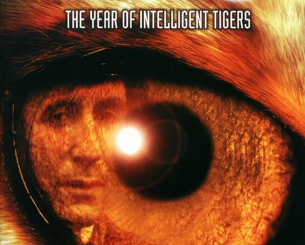
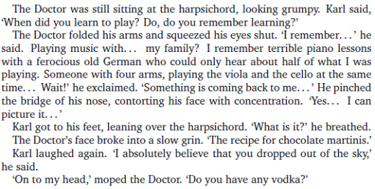
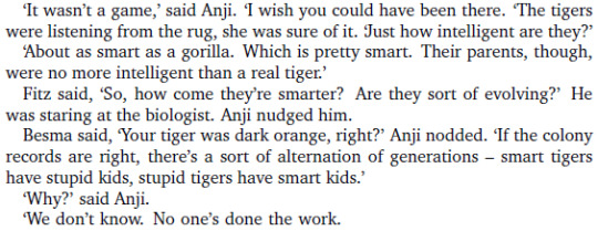
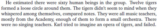
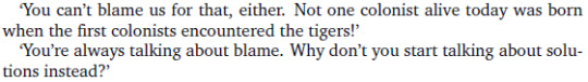
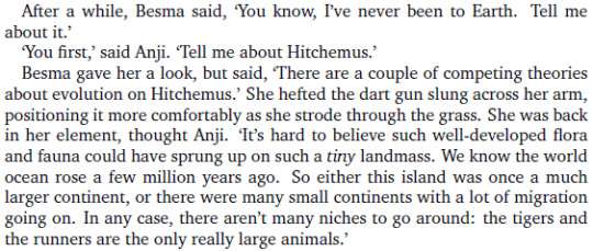
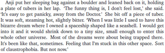
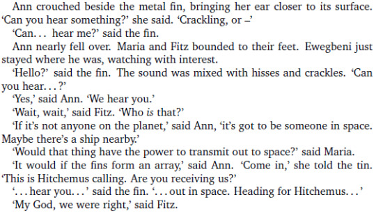
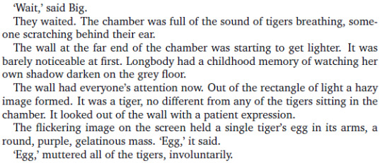
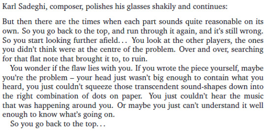
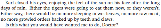
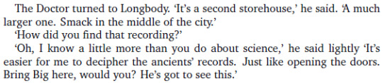
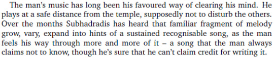
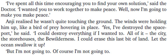
The Year of Intelligent Tigers
Some A shit ton of highlights of the last EDA I’ve read (The Year of Intelligent Tigers). Probably my longest post so far.
I took these screens while reading, along with my reactions. As usual, this is full of spoilers.
This book accomplished something unthinkable. It made me want to learn how to play music.
No. Really. That’s a big deal. See, my mother had won a synthetiser in a contest when I was like 7, didn’t care about it, and she decided I should learn the piano ; but the teacher was kind of an asshole and he kept hitting my fingers whenever I got something wrong, so I completely gave up and never tried music ever again. Like, ever. I barely know the notes’ names anymore.
Because of this book, I unearthed that synthetiser (outdated since the mid 90s) from its 18 years-old yellowish plastic sheet, and bought a method to learn how to play the piano. I’m still struggling with the names of the notes and I can barely play a simple four-notes chord without hurting my hands.
This book made me do that.
It’s about identity, cohabitation, difference, colors and music. It also has some of the best aliens in all of Doctor Who, some of the best worldbuilding ever put in the series, flashbacks to some bits of the Earth Arc which should have been in the Earth Arc, chapters ordered like an opera, great characters, top quality escapism - I can’t list everything.
I have a new favorite Eighth Doctor Adventure, and the fact that my previous one was from the same author only highlights how good this one is. 10/10
A little map! Look! It’s like the old adventure books when I was a kid!

Excuse me, what
What is this place? I like it.
Take me there, please.
Holy shit look at this description, it’s like the book blasted music in my face
You’re probably tired of reading this, but for the record, I would like to solemnly thank in person every single writer who shows the more alien side of the Doctor in these books and how his friends react to it.
A++ description

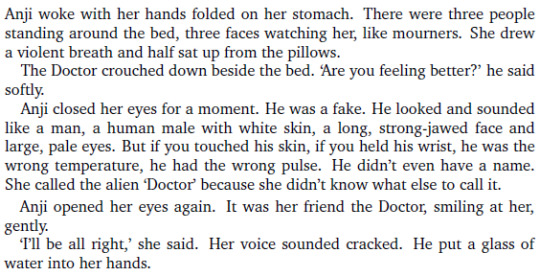
I would be completely lost on this planet since I don’t know anything about music apart from what it looks like to me. I feel you, Anji.
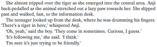
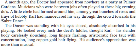
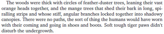
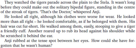
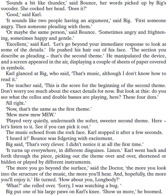
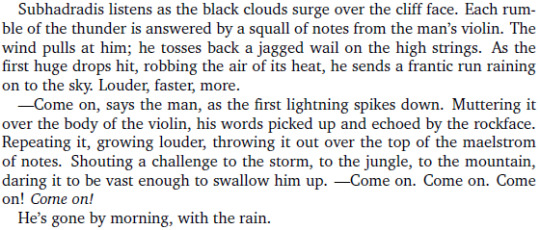
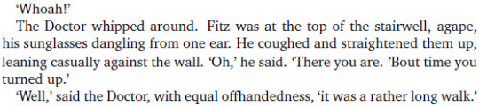
Here There Be Tigers
Look at these two idiots I love them

Hey, their new friend Karl has a slight speech impediment, that’s pretty rare on non-comical characters! I like that.
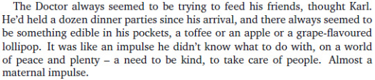
Hmmm cute? Not permitted? Thank you

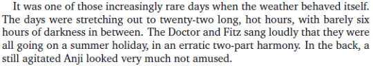
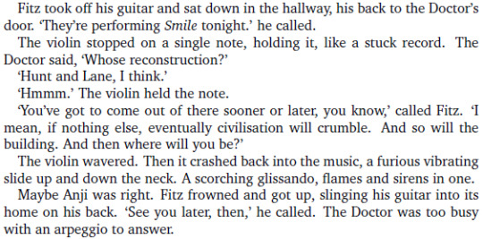
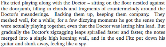
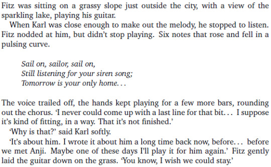
Please enjoy this sweet little quiet moment of our favorite Team TARDIS resting under the sun in the grass and Fitz playing the guitar

This planet was made for him, hahaha

I keep saying that team deserves some vacations, so this book is exactly what I wanted, so far. Of course there’s gonna be a disruptive element any moment now, but let them enjoy this planet while they still can.

The more we know about this planet, the more I’m internally yelling PLEASE TAKE ME TO THIS PLANET

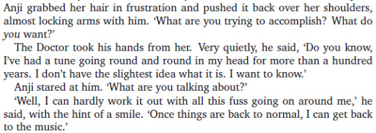
“who was full of interest”
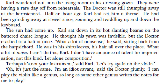
Are you two living together & should Fitz be jealous
A wild trope appeared!
SORRY WHAT
IS KARL SADEGHI A SYNESTHETE TOO? OH MY GOD?!

[DOCTOR NYARLATHOTEP INTENSIFIES]
I laughed like an idiot, well played.
Interesting.
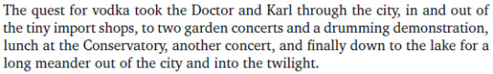
“The quest for vodka”

Ok now I want to draw Eight playing the violin
Stop being cute this instant
Also this tweet comes to mind:
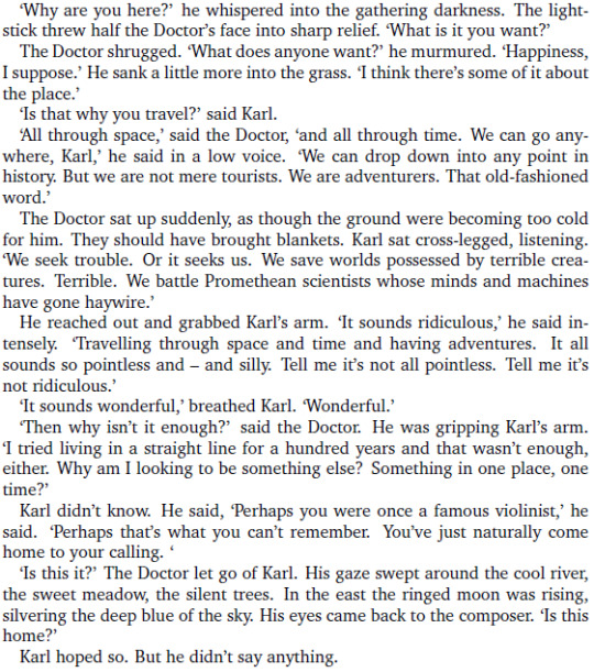

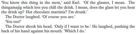
Eight. No. Bad. What are you doing. Don’t steal the show.
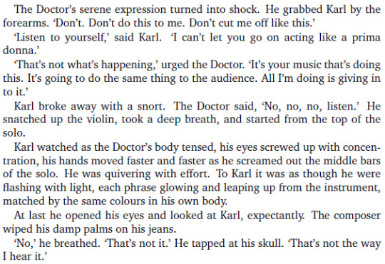
What ended your last relationship: violin

HOLY SHIT DOCTOR

And now he’s sulking in his room haha, wow.
This whole situation is hilarious, adorable and sad, simultaneously.
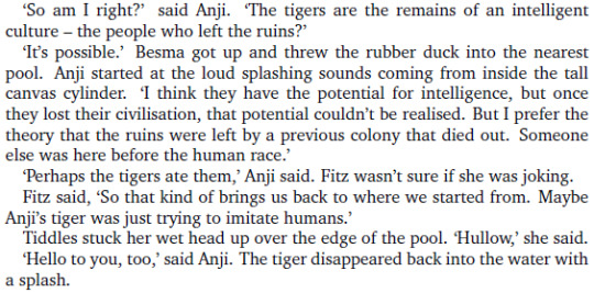
There’s something a bit uncanny about these talking tigers, true, but the "Hullow" thing is way too cute to be creepy.
I’m laughing like an idiot too, thank you, book
Oh nooo he’s trying to talk to him through music

What.

SCREAMING
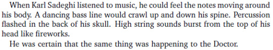
Wait what the f█ck why is there a flashback to 1935?
OH SHIT OH DAMN IT’S A FLASHBACK TO THE EARTH ARC AND TO THE EXACT PART I WANTED TO KNOW MORE ABOUT SINCE THE PREVIOUS BOOK??

Oooooh so that’s why he’s so passionate about music and violin in particular, it’s one of the first things he managed to remember besides his TARDIS!
Also, I can't believe I'm saying this considering how allergic I am to anything related to music theory, but – I kinda want to learn how to play music now. I'm serious. What is this book doing to me.

"Scared to stop in case he can’t ever start again"
That damn flashback nearly made me cry, but it’s over now. Crisis averted.

Geoffrey you’re a very nice tiger but you’re not making much sense
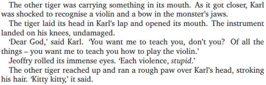
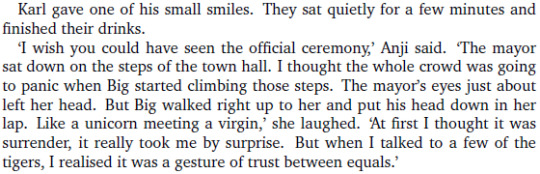
THE TIGERS WANT TO LEARN HOW TO PLAY MUSIC OH MY GOD I LOVE THIS?!

OH NO I LOVE BIG
Doctor what the hell are you wearing
An opera of tigers sounds like a marvelous thing.
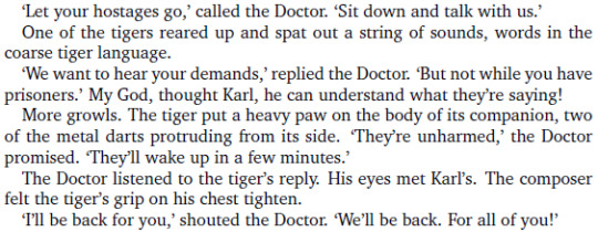
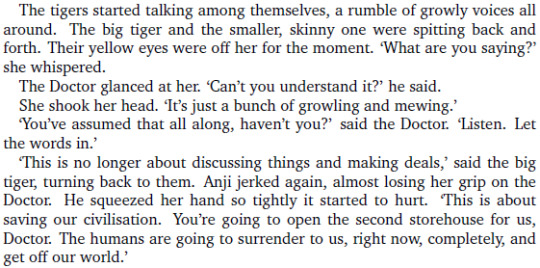
And the negociations failed. Obviously. Technically, the humans are the invaders here, not the tigers.
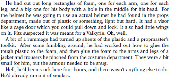
Fitz’s natural response to this situation is "I’m gonna build an anti-tiger armor". Bless him.

"DO I LOOK TIGERPROOF"
YES GOOD 10/10
The anti-tiger armor saga continues.
Ouch. Ouch, ouch ouch.
And this was the end of the anti-tiger armor saga. Long live the anti-tiger armor.
Doctor where the hell are you going, come back here this instant you major alien diva

I love how the "tigers" are only looking superficially like tigers but are something completely different inside, closer to lizards. And they have two opposable thumbs on each paw too. This is so cool.
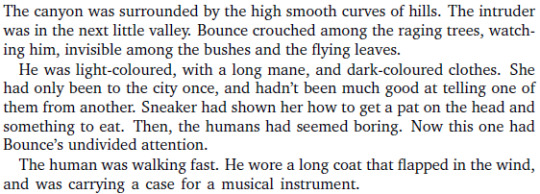
Is… is Eight going to sulk among the tigers?
I love this so much.
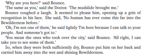
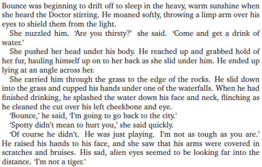
Bounce is so curious and I love her okay
Eight you idiot please try to concentrate
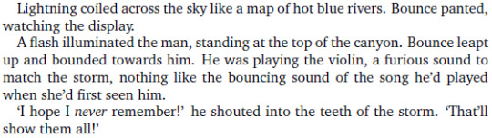
Well I love this too & now I have to draw it too. Damn you, book.

I don’t even know what to say anymore. I love this book. I love this.
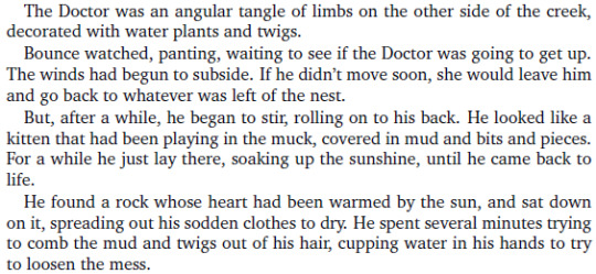
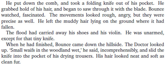
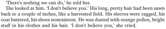
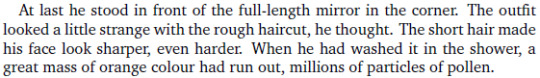
Dramatic haircut!
“Neat and soft as clean fur”, oh nooo that’s cute
I… I just realised.
The Tigers look like tigers but aren’t tigers. The Doctor looks human but isn’t human.
I feel like an idiot for not noticing the parallel sooner.

I’m picturing a Tiger sipping coffee and that’s a wonderful mental picture.

Stop it Fitz


OH NOOOOO CUTE

Eight sounds like he’s doing that thing my cat does when he doesn’t want to be picked up and moved somewhere else.

And to think I was admiring how alien Eight was in the previous book.
Talking seems to work better with Tigers than humans in this case anyway.
I love this damn planet and everything on it including the plants.
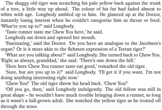
I also love Chew You the old yellow tiger.
It’s also really strange and I hope we’ll get an explanation for that.
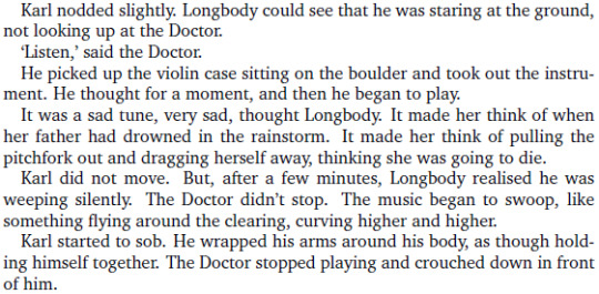
Guys this is cute and I like you both very much, but you do realise there’s simpler roads to reconciliation than "being kidnapped by tigers who want to play the violin and meeting again in the middle of nowhere and play some dramatic music", right?
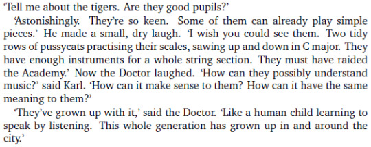
My list of things I need to draw is getting longer by the minute.
I just like that tiny detail of worldbuilding okay

YES GOOD I WANT TO KNOW TOO

This shouldn’t make me so sad, but it does.
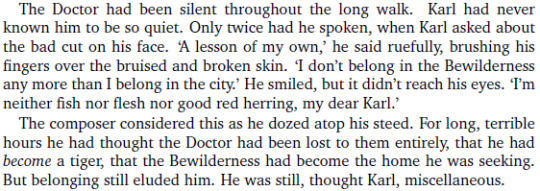
Okay then.Chapters New Who
This planet is still very intriguing and I hope we’ll get some answers.
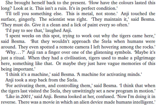
I’m going to be very disappointed if this is true.
Interesting.

Probably, and I’d love to hear them.
The amount of scenes I want to draw in this book is getting alarmingly important

I WANT TO KNOW
We desesperately need the Tigers’ point of view of this part of the story. What happened. Why.

Woah.
I’m torn between wanting to hug Anji and wanting to laugh at Eight’s look.
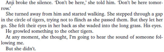
Not okay.
Also my mp3 player decided to play Palladio, so I’m gonna make an improvised playlist and I will listen to it for the rest of this book.

Sadness intensifies
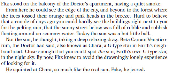
I’ve said it already but I love this book’s worldbuilding.
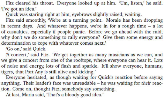
Another entry on our "Fitz CAN have good ideas sometimes" list!


No no go on, it really was a good idea.
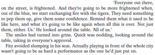

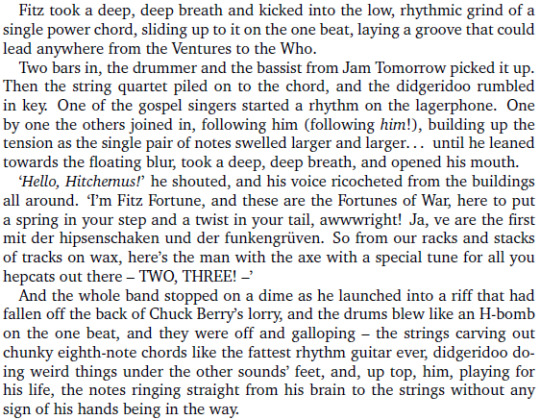
Even if we already know for a fact that Fitz can’t sustain this level of awesomeness for more than half an hour, I’m still happy for him.
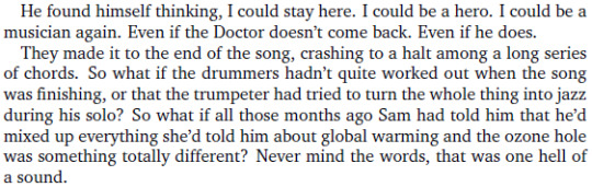
It’s a song he wrote for Sam oh nooooo
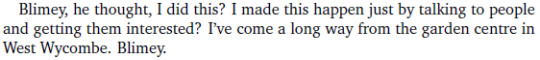
Can I hug Fitz
Look at him he’s so happy
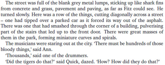
Of course something happened right in the middle of his moment of glory. Of course it did.
Wait, what the f█ck
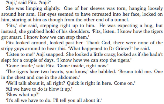
No Anji asdfghjk stop we still don’t know what that place does
Ohhhh that’s so cool!
I have way too many feelings about Eight trying to be a Tiger okay
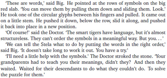
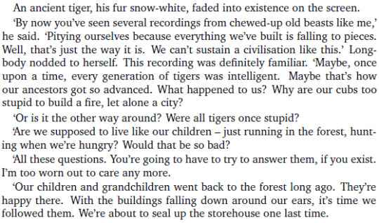
So… the Tigers used to be more intelligent? Then something happened, and they built this place to keep their culture safe? I love this oh my god
You don’t realise how long it took to make this liveblog readable because of the sheer amount of reactions boiling down to "I love this" or rows of exclamation marks.

It’s an ark. It’s a damn ark, containing all the culture of their ancestors. Why. What happened. Why am I getting so emotional about talking tigers that lay eggs. WHY.
Okay, that’s it
Breaking news: Year of Intelligent Tigers is officially the third EDA which actually made me cry. And it did it with TALKING TIGERS.

CENTURIES
AN ANCIENT CIVILISATION OF ALIEN TIGERS

Still crying by the way
Once again I’m struggling to not post row after row of exclamation points

Yes yes good I want to see the other rooms

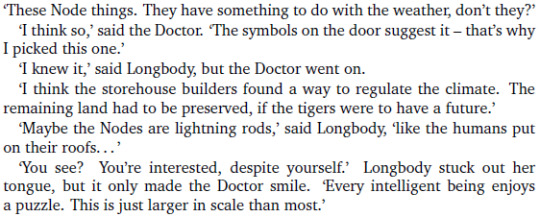
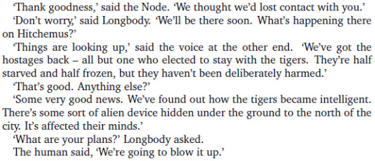
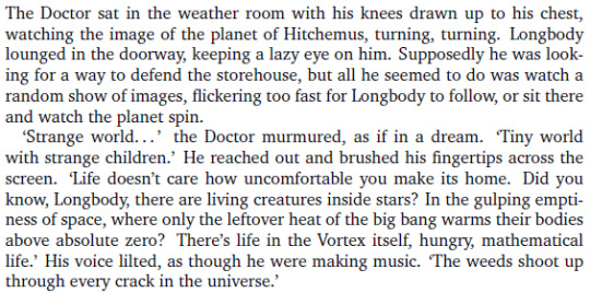
OOOHH. So HE’S responsible for the sudden appearance of the nodes all over the city!

Well, now I’m sad again.
HOLY SHIT
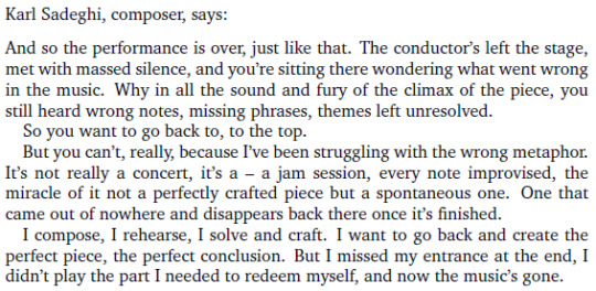
Have I told you how well this book is constructed yet? There’s parts where you follow the whole cast, then individual "solo" chapters, then the whole cast again. There’s references to music even in the construction of the chapters. It’s wonderful.
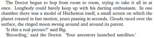
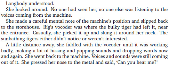
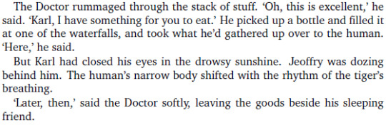
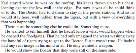
No Karl no what are you doing
Not really, no

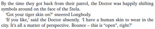
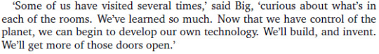
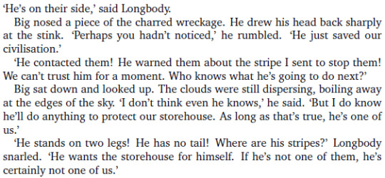
He’s just trying to help, Longbody, don’t be so suspicious.
I have a bad feeling about this.
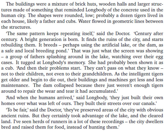
Port Any was built on top of the ancient Tigers city!
There’s something in my eyes again, dammit

Another line of exclamation points I’m trying to suppress.
If it’s right in the middle of the city, that’s going to be a problem.

COULD YOU ALL STOP BEING SO ADORABLE
EXCUSE ME THIS IS STILL WAY TOO CUTE PLEASE TONE IT DOWN
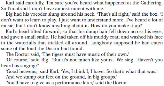
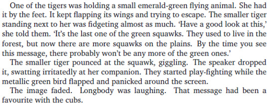
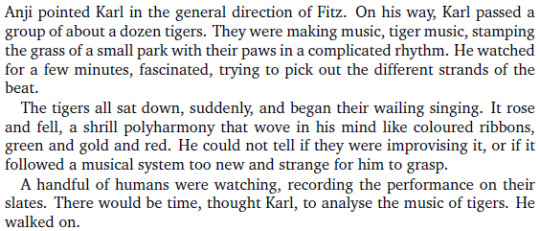
The Tigers already have a form of music of their own. Every time I think this book can’t get better, it finds a way to do so.
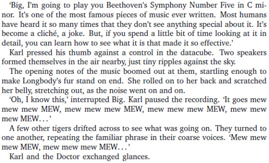
Oh my f█cking god
In a book full of wonderful scenes, I think this one might be my favorite so far. Karl and Eight trying to explain Beethoven to the Tigers. I’m so happy.
Also "sorry, I was watching a bug".
Oh shit oh f█ck oh damn, thank god Longbody was listening
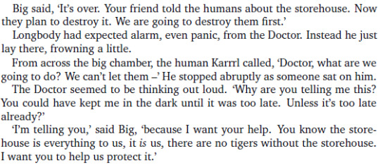
The Tigers are surprisingly reasonable considering what the humans are planning to do.

I still hope this story will end well, though.
Please no
"They were all surrounding a problem, ready to pounce on it and kill it"
Next on my improvised playlist is Beyond the Stars by Cristian Onofreiciuc and I'm overdosing a little bit on beautiful imagery at this point, my head is full of colors

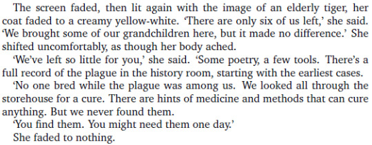
"There were no other Tigers"
I'm so sad and also so happy, this book is doing weird things to my head.


So he still wants to save everyone, not just the Tigers. Of course he does.

GOOD
GOOD²

The bomb got struck by lightning. What. How. What the hell did he do.

I have to admit it's really strange.
Despite all the music and the cultural differences and the environmental message and the anti-colonialist message, the main theme of this book seems to be identity, and I'm always a sucker for that.

Are you telling me we could have had a book in that setting instead of Endgame??

Well I'm sad again now.
Uh. So after remembering how to play the violin, he remembered one particular tune.
Imagine having a song stuck in your head for decades and not being able to recognise it. That's both funny and horrific.

CUTENESS OVERLOAD


Oh nooo they forgot he was more fragile than a Tiger and he's hurt
THIS BOOK NEEDS TO STOP MAKING ME CRY
Also, in its own weird metaphorical way, this book hits way too close to home
Fitz trying to look casual after the whole "the Doctor tried to be a Tiger" thing

Just so you know, the song currently playing in my improvised playlist for this book is The March by Lights and Motion, and this playlist was a terrible idea because it makes everything more intense and the book is already intense enough on its own.
Another thing on my endless list of things I should draw

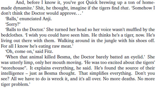
Would somebody please stop Quick before he does something incredibly stupid again
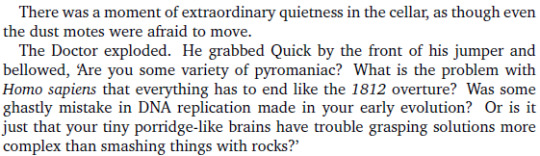
Thank you Doctor.
Also I'm getting strong Twelve vibes from this bit.

I laughed so hard
Why is every silly little detail in this book making me so sad and so happy at the same time
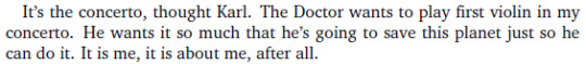
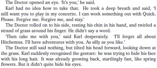
Not everything has to be about you and your concerto, Karl
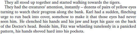
Fitz, stop making me laugh, this is supposed to be a tense scene.

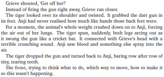
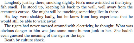
KARL WHAT THE F█CK WHY DID YOU DO THAT
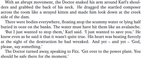
ASFGHJJKLMKGJ F█CK YOU KARL WHY
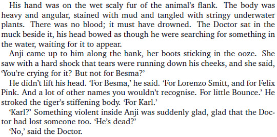
WAIT THAT'S BOUNCE
NO NOT BOUNCE
F█CK NOW I'M CRYING AGAIN TOO
ARE YOU HAPPY NOW BOOK ARE YOU F█CKING HAPPY
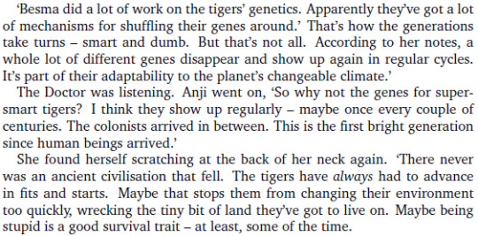
So they rediscover their civilisation every two centuries, and then they lose it again, that's some sort of perpetual tragedy and I'm still not okay.
THEY WERE ALWAYS ABLE TO UNDERSTAND THE TIGERS THANKS TO THE TARDIS BUT THEIR BRAINS DIDN'T ASSUME THE TIGERS HAD A LANGUAGE SO IT DIDN'T WORK AT FIRST, THIS IS SO COOL
YOU'VE DONE ENOUGH DAMAGE ALREADY, KARL, STAY WHERE YOU ARE
Fitz, that pun was atrocious
Also RIP Longbody
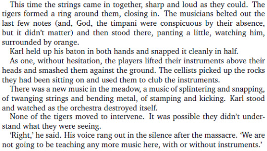
Okay we're nearly at the end, I need some kind of epic music for this, something very over the top and ridiculous

As it turns out, Creation of Earth by Thomas Bergersen was an excELLENT CHOICE -HOLY SHIT DOCTOR WHAT ARE YOU DOING TO THE WEATHER, I mean yeah this is epic but I'm also concerned okay
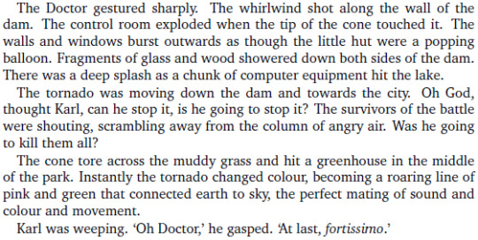
DON'T ADD EVEN MORE COLOR TO THIS SCENE THERE'S ALREADY A TON OF IT AND BETWEEN THIS AND THE MUSIC I'M KINDA OVERDOSING
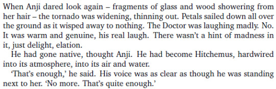
THANK YOU THAT WAS AMAZING
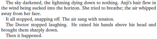
WAIT IT'S NOT OVER
WHAT THE HELL HAPPENED
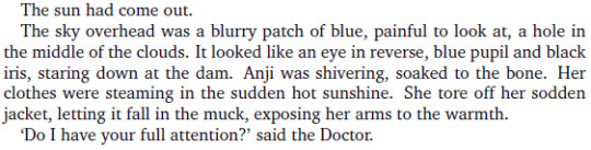
YOU DO, HOLY SHIT
Oh my god I just remembered something.
That's exactly what I.M.Foreman told him in Interference. With the riddle involving a baby goose you have to free from a bottle without breaking the bottle yourself. You feed the bird until it's strong enough to break it itself. That's exactly what he's trying to do here. He can't remember that conversation since it happened long before the Earth Arc, but I believe it had an impact on him anyway.

I love that ending. Simple but absolutely wonderful.
This book needs to stop making me sad at unexpected moments.
I wish I could have seen that too.
TIGER MUSIC OH NOOO
...Wait
If this turns out to be the song that was stuck in Eight's head I'm gonna die
LOOK WHAT YOU'VE DONE, FITZ KREINER


This book was a rollercoaster of emotions until the very end, wasn't it

...and it deserves a standing ovation.
Damn.
#Eighth Doctor Adventures#The Year of Intelligent Tigers#Eighth Doctor#Fitz Kreiner#Anji Kapoor#EDAs#An EDA liveblog full of useless comments#doctor who#long post#infinitely long post#gif#caps lock#violence tw
71 notes
·
View notes
Text

Anon said: your i love your pencil-like sketches so much they’re so soft and cozy
Thank youuuuuuu they’re super relaxing to make so I’m glad you like them specifically!!
Anon said: whenever im crying i just look up your geto-sensei art and cry even more. it's a nice way to let it all out, so....thank you :D
It’s the Geto-sensei effect...........🙏🙏😭😭😭
Anon said: So you mentioned in one of your previous asks that your shipping krbk is in one of your asks you said that you ship krbk based on their canon relationship and you don’t really *feel* them as much because of that scene where Kiri was hanging with Todo instead of Baku and I totally understand how you feel BUT!!!!!!!!!!! consider this: after Todo went to visit his dad with the rest of his family, Mina Momo and Kiri are nowhere to be seen and where else would Kiri go except to visit his boyfriend?
Ah, but that would still be headcanon and not actual canon, wouldn’t it? 😂
Anon said: I usually struggle to pronounce things so I keep reading your url as "friend art" and I think that just makes my experience on your blog all the more fantastic.
That makes me happy to hear actually!!! I def hope my art comes off as friendly most of the times at the very least! :D
Anon said: that satosugu comic where Gojo broke his shades was so clever, man I wish I had your mind
GOSH that’s such a compliment, thank you so much!!!! ;A; my mind’s nothing special tho, I assure you haha
Anon said: i just found your blog and immediate follow i am obsessed OBSESSED you hear me!! so (i know im late) but i saw your tag that went along the lines of “i remember when getwo said gojo is considerate at the most awkward of times, thats my favorite character trait of him” and YES YES YES that line literally kept me up at night, imagining gojo getting random waves of intense empathy and your art just made me think further like what if its less “random”empathy and more when hes exposed to something that hits a nerve (usually the nerve involving geto). so like in your comic he suddenly feels for shoko and starts to harass utahime because it hits the part of him that knows how frustrating it is to long and pine over someone, and gojo our emotionally unaware king instead of fully facing his feelings about geto instead takes his annoyance and frustration out on poor utahime (also like you said he just likes pissing her off). same with him not getting rid of the body but also other little headcanons like as much as he likes to mess with his students, pre-shibuya he goes out of his way never interrupt nobamaki training sessions, even if its kinda important cus he understands how precious those fleeting moments are with your crush (he goes and harasses megumi instead who threatens to summon a dragon shikigami if he doesnt go away). Out of (seemingly) nowhere he throws a tantrum with the elders to get megumi and yujis dorm rooms next door, because he knows the comfort of having the people you care about close (you never know when they’ll be gone). anyway im rambling at this point but you get it :’)
Yes yes yes it’s such a sweet little thing about him I love it so much!!!! Gojo’s a very complex character isn’t he? Thinking about this kind of throwaway lines about him makes me love him even more, especially when they imply that there’s more to his feelings and way of processing them than his surface way of acting would let you believe ;;;;;
Anon said: the most hilarious panel to me is in chap 65 when yaga asks who forgot to put the curtain down and everyone points to gojo while hes like “sensei!! we are better than pointing fingers at each other!!” 😭😭 so now im imagining satosugu where sugurus like “who ate the rest of my soba? 🙃” and gojos like “you know, a huge part of loving someone is sharing all parts of yourself with them 🥰😘❤️” and suguru activates uzumaki // (anon who just sent the satosugu soba uzumaki headcanon) i also hope it didnt come off like a request it deff wasnt, i just wanted to share my headcanon 😭😭😭
No but why is he like thisssss 😂😂😂😂 I love him so much he’s so incredibly annoying in the most endearing way hahaha and yes absolutely Suguru has definitely been ready to throw serious hands with him on this kind of things way more often than his serious face would lead you to assume, they’re so dumb!!!!!!! They’re so dumb I love them 😂💕💕💕
Anon said: Hi, sorry if I got the wrong blog but I’m pretty sure you made a super cute bokuto/ kuroo/ terushima tattoo artist comic, but I couldn’t find it when I went through ur haikyuu tag, did it get deleted or something? sorry to bother if I’m wrong! thanks!
I did yes! You can find it here!!!
Anon said: The pure readability of your comics is outstanding! Every time you post something I click on your blog and end up scrolling to the bottom lol- every frickin post is a banger.
Anon what a compliment!!!!!!! Thank you so much this makes me so incredibly happy to hear!!!!!! ;A; 💕💕
Anon said: Hi hun! With MHA finally getting to the animation of the joint training arc, do you think we'll see some more Class 1-B boys? I love them drawn in your style and I'd love to see more if the inspiration so compels you! :3c
I wonder!!! What I feel like drawing is so incredibly random even to me that predicting this kind of things is impossible - maybe!! I’d very much like to, I just gotta find the right moment for it :D
Anon said: Sososo same records of ragnarok anon again I'm having?? Feelings?? About Jack the Ripper ?? Mainly internal yelling about how he's so clever and pretty but also. Confusion. Because like the fighters are meant to be the greatest fighters of humanity right?? And Jack just. Wasn't really a fighter?? Being a serial killer does not necessarily implies being able to fight and he didn't kill that much people everyone knows him because he was never caught but?? He wasn't really a fighter?? And I'm just confused as to why he was brought into that like it is just because he's a great criminal mystery?? I mean sure he won and all that but. Guy wasn't a fighter, he was just clever as fuck. (also I'm curious what colour do you think his eyes would be?)
AH he’s not the only fighter who isn’t an actual fighter on the side of humans!! Like Nostradamus, for example, anddddd Tesla! Tesla was in the list as well - but also Adam, I’d say! He was just some dude, nothing implies he’d be able to fight in his story - I think the author is using the words “greatest fighters” as a very general way of implying the greatest humans (in his mind, that is). I mean, I’d assume Buddha wouldn’t fight either, and yet here we are hahaha it’s fun tho, isn’t it!!! To try and figure out how they could ever fight, and then seeing it!!! Extremely amusing - also Jack has official colors!!! his eyes are one black and one red, you can see him in his full colored glory here! By the way have you seen Buddha’s official colors I’m still crying over them 😭😭😭😭 he’s so beautiful my heart can’t take him at all 😭💕💕💕
76 notes
·
View notes
Photo

5 WEBSITE DESIGN IDEAS PROVEN TO HELP YOU SELL MORE
5 Website Design Ideas Proven to Help You Sell More Running a small business? You need to have a well-designed website. Don't worry. These website design ideas won't only inspire - they'll help you bring in cash.
Are you a small business owner who is thinking about creating a website for your business?
Let's be real: You're a business person, not a designer. The idea of creating a website from scratch that is not only informative but brings in new customers can be a daunting one for non-creatives.
Believe it or not, it is actually pretty easy to build a website once you've absorbed a bit of information. Whether you're doing it yourself or you decide to seek a bit of help, it never hurts to learn more about the basics of website design and what looks good.
We put together five of the coolest (and beneficial) website design ideas that will inspire you to build your own website.
Are you ready to get educated? Let's check out some advice and ideas!
Five Brilliant Website Design Ideas
These tips could work for just about any type of business website.
Be Easy, Simple, And Clear
If your website is coded badly, designed poorly, badly linked, and generally a complete and total mess, this can affect whether or not a customer is even going to consider you.
For example, say you are a restaurant owner. You have a Yelp page. Potential customers would love to see your menu, so they check out your business website.
When they go to your website, they will want to find the menu section quickly and easily.
The same goes for the service provider or freelancer. Potential clients will want to access your contact information as quickly as possible.
Sit down and really think about what potential customers would want from your website. A menu, a contact page, an about page, or list of products? The most important ones should be easily accessible via a menu bar.
If your website is oversaturated with images and words, consider making it more simple and clean.
You don't have to be a full-on minimalist with your website (unless that's your thing) but reducing the fluff will make it easier to find the information potential customers want most of all.
If your website is badly designed, cheesy, and frustrating to navigate, you might find that potential customers are over it pretty quickly.
Be straightforward with your mission statement and call to action. Dropbox is a good example of this.
You should also be very clear with your navigation wording. Airbnb is a great example of good navigation.
Take Hold Of That First Impression
This is a given, but a lot of business owners don't ask themselves the important questions when putting information up on their website.
Ask yourself who you are, why you own this business, why you have a passion for whatever it is you're selling. Connect with your target audience and have some personality.
Be clear and short with that information, too. First impressions are important, especially for a business owner, so your "mission statement" should be seen immediately on your homepage.
Choose three colors to be used on your website, but no more. An overload of color looks child-like, and you want that first impression to be good.
Consider The Text
Words are important. That's pretty obvious, right? They're the most important element to your website, too.
When writing a lengthy page (remember to eliminate fluff!), remember that nobody is coming to your website to read a novel. Unless you're a novel writer, of course.
Don't be afraid to break up that great wall of text with white space or images. Your readers will absorb the information better when their eyes can have a periodic break.
Be generous with the line spacing too-- if all your paragraphs are squished tightly together, it can be exhausting to try to read. Plus, wider line spacing just looks really pretty.
Don't make a bad decision with your font type, font color, or font size either.
Your body text should be big enough to read but not enormous. Use headers that are fairly big but not giant as well.
The goal is to make your text readable, and that can be hard to do if you have a goofy font. Don't opt for cheesy Comic Sans and try going for a more professional typewriter-like font. Readability is key.
If you have a red background, please don't color your text a slightly different shade of red. This tone-to-tone style is painful on the eyes and might cause your potential customers to check out.
Avoid Common Mistakes
A major common mistake when it comes to website building for a business is the sense of urgency. Slow down, cowboy-- your target audience is important, so you should really spend time matching your website to their needs and aesthetics.
Don't be too flashy, even if your business is on the flashier side. Less is definitely more when it comes to making a website.
A lot of business owners forget to include a call to action within their website, too. That's a sore loss because a call to action answers the question of "Why should I bother?" Your customers want to know what they'll get out of buying from you, so let them know.
If you're trying to revamp your old website, be sure to do away with as much old content as possible.
If major things have changed, such as your name, address, or products, you absolutely need to update these.
If your website has out of date information, that will offer no help to your target audience.
Try to get caught up with the most recent coding trends, too. If your website looks like it was made in 1997 (or if your website actually was made in 1997) it probably doesn't look all that pretty. Pretty, accessible, simple, and information are the goals.
Optimize! Seriously!
In this day and age, a lot of people use their mobile devices to access the internet. Mobile internet access is steadily climbing to the top over desktop access.
Be sure your website is optimized for smartphones and tablets as well as computers. If your mobile site looks like garbage, potential customers won't deal with it.
Get To Building!
Building your own website can be tough. We hope these cool web design ideas have left you inspired and ready to work. If not, there are some great website design companies out there that can do the dirty work for you.
Sometimes it is best to leave it to the pros.
Do you have a favorite website theme or a website design idea? Tell us about it in the comments! We'd love to hear from you.
Go here: http://bit.ly/2kd3vof
0 notes
Last Seen Blogs


bontebok0
bontebok

troubleismybusinessfilmnoir
Trouble Is My Business - A New Film Noir Feature

chameleonsoulparadise
Wonderful Wonderful

delicatepointeofview
i love you, it's ruining my life