#typographyworkshop
Explore tagged Tumblr posts
Visit Tumblr Blog
Explore Tumblr blogs with no restrictions, modern design and the best experience.
Last Seen Tumblr Blogs


Fun Fact
If you dial 1-866-584-6757, you can leave an audio post for your followers.
Photo
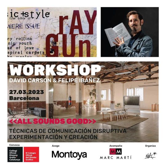
«ALL SOUNDS GOOD» Rompiendo moldes:
Explorando la comunicación disruptiva a través del diseño gráfico y el arte 〰️ David Carson viene a Barcelona para dar una conferencia en el festival OFFF y un Workshop junto a Felipe Ibañez 🙌🏻〰️ Con una leyenda del diseño, que yo lo admiro desde la Facu, este será un reencuentro fabuloso, para volver a aprender de cerca con él. Haciendo equipo con un grandioso diseñador amigo mío, que tambiés es editor, es hacedor, y tengo el honor de organizar el encuentro. 〰️🖤🙌🏻 Durante el taller, se verán herramientas de diseño gráfico y arte para crear una comunicación disruptiva que llame la atención. Estos mega instructores compartirán sus experiencias y técnicas innovadoras para crear piezas de diseño de impacto y memorables. ✂️♥️〰️ El Workshop será el día 27 de Marzo, a las 17 hs. En el hermoso espacio @pasajeMontoya junto a su comunidad. Con la colaboración y el apoyo del Col·legi Oficial de Disseny Gràfic de Catalunya del cual Felipe y yo somos colegiados @codgc También nos acompaña la empresa Marc Martí @marcmarti_impresion que estará presente con materiales sorpresa. No faltará el momento brindis… ¡Te esperamos! Nina 〰️🖤〰️ Link de inscripción con descuento amigo en mi bio #WorkshopCarsonBarcelona #DavidCarson #FelipeIbáñez #WorkshopBarcelona #DesignWorkshop #DiseñoGráfico #GraphicDesign #DissenyGrafic #BarcelonaDesign #DesignEvents #DesignConference #CreativeWorkshop #Creativity #TypographyWorkshop #DesignThinking #VisualCommunication #BarcelonaCreativa #ArtAndDesign #Art #DesignInspiration #BarcelonaEvents #DesignEducation #DesignCommunity #Workshop #Creativity #NinaBenetDesign (at Montoya) https://www.instagram.com/p/Cp-z-7DNuAk/?igshid=NGJjMDIxMWI=
#workshopcarsonbarcelona#davidcarson#felipeibáñez#workshopbarcelona#designworkshop#diseñográfico#graphicdesign#dissenygrafic#barcelonadesign#designevents#designconference#creativeworkshop#creativity#typographyworkshop#designthinking#visualcommunication#barcelonacreativa#artanddesign#art#designinspiration#barcelonaevents#designeducation#designcommunity#workshop#ninabenetdesign
0 notes
Text
Typography Workshop
Over the course of the day we progressed around a series of 5 different typography workstations. All of which challenged us with a different way of producing a piece of typography.
The station which I began on required me to produce a collage using different letters and typefaces. Overall I believe that this station was one of the more compelling, as it was simple in practice, but required much thought in choosing which letters you would use, and then deciding on a layout. My design is shown below.

Moving on from this station I began a task which required me to use drawing ink to create a series of letters. Using pieces of wood, card and a collection of brushes the letters were created, albeit unsuccessfully. As it can be seen in the images below, my letters look rather rushed and untidy, and therefore I would consider this task a failure. I would base this upon the fact that I have never worked well with ink/paint, as I find it hard to work in strokes.

The 3D station, for me, was not very entertaining. I chose to make a piece which could be interpreted as different letters from different angles. For example, at one angle it could be seen as an ‘L’, whereas at another it may be looked upon as a ‘V’. A ‘U’ may also be possible to be seen at one angle.

The tracing stage was one of the most enthralling for me, as it required a lot of attention, patience and focus. The quote was taken from Dan Rhatigan, the typographer. My outcome, I believe, looks neat and well produced, although is partially smudged, which is an annoyance.

The final rotation was the digital stage, where I produced a series of pieces using Illustrator. The first of the two tasks required me to produce a design using two contradicting words and well known typefaces. My designs are fairly basic, although I think they convey their meaning very well.


After producing these pieces, I moved on to create another set of designs. The difference this time being that any font could be used for a single word. This word was ‘Crowded’. Again, I believe that my designs are well produced and showcase the meaning of the word effectively.


1 note
·
View note
Photo


Workshops 1, 4 and 5
10.10.18
When split into groups in the morning, we started at workshop 4 which included having a practice with ink, different size sticks of board, alternating paintbrush sizes and then creating a full alphabet with different styles. This was a good exercise to start with, and in general, because it allowed me to loosen up in style and think of out-of-the-box ways to style the task. Looking at the work produced I am pleased with them as far as quick and wild work goes, but I would branch out and maybe do a letter a page next time I get an exercise like this and explore all ways of working from one end of the scale to the other.
Workshop 5 was then a challenge to create a 3D letter and photograph it in alternative ways that may create interesting effects. I chose an ‘S’ because I thought it presented me with an interesting challenge, and then when I built it up with curling, folding and glueing paper it looked interesting with the curves of the letter. This was an interesting part of the task as it challenged me to think of how I could make a letter 3D using just the paper we had, glue and a few pieces of board. Its also surprisingly hard to pick a letter you would prefer to work with. When it came to taking photos of this I couldn't really work with the light box because of the card piece at the bottom (thinking back now I could have placed it on its side and used the shape like a shadow etc) and there wasn't a lot I could do with the time pressure we had at the end of the session. However I did try and take pictures with the view of the outside as if it was a building amongst the others, then used plain backgrounds like the grey pillar to try and make it stand out. Upon reflection I didn't enjoy this part of the exercise as much as the making because photography isn't my forté... but that the challenge isn't it.
The workshop 1 which we then circled round to was tracing a chosen font to make up a quote using our own judgment of tracking, kerning, leading etc.you can see my choice of quote and font at the bottom. With my limited knowledge so far I feel as though I did a good job, but overall the exercise was valuable in making me think more about my choice of placement/use of each letter, which was a strong learning experience.
0 notes