#davidcarson
Explore tagged Tumblr posts
Visit Tumblr Blog
Explore Tumblr blogs with no restrictions, modern design and the best experience.
Last Seen Tumblr Blogs


Fun Fact
28.6 is the average number of monthly visits per US mobile user.
Text

0 notes

Text
The Legend - David Carson
Got a chance to meet the legendary Graphic Designer @Davidcarson and got an autograph on the poster he designed at #Designyatra.
5 notes
·
View notes
Text
Warp #1 (1983) Frank Brunner Cover & Pencils / John Ostrander, Frank Brunner & Peter B. Gillis Story / Joe Staton Inker
#Warp #1 (1983) #FrankBrunner Art / #JohnOstrander, Frank Brunner & #PeterBGillis Story / #JoeStaton Inker #DavidCarson, ordinary man in an ordinary bank teller job, suddenly finds himself pulled into another time and space where he is called #LordCumulus and put into training to face the powerful #PrinceChaos in "Warp." https://rarecomicbooks.fashionablewebs.com/Warp%201983.html @rarecomicbooks Website Link In Bio Page If Applicable. SAVE ON SHIPPING COST - NOW AVAILABLE FOR LOCAL PICK UP IN DELTONA, FLORIDA #FirstComics #RareComics #KeyComicBooks #KeyComics #VintageComics

#Warp#1 (1983) Frank Brunner Cover & Pencils / John Ostrander#Frank Brunner & Peter B. Gillis Story / Joe Staton Inker#Rare Comic Books#Key Comic Books#DC Comics#DCU#DC#Marvel Comics#MCU#Marvel#Marvel Universe#DC Universe#Dynamite Entertainment#Dark Horse Comic Books#Boom#IDW Publishing#Image Comics#Now Comics
0 notes
Photo

Colour Collection Global launch and art exhibition @somersethouse for @the_macallan // by MA+ Art talent @bompasandparr A quintet of whiskies by @the_macallan that celebrates the natural colour and influence of sherry seasoning, brought to life wit iconic graphic designer David Carson. Cocktails and food by @littlechefsally . . . #themacallan #colourcollection #davidcarson #travelexclusive #experiencedesign #bompasandparr
0 notes
Text
As we get more technically driven, the importance of people becomes more than it’s ever been before. You have to utilize who you are in your work. Nobody else can do that. Nobody else can pull from your background, from your parents, your upbringing, your whole life experience. If you allow that to happen, it’s really the only way you can do some unique work. And you’re going to enjoy the work a lot more as well.
--David Carson
10 notes
·
View notes
Text


Revista Ray Gun
Lecturabilidad no es Legibilidad.
7 notes
·
View notes
Text
Typographic Design
Inspiration
Three Prominent Typographic Designers & Their Influence on Contemporary Typographic Design
Type is all around us, from menus to shop fronts, whether its on our phones or websites - we are constantly digesting the written word; but what is typography?
Typography is the art of arranging letters and text in a way that makes the copy legible, clear, and visually appealing to the reader. Typography involves font style, appearance, and structure, which aims to elicit certain emotions and convey specific messages. In short, typography is what brings the text to life.(Hannah, 2020)
To understand more about this, I have researched three prominent typographers, looking at their influence on contemporary typographic design.
Paula Scher
“Words have meaning and typography has feeling. When you put them together it’s a spectacular combination.” (Paula Scher)
Images via Google Images
Paula Scher is a New York based illustrator, painter, graphic designer, and art educator - she is one of the most influential designers of all time. Reviving design styles and historical typefaces, she is renowned for her eclectic approach to typography.

In her early career she secured a role at Random House, designing the insides of children’s books. From there she moved to the promotional department at CBS Records where she designed ads. Two years later, she left to join Atlantic Records as an Art Director and it was in this role that she designed her first cover for an album. She subsequently returned to CBS records where she went on to design over 150 album covers annually.
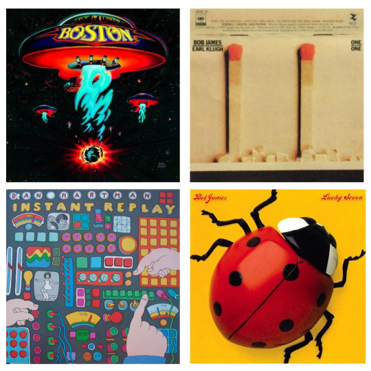
Paula Scher album covers - images via Google Images
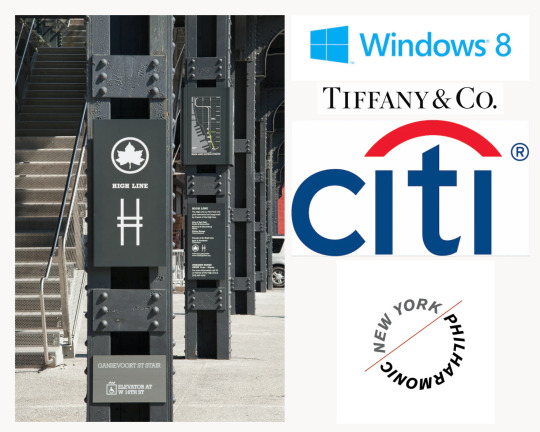
After working for decades designing record covers and magazines, Scher became a principal at the heavy-hitting design agency Pentagram in 1991. Since then she has remade the identities of brands ranging from Microsoft to the Museum of Modern Art, all the while maintaining an abiding interest in environmental design, and a mural-scale painting practice that is all her own. (Bigman, 2016)
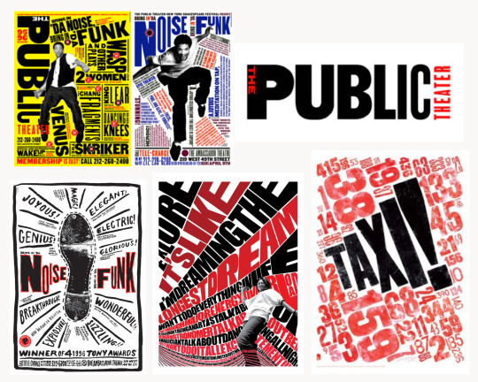
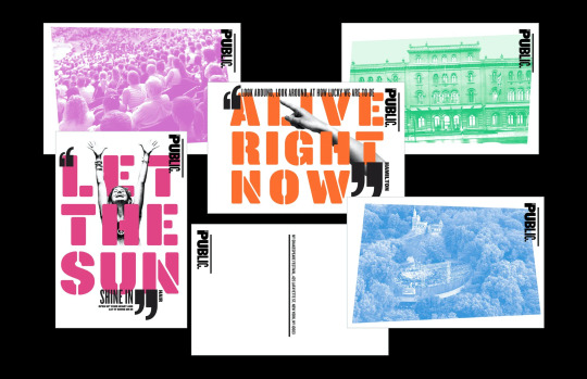
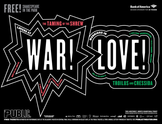
It was Paula Scher's ground-breaking identity and graphic campaign for New York's Public Theatre that set a new bar for typography in the 90′s and noughties.
Shakespeare in the Park 2016 (https://www.typeroom.eu/)
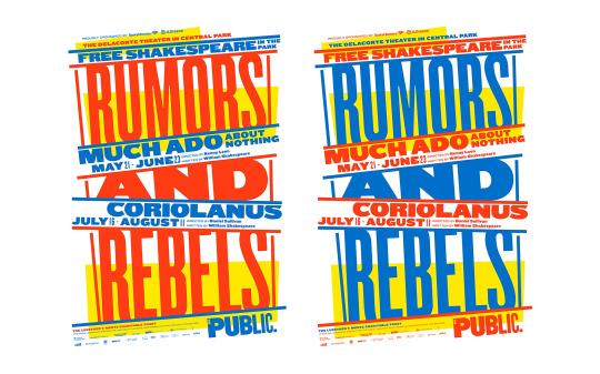
Shakespeare in the Park 2019 (https://www.typeroom.eu/)
"Using unorthodox spacing, mixing font colours and weights, and employing uncommon and often historic typefaces, Scher's text-heavy poster presents a large amount of information in a dynamic and expressive way" (War, lust, type! How Paula Scher's typographic affair with The Public Theater redefined our culture - TypeRoom, 2019)
Having lectured and exhibited all over the world, and received hundreds of prestigious design awards for her work over the years, Paula Scher still works at Pentagram today.
Other notable work includes:
Images via Google Images
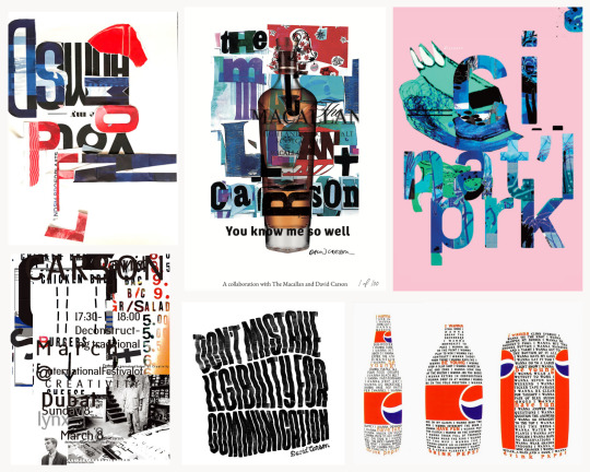
Craig Ward
“Legibility is overrated.” (Craig Ward)
Images via http://wordsarepictures.co.uk/
Craig Ward is a British-born designer and art director currently living & working in New York City, he is based at his studio in North Brooklyn named Words are Pictures.
Ward initially pursued a career in writing and journalism and it was during a summer work placement that he met a designer who was working at the printers where the newspaper was put together. Fascinated by watching him work, he decided to defer his university application by a year and take a foundation course in Design - the rest they say, is history!
In 2015 Ward was named one of the most important designers of all time and he has enjoyed a successful career with stints as Head of Design at Grey (NY) and agencies in London including CHI & Partners and MCBD. He is best known for his pioneering typographic works and counts Calvin Klein, Adobe, Google, Nike, The New York Times and Mulberry amongst his growing list of clients.
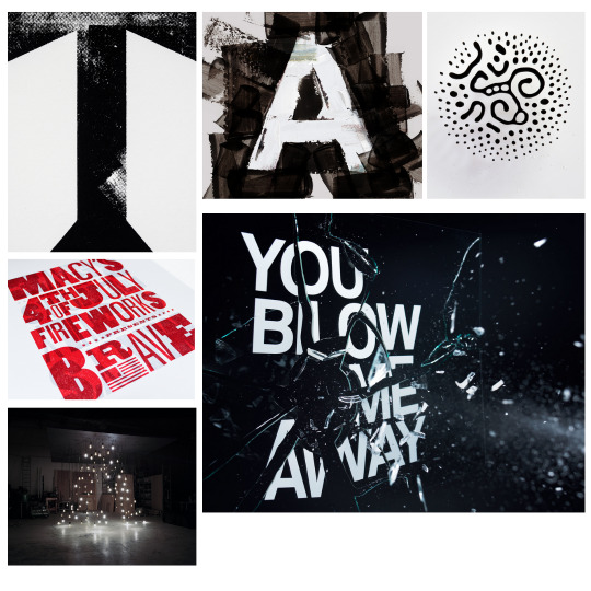
Passionate about pushing type to its limits, Craig Ward straddles the boundary between illustration and typography in his work, exploring the notion of word as image. (Sagar, 2009)

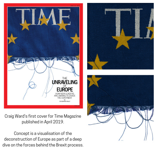
Custom typeface and titles for The Washington Post’s short video series, What’s Next? (http://wordsarepictures.co.uk)
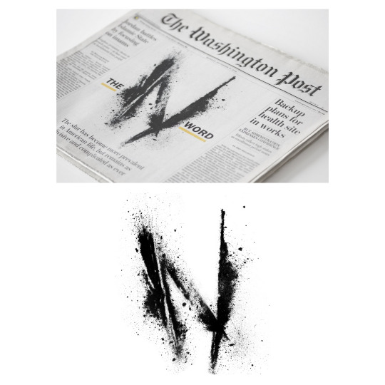
The Washington Post's first ever illustrated cover — a provocative piece for a special issue on race and racial slurs in the U.S. (http://wordsarepictures.co.uk)
In 2018, he became only the second designer in history when he created a custom typeface for the England World Cup kit in Russia – one that received much acclaim from the design community and beyond.
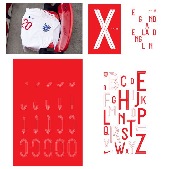
Images via http://wordsarepictures.co.uk/
Images via http://wordsarepictures.co.uk/
Ward’s work has been profiled by top publications and documented in countless books, journals and exhibitions - he continues to be a leading pioneer in typographic design.
David Carson
“Graphic design will save the world right after rock and roll does”. (David Carson)
David Carson is a prominent contemporary graphic designer and art director. His work as founding art director of the iconic magazine Ray Gun and unconventional and experimental graphic style revolutionised the graphic design scene in America during 1990s. He is claimed to be the godfather of ‘grunge typography’ which he employed perpetually in his magazine issues. (David Carson | Biography, Designs and Facts, 2020)
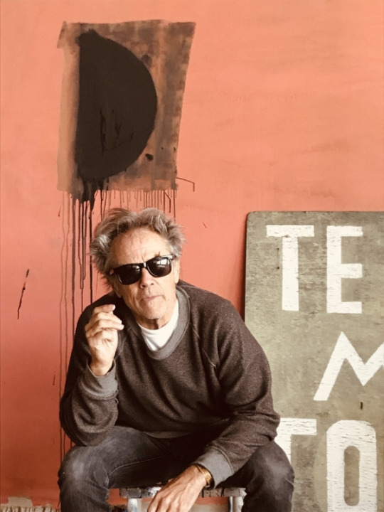
Image via https://www.hulamediagroup.com/books/nu-collage001.html
Image via https://thelogocreative.medium.com/designer-interview-with-david-carson-ea46fc338654
Originally graduating from San Diego State University with a Bachelor of Arts in Sociology, Carson embarked on his passion for graphic designing a little later in his life. With no formal training he sees this as a massive benefit when it comes to approaching a brief - “Since I knew nothing about girds, formulas, schools of thought, etc. I just did what felt right. I try to reinforce visually what's written, spoken or sung. I want the work to connect with people on an emotional level, which is where I feel it’s most effective and lasting”. (David Carson via Butler, 2014)
Carson’s continual reinvention of the relationship between design and type, has changed the course of graphic design and crystalized the look and attitude of an entire generation, making him a powerful catalyst for design change. Running several workshops for graphic design students worldwide has provided Carson with a cult following of inspired young designers. (David Carson Influences | Modern Graphic Design, 2018)
WORD COUNT: 990
References
Intro & Paula Sher Section:
Bigman, A., 2016. Get to know Paula Scher, titan of postmodern design - 99designs. [online] 99designs. Available at: <https://99designs.co.uk/blog/famous-design/paula-scher-titan-of-postmodern-design/> [Accessed 26 March 2021].
Hannah, J., 2020. What Is Typography, And Why Is It Important? A Beginner’s Guide. [online] Careerfoundry.com. Available at: <https://careerfoundry.com/en/blog/ui-design/beginners-guide-to-typography/> [Accessed 26 March 2021].
Pentagram. n.d. Paula Scher. [online] Available at: <https://www.pentagram.com/about/paula-scher> [Accessed 26 March 2021].
The Type Directors Club. 2015. Paula Scher - The Type Directors Club. [online] Available at: <https://www.tdc.org/profiles/paula-scher/> [Accessed 26 March 2021].
Famous Graphic Designers. n.d. Paula Scher | Biography, Designs and Facts. [online] Available at: <https://www.famousgraphicdesigners.org/paula-scher> [Accessed 26 March 2021].
Scher, P., 2019. Paula Scher Biography – Paula Scher on artnet. [online] Artnet.com. Available at: <http://www.artnet.com/artists/paula-scher/biography> [Accessed 26 March 2021].
Typeroom.eu. 2019. War, lust, type! How Paula Scher's typographic affair with The Public Theater redefined our culture - TypeRoom. [online] Available at: <https://www.typeroom.eu/war-lust-type-paula-scher-the-public-theater-pentagram> [Accessed 26 March 2021].
Craig Ward Section:
Cowan, K., n.d. Craig Ward on never dropping the ball, embracing fear and seeking a kinder design community. [online] Creative Boom. Available at: <https://www.creativeboom.com/features/craig-ward/> [Accessed 22 April 2021].
CRAIG WARD. 2021. CRAIG WARD. [online] Available at: <http://wordsarepictures.co.uk/> [Accessed 22 April 2021].
The Type Directors Club. 2016. Craig Ward - The Type Directors Club. [online] Available at: <https://www.tdc.org/profiles/craig-ward/> [Accessed 22 April 2021].
The Logo Creative | International Logo Design & Branding Studio. 2021. Designer Interview With Craig Ward - Designer Interview. [online] Available at: <https://www.thelogocreative.co.uk/designer-interview-with-craig-ward/> [Accessed 22 April 2021].
McNicol, S., 2015. Craig Ward and Experimental Typography. [online] H.GREEN-COURSE HUB. Available at: <https://www.green-coursehub.com/research-blog/craig-ward-and-experimental-typography> [Accessed 22 April 2021].
Sagar, J., 2009. Craig Ward | Creative Bloq. [online] Creativebloq.com. Available at: <https://www.creativebloq.com/computer-arts/craig-ward-6099057> [Accessed 21 April 2021].
David Carson Section:
Butler, A., 2014. interview with graphic designer david carson. [online] designboom | architecture & design magazine. Available at: <https://www.designboom.com/design/interview-with-graphic-designer-david-carson-09-22-2013/> [Accessed 22 April 2021].
UKEssays.com. 2018. David Carson Influences | Modern Graphic Design. [online] Available at: <https://www.ukessays.com/essays/cultural-studies/post-modernist-design-influences-on-david-carson-cultural-studies-essay.php> [Accessed 22 April 2021].
Famous Graphic Designers. 2020. David Carson | Biography, Designs and Facts. [online] Available at: <https://www.famousgraphicdesigners.org/david-carson> [Accessed 22 April 2021].
Medium. 2019. Designer Interview With David Carson. [online] Available at: <https://thelogocreative.medium.com/designer-interview-with-david-carson-ea46fc338654> [Accessed 22 April 2021].
10 notes
·
View notes
Text
Letters from a Killer (1998)

From the cover, Letters from a Killer made me expect a bad movie. Look at that photo of Patrick Swayze with a bowie knife and the tagline of “Don’t Open the Mail”. It’s selling itself as a killer mailman slasher movie. Thankfully, this is a better film than it advertises. Unfortunately, the further you get into this thriller’s plot, the worse it gets.
Patrick Swayze plays Race Darnell, a man convicted and sentenced to death for a murder he didn’t commit. On death row, he receives letters from 5 women with whom he forms “relationships”. When a retrial exonerates him, one of his girlfriend pen pals discovers that she wasn’t the only one, begins killing her rivals, and framing Race for their murders.
This is a picture that would be much better if it were worse. There’s no law against dating multiple women at once. Race isn’t committing any crimes. Actually, sitting on death row wrongfully for 7 years means he's the victim. You might call him a scumbag but put yourself in his shoes. If you didn’t believe you’d ever be freed, would you turn down a woman who writes to you affectionately? Keep in mind the emotional tax of being in prison, surrounded by criminals and vindictive guards every day. He's not sleeping with any of them. I say go for it.
The picture gets interesting once Race is released. Suddenly there’s a woman who swears she’ll have her revenge on him and he doesn’t know who it could be. This, on top of some compelling drama. People think he’s a reptile who's managed to slime his way out of a just sentence. He just wants a normal life but he's stuck dealing with his five "relationships" - and not in a comedic fashion. There are good scenes as he is asked whether he’s admitting the truth to the women because he genuinely feels guilt, or just to save his own skin.
As Letters from a Killer progresses, the crazier and more obvious it becomes. The killer is free to go about as they please, killing left and right and leaving no clues behind except for that thing that will help propel the story forward. In more than one scene, someone suffers a severe injury and carries on as if nothing's happened. Not because it’s a “flesh wound” but because it has to be a surprise that they’re not dead or to generate some artificial tension. While the plot makes sense and everything is explained, this is a movie that could've easily been solved much, much faster if someone just called the police or sat down and had a conversation. With the way the ending plays out, I’m reminded of several action movies where yeah the city was saved or whatever, but the hero would be thrown in jail for causing huge amounts of property damage, breaking countless laws, and blatantly disobeying orders. Even with the excuse that Race encounters some of the most trigger-happy police officers I’ve ever seen in a thriller, he would have had a lot of explaining to do and some serious jail time.
You’re not getting Johnny Castle cutting up women foolish enough to answer chain letters in Letters from a Killer. Actually, the killer doesn't send letters at all; only audiotapes. It begins with a good premise but by the end, it's frequently laughable and preposterous. I can’t even call it lousy. It’s just ok, the kind of mediocre that makes you feel that ultimately, this is one of these films you would watch and never, ever meet anyone else who did. (Full-screen version on VHS, October 14, 2015)

#LettersfromaKiller#movies#films#movieReviews#FilmReviews#DavidCarson#NicholasHicks-Beach#ShelleyMiller#patrick swayze#KimMyers#TniaLifford#GiaCarides#OliviaBirkelund#1998movies#1998films
5 notes
·
View notes
Photo

@davidcarsondesigner X @albumsurf / Nu series in the works - this is the first of a few beauties / 5’8” Twinsman // #davidcarson #albumsurdboards #albumtwinsman (at Album Surf) https://www.instagram.com/p/CN8I-NqB_8L/?igshid=1qdtnfjkwbgl3
4 notes
·
View notes
Text
ХаосVSПорядок, или пост о том, как я открывала для себя новые границы
Всем привет. Вот и настал тот самый момент, когда я собралась с мыслями и взялась написать пост о том, как я смогла выйти из своей зоны комфорта. Для начала небольшое предисловие: я не имею художественного образования и не являюсь гуру специалистом в искусствоведении. Однако, всю свою сознательную жизнь я мечтала посвятить себя именно творческой деятельности. Я всегда рисовала, сколько себя помню. С помощью творчества я снимала внутреннее напряжение и перенаправляла скопившеюся энергию на лист бумаги. В общем, сублимировала по полной. И я бесконечно счастлива, что пускай и не сразу, но все таки смогла сделать шаг навстречу мечте и поступила в университет и буду учится тому, чего так желала всю жизнь. Это не первое задание, которое нам дали выполнить. Однако, это первая работа, которая заставила меня взглянуть на творчество под другим углом. До этого мы делали Ноллинг(Knolling)- упорядочивание предметов. Так как по жизни я аккуратистка, то это задание не доставило мне особых трудностей. Но вот, нас начали знакомить с творчеством Сесилия Тушона и Девида Карсона. И тут я столкнулась с трудностью. Их работы как бы говорят: учитесь думать руками и забудьте о смысле. Порядок в полном беспорядке. Когда я просматривала их работы, то в голове крутилась постоянно одна и та же мысль - я так не смогу. Мне начало казаться, что это что то нереальное. Я долго сидела и думала “Как начать это делать?С чего же мне начать?”. А потом я вернулась к той самой мысли, которую я сама же озвучила себе, когда смотрела их работы “Они не думают головой, они думают руками”.

Просматривая работы двух мэтров я выделила для себя их особенности и решила скомпоновать в своих работах. Тушон, по моему мнению, более структурирован, спокоен и прагматичен. А вот Карсон наоборот, резкий, яркий, энергичный. На первой работе я еще не была совсем уверена в том, что я делаю. Я просто взяла журнал и вырезала понравившиеся мне элементы а сверху добавила черной краски. Сейчас, смотря на эту работу, я вижу все таки в ней больше хауса и треша, однако мне все равно нравится конечный результат.

Вторая работа далась уже проще, однако она кажется мне менее насыщенной. Я постаралась сделать ее более сдержанной, чем предыдущая. Граффити, которое я нарисовала, разрезала на произвольные прямоугольники и постаралась скомпоновать так, чтобы буквы были хотя бы немного читабельными. В конце, я решила все таки добавить немного акцента и нарисовала произвольные точки поверх коллажа.

Третья работа была сделана на одном дыхании. Точнее сказать, я просто расслабилась. Перестала думать, и просто наслаждалась процессом. Поверх монохромных букв, я добавила цветные литеры, из которых складывается фраза “ счастье есть”. Почему такая фраза? Скорее всего это внутренняя установка, которую я каждодневно произношу самой себе, и именно поэтому я ее добавила туда, потому что в процессе создания этого коллажа наконец-таки начала получать удовольствие от процесса работы.

Четвертая работа заняла больше всего времени. Здесь структурированность я решила разбавить акцентными яркими буквами, однако мне показалось, что этого мало. И добила в этот коллаж яркие оранжевые хаотичные линии.

И вот последний, пятый коллаж. Если честно, особо нечего сказать. Граффити был в последний момент увиден мной на Пинтересте, и мне показалось, что он будет уместен в данной работе. Букв оставалось уже не так много, поэтому таким образом я решила выкрутится чтобы скрыть пробелы на листе.
Вот итоговые работы моих рук, которые смогли абстрагироваться от моего мозга, и сами решали что и как им делать и творить. Для меня, безусловно, это необычный экспириенс, который помог увидеть новые горизонты в творчестве. Данное задание должно здорово помочь в дальнейшем изучении и создании шрифтов и леттеринге.
10 notes
·
View notes
Photo


Research
David Carson
After Sharons typography workshop I was interested in looking up more works of the listed artists and stopped at David Carsons website. His flow in his work is so free, unique with no limits regarding the line up of the type. It’s really inspiring and refreshing seeing this because when I try to arrange everthing digitally it always hast to be on the same hight and is never layering on each other. I want to experiment more in that way and maybe it will help me in my project!
http://www.davidcarsondesign.com/
3 notes
·
View notes
Text
𝓕𝓻𝓪𝓼𝓮𝓼 𝓬𝓮𝓵𝓮𝓫𝓻𝓮𝓼
๑ “Hago muchas fotografías, esto influencia mi trabajo. Los colores, las formas, las texturas… hay algo que se queda registrado”
๑ “Nadie puede mejorar el arte de los niños. Hay gente que lo intenta imitar, pero nunca consigue ser auténtico”
๑ “Que algo sea legible no garantiza la comunicación”
๑ “El diseño grafico en las ultimas décadas se ha gentrificado. Se está convirtiendo en aburrido, los diseñadores están siendo un poco vagos y dejan que las editoras tomen las decisiones por ellos”
๑ “No permitas que tu ordenador decida por ti. Utiliza tu ojo, tu intuición”
๑ “Si el dinero no fuera un problema para ti, ¿seguirías haciendo el mismo trabajo?”
๑ “Si a todo el mundo le gusta tu trabajo estás siendo demasiado cauteloso”
๑ “Todo mi trabajo es personal, subjetivo, pongo parte de mí. Por eso me divierto”
1 note
·
View note
Photo

@nblender in the Tahoe Massacre layout from the December 1984 issue of @transworldskate Designed by @davidcarson With Carson as Art Director, I think we started to define our cleaner look and how graphics and skate photography could go together and enhance one another. Carson’s design also helped my magazine photography, I became more aware of the end product, the layout and shooting compositionally for the printed layout. We had our Look and Thrasher had their’s. Can’t we all just get along?😏 jgrantbrittainphotos.com #neilblender #worldwideartparty #tahoemassacre #milehighramp #davidcarson #theendofprint #transworldskateboarding #lookbacklibrary #skateboardphotography #jgrantbrittain #jgrantbrittainphotos #grantbrittain https://www.instagram.com/p/B-PhTkAF2hf/?igshid=y09hcm12xd4n
#neilblender#worldwideartparty#tahoemassacre#milehighramp#davidcarson#theendofprint#transworldskateboarding#lookbacklibrary#skateboardphotography#jgrantbrittain#jgrantbrittainphotos#grantbrittain
7 notes
·
View notes
Text

9 notes
·
View notes
Photo

@davidcarson poster from @offfest in Barcelona has finally found a home in my stairwell. Highlight of his talk (and OFFF) was definitely the crowds reaction to his ripped toenail slide! 😂 That’s the power of visual communication! . . #davidcarson #toenails #toenailart #design #poster #posterdesign #collage #print #printwillneverdie #graphicdesign #typography #type (at Oslo, Norway) https://www.instagram.com/p/B06dBp0ou-E/?igshid=33sa03zjcjac
#davidcarson#toenails#toenailart#design#poster#posterdesign#collage#print#printwillneverdie#graphicdesign#typography#type
1 note
·
View note