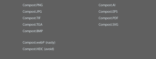
#vector vs raster
Explore tagged Tumblr posts
Visit Tumblr Blog
Explore Tumblr blogs with no restrictions, modern design and the best experience.
Last Seen Tumblr Blogs


Fun Fact
Total funding amounts to $125.3M.
Note
I've been using a mix of Krita and Paint tool SAI. I'd appreciate resources for Krita specifically too. Thank you for answering by the way. ♥️
Of course!
So! Here's my guide to making comics with Krita, down to the details such as layer setup, borders, speech bubbles, and SFX.
preface: it took me at least a year to figure this process out; but once when you've figured out the system & a template, it's smooth sailing. let's use this finished spread from the selfship comic last year to go through the process:

i'm going to assume a certian level of digital program proficiency (knowing what layers are, having a general idea of what vector vs raster graphics are, etc) since otherwise this post would be a book lol.
(if the read more does not work: the static permanent link for the full tutorial is on my website here: https://kradeelav.com/diary/tegalog.cgi?postid=312&1740096282
rest of the post under the cut; this one's going to be a long one as is.
let's start with talking about the layers for a single page of the above comic image.

(ignore the "orbs" and "titania bubble" layers - those were oddities for this specific spread.) Going from the top downwards:
SFX - sound effects. this is an optional layer to have if you don't have a lot of sound effects. you can use either render the sound effects by drawing them out (raster) or vector SFX; whatever you're most comfortable with. more on that below.
frame - this is the comic page borders.
speech bubbles - self explanatory. contains both the text inside the bubble and the bubbles themselves.
ink - main lineart & drawing layer; self explanatory.
tone - the shading layer.
(deleted) ruff/sketch - this is the sketchy thumbnail layer that is imported when i first start working on each spread, and naturally gets deleted when the lineart starts looking good on its own.
so!
there's two types of digital rendering krita can do: raster (most similar to drawing with a pencil or tablet) and vector (computer draws mathematical lines and shapes and text that you can manipulate). a lot of programs fully specialize in one or the other but the killer feature of krita is it can do both on a single page; you just need separate layers depending on the rendering..
that's what this "fx" symbol stands for by the way - these are the vector layers....

... and the symbols circled in purple clue you in that they're raster layers (ink, tone, sketch) where you do the actual drawing. with me so far?
speaking of those:
borders/frame
here's what the borders layer looks like + (the print layout layer above everything in black/yellow). the print layout layer is really only useful if you're physically printing this comic (it's basically bleed/trim if you've heard of those terms, ignore this otherwise).

i really struggled with doing borders in krita until finding this tutorial:
youtube
- since the thing is i make a lot of last minute changes. i need to be able to move and edit borders around easily if a panel's not working for me. so the method above makes it incredibly flexible to just ... up and move one, or to make a gutter wider.
i also really need to be able to see what's behind the borders while i'm drawing it to check anatomy sometimes -- the beautiful thing is you can simply turn the layer style to "multiply" and it's effectively transparent with one click.

like this, voila!
lettering
here's the lettering layer(s) with one bubble's text selected.

fair warning: krita is absolute ass with the text tool. it's the biggest failing but in newer versions i do believe they're slowly working on improvements. thankfully this program can do just enough to letter bubbles.
essentially, i use the same trick as the frames shown in the video above. if you slap a "layer style > stroke" on the whole "bubbles" layer, that's where that 2px black border comes from, and that layer-style-as-a-border "follows" every bubble so it's consistent.
(rule of thumb aesthetics-wise is speech bubble borders should be slightly thinner than frame borders, and on average about as wide as your lineart.)
SFX (sound effects)
technically you can hand-ink all of your SFX if vector art scares you or if you don't intend on doing much, but the vast majority of pros use vector work for efficiency. hentai/erotic work also has a lot of SFX versus other (non-NSFW) genres for the immersion factor with bodily functions.
the spread above didn't need a lot, though.

as you can see it's mostly the inorganic orb clinks and then the big SHING. (i put my for-the-web-kradeelav.com signature on the same layer for laziness).
here's part of my current sfx library below just to show you what i start with for erotic strips; usually i start with some base fonts and start moving the letters around individually.

(a lot of these are redone for every project; there's some in here that are already "outdated" in my eyes.)
miscellaneous
my favorite inking brushes are from this free resource pack. my favorite halftone (shading) brushes are from this (also free). thanks for reading!
26 notes
·
View notes
Text
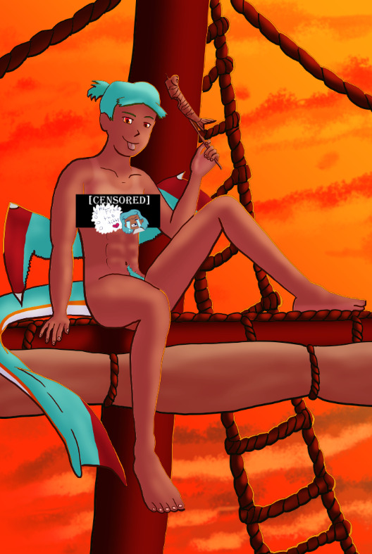
The Harriet Pinup Art Project
Session 2- Process till completion? But where're the other sessions?? Well that escalated both quickly and slowly
The last report was Early September 2024…. Dear god it’s been almost 7 months since last report. I would’ve like to have split what comes next into 2 more sessions but- it is what it is. This is gonna go all over the place so apologies.

Finding some dissatisfaction with my end result in last-session I tweaked the fish-holding arm and the dangling leg a little bit more to my liking and sketched again.
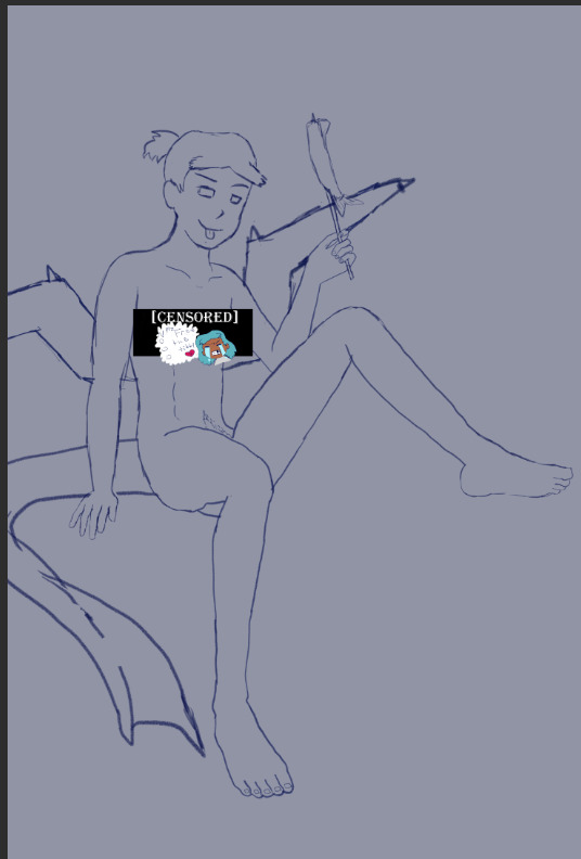
The nips got finally drawn and with it- the censor will now have to drop to keep tumblr-compliant and also to keep this blog sfw, hope you enjoy the humor (Harriet doesn’t).

The wings kept feeling wrong (looking more stretched and unnaturally tacked on vs being naturally relaxing from her backside) so between struggling wing csp assets to reference (not super great when there are no flipper-esque wings) and some more direct input from a friend I ended up landing on a more natural look.
Linearting
Now for my nemesis- linearting.

Despite my disdain for the process I did not want to half ass it by just cleaning up the sketchwork like I normally do. While I struggle to grasp its use, I really wanted to implement lineweight in my lineart. From what I’ve seen lineweight can be used in a lot of different ways; purely randomly, to emphasize mass, or to emphasize the light source of the piece. Of all the choices I tried to stick to the last option since I felt I could best understand it enough to attempt it.
I also decided to try a feature I’ve never used before; linearting with vector lines instead of rasterized ones. For those who don’t know what the difference is I’ll do the extremely dumbed down explanation; rasterized lineart is more common (I think) and is less memory intensive, vector lines are more common in graphic design (since they can be resized w/o the pixel distortion you can encounter with raster lines). I wanted to try this method in an attempt to make the process of linearting a little less painful; with vectors I can adjust the lineart without having to redraw said line if it’s a small tweak, and changing colours is a lot quicker too.
Sadly during this phase my tablet pen's nib broke in a way that was unfixable (leaving the broken part of the nib DEEP in the pen), and due to pricing (tldr- the pen was more expensive than just replacing the entire tablet, in which case it's better to upgrade altogether if possible) had to wait for a new tablet after researching my best choice for a replacement; definitely was a great upgrade but GOD I did not like that happening when it did. Upon a friend’s suggestion I adjusted pen sensitivity so I could try to avoid putting so much force on the pen when doing the thicker lines.

I think I’ve grown a little more confidence on linearting, but it’s still far from my favourite step. I both enjoyed and hated the process of using vectors for the lineart. I felt like there’s probably a lot more I could’ve done with the vectors than what I was doing, but in my opinion it is not that bad for someone jumping in with very minimal knowledge/understanding.
Colouring/Shading

Being colouring is one of my favourite steps I couldn’t resist I rushed right into it. Though I actually ended up doing the shading before the colouring this time. I did the method I’ve heard/seen for digital artists where you block the subject with just black/dark, and then erase it off where the lighting/highlights would be. I’ll say I definitely found this method put more strength into my shading from usual.
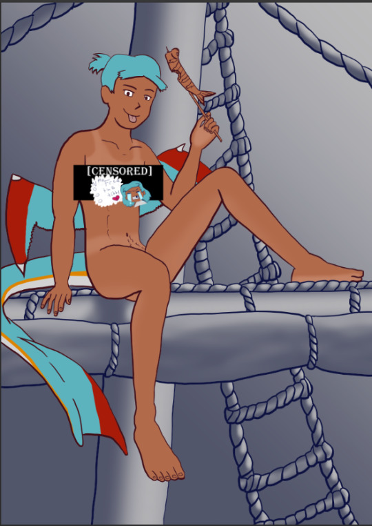
Then I rushed to colouring Harriet herself. Just did the ol-colour picker from her refsheet to throw her colours on, then did some adjustments to colour her nipples and tanlines (cause I WANTED DEM TANLINES!!!!!) though I tried to not make the latter too bold of a contrast since she imo has darker skin and not just tanned.
Then from there there was colouring the background and mast and just wrestling the colour balance and blends, there was a lot of it so I’m just gonna share one of the ones I went through.
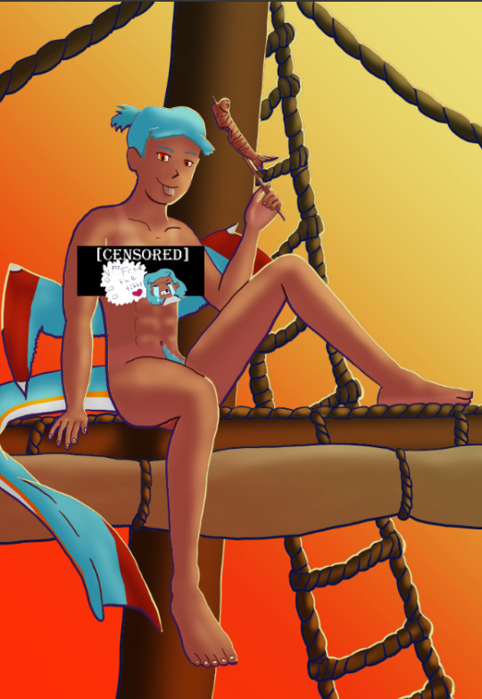
At one point I even took a sunset from google and maxed its size on the background (and crashed CSP as a consequence due to the large image resolution- which lead to me shrinking the canvas/image during this process) to try to help me get an idea of what I MIGHT want to do for the background.
Clouds 💢
After a point I started trying to make my own clouds- the first attempt wasn’t too bad save for the tiny little problem that was the brush made the clouds look wayyy too sharp and grainy on closer inspection so had to scrap them and try again, even going as far as looking at irl clouds to try to get an idea of how to emulate them.

I ended up using a generic soft brush and tried my best to do clouds again. It was okay, but not great and kept getting adjusted between other steps. fortunately we’ll better revisit/redux on these clouds far later in the chain-of-events.
Like the clouds I has having problems getting the nice folds look for the sails, grabbed some refs and kept trying to get it right. The results are far from perfection but they are sufficient. Folds on this sort gonna be a pain in general.
Clothes roughs
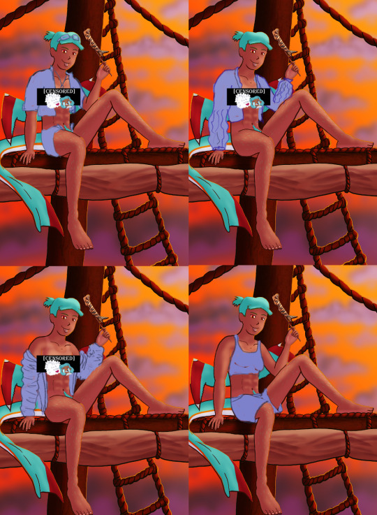
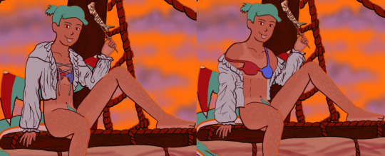
I did some rough draw-ups of different alternative outfits for her to wear. After a lot of wrestling I settled on her just wearing an opened poet’s shirt and the other two ideas got discarded.
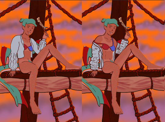
Added a bi-colour bra to make it that I don't have there's a variant that I can share in sfw spaces, and then I lined and coloured the rest of it up, only to stumble into an unfortunate realization-
Ew that went wrong for clothes- reference and redo

[image source 1, 2, and sadly 3 only leads to a pinterest result or a malicious site so 🤷]
With extreme dissatisfaction I ended up trying to tackle them again; I learned the term for the kind of shirt I was after (poet’s shirt, that way it also reduced the amount of AI messing with my results), got several reference photos then tried again while trying to mimic what I was seeing.
MUCH better.
Clouds redo
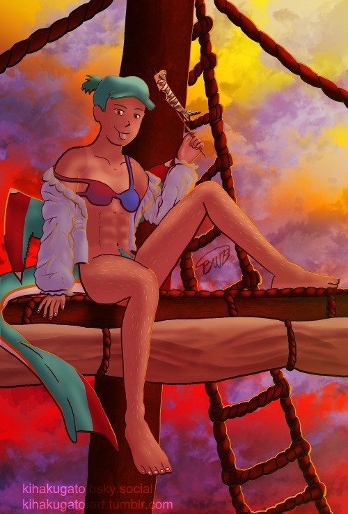
With that, let’s get the clouds looking better. I checked this tutorial to try to get a better idea, and found some cloud brushes that are in Official CSP but weren’t downloaded thanks to another tutorial and used them, used them then used the tutorial to help further elevate them a little bit. To further elevate said clouds I hilariously used my previous crummy clouds as a overlay to help the new clouds pop. Much better, and with that it’s done, slap dat signature and watermarks! Ready to throw onto the internets
Personal Evaluation on this project
This project ended up taking much longer than I wanted; Some of it was due to real life kicking my butt, and some of it was from clumsy planning and impulsiveness to get to certain steps quicker.
I liked it taking longer cause it gave me more time to think about certain steps and chisel away at parts when I had time, like working on a super large puzzle. On the opposite end it ended up making me much more intimate with the flaws with the piece/project than I’d like to be during the process, since most artists nowadays including myself tend to hit that stage after they’ve completed and posted a work online.
This lead to a lot of times asking “am I gonna shrug off this flaw or go through the time/trouble to redo a part to make it better?” For the case of the clouds and clothes, yes I felt the redo was necessary and it helped strengthen the overall piece, but there were many other flaws I chose to ignore cause I was too far into it to be worth the backtrack.
The biggest example flaw is ironically the anatomy/perspective when sketching Harriet’s body; while using the 3D tool was very helpful, I feel I should’ve did more perspective exaggeration for certain parts of her body (the biggest case being her hands; they imo would’ve looked much better if I made them and her fingers a little bit bigger and chonkier). Another case were the folded sails of the ship that I feel could’ve been better shaped and the folds could’ve been more sensible, ironic for me to say considering I had done several references and do-overs for that part of the piece. Conversely there are probably still various flaws in the lineart itself; despite the convenience of being able to edit the lineart via the vector points it is still a lot of nitpicking if you don’t decide that it’d be better to just move on so long as the idea is brought across via the art, flaws be damned.
When it came to the clothes stage, in my opinion I should’ve done that LONG before colouring/shading Harriet’s body and back when I had just finished the lineart, as it would’ve lead to less visual confusion for my eyes when I had to sketch the clothes out. Some ofher steps were out of order enough to cause confusion to myself, but I won’t bash myself about it since this is probably the first piece I’ve worked on that’s taken this long, plus this winter alone has been very mentally taxing so dumb decisions are bound to happen thanks to that.
That being said, I’m glad I did this project. I got to experiment and test out strategies and tools I’ve never even considered delving into before, and I may even end up using some of them again. There were even some points in this project where said tools I just thought “well this could be handy for [this group of drawing ideas]”. It’s also lead to beautiful results and is probably my biggest high effort piece I’ve done in a long time, probably rivaling if not outclassing some of my bigger pieces that I still admire today from back in my highschool days.
Hearing from one friend talk about the flow of the piece made me happy since, despite never mentioning it during the journaling of this project, that it was something in the back of my mind on/off while working on this piece; the flow of the ladder and clouds all intentionally despite to try to point the eyes of the audience towards Harriet who’s meant to be the main feature of the piece. It really proves that considering flow is a vital element when you want to make a piece work.
I may actually try to print one of the several variants as a print to put on my wall. Not that I will hold my breath on the results as my track record of digital-to-print for my artworks has always been a hard hit/miss for results.
Thank you for those who decided to follow along on the journaling of this art project.
[Session 0] [Session 1]
#The Harriet Pinup Project#artists of tumblr#artists on tumblr#art process journal#wip art#wall of text#long post
6 notes
·
View notes
Text
How to Draw Multiple Lines in Photoshop (Step-by-Step, Friendly Guide)

I remember the first time I needed to draw multiple lines in Photoshop…
I was creating a product layout for an Amazon client who wanted a “tech-specs” graphic for their new Bluetooth speaker. Each feature needed a crisp line pointing to the part of the product—something clean, balanced, and symmetrical. I thought, "Drawing one line is easy—but how do I create many consistent, perfectly aligned lines without wasting hours?"
Turns out, it’s not hard at all… once you know the steps.
In this guide, I’ll walk you through how to draw multiple lines in Photoshop like a pro—without frustration or guesswork. Whether you're designing for e-commerce, creating product callouts, real estate floor plans, or even social media content, these tips will save you time and elevate your visuals.
✏️ Quick Answer: How to Draw Multiple Lines in Photoshop
To draw multiple lines in Photoshop, use the Line Tool (U) from the shape tools. Hold Shift for straight lines, duplicate with Alt + drag, and align lines with Smart Guides or the Align panel for precision.
🔧 Tools You’ll Need
Adobe Photoshop (any recent version)
A basic understanding of layers
A bit of creativity!
Let’s dive into the steps.
🎯 Step-by-Step: How to Draw Multiple Lines in Photoshop
1. Select the Line Tool
Go to the Toolbar and find the Line Tool (U). It’s grouped with the rectangle and other shape tools.
📝 Tip: If you can’t see it, right-click on the shape tool icon and select “Line Tool” from the dropdown.
2. Set Line Properties
Before you draw, check the options bar at the top:
Weight: Choose your line thickness (e.g., 2px or 3px).
Color: Pick a stroke color that fits your design.
Fill: Make sure this is set to none.
🧠 Snippet-worthy tip: Keep your line thickness consistent when drawing multiple lines—this creates a clean, professional look.
3. Draw the First Line
Click and drag on your canvas to draw your first line. Hold Shift to make it perfectly horizontal, vertical, or at 45° angles.
4. Duplicate the Line
Once you have one line, you can easily create more:
Select the Move Tool (V)
Hold Alt (Option on Mac) and drag the line
Release to duplicate it in place
Repeat this process to draw multiple lines quickly.
📌 Fast tip: You can press Ctrl + J (Cmd + J on Mac) to duplicate the selected line layer, then move it manually or with arrow keys.
5. Align the Lines Perfectly
Use Smart Guides (Ctrl + ;) to snap your lines into alignment, or use:
Window > Align to open the Align panel
Select all lines and click “Distribute Vertical Centers” or “Align Left Edges” for symmetry
This is especially useful in e-commerce product design, real estate labels, or print merchandise previews, where layout precision matters.
✨ Pro Tips for Perfect Multiple Lines in Photoshop
Here are some tips I’ve picked up over years of working with clients like Amazon sellers, Shopify brands, and even interior designers:
✅ Use Layers for Each Line
Keep each line on its own layer. This gives you full control for adjusting later without affecting others.
✅ Group Lines Together
Select all line layers and hit Ctrl + G to group them. This keeps your layer panel neat and your project organized.
✅ Use Grids or Guides
Turn on View > Show > Grid for pixel-perfect placement. You can also drag guides from rulers (Ctrl + R) to help.
✅ Work in High Resolution
Lines can look blurry in low-res documents. For best results, work in 300 DPI for print, and 72 DPI for web—but always use shape layers, not raster lines.
🎨 When Should You Use the Line Tool (vs. Brushes or Pen Tool)?
Sometimes people ask me, “Can I just draw lines with the brush?” Sure—but here’s the difference:
Tool
Best Use Case
Pros
Line Tool
Precise, straight lines for product labels, UI, infographics
Clean, editable vector lines
Brush Tool
Artistic, freehand lines for sketches or texture
Natural feel, pressure sensitive
Pen Tool
Custom paths, curves, shapes
Highly flexible, scalable lines
📍 Best Practice: Use the Line Tool when you need consistency and control—especially for ecommerce or print work.
🔍 Real-Life Example: Expert Clipping’s Case Study
Over at Expert Clipping, we helped a client launch a new product line on Etsy. They needed a minimalist infographic with eight callout lines pointing to product features on a white background. Using Photoshop’s line tool, our team created sleek, symmetrical lines in just minutes—saving them hours of manual tweaking.
By using smart duplication, consistent styling, and grouping, we delivered 15+ infographics with zero alignment issues and 100% brand consistency. This process works beautifully across industries—from tech specs to cosmetic packaging mockups.
🧠 Why This Matters for You
Whether you’re a Shopify seller, real estate agent, POD business, or even a social media content creator, knowing how to draw multiple lines in Photoshop empowers you to:
Annotate images with clarity
Create info-rich product images
Design social posts with clear callouts
Lay out clean infographics or spec sheets
✅ Final Thoughts: Drawing Multiple Lines Made Easy
To wrap it up, here's a quick checklist:
✔️ Select the Line Tool (U) ✔️ Customize the line weight and color ✔️ Draw the first line holding Shift for straightness ✔️ Duplicate with Alt + Drag or Ctrl + J ✔️ Align perfectly with Smart Guides or Align panel ✔️ Group and label your layers for organization
Once you’ve done it a few times, it becomes second nature. Just like I learned back when I was working on that Bluetooth speaker project—sometimes the simplest tools can make the biggest difference in how polished your work looks.
So go ahead, fire up Photoshop, and start drawing your lines like a pro. And if you ever get stuck, bookmark Expert Clipping’s detailed guide—we’ve got your back with practical, expert-backed help.
0 notes
Text
Graphic Design Terms Every Business Owner Should Know
Working with a graphic designer can be exciting—but also overwhelming—especially when unfamiliar terms start flying around. From “CMYK” to “white space,” design jargon can feel like a different language. But if you're a business owner investing in branding, marketing, or website visuals, understanding key design terms isn’t just helpful—it’s empowering.
By learning the basics, you can collaborate better, avoid miscommunication, and get the results you’re really looking for. That’s also why many businesses now turn to professional Graphic Designing Services that simplify the process and explain each step in clear, client-friendly terms.
Here’s a handy guide to essential graphic design terminology every business owner should know—no design degree required.
1. Brand Identity
This includes the visual elements that represent your business: logo, color palette, typography, and brand style guidelines. A strong brand identity ensures consistency across all marketing materials.
Why it matters: It’s how customers recognize and remember you.
2. Logo Variations
Designers often create multiple logo types:
Primary logo: Full version
Secondary logo: Simplified for tighter spaces
Favicon: The tiny icon seen in browser tabs
Monogram: Initials or symbol-only version
Why it matters: Using the right version keeps your visuals clean and polished on different platforms.
3. Typography
Typography refers to the style and arrangement of text. Key typography terms include:
Serif vs. Sans-serif: Serif fonts have little “feet” on the letters, sans-serif fonts don’t.
Kerning: Space between individual letters.
Leading: Space between lines of text.
Hierarchy: How fonts are arranged to guide the viewer's eye (e.g., headlines vs. body copy).
Why it matters: Font choices affect brand tone, readability, and visual flow.
4. Color Modes: RGB vs. CMYK
RGB (Red, Green, Blue): Used for digital screens.
CMYK (Cyan, Magenta, Yellow, Black): Used for printing.
Why it matters: Designing in the wrong mode can lead to color mismatches in print or online.
5. DPI and PPI
DPI (Dots Per Inch): Resolution used in print.
PPI (Pixels Per Inch): Resolution used for screens.
Why it matters: High-resolution graphics (300 DPI for print, 72 PPI for web) ensure clarity.
6. White Space
Also known as “negative space,” this refers to empty space around design elements.
Why it matters: It helps focus attention, reduce clutter, and create a clean, professional layout.
7. Vector vs. Raster Graphics
Vector files (AI, SVG, EPS): Scalable without losing quality; best for logos and icons.
Raster files (JPEG, PNG, GIF): Made of pixels; can become blurry when enlarged.
Why it matters: Always ask for vector files of your logo—they stay crisp at any size.
8. File Types You Should Know
JPEG: Good for photos; compressed format.
PNG: Supports transparent backgrounds; ideal for web graphics.
PDF: Great for print-ready designs or document sharing.
AI/PSD: Adobe Illustrator/Photoshop source files; editable by designers.
Why it matters: Each file type has a purpose. Knowing which one to use saves time and quality.
9. Mockup
A mockup is a realistic preview of how your design will appear in the real world—like a billboard, packaging, website screen, or T-shirt.
Why it matters: It helps you visualize the design in context before final production.
10. Bleed
In print design, bleed refers to the area beyond the final cut line. Designers extend backgrounds or images into this zone so no white edges appear after trimming.
Why it matters: Print-ready files without proper bleed may be cut incorrectly.
11. Grid System
A grid system helps designers align elements consistently. It's the invisible structure that keeps layouts balanced and organized.
Why it matters: It ensures consistency and professionalism, especially in multi-page documents or web layouts.
12. Mood Board
A mood board is a collection of images, colors, and typography used to set the visual tone of a brand or project.
Why it matters: It helps align expectations between you and the designer before the actual design work begins.
Conclusion: Speak the Visual Language of Your Brand
You don’t need to be a designer to get great design—but knowing the basics helps you ask better questions, give clearer feedback, and get better results. A good designer will guide you through the process, but having a working knowledge of design terms ensures you stay in control of your brand.
If you're ready to collaborate with professionals who simplify the design process and deliver results that align with your vision, explore expert Graphic Designing Services that speak both visual and business fluently.
0 notes
Text
How to Choose the Right Patent Drawing Provider for Your Invention
Patent drawings are more than just illustrations, they are a crucial part of a successful patent application. Whether you're filing for a utility patent or a design patent, your drawings must clearly and accurately represent your invention and meet the strict formatting rules of the patent office you're filing with. For most inventors, working with a professional patent drawing provider is the smartest move.
But how do you find the right provider, someone who can deliver quality, compliance, and confidentiality? Here’s a comprehensive guide to help you make the right choice.
1. Look for Expertise in Patent Drawing Standards
Different countries have their own rules for patent drawings. The USPTO (United States Patent and Trademark Office), EPO (European Patent Office), and WIPO (World Intellectual Property Organisation) each have specific requirements for line quality, labelling, margins, shading, and views.
A qualified patent drawing service should:
Understand current USPTO, PCT, and other jurisdictional standards
Know when and how to use solid vs. broken lines
Provide compliant formatting for both design and utility patents
Tip: Ask if the provider keeps up with changes in regulations. Even minor formatting errors can delay or derail your application.
2. Evaluate Their Experience and Portfolio
The complexity of your invention may require different technical skills. Some providers specialise in mechanical inventions, others in medical devices, consumer products, or electrical components.
Look for providers who:
Have experience creating drawings for inventions in your industry
Can show sample work or case studies
Understand both technical functionality and aesthetic detailing
Design patents require more attention to shading and visual presentation, while utility patents require functional clarity. Make sure your provider can handle both, if needed.
3. Confirm Turnaround Time and Reliability
Time is often a critical factor when filing a patent. Delays in drawings can cause you to miss filing deadlines or lose priority. Ask the provider:
What is the typical turnaround time?
Can they handle urgent or rush requests?
What happens if you need a revision close to your filing date?
Choose a service that commits to quick and reliable delivery without sacrificing quality.
4. Understand the Revision and Support Policy
Professional drawing services should offer at least 1–2 free rounds of revisions, especially for minor updates. Some inventions evolve during drafting, or you might receive feedback from a patent attorney that requires changes.
Check:
How revisions are handled (email, online portal, etc.)
How many rounds of changes are included in the price
Whether customer support is responsive and technically informed
Support during the review phase is critical.
5. Check File Format Options
Patent drawings are typically submitted in specific formats such as PDF, TIFF, DWG, or DXF. Your attorney, patent office, or country of filing might have different requirements.
Ensure the provider can:
Deliver high-resolution, patent-office-ready files
Offer both raster and vector formats as needed
Adapt file sizes and layouts for various patent filing systems
6. Ask About Pricing and Transparency
While you want quality, your budget matters too. Avoid services with vague pricing or unexpected charges. Look for:
Flat-rate pricing for standard views
Clear cost estimates for complex figures
Inclusive rates for basic revisions and delivery
Some providers offer package deals for multiple figures or both design and utility patent drawings.
7. Prioritise Confidentiality and IP Security
Your invention is valuable. Sharing it with any third party requires trust and security. The right provider should:
Offer to sign a Non-Disclosure Agreement (NDA)
Guarantee the confidentiality of all drawings and data
Use secure communication channels and data storage systems
Pro Tip: Always get a written NDA before submitting your invention details.
8. Look for Industry Recommendations or Reviews
Check reviews on Google, LinkedIn, and legal or IP industry directories. You can also ask your patent attorney or colleagues for recommendations. Reputable providers often have long-standing relationships with patent law firms and inventors.
In a Nutshell
Choosing the right patent drawing provider is a key step in protecting your invention. A strong partner will ensure your drawings meet legal standards, clearly present your innovation, and effectively support your patent claims.
When making your choice, prioritise experience and technical skill, regulatory knowledge, responsive support, file format flexibility, and strong security and confidentiality practices. Taking the time to select the right partner can make the difference between a smooth patent process and one filled with delays or rejections.
0 notes
Text

Meeting with IP artist Janesha Partee to talk about her interest in learning more about graphic design. We talked about exploring web design, design software, raster vs. vector, SVGs, Adobe Express, and more. Going forward, we’ll be working on a website project as a way to explore many facets of graphic design.
--Tyson Phipps / In Progress / Studio 213 / Saint Paul
0 notes
Text
Graphic Design vs. Web Design: Which Creative Career Path is Right for You? A Guide for Aspiring Creatives in Bardhaman

So, you're drawn to the world of design. You have a keen eye for aesthetics, a passion for visuals, and a desire to create things that capture attention and communicate ideas. That's fantastic! The creative industry is vibrant and offers fulfilling career paths. But as you explore your options, you might encounter two terms frequently: Graphic Design and Web Design.
They sound related, and they certainly share some DNA, but they represent distinct disciplines with different focuses, tools, and end goals. For many aspiring creatives, especially students in Bardhaman looking to launch their careers, understanding the difference is crucial for making the right educational and professional choices. Are you destined to craft stunning logos and brochures, or are you more intrigued by building engaging online experiences?
Choosing the right path can feel daunting, but it doesn't have to be. This guide will break down the core differences and similarities between Graphic Design and Web Design, explore the skills required for each, discuss career prospects, and help you figure out which exciting creative journey aligns best with your interests and aptitudes. And importantly, we'll touch upon how quality training, like that offered at Moople Institute Bardhaman, can equip you for success in either field.
What is Graphic Design? The Art of Visual Communication
At its heart, Graphic Design is about visual communication and problem-solving through the use of typography, photography, iconography, and illustration. Graphic designers are visual storytellers who create concepts primarily for print or static digital media to convey specific messages, establish brand identities, and engage audiences.
Core Focus: Aesthetics, branding, communication, layout, typography, color theory.
Primary Mediums: Print materials (brochures, posters, business cards, packaging, book covers, magazines), static digital assets (social media graphics, website banners, email marketing visuals, digital ads), branding elements (logos, style guides).
Key Goal: To create visually appealing compositions that effectively communicate a client's message, identity, or information in a clear, memorable, and impactful way. The focus is often on making a strong visual statement or conveying information concisely.
Think: The logo that makes you instantly recognize a brand, the eye-catching poster for an event, the beautifully laid-out magazine spread, the packaging that makes a product jump off the shelf.
Essential Tools: Primarily vector and raster graphics software like Adobe Illustrator, Adobe Photoshop, and Adobe InDesign.
Key Skills: Strong understanding of design principles (layout, hierarchy, balance, contrast, proximity), typography mastery, color theory expertise, creativity, visual problem-solving, communication skills (to understand client needs), software proficiency.
What is Web Design? Crafting the Digital Experience
Web Design, on the other hand, is focused on the planning, creation, and maintenance of websites. While aesthetics are certainly important, web design goes beyond just how a site looks. It heavily incorporates User Experience (UX) and User Interface (UI) principles to ensure a website is not only visually appealing but also functional, easy to navigate, accessible, and provides a positive experience for the visitor.
Core Focus: User experience (UX), user interface (UI), website layout, navigation, interactivity, functionality, accessibility, responsiveness (adapting to different screen sizes).
Primary Mediums: Websites, web applications, mobile apps (often overlaps with app design).
Key Goal: To create websites and digital interfaces that are intuitive, engaging, and help users achieve their goals efficiently (e.g., find information, purchase a product, sign up for a service). It balances visual appeal with usability.
Think: The ease with which you navigate your favourite online store, the clear layout of a news website, the intuitive interface of a web-based tool, how a site looks and works seamlessly on both your laptop and phone.
Essential Tools: Design and prototyping tools like Figma, Sketch, Adobe XD. Web designers also frequently use Adobe Photoshop and Illustrator for creating visual assets. Understanding of foundational web technologies like HTML (structure) and CSS (styling) is often crucial, and sometimes basic JavaScript (interactivity) is beneficial.
Key Skills: Understanding of UX/UI principles, visual design skills, information architecture, wireframing and prototyping, understanding of responsive design, empathy for users, problem-solving (fixing usability issues), basic coding knowledge (often HTML/CSS), software proficiency (design tools).
The Key Differences Summarized:
Graphic design and web design may both revolve around creativity and visuals, but they serve very different purposes.
Graphic design is mainly focused on creating static visuals for print or digital platforms. Think logos, posters, brochures, and ad creatives. The goal is to communicate a message visually with maximum impact. Here, beauty, brand consistency, and message clarity are everything. It’s all about layout, typography, color theory, and mastering design tools like Adobe Photoshop or Illustrator. Once a visual is created, it’s final—typically exported as a JPG, PNG, or PDF.
Web design, on the other hand, lives in the digital space and focuses on interactivity. A web designer doesn’t just craft how things look, but also how users experience and navigate them. They design websites, web apps, and interfaces that must respond to different screen sizes and devices. Layouts are fluid, not fixed. The success of a web design is measured not just by how beautiful it looks, but by how functional, intuitive, and user-friendly it is. That means understanding UI and UX, using prototyping tools, and often working with HTML, CSS, or frameworks like WordPress.
While graphic design is about visual storytelling, web design combines visual design with usability. Both fields require creativity, but web design also demands a deeper understanding of how people interact with digital platforms.
In short, graphic designers create visuals you see. Web designers shape the digital experiences you use.
Where Do They Overlap? The Synergies
While distinct, these fields are not mutually exclusive islands. There's significant overlap:
Visual Foundation: Both require a strong understanding of design principles like color, layout, and typography. A website still needs to look good (graphic design principles), and graphic assets are often needed for websites.
Software: Tools like Photoshop and Illustrator are commonly used in both fields, albeit sometimes for different purposes (e.g., a graphic designer might create a logo in Illustrator, while a web designer might use it to create icons for a website).
UI Design: The visual aspect of User Interface (UI) design sits squarely at the intersection. UI designers focus on the look and feel of buttons, menus, and visual elements within a digital interface, requiring strong graphic design skills applied within a web/app context.
Collaboration: Graphic designers and web designers/developers often work together on projects. A graphic designer might create the brand assets (logo, color palette) that a web designer then incorporates into the website layout.
Career Prospects: Opportunities Abound in Both Fields
The good news is that both Graphic Design and Web Design offer robust career opportunities in today's visually driven world.
Graphic Design Careers: Opportunities exist in advertising agencies, marketing departments, publishing houses (books, magazines), branding agencies, print shops, design studios, and freelance. Roles include Graphic Designer, Visual Designer, Brand Identity Designer, Packaging Designer, Layout Artist, Production Artist. The demand is steady, particularly for designers who can adapt to creating assets for digital marketing alongside traditional print.
Web Design Careers: Demand is extremely high due to the necessity for businesses of all sizes to have an effective online presence. Opportunities are found in web design/development agencies, tech companies, digital marketing agencies, large corporations with in-house teams, e-commerce businesses, startups, and freelance. Roles include Web Designer, UI Designer, UX Designer (often requires more specialized UX focus), Front-End Developer (if coding skills are strong), Product Designer. The field is constantly evolving with technology.
Which Path is Right for You? Ask Yourself These Questions:
Still unsure? Reflect on your natural inclinations and interests:
What kind of final product excites you more? Seeing your design on a printed poster/book cover, or seeing users interact with a website you designed?
Do you love pixel-perfect layouts and typography for static consumption? Or are you more fascinated by how users navigate through information and interact with elements? (Graphic Design vs. Web Design)
Are you primarily driven by aesthetics and visual impact? Or do you enjoy solving usability puzzles and thinking about the user's journey? (Graphic Design vs. Web Design)
Do you enjoy the tangible nature of print? Or are you drawn to the dynamic, ever-evolving digital world? (Graphic Design vs. Web Design)
Are you interested in learning the basics of coding (HTML/CSS)? A strong interest here leans towards Web Design. If coding seems intimidating or uninteresting, Graphic Design might be a better fit, though digital graphic design is still essential.
Do you prefer focusing purely on visual creation? Or do you like blending visual creation with technical considerations and user psychology? (Graphic Design vs. Web Design/UX)
There's no right or wrong answer, only what resonates most strongly with you.
Building Your Foundation at Moople Institute Bardhaman
Regardless of which path you lean towards, a strong educational foundation is key. At Moople Institute Bardhaman, we understand the nuances of both fields and offer comprehensive training designed to equip you with the skills demanded by the industry.
Targeted Curriculum: Our courses, such as the Diploma in Graphics & Web Design, are structured to provide a solid grounding in core design principles applicable to both fields. We cover essential software like Adobe Photoshop, Illustrator, InDesign, and introduce concepts relevant to both print/static design and web/UI design (potentially including tools like Figma or XD, depending on the specific course structure).
Practical Skill Development: We emphasize hands-on learning through projects that mirror real-world assignments. You won't just learn the tools; you'll learn how to apply them creatively and effectively, building a professional portfolio that showcases your abilities to potential employers.
Industry-Experienced Faculty: Learn from instructors who bring real-world experience from the design industry, providing valuable insights and mentorship.
Career Support: Our commitment extends beyond the classroom. We offer placement assistance to help connect our graduates with job opportunities in Bardhaman and beyond, leveraging our network and understanding of the creative job market.
Whether you choose to specialize purely in Graphic Design, dive deep into Web Design, or explore the overlapping world of UI/UX, Moople Bardhaman provides the environment, resources, and guidance to start your journey.
Choose Your Creative Canvas
Graphic Design and Web Design are both exciting, viable, and rewarding creative career paths. Graphic Design focuses on visual communication primarily through static media, emphasizing aesthetics and branding. Web Design focuses on creating functional, engaging, and user-friendly online experiences, blending visual design with usability and technical considerations.
The "better" path is simply the one that better aligns with your personal interests, strengths, and career aspirations. Reflect on what truly excites you – the power of a striking visual message or the elegance of a seamless digital interaction?
Whichever direction you choose, remember that success requires dedication, continuous learning, and a strong foundation.
0 notes
Text
i just looked up "vector vs raster cathode ray tube" and i got so excited i started beating the heck out of my chair. why
0 notes
Text
From Beginner to Pro: How to Create Professional Designs in CorelDRAW

Introduction
Graphic design is an essential skill in today’s digital world, and CorelDRAW is one of the most powerful tools for creating stunning visuals. Whether you’re just starting or looking to enhance your skills, mastering CorelDRAW can help you create professional-grade designs effortlessly. If you're searching for a graphic designing course in Yamuna Vihar or graphic designing course in Uttam Nagar, having a strong command over CorelDRAW can open many doors in the creative industry.
Getting Started with CorelDRAW
For beginners, CorelDRAW may seem overwhelming, but with the right approach, you can quickly get comfortable. Before diving into complex designs, it's crucial to understand the software’s interface and tools.
Workspace Familiarization
CorelDRAW has an intuitive interface with menus, toolbars, and a workspace designed for smooth navigation.
Learn the basics like the Pick Tool, Shape Tool, Pen Tool, and Text Tool to start designing.
Using Templates and Presets
CorelDRAW provides a variety of templates that can save time and effort.
If you are attending graphic designing training in Yamuna Vihar, you will learn how to modify these templates to suit your design needs.
Setting Up Your Canvas
Choosing the correct dimensions for your project is vital. Whether designing a logo, poster, or social media graphic, setting up the canvas properly ensures a high-quality outcome.
Essential Tools and Techniques
Once you’re comfortable with the basics, it’s time to explore advanced features to take your designs to the next level. If you enroll in a Graphic Designing Coaching Institute in Yamuna Vihar or Graphic Designing Coaching Centre in Uttam Nagar, you'll get hands-on experience with these tools:
Vector Shapes and Curves
Unlike raster graphics, vectors ensure high-quality resolution, making CorelDRAW ideal for logos and print designs.
The Bezier Tool helps create smooth curves, a crucial skill for professional designs.
Typography and Text Effects
Fonts play a significant role in design. CorelDRAW offers various text effects like shadows, outlines, and embossing.
Many graphic designing training institutes in Uttam Nagar focus on typography because of its impact on branding and advertising.
Color Theory and Gradients
Understanding color combinations is essential for professional designs.
CorelDRAW’s Fountain Fill Tool helps create beautiful gradients for a modern look.
Image Tracing and Editing
The Powertrace feature converts raster images to vector format, allowing you to refine existing designs.
If you’re attending graphic designing classes in Delhi, you'll learn how to manipulate images seamlessly.
Advanced Techniques for Professional Designs
After mastering the fundamentals, it's time to elevate your skills. Graphic Designing Training Institutes in Yamuna Vihar often emphasize these advanced techniques:
Blending and Transparency Effects
The Transparency Tool can add depth and realism to your designs.
Blending tools help merge multiple design elements smoothly.
Mockups and 3D Effects
CorelDRAW allows you to create 3D-like effects that enhance visual appeal.
This technique is particularly useful in Multimedia Training Institutes in Uttam Nagar for UI/UX design.
Exporting and Printing Like a Pro
Choosing the right format for exporting ensures high quality.
CMYK vs. RGB: Use CMYK for print media and RGB for digital designs.
Where to Learn CorelDRAW Professionally?
Conclusion If you're passionate about design and looking for structured learning, joining a Graphic Designing Coaching Institute in Yamuna Vihar or Graphic Designing Centre in Uttam Nagar is a great choice. Many training centers provide hands-on experience, industry-relevant projects, and expert guidance to help you transition from a beginner to a professional designer.
For those interested in broader creative fields, Multimedia Coaching Institutes in Yamuna Vihar also cover CorelDRAW along with other graphic tools to enhance your skill set.
Mastering CorelDRAW is a game-changer for anyone interested in graphic design. Whether you're self-learning or enrolling in a graphic designing training institute in Uttam Nagar, practice and creativity are key to becoming a pro. Keep experimenting with new techniques, stay updated with the latest design trends, and build a strong portfolio.
If you’re serious about a career in design, explore the best Multimedia Training Institutes in Yamuna Vihar or Graphic Designing Coaching Centres in Delhi to get professional training and take your skills to the next level. Visit Us
Suggested Links
Adobe After Effects
Website Designing Training
Digital Marketing
#graphic designing#graphic design tutorials#graphic design#graphic design tips#graphic designers#Grapphic Designing course in yamuna vihar#Graphic Designing Course in Uttam Nagar#graphic designing institute
0 notes
Text
How to Make a Digital Design: A Step-by-Step Guide

Digital design is an essential skill in today’s digital world, whether you’re creating graphics for social media, websites, branding, or digital art. Whether you’re a beginner or an aspiring professional, understanding the process can help you create visually appealing and functional designs. In this guide, we’ll break down the steps to making a digital design from start to finish.
Step 1: Define Your Purpose and Audience
Before you start designing, determine the goal of your design and your target audience. Ask yourself:
Is it for a website, social media, advertisement, or personal project?
Who will see this design? What are their preferences?
What emotions or actions do you want to evoke?
Having clarity on these points will help guide your design choices.
Step 2: Choose the Right Software
There are many digital design tools available, and selecting the right one depends on your project needs:
Adobe Photoshop – Best for photo editing and raster graphics.
Adobe Illustrator – Ideal for vector graphics and logo design.
Canva – User-friendly for beginners, great for social media and presentations.
Figma – Excellent for UI/UX design and collaboration.
Procreate – Perfect for digital painting and illustrations.
Step 3: Gather Inspiration and Plan Your Design
Before starting, gather inspiration from online sources such as Pinterest, Behance, or Dribbble. Create a mood board to organize color schemes, typography, and layout ideas.
Sketch your ideas on paper or use wireframing tools to map out the structure of your design before you dive into software.
Step 4: Set Up Your Canvas
Open your chosen software and set the appropriate dimensions for your design. Consider:
Resolution: Use 72 DPI for digital designs and 300 DPI for print designs.
Color Mode: RGB for screens, CMYK for print.
Aspect Ratio: Make sure it suits the platform where it will be displayed (e.g., Instagram post vs. website banner).
Step 5: Create a Strong Composition
A well-balanced layout improves readability and visual appeal. Follow design principles such as:
Rule of Thirds: Place key elements along grid lines for balance.
Alignment and Spacing: Keep elements aligned and maintain consistent spacing.
Hierarchy: Emphasize important elements through size, contrast, and placement.
Step 6: Choose Colors and Typography
Colors: Use a color palette that complements your design's theme. Tools like Adobe Color or Coolors can help.
Fonts: Select readable and appropriate fonts. Use font pairings that work well together (e.g., bold headings with simple body text).
Contrast: Ensure good contrast between text and background for readability.
Step 7: Add Graphics and Visual Elements
Enhance your design with:
Icons and illustrations
High-quality images
Shapes and lines to guide the viewer’s eye Make sure these elements blend well with the overall design.
Step 8: Use Layers and Effects Wisely
Most design software allows working with layers. Organize your layers and name them for easier editing. Use effects like:
Shadows and gradients for depth
Transparency and overlays for a modern look
Blending modes to merge images creatively
Step 9: Review and Refine
Take a step back and analyze your design. Check for:
Spacing and alignment issues
Color consistency
Readability of text Ask for feedback from peers and make necessary adjustments.
Step 10: Export in the Right Format
Save your design in the appropriate format:
PNG – High quality, supports transparency.
JPEG – Smaller file size, good for web use.
SVG – Scalable vector format, ideal for logos and icons.
PDF – Best for print and document sharing.
Conclusion
Creating a digital design involves planning, creativity, and technical skills. By following these steps, you can improve your design process and produce stunning visuals for any purpose. Keep practicing, stay updated with design trends, and experiment with new techniques to refine your skills. Happy designing!
1 note
·
View note
Text
Kiến thức học thiết kế đồ họa từ cơ bản đến nâng cao
Học thiết kế đồ họa từ cơ bản đến nâng cao với lộ trình chi tiết. Khám phá công cụ, xu hướng, kỹ năng quan trọng để trở thành designer chuyên nghiệp!
Tham khảo thêm:
1. Học thiết kế đồ họa – Cơ hội sáng tạo không giới hạn
Bạn có từng ấn tượng bởi những mẫu quảng cáo bắt mắt hay logo thương hiệu độc đáo? Đó chính là thành quả của ngành thiết kế đồ họa! Học thiết kế đồ họa không chỉ giúp bạn làm chủ nghệ thuật sáng tạo mà còn mở ra nhiều cơ hội nghề nghiệp hấp dẫn.
Thiết kế đồ họa là sự kết hợp giữa hình ảnh, chữ viết và màu sắc để truyền tải thông điệp. Ngành này không chỉ áp dụng trong marketing, quảng cáo mà còn xuất hiện khắp nơi trong cuộc sống: từ bao bì sản phẩm đến giao diện website hay ứng dụng di động.
Vậy ai phù hợp để học thiết kế đồ họa? Nếu bạn yêu thích sáng tạo, có tư duy thẩm mỹ và luôn muốn thử thách bản thân với những ý tưởng mới, thì đây chính là lĩnh vực dành cho bạn!
2. Bắt đầu học thiết kế đồ họa từ con số 0
Tìm hiểu các nguyên tắc cơ bản trong thiết kế
Một tác phẩm thiết kế đẹp không chỉ đơn thuần là sự sắp xếp hình ảnh và chữ viết mà cần tuân theo các nguyên tắc quan trọng như:
Màu sắc: Biết cách kết hợp màu sắc sẽ giúp thiết kế trở nên ấn tượng và có tính thẩm mỹ cao.
Bố cục: Cách sắp xếp các yếu tố trong khung hình để tạo sự hài hòa.
Typography: Chọn font chữ phù hợp với thông điệp và đối tượng mục tiêu.
Công cụ quan trọng cần thành thạo
Không thể làm thiết kế đồ họa nếu thiếu các phần mềm chuyên dụng. Một số công cụ phổ biến mà designer cần biết:
Adobe Photoshop – Xử lý hình ảnh chuyên nghiệp, tạo hiệu ứng đẹp mắt.
Adobe Illustrator – Thiết kế vector, logo, icon, bộ nhận diện thương hiệu.
CorelDRAW – Phù hợp cho thiết kế in ấn, bảng quảng cáo.
Figma – Công cụ hỗ trợ thiết kế UI/UX hiện đại.
Nền tảng kỹ thuật số cần nắm vững
Hiểu rõ về định dạng file và cách hoạt động của các loại ảnh sẽ giúp bạn làm việc hiệu quả hơn:
Vector vs Raster: Vector có thể phóng to vô hạn mà không bị vỡ hình (AI, SVG), trong khi Raster là ảnh điểm ảnh có giới hạn (JPEG, PNG).
Các định dạng file phổ biến: JPEG (hình ảnh nén), PNG (ảnh trong suốt), PDF (tài liệu in ấn).
Xem thêm tại:
3. Nâng cao kỹ năng thiết kế đồ họa
Phong cách thiết kế và xu hướng thịnh hành
Thiết kế đồ họa luôn thay đổi theo thời gian, việc cập nhật xu hướng mới sẽ giúp bạn không bị tụt hậu. Một số phong cách đang thịnh hành hiện nay:
Minimalism: Đơn giản nhưng tinh tế, ít chi tiết nhưng giàu ý nghĩa.
Flat Design: Thiết kế phẳng, sử dụng màu sắc tươi sáng và icon đơn giản.
3D Design: Tạo hiệu ứng chân thực, mang lại cảm giác sống động.
Tư duy thẩm mỹ và sáng tạo
Không chỉ làm theo xu hướng, một designer giỏi cần có phong cách riêng. Hãy rèn luyện khả năng phối màu, tìm kiếm cảm hứng từ thiên nhiên, nghệ thuật để tạo nên những thiết kế độc đáo.
Thực hành qua các dự án thực tế
Lý thuyết chỉ là một phần, thực hành mới là yếu tố quyết định. Hãy bắt tay vào thiết kế logo, banner, poster hoặc UI/UX để rèn luyện tay nghề. Làm việc với khách hàng hoặc tham gia các dự án freelance cũng là cách tốt để tích lũy kinh nghiệm.
4. Lộ trình phát triển thành designer chuyên nghiệp
Chọn hướng đi phù hợp
Thiết kế đồ họa có nhiều lĩnh vực để lựa chọn, hãy tìm ra hướng đi phù hợp với sở trường của bạn:
Thiết kế thương hiệu: Logo, bộ nhận diện thương hiệu.
UI/UX: Thiết kế giao diện website, ứng dụng di động.
Thiết kế quảng cáo: Banner, poster, video marketing.
Xây dựng portfolio cá nhân ấn tượng
Portfolio chính là “bộ mặt” của designer. Hãy chọn lọc những sản phẩm tốt nhất, trình bày chuyên nghiệp để gây ấn tượng với nhà tuyển dụng hoặc khách hàng.
Tham gia cộng đồng và cập nhật xu hướng liên tục
Học thiết kế đồ họa là quá trình không ngừng cập nhật. Hãy tham gia các nhóm designer, theo dõi các trang web chuyên ngành và học hỏi từ những người đi trước để phát triển bản thân.
Tìm hiểu ngay:
Kết luận
Học thiết kế đồ họa là một hành trình đầy sáng tạo và thử thách. Nếu bạn kiên trì rèn luyện, không ngừng cập nhật xu hướng và thực hành thực tế, cơ hội thành công trong ngành này là rất lớn. Bắt đầu ngay hôm nay, ai biết được, có thể bạn sẽ trở thành một designer tài năng trong tương lai!
0 notes
Text
Day 1 - Notes

Left - uses of Illustrator, Photoshop, and InDesign - vector vs raster
Right - shortcuts
0 notes
Text
Raster/Bitmap Vs Vector
Raster/Bitmap (Photoshop) Vector (Illustrator) Pixel Graphics Shapes Bitmap Curves Looks yucky and gross Looks nice and clean Use for photos Use for Logos Made from lines
^ Bitmap (pixelated) ^ Vector (Clean and looks nice)
Save Files for Bitmaps and Vectors: Bitmap Files Vector Files
1 note
·
View note
Text
The need for PNG to SVG conversion arises from the inherent limitations of raster graphics when it comes to scaling. Here are some key reasons why converting to SVG is often necessary.
0 notes
Text
The Art of Conversion: Transforming Raster Images into Vector Graphics in Illustrator
Vectorization in Illustrator: Common Questions Answered
1. What is vectorization in Adobe Illustrator, and how does it differ from rasterization?
Vectorization in Adobe Illustrator refers to converting raster images (composed of pixels) into vector graphics, which are made up of paths defined by mathematical formulas. This allows for infinite scaling without loss of quality. In contrast, rasterization is the process of converting vector graphics into raster images, resulting in fixed resolution and potential quality loss when scaled.
2. What are the emerging techniques in vectorization that are expected to gain popularity among designers using Illustrator in 2024?
In 2024, emerging vectorization techniques for Adobe Illustrator include AI-powered tools for automatic tracing and simplification, enhanced live shapes for easier manipulation, and improved path-finding algorithms for cleaner designs. Additionally, integration with 3D modeling and augmented reality features is expected to gain traction, allowing designers to create more dynamic and interactive vector graphics.
3. What are the steps to convert a raster image to a vector graphic using the Image Trace feature in Illustrator?
1. Open Adobe Illustrator and import your raster image. 2. Select the image with the Selection Tool. 3. Go to the top menu and click on "Window," then select "Image Trace." 4. In the Image Trace panel, choose a preset or adjust settings. 5. Click "Trace" to convert the image. 6. Once satisfied, click "Expand" to finalize the vector graphic.
4. What are some common challenges faced when vectorizing images in Illustrator, and how can they be overcome?
Common challenges when vectorizing images in Illustrator include loss of detail, complex shapes, and color matching. To overcome these, use the Image Trace tool with appropriate settings, adjust paths manually for precision, and simplify complex areas. Additionally, experimenting with tracing presets and fine-tuning settings can help achieve better results. Always preview changes to ensure desired output.
5. How does the use of layers and paths in Illustrator enhance the process of editing and refining vectorized images?
Layers in Illustrator allow for organized management of different elements, making it easy to isolate and edit specific parts of an image without affecting others. Paths define the shapes and outlines, enabling precise adjustments to curves and lines. Together, they enhance workflow efficiency, enabling quick edits, refinements, and experiments while maintaining the integrity of the overall design.

Visit: VS Website See: VS Portfolio
0 notes
Text
Vector vs. Raster Graphics: What’s the Difference and Why It Matters in Logo Design

In the world of graphic design, one of the most important decisions when creating a logo is choosing between vector and raster graphics. These two formats play a significant role in the quality, scalability, and versatility of your design. At SV Soft Solutions, the best logo design company in Vijayawada, we understand the importance of making the right choice for our clients’ brands. In this blog, we'll explain the key differences between vector and raster graphics, and why it matters when it comes to logo design.
What Are Vector Graphics?
Vector graphics are made up of points, lines, curves, and shapes that are mathematically defined. Unlike raster images, they are not based on pixels, which means they can be resized indefinitely without losing any quality. This scalability makes vector graphics the go-to format for professional logo design.
At SV Soft Solutions, the best logo designing company in Vijayawada, we specialize in creating vector-based logos that retain their sharpness and clarity across all mediums—from business cards to billboards.
Key Advantages of Vector Graphics:
Scalability: Vector graphics can be resized to any dimension without losing quality, making them perfect for logos.
Lightweight: Vector files are generally smaller in size compared to raster files, which helps with faster loading times.
Editability: Elements in a vector graphic can easily be edited, modified, or rearranged without affecting the overall design.
Versatility: Vector logos are compatible with a wide range of print and digital formats.
What Are Raster Graphics?
Raster graphics, on the other hand, are made up of individual pixels. Common raster file types include JPEG, PNG, and GIF. These images are resolution-dependent, which means that resizing them can result in a loss of quality and pixelation.
While raster graphics are excellent for photos and complex images, they are less suitable for logo design due to their scalability limitations. As a trusted logo design company in Vijayawada, we always recommend vector formats for logos to ensure that they look sharp, no matter the size or medium.
Key Limitations of Raster Graphics:
Resolution Dependency: Raster images lose quality when scaled up, leading to pixelation and blurriness.
Large File Size: High-resolution raster files can be large, which may slow down websites and digital platforms.
Limited Editability: Modifying individual elements in a raster graphic can be difficult without affecting the entire image.
Why Vector Graphics Matter in Logo Design
Logos are a critical part of your brand’s identity, and they need to look professional across all formats—whether on your website, social media, packaging, or signage. Using vector graphics ensures that your logo maintains its quality and integrity, regardless of how or where it’s displayed.
At SV Soft Solutions, the best logo designer near you, we pride ourselves on offering creative design services in Vijayawada that prioritize both aesthetics and functionality. When we create a logo, we deliver it in vector format to ensure that your brand’s visual identity remains consistent and professional, whether it’s printed on a small business card or displayed on a large billboard.
When Should You Use Raster Graphics?
Although vector graphics are the preferred choice for logo design, there are instances where raster graphics are useful, especially for photographs or detailed images. For example, websites, social media graphics, and product photos are often better suited for raster images.
However, for logos, icons, and illustrations, vector graphics should always be the first choice. That’s why SV Soft Solutions, a leading graphic design company in Vijayawada, focuses on creating vector-based logos that can be easily adapted to any digital or print platform.
Conclusion
Choosing between vector and raster graphics is crucial when it comes to designing a logo that looks sharp, professional, and versatile. At SV Soft Solutions, we are dedicated to delivering high-quality logo designs that are scalable, editable, and visually stunning. As the best logo design services in Vijayawada, we use vector graphics to ensure that your logo stands the test of time across all formats.
If you're looking for a professional, creative, and scalable logo, contact SV Soft Solutions, your go-to graphic design company in Vijayawada. Our team of experienced designers is ready to help you craft a logo that perfectly represents your brand.
For more details
Contact: +91 8121115678
https://svss.co.in/logo-and-graphic-design/
#logo design company in Vijayawada#creative design services in Vijayawada#leading graphic design company in Vijayawada#best logo design services in Vijayawada#best logo designing company in Vijayawada
0 notes