#venusaur is the only good final evo for first gen
Text
wartortle is hands down the BEST mid evolution for a starter hands DOWN
#im gonna be so honest i HATEEE blastoise#because its really not a clean segue from squirtle and wartortle at all!!#venusaur is the only good final evo for first gen#jack's dumb fuckery#pokemon
2 notes
·
View notes
Note
Could you review the bulbasaur line, please? I love them.

Everyone knows Bulbasaur is the best Gen 1 starter, right? Like I don't need to tell you this, you all know it. I love how it's kind of a pac-man frog, with the designers confirming that's what it was based on, but also with cat ears (because Gen 1 loves its cat ears), and also vague enough to be interpreted in lots of different ways.
And, of course, the bulb. The lore behind it is interesting, as it's actually planted there by the parent, rather than being there from birth:

I like seeing instances of symbiotic relationships in Pokemon, so the Pokemon having sort of a mutualistic relationship with the bulb is much more interesting than the way most grass-types merely have plants growing out of them as part of their bodies.
Design-wise, I don't really have any complaints; the red eyes pop, the markings add a bit of flair to the body, and the bulb is nice and obvious. I do find it interesting that it has fangs and claws this early on, as most first-stagers don't have them until later, but that's not a complaint, only an observation.

I really only have one big complaint about the line as a whole, which is that I feel like it's a bit too linear. All it does is get bigger, with the bud opening up. This is entirely personal preference, but I like when each stage has a distinct flair to it, and this line doesn't really have that.
This is probably because Ivysaur was designed first out of the line, then Venusaur was created, and then Bulbasaur last (so Kadabra-style, with the middle evo being first and everything else being built out around it). On the plus side, the stages being similar means that nothing good on Bulbasaur is lost as it evolves; on the minus side, Ivysaur doesn't do much unique on its own because it doesn't have room to.
Regardless, Ivysaur is probably my personal fav; I like how it's still somewhat cute, but also kind of fierce. The pink matches the eyes nicely, the blue color helps separate the plant from the Pokemon a bit more, and I like the darker markings as well. Overall, it's nice; just not that unique.
Side note: Why is Ivysaur the only member of the line to have black pupils instead of white, and black ears on the inside instead of pink? These questions and more will not be answered.

Just like Ivysaur, Venusaur is just a bigger, fatter Bulbasaur. While not that exciting, it at least does look extremely powerful, and I like how they opted for a prehistoric kind of carrion plant, instead of just a regular flower.
I will say that I miss the markings a bit however; the warts aren't bad, but the markings helped break up the body a bit. On the plus side, this does make it at least a little more unique than it would be otherwise. Overall, it's suitable enough for a final evo.

The mega evolution is... pretty underwhelming. If the rest of the line is just a little too similar to each other, mega Venusaur is near-identical. There are different elements, of course; the flower on the head (and the butt), the flowering being taller with some vines and a second set of leaves, ect. But at the end of the day, none of that is enough for it to really feel distinct.
I feel like one odd thing about the Bulbasaur line is that it's grass/poison for... no real reason (most grass-types were in Gen 1). I feel like, much how mega Charizard Y emphasizes the flying-type and justifies it, mega Venusaur could've really leaned into the poison-type more. The plant becomes purple or maybe even starts to decay, the body gains some brightly-colored warning markings (like a poison dart frog), etc. That would've maybe helped to give it more flavor.
Also, there are one or two things that bug me artistically; like how the head (and butt) flowers are flat shapes while the flower on the back is still very detailed, or how the petals on the back only have one single spot instead of several lighter spot, or how the vine at the top... doesn't actually connect to anything. Whoops.

On the plus side, I do really like those markings on the nose. Like I said, I kind of missed them on regular Venusaur, and they add a bit to the head shape that I like. The design, as a whole, is fine; it's just too similar for its own good.

Venusaur is one of the only times I prefer the g-max design over the mega; mostly because the g-max is much more unique and interesting. Having the petals cover the body makes sense for a bigger Venusaur, and it immediately gives it a different look than the default form. I also like how the front petal has a notch out of it, allowing the eye to always be visible. Likewise, the brighter green accents look nice (I would've like to see the underbelly markings be more like Bulbasaur's markings in terms of shape, but oh well), and I like the triangular eyes; gives it a more threatening look.
My only real complaint is that the petals feel a bit too thick; they look more like cushions than petals, and it's a bit distracting. I also would've like to see them keep the spots on the original plant, seeing as they now take up most of the design. That's it, though; it's otherwise pretty solid.
So as a whole: Bulbasaur is a great starter, and the entire line is quite nice; the only problem being that it's a bit too linear. The mega, meanwhile, is too similar-looking to the original and is fairly boring, albeit still nice; the g-max does a much better job of doing something interesting with the form. Overall, a solid line.
Also, random weird side note: Ivysaur's Red sprite shows it standing, while its Leafgreen 'dex entry states that it can no longer stand on its hind legs. I think this is the only time Ivysaur has been shown or acknowledged to do this.

Also, Gamefreak, what the hell was this:

81 notes
·
View notes
Text
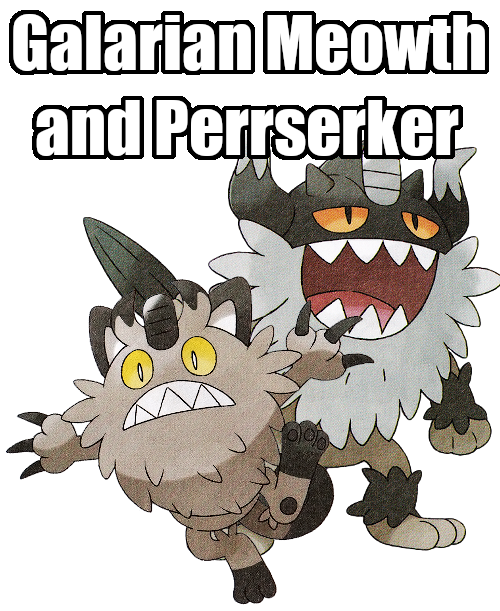
Let’s Talk About Pokemon - Galarian Meowth and Perrserker
Okay, change of plans. Since it is now mid-January; two whole months after the dang games have come out and we STILL don't have good and high-quality official artwork, I'm gonna have to make due with the middling quality scans we have at the moment. Especially since SwSh are now getting DLC updates that are introducing even more new Pokemon. Though I'm gonna wait on the DLC to come out before I go over those.
I had also said something about the reviews having a little more “oomph” this time around. That's sadly not gonna be happening like I thought it was. I WAS gonna go full-on animation critic since animations have become such a big deal to Pokemon lately and judge all the noteworthy animations the Pokemon have, but sadly all the sprite resources I usually use don't have such things uploaded as of yet. And I can't find them out in the wild cause good luck googling “Sword and Shield/Gen 8 Animations” without just finding a giant wall of that goddang gif of Scorbunny using Double Kick. But it might be something I might come back to in the future, anyways. I'll still point out some nice animations if I happen to have decent gifs of them.
I will also be putting a bit more effort into analyzing these designs either way. Especially when we get to the completely new Pokemon. Doing a personal project that involves designing a LOT of my own monsters has seen me pay a lot more attention to smaller details and such. With me for the most part getting more in-depth about the designs of these things, I'm gonna move to a thrice-a-week schedule. Once on Monday, Wednesday, and Friday.
FINAL BIT: The order of operations here. We'll be touching on Galarian forms first (obviously), including their new regional evolutions. After we're done with them, we'll hit on the Gigantamax forms of pre-existing Pokemon, and then once we've reviewed Gigantamax Melmetal, we can finally move onto Gen 8 itself with Grookey.
ANYWAY
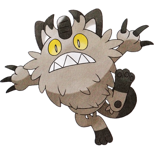
Galarian Meowth:
Ahhh, feels good to just review a single Pokemon again. Today we're starting our Galarian adventures with none other than the new batch of regional variants! Would you get a load of that cat!! It's quite a step up from Meowth's Alolan counterpart, which was little more than a recolor. This crazy new spin on our old friend sports what is reasonable to assume a big fluffy coat over its body. But if you were to turn this Pokemon to its backside...
Nah, that's no fluff. It's a stinkin BEARD. Talk about a facelift! Indeed, a lot of the regional variants this time around feel a lot more differing from their original selves. Alolan Regionals definitely suffered from a little too many of them just boiling down to being a different color with some extra bits added on here and there. Galar opts to be a bit more adventurous with the concept. Meowth's whole attitude shifted here! Easily my favorite part about it are those big yellow eyes and that wide, toothy grin that makes it look like a mini-Totoro.
So, what type is the bearded, gray-tinged Meowth then? None other than Steel, OBVIOUSLY. Nah, that one caught me off guard when I first found out about it. It's definitely a type that makes more sense after it evolves, but it could still at least make sense for a Meowth given the emphasis on the coin on its forehead. Though the Pokedex states that the way Galarian Meowth came to be was Meowth sailing the seas on boats hardened its fur, turning it into the Steel type. I know Pokedex states some pretty sketch pseudoscience but even THAT seems like a hilarious stretch.
So like, is a regional variant of Meowth going to become a new tradition in the same vein as every generation having a Pika-clone? I can't say I'd mind it, honestly. While Meowth is from Gen 1 and Gamefreak is notorious with shouting out Gen 1 all the time, I feel like Meowth has just enough of a downplayed popularity that it doesn't feel overly egregious to do this as say, booting out Venusaur and Blastoise but Charizard not only returns but gets a whole new dang form to go with it. I just hope it won't mean no more new feline Pokemon, or that other feline Pokemon are being bullied out of getting their own regional variants. Just saying, Glameow and Purrloin could REALLY use a fresh coat of paint.
But either way, it'd help bolster the number of cat species represented in Pokemon as a whole too. There's countless domestic cat breeds that could all see some fun interpretations if you just took those animals and turned them into a different shape of Meowth. Meowth on its own is just a solid cat design, y'know?

863: Perrserker
Galarian Meowth, shock of all shocks, doesn't actually evolve into a Galarian Persian at all, but instead becomes an entirely new Pokemon, Perrserker! And do I adore this concept. The idea of giving past generations Pokemon new evolutions (neverminding Sylveon) hasn't been seen since Gen 4 over a decade ago. Regional evolutions is a really neat way to bring the idea back! And in a way that grants so much more room to still be able to create future iterations. It feels like every Pokemon that has an original form that's much nicer than its evolution now has a second chance at getting a better evolution to its name.
But even so, wow this Pokemon in particular feels. Weird. Weirder than all the other Regional Evos this gen. After years on top of years on top of years of knowing Meowth evolves into Persian, not only do we get a new split evolution. But said split evolution rather than looking ANYTHING like Persian at all elects to be Bigger Meowth. The other Galarian form that turns into a split-evo, Yamask into Runerigus, you COULD reasonably mistake Runerigas for just being Galarian Cofagrigus. Which only makes Perrserker look even funnier to me from a metacontextual level. Is that just me? Might be, I dunno.
Admittedly Perrserker had to grow on me. My main turn-off was the fact that it very clearly has lost its ears, and replaced them with a metal helmet with stereotypical viking horns. It's so unsubtle they even just up and call it a “Viking Pokemon” in its classification. (Though note, vikings never actually wore helmets with horns on them due to how hilariously impracticable they are in battle. But pop culture is a powerful beast, so horned helmets be the signifier for vikings.)
And to solidify its design together, it has retractable claws, but when the claws are extended they become sword-like and merge into one. AND of course, Perrserker gets its name from Berserker, a class of viking with a particular bloodlust caused by a lack of empathy and a drunken rage. Clearly shown in how its attack animations feature its eyes rolling into the back of its head. One last little detail bringing it all together is how it has tufts of fur on its arms and legs, not unlike viking warriors who wore fur this way for obvious keep-warm reasons.
In the end, it's A LOT to get used to, and the lack of ears still puts me off somewhat. If it were me making a viking version of Meowth like this, I'd probably put ear holes ON said horns or something, but whatever. I'll probably just get used to it. But I do like the design in the end. Its face is great and is yet another Pokemon that is unfairly called “ugly” even though that's the point of some of these things. Not all animals are pretty, cute, or cool! Some are just downright unappealing looking and that's fine.
I do also like that it's a Pokemon with a more lowkey color scheme. Not that I think the majority of Pokemon being bright and colorful is a bad thing but color schemes like these definitely feel like a minority these days.
A solid pair, overall! Certainly takes a lot of unsuspected turns, but I like that direction when approaching regional variants. It’s like a whole new flavor of Meowth!

Personal Score: 8/10

29 notes
·
View notes
Last Seen Blogs