#visualstorytellingtips
Explore tagged Tumblr posts
Visit Tumblr Blog
Explore Tumblr blogs with no restrictions, modern design and the best experience.
Last Seen Tumblr Blogs


Fun Fact
Forty percent of Tumblr users are between the ages of 18 to 25.
Photo

ZERO DOLLAR CREATOR STARTER PACK aka THE ULTIMATE FREE KIT FOR CONTENT CREATORS - I’ve learned from questions that come to me that many aspiring content creators are afraid to get started because they feel intimidated by the assumed costs of the business. But content creation doesn’t have to cost a thing. There are free tools you could use to start building your content creation empire immediately. In this post, I laid them all out, categorized by function. From design to video and insights, this post covers every tool you need for a balanced content creation eco-system. And they’re all completely free! I hope it gets you along your way on building your content creation empire. DM me and let’s get your visual content soaring. • • • • #visualstorytellingtips #contentisking #tellvisualstories #creativeconsultants #futurwolfpack #creativeresources #digitalcreator #freecontenttools #freecontentideas #contentideas #visualcreator #contentcreators #visualstoryteller #visualstorytelling #contentcoach #contentstrategy #hersuccess #storytellingcoach #creativecoach #creativeinspiration #influencercoach #socialmediacoaching #creativemotivation #bizofdesign #designprofessional #socialshrey (at Social Shrey) https://www.instagram.com/p/CEZN7n3FkTy/?igshid=7ngbkr3gobps
#visualstorytellingtips#contentisking#tellvisualstories#creativeconsultants#futurwolfpack#creativeresources#digitalcreator#freecontenttools#freecontentideas#contentideas#visualcreator#contentcreators#visualstoryteller#visualstorytelling#contentcoach#contentstrategy#hersuccess#storytellingcoach#creativecoach#creativeinspiration#influencercoach#socialmediacoaching#creativemotivation#bizofdesign#designprofessional#socialshrey
0 notes
Text
5 Trends and Rules of Visual Storytelling that Designers Must Follow

Visual storytelling is a fundamental part of the web and graphic design, yet it seems that many designers – even experienced ones – often underappreciate the power of visual storytelling. Here are five trends and rules of visual storytelling that designers must follow.
#1 Show, Don’t Tell
This rule is actually applied in many industries including the sphere of design. But while it is an obvious rule for journalists and filmmakers, it might seem a bit illogical for designers. After all, these people are supposed to work only with visuals, so why would you even recommend showing instead of telling those who weren’t even going to say anything? Well, it is more complicated than you think. The problem is that many designers tend to include tons of text into their work even though they are actually supposed to be primarily focusing on illustrations and images. That’s why it is so important to highlight this rule separately so that working specialists don’t forget about it. Every time you sit down to create another piece of web or graphic design, keep in mind that you have to show rather than tell whatever you want to communicate to your readers. If there is a particular concept you want to convey, try to change it into something visual instead of simply writing it wherever you feel like. You can also use metaphors to help you with this. For example, wordplay can be transferred to illustrations to create eye-catching imagery. If you get the chance to work with such sentences or phrases that use words in such an interesting way, you should definitely incorporate that aspect into your visual work.
#2 Add Some Animated Elements
An interesting trend nowadays is that ads, banners, and other web design elements are converted into something more interactive than they used to be. This is mostly done so that the audience becomes more engaged with such content and they turn from inactive to proactive customers. Of course, animated features in visual content can come in all kinds of forms and sizes. These can simply be a few small elements that move to attract attention or you can turn the entire ad into something interactive (e.g. you have probably seen game ads that let you pass a level of the game before asking you to install it). Think about what kind of animation you believe will be just enough for the design to work. If you use too much, it can be confusing for your audience both visually and logically. This is why it is crucial that you find the golden middle and don’t go overboard with your animation (though it will probably be okay if you don’t use any of it at all). You can take some inspiration from other highly interactive content such as video games (especially the ones that let you choose your own story). Check out what your competitors are doing and analyze how you can use their methods in your own work while trying to improve these practices as much as you can.
#3 Don’t Forget Your Message
While writing professionally, many writers realize that they often tend to stray away from their main topic which results in diluted writing and a lot of so-called “water”. However, the problem is actually more widespread than it seems at first glance because designers suffer from this issue too. It’s very important that you don’t lose focus and remember what your message is. What are you trying to communicate to your readers? What should they take away from your piece of work? What kind of impression are you trying to make? What feelings should your audience have when viewing your design? After you answer these questions, you will know how you should shape your piece so that it keeps close to the original idea and sticks to the original topic. You might also realize that there is some dissonance between the text you use in your design and the illustrations you create which can become a huge problem. Always check that every element of your piece corresponds to each other and makes sense when they are put together. Just make sure that you don’t get yourself in an awkward situation when you have to explain the meaning of certain elements that seem to be at odds with everything else.
#4 Add Conflict
Most ads try to only send a positive message and focus solely on the “good vibes”. Of course, it is quite logical that companies want to be associated with something good but adding conflict can actually improve your pieces and show that you are not afraid to do something innovative with your designs. Address the issues your customers have instead of trying to avoid them. Show that you are not afraid to face these problems and actively try to solve them. This will also help you to improve the levels of customer loyalty and the reputation of the brands you create your designs for. But adding conflict is only half of the job. You should also be able to resolve this conflict logically and show a good way out of the situation. After all, you don’t want to come off as simply mean with your remarks. You must be the one to propose whatever there is that will show that you are not only considerate about customer problems but actively solving them. A good idea would be to do some research and find out what your customers are mostly worried about or what kind of complaints they have concerning your startup. If you can find these pain points and determine how you will approach them, your potential customers will turn into clients.
#5 Include Human Elements
Last but not least, consider including some human elements in your work. These will positively influence the impression viewers get from seeing the design. You could even say it is somewhat similar to the aforementioned tip about animated elements because human elements can also improve your design to some extent. Humans are social beings which means including human elements like faces, hands, and so on into your designs will unconsciously attract viewers to your design. Even though they might not realize it at once, they will actually be drawn towards such imagery. If you don’t want to make the illustration too detailed, try to make it minimalist. For example, using geometric shapes and only creating silhouettes can also be quite useful for your piece of work. That being said, human faces are perhaps the most effective body part to show in ads according to numerous studies. But no matter which human element you decide to show in your designs, make sure that it looks natural and logical wherever you place it. You wouldn’t want to confuse your customers (like the case with too much animation). Just make sure you think everything through and maybe even run some tests and get feedback on your work.
Final Thoughts
To sum up, trends and rules of visual storytelling should not be ignored if you want to become a more successful designer. Make sure to follow the tips in this article to improve your skills and perfect your craft. Read the full article
#5TrendsandRulesofVisualStorytellingthatDesignersMustFollow#GraphicDesign#howtousevisualstorytelling#ThePowerofVisualStorytelling#VisualStorytelling#visualstorytellingtechniques#visualstorytellingtips#WebDesign
0 notes
Photo

STEP-BY-STEP TIPS FROM ZERO TO 3000 - I joined the carousel community without an agenda. But this meant I was open to experimenting and learning as I go. About two months later, here I am. And this post is about the tips I’ve picked up along the way. In general, build community. Surrender to the process. Be open minded. Have fun! I hope these get you along your way to growing your community. DM me and let’s get your visual content soaring! Follow for more visual storytelling tips & ideas @social_shrey • • • • #visualstorytellingtips #tellvisualstories #contentisking #etsysellersofinstagram #creativeconsultants #creativeresources #futurwolfpack #audiencegrowth #visualstorytelling #visualstoryteller #digitalstory #digitalstorytelling #socialproof #contentcoach #storytellingcoach #influencercoach #hersuccess #socialmediagrowth #imagecoach #creativecoach #creativeinspiration #creativemotivation #contentcreators #contentcreation #contentstorytelling #digitalcreator #socialshrey (at Social Shrey) https://www.instagram.com/p/CEJsEJSFenE/?igshid=1c668whlipkpq
#visualstorytellingtips#tellvisualstories#contentisking#etsysellersofinstagram#creativeconsultants#creativeresources#futurwolfpack#audiencegrowth#visualstorytelling#visualstoryteller#digitalstory#digitalstorytelling#socialproof#contentcoach#storytellingcoach#influencercoach#hersuccess#socialmediagrowth#imagecoach#creativecoach#creativeinspiration#creativemotivation#contentcreators#contentcreation#contentstorytelling#digitalcreator#socialshrey
0 notes
Text
5 Visual Storytelling Tips to Fill the Top of Sales Funnel

Every new customer begins with the flow of leads into the top of your sales funnel. The more leads you fill the funnel, the more customers you will likely generate. As an inbound marketer, you should know how to leverage the power of visual communications to attract and educate more leads over the time.
Following are 5 visual storytelling tips to drive more traffic to your website and fill the top of your sales funnel. #1: Add more visuals to your existing content It goes without saying that blog is considered a primary method to attract leads to your website via social sharing and organic traffic. Adding visuals to your blog posts can increase your credibility and make your personality shine through. 3 Tips for Turning Blog Posts into Visual Content Turning ordinary blog posts into images, slideshows, infographics or video is a great idea too. SlideShare Best Practices: How to Turn Written Content Into a Winning Deck - Copyblogger From Blog to Vlog - How to Turn Written Blog Posts into Video Blog Posts #2: Turn white papers into a series of infographics If white papers help you build thought leadership, infographics add personal touch to them and make your brand more authentic. And best of all, infographics drive you more traffic which can be turned into qualified leads for your business.

#3: Turn case studies into video testimonials Videos work like a charm when it comes to traffic generation. Instead of boring case studies with little to no visuals on your website, shooting video testimonials can help you build trust and authority. #4: Use explainer videos to talk about your services, how it works, etc Long are the days when you use long-form, text-heavy pages to explain your services and what you can do for your potential clients. Videos are on the rise. A well-crafted explainer video breaks complicated topics into simple, easy-to-understand components with eye-catching visuals and animations helping you connect and deliver your message to the heart of your audience.

#5: Visualize your social media channels Your prospects get bombarded with boring text-based updates all the time, why don’t you stand out with creative, funny pictures or images? Get your creativity to work and wow your audience with visual social posts and updates. The bottom line? You’ll get more shares, likes, comments and referring traffic for your content marketing efforts.

Top Picks this Week from THE SEEN – Visual Inbound Issue 006 Each week, we sort through the huge pile of latest news in visual inbound marketing, social media and technology and select the most trending, informative pieces for you. And here is visual inbound issue of this week: Visual Marketing & Social Media The 10 New Rules Of Visual Content Marketing How to Learn Social Media Marketing: 41 Resources for Beginners Best Visual Marketing Apps to Create Social Media Graphics Marketing Technology & Tools 9 Great Tools to Help You Write & Edit Blog Posts Better 20 Must-Have Tools for Clever Marketers 14 Tools & Resources for Conducting Market Research
Weekly visual inbound practical tips, tactics and insights delivered to your inbox
* indicates required First Name * Last Name * Email Address * Website // Read the full article
#5VisualStorytellingTipstoFilltheTopofSalesFunnel[VisualMarketingInsightIssue006]#onlinesalesfunnel#visualcontentmarketing#visualmarketinginsights#visualstorytellingtips
0 notes
Text
How to Create Visual Marketing for the Entire Sales Funnel

Most B2B companies I know just put some explainer videos at the top of their sales funnel and wait, do you? This is a big mistake as video and other visual content don’t end at the top of the funnel, they can do much more. 9 Examples of Video for Demand Generation - Vidyard Let’s take a look at visual content mix you can create for the entire sales funnel.
The Top of the Funnel The main job of visual content at the top of the funnel is to drive as much traffic as possible. For this reason, infographics, interesting quotes, funny comics, memes and informative videos are a good mix to attract visitors to your funnel. The topics you can talk about can be: How-to visual content. Repurposed webinar content. Thought leadership interviews and discussion. Content about company culture. Remember to use compelling CTA (call to action) to tell these visitors to do what you want them to do or simply guide them to your website for further action. The Middle OK, so now you have visitors to your website who show some interest in your company and products. What next? The middle-funnel content is all about educating and building trust. Visitors are in “evaluation stage” so they keep looking for more information, comparing and weighing among many solutions. To help them determine if you’re a good fit, following are some visual content you can produce: Detailed product demo videos. Videos of keynotes, speaking engagements or client testimonials. Case studies in forms of videos or infographics. In-depth visual blog posts. Videos about your products in action showcasing how customers can integrate your products with their business and other services. In this stage, try to be personal as people trust people, not organizations. Visual Content at the End It’s time to close the deal. At this stage, your visual content strategy should focus on overcoming final objections and convincing prospects to make a purchase. Instructional videos covering any issues or concerns about your products/services that you think customers might have. More in-depth visual blog posts or articles. Infographics with input from your current customers or brand advocates. Client testimonials in audios or videos. No matter what visual content you produce for each stage of your sales funnel, one thing you should remember is: Always put customers in mind. Top Picks this Week from THE SEEN – Visual Inbound Issue 008 Each week, we sort through the huge pile of latest news in visual inbound marketing, social media and technology and select the most trending, informative pieces for you. And here is visual inbound issue of this week: Visual Marketing & Social Media Why use Visual Communication in your Content Marketing Strategy? 5 Ways Infographics Can Strengthen Your Sales Funnel How to Start a Pinterest Board That Succeeds | Marketing Technology & Tools Top 7 Online Tools to Create Visual Content that Engages The Best SEO Tools – 2015 Edition Social Media Tools That Help Optimize Your Time | #mc_embed_signup{background:#fff; clear:left; font:14px Helvetica,Arial,sans-serif; } /* Add your own MailChimp form style overrides in your site stylesheet or in this style block. We recommend moving this block and the preceding CSS link to the HEAD of your HTML file. */
Weekly visual inbound practical tips, tactics and insights delivered to your inbox
* indicates required First Name * Last Name * Email Address * Website (function($) {window.fnames = new Array(); window.ftypes = new Array();fnames='FNAME';ftypes='text';fnames='LNAME';ftypes='text';fnames='EMAIL';ftypes='email';fnames='MMERGE3';ftypes='url';}(jQuery));var $mcj = jQuery.noConflict(true); Read the full article
#HowtoCreateVisualMarketingfortheEntireSalesFunnel#HowtoCreateVisualMarketingfortheEntireSalesFunnel[VisualInboundIssue008]#onlinesalesfunnel#visualcontentcreation#visualstorytellingtips
0 notes
Text
Steps to Turn Fact-driven White Papers into Compelling Infographics

In the previous issue of our visual marketing insights, we talk about turning white papers into a series of infographics to get the most out of your content efforts. 5 Visual Storytelling Tips to Fill the Top of Sales Funnel Business who market with infographics grow in traffic an average of 12% more than those who don't.

Today, we show you steps to turn fact-driven white papers into compelling infographics. Step 1: Choose your white paper with clear storyline and key milestones Step 2: Break it down into smaller components Step 3: Highlight your story, what do you want your audiences to remember? Step 4: Clarify your message with appropriate visuals and data Step 5: Choose your style, fonts, and colors to best deliver the message Step 6: Putting it all together Step 7: Publish this new infographic on your blog Step 8: Be social and sharing Step 9: Distribute your infographic to other websites and directories Step 10: You’re done. Waiting for traffic to roll in.

Are you infographic lovers? Following are some infographic related resources that you may find interesting: Infographic Inspiration Infographic Inspiration Infographic Templates Infographic Templates - THE SEEN Download Free Powerpoint Infographic Templates

Read the full article
#turnwhitepapersintoinfographics#visualcontentmarketing#visualmarketinginsights#visualstorytellingtips
0 notes
Text
5 Ways Infographics Can Strengthen Your Sales Funnel

Last week, we show you steps to turn fact-driven white papers into infographics. Steps to Turn Fact-driven White Papers into Compelling Infographics If you have successfully turned your premium content like white papers and ebooks into infographics, the next step is to maximize the results they can generate. Today, I want to discuss about 5 ways infographics can help strengthen your sales funnel.
#1: Attract traffic to your website Infographics, when putting at the top of your sales funnel help drive more traffic via organic search, link building and social shares. #2: Raise awareness about your business via social media channels In 2014, 39% of B2B buyers identified that they share infographics on social media frequently. (Source) #3: Convert visitors into qualified leads Infographics can be used as your offer for email opt-in or to redirect visitors to your landing page where they are asked to fill in information to receive premium content like white papers or ebooks. #4: Educate and nurture your leads Well-designed infographics about any complicated topics help you educate and build great relationships with opt-in leads in an entertaining way. #5: Surprise and delight your customers Keeping frequent connection with your customers is a great way to grow your business. Infographics can be your secret weapon to attract more interest and generate delight from your current customers, build trust and finally turn them into brand advocates. 5 Ways Infographics Can Strengthen Your Sales Funnel from Catherine Pham Are you infographic lovers? Following are some infographic related resources that you may find interesting: Infographic Inspiration Infographic Inspiration Infographic Templates Infographic Templates - THE SEEN Download Free Powerpoint Infographic Templates

Read the full article
#5WaysInfographicsCanStrengthenYourSalesFunnel[ActionableTipstoInfographics]#onlinesalesfunnel#visualcontentmarketing#visualstorytellingtips
0 notes
Text
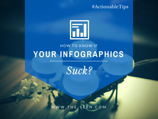
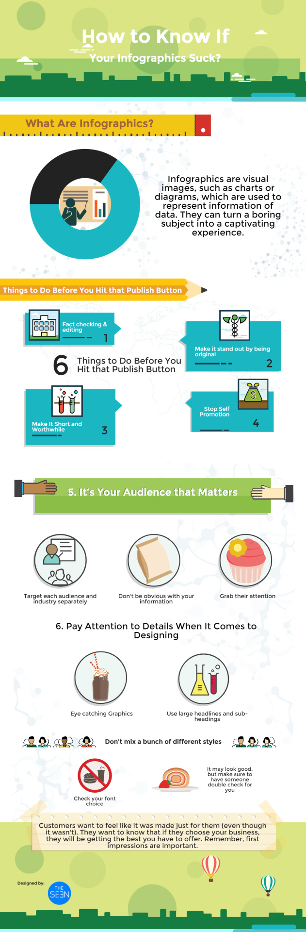
How to Know If Your Infographics Suck?
Infographics are visual images, such as charts or diagrams, which are used to represent information of data. They can turn a boring subject into a captivating experience. Visually, they should be engaging, contain a subject matter that is appealing to your audience and be supported by other engaging content. The best ones are entertaining. Unfortunately, sometimes you can try too hard with your Infographics. Here are 6 tips you should follow before you hit that “Publish” button to make sure your Infographics don’t suck.
Fact Checking Some of the easy things to do to make your Infographics bad can be simple. One of the biggest mistakes is not fact checking and editing. Make sure to have your work checked over and over again for misspellings and wrong word usages. Your potential customers can see this data and make their decision whether or not they should trust the service you offer. Make It Stand out Don't make your Infographics like everyone else. Be original. Choose your color scheme with thought. You want your colors to pop but you also want it to be a good color combination. Stop Self Promotion Don't spend too much time talking about your services or product. Believe me; you can scare your audiences off this way. Make It Short and Worthwhile You don't want your Infographics to be too long. You don't want it to be too busy, with so much happening at the same time because it draws a person’s focus from where you want it to be. Don't spend a lot of time trying to explain it. Make it short and sweet and to the point. Make sure when you have something to say you make it interesting and understandable. Don’t confuse your audience. It’s Your Audience that Matters Try to target each audience and industry separately. If your business is marketed for multiple industries, try to have something specific for each. Make sure your audiences don't already know what you are going to say. Don't be too obvious with your information. Try using unusual tactics to explain things and grab their attention. Pay Attention to Details When It Comes to Designing For your graphics, make sure you don't skimp. You want graphics but not too much. It should be eye catching and somewhat subtle. You want to grab your customers’ attention but in a tacky way. Make sure your headline grabs attention. Don't mix a bunch of different styles. You don't want to risk throwing the potential customers off. Check your font choice. You may think it looks good but you should still have someone else look it over. Use large sub-headings. Last But Not Least Customers don't want to feel like it is jumping out to get them all at the same time, they want to notice the important things. That said, use sub-headings to grab their attention. If they find it interesting, they’ll want to know more. Customers also want to feel like it was made just for them (even though it wasn't). Most of all, they want to know that if they choose your business, they will be getting the best you have to offer. Remember, first impressions are important.
Are you infographic lovers? Following are some infographic related resources that you may find interesting: Infographic Inspiration Infographic Inspiration Infographic Templates Infographic Templates - THE SEEN Download Free Powerpoint Infographic Templates

Read the full article
#HowtoKnowIfYourInfographicsSuck[ActionableTips]#infographicmarketing#visualcontentmarketing#visualmarketing#visualstorytellingtips
0 notes
Text
Why Should You Incorporate Video Marketing into Your Inbound Strategy?

The number speaks for itself Every day, 100 million internet users watch an online video. 80% of online visitors will watch a video. By 2017, it is predicted that 74% of all internet traffic will be video. Video content in search engine results are becoming more useful According to a study completed by Forrester, websites using good video marketing strategies increase their chances of being ranked on the first page of Google by 53 times. Videos can be used by any size business to maximize visibility and to stand out Using video annotations, video rich snippets and custom thumbnail images can be fairly inexpensive and can be completed on a small budget if done correctly. More creative, please! Video marketing should be innovative with fresh and engaging ways to develop content that effectively connects to your target audience. Nowadays, videos can reach worldwide and have become like prime-time to business but all the time. 80% of online visitors will watch a video compared to 20% who will read the entire content. Videos make you feel emotions quicker. Websites with video content can hold a viewer's attention for more than 2 minutes on average compared to websites with no video content. Because videos are considered a content asset to your website and every business strives to stand out, the more popular your video becomes, the more natural links and embeds you'll see across the internet. With videos, you can: Make corporate culture videos to communicate who you are as a company. Tell about your brand milestones and goals (try to use testimonial videos and case studies). Use your videos for instructional purpose. Explain how your products/services make your customers' life easier. And remember to always: Develop a deep library of videos. Make things clear to your viewers. Top Picks this Week from THE SEEN Each week, we sort through the huge pile of latest news in visual inbound marketing, social media and technology and select the most trending, informative pieces for you. And here is visual inbound issue of this week: Visual Marketing & Social Media Why Do I Need #HubSpot? A Revealing Study of 14 #InboundMarketing #Campaigns http://t.co/jRopQJ3eaE @OverGoStudio… pic.twitter.com/bY8aryQxy6 — THE SEEN (@Infographicb2b) July 29, 2015 Best 100+ #Free #SocialMedia #MarketingTools For #Business http://t.co/CMZAp8IhEc #socialmediatools pic.twitter.com/X0x3xvQUeP — THE SEEN (@Infographicb2b) July 27, 2015 How to Master #ContentMarketing on #LinkedIn http://t.co/28On3mVfIS #visualcontent #visualinbound #inboundmarketing pic.twitter.com/qCxoJvfz80 — THE SEEN (@Infographicb2b) July 22, 2015 Marketing Technology & Tools Top 7 #OnlineTools to Create #VisualContent that Engages http://t.co/ZPtE2kYutd #marketingtools pic.twitter.com/4vU6sLCTis — THE SEEN (@Infographicb2b) July 27, 2015 7 less well known #SocialMedia #Management #productivitytools http://t.co/gVqEvSnQY1 #socialmediamarketing pic.twitter.com/dz0IXgrRd8 — THE SEEN (@Infographicb2b) July 20, 2015 #GoogleAdWords Adds Bidding #Tools For #TargetCPA And Target ROAS http://t.co/PmGlSNqp1U #ppc #paidads pic.twitter.com/ty4UI8PiZw — THE SEEN (@Infographicb2b) July 20, 2015
Weekly visual inbound practical tips, tactics and insights delivered to your inbox
* indicates required First Name * Last Name * Email Address * Website // Read the full article
#videomarketing#visualcontentmarketing#visualinboundmarketing#visualstorytellingtips#WhyYouShouldIncorporateVideoMarketingintoYourInboundStrategy
0 notes
Text
Top 7 Effective Visual Content That Boosts Your Brand Awareness and Engagement

Let’s face it. We marketers are doing our best to find new ways to get in front of potential customers, engage them, build strong relationship with them and finally convert them. However, the competition out there is huge and tough. If not done well, our messages can never be delivered and our voices can never be heard. Visual content appears as a solution to this battle. That said, visual content not only captures the attention of your audiences from the first time but it also engages them and makes them share it with their friends and family. To make your brand stand out and be seen you need to be aware of client and customers likes and dislikes. Know your market and what they want and need. Some of the best ways to do that are Infographics, animated videos, visual blog posts, slideshows, photos, visual guides and comics, cartoons and memes. While no brands can live and grow without their loyal customers, we believe that visual content is the strongest weapon the creativity can give you to build your loyal customer base even when you are new in your industry. Following top 7 effective visual content can help boost your brand awareness and engagement.
1. Infographics Internet has changed our life and the ways we learn and work today. The good thing to this is that it’s never been easier to search for information and learn new skills. The bad thing is we are overloaded. We’re drowning in words. Fortunately, Infographics come to life as a perfect solution. It helps us pack relevant information neatly in one piece of stunning design. 60,000 Visitors and Counting: How to Double Your Traffic With Infographics Top 10 Free Online Tools to Create Your Infographics from Catherine Pham Infographics are visual images that represent information of data. It is one of the most popular tolls and you don't have to spend a fortune. Facts should be checked and any information used should be as accurate as possible. Know your target audience and focus on it. You want them to understand what you are trying to inform them of so make sure to keep the information as simple as you can. Be original and try to stand out. The first impression a potential customer or client has is your information. Let them see what you offer and help them understand it. Infographics help you present complex information in a simple way. 2. Animated Videos Animated videos can be attention grabbing. They can also be used during presentations. These animations can be created with PowToon which is fairly easy to use. With animation, you can create anything from slideshows to comics and cartoons. 3. Visual Blog Posts As humans, we are wired for visuals. It is just an automatic habit to look at anything visual first. Bloggers are getting more engagement per user, more leads and more followers when using visuals. Creating great visual components using logos, charts, images and graphics dominate blogs. Be sure not to create a visual just because you want to showcase one on your website. 4. Slideshows Slideshows can be used for many things. Creating a photo slideshow can show your customers and clients your product or service in action. Using slideshows during presentations can grab your audience’s attention. Be sure to have accurate information and that the quality of any photo you use is good. Haiku Deck is a great tool to create stunning presentations. 5. Photos General Electric uses very powerful photos for marketing while the Square uses simple yet stunning photography. The quality of the image is more important than the product-specific information. Try to avoid using stock images when possible. Along with your photos, use quoting tools (like Quotery) to stand out and make good impression. You can also use editing tools to add words and phrases on the photos. 6. Visual Guides We have always been drawn to the drawings Drop Box uses. They are pencil like drawings with bright colors and visible line strokes. We believe it was brilliant when they started this concept. Help Scout uses vector images. Adding these to a photo or drawing is a great attention grabber. Try creating your own stock image and adding a vector to it. 7. Comics, Cartoons and Memes American Marketing Association uses cartoon drawings to humanize the brand. Creating a personalized cartoon character or images is a great way for a company to add humor. Top Picks this Week from THE SEEN Each week, we sort through the huge pile of latest news in visual inbound marketing, social media and technology and select the most trending, informative pieces for you. And here is visual inbound issue of this week: Visual Marketing & Social Media 5 Simple Ways to Optimize Your Website for Lead Generation 5 Little Lead Generation Experiments You Can Run Right Now 14 Ways to Increase Your Clickthrough Rate on Twitter Marketing Technology & Tools Automated Tools To Help Local Businesses Tackle Online Marketing Automated Webinars May Be the Tool You Need to Scale Your Marketing Efforts 10 Marketing Automation Hacks All Businesses Should Be Using Read the full article
#visualcontentcreation#visualcontentmarketing#visualinboundmarketing#visualmarketinginsights#visualstorytellingtips
0 notes