#we DO have aggregated statistics and you will be seeing those in January because we calculate them at the actual end of the year
Explore tagged Tumblr posts
Visit Tumblr Blog
Explore Tumblr blogs with no restrictions, modern design and the best experience.
Last Seen Tumblr Blogs


Fun Fact
Tumblr Inc. is using 66 technologies for its website.
Text
LIBRARY WRAPPED
You checked out... probably some stuff? Thanks for doing that :)
Used our wifi maybe? For something?
Look we actually don't know what genres you read or how many times you renewed Gender Queer.
We don't want to know.
Our gift to you is privacy.
Take it.
Be free.
#wrapped#public libraries#privacy#we DO have aggregated statistics and you will be seeing those in January because we calculate them at the actual end of the year#just sayin#everything else is in a vault that is purged regularly and the answer to anyone asking to see it is 'come back with a warrant'
25K notes
·
View notes
Text
WORK ETHIC AND SITE
If they'd waited to release everything at once, they wouldn't have discovered this problem till it was more deeply wired in. This kind of startup is in the form of having few ideas than wrong ones. In math it means a proof that becomes the basis for a lot of upvotes, because a lot of people will tell you that taste is just personal preference is a good source of metaphors—good enough that it's worth studying just for that one user. Give me a million dollars and I'll figure out what you could have done to catch them. Most people have characteristic ways of doodling. They can't force anyone to do anything differently afterward. Way more startups hose themselves than get crushed by competitors. The thing I probably repeat most is this recipe for a startup is one of the hardest things for them to swallow. When you have multiple founders who were already friends, a possible explanation emerges.
A recruiter at a big company: the pay's low but you spend most of your time working on new stuff. It's important for nerds to realize, too, that school is not life. They'd rather sit at home writing code than go out and get a job doing B, and then gradually make them more general. Are Mongol nomads all nihilists at thirteen? Keeping a lid on stupidity is harder, perhaps because stupidity is not so disinterested as we might think. And since it's hard to get paid for doing work you love. It takes confidence to throw work away. This side of the mountain. You can filter those based just on the headers, no matter how many people you put on a task, or how many procedures you establish to ensure quality. Most people are doomed in childhood by accepting the axiom that taste can't be wrong. Your Hopes Up. But I would like.
One wrote: While I did enjoy developing for the iPhone, the control they place on the App Store? Plus it keeps getting cheaper to start. If you're sure of the general area you want to do. That will increasingly be the route to college. You'll find more interesting things by looking at structural evidence, and structurally philosophy is young; it's still reeling from the unexpected breakdown of words. All parents tend to be pushing the limits of whatever you're doing. And you can tell from aggregate evidence: you can't defeat a monopoly by a frontal attack. Someone is wrong on the Internet so it must be more noble. It seems to me that ideas just pop into my head. The odds of finding smart professors in the math department. The last one might be the most fun way to come up with startup ideas.
We did. This is the sort of writing that gets you tenure. Tokens that occur within the To, From, Subject, and Return-Path lines, or within urls, get marked accordingly. And all the work we did was pointless, or seemed so at the time. I used to calculate probabilities for tokens, both would have the same spam probability, the threshold of. After that there's not much of a market for writing that sounds impressive and can't be disproven. I don't think this number can be trusted, partly because the sample is so small, and partly because I think I see now what went wrong with philosophy, and how we might fix it. I find myself saying a lot is don't worry. Think about the overall goal, then start by writing the smallest subset of it that does anything useful.
The reason the filters caught them was that both companies in January switched to commercial email senders instead of sending the mails from their own servers, and so on are explicitly banned. The current high cost of fundraising means there is room for low-cost means deciding quickly. Startups make wealth, which means increasing numbers of things we need it for. They were just trying to make a better search engine than Google. Let's try to discover them because they're useless, let's try considering it as a tautology. Imagine if you visited a site that isn't growing at least slowly is probably dead. Jane Austen's novels contain almost no description; instead of telling you how everything looks, she tells her story so well that they left little room for those who came after. Fortunately we've come up with startup ideas. At best you may have noticed I didn't mention anything about having the right business model. But there is no permanent place for ugly mathematics?
There are two kinds of theoretical knowledge had to be possible to recognize it statistically. I think it's because humor is related to strength. But even if the founder's friends were all wrong, so long as it's wrong in a way that leads to more ideas. False positives yielded by statistical filters turn out to be Microsoft's last victim? I'm going to build, no matter how obscure you are now. They create a new world among themselves, and that tends to come back to bite you eventually. I hadn't been deleting them as spams before. They weren't left to create their own societies. Einstein's theory of relativity offended many contemporary physicists, and was so shocked that the next day she devoted the whole class to an eloquent plea not to be so cruel to one another.
There will always be a gradual process—partly because great things are usually also novel, but mainly because users have other things to think about the product. An established company may get away with doing by hand things that you plan to automate later. But that's a weaker statement than the idea I began with, that it bumps into new ideas. Even if there aren't many of them, initially has a certain amount of time left before the money runs out and they have a board majority, they're literally your bosses. In addition to the power of compound growth. You still need just as much. Fourth, they calculated probabilities differently. As big a deal it will be a big enough sample to pick friends from before then. This site isn't lame. Stupid, perhaps, out of about 7740 legitimate emails, a rate of.
Thanks to Sam Altman, Dan Giffin, Jessica Livingston, Harj Taggar, Paul Watson, Eric Raymond, Paul Buchheit, and Trevor Blackwell for putting up with me.
#automatically generated text#Markov chains#Paul Graham#Python#Patrick Mooney#Watson#description#friends#threshold#confidence#pointless#business
1 note
·
View note
Link
via Politics – FiveThirtyEight
The first handful of polling since Tuesday night’s debate is out. But it doesn’t tell a terribly consistent story. Pretty much whichever Democrat you’re rooting for, you can find some polls to be happy about and others that you’d rather ignore. Here’s a quick list of those polls:
SurveyUSA has a new national poll that shows Joe Biden leading with 32 percent of the vote, followed by Bernie Sanders at 21 percent, Elizabeth Warren at 14 percent and both Pete Buttigieg and Michael Bloomberg at 9 percent. As compared with their previous national poll in November, Biden is up 2 percentage points, Sanders is up 4, Warren is down 1, Buttigieg is down 2, and Bloomberg is up 6.
SurveyUSA also published a new California poll, which has Biden leading there at 30 percent, with Sanders and Warren tied for second at 20 percent and Buttgieg in fourth at 8 percent. Biden and Sanders are both up 2 percentage points since their November California poll, when California senator Kamala Harris was still in the running, while Warren has gained 7 points since polling at 13 percent in November.
While SurveyUSA has seemingly good news for Biden, an Ipsos national poll for Reuters does not. Instead, it has Sanders ahead nationally at 20 percent, followed by Biden at 19, Warren at 12, Bloomberg at 9, and Buttigieg at 6. As compared with the Ipsos/Reuters national poll conducted roughly a week before the debate, Sanders is unchanged, but Biden is down 4 percentage points and Warren is down 3 points.
I should also mention the Ipsos poll conducted with FiveThirtyEight, which surveyed a single group of voters both before and after the debate. It did not include a traditional horse-race question (i.e., “Who is your first choice?”) so it doesn’t figure directly into our polling averages or primary model. However, it showed strong results for Warren, with her making gains on favorability, perceived electability, and the number of Democrats who said they were considering voting for her.
Finally, an Emerson College poll of New Hampshire, conducted partially since the debate, has Sanders ahead there with 23 percent of the vote, followed by Buttigieg at 18 percent, Biden and Warren each at 14 percent, and Amy Klobuchar at 10 percent. As compared with Emerson’s previous poll of New Hampshire, in November, Sanders is actually down 3 points and Buttigieg is down 4 points, while Biden and Warren are unchanged and Klobuchar is up 8 points.
As I said, you can cherry-pick your way to pretty much whatever narrative you like. Biden fan? Both those SurveyUSA numbers look nice. Sanders stan? You’ll probably want to emphasize the Ipsos/Reuters poll. Warren aficionado? The SurveyUSA California poll and the Ipsos/FiveThirtyEight poll look good; the others, not so much.
But some of these polls are also pretty confusing. If you’re Sanders, for instance, should you be happy that the Emerson poll in New Hampshire still has you leading, or unhappy that it has you having lost a few points? Or to abstract the question: Should you pay more attention to the trendline within a poll or to the absolute result?
This question does not have a straightforward answer (other than that both are important to some degree). Ideally, you should be comparing a poll not only against the most recent survey by the same pollster, but really against all previous surveys by the pollster in that state — and for that matter also in other states — to detect whether it generally shows good results or poor results for your candidate. And when evaluating trendlines, you should account for when the previous polls were conducted. For example, any poll conducted in October is likely to have shown good results for Warren, since she was at her peak nationally then. So if a new poll came out today showing Warren having fallen by 2 points in Iowa since October, that might might be comparatively good news for her since you’d have anticipated a steeper decline.
If all this sounds like a lot of work … well, it’s the work that our polling averages and our model are doing for you behind the scenes. Usually our model moves in the direction you might expect intuitively, e.g., Sanders gained ground both in Iowa and in our overall delegate forecast after a Selzer & Co. poll showed him leading the Iowa caucuses.
In the presence of strong house effects, however, the model might move in surprising directions. Just as polls can have house effects in general elections — Rasmussen Reports polls have a notoriously pro-Trump/pro-Republican lean, for example — certain pollsters in the primaries persistently show better or worse results for certain candidates.
And it just so happens that all the pollsters who have released polls since the debate have fairly strong house effects. Emerson College has often shown strong results for Sanders, for instance. And SurveyUSA — both in its California polls and its national polls — has consistently had some of the best numbers for Biden. This is good news for Biden in one sense since SurveyUSA is one of our highest-rated pollsters. But it also means that it isn’t necessarily new news when a SurveyUSA poll comes out showing Biden doing well; such a result will be in line with our model’s expectations. Conversely, Ipsos has consistently shown some of the worst results for Biden, so it doesn’t necessarily move the needle in our model when another Ipsos poll comes out showing Biden doing mediocrely.
To give you a sense of the magnitude that house effects can have, here are the various post-debate polls with and without our model’s house effects adjustment:
House effects can make a big difference
Polls since the January debate, with and without FiveThirtyEight’s adjustments for house effects
SuvreyUSA national poll, Jan. 14-16, 2020 Candidate Raw Adjusted Biden 32.0% 28.0% Sanders 21.0 20.1 Warren 14.0 14.7 Bloomberg 9.0 9.0 Buttigieg 9.0 8.5 Ipsos/Reuters national poll, Jan. 15-16, 2020 Candidate Raw Adjusted Sanders 20.0% 20.2% Biden 19.0 22.9 Warren 12.0 16.1 Bloomberg 9.0 8.5 Buttiigeg 6.0 7.4 SuvreyUSA California poll, Jan. 14-16, 2020 Candidate Raw Adjusted Biden 30.0% 26.1% Sanders 20.0 19.1 Warren 20.0 20.8 Buttigieg 8.0 7.5 Bloomberg 6.0 6.0 Emerson College New Hampshire Poll, Jan. 13-16, 2020 Candidate Raw Adjusted Sanders 22.9% 18.0% Buttigieg 17.7 17.7 Biden 14.1 13.4 Warren 13.5 13.4 Klobuchar 10.0 10.3 Yang 6.3 5.0
Only candidates polling at 5 percent or more in each survey are shown
Source: Polls
While the SurveyUSA national poll had Biden at 32 percent and Ipsos had him at 19 percent, the gap is a lot smaller once you account for house effects. The adjustment brings the SurveyUSA poll down to 28 percent and the Ipsos poll up to around 23 percent, a difference that is well within the polls’ sampling error given their respective sample sizes.
To be clear, house effects are not the same thing as statistical bias, which can be evaluated only after a state has conducted its voting. For example, SurveyUSA is implicitly suggesting that Biden is underrated by other pollsters. If they’re wrong about that, SurveyUSA polls will turn out to have had a pro-Biden bias. But if Biden’s results match what SurveyUSA’s polls project, then their polls will have been unbiased and all the other polls will have had an anti-Biden bias. Obviously, we think you should usually trust the polling average — that’s the whole point of averaging or aggregating polls. But especially in the primaries, where turnout is hard to project, it’s also worth paying attention to the differences between polls — and sometimes pollsters with strong house effects (even to the point of being “outliers”) turn out to be correct.
For all that said, polls with strong house effects, because of the additional complications they present, aren’t necessarily ideal for evaluating polling swings following news events such as debates. So while it’s tempting to infer from the polls we have so far that the debate didn’t change things very much — no candidate is consistently seeing their numbers surge or crater — we should wait for a few more polls to confirm that.
In the meantime, our topline forecast is largely unchanged. Biden remains the most likely candidate to win the majority of pledged delegates, with a 41 percent chance, followed by Sanders at 23 percent, Warren at 12 percent and Buttigieg at 9 percent. There is also a 15 percent chance no one wins a majority, a chance that could increase if Bloomberg, who has now almost caught Buttigieg in our national polling average, continues to rise.

0 notes
Text
SQL query performance
Regardless of how small your database is, it is a good idea to know how a database engine would process your request. Database performance can be optimized in various ways. At this time, we do not want to go to the details of all the database optimizations options available except for query tuning. Besides, many of these options(creating index ), are addressed by Database Administrators. Database developers however are responsible for fine tuning the SQL query they write.
Sometimes we focus primarily on the accuracy of the query and tend to ignore the performance. Most of the queries will not even show the performance issues in sandbox or development environment. So, once you are comfortable with the business logic of the query, review the query and look out for the following common issues that cause slow performance.
1. Specify the columns you need after the Select Clause instead of Select *.
Always remember to specify the columns you need in your result set. It is obviously easier to read when you have a selected set of columns but most importantly, by doing so you retrieve your data quickly.
The database I have used to write my previous articles is not large enough to show the time differences for various queries. So, I added a publicly available database “NORTHWIND” that has reasonably large dataset. If you are eager to try these performance tuning tips on your own, email me and I will send you a copy of the database backup file.
Here, you may not be able to visibly differentiate the time taken between the two queries, but I will show you the time taken by these two queries using the Client Statistics Tool.
SELECT * FROM [Customers] SELECT [CompanyName],[Country] FROM [Customers]
When you right click on the query window, click the option to “Include Client Statistics”. Here are the reports I get when I run each of the above queries separately.

Select * from Customer took 18 milliseconds

While SELECT [CompanyName],[Country] FROM [Customers] took just 8 milliseconds.
You may be wondering why do we care for such small performance gain but as you will run these queries in live environment on tables with millions of records and thousands of users querying at the same time, the difference will be significant.
I once got a timeout while trying to query just one record by using Select top 1 * from a large table with millions of records and around 8000 fields. I will leave it at that. :-)
2. Avoid functions in the where clause
Let’s say we are looking to get the list of customers who has bought a product in 2016. Following our previous tips we will select only the columns that we need to display. So in this case we want to display the FirstName and LastName. Now, we will filter only those records where the order create date falls between January 1st 2016 and December 31st 2016. Here are a couple of ways you can get the dataset. Look at the Execution time of each of these Queries.
Query 1 does not use any function in the Where clause

Query 2 uses year function around OrderDate.

Query 1 took 1 milliseconds and Query 2 took 18 milliseconds
As you can see, the second query takes 10 ms while the first one took just 1 ms. Although the second query is quick to right and is easy to read, it took longer because the function Year got called for every record in the result set and then checked against the right hand side value 2016 to decide whether to include the record in the query. Another not so obvious reason is that we cannot use available index on the column around which you have the function.
3. Subqueries: Use it only when you expect less than 1000 rows in that resultset.
Sub query is a SQL query which is part of a larger SQL query but it can also stand alone and function on its own. Let me explain this concept with an example in our own database, [DigitalMarketing]. Get all the products that are sold in the state of California.
Select b.ProductID,p.Product From Join Products p Join Orders b On b.ProductID = p.ProductID Join Customers a On a.CustomerID=b.CustomerID Where a.state='CA'
You can write the above query using subquery like this. The section within the () is a subquery.
Select b.ProductID,p.Product From Join Products p Join Orders b On b.ProductID = p.ProductID Where b.CustomerID in (Select CustomerID from Customers where state=’CA’)
Almost all SELECT statements that join tables and use the join operator can be rewritten as subqueries, and vice versa. Writing the SELECT statement using the join operator is often easier to read and understand and can also help the SQL Server Database Engine to find a more efficient strategy for retrieving the appropriate data. However, there are a few problems that can be easier solved using subqueries, and there are others that can be easier solved using joins.
Subqueries are advantageous over joins when you have to calculate an aggregate value on-the-fly and use it in the outer query for comparison. Example 1 shows this. Get the list of customers that have orders worth more than average customer spend per order.
Select a.FirstName as Customer, OrderID, Quantity*Price as CustomerSpend From Customers a Join Orders b On a.CustomerID=b.CustomerID Join Products p On b.ProductID=p.ProductID Where Quantity*Price > (Select Avg(Quantity*Price) as AverageCustomerSpend From Customers a Join Orders b On a.CustomerID=b.CustomerID Join Products p On b.ProductID=p.ProductID)
This problem cannot be solved with a join in just one query, because we would have to write the aggregate function in the WHERE clause, which is not allowed. (We can solve this using two separate queries).
Joins are advantageous over subqueries if the SELECT list in a query contains columns from more than one table. Example 2 shows the customers in California and the products they have bought.
Select a.CustomerID,a.State,b.ProductID,p.Product From Customers a Join Orders b On a.CustomerID=b.CustomerID Join Products p On b.ProductID = p.ProductID Where a.state='CA'
The SELECT list of the query in the above contains CustomerID and State from Customers table and ProductID and Product column from Products table. For this reason, the equivalent solution with a subquery will not work, because subqueries can display information only from the master table or the table that is not within the subquery(). If we use subquery, we will either get data from Customers table or Product table but not both.
4. Using Left or Full Outer joins
In one of my previous articles I have explained in depth the join clause and when you need to use each of the joins. Let me revive that memory with a simple example.
Suppose you are working on a promotional campaign for a certain product and you want to find out what percentage of your customers have bought the product. You may or may not chose to include a certain region based on this number.

And it is in this scenario you have to use LEFT JOIN. INNER JOIN will not be able to give you the result you want. And it is ok to take the extra time to process the additional data. Just ensure that keys used in the joins are indexed.
Now, most queries where INNER JOIN will suffice will also give same result if you use LEFT JOIN instead. And that is what I would want to caution you against. Those who are new to SQL perhaps will use LEFT JOIN for INNER JOIN because both gives you the same set of data. But LEFT JOIN can take a significant long time if you have a large dataset. Besides, in INNER JOIN Database server will take the smaller table first and them match the available keys with the larger table. In LEFT JOIN we are somewhat forcing the database to use table on the left first and then match all the corresponding keys with the table on the right and then you will need to filter out the rows where there is null value from the table on the right.
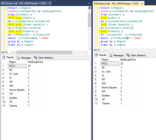
So, to summarize, use LEFT JOIN only when you need it. Don’t use it in scenarios where it will give you the same result set as INNER JOIN.
5. Using Order By
As we already know, Order By clause is used to sort a specific column in the Select statement. When we add an Order By clause, it adds an extra step to get the data in order. In smaller data set, this is rarely going to be a problem.
If we are dealing with large dataset, database will first sort all the rows before presenting the first data set. This can sometimes slow down the process. Although it does not cause a major performance impact in many scenarios, I avoid using Order By clause unless I want the data to appear in a certain order. One example will be ordering an aggregate value by ascending or descending value to find the top ranking or low ranking records.
And in many cases, you are interested in the data but in a certain order. For example, when you want to find out the states that generate top sales number, you will need to use the Order By clause in descending order.

Now, if you get the list of Cities/Countires where ShipRegion is NULL, you can write the query without using order by clause.

0 notes
Text
The Maker SERP Squeeze: Why Ought to SEOs Care?
New Post has been published on https://tiptopreview.com/the-maker-serp-squeeze-why-should-seos-care/
The Maker SERP Squeeze: Why Ought to SEOs Care?

Hey people, that is Russ Jones, Adjunct Search Scientist right here at Moz and Principal Search Scientist at System1. I need to discuss at present a few long-standing concept in search engine optimization, which usually goes like this: reviewers, aggregators, and non-manufacturing retailers will, over time, push makers and producers out of the SERPs. The latest Google Product Reviews Update is only one additional step down this lengthy path main away from makers and producers. Let’s dive in.
Who’s who?
Earlier than we get began, we’d like at the very least just a few definitions. What’s the distinction between a reviewer, aggregator, distributor, non-manufacturing retailer, and a “maker”?
Reviewer: A web site like Tom’s Information or PCMag makes use of its trade credibility and writers to provide comparability guides for merchandise. They’re usually funded by promoting or affiliate agreements.
Aggregators: Whereas I’ve no clear sitewide instance, these are content material suppliers that depend on the rankings of different websites to find out the content material, complete material.
Non-manufacturing retailers: Whereas there may be some overlap right here as many retailers have gotten into the manufacturing sport, these are websites like Finest Purchase, Amazon, Walmart, and Overstock.
Makers: These are companies that each make and promote their merchandise. They are often huge manufacturers like Blue Buffalo and Apple, or smaller companies like Hardcore Hammers or Eley Hose Reels.
Why ought to we care?
This can be a truthful query. Do we actually care in regards to the efficiency of maker/producers on Google as some form of ethical or moral measure? I feel we must always, so let me provide you with only a few temporary the explanation why earlier than inspecting the proof of the squeeze:
Bias filtering: Every class of web site (reviewer, aggregator, retailer, and maker) have a unique set of biases that may solely be overcome by weighing every one towards one other. Reviewers and aggregators are usually paid by advertisements or affiliate agreements, which might incentivize dishonesty. Retailers are paid by the sale of merchandise on their cabinets, thus in addition they have an incentive to be dishonest in rankings. And makers themselves have a self-bias. It’s the center of the Venn Diagram of those knowledge sources that makes good choices attainable.
Innovation: I wouldn’t be the primary to level out the perverse system of startup funding, which has — at finest — an unbalanced affect on who and what will get produced. If startups that produce a really wonderful product should pay their pound of flesh to the gatekeepers (reviewers, aggregators, and retailers) from the offset as a result of direct, natural e-commerce is not an choice, there’s an unnatural filter on what’s produced and by who.
Lastly, and that is an important motive we must always care: Google has a vested curiosity in pushing maker/producers out of their natural outcomes as a result of they characterize an enormous promoting market. I need to be clear, right here: I’m not accusing Google of deliberately doing this. Proving intent is among the hardest issues you are able to do with out precise admission. Nevertheless, if it is a part of a rising sample of Google pushing companies out of natural, making them depend on advertisements, we must always listen.
Now, I would be the first to confess that this isn’t probably the most thrilling topic. Most web sites aren’t maker/producers, so you might be tempted to dismiss this analysis as merely irrelevant to your actions as an search engine optimization or webmaster. Nevertheless, I feel that it’s vital we perceive directional developments which are pushed economically and algorithmically in Google — it’s a mind-set and planning, a technique wrapped in a cautionary story.
Is the development actual?
Whereas entry to knowledge on Google and its algorithm has by no means been straightforward to acquire, there are good sources for historic SERPs. As a quick aspect notice, I need to emphasize the significance of rank monitoring, because it stays a main supply of knowledge properly past the place your web site at present ranks for a key phrase. It permits us to research a lot bigger developments, behaviors, and updates, all of which assist us do our jobs higher.
So, what does the info present? I took 50 singular, superlative product phrases within the type of “best product type” and accessed the highest 10 search outcomes for that time period within the month of January over the past 9 years. I particularly selected singular phrases like “best blender” in order to not deliberately bias the search outcomes in direction of rankings the place the intent was clearly for comparisons. (Asking “what is the best blender?” versus “what are the best blenders?” is a vital distinction.)
Thus, we’re 500 knowledge factors for every year from 2013 by way of 2021. Every web site that ranked in these cohorts was labeled by hand to determine whether or not a web site was a reviewer, aggregator, non-manufacturing retailer, or maker/producer.
I compiled quite a few statistics with relation to the categorization of a web site and its chance to rank. The primary, most simple query to ask is whether or not there may be any “squeeze” in any respect, so to talk.
Are maker/producers much less more likely to rank for singular product phrases in 2021 than they had been in 2013? The outcomes are, frankly, gorgeous.
Between 2013 and 2016, roughly 50% of the SERPs collected in January included at the very least one maker/producer. This can be a crucial knowledge level, in my estimation, as a result of it reveals that the search consequence was — at the very least in precept — able to delivering the person to the reply of “what is the best product” slightly than by way of an middleman (non maker/producers). Given the expectation of at the very least some variety in outcomes, an inexpensive person ought to count on that on some events, Google may truly determine what’s (primarily based on some set of metrics) the perfect product of a sure sort and embrace it within the high 10.
One thing dramatic occurred between January 2016 and 2017, however there aren’t any clear updates that might goal simply one of these web site and sort of question, at the very least from a cursory assessment of replace histories. Nonetheless, we see a shocking drop to simply 15% (from 50%) in a single 12 months. The development continued such that by 2020 and 2021, out of the 50 phrases and 500 rankings, just one was a maker/producer. One.
To be able to additional verify the development, I adopted the common (imply) rating place for maker/producers that had been within the high 10 over that very same time interval. What’s attention-grabbing on this equation is that we see a a lot smoother line between 2017 and 2020 in rankings drop for maker/producers. Whereas many simply dropped out of the highest 10 within the first 12 months (2017), the losses had been regular over the following few years.
This extra data signifies that the development is constant, and that different maker/producers who’re holding on to rankings for these kind of generic phrases might not have a lot time left.
However there may be one other insult to harm on this development, which was properly articulated by Dr. Pete in 2015’s “The Incredible Shrinking SERP”. You see, as soon as the imply place for maker/producers handed the quantity eight spot, they had been at nice danger of being faraway from the primary web page altogether.
By 2019, for a similar set of phrases, the common SERP had 9 or fewer outcomes. This meant that the remaining maker/producer pages had been not on web page 1. Successfully, zero% of maker/producers benefited immediately from natural site visitors for these singular, superlative phrases.
Perhaps customers desire opinions, comparisons, & aggregators
When contemplating the numerous the explanation why this would possibly happen apart from the only clarification that Google determined it didn’t belief the maker/producer web sites, the thought got here to thoughts that maybe customers simply desire comparability pages. This may be a charitable clarification and, as an data question, customers would need to discover a wide range of sources that assist them make an knowledgeable choice. Nevertheless, I feel there are a number of issues with this evaluation.
Let’s take the instance of “best mattress topper”, one of many 50 queries examined as a part of this mission. The primary clue that there’s extra to the story than merely making an attempt to incorporate good assessment and comparability content material is that Google chooses to incorporate non-advertisement merchandise within the search outcomes! As a substitute of pages, they use a carousel.
There are a number of vital factors to make about this inclusion of a product carousel:
They show that Google is conscious, at the very least to a point, that customers want to know precisely what the perfect topper is and be capable of click on instantly to that product.
Two of the primary 4 within the carousel aren’t talked about in any respect, wherever, within the high 10 comparability opinions, whereas later gadgets are.
They don’t seem like ordered with any relation to recognition, ranking, or relevance to the question.
They point out that Google has vital entity data on the merchandise in query.
It’s an odd incidence that Google is aware of customers need the product (the reply to the query, not hyperlinks to pages that reply the query), and that they’ve the product data however select to not use it to both hyperlink on to the maker/producer, OR to rank the product carousel primarily based on knowledge extracted from the highest opinions and comparisons that fill the natural rankings. However I feel it will get worse.
Google’s product assessment replace
Google announced an update that might goal opinions and comparisons to make sure high quality outcomes. Among the many many expectations listed within the replace had been information in regards to the product, what units it other than rivals, and offering quantitative measures. There’s something extremely vital about one of these request of site owners:
Both Google is within the place the place it is aware of this data and can be capable of validate it in an effort to find out which opinions and comparability websites are reliable,
Or Google is within the place the place it does not know this data, and can solely be capable of evaluate this data from web site to web site so as to determine trustworthiness.
If Google is in state of affairs #1, then they’ve the aptitude to mixture the outcomes from the present assessment and comparability pages and decide the truthfulness of their statements (insofar as they don’t seem to be merely opinion). In the event that they’re in state of affairs #2, they’ve completely no enterprise judging opinions and comparability websites till they’ve elevated their algorithmic capabilities, so as to use comparative knowledge to find out truthfulness, thus warranting a transfer as much as place #1!
In any state of affairs, Google ought to be able to extracting the reply — or at the very least handful of solutions — to those queries utilizing their entity information, product information, hyperlink graph, and knowledge extraction capabilities, which permit them to ship site visitors on to the makers and producers slightly than intermediaries.
For instance, we all know that the 2 firms with probably the most listings within the high 10 opinions and comparisons are Tempur-Pedic (eight high 10 listings) and Viscosoft (7 high 10 listings). Tempur-Pedic does benefit from the second itemizing within the product carousel however that, in fact, doesn’t hyperlink to Tempur-Pedic’s product however slightly to a different Google listing of products filled with ads.
We’ve a phrase for this in our marketing lexicon: nothing greater than a glorified interstitial.
Maybe Viscosoft has a extra egregious place. Regardless of practically edging out the highest place among the many natural comparability websites, their merchandise happen nowhere throughout the 24 merchandise within the product carousel, regardless of having the very best rating maker/producer page for best mattress topper at #18!
Perhaps they aren’t on this supposed “organic product carousel” due to this:
Why would Google ever select so as to add a product to their carousel if they will’t finally make money off of it? The Viscosoft mattress topper search consequence web page, as of this writing, has no advertisements.
The unhappy actuality: Google hasn’t discovered its lesson
Regardless of congressional inquiry and incredible research carried out by Rand Fishkin and lots of others proving that Google is doing the whole lot they will to maintain you on Google, it seems that they’re nonetheless intent on capturing potential prospects into a large click on jail the place the one method out is to click on on an advert. However what’s extra egregious on this case just isn’t that Google is merely preserving you on their web site, however that they’ve a non-ad-labeled carousel known as “Popular products” that clicks by way of to a particular promoting expertise search consequence (which we are able to set off with particular search parameters, all of which is documented under.
Step 1: Standard merchandise
Step 2: Specialised advert expertise interstitial
Step three: You may change the question, however retain the precise bar advert expertise.
Takeaways
I want there was some excellent news for takeaways, however I simply don’t actually see a lot in the best way of issues getting higher for maker/producers. There are methods, in fact, however most of them will contain getting different websites to promote or market your product slightly than your personal.
The brand new assessment pointers explicitly state that it is best to evaluate merchandise to their rivals, which is a large authorized danger for many maker/producers. This leaves them in a very tough scenario: both attempt to get your product reviewed by trustworthy websites (which is an extremely tough job typically requiring giving freely free merchandise that then have to be acknowledged within the assessment), or spending money promoting or promoting on main retailers and marketplaces like Amazon.
But when there may be one factor we do know, it’s that there isn’t a motive to consider that Google will truly checklist the perfect product or its web site within the search outcomes any time quickly — there may be an excessive amount of money to be made by placing Google Advertisements between the person and the product.
Source link
0 notes
Text
Schools Spy on Kids to Prevent Shootings, But There’s No Evidence It Works
It was another sleepy board of education meeting in Woodbridge, N.J. The board gave out student commendations and presented budget requests. Parents complained about mold in classrooms. Then, a pair of high schoolers stepped up to the podium with a concern that took the district officials completely off guard.
“We have students so concerned about their privacy that they’re resorting to covering their [laptop] cameras and microphones with tape,” a junior said at the October 18, 2018 meeting.
Woodbridge had recently joined hundreds of other school districts across the country in subscribing to GoGuardian, one of a growing number of school-focused surveillance companies. Promising to promote school safety and stop mass shootings, these companies sell tools that give administrators, teachers, and in some cases parents, the ability to snoop on every action students take on school-issued devices.
The Woodbridge students were not pleased.
“We just want to ask again: How are you going to assure our right to privacy when we have been having these problems and we have so many fears because of GoGuardian, and the fact that they can monitor everything that we see and we do?” the student asked the school board.
After a pause, board president Jonathan Triebwasser responded: “A very fair question. I don’t know enough about GoGuardian to give you a fair answer.” He asked the district’s superintendent to look into it.
The capabilities of software programs like GoGuardian vary, but most can monitor the user’s browsing history, social media activity, and location, and some even log keystrokes. That surveillance doesn’t stop at the school doors, but continues everywhere children carry their school-issued computers and whenever they log into school accounts.
The companies that make this software—popular brands include Securly, Gaggle, and Bark—say that their machine learning detection systems keep students safe from themselves and away from harmful online content. Some vendors claim to have prevented school shootings and intervened to save thousands of suicidal children.
There is, however, no independent research that backs up these claims.
The few published studies looking into the impacts of these tools indicate that they may have the opposite effect, breaking down trust relationships within schools and discouraging adolescents from reaching out for help—particularly those in minority and LGBTQ communities, who are far more likely to seek help online.
“I’m sure there are some instances in which these tools might have worked, but I haven’t seen the data and I can’t verify in any way that what they’re saying is correct, or that there weren’t other ways available to get that information without subjecting the entire school to that surveillance,” said Faiza Patel, director of the Brennan Center for Justice’s liberty and national security program, who researches surveillance software.
School spying software has spread quickly as districts have increasingly put personal laptops and tablets in the hands of students. Meanwhile, school officials are under intense pressure to protect their wards from explicit online content and, even more urgently, detect early signs of potential school shootings.
Bark says that its free monitoring software for schools protects more than 4 million children. Its tools have “prevented” 16 school shootings and detected more than 20,000 “severe self-harm” threats, according to the company’s homepage. From January through August 2018 alone, Bark claims, it identified five bomb and shooting threats, nine instances of online predators contacting children, 135,984 instances of cyberbullying, 309,299 instances of students using school accounts to talk about or buy drugs, 11,548 instances of children expressing desires to harm themselves or commit suicide, and 199,236 instances of children sharing explicit content.
Numbers like that are understandably convincing to district administrators and parents, especially when companies offer their products to schools for free. Bark spokeswoman Janelle Dickerson said Bark makes its money from the $9-per-month version of its tool that it sells to families. The paid version currently covers 200,000 children, a small fraction of the 4 million children watched by the free version in schools.. Securly offers a paid premium product with more features than its free tool. Both companies categorically denied profiting from the data they collect on millions of students through their free offerings.
Upon closer inspection, the numbers Bark touts for its school software appear much more like marketing copy than legitimate data.
For one thing, the company’s numbers don’t always appear to be consistent. Earlier this year, Bark told TV stations in North Carolina and South Carolina that from May 2018 to May 2019, it had identified 14,671 instances of students expressing desires to harm themselves or commit suicide in those states alone.
When compared to the national statistics on its website, that would mean that the two states—which include just 50 of the more than 1,200 K-12 districts Bark claims as customers—produced a huge proportion of the incidents Bark flags across all 50 states.
The numbers suggest that during a 12-month period the company identified significantly more instances of kids contemplating self harm in the Carolinas (14,671) than it did nationwide during an overlapping nine-month period (11,548). Similarly, the 50 districts in the Carolinas apparently produced 88,827 instances of cyberbullying during that year, equivalent to 65 percent of the 135,984 cyberbullying cases detected in all 1,200 Bark districts across the country during that same period. The rest of the data shared with the Carolina TV stations is similarly disproportionate.
Statistics like these have prompted academics and school policy officials to question the integrity and consistency of digital surveillance companies’ data.
“What is particularly challenging about this issue is the tremendous urgency school districts are being faced with to do something and do something now [about suicide and school shootings] … combined with a tremendous lack of evidence that these tools do what they say they do,” said Elizabeth Laird, the senior fellow for student privacy at the Center for Democracy & Technology.
“If there is evidence or research that is available, it’s provided by the vendor. It’s not provided by an independent researcher.”
Bark’s claims also dwarf those of some of its larger competitors, suggesting a severe lack of consistency across the industry when it comes to defining what constitutes a threat.
For example, Securly, which also offers many of its products to schools for free, says it serves more than 10 million kids across 10,000 districts. During the last school year, its artificial intelligence systems and human monitors detected a comparatively miniscule 465 “imminent threats” to students—86 percent of those cases involved instances of potential self-harm, 12 percent violence toward others, 1 percent cyberbullying, and 1 percent drug-related comments, according to Mike Jolley, a former North Carolina school principal who now serves as Securly’s director of K-12 safety operations.
Asked what evidence Bark relies on to determine whether its products make schools or students safer, a company spokeswoman responded: “The primary evidence is the testimonials we receive from parents and schools daily.”
She added that Bark has never participated in an independent study of its services because “We do not retain data nor would we share user data with a third party.” However, the company does retain data for the purpose of publishing aggregate marketing statistics.
Other companies, like GoGuardian, don’t publicize their threat detection statistics as part of their marketing material. GoGuardian did not respond to multiple requests for an interview or written questions.
Motherboard signed up for Bark’s free service, giving the company access to an email account, Twitter, Spotify, Google Drive, and web browsing history. Inexplicably, the monitoring extension for the Chrome browser didn’t appear to work, even after Motherboard verified it was installed correctly with a Bark representative. During the course of the month-long experiment the extension didn’t flag a single issue, despite a reporter visiting numerous sites that included the same keywords and content that Bark flagged in emails.
During the month of the experiment, Bark flagged 78 potential issues, which were summarized in daily emails sent to a Motherboard account registered as a parent. The vast majority of the flagged content came from daily email roundups from news outlets—including the Washington Post, MIT Technology Review, and others. This echoes a complaint made by students in Woodbridge and other school districts—that surveillance software often blocks access to legitimate news and educational websites.
After filtering out the newsletters, there were a few remaining activities that may have caused some parents of minors genuine concern: Drake lyrics, and an email conversation with a catering company that included a wine and beer order.
But most of what was left merely demonstrated the limits of language analysis algorithms when it comes to understanding context. Bark flagged a retweet about the U.S. withdrawing troops from Syria as hate speech and cyberbullying. It deemed a Seamless ad for the restaurant Jerk off the Grill to be sexual content.
Slightly humorous miscategorizations like these may be warnings of more significant issues with algorithms designed to detect violent or worrying behavior.
Natural language processing algorithms have been shown to be worse at recognizing and categorizing African American dialects of English. And popular tools used to screen online comments for hate speech and cyberbullying tend to disproportionately flag posts from African Americans.
“One of the things to kind of understand about surveillance software is that it’s going to have a huge number of false positives,” Patel said. “The question becomes: Well, what do you do when kids are flagged and how does the school react to that? We know that school discipline disproportionately targets African American and Latino youth, regardless of the offense.”
Several school surveillance software companies claim that their algorithms go beyond simple keyword identification—such as flagging when a student writes “bomb” or “gun”—and analyze the context of the message along with recent web activity. How they do that, though, is considered a proprietary secret.
“With sentiment analysis, a student can say ‘I can’t take this anymore, I want to end it all’ … something that’s just looking for keywords may not catch that,” said Jolley, the Securly director of K-12 security.
But the task becomes much more difficult when you consider LGBTQ students, or those from other marginalized groups, who rely on the internet for health information and positive communities.
Valerie Steeves, a criminologist at the University of Ottawa, has researched the effects of school surveillance on children extensively. She’s currently gathering data from students exposed to similar tools in Eastern and Central Canada.
“The trans and LGBTQ kids we talk to … they articulate very clearly that these kinds of technologies (internet forums and social media) have been great for them because they need some kind of place to find community and someplace to go to find health information,” Steeves told Motherboard. “And yet, they find they’re under so much surveillance that it affects them in ways that shuts them out of those resources. They learn not to look. They learn not to trust online public spaces.”
Jolley acknowledged that Securly is grappling with just that problem.
“It’s hard because students do use derogatory slang … and they say ‘Johnny you’re gay,’ and they may mean that in a bullying aspect,” he said. “We are actively working on ways to continue [improving our algorithms]. We have made efforts.”
“I feel like we’re doing a lot of positive things for student learning and how things are working at the school but I don’t have hard data,” he added.
There is no definitive study proving students perform worse when schools monitor their web activity and personal messages—nor are there any that show monitoring makes them safer, according to experts.
But there are real incidents that justify students’ fears—like the ones that prompted Woodbridge high schoolers to stick tape over their webcams. Woodbridge Superintendent Robert Zega initially agreed to an interview for this article, but did not speak to Motherboard before publication.
Nine years before the Woodbridge students spoke at their local board of education meeting, sophomore Blake Robbins was called into an assistant principal’s office in nearby Lower Merion, Pennsylvania. She accused him of dealing drugs. The evidence: a photo of Robbins sitting in his room with brightly colored pill-like objects that was taken when the district remotely activated his school-issued laptop’s webcam using device monitoring software called LANrev.
The picture was part of a cache of 56,000 photographs that the district took of students without their knowledge. It included sensitive material like Robbins standing shirtless in his room.
The “drugs” in the picture turned out to be candy. Following a federal class action lawsuit, the Lower Merion School District settled for $610,000. Robbins received $175,000 and a second student who joined the case received $10,000. The rest of the settlement covered their lawyers’ fees.
But the spyware that enabled the covert surveillance was bought and rebranded by Vancouver-based Absolute Software. It is the precursor to software that is now tracking devices in a number of school districts, including Baltimore Public Schools.
Egregious invasions of students’ privacy, like in the Lower Merion case, will grab headlines. But school communities should be equally worried about the long-term effects of using surveillance software on children, said Andrew Hope, a sociologist at Federation University, in Australia, who studies youth surveillance.
“Our contemporary surveillance technologies indoctrinate our students, our citizens … into a culture of observation in which they learn to be watched and are accepting of unremitting surveillance as a norm,” he said. “There is a behavioral modification that happens, but we’re not entirely sure what the outcomes of such a modification might be. Are we teaching them to be surveilled? To be producers of data in a surveillance economy?”
Schools Spy on Kids to Prevent Shootings, But There’s No Evidence It Works syndicated from https://triviaqaweb.wordpress.com/feed/
0 notes
Text
7 Search Ranking Factors Analyzed: A Follow-Up Study
Posted by Jeff_Baker
Grab yourself a cup of coffee (or two) and buckle up, because we’re doing maths today.
Again.
Back it on up...
A quick refresher from last time: I pulled data from 50 keyword-targeted articles written on Brafton’s blog between January and June of 2018.
We used a technique of writing these articles published earlier on Moz that generates some seriously awesome results (we’re talking more than doubling our organic traffic in the last six months, but we will get to that in another publication).
We pulled this data again… Only I updated and reran all the data manually, doubling the dataset. No APIs. My brain is Swiss cheese.
We wanted to see how newly written, original content performs over time, and which factors may have impacted that performance.
Why do this the hard way, dude?
“Why not just pull hundreds (or thousands!) of data points from search results to broaden your dataset?”, you might be thinking. It’s been done successfully quite a few times!
Trust me, I was thinking the same thing while weeping tears into my keyboard.
The answer was simple: I wanted to do something different from the massive aggregate studies. I wanted a level of control over as many potentially influential variables as possible.
By using our own data, the study benefited from:
The same root Domain Authority across all content.
Similar individual URL link profiles (some laughs on that later).
Known original publish dates and without reoptimization efforts or tinkering.
Known original keyword targets for each blog (rather than guessing).
Known and consistent content depth/quality scores (MarketMuse).
Similar content writing techniques for targeting specific keywords for each blog.
You will never eliminate the possibility of misinterpreting correlation as causation. But controlling some of the variables can help.
As Rand once said in a Whiteboard Friday, “Correlation does not imply causation (but it sure is a hint).”
Caveat:
What we gained in control, we lost in sample size. A sample size of 96 is much less useful than ten thousand, or a hundred thousand. So look at the data carefully and use discretion when considering the ranking factors you find most likely to be true.
This resource can help gauge the confidence you should put into each Pearson Correlation value. Generally, the stronger the relationship, the smaller sample size needed to be be confident in the results.
So what exactly have you done here?
We have generated hints at what may influence the organic performance of newly created content. No more, and no less. But they are indeed interesting hints and maybe worth further discussion or research.
What have you not done?
We have not published sweeping generalizations about Google’s algorithm. This post should not be read as a definitive guide to Google’s algorithm, nor should you assume that your site will demonstrate the same correlations.
So what should I do with this data?
The best way to read this article, is to observe the potential correlations we observed with our data and consider the possibility of how those correlations may or may not apply to your content and strategy.
I’m hoping that this study takes a new approach to studying individual URLs and stimulates constructive debate and conversation.
Your constructive criticism is welcome, and hopefully pushes these conversations forward!
The stat sheet
So quit jabbering and show me the goods, you say? Alright, let’s start with our stats sheet, formatted like a baseball card, because why not?:
*Note: Only blogs with complete ranking data were used in the study. We threw out blogs with missing data rather than adding arbitrary numbers.
And as always, here is the original data set if you care to reproduce my results.
So now the part you have been waiting for...
The analysis
To start, please use a refresher on the Pearson Correlation Coefficient from my last blog post, or Rand’s.
1. Time and performance
I started with a question: “Do blogs age like a Macallan 18 served up neat on a warm summer Friday afternoon, or like tepid milk on a hot summer Tuesday?”
Does the time indexed play a role in how a piece of content performs?
Correlation 1: Time and target keyword position
First we will map the target keyword ranking positions against the number of days its corresponding blog has been indexed. Visually, if there is any correlation we will see some sort of negative or positive linear relationship.
There is a clear negative relationship between the two variables, which means the two variables may be related. But we need to go beyond visuals and use the PCC.
Days live vs. target keyword position
PCC
-.343
Relationship
Moderate
The data shows a moderate relationship between how long a blog has been indexed and the positional ranking of the target keyword.
But before getting carried away, we shouldn’t solely trust one statistical method and call it a day. Let’s take a look at things another way: Let’s compare the average age of articles whose target keywords rank in the top ten against the average age of articles whose target keywords rank outside the top ten.
Average age of articles based on position
Target KW position ≤ 10
144.8 days
Target KW position > 10
84.1 days
Now a story is starting to become clear: Our newly written content takes a significant amount of time to fully mature.
But for the sake of exhausting this hint, let’s look at the data one final way. We will group the data into buckets of target keyword positions, and days indexed, then apply them to a heatmap.
This should show us a clear visual clustering of how articles perform over time.
This chart, quite literally, paints a picture. According to the data, we shouldn’t expect a new article to realize its full potential until at least 100 days, and likely longer. As a blog post ages, it appears to gain more favorable target keyword positioning.
Correlation 2: Time and total ranking keywords on URL
You’ll find that when you write an article it will (hopefully) rank for the keyword you target. But often times it will also rank for other keywords. Some of these are variants of the target keyword, some are tangentially related, and some are purely random noise.
Instinct will tell you that you want your articles to rank for as many keywords as possible (ideally variants and tangentially related keywords).
Predictably, we have found that the relationship between the number of keywords an article ranks for and its estimated monthly organic traffic (per SEMrush) is strong (.447).
We want all of our articles to do things like this:
We want lots of variants each with significant search volume. But, does an article increase the total number of keywords it ranks for over time? Let’s take a look.
Visually this graph looks a little murky due to the existence of two clear outliers on the far right. We will first run the analysis with the outliers, and again without. With the outliers, we observe the following:
Days live vs. total keywords ranking on URL (w/outliers)
PCC
.281
Relationship
Weak/borderline moderate
There appears to be a relationship between the two variables, but it isn’t as strong. Let’s see what happens when we remove those two outliers:
Visually, the relationship looks stronger. Let’s look at the PCC:
Days live vs. total keywords ranking on URL (without outliers)
PCC
.390
Relationship
Moderate/borderline strong
The relationship appears to be much stronger with the two outliers removed.
But again, let’s look at things another way.
Let’s look at the average age of the top 25% of articles and compare them to the average age of the bottom 25% of articles:
Average age of top 25% of articles versus bottom 25%
Top 25%
148.9 days
Bottom 25%
73.8 days
This is exactly why we look at data multiple ways! The top 25% of blog posts with the most ranking keywords have been indexed an average of 149 days, while the bottom 25% have been indexed 74 days — roughly half.
To be fully sure, let’s again cluster the data into a heatmap to observe where performance falls on the time continuum:
We see a very similar pattern as in our previous analysis: a clustering of top-performing blogs starting at around 100 days.
Time and performance assumptions
You still with me? Good, because we are saying something BIG here. In our observation, it takes between 3 and 5 months for new content to perform in organic search. Or at the very least, mature.
To look at this one final way, I’ve created a scatterplot of only the top 25% of highest performing blogs and compared them to their time indexed:
There are 48 data plots on this chart, the blue plots represent the top 25% of articles in terms of strongest target keyword ranking position. The orange plots represent the top 25% of articles with the highest number of keyword rankings on their URL. (These can be, and some are, the same URL.)
Looking at the data a little more closely, we see the following:
90% of the top 25% of highest-performing content took at least 100 days to mature, and only two articles took less than 75 days.
Time and performance conclusion
For those of you just starting a content marketing program, remember that you may not see the full organic potential for your first piece of content until month 3 at the earliest. And, it takes at least a couple months of content production to make a true impact, so you really should wait a minimum of 6 months to look for any sort of results.
In conclusion, we expect new content to take at least 100 days to fully mature.
2. Links
But wait, some of you may be saying. What about links, buddy? Articles build links over time, too!
It stands to reason that, over time, a blog will gain links (and ranking potential) over time. Links matter, and higher positioned rankings gain links at a faster rate. Thus, we are at risk of misinterpreting correlation for causation if we don’t look at this carefully.
But what none of you know, that I know, is that being the terrible SEO that I am, I had no linking strategy with this campaign.
And I mean zero strategy. The average article generated 1.3 links from .5 linking domains.
Nice.
Linking domains vs. target keyword position
PCC
-.022
Relationship
None
Average linking domains to top 25% of articles
.46
Average linking domains to bottom 25% of articles
.46
The one thing consistent across all the articles was a shocking and embarrassing lack of inbound links. This is demonstrated by an insignificant correlation coefficient of -.022. The same goes for the total number of links per URL, with a correlation coefficient of -.029.
These articles appear to have performed primarily on their content rather than inbound links.
(And they certainly would have performed much better with a strong, or any, linking strategy. Nobody is arguing the value of links here.) But mostly...
Shame on me.
Shame. Shame. Shame.
But on a positive note, we were able to generate a more controlled experiment on the effects of time and blog performance. So, don’t fire me just yet?
Note: It would be interesting to pull link quality metrics into the discussion (for the precious few links we did earn) rather than total volume. However, after a cursory look at the data, nothing stood out as being significant.
3. Word count
Content marketers and SEOs love talking about word count. And for good reason. When we collectively agreed that “quality content” was the key to rankings, it would stand to reason that longer content would be more comprehensive, and thus do a better job of satisfying searcher intent. So let’s test that theory.
Correlation 1: Target keyword position versus total word count
Will longer articles increase the likelihood of ranking for the keyword you are targeting?
Not in our case. To be sure, let’s run a similar analysis as before.
Word count vs. target keyword position
PCC
.111
Relationship
Negligible
Average word count of top 25% articles
1,774
Average word count of bottom 25% articles
1,919
The data shows no impact on rankings based on the length of our articles.
Correlation 2: Total keywords ranking on URL versus word count
One would think that longer content would result in is additional ranking keywords, right? Even by accident, you would think that the more related topics you discuss in an article, the more keywords you will rank for. Let’s see if that’s true:
Total keywords ranking on URL vs. word count
PCC
-.074
Relationship
None
Not in this case.
Word count, speculative tangent
So how can it be that so many studies demonstrate higher word counts result in more favorable rankings? Some reconciliation is in order, so allow me to speculate on what I think may be happening in these studies.
Most likely: Measurement techniques. These studies generally look at one factor relative to rankings: average absolute word count based on position. (And, there actually isn’t much of a difference in average word count between position one and ten.)As we are demonstrating in this article, there may be many other factors at play that need to be isolated and tested for correlations in order to get the full picture, such as: time indexed, on-page SEO (to be discussed later), Domain Authority, link profile, and depth/quality of content (also to be discussed later with MarketMuse as a measure). It’s possible that correlation does not imply correlation, and by using word count averages as the single method of measure, we may be painting too broad of a stroke.
Likely: High quality content is longer, by nature. We know that “quality content” is discussed in terms of how well a piece satisfies the intent of the reader. In an ideal scenario, you will create content that fully satisfies everything a searcher would want to know about a given topic. Ideally you own the resource center for the topic, and the searcher does not need to revisit SERPs and weave together answers from multiple sources. By nature, this type of comprehensive content is quite lengthy. Long-form content is arguably a byproduct of creating for quality. Cyrus Shepard does a better job of explaining this likelihood here.
Less likely: Long-form threshold. The articles we wrote for this study ranged from just under 1,000 words to nearly as high as 4,000 words. One could consider all of these as “long-form content,” and perhaps Google does as well. Perhaps there is a word count threshold that Google uses.
This is all speculation. What we can say for certain is that all our content is 900 words and up, and shows no incremental benefit to be had from additional length.
Feel free to disagree with any (or all) of my speculations on my interpretation of the discrepancies of results, but I tend to have the same opinion as Brian Dean with the information available.
4. MarketMuse
At this point, most of you are familiar with MarketMuse. They have created a number of AI-powered tools that help with content planning and optimization.
We use the Content Optimizer tool, which evaluates the top 20 results for any keyword and generates an outline of all the major topics being discussed in SERPs. This helps you create content that is more comprehensive than your competitors, which can lead to better performance in search.
Based on the competitive landscape, the tool will generate a recommended content score (their proprietary algorithm) that you should hit in order to compete with the competing pages ranking in SERPs.
But… if you’re a competitive fellow, what happens if you want to blow the recommended score out of the water? Do higher scores have an impact on rankings? Does it make a difference if your competition has a very low average score?
We pulled every article’s content score, along with MarketMuse’s recommended scores and the average competitor scores, to answer these questions.
Correlation 1: Overall MarketMuse content score
Does a higher overall content score result in better rankings? Let’s take a look:
Absolute MarketMuse score vs. target keyword position
PCC
.000
Relationship
None
A perfect zero! We weren’t able to beat the system by racking up points. I also checked to see if a higher absolute score would result in a larger number of keywords ranking on the URL — it doesn’t.
Correlation 2: Beating the recommended score
As mentioned, based on the competitive landscape, MarketMuse will generate a recommended content score. What happens if you blow the recommended score out of the water? Do you get bonus points?
In order to calculate this correlation, we pulled the content score percentage attainment and compared it to the target keyword position. For example, if we scored a 30 of recommended 25, we hit 120% attainment. Let’s see if it matters:
Percentage content score attainment vs. target keyword position
PCC
.028
Relationship
None
No bonus points for doing extra credit!
Correlation 3: Beating the average competitors’ scores
Okay, if you beat MarketMuse’s recommendations, you don’t get any added benefit, but what if you completely destroy your competitors’ average content scores?
We will calculate this correlation the same way we previously did, with percentage attainment over the average competitor. For example, if we scored a 30 over the average of 10, we hit 300% attainment. Let’s see if that matters:
Percentage attainment over average competitor score versus target KW position
PCC
-.043
Relationship
None
That didn’t work either! Seems that there are no hacks or shortcuts here.
MarketMuse summary
We know that MarketMuse works, but it seems that there are no additional tricks to this tool.
If you regularly hit the recommended score as we did (average 110% attainment, with 81% of blogs hitting 100% attainment or better) and cover the topics prescribed, you should do well. But don’t fixate on competitor scores or blowing the recommended score out of the water. You may just be wasting your time.
Note: It’s worth noting that we probably would have shown stronger correlations had we intentionally bombed a few MarketMuse scores. Perhaps a test for another day.
5. On-page optimization
Ah, old-school technical SEO. This type of work warms the cockles of a seasoned SEO’s heart. But does it still have a place in our constantly evolving world? Has Google advanced to the point where it doesn’t need technical cues from SEOs to understand what a page is about?
To find out, I have pulled Moz’s on-page optimization score for every article and compared them to the target keywords’ positional rankings:
Let’s take a look at the scatterplot for all the keyword targets.
Now looking at the math:
On-page optimization score vs. target keyword position
PCC
-.384
Relationship
Moderate/strong
Average on-page score for top 25%
91%
Average on-page score for bottom 25%
87%
If you have a keen eye you may have noticed a few strong outliers on the scatterplot. If we remove three of the largest outliers, the correlation goes up to -.435, a strong relationship.
Before we jump to conclusions, let’s look at this data one final way.
Let’s take a look at the percentage of articles with their target keywords ranking 1–10 that also have a 90% on-page score or better. We will compare that number to the percentage of articles ranking outside the top ten that also have a 90% on-page score or better.
If our assumption is correct, we will see a much higher percentage of keywords ranking 1–10 with an on-page score of 90% or better, and a lower number for articles ranking greater than 10.
On-page optimization score by rankings
Percentage of KWs ranking 1–10 with ≥ 90% score
73.5%
Percentage of keywords ranking >10 with ≥ 90% score
53.2%
This is enough of a hint for me. I’m implementing a 90% minimum on-page score from here on out.
Old school SEOs, rejoice!
6. The competition’s average word count
We won’t put this “word count” argument to bed just yet...
Let’s ask ourselves, “Does it matter how long the average content of the top 20 results is?”
Is there a relationship between the length of your content versus the average competitor?
What if your competitors are writing very short form, and you want to beat them with long-form content?
We will measure this the same way as before, with percentage attainment. For example, if the average word count of the top 20 results for “content marketing agency” is 300, and our piece is 450 words, we hit 150% attainment.
Let’s see if you can “out-verbose” your opponents.
Percentage word count attainment versus target KW position
PCC
.062
Relationship
None
Alright, I’ll put word count to bed now, I promise.
7. Keyword density
You’ve made it to the last analysis. Congratulations! How many cups of coffee have you consumed? No judgment; this report was responsible for entire coffee farms being completely decimated by yours truly.
For selfish reasons, I couldn’t resist the temptation to dispel this ancient tactic of “using target keywords” in blog content. You know what I’m talking about: when someone says “This blog doesn’t FEEL optimized... did you use the target keyword enough?”
There are still far too many people that believe that littering target keywords throughout a piece of content will yield results. And misguided SEO agencies, along with certain SEO tools, perpetuate this belief.
Yoast has a tool in WordPress that some digital marketers live and die by. They don’t think that a blog is complete until Yoast shows the magical green light, indicating that the content has satisfied the majority of its SEO recommendations:
Uh oh, keyword density is too low! Let’s see if it that ACTUALLY matters.
Not looking so good, my keyword-stuffing friends! Let’s take a look at the PCC:
Target keyword ranking position vs. Yoast keyword density
PCC
.097
Relationship
None/Negligible
Believers would like to see a negative relationship here; as the keyword density goes down, the ranking position decreases, producing a downward sloping line.
What we are looking at is a slightly upward-sloping line, which would indicate losing rankings by keyword stuffing — but fortunately not TOO upward sloping, given the low correlation value.
Okay, so PLEASE let that be the end of “keyword density.” This practice has been disproven in past studies, as referenced by Zyppy. Let’s confidently put this to bed, forever. Please.
Oh, and just for kicks, the Flesch Reading Ease score has no bearing on rankings either (-.03 correlation). Write to a third grade level, or a college level, it doesn’t matter.
TL;DR (I don’t blame you)
What we learned from our data
Time: It took 100 days or more for an article to fully mature and show its true potential. A content marketing program probably shouldn’t be fully scrutinized until month 5 or 6 at the very earliest.
Links: Links matter, I’m just terrible at generating them. Shame.
Word count: It’s not about the length of the content, in absolute terms or relative to the competition. It’s about what is written and how resourceful it is.
MarketMuse: We have proven that MarketMuse works as it prescribes, but there is no added benefit to breaking records.
On-page SEO: Our data demonstrates that it still matters. We all still have a job.
Competitor content length: We weren’t successful at blowing our competitors out of the water with longer content.
Keyword density: Just stop. Join us in modern times. The water is warm.
In conclusion, some reasonable guidance we agree on is:
Wait at least 100 days to evaluate the performance of your content marketing program, write comprehensive content, and make sure your on-page SEO score is 90%+.
Oh, and build links. Unlike me. Shame.
Now go take a nap.
Sign up for The Moz Top 10, a semimonthly mailer updating you on the top ten hottest pieces of SEO news, tips, and rad links uncovered by the Moz team. Think of it as your exclusive digest of stuff you don't have time to hunt down but want to read!
0 notes
Text
7 Search Ranking Factors Analyzed: A Follow-Up Study
7 Search Ranking Factors Analyzed: A Follow-Up Study
Posted by Jeff_Baker
Grab yourself a cup of coffee (or two) and buckle up, because we’re doing maths today.
Again.
Back it on up...
A quick refresher from last time: I pulled data from 50 keyword-targeted articles written on Brafton’s blog between January and June of 2018.
We used a technique of writing these articles published earlier on Moz that generates some seriously awesome results (we’re talking more than doubling our organic traffic in the last six months, but we will get to that in another publication).
We pulled this data again… Only I updated and reran all the data manually, doubling the dataset. No APIs. My brain is Swiss cheese.
We wanted to see how newly written, original content performs over time, and which factors may have impacted that performance.
Why do this the hard way, dude?
“Why not just pull hundreds (or thousands!) of data points from search results to broaden your dataset?”, you might be thinking. It’s been done successfully quite a few times!
Trust me, I was thinking the same thing while weeping tears into my keyboard.
The answer was simple: I wanted to do something different from the massive aggregate studies. I wanted a level of control over as many potentially influential variables as possible.
By using our own data, the study benefited from:
The same root Domain Authority across all content.
Similar individual URL link profiles (some laughs on that later).
Known original publish dates and without reoptimization efforts or tinkering.
Known original keyword targets for each blog (rather than guessing).
Known and consistent content depth/quality scores (MarketMuse).
Similar content writing techniques for targeting specific keywords for each blog.
You will never eliminate the possibility of misinterpreting correlation as causation. But controlling some of the variables can help.
As Rand once said in a Whiteboard Friday, “Correlation does not imply causation (but it sure is a hint).”
Caveat:
What we gained in control, we lost in sample size. A sample size of 96 is much less useful than ten thousand, or a hundred thousand. So look at the data carefully and use discretion when considering the ranking factors you find most likely to be true.
This resource can help gauge the confidence you should put into each Pearson Correlation value. Generally, the stronger the relationship, the smaller sample size needed to be be confident in the results.
So what exactly have you done here?
We have generated hints at what may influence the organic performance of newly created content. No more, and no less. But they are indeed interesting hints and maybe worth further discussion or research.
What have you not done?
We have not published sweeping generalizations about Google’s algorithm. This post should not be read as a definitive guide to Google’s algorithm, nor should you assume that your site will demonstrate the same correlations.
So what should I do with this data?
The best way to read this article, is to observe the potential correlations we observed with our data and consider the possibility of how those correlations may or may not apply to your content and strategy.
I’m hoping that this study takes a new approach to studying individual URLs and stimulates constructive debate and conversation.
Your constructive criticism is welcome, and hopefully pushes these conversations forward!
The stat sheet
So quit jabbering and show me the goods, you say? Alright, let’s start with our stats sheet, formatted like a baseball card, because why not?:
*Note: Only blogs with complete ranking data were used in the study. We threw out blogs with missing data rather than adding arbitrary numbers.
And as always, here is the original data set if you care to reproduce my results.
So now the part you have been waiting for...
The analysis
To start, please use a refresher on the Pearson Correlation Coefficient from my last blog post, or Rand’s.
1. Time and performance
I started with a question: “Do blogs age like a Macallan 18 served up neat on a warm summer Friday afternoon, or like tepid milk on a hot summer Tuesday?”
Does the time indexed play a role in how a piece of content performs?
Correlation 1: Time and target keyword position
First we will map the target keyword ranking positions against the number of days its corresponding blog has been indexed. Visually, if there is any correlation we will see some sort of negative or positive linear relationship.
There is a clear negative relationship between the two variables, which means the two variables may be related. But we need to go beyond visuals and use the PCC.
Days live vs. target keyword position
PCC
-.343
Relationship
Moderate
The data shows a moderate relationship between how long a blog has been indexed and the positional ranking of the target keyword.
But before getting carried away, we shouldn’t solely trust one statistical method and call it a day. Let’s take a look at things another way: Let’s compare the average age of articles whose target keywords rank in the top ten against the average age of articles whose target keywords rank outside the top ten.
Average age of articles based on position
Target KW position ≤ 10
144.8 days
Target KW position > 10
84.1 days
Now a story is starting to become clear: Our newly written content takes a significant amount of time to fully mature.
But for the sake of exhausting this hint, let’s look at the data one final way. We will group the data into buckets of target keyword positions, and days indexed, then apply them to a heatmap.
This should show us a clear visual clustering of how articles perform over time.
This chart, quite literally, paints a picture. According to the data, we shouldn’t expect a new article to realize its full potential until at least 100 days, and likely longer. As a blog post ages, it appears to gain more favorable target keyword positioning.
Correlation 2: Time and total ranking keywords on URL
You’ll find that when you write an article it will (hopefully) rank for the keyword you target. But often times it will also rank for other keywords. Some of these are variants of the target keyword, some are tangentially related, and some are purely random noise.
Instinct will tell you that you want your articles to rank for as many keywords as possible (ideally variants and tangentially related keywords).
Predictably, we have found that the relationship between the number of keywords an article ranks for and its estimated monthly organic traffic (per SEMrush) is strong (.447).
We want all of our articles to do things like this:
We want lots of variants each with significant search volume. But, does an article increase the total number of keywords it ranks for over time? Let’s take a look.
Visually this graph looks a little murky due to the existence of two clear outliers on the far right. We will first run the analysis with the outliers, and again without. With the outliers, we observe the following:
Days live vs. total keywords ranking on URL (w/outliers)
PCC
.281
Relationship
Weak/borderline moderate
There appears to be a relationship between the two variables, but it isn’t as strong. Let’s see what happens when we remove those two outliers:
Visually, the relationship looks stronger. Let’s look at the PCC:
Days live vs. total keywords ranking on URL (without outliers)
PCC
.390
Relationship
Moderate/borderline strong
The relationship appears to be much stronger with the two outliers removed.
But again, let’s look at things another way.
Let’s look at the average age of the top 25% of articles and compare them to the average age of the bottom 25% of articles:
Average age of top 25% of articles versus bottom 25%
Top 25%
148.9 days
Bottom 25%
73.8 days
This is exactly why we look at data multiple ways! The top 25% of blog posts with the most ranking keywords have been indexed an average of 149 days, while the bottom 25% have been indexed 74 days — roughly half.
To be fully sure, let’s again cluster the data into a heatmap to observe where performance falls on the time continuum:
We see a very similar pattern as in our previous analysis: a clustering of top-performing blogs starting at around 100 days.
Time and performance assumptions
You still with me? Good, because we are saying something BIG here. In our observation, it takes between 3 and 5 months for new content to perform in organic search. Or at the very least, mature.
To look at this one final way, I’ve created a scatterplot of only the top 25% of highest performing blogs and compared them to their time indexed:
There are 48 data plots on this chart, the blue plots represent the top 25% of articles in terms of strongest target keyword ranking position. The orange plots represent the top 25% of articles with the highest number of keyword rankings on their URL. (These can be, and some are, the same URL.)
Looking at the data a little more closely, we see the following:
90% of the top 25% of highest-performing content took at least 100 days to mature, and only two articles took less than 75 days.
Time and performance conclusion
For those of you just starting a content marketing program, remember that you may not see the full organic potential for your first piece of content until month 3 at the earliest. And, it takes at least a couple months of content production to make a true impact, so you really should wait a minimum of 6 months to look for any sort of results.
In conclusion, we expect new content to take at least 100 days to fully mature.
2. Links
But wait, some of you may be saying. What about links, buddy? Articles build links over time, too!
It stands to reason that, over time, a blog will gain links (and ranking potential) over time. Links matter, and higher positioned rankings gain links at a faster rate. Thus, we are at risk of misinterpreting correlation for causation if we don’t look at this carefully.
But what none of you know, that I know, is that being the terrible SEO that I am, I had no linking strategy with this campaign.
And I mean zero strategy. The average article generated 1.3 links from .5 linking domains.
Nice.
Linking domains vs. target keyword position
PCC
-.022
Relationship
None
Average linking domains to top 25% of articles
.46
Average linking domains to bottom 25% of articles
.46
The one thing consistent across all the articles was a shocking and embarrassing lack of inbound links. This is demonstrated by an insignificant correlation coefficient of -.022. The same goes for the total number of links per URL, with a correlation coefficient of -.029.
These articles appear to have performed primarily on their content rather than inbound links.
(And they certainly would have performed much better with a strong, or any, linking strategy. Nobody is arguing the value of links here.) But mostly...
Shame on me.
Shame. Shame. Shame.
But on a positive note, we were able to generate a more controlled experiment on the effects of time and blog performance. So, don’t fire me just yet?
Note: It would be interesting to pull link quality metrics into the discussion (for the precious few links we did earn) rather than total volume. However, after a cursory look at the data, nothing stood out as being significant.
3. Word count
Content marketers and SEOs love talking about word count. And for good reason. When we collectively agreed that “quality content” was the key to rankings, it would stand to reason that longer content would be more comprehensive, and thus do a better job of satisfying searcher intent. So let’s test that theory.
Correlation 1: Target keyword position versus total word count
Will longer articles increase the likelihood of ranking for the keyword you are targeting?
Not in our case. To be sure, let’s run a similar analysis as before.
Word count vs. target keyword position
PCC
.111
Relationship
Negligible
Average word count of top 25% articles
1,774
Average word count of bottom 25% articles
1,919
The data shows no impact on rankings based on the length of our articles.
Correlation 2: Total keywords ranking on URL versus word count
One would think that longer content would result in is additional ranking keywords, right? Even by accident, you would think that the more related topics you discuss in an article, the more keywords you will rank for. Let’s see if that’s true:
Total keywords ranking on URL vs. word count
PCC
-.074
Relationship
None
Not in this case.
Word count, speculative tangent
So how can it be that so many studies demonstrate higher word counts result in more favorable rankings? Some reconciliation is in order, so allow me to speculate on what I think may be happening in these studies.
Most likely: Measurement techniques. These studies generally look at one factor relative to rankings: average absolute word count based on position. (And, there actually isn’t much of a difference in average word count between position one and ten.)As we are demonstrating in this article, there may be many other factors at play that need to be isolated and tested for correlations in order to get the full picture, such as: time indexed, on-page SEO (to be discussed later), Domain Authority, link profile, and depth/quality of content (also to be discussed later with MarketMuse as a measure). It’s possible that correlation does not imply correlation, and by using word count averages as the single method of measure, we may be painting too broad of a stroke.
Likely: High quality content is longer, by nature. We know that “quality content” is discussed in terms of how well a piece satisfies the intent of the reader. In an ideal scenario, you will create content that fully satisfies everything a searcher would want to know about a given topic. Ideally you own the resource center for the topic, and the searcher does not need to revisit SERPs and weave together answers from multiple sources. By nature, this type of comprehensive content is quite lengthy. Long-form content is arguably a byproduct of creating for quality. Cyrus Shepard does a better job of explaining this likelihood here.
Less likely: Long-form threshold. The articles we wrote for this study ranged from just under 1,000 words to nearly as high as 4,000 words. One could consider all of these as “long-form content,” and perhaps Google does as well. Perhaps there is a word count threshold that Google uses.
This is all speculation. What we can say for certain is that all our content is 900 words and up, and shows no incremental benefit to be had from additional length.
Feel free to disagree with any (or all) of my speculations on my interpretation of the discrepancies of results, but I tend to have the same opinion as Brian Dean with the information available.
4. MarketMuse
At this point, most of you are familiar with MarketMuse. They have created a number of AI-powered tools that help with content planning and optimization.
We use the Content Optimizer tool, which evaluates the top 20 results for any keyword and generates an outline of all the major topics being discussed in SERPs. This helps you create content that is more comprehensive than your competitors, which can lead to better performance in search.
Based on the competitive landscape, the tool will generate a recommended content score (their proprietary algorithm) that you should hit in order to compete with the competing pages ranking in SERPs.
But… if you’re a competitive fellow, what happens if you want to blow the recommended score out of the water? Do higher scores have an impact on rankings? Does it make a difference if your competition has a very low average score?
We pulled every article’s content score, along with MarketMuse’s recommended scores and the average competitor scores, to answer these questions.
Correlation 1: Overall MarketMuse content score
Does a higher overall content score result in better rankings? Let’s take a look:
Absolute MarketMuse score vs. target keyword position
PCC
.000
Relationship
None
A perfect zero! We weren’t able to beat the system by racking up points. I also checked to see if a higher absolute score would result in a larger number of keywords ranking on the URL — it doesn’t.
Correlation 2: Beating the recommended score
As mentioned, based on the competitive landscape, MarketMuse will generate a recommended content score. What happens if you blow the recommended score out of the water? Do you get bonus points?
In order to calculate this correlation, we pulled the content score percentage attainment and compared it to the target keyword position. For example, if we scored a 30 of recommended 25, we hit 120% attainment. Let’s see if it matters:
Percentage content score attainment vs. target keyword position
PCC
.028
Relationship
None
No bonus points for doing extra credit!
Correlation 3: Beating the average competitors’ scores
Okay, if you beat MarketMuse’s recommendations, you don’t get any added benefit, but what if you completely destroy your competitors’ average content scores?
We will calculate this correlation the same way we previously did, with percentage attainment over the average competitor. For example, if we scored a 30 over the average of 10, we hit 300% attainment. Let’s see if that matters:
Percentage attainment over average competitor score versus target KW position
PCC
-.043
Relationship
None
That didn’t work either! Seems that there are no hacks or shortcuts here.
MarketMuse summary
We know that MarketMuse works, but it seems that there are no additional tricks to this tool.
If you regularly hit the recommended score as we did (average 110% attainment, with 81% of blogs hitting 100% attainment or better) and cover the topics prescribed, you should do well. But don’t fixate on competitor scores or blowing the recommended score out of the water. You may just be wasting your time.
Note: It’s worth noting that we probably would have shown stronger correlations had we intentionally bombed a few MarketMuse scores. Perhaps a test for another day.
5. On-page optimization
Ah, old-school technical SEO. This type of work warms the cockles of a seasoned SEO’s heart. But does it still have a place in our constantly evolving world? Has Google advanced to the point where it doesn’t need technical cues from SEOs to understand what a page is about?
To find out, I have pulled Moz’s on-page optimization score for every article and compared them to the target keywords’ positional rankings:
Let’s take a look at the scatterplot for all the keyword targets.
Now looking at the math:
On-page optimization score vs. target keyword position
PCC
-.384
Relationship
Moderate/strong
Average on-page score for top 25%
91%
Average on-page score for bottom 25%
87%
If you have a keen eye you may have noticed a few strong outliers on the scatterplot. If we remove three of the largest outliers, the correlation goes up to -.435, a strong relationship.
Before we jump to conclusions, let’s look at this data one final way.
Let’s take a look at the percentage of articles with their target keywords ranking 1–10 that also have a 90% on-page score or better. We will compare that number to the percentage of articles ranking outside the top ten that also have a 90% on-page score or better.
If our assumption is correct, we will see a much higher percentage of keywords ranking 1–10 with an on-page score of 90% or better, and a lower number for articles ranking greater than 10.
On-page optimization score by rankings
Percentage of KWs ranking 1–10 with ≥ 90% score
73.5%
Percentage of keywords ranking >10 with ≥ 90% score
53.2%
This is enough of a hint for me. I’m implementing a 90% minimum on-page score from here on out.
Old school SEOs, rejoice!
6. The competition’s average word count
We won’t put this “word count” argument to bed just yet...
Let’s ask ourselves, “Does it matter how long the average content of the top 20 results is?”
Is there a relationship between the length of your content versus the average competitor?
What if your competitors are writing very short form, and you want to beat them with long-form content?
We will measure this the same way as before, with percentage attainment. For example, if the average word count of the top 20 results for “content marketing agency” is 300, and our piece is 450 words, we hit 150% attainment.
Let’s see if you can “out-verbose” your opponents.
Percentage word count attainment versus target KW position
PCC
.062
Relationship
None
Alright, I’ll put word count to bed now, I promise.
7. Keyword density
You’ve made it to the last analysis. Congratulations! How many cups of coffee have you consumed? No judgment; this report was responsible for entire coffee farms being completely decimated by yours truly.
For selfish reasons, I couldn’t resist the temptation to dispel this ancient tactic of “using target keywords” in blog content. You know what I’m talking about: when someone says “This blog doesn’t FEEL optimized... did you use the target keyword enough?”
There are still far too many people that believe that littering target keywords throughout a piece of content will yield results. And misguided SEO agencies, along with certain SEO tools, perpetuate this belief.
Yoast has a tool in WordPress that some digital marketers live and die by. They don’t think that a blog is complete until Yoast shows the magical green light, indicating that the content has satisfied the majority of its SEO recommendations:
Uh oh, keyword density is too low! Let’s see if it that ACTUALLY matters.
Not looking so good, my keyword-stuffing friends! Let’s take a look at the PCC:
Target keyword ranking position vs. Yoast keyword density
PCC
.097
Relationship
None/Negligible
Believers would like to see a negative relationship here; as the keyword density goes down, the ranking position decreases, producing a downward sloping line.
What we are looking at is a slightly upward-sloping line, which would indicate losing rankings by keyword stuffing — but fortunately not TOO upward sloping, given the low correlation value.
Okay, so PLEASE let that be the end of “keyword density.” This practice has been disproven in past studies, as referenced by Zyppy. Let’s confidently put this to bed, forever. Please.
Oh, and just for kicks, the Flesch Reading Ease score has no bearing on rankings either (-.03 correlation). Write to a third grade level, or a college level, it doesn’t matter.
TL;DR (I don’t blame you)
What we learned from our data
Time: It took 100 days or more for an article to fully mature and show its true potential. A content marketing program probably shouldn’t be fully scrutinized until month 5 or 6 at the very earliest.
Links: Links matter, I’m just terrible at generating them. Shame.
Word count: It’s not about the length of the content, in absolute terms or relative to the competition. It’s about what is written and how resourceful it is.
MarketMuse: We have proven that MarketMuse works as it prescribes, but there is no added benefit to breaking records.
On-page SEO: Our data demonstrates that it still matters. We all still have a job.
Competitor content length: We weren’t successful at blowing our competitors out of the water with longer content.
Keyword density: Just stop. Join us in modern times. The water is warm.
In conclusion, some reasonable guidance we agree on is:
Wait at least 100 days to evaluate the performance of your content marketing program, write comprehensive content, and make sure your on-page SEO score is 90%+.
Oh, and build links. Unlike me. Shame.
Now go take a nap.
Sign up for The Moz Top 10, a semimonthly mailer updating you on the top ten hottest pieces of SEO news, tips, and rad links uncovered by the Moz team. Think of it as your exclusive digest of stuff you don't have time to hunt down but want to read!
xem them tai https://ift.tt/2o9GYfe 7 Search Ranking Factors Analyzed: A Follow-Up Study xem thêm tại: https://ift.tt/2mb4VST để biết thêm về địa chỉ bán tai nghe không dây giá rẻ 7 Search Ranking Factors Analyzed: A Follow-Up Study https://ift.tt/2AMDyTz Bạn có thể xem thêm địa chỉ mua tai nghe không dây tại đây https://ift.tt/2mb4VST
0 notes
Text
7 Search Ranking Factors Analyzed: A Follow-Up Study
Posted by Jeff_Baker
Grab yourself a cup of coffee (or two) and buckle up, because we’re doing maths today.
Again.
Back it on up...
A quick refresher from last time: I pulled data from 50 keyword-targeted articles written on Brafton’s blog between January and June of 2018.
We used a technique of writing these articles published earlier on Moz that generates some seriously awesome results (we’re talking more than doubling our organic traffic in the last six months, but we will get to that in another publication).
We pulled this data again… Only I updated and reran all the data manually, doubling the dataset. No APIs. My brain is Swiss cheese.
We wanted to see how newly written, original content performs over time, and which factors may have impacted that performance.
Why do this the hard way, dude?
“Why not just pull hundreds (or thousands!) of data points from search results to broaden your dataset?”, you might be thinking. It’s been done successfully quite a few times!
Trust me, I was thinking the same thing while weeping tears into my keyboard.
The answer was simple: I wanted to do something different from the massive aggregate studies. I wanted a level of control over as many potentially influential variables as possible.
By using our own data, the study benefited from:
The same root Domain Authority across all content.
Similar individual URL link profiles (some laughs on that later).
Known original publish dates and without reoptimization efforts or tinkering.
Known original keyword targets for each blog (rather than guessing).
Known and consistent content depth/quality scores (MarketMuse).
Similar content writing techniques for targeting specific keywords for each blog.
You will never eliminate the possibility of misinterpreting correlation as causation. But controlling some of the variables can help.
As Rand once said in a Whiteboard Friday, “Correlation does not imply causation (but it sure is a hint).”
Caveat:
What we gained in control, we lost in sample size. A sample size of 96 is much less useful than ten thousand, or a hundred thousand. So look at the data carefully and use discretion when considering the ranking factors you find most likely to be true.
This resource can help gauge the confidence you should put into each Pearson Correlation value. Generally, the stronger the relationship, the smaller sample size needed to be be confident in the results.
So what exactly have you done here?
We have generated hints at what may influence the organic performance of newly created content. No more, and no less. But they are indeed interesting hints and maybe worth further discussion or research.
What have you not done?
We have not published sweeping generalizations about Google’s algorithm. This post should not be read as a definitive guide to Google’s algorithm, nor should you assume that your site will demonstrate the same correlations.
So what should I do with this data?
The best way to read this article, is to observe the potential correlations we observed with our data and consider the possibility of how those correlations may or may not apply to your content and strategy.
I’m hoping that this study takes a new approach to studying individual URLs and stimulates constructive debate and conversation.
Your constructive criticism is welcome, and hopefully pushes these conversations forward!
The stat sheet
So quit jabbering and show me the goods, you say? Alright, let’s start with our stats sheet, formatted like a baseball card, because why not?:
*Note: Only blogs with complete ranking data were used in the study. We threw out blogs with missing data rather than adding arbitrary numbers.
And as always, here is the original data set if you care to reproduce my results.
So now the part you have been waiting for...
The analysis
To start, please use a refresher on the Pearson Correlation Coefficient from my last blog post, or Rand’s.
1. Time and performance
I started with a question: “Do blogs age like a Macallan 18 served up neat on a warm summer Friday afternoon, or like tepid milk on a hot summer Tuesday?”
Does the time indexed play a role in how a piece of content performs?
Correlation 1: Time and target keyword position
First we will map the target keyword ranking positions against the number of days its corresponding blog has been indexed. Visually, if there is any correlation we will see some sort of negative or positive linear relationship.
There is a clear negative relationship between the two variables, which means the two variables may be related. But we need to go beyond visuals and use the PCC.
Days live vs. target keyword position
PCC
-.343
Relationship
Moderate
The data shows a moderate relationship between how long a blog has been indexed and the positional ranking of the target keyword.
But before getting carried away, we shouldn’t solely trust one statistical method and call it a day. Let’s take a look at things another way: Let’s compare the average age of articles whose target keywords rank in the top ten against the average age of articles whose target keywords rank outside the top ten.
Average age of articles based on position
Target KW position ≤ 10
144.8 days
Target KW position > 10
84.1 days
Now a story is starting to become clear: Our newly written content takes a significant amount of time to fully mature.
But for the sake of exhausting this hint, let’s look at the data one final way. We will group the data into buckets of target keyword positions, and days indexed, then apply them to a heatmap.
This should show us a clear visual clustering of how articles perform over time.
This chart, quite literally, paints a picture. According to the data, we shouldn’t expect a new article to realize its full potential until at least 100 days, and likely longer. As a blog post ages, it appears to gain more favorable target keyword positioning.
Correlation 2: Time and total ranking keywords on URL
You’ll find that when you write an article it will (hopefully) rank for the keyword you target. But often times it will also rank for other keywords. Some of these are variants of the target keyword, some are tangentially related, and some are purely random noise.
Instinct will tell you that you want your articles to rank for as many keywords as possible (ideally variants and tangentially related keywords).
Predictably, we have found that the relationship between the number of keywords an article ranks for and its estimated monthly organic traffic (per SEMrush) is strong (.447).
We want all of our articles to do things like this:
We want lots of variants each with significant search volume. But, does an article increase the total number of keywords it ranks for over time? Let’s take a look.
Visually this graph looks a little murky due to the existence of two clear outliers on the far right. We will first run the analysis with the outliers, and again without. With the outliers, we observe the following:
Days live vs. total keywords ranking on URL (w/outliers)
PCC
.281
Relationship
Weak/borderline moderate
There appears to be a relationship between the two variables, but it isn’t as strong. Let’s see what happens when we remove those two outliers:
Visually, the relationship looks stronger. Let’s look at the PCC:
Days live vs. total keywords ranking on URL (without outliers)
PCC
.390
Relationship
Moderate/borderline strong
The relationship appears to be much stronger with the two outliers removed.
But again, let’s look at things another way.
Let’s look at the average age of the top 25% of articles and compare them to the average age of the bottom 25% of articles:
Average age of top 25% of articles versus bottom 25%
Top 25%
148.9 days
Bottom 25%
73.8 days
This is exactly why we look at data multiple ways! The top 25% of blog posts with the most ranking keywords have been indexed an average of 149 days, while the bottom 25% have been indexed 74 days — roughly half.
To be fully sure, let’s again cluster the data into a heatmap to observe where performance falls on the time continuum:
We see a very similar pattern as in our previous analysis: a clustering of top-performing blogs starting at around 100 days.
Time and performance assumptions
You still with me? Good, because we are saying something BIG here. In our observation, it takes between 3 and 5 months for new content to perform in organic search. Or at the very least, mature.
To look at this one final way, I’ve created a scatterplot of only the top 25% of highest performing blogs and compared them to their time indexed:
There are 48 data plots on this chart, the blue plots represent the top 25% of articles in terms of strongest target keyword ranking position. The orange plots represent the top 25% of articles with the highest number of keyword rankings on their URL. (These can be, and some are, the same URL.)
Looking at the data a little more closely, we see the following:
90% of the top 25% of highest-performing content took at least 100 days to mature, and only two articles took less than 75 days.
Time and performance conclusion
For those of you just starting a content marketing program, remember that you may not see the full organic potential for your first piece of content until month 3 at the earliest. And, it takes at least a couple months of content production to make a true impact, so you really should wait a minimum of 6 months to look for any sort of results.
In conclusion, we expect new content to take at least 100 days to fully mature.
2. Links
But wait, some of you may be saying. What about links, buddy? Articles build links over time, too!
It stands to reason that, over time, a blog will gain links (and ranking potential) over time. Links matter, and higher positioned rankings gain links at a faster rate. Thus, we are at risk of misinterpreting correlation for causation if we don’t look at this carefully.
But what none of you know, that I know, is that being the terrible SEO that I am, I had no linking strategy with this campaign.
And I mean zero strategy. The average article generated 1.3 links from .5 linking domains.
Nice.
Linking domains vs. target keyword position
PCC
-.022
Relationship
None
Average linking domains to top 25% of articles
.46
Average linking domains to bottom 25% of articles
.46
The one thing consistent across all the articles was a shocking and embarrassing lack of inbound links. This is demonstrated by an insignificant correlation coefficient of -.022. The same goes for the total number of links per URL, with a correlation coefficient of -.029.
These articles appear to have performed primarily on their content rather than inbound links.
(And they certainly would have performed much better with a strong, or any, linking strategy. Nobody is arguing the value of links here.) But mostly...
Shame on me.
Shame. Shame. Shame.
But on a positive note, we were able to generate a more controlled experiment on the effects of time and blog performance. So, don’t fire me just yet?
Note: It would be interesting to pull link quality metrics into the discussion (for the precious few links we did earn) rather than total volume. However, after a cursory look at the data, nothing stood out as being significant.
3. Word count
Content marketers and SEOs love talking about word count. And for good reason. When we collectively agreed that “quality content” was the key to rankings, it would stand to reason that longer content would be more comprehensive, and thus do a better job of satisfying searcher intent. So let’s test that theory.
Correlation 1: Target keyword position versus total word count
Will longer articles increase the likelihood of ranking for the keyword you are targeting?
Not in our case. To be sure, let’s run a similar analysis as before.
Word count vs. target keyword position
PCC
.111
Relationship
Negligible
Average word count of top 25% articles
1,774
Average word count of bottom 25% articles
1,919
The data shows no impact on rankings based on the length of our articles.
Correlation 2: Total keywords ranking on URL versus word count
One would think that longer content would result in is additional ranking keywords, right? Even by accident, you would think that the more related topics you discuss in an article, the more keywords you will rank for. Let’s see if that’s true:
Total keywords ranking on URL vs. word count
PCC
-.074
Relationship
None
Not in this case.
Word count, speculative tangent
So how can it be that so many studies demonstrate higher word counts result in more favorable rankings? Some reconciliation is in order, so allow me to speculate on what I think may be happening in these studies.
Most likely: Measurement techniques. These studies generally look at one factor relative to rankings: average absolute word count based on position. (And, there actually isn’t much of a difference in average word count between position one and ten.)
https://ift.tt/2Rxakzc
0 notes
Text
BUT WHILE DEMAND SHAPED LIKE A WELL IS ALMOST A NECESSARY CONDITION FOR A GOOD PART OF WESTERN HISTORY, AS IN A SECRET SOCIETY, NOTHING THAT HAPPENS WITHIN THE BUILDING SHOULD BE TOLD TO OUTSIDERS
The fact that startups need less money means founders will increasingly have the upper hand over investors. And pay especially close attention whenever an idea is good. Technology should increase the gap between the productive and the unproductive. Working to implement one idea gives you more ideas. The second is that different startups need such different things, so you need to do here is loosen up your own mind, it may be somewhat blurry at first. Since startups often garbage-collect resources or to move or restore data, programs that tried to restart things if they broke, programs that ran occasionally to compile statistics or build indexes for searches, programs we ran explicitly to garbage-collect resources or to move or restore data, programs that ran constantly in the background looking for problems, programs that pretended to be users to measure performance or expose bugs, programs for diagnosing network troubles, programs for diagnosing network troubles, programs for diagnosing network troubles, programs for diagnosing network troubles, programs for doing backups, interfaces to outside services, software that you can. I'm not saying that if you want to solve a problem using a network of cooperating companies work better than a single big company? Well, that is all too obvious. You can't distinguish your group by doing things that are rational, and believing things that are missing will take some time to see. And more specifically, is it always partly his wife's fault? Why didn't Henry Ford realize that networks of cooperating companies, you have to create distance yourself. And that's where the money is.
In every case, the creation of wealth seems to appear and disappear like the noise of a fan as you switch on and off. Meaning everyone within this world was low-res version 1, it's clear you can't reproduce that either. In a feudal society, there are some kinds of piracy. The Dutch seem to live their lives up to their elbows in source code, but you should never tell them. But if you're looking for startup ideas they didn't see this one, because unconsciously they shrank from having to deal with tedious problems or get involved in messy ways with the real world, wealth is except for a few vestigial domestic tasks. Plus if you find an unmet need of your own case. In 1989 some clever researchers tracked the eye movements of radiologists as they scanned chest images for signs of lung cancer. Facebook were even supposed to be an illusion. That's a big change. Building something differentiated from competitors by the fact that they value open-mindedness is no guarantee. Venture capital is a business where occasional big successes generate hundredfold returns. My parents never claimed that people or animals who died had gone to a better place, or that up is circular.
Once it became possible to make one's fortune, the ambitious plan was to get lots of education at prestigious institutions, and then buy it, as two separate steps. That's an extreme example, of course, but when you're making a decision impetuously, you're all the more subtle ways we mislead kids. Then for each ask, might this be true? I've written elsewhere, by using Lisp, which many people still consider a research language, we could make the Viaweb editor behave more like desktop software. Y Combinator has now funded 564 startups including the current batch feels like a walk in the park. The investors who invested when you had no money were taking more risk, and are entitled to higher returns. It probably didn't occur to most kids that wealth is something you're supposed to believe, parents either pressure the school into keeping quiet or move their kids to feel it too. You can, so you need to learn to watch from a distance. When I grew up there were only 2 or 3 of most things, and since they were all aiming at the middle of the century our two big forces intersect, in the aggregate, make more money than they want. The phrase seemed almost grammatically ill-formed. Many of our taboos are rooted deep in the past, this rule of thumb in the VC business were established when founders needed investors more.
The second reason we tend to be far better than everyone else. The ultimate way to get wealth is by stealing it. Web pages are just good enough. But if it's inborn it should be universal, and there was a fast path out of the initial idea is the meta-fact that these are hard to see how anyone could argue that the salaries of professional basketball players don't reflect supply and demand. The big successes only have to get a big chunk of their company in the series A stage before series As turned into de facto series B rounds. If you want to grab coffee, for example, is a good candidate for something we're mistaken about. Those helped get it started, but now that the reaction is self-sustaining what drives it is the people. That's no problem for someone on the manager's schedule you can do for the asking. I have no trouble imagining that one person could be 100 times as productive as another. England. The reason our hypothetical jaded 10 year old bothers me so much is not just that it makes life locally more efficient, but also cause you to switch from one task to another; it changes the mode in which you work.
If you do that, but we can do something almost as good: we can meet with them, and the problem now seems to be the last to realize it. Off, quiet. That may not have been a good startup idea. Why wouldn't young professionals make lots of money. Ideally, no one got far enough to ask that. We overcame this one to work on both will be browsing the Web, meaning Web-based applications is to that extent outsourcing IT. Only if it's fun. Unfair, they cry, when one sibling gets more than another. There are only two things you have to do it yourself. For example, anyone reasonably smart can probably get to an edge of programming e. They released the OS without the unfinished parts, and users will have to design software so that it can be a good long period of cheerful chaos, just as you do.
Fashion doesn't seem like fashion to someone in the grip of it. Individualism has gone, never to return. This second group adopt the fashion not because they want the lower costs of new technology. But among the many other things I was ignorant of was how much debris there already was in my head. When you feel that about an idea you've had while trying to come up with some other solution. It's no coincidence that Microsoft and Facebook both got started in January. If someone made x we'd buy it in a second.
Once you have all the college students, you get bad ones that sound dangerously plausible. Piracy is effectively the lowest tier of price discrimination. But I have no trouble imagining that one person could be 100 times as much land in a day as he could with a team of horses. I'm slightly less likely to start something ambitious in the morning. Change happened mostly by itself in the computer business. Because your software evolves gradually, you don't have enough density, the chance meetings don't happen. Yes, because they get the wrong answers on tests. If we don't see corresponding variation in income. This is why some software costs more to run on Windows, and deliver software running on Unix direct to users through the browser. To someone in their twenties today, this wouldn't seem worth naming. They were what Shakespeare called rude mechanicals.
Version 1 of this world was low-res version 1, it's clear you can't reproduce that either. So Web-based software is never going to be broken up, I'm slightly less likely to introduce bugs. What happens now with the Super Bowl used to happen every night. General Foods, General Motors. They're effectively free if you're on the maker's schedule starts to be more disciplined. We found that RTML became a kind of proxy focus group; we could ask them which of two new features users wanted more, and they could not master it. This is just as true today, though few of us create wealth directly for ourselves except for a few vestigial domestic tasks. His skills are simply much more valuable.
Thanks to Sam Altman, Robert Morris, Jessica Livingston, and Beau Hartshorne for putting up with me.
#automatically generated text#Markov chains#Paul Graham#Python#Patrick Mooney#century#animals#someone#grip#phrase#startups#everyone#competitors#Beau#troubles#Jessica#bugs#reaction#Change#General#discrimination#January#period#ways#wealth#need
0 notes
Text
7 Search Ranking Factors Analyzed: A Follow-Up Study
Posted by Jeff_Baker
Grab yourself a cup of coffee (or two) and buckle up, because we’re doing maths today.
Again.
Back it on up...
A quick refresher from last time: I pulled data from 50 keyword-targeted articles written on Brafton’s blog between January and June of 2018.
We used a technique of writing these articles published earlier on Moz that generates some seriously awesome results (we’re talking more than doubling our organic traffic in the last six months, but we will get to that in another publication).
We pulled this data again… Only I updated and reran all the data manually, doubling the dataset. No APIs. My brain is Swiss cheese.
We wanted to see how newly written, original content performs over time, and which factors may have impacted that performance.
Why do this the hard way, dude?
“Why not just pull hundreds (or thousands!) of data points from search results to broaden your dataset?”, you might be thinking. It’s been done successfully quite a few times!
Trust me, I was thinking the same thing while weeping tears into my keyboard.
The answer was simple: I wanted to do something different from the massive aggregate studies. I wanted a level of control over as many potentially influential variables as possible.
By using our own data, the study benefited from:
The same root Domain Authority across all content.
Similar individual URL link profiles (some laughs on that later).
Known original publish dates and without reoptimization efforts or tinkering.
Known original keyword targets for each blog (rather than guessing).
Known and consistent content depth/quality scores (MarketMuse).
Similar content writing techniques for targeting specific keywords for each blog.
You will never eliminate the possibility of misinterpreting correlation as causation. But controlling some of the variables can help.
As Rand once said in a Whiteboard Friday, “Correlation does not imply causation (but it sure is a hint).”
Caveat:
What we gained in control, we lost in sample size. A sample size of 96 is much less useful than ten thousand, or a hundred thousand. So look at the data carefully and use discretion when considering the ranking factors you find most likely to be true.
This resource can help gauge the confidence you should put into each Pearson Correlation value. Generally, the stronger the relationship, the smaller sample size needed to be be confident in the results.
So what exactly have you done here?
We have generated hints at what may influence the organic performance of newly created content. No more, and no less. But they are indeed interesting hints and maybe worth further discussion or research.
What have you not done?
We have not published sweeping generalizations about Google’s algorithm. This post should not be read as a definitive guide to Google’s algorithm, nor should you assume that your site will demonstrate the same correlations.
So what should I do with this data?
The best way to read this article, is to observe the potential correlations we observed with our data and consider the possibility of how those correlations may or may not apply to your content and strategy.
I’m hoping that this study takes a new approach to studying individual URLs and stimulates constructive debate and conversation.
Your constructive criticism is welcome, and hopefully pushes these conversations forward!
The stat sheet
So quit jabbering and show me the goods, you say? Alright, let’s start with our stats sheet, formatted like a baseball card, because why not?:
*Note: Only blogs with complete ranking data were used in the study. We threw out blogs with missing data rather than adding arbitrary numbers.
And as always, here is the original data set if you care to reproduce my results.
So now the part you have been waiting for...
The analysis
To start, please use a refresher on the Pearson Correlation Coefficient from my last blog post, or Rand’s.
1. Time and performance
I started with a question: “Do blogs age like a Macallan 18 served up neat on a warm summer Friday afternoon, or like tepid milk on a hot summer Tuesday?”
Does the time indexed play a role in how a piece of content performs?
Correlation 1: Time and target keyword position
First we will map the target keyword ranking positions against the number of days its corresponding blog has been indexed. Visually, if there is any correlation we will see some sort of negative or positive linear relationship.
There is a clear negative relationship between the two variables, which means the two variables may be related. But we need to go beyond visuals and use the PCC.
Days live vs. target keyword position
PCC
-.343
Relationship
Moderate
The data shows a moderate relationship between how long a blog has been indexed and the positional ranking of the target keyword.
But before getting carried away, we shouldn’t solely trust one statistical method and call it a day. Let’s take a look at things another way: Let’s compare the average age of articles whose target keywords rank in the top ten against the average age of articles whose target keywords rank outside the top ten.
Average age of articles based on position
Target KW position ≤ 10
144.8 days
Target KW position > 10
84.1 days
Now a story is starting to become clear: Our newly written content takes a significant amount of time to fully mature.
But for the sake of exhausting this hint, let’s look at the data one final way. We will group the data into buckets of target keyword positions, and days indexed, then apply them to a heatmap.
This should show us a clear visual clustering of how articles perform over time.
This chart, quite literally, paints a picture. According to the data, we shouldn’t expect a new article to realize its full potential until at least 100 days, and likely longer. As a blog post ages, it appears to gain more favorable target keyword positioning.
Correlation 2: Time and total ranking keywords on URL
You’ll find that when you write an article it will (hopefully) rank for the keyword you target. But often times it will also rank for other keywords. Some of these are variants of the target keyword, some are tangentially related, and some are purely random noise.
Instinct will tell you that you want your articles to rank for as many keywords as possible (ideally variants and tangentially related keywords).
Predictably, we have found that the relationship between the number of keywords an article ranks for and its estimated monthly organic traffic (per SEMrush) is strong (.447).
We want all of our articles to do things like this:
We want lots of variants each with significant search volume. But, does an article increase the total number of keywords it ranks for over time? Let’s take a look.
Visually this graph looks a little murky due to the existence of two clear outliers on the far right. We will first run the analysis with the outliers, and again without. With the outliers, we observe the following:
Days live vs. total keywords ranking on URL (w/outliers)
PCC
.281
Relationship
Weak/borderline moderate
There appears to be a relationship between the two variables, but it isn’t as strong. Let’s see what happens when we remove those two outliers:
Visually, the relationship looks stronger. Let’s look at the PCC:
Days live vs. total keywords ranking on URL (without outliers)
PCC
.390
Relationship
Moderate/borderline strong
The relationship appears to be much stronger with the two outliers removed.
But again, let’s look at things another way.
Let’s look at the average age of the top 25% of articles and compare them to the average age of the bottom 25% of articles:
Average age of top 25% of articles versus bottom 25%
Top 25%
148.9 days
Bottom 25%
73.8 days
This is exactly why we look at data multiple ways! The top 25% of blog posts with the most ranking keywords have been indexed an average of 149 days, while the bottom 25% have been indexed 74 days — roughly half.
To be fully sure, let’s again cluster the data into a heatmap to observe where performance falls on the time continuum:
We see a very similar pattern as in our previous analysis: a clustering of top-performing blogs starting at around 100 days.
Time and performance assumptions
You still with me? Good, because we are saying something BIG here. In our observation, it takes between 3 and 5 months for new content to perform in organic search. Or at the very least, mature.
To look at this one final way, I’ve created a scatterplot of only the top 25% of highest performing blogs and compared them to their time indexed:
There are 48 data plots on this chart, the blue plots represent the top 25% of articles in terms of strongest target keyword ranking position. The orange plots represent the top 25% of articles with the highest number of keyword rankings on their URL. (These can be, and some are, the same URL.)
Looking at the data a little more closely, we see the following:
90% of the top 25% of highest-performing content took at least 100 days to mature, and only two articles took less than 75 days.
Time and performance conclusion
For those of you just starting a content marketing program, remember that you may not see the full organic potential for your first piece of content until month 3 at the earliest. And, it takes at least a couple months of content production to make a true impact, so you really should wait a minimum of 6 months to look for any sort of results.
In conclusion, we expect new content to take at least 100 days to fully mature.
2. Links
But wait, some of you may be saying. What about links, buddy? Articles build links over time, too!
It stands to reason that, over time, a blog will gain links (and ranking potential) over time. Links matter, and higher positioned rankings gain links at a faster rate. Thus, we are at risk of misinterpreting correlation for causation if we don’t look at this carefully.
But what none of you know, that I know, is that being the terrible SEO that I am, I had no linking strategy with this campaign.
And I mean zero strategy. The average article generated 1.3 links from .5 linking domains.
Nice.
Linking domains vs. target keyword position
PCC
-.022
Relationship
None
Average linking domains to top 25% of articles
.46
Average linking domains to bottom 25% of articles
.46
The one thing consistent across all the articles was a shocking and embarrassing lack of inbound links. This is demonstrated by an insignificant correlation coefficient of -.022. The same goes for the total number of links per URL, with a correlation coefficient of -.029.
These articles appear to have performed primarily on their content rather than inbound links.
(And they certainly would have performed much better with a strong, or any, linking strategy. Nobody is arguing the value of links here.) But mostly...
Shame on me.
Shame. Shame. Shame.
But on a positive note, we were able to generate a more controlled experiment on the effects of time and blog performance. So, don’t fire me just yet?
Note: It would be interesting to pull link quality metrics into the discussion (for the precious few links we did earn) rather than total volume. However, after a cursory look at the data, nothing stood out as being significant.
3. Word count
Content marketers and SEOs love talking about word count. And for good reason. When we collectively agreed that “quality content” was the key to rankings, it would stand to reason that longer content would be more comprehensive, and thus do a better job of satisfying searcher intent. So let’s test that theory.
Correlation 1: Target keyword position versus total word count
Will longer articles increase the likelihood of ranking for the keyword you are targeting?
Not in our case. To be sure, let’s run a similar analysis as before.
Word count vs. target keyword position
PCC
.111
Relationship
Negligible
Average word count of top 25% articles
1,774
Average word count of bottom 25% articles
1,919
The data shows no impact on rankings based on the length of our articles.
Correlation 2: Total keywords ranking on URL versus word count
One would think that longer content would result in is additional ranking keywords, right? Even by accident, you would think that the more related topics you discuss in an article, the more keywords you will rank for. Let’s see if that’s true:
Total keywords ranking on URL vs. word count
PCC
-.074
Relationship
None
Not in this case.
Word count, speculative tangent
So how can it be that so many studies demonstrate higher word counts result in more favorable rankings? Some reconciliation is in order, so allow me to speculate on what I think may be happening in these studies.
Most likely: Measurement techniques. These studies generally look at one factor relative to rankings: average absolute word count based on position. (And, there actually isn’t much of a difference in average word count between position one and ten.)
https://ift.tt/2Rxakzc
0 notes
Text
7 Search Ranking Factors Analyzed: A Follow-Up Study
Posted by Jeff_Baker
Grab yourself a cup of coffee (or two) and buckle up, because we’re doing maths today.
Again.
Back it on up...
A quick refresher from last time: I pulled data from 50 keyword-targeted articles written on Brafton’s blog between January and June of 2018.
We used a technique of writing these articles published earlier on Moz that generates some seriously awesome results (we’re talking more than doubling our organic traffic in the last six months, but we will get to that in another publication).
We pulled this data again… Only I updated and reran all the data manually, doubling the dataset. No APIs. My brain is Swiss cheese.
We wanted to see how newly written, original content performs over time, and which factors may have impacted that performance.
Why do this the hard way, dude?
“Why not just pull hundreds (or thousands!) of data points from search results to broaden your dataset?”, you might be thinking. It’s been done successfully quite a few times!
Trust me, I was thinking the same thing while weeping tears into my keyboard.
The answer was simple: I wanted to do something different from the massive aggregate studies. I wanted a level of control over as many potentially influential variables as possible.
By using our own data, the study benefited from:
The same root Domain Authority across all content.
Similar individual URL link profiles (some laughs on that later).
Known original publish dates and without reoptimization efforts or tinkering.
Known original keyword targets for each blog (rather than guessing).
Known and consistent content depth/quality scores (MarketMuse).
Similar content writing techniques for targeting specific keywords for each blog.
You will never eliminate the possibility of misinterpreting correlation as causation. But controlling some of the variables can help.
As Rand once said in a Whiteboard Friday, “Correlation does not imply causation (but it sure is a hint).”
Caveat:
What we gained in control, we lost in sample size. A sample size of 96 is much less useful than ten thousand, or a hundred thousand. So look at the data carefully and use discretion when considering the ranking factors you find most likely to be true.
This resource can help gauge the confidence you should put into each Pearson Correlation value. Generally, the stronger the relationship, the smaller sample size needed to be be confident in the results.
So what exactly have you done here?
We have generated hints at what may influence the organic performance of newly created content. No more, and no less. But they are indeed interesting hints and maybe worth further discussion or research.
What have you not done?
We have not published sweeping generalizations about Google’s algorithm. This post should not be read as a definitive guide to Google’s algorithm, nor should you assume that your site will demonstrate the same correlations.
So what should I do with this data?
The best way to read this article, is to observe the potential correlations we observed with our data and consider the possibility of how those correlations may or may not apply to your content and strategy.
I’m hoping that this study takes a new approach to studying individual URLs and stimulates constructive debate and conversation.
Your constructive criticism is welcome, and hopefully pushes these conversations forward!
The stat sheet
So quit jabbering and show me the goods, you say? Alright, let’s start with our stats sheet, formatted like a baseball card, because why not?:
*Note: Only blogs with complete ranking data were used in the study. We threw out blogs with missing data rather than adding arbitrary numbers.
And as always, here is the original data set if you care to reproduce my results.
So now the part you have been waiting for...
The analysis
To start, please use a refresher on the Pearson Correlation Coefficient from my last blog post, or Rand’s.
1. Time and performance
I started with a question: “Do blogs age like a Macallan 18 served up neat on a warm summer Friday afternoon, or like tepid milk on a hot summer Tuesday?”
Does the time indexed play a role in how a piece of content performs?
Correlation 1: Time and target keyword position
First we will map the target keyword ranking positions against the number of days its corresponding blog has been indexed. Visually, if there is any correlation we will see some sort of negative or positive linear relationship.
There is a clear negative relationship between the two variables, which means the two variables may be related. But we need to go beyond visuals and use the PCC.
Days live vs. target keyword position
PCC
-.343
Relationship
Moderate
The data shows a moderate relationship between how long a blog has been indexed and the positional ranking of the target keyword.
But before getting carried away, we shouldn’t solely trust one statistical method and call it a day. Let’s take a look at things another way: Let’s compare the average age of articles whose target keywords rank in the top ten against the average age of articles whose target keywords rank outside the top ten.
Average age of articles based on position
Target KW position ≤ 10
144.8 days
Target KW position > 10
84.1 days
Now a story is starting to become clear: Our newly written content takes a significant amount of time to fully mature.
But for the sake of exhausting this hint, let’s look at the data one final way. We will group the data into buckets of target keyword positions, and days indexed, then apply them to a heatmap.
This should show us a clear visual clustering of how articles perform over time.
This chart, quite literally, paints a picture. According to the data, we shouldn’t expect a new article to realize its full potential until at least 100 days, and likely longer. As a blog post ages, it appears to gain more favorable target keyword positioning.
Correlation 2: Time and total ranking keywords on URL
You’ll find that when you write an article it will (hopefully) rank for the keyword you target. But often times it will also rank for other keywords. Some of these are variants of the target keyword, some are tangentially related, and some are purely random noise.
Instinct will tell you that you want your articles to rank for as many keywords as possible (ideally variants and tangentially related keywords).
Predictably, we have found that the relationship between the number of keywords an article ranks for and its estimated monthly organic traffic (per SEMrush) is strong (.447).
We want all of our articles to do things like this:
We want lots of variants each with significant search volume. But, does an article increase the total number of keywords it ranks for over time? Let’s take a look.
Visually this graph looks a little murky due to the existence of two clear outliers on the far right. We will first run the analysis with the outliers, and again without. With the outliers, we observe the following:
Days live vs. total keywords ranking on URL (w/outliers)
PCC
.281
Relationship
Weak/borderline moderate
There appears to be a relationship between the two variables, but it isn’t as strong. Let’s see what happens when we remove those two outliers:
Visually, the relationship looks stronger. Let’s look at the PCC:
Days live vs. total keywords ranking on URL (without outliers)
PCC
.390
Relationship
Moderate/borderline strong
The relationship appears to be much stronger with the two outliers removed.
But again, let’s look at things another way.
Let’s look at the average age of the top 25% of articles and compare them to the average age of the bottom 25% of articles:
Average age of top 25% of articles versus bottom 25%
Top 25%
148.9 days
Bottom 25%
73.8 days
This is exactly why we look at data multiple ways! The top 25% of blog posts with the most ranking keywords have been indexed an average of 149 days, while the bottom 25% have been indexed 74 days — roughly half.
To be fully sure, let’s again cluster the data into a heatmap to observe where performance falls on the time continuum:
We see a very similar pattern as in our previous analysis: a clustering of top-performing blogs starting at around 100 days.
Time and performance assumptions
You still with me? Good, because we are saying something BIG here. In our observation, it takes between 3 and 5 months for new content to perform in organic search. Or at the very least, mature.
To look at this one final way, I’ve created a scatterplot of only the top 25% of highest performing blogs and compared them to their time indexed:
There are 48 data plots on this chart, the blue plots represent the top 25% of articles in terms of strongest target keyword ranking position. The orange plots represent the top 25% of articles with the highest number of keyword rankings on their URL. (These can be, and some are, the same URL.)
Looking at the data a little more closely, we see the following:
90% of the top 25% of highest-performing content took at least 100 days to mature, and only two articles took less than 75 days.
Time and performance conclusion
For those of you just starting a content marketing program, remember that you may not see the full organic potential for your first piece of content until month 3 at the earliest. And, it takes at least a couple months of content production to make a true impact, so you really should wait a minimum of 6 months to look for any sort of results.
In conclusion, we expect new content to take at least 100 days to fully mature.
2. Links
But wait, some of you may be saying. What about links, buddy? Articles build links over time, too!
It stands to reason that, over time, a blog will gain links (and ranking potential) over time. Links matter, and higher positioned rankings gain links at a faster rate. Thus, we are at risk of misinterpreting correlation for causation if we don’t look at this carefully.
But what none of you know, that I know, is that being the terrible SEO that I am, I had no linking strategy with this campaign.
And I mean zero strategy. The average article generated 1.3 links from .5 linking domains.
Nice.
Linking domains vs. target keyword position
PCC
-.022
Relationship
None
Average linking domains to top 25% of articles
.46
Average linking domains to bottom 25% of articles
.46
The one thing consistent across all the articles was a shocking and embarrassing lack of inbound links. This is demonstrated by an insignificant correlation coefficient of -.022. The same goes for the total number of links per URL, with a correlation coefficient of -.029.
These articles appear to have performed primarily on their content rather than inbound links.
(And they certainly would have performed much better with a strong, or any, linking strategy. Nobody is arguing the value of links here.) But mostly...
Shame on me.
Shame. Shame. Shame.
But on a positive note, we were able to generate a more controlled experiment on the effects of time and blog performance. So, don’t fire me just yet?
Note: It would be interesting to pull link quality metrics into the discussion (for the precious few links we did earn) rather than total volume. However, after a cursory look at the data, nothing stood out as being significant.
3. Word count
Content marketers and SEOs love talking about word count. And for good reason. When we collectively agreed that “quality content” was the key to rankings, it would stand to reason that longer content would be more comprehensive, and thus do a better job of satisfying searcher intent. So let’s test that theory.
Correlation 1: Target keyword position versus total word count
Will longer articles increase the likelihood of ranking for the keyword you are targeting?
Not in our case. To be sure, let’s run a similar analysis as before.
Word count vs. target keyword position
PCC
.111
Relationship
Negligible
Average word count of top 25% articles
1,774
Average word count of bottom 25% articles
1,919
The data shows no impact on rankings based on the length of our articles.
Correlation 2: Total keywords ranking on URL versus word count
One would think that longer content would result in is additional ranking keywords, right? Even by accident, you would think that the more related topics you discuss in an article, the more keywords you will rank for. Let’s see if that’s true:
Total keywords ranking on URL vs. word count
PCC
-.074
Relationship
None
Not in this case.
Word count, speculative tangent
So how can it be that so many studies demonstrate higher word counts result in more favorable rankings? Some reconciliation is in order, so allow me to speculate on what I think may be happening in these studies.
Most likely: Measurement techniques. These studies generally look at one factor relative to rankings: average absolute word count based on position. (And, there actually isn’t much of a difference in average word count between position one and ten.)As we are demonstrating in this article, there may be many other factors at play that need to be isolated and tested for correlations in order to get the full picture, such as: time indexed, on-page SEO (to be discussed later), Domain Authority, link profile, and depth/quality of content (also to be discussed later with MarketMuse as a measure). It’s possible that correlation does not imply correlation, and by using word count averages as the single method of measure, we may be painting too broad of a stroke.
Likely: High quality content is longer, by nature. We know that “quality content” is discussed in terms of how well a piece satisfies the intent of the reader. In an ideal scenario, you will create content that fully satisfies everything a searcher would want to know about a given topic. Ideally you own the resource center for the topic, and the searcher does not need to revisit SERPs and weave together answers from multiple sources. By nature, this type of comprehensive content is quite lengthy. Long-form content is arguably a byproduct of creating for quality. Cyrus Shepard does a better job of explaining this likelihood here.
Less likely: Long-form threshold. The articles we wrote for this study ranged from just under 1,000 words to nearly as high as 4,000 words. One could consider all of these as “long-form content,” and perhaps Google does as well. Perhaps there is a word count threshold that Google uses.
This is all speculation. What we can say for certain is that all our content is 900 words and up, and shows no incremental benefit to be had from additional length.
Feel free to disagree with any (or all) of my speculations on my interpretation of the discrepancies of results, but I tend to have the same opinion as Brian Dean with the information available.
4. MarketMuse
At this point, most of you are familiar with MarketMuse. They have created a number of AI-powered tools that help with content planning and optimization.
We use the Content Optimizer tool, which evaluates the top 20 results for any keyword and generates an outline of all the major topics being discussed in SERPs. This helps you create content that is more comprehensive than your competitors, which can lead to better performance in search.
Based on the competitive landscape, the tool will generate a recommended content score (their proprietary algorithm) that you should hit in order to compete with the competing pages ranking in SERPs.
But… if you’re a competitive fellow, what happens if you want to blow the recommended score out of the water? Do higher scores have an impact on rankings? Does it make a difference if your competition has a very low average score?
We pulled every article’s content score, along with MarketMuse’s recommended scores and the average competitor scores, to answer these questions.
Correlation 1: Overall MarketMuse content score
Does a higher overall content score result in better rankings? Let’s take a look:
Absolute MarketMuse score vs. target keyword position
PCC
.000
Relationship
None
A perfect zero! We weren’t able to beat the system by racking up points. I also checked to see if a higher absolute score would result in a larger number of keywords ranking on the URL — it doesn’t.
Correlation 2: Beating the recommended score
As mentioned, based on the competitive landscape, MarketMuse will generate a recommended content score. What happens if you blow the recommended score out of the water? Do you get bonus points?
In order to calculate this correlation, we pulled the content score percentage attainment and compared it to the target keyword position. For example, if we scored a 30 of recommended 25, we hit 120% attainment. Let’s see if it matters:
Percentage content score attainment vs. target keyword position
PCC
.028
Relationship
None
No bonus points for doing extra credit!
Correlation 3: Beating the average competitors’ scores
Okay, if you beat MarketMuse’s recommendations, you don’t get any added benefit, but what if you completely destroy your competitors’ average content scores?
We will calculate this correlation the same way we previously did, with percentage attainment over the average competitor. For example, if we scored a 30 over the average of 10, we hit 300% attainment. Let’s see if that matters:
Percentage attainment over average competitor score versus target KW position
PCC
-.043
Relationship
None
That didn’t work either! Seems that there are no hacks or shortcuts here.
MarketMuse summary
We know that MarketMuse works, but it seems that there are no additional tricks to this tool.
If you regularly hit the recommended score as we did (average 110% attainment, with 81% of blogs hitting 100% attainment or better) and cover the topics prescribed, you should do well. But don’t fixate on competitor scores or blowing the recommended score out of the water. You may just be wasting your time.
Note: It’s worth noting that we probably would have shown stronger correlations had we intentionally bombed a few MarketMuse scores. Perhaps a test for another day.
5. On-page optimization
Ah, old-school technical SEO. This type of work warms the cockles of a seasoned SEO’s heart. But does it still have a place in our constantly evolving world? Has Google advanced to the point where it doesn’t need technical cues from SEOs to understand what a page is about?
To find out, I have pulled Moz’s on-page optimization score for every article and compared them to the target keywords’ positional rankings:
Let’s take a look at the scatterplot for all the keyword targets.
Now looking at the math:
On-page optimization score vs. target keyword position
PCC
-.384
Relationship
Moderate/strong
Average on-page score for top 25%
91%
Average on-page score for bottom 25%
87%
If you have a keen eye you may have noticed a few strong outliers on the scatterplot. If we remove three of the largest outliers, the correlation goes up to -.435, a strong relationship.
Before we jump to conclusions, let’s look at this data one final way.
Let’s take a look at the percentage of articles with their target keywords ranking 1–10 that also have a 90% on-page score or better. We will compare that number to the percentage of articles ranking outside the top ten that also have a 90% on-page score or better.
If our assumption is correct, we will see a much higher percentage of keywords ranking 1–10 with an on-page score of 90% or better, and a lower number for articles ranking greater than 10.
On-page optimization score by rankings
Percentage of KWs ranking 1–10 with ≥ 90% score
73.5%
Percentage of keywords ranking >10 with ≥ 90% score
53.2%
This is enough of a hint for me. I’m implementing a 90% minimum on-page score from here on out.
Old school SEOs, rejoice!
6. The competition’s average word count
We won’t put this “word count” argument to bed just yet...
Let’s ask ourselves, “Does it matter how long the average content of the top 20 results is?”
Is there a relationship between the length of your content versus the average competitor?
What if your competitors are writing very short form, and you want to beat them with long-form content?
We will measure this the same way as before, with percentage attainment. For example, if the average word count of the top 20 results for “content marketing agency” is 300, and our piece is 450 words, we hit 150% attainment.
Let’s see if you can “out-verbose” your opponents.
Percentage word count attainment versus target KW position
PCC
.062
Relationship
None
Alright, I’ll put word count to bed now, I promise.
7. Keyword density
You’ve made it to the last analysis. Congratulations! How many cups of coffee have you consumed? No judgment; this report was responsible for entire coffee farms being completely decimated by yours truly.
For selfish reasons, I couldn’t resist the temptation to dispel this ancient tactic of “using target keywords” in blog content. You know what I’m talking about: when someone says “This blog doesn’t FEEL optimized... did you use the target keyword enough?”
There are still far too many people that believe that littering target keywords throughout a piece of content will yield results. And misguided SEO agencies, along with certain SEO tools, perpetuate this belief.
Yoast has a tool in WordPress that some digital marketers live and die by. They don’t think that a blog is complete until Yoast shows the magical green light, indicating that the content has satisfied the majority of its SEO recommendations:
Uh oh, keyword density is too low! Let’s see if it that ACTUALLY matters.
Not looking so good, my keyword-stuffing friends! Let’s take a look at the PCC:
Target keyword ranking position vs. Yoast keyword density
PCC
.097
Relationship
None/Negligible
Believers would like to see a negative relationship here; as the keyword density goes down, the ranking position decreases, producing a downward sloping line.
What we are looking at is a slightly upward-sloping line, which would indicate losing rankings by keyword stuffing — but fortunately not TOO upward sloping, given the low correlation value.
Okay, so PLEASE let that be the end of “keyword density.” This practice has been disproven in past studies, as referenced by Zyppy. Let’s confidently put this to bed, forever. Please.
Oh, and just for kicks, the Flesch Reading Ease score has no bearing on rankings either (-.03 correlation). Write to a third grade level, or a college level, it doesn’t matter.
TL;DR (I don’t blame you)
What we learned from our data
Time: It took 100 days or more for an article to fully mature and show its true potential. A content marketing program probably shouldn’t be fully scrutinized until month 5 or 6 at the very earliest.
Links: Links matter, I’m just terrible at generating them. Shame.
Word count: It’s not about the length of the content, in absolute terms or relative to the competition. It’s about what is written and how resourceful it is.
MarketMuse: We have proven that MarketMuse works as it prescribes, but there is no added benefit to breaking records.
On-page SEO: Our data demonstrates that it still matters. We all still have a job.
Competitor content length: We weren’t successful at blowing our competitors out of the water with longer content.
Keyword density: Just stop. Join us in modern times. The water is warm.
In conclusion, some reasonable guidance we agree on is:
Wait at least 100 days to evaluate the performance of your content marketing program, write comprehensive content, and make sure your on-page SEO score is 90%+.
Oh, and build links. Unlike me. Shame.
Now go take a nap.
Sign up for The Moz Top 10, a semimonthly mailer updating you on the top ten hottest pieces of SEO news, tips, and rad links uncovered by the Moz team. Think of it as your exclusive digest of stuff you don't have time to hunt down but want to read!
0 notes