#weekeleven
Text


Some typographic and shape inspiration from music album covers on Spotify.
I also took inspiration for the publication from the interface of music software here. The pause, play and skip song buttons and also the line which represents the progress of the song.
0 notes
Text


Week 11
Peer review on my draft abstract.
They said it is too wordy which I agree with and make it more concise.
0 notes
Text


Version 3 – Final Packaging Iteration
I printed version two and some of the patterns did not line up on the corners so I calculated the distance and did a few test prints in black and white to get them lined up.
Version two prototype also was exactly to scale for the size of the box but when I go into the bindery I want to put 3mm card in between the sides of the printing. Therefore I have accounted extra space in between folds so it folds precisely once stuck to the card and also to allow me to put magnets inside.
For consistency I have made the colours on the sides dark blue one long edge of the packaging represents traction and the other side represents distraction (the curvy distracting pattern that is almost an optical illusion).
I have also allowed for the height of the outside packaging designs to be longer so they can fold over the cardboard pieces and be sealed by the inner packaging prints.
0 notes
Photo
WIP Draft Zine Pages
Boy have I underestimated the time and effort that goes into making a zine. Even though the four pages I’ve managed to do so far look quite simple with sole collaging and text, they have been challenging to do. This is because it has been hard finding a balance between not being a perfectionist & trying to keep that rough and quick aesthetic of a zine, and the need to make sure my designs are reflecting the rebellious, random and playful aesthetic of the Dada movement. Having constraints on the zine due to the brief has meant I have had to rearrange layouts again and again and restart pages.
What I have decided to do is to attach my collages and text onto the page with blu tack, as I found that even if I thought a page was all done, later I would likely rearrange it again. This has given me more flexibility that would usually be offered if I were to do it digitally.
I have made some changes to my cover design from my last post, as I received feedback from my teacher that it wasn’t fully reflective of Dada with its softer aesthetic, and that I should try position it to appear more rebellious and limit pushing.
I’m planning to stick my designs onto new fresh pages a few days before submission as the final zine, as this will also allow me to make some refinements.
Some refinements I’ve already got in mind are:
Front cover:
Changing the title type to look more unconventional, some letters could side at 90 degrees, each letter typeface could be different
Changing the underlined colour on the text behind the title to either be blue or red, as over time I have established a primary coloured palette to the zine which the orange doesn’t adhere to
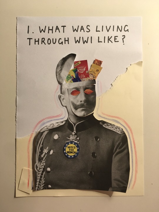
Page 1:
Changing the interview question typeface to be like the cursive one on page 4, as I found that having a stylistic contrast between the interviewer voice and interviewee voice was more effective in separating them
Changing the outline around the man to be with markers as that will look more neat. Perhaps I could changing it to zigzagging lines to make the composition more playful
Essentially, developing this zine has reinforced the notion that design is very time consuming and requires constant refinement and changing. Although it has been kind of mentally taxing to do this zine, also as I have been cutting out little things from magazines late at night, I have enjoyed doing this assignment so far. I really love being creative and it has been fun making a zine for the first time, and pushing myself to embody a different style to my own.
11 notes
·
View notes
Text
zine experiments
Did some more experimentations this week with different scanned items, scribbles and messes that I think could work well with my zine.


8 notes
·
View notes
Text
Bellarke Fam Gratitude Day 💛 - #weekeleven
Today, this week, I'm grateful for a chance to be future student of psychology 💪🏻 for my courage to meet new people, greet nicely old ones, and fight back with social anxiety and self-esteem.
We only go up, babes. Let's be positive.
Let's be grateful.
Love u all.
Be well. Be kind.
#weekeleven#love it#bfgd#bfsn#kadi speaks#bellarke fam gratitude day#bellarke fam selfie night#♥️♥️♥️
6 notes
·
View notes
Quote
"Let me smell your skin one last time"
Anne Parèze. Knife + Heart (Yann Gonzalez, France 2018)
0 notes
Photo

Week 11 is here! - https://goo.gl/GcSDKB - #songaweek2020 #saw20 #weekeleven #noexit #addingmorelanes #brah To hear the songs, join the mailing list, and learn more about the project, visit = www.songaweek2020.com Love and art to all <3 (at East Nashville, Tennessee) https://www.instagram.com/p/B9wp4oLHTl6/?igshid=1n1vnfszkf4nf
0 notes
Text


November 20, 2019
Last event day!
For our event we had cajun style food, I was on the amuse bouche team and we made alligator crostini’s with an avocado spread. The event day ran very smoothly and the only complaint we seem to get at both of our events was temperature control: We needed to keep to food hotter. Everything was delicious and our guests were satisfied with the presentation of our restaurant decor and the food.
0 notes
Text


Pic 1) another rug I found with the design of brown, black, and white elephant. This design in intriguing to me and creative
Pic 2) a picture I took near jessup of the sunset. I enjoy the orange against the grey/blue sky
Pic 3) my dog when he was a puppy! Super saturated grass behind the saturated brown and orange and yellow leaves
0 notes
Text


These Spotify codes aren’t scanning due to low background contrast I will fix these photos.
0 notes
Text
Emils Advice to the class
Outcomes
Design contexts
By young men I mean this..
Industry..
Providing specific design contexts
Awareness campaign around masculinity
Violence in lyrics
Similar projects and as useful as much as possible to your project
PUT ALL THE EMPHASIS ON DISCUSSING OTHER DESIGNERS WORK AND HOW IT IS RELEVANT TO YOU OWN PROJECT
Fieldwork
To build a library of photos for urban decay
Literature review
Prototyping and testing of a publication
Other design precedents
Raise awareness
And delivered in a design context
Photograph as a form of research
Sketching & Planning
Visualisation
0 notes
Text


Version 2 – Final Packaging Iterations
Here I tested muliple layouts to see which colours would make sense next to each other and where it made sense to place certain information. I also tested and experimented with patterns.
I decided to put the being present tips on the back of the packaging because it makes more sense to put the information about the opporunity cards inside the packaging where the opportunity cards will be sitting inside of. Therefore people will understand what to do with them and not miss the information.
The being present tips on the back people will find and remember that when they put their phone in the box they can flip it over for some tips about being present or just reminder to not engage digitally for a while.
I also printed these options to decide the best outcomes.
0 notes
Text
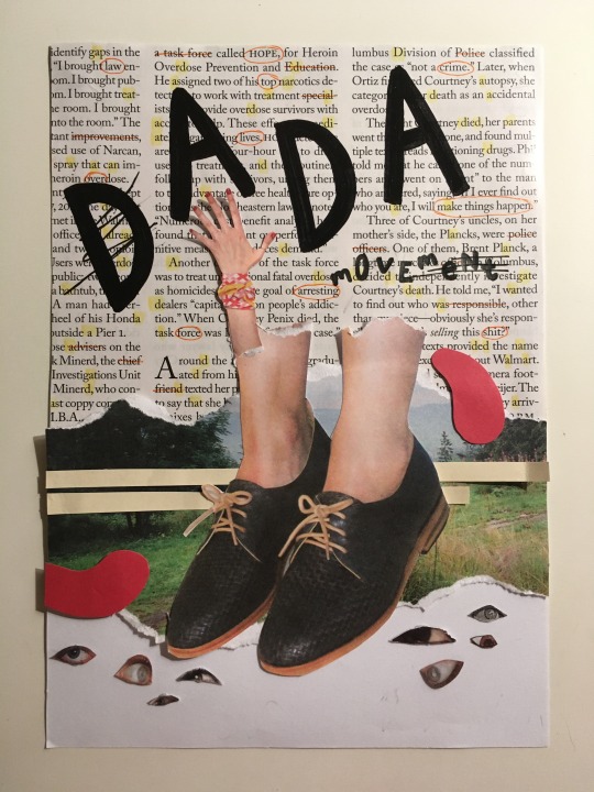
Starting My Zine

Beginning my zine for the “Ask Me Anything” assignment proved to be harder than expected. As I planned to predominantly use the technique of collaging to create my designs as it relates to the Dada and zine aesthetic, I couldn’t fully plan out my cover design like I usually would, as the collaging was to be spontaneous and random.
However, I did roughly draw out how I could arrange my title in combination with the collage. I did not intend to post it onto here hence the messiness and lack of care, but I thought it may be good to show my development.

This meant I could cancel out certain layouts that weren’t as effective, which was useful due to the analog hand-made nature of my zine, meaning that I would not be able to play around with layout as easily compared to if it were in a digital form.
I begun by flipping through some old Frankie magazines I had and cutting out images that I was attracted to. From this, I chose a select few of my images and collaged them onto my page. Eventually, I ended up being happy with my composition in the first photograph included, as the legs created effective contrast and balance due to its large size. The use of flat shapes added a more playful look.
Once I established my first layout, I found that it did not leave much space for me to add in my title. Therefore I moved my collage further downwards on the page. From my planning, I trialled two types of my generated titles with greylead, and chose to create a typeface with the combination of the two on my final cover. I chose to draw my own type rather than digitally implement it as it gave a more personal and raw look with the imperfect structures.
Adding the border composed of “dadadadada etc.” made the design look more complete, but I’m still not fully satisfied with the composition. I think that more could be added perhaps to the top half of the page, and I will experiment with it more.
Overall, I found this collage style quite challenging, as I am usually one to precisely plan out all my elements and keep everything neat and orderly. The reliance on chance when collaging definitely took me out of my comfort zone. I needed to keep reminding myself to take a more relaxed approach and to not think too much about it looking perfect. I also found it hard to create it all by hand as it was harder to play with different compositions.
Not going to lie, doing this cover put me off starting on the rest of the zine. I also found myself not being able to think of any design ideas. Again, to overcome this, I will need to put less pressure on making it look perfect to the point where I am too scared to even start, and just get right in with trialling.
5 notes
·
View notes
Text
zine progress
This is one of the trial covers I made for my punk zine project! Almost done the final product, just putting those finishing touches on before submission.

4 notes
·
View notes
Last Seen Blogs

neuroticclover
neurotic_clover

pwgifs
Objection!
early20sfailingplenty
I melt like wax around you

darthmanius-abandoned
Love Is Weakness