#weightedtextiles
Explore tagged Tumblr posts
Visit Tumblr Blog
Explore Tumblr blogs with no restrictions, modern design and the best experience.
Last Seen Tumblr Blogs


Fun Fact
Tumblr.com is the 103rd most visited website in the world.
Photo


Context images- one way of finalising the project
Within previous projects and throughout the duration of my time at NUA, I’ve struggled with envisioning my designs within a particular context. I don’t have a reason as to why I’ve struggled with this in the past, (most probably because it involved photoshop). I had simply wanted to create art work- not products. It wasn’t until the last term of my second year when I realised that being able to put my designs into context, meant that they would come alive. They would become something real, something that shops might sell and people might use. It gave my design work a purpose. I think the context I chose for this project [Weighted Textiles], helped push forward the act of using my designs within it. I had no interest in seeing my designs on cushions or curtains, stationary, or even fashion items. These things just didn’t excite me, and they already existed on the market in a hundred thousands different designs- there were already aesthetic choices available in regards to these kinds of products, so people’s options weren’t restricted in any way. I make no judgement, we need artists and designers who want to create designs for these products. I myself am particularly fussy when it comes to design and aesthetics. But for me, as a designer, it wasn’t where I was headed.
There was a personal reason as to why I chose this context to work towards within my brief, and this helped me connect with the project on a first level basis. Albeit some people informing me that I was too interconnected with my work, (something I didn’t realise was possible, and definitely didn’t view as a negative). I knew individuals who used these exact products, and who benefited massively from their use on a daily basis, 24/7. I’d seen first hand the importance of them, and also how they improved the quality of people’s lives. When I first began researching them I was surprised by how few decorative and aesthetic options there were online, and I knew that this project could be huge. Of course there would be many technical issues to figure out, I’d have to create prototypes and research how to do this if I were to actually make them. However, I decided to begin by focusing on creating bright, fun, designs that could be used as fabrics for these products. The above images show the original photograph of the product alongside my edited contextual version, and to me the difference is quite surprising. I loved how these bland, one colour, products, (which looked as though they belonged in a hospital) had turned into these bright, flowery, visually interactive products. Surely they were more appealing, and straight out nicer to look at, whilst still benefiting the individual in exactly the same way. I knew which one I’d rather wear, use, or have in my bedroom. This was the difference that I was trying to achieve, and as soon as my designs were in context, I knew I’d done it. Whether the actual product was there or not, the Photoshop images explained the project exactly how I wanted them to, and they helped make obvious what I’d been attempting to achieve within the brief, and within the project as a whole.
Referring back to previous posts in which I wrote about my target audience, looking at the final product collection made me think that these designs were more likely aimed at young girls and young women, perhaps apart from the weighted lap pad which could be appropriate to both genders, however of course there is no rulebook!
[Each original image is taken from https://www.sensorydirect.com]
#textiles#textiledesign#finalcontext#weightedtextiles#adobe#photoshop#software#digitaldesign#digitaldevelopment#specialistdesign#NUA
0 notes
Photo


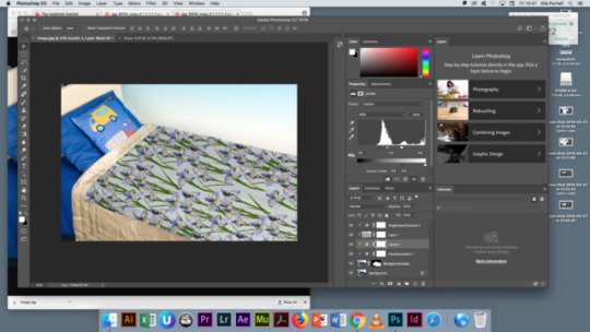


Photoshop development- putting designs into context
As I’ve probably mentioned previously within other blog posts, I began my third year at NUA having completely avoided Photoshop as much as possible, only using it when I completely, and absolutely had to. I simply didn’t see it as part of my practice. However all of my peers began getting really good at it, and as a result, their work looked great and completely professional. As everyone else’s work around me developed, I wanted mine to as well. I was pleased with my development amongst other aspects of my work, such as how far I’d come with my drawing skills, and my ability to put line and colour to paper, but I wasn’t pleased with my development in regards to digital design. As a result of these thoughts, I pretty much decided that this was what my third year would focus around. If I couldn’t get good at this thing I’d been avoiding for the past two years, then what had I really learned about the digital world of modern design during my time at NUA? The answer- nothing.
To me, Photoshop was this massively complicated, cleverly engineered software system, and it really freaked me out. All I had to do was open the software up and look at it, and straight away I would want to cry because of how many different symbols and numbers I could see on the screen. There were SO. many. numbers. and numbers just reminded me of Maths, which I hated, and which also made me want to cry. I did literally force myself to use this software, and I told myself I would get good at it whether or not it killed me. The thing was it was no good someone showing me what to do, and me then copying the work and miraculously remembering how to do it. I could remember whole paragraphs, word for word, from books I’d read once or twice ten years previously, but could I hell remember anything in regards to using Adobe Photoshop.
I ended up spending hours (god knows how many), sitting with various people. My peers, tutors, friends from other courses. I made them sit me down and go through each and every process I wanted to learn, and I wrote down every single step and repeated it over and over again until I’d cracked it. I’d have to ask them to show me again, three or four times, before I actually started to understand the software, and before I could actually get it to do what I wanted it to do. (I’m pretty sure I drove every single person mad who tried to help me). I kept notes on my phone of the step by step processes, and I’ve just used them to refer back to every time. Slowly but surely my confidence grew, and every time I perfected something, a new challenge or a new way of doing something would crop up.
This process pictured above is one of the most challenging I’ve come across throughout third year, and was made further challenging mostly by my choice of images, brief and context. I needed to put my designs from my Weighted Textiles project into context, and everyone kept advising me to search for white coloured versions of the products online, which just didn’t exist. I’d got this far and I definitely wasn’t going to give up, and aside from this I felt like the only way of concluding and explaining this project fully, was by putting my designs into the correct context. I sought help from a Photoshop specialist at NUA, and she showed me (first image) how to search on Google Chrome for the largest possible version of this product image on the web. It involved searching through each available folder within every source linked to a specific image, until the largest KB version appeared. The larger the image, the higher the quality, due to the fact that the resolution could be more easily adapted. She further proceeded to show me how to turn the image white, by selecting the specific part of the image the chosen design needed to appear on, creating a clipping mask, and then adjusting the levels, brightness and contrast, and the hue and saturation, all the while keeping these on different layers and creating clipping masks to link them to the same part of the image intended for edit. The act of putting the design in is simple, and was done by dragging the design file into the one containing the edited online image, and again clipping it via clipping mask to the intended content. Next, another levels layer must be added, and the levels must be adjusted so that the quality of the fabric within the original image can be seen through the design. Lastly, the final image shows how adjusting the black and white levels changes the colour of the shadows within the image.
To conclude, if I had an image of a product which was already coloured white, the first half of this process would not be needed. I couldn’t find any of these specialist weighted products in white, my guess as to why is because white is probably the most impractical colour for something which is used for practical, and tactile use on a daily basis.
[Each original image is taken from https://www.sensorydirect.com]
#textiles#textiledesign#NUA#adobe#photoshop#software#development#learning#context#specialistdesign#weightedtextiles
0 notes
Link
Whilst doing some general research on weighted products and their beneficial uses, I came across this page on autismspeaks.org, which is basically a library containing a description and a link to every source used on their website, with the aim to guide families and/or service users in the right direction to finding the products they need. It contains links to family run businesses, professional companies, articles, all of which sell or provide personal insights into weighted blankets, vests, toys etc. and the positives and negatives that come with using them.
https://www.autism-products.com is one of the first links available, and is run by a woman who’s son is on the autistic spectrum. She claims to have started her business so that others ‘don’t have to search as hard as we did to find products for our child.’ She sells almost every item you could possibly imagine, all of which aid sensory needs. The options on her website are endless, and include objects such as weighted toys, weighted balls, weighted shoulder and lap pads, weighted ‘halos’ [https://www.autism-products.com/product/halo-weight-2-2-pounds-yellow/], and weighted ‘hall passes’ [https://www.autism-products.com/product/weighted-hall-pass-2-pounds/]. Many of her weighted blankets can be made to order in different fabrics, which again provide sensory stimulation due to their tactile qualities. Some examples of the materials she can provide blankets and other weighted products in are fleece, lace, cotton, and corduroy. Available on the website are also neoprene compression vests, [https://www.autism-products.com/product/neoprene-compression-vest/] which are described as having ‘deep pressure input, (similar to being hugged).’ It is further explained that ‘from a sensory point of view they can help to calm and focus a child, by giving a greater sense of body awareness. Compression vests are designed to provide constant, even pressure to children and adults with autism, sensory processing disorders, hyperactivity, and more.’
Another product available on this particular website is elasticated wrist weights, made using soft fleece. [https://www.autism-products.com/product/stretchy-wrist-weights/] They are elasticated so that there is ‘no noisy, scratchy velcro closure’, and they are to be ‘worn on the wrist to provide weight bearing and strength building benefits.’ ‘Feedback shows that they are effective for children with autism, sensory integration disorders, and many other neurological challenges. The luxurious fleece fabric is soft to the touch yet durable enough for every day use. Filled with plastic poly pellets, and machine washable.’
Also available on the website are bean bags in a variety of different colours, sizes and materials. They are made using fleece, nylon, canvas and cotton, and are all filled with non-toxic plastic poly pellets. Different fabrics are used for tactile and durability reasons.
http://consumercarellc.com/category/BH.html is one of the other many links available. This particular page on the website informs the reader of a product called ‘The Big Hug’. The Big Hug is described as a ‘ergonomically designed’, with an aim to ‘calm, reorganise, and redirect the energy of children and adults with autism, particularly those who may benefit from deep pressure therapy.’ There are videos and descriptive diagrams and photographs which demonstrate the exact use of the product, and it appears that the actual design is what counts rather than the material used, due to the fact that it focuses on creating deep pressure rather than providing a sensory, tactile experience. The item also does not contain weights of any kind, but rather seems to provide pressure from how tightly the velcro straps are, and how it is adjusted. This is just another of so many products, all used for similar reasons for the same target audience my final term projects are aimed at.
https://www.squeasewear.com are another company which sell ‘deep pressure vests’, however their vests do not provide deep pressure through the use of weights. autismspeaks.org explains on this link that ‘Squeeze is an inflatable pressure vest that is hidden away inside a hooded top. No weights are used; hug-like pressure is applied to the upper body simply by inflating the vest with air.’ The general idea is that the vest is worn deflated, and when the individual experiences feelings of anxiety or stress, they can immediately inflate the vest to receive deep pressure. Therefore, it is dissimilar to a weighted vest due to the fact that it is not constantly, evenly, providing pressure. This is a great example of how you simply cannot generalise these kinds of products to an overall group of people. Different types of products will have more benefits to different types of people- it depends entirely on the individual and their needs. With this particular product, there is no mention on the website of which materials are used, only that they are designed with a ‘soft fabric front which enables the individual to move more freely’. [https://www.squeasewear.com/shop/pressure-vest/]
#weightedproducts#research#weightedtextiles#NUA#specialistdesign#support#system#business#selling#products#materialresearch#tactile#sensoryintegration#sensoryprocessing#sensoryneeds#design
0 notes