#what am i supposed to do with a 3d modeling software in my head where all my stories where
Text
Damned eclipse.
I went to bed last night and wake up to having all the fun parts of being mentally unstable being replaced with blender.
I don't know what happened but the fact I no longer get to dissociate on command is annoying. Instead of the nice headspace I had for the extremely long and convoluted story's, I now have all I have is an infinite grid hellscape.
#this is not a joke#i dont fucking know#im concerned but mainly annoyed#what am i supposed to do with a 3d modeling software in my head where all my stories where#eclipse
2 notes
·
View notes
Text
AX2001 - University - Week 4 Friday Lesson Reflection
In today’s lesson, we were able to have the lesson we were supposed to originally have last week, this lesson being a focus on different disciplines/ animation types including 2D, 3D and stop motion. We were asked to chose which one of the three options we would like to focus on, however I am still struggling to decide which of the three to choose from, as I feel (especially from last year) that each of the three provide valuables skills and lessons that have a knock effect to the other types of animation. So asked my tutor if I could join in with all three to maybe help me make up my mind, he was fine with me joining in on all three and that for me was what most of today’s lesson revolved around.
2D, Cell Action
The first focus was on 2D animation at first, I was expecting this to be a focus on different techniques to help your animation appear more fluid and boost production time, but I was wrong and caught a little off guard. The focus was on 2D model/ character rigging software called “Cell Action”, a software that has apparently become very common and popular within the animation industry, we had also not touched upon this software at all in the first year, so everything was entirely new to me.
Our tutor ran through the basics of the software, explaining that this software will only work if we create a character in a different software that allows multiple layers for drawing (E.g., “Photoshop” and I think maybe “ToonBoom”). Once we import the character into Cell Action, we need to assign and parent the different anchor points, joints and create groups for various changing body parts and features such as for the eyes and mouth for blinking and dialogue. This process reminded me of a slightly more complex version of rigging 3D models, within a software like Maya, but as our tutor explained once everything is rigged up correctly, the production of creating our animation character should speed up a lot. Overall, this Cell Action seems very interesting and if in some cases its become industry standard, then If I can I would like to give this software a try.
3D, Modelling Eyeborg
The second focus was on 3D animation and some cases we were treading familiar ground. Our first introduction to Maya during the first year was animating a rig of one our tutor’s characters called “Eyeborg”. However, unlike last year, this time our task was to create our own Eyeborg model from scratch, which covers a variety of different skills needed and techniques required to create any model. Some of what was explained was familiar to me whether it be from the E4 project I did in the first year, or discovery through trial and error from my spare time and during our summer project. But there where some new features and aspects covered, such as using the B key to stretch and adjust proportions of the model’s body, something I was unaware of in the first year.
Although this week nothing in regard to rigging the model was explained, I felt that there was still a lot I could do with this project set to us and will hopefully learn a lot in terms of creating more detailed and complex model, in comparison to the simple cylinder bodies and oval heads I have been creating previously.
Stop motion, Modelling a character from scratch
The third and final focus/ discipline was for stop motion animation, before starting this discipline, I thought we would be learning how to create and interact with armatures effectively for an animated piece. Turns out that I was once again incorrect and we instead did a group exercise, we were handed an A4 piece of paper with a picture of what looks to be a fish in some robotic space suite. We would need to create this character out of the materials we were given, these materials were Newplast plasticine and tin foil as well as a small copper wire.
We began by creating a ball out of crumpled up tin foil and then created the legs out of two separate pieces of tin foil, the ends of the legs where they would attach to the body were left as an open piece of tin foil in order to easily keep the legs attached to the body. Once we created the shape of the body and legs, we used a small piece of copper wire and wrapped it around the ball body of tin foil, this was to ensure the tin foil would not fall apart as we applied the Newplast plasticine. We applied a think layer of the Newplast around the tin foil body and legs until we could not see the tin foil anymore, once this was done, we covered the Newplast with tin foil, we did this repeatedly three times to create the overall form of the body. During the second layer of Newplast I decided to nip the sides and back of the model, in order to begin creating the characters arms/ hands and the lower half of the fin on its back. After the lesson, I added one more layer of tin foil and Newplast, as we were asked to make the top of the model as flat as possible for next lesson when we begin creating the upper half of the character, so I applied one more layer of both tin foil and Newplast and squashed the top of the body, to get it as flat as possible.
Overall, I came away from this lesson learning a lot, admittedly I feel like I’m still struggling to decide as Cell Action seems important to learn if this software is becoming industry, I’ve been wanting/ needing to learn more about model making and creating character Riggs and lastly knowing how to build a model with proper materials and not out of just wire and cardboard. But I will try to complete as many of these tasks as I can before next lesson, I can’t guarantee this due to my other module work, but I going to give as much of it a go as possible.
0 notes
Text
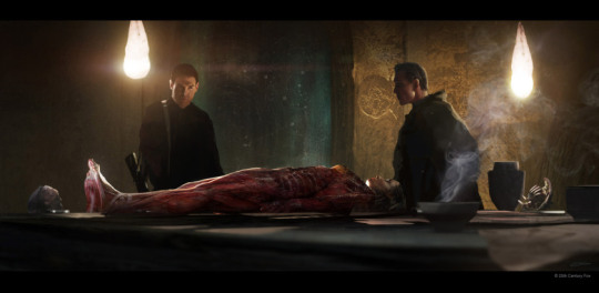
My next instalment of the creatives series features the amazingly talented concept artist Ev Shipard who worked on art concepts for the Engineer city, David’s Lab and the Egg chamber.
Clara Fei-Fei: Thanks so much for taking time to answer my questions, could you start by telling me what was your favourite Alien/sci-fi movie?
Ev Shipard: That’s a tough one- if we are talking about creature films then it’s a very close tie between Alien and The Thing- both get a lot of screen time in the studio. The level of tension in both of these has you on the edge of the seat looking into the shadows. Obviously Alien has stunning production design and cinematography which I find myself constantly coming back to for inspiration- a defining moment for Science Fiction. But let’s not forget the original trilogy of Star Wars. I was a kid of the late 70’s/80’s so it was my foray into the world of sci-fi film… and of course the toys!
CF: Who’s your favourite character in any alien/sci-fi movie?
ES: I think David’s character arc has been great. Getting my head around his approach with his Lab and Room during the design phase was a unique opportunity. Of course, I do have a soft spot for Private Hudson.
CF: Which variation of the xenomorph is your favourite?
ES: I always thought Fincher’s Alien 3 creature was great- it felt more animalistic and I remember moved a little better than the suits in Aliens. The browns and ochres were an interesting departure and Giger created a very cool looking variant initially for that film. I love the look of Fincher’s film and absolutely love the production design. Norman Reynolds interestingly enough also worked on Raiders and the original Star Wars Trilogy. Prior to Fincher, Vincent Ward has a very interesting approach to this film- the story is pretty much unchanged but it’s worth perusing his site for some of the visuals. On our ‘Covenant’ the creature department did an amazing job revisiting the Xenomorph- walking around the studio looking at the sculpts in progress was great inspiration for some of my work on David’s Lab.
CF: If you could enhance any part of your body using robotics, which would it be and what abilities would you choose to give it?
ES: I am a traditionalist at heart so I’d steer clear of any mods.
CF: What got you interested in being a concept artist? Which concept artists do you admire? What sort of advice do you have for others considering this line of work?
ES: I think I’d have to owe that to Star Wars and Bladerunner- seeing McQuarrie and Mead’s work in books as well as a drive to tell my own stories visually from a young age. I was the kid drawing in all my class books- massive battles starting on the back page. These days as an artist I am always looking for a creative outlet for personal expression which is usually drawing or oil painting.
Being an artist in the entertainment industry in a global market is very competitive and requires a real commitment to study. I think the best advice is to focus on fundamentals and be prepared to be the perpetual student- always willing to learn and grow. Not just with skill and aesthetic but also with the myriad of software packages that allow us to do what we do. An artist perceives the world in a unique way and I believe it isn’t a vocation but a way of life. It’s the curiosity about even the most mundane aspects of what most people take for granted and how to represent this visually often within a story.
This slideshow requires JavaScript.
CF: What sort of things did you have to consider when creating concept art for David’s lab?
ES: Initially, the space for the lab was supposed to resemble the egg chamber- we had this favourite reference of a bunker and the ceiling would have a stone spine with arches that we could utilise across the two sets. This changed as many things invariably do within the context of the story and the idea. Often Ridley would sketch out in pen a rough idea, we called these Ridleygrams, and this would become the basic idea of our direction. Sometimes they would be very simple but all the information was there for a visual starting place. Ridley had an affinity for a photo reference of a catacomb in Malta and It was my job to take this aesthetic and shape language and bring it into David’s Lab and also his room. David was repurposing the space for his own work so the Lab would have aspects of its previous history plus all his experimentation and failed attempts at biology. We see again the ampules and canisters which were recreated for this film. One of the striking features were the drawings that Dane Hallett and Matt Hatton produced hanging from the walls and ceiling. These were originally supposed to be drawn on stretched flesh and mounted on frames above. I scattered these around as compositional elements in my paintings and used them to refract light and create interest- when the camera moves you would have nice overlapping elements and parallax. I built this set in 3d after the initial sketches and handed this over to the set designers to refine, create plans and accurate dimensions to build. The table was also a 3d model which started out life in ZBrush. My take on it was a large obsidian slab but with a fine blood channel through the centre and on the ground small drains. The idea was that it could have been a sacrificial chamber below the cathedral- David had repurposed this as his workbench. All this is my hypothesis rather than direction from above but these little things all become part of the bigger picture and it’s great to put your stamp on aspects that you consider have merit within the overarching narrative.
CF: What is your favourite piece you ever created?
This is a hard one- most commercial work and even my personal work is only really a favourite till the next one. It’s always a challenge and rarely comes easy but this is all part of the process.
CF: What sort of concept art projects have you worked on in the past? What was the major difference between those projects? e.g: Large-scale vs small scale
ES: I’ve worked on a broad range of projects with the majority being period films from 300 to Unbroken. Every project has a unique with vision spearheaded by the Director and Production Designer. I’ve worked with the same crew many times however on both large and smaller budget projects. Sometimes there is more of a focus on design with pure concept art and sometimes it’s more about rendering sets already designed in the context of the story.
CF: What’s it like to work on concept art for a movie vs games?
ES: With games projects, I have only really worked with cinematics or live action marketing campaigns, like the Halo and Battlefield spots, so that is very similar to preproduction and postproduction on films.
CF: How long does it take to work on a piece? How many hours?
ES: Some artwork is executed in hours, some days, it really depends on the context and requirements of the work. I produced a lot of b/w studies or story beats from the script on Covenant which was used by Ridley Scott and Chris Seagers to work out the expedition from the Lander to the City and what we would see. some of these were done very quickly but for the most part, a rendered frame takes me around 2-3 days. This isn’t including the many iterations based on feedback/comments or script changes that occur throughout the process.
CF: I became familiar with your work through Alien: Covenant, what sort of concept art did you do for the movie?
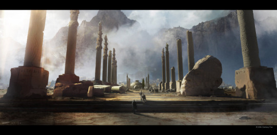
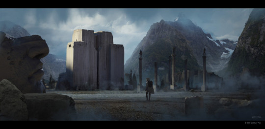
ES: My work encompassed many sets and potential locations but my main focus was the Engineers World. I spent the most time working on the Hall of Heads which included digitally painted art, sculpted clay maquettes, digitally sculpted pieces to mill for the set and worked with story points and dressing throughout it. I worked on an early rendition of the plaza and digital sculpts of statues that were also milled from foam full scale for the sets. David’s lab, his room and the egg chamber also took up a major part of my time. A lot of my work focuses on mood and lighting within these environments. I also worked on the Lander in the air and on the ground with Steve Burg’s amazing design. There were lots of location-based pieces of art using photos from various places in Australia and New Zealand- these are contextual paintings with script elements and used to help the production settle in a specific location. This is a big part of what we do on a lot of features.
CF: What details could you share about your pieces featured in the art book?
ES: The art book… a point of contention. I am grateful that I had many pieces featured but the lack of image credits for a lot of the art just really gets my blood boiling. Of course by the time the book is produced most of the art department is no longer involved in any of the process, it’s another publisher and marketing team working on it and rights and deals mean there is no requirement for any credit but still some of the best ‘making of’ books out there credit the artists. I’ve been involved in many projects where this is the case and it’s a frustrating aspect of the experience.
CF: As for the Engineer city and scenes, did you get much of a say in aesthetics? What sort of design brief were you given to adhere to?
ES: Ridley and Chris have accumulated tons of references- beautiful photographs from classical art, architecture, and design to really get the feel across. These were collated on large black foam core boards and posted in the ‘War Room’ which became our go-to place for inspiration. All this was replicated across the servers but it was nice to peruse all this together in the room. Stephane Levallois who is an amazing storyboard artist explored the city early on with some architectural designs in pencil. We also referenced Steve Messing’s earlier work. I was tasked with following this aesthetic and the look and feel of what we designed with the Plaza and interiors bringing it all together. I spent a lot of time designing profiles of buildings and structures to make sure the aesthetic flowed through into post-production. Our pre-production nestled nicely into the post with a lot of communication with the VFX supervisor. Chris Seagers (Production Designer) was very savvy and aware of this- he wanted it to flow smoothly.
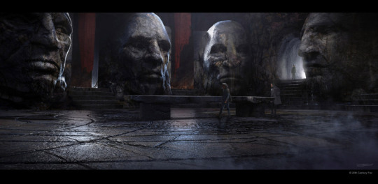
CF: For the hall of heads did you use the elder Engineers from the initial Sacrificial Engineer scene cut from Prometheus as a reference?
ES: They were part of the reference library but more specifically we tried to create an original look and feel for this culture that tied back to what we had seen in the previous film. Ridley had these great photos of elder indigenous people from all over the world and aspects of these were sculpted into all the 7 heads. The heads started life as ZBrush sculpts, clay maquettes and later milled foam sections from the digital file. These were reproduced in detail for the epic heads we see on the set. Each one is individual, however with the final lighting and framing that is a little hard to register. We built a bit of a hypothetical back story here with the heads being effigies of the elders of the society- this place was a meeting room where decisions were made. Initially there were specific seats, a fire pit in the middle and of course the large table which was a variation of the table in David’s Lab. 7 heads with 7 a prime number and perhaps they used a base 7 system- so a kind of history and culture was sketched out to give it all a foundation. I guess with many early Earth cultures tied into this we can hypothesise about the Engineers and our planet, seeding life etc- I’m making presumptions here as Ridley and Chris didn’t specifically explain this. The concept art room was a fun melting pot of ancient alien ramblings and conspiracy theories, to much of the Art Department’s entertainment. I’m not sure how serious we were considering this though, with this project I guess it comes with the territory.

CF: What sort of things did you have to consider when creating concept art for David’s lab?
ES: Initially the space for the lab was supposed to resemble the egg chamber- we had this favourite reference of a bunker and the ceiling would have a stone spine with arches that we could utilise across the two sets. This changed as many things invariably do within the context of the story and the idea. Often Ridley would sketch out in pen a rough idea, we called these Ridleygrams, and this would become the basic idea of our direction. Sometimes they would be very simple but all the information was there for a visual starting place. Ridley had an affinity for a photo reference of a catacomb in Malta and It was my job to take this aesthetic and shape language and bring it into David’s Lab and also his room. David was repurposing the space for his own work so the Lab would have aspects of its previous history plus all his experimentation and failed attempts at biology. We see again the ampules and canisters which were recreated for this film. One of the striking features were the drawings that Dane Hallett and Matt Hatton produced hanging from the walls and ceiling. These were originally supposed to be drawn on stretched flesh and mounted on frames above. I scattered these around as compositional elements in my paintings and used them to refract light and create interest- when the camera moves you would have nice overlapping elements and parallax. I built this set in 3d after the initial sketches and handed this over to the set designers to refine, create plans and accurate dimensions to build. The table was also a 3d model which started out life in ZBrush. My take on it was a large obsidian slab but with a fine blood channel through the centre and on the ground small drains. The idea was that it could have been a sacrificial chamber below the cathedral- David had repurposed this as his workbench. All this is my hypothesis rather than direction from above but these little things all become part of the bigger picture and it’s great to put your stamp on aspects that you consider have merit within the overarching narrative.

CF: What was it like creating your version of Giger’s Li?
ES: For me, this was a fun diversion. It plugged into David’s lab but the script was constantly moving with this and I wanted to create something early on- a tribute to Giger. It became a bit of a talking point then we moved on still not knowing what was happening with Shaw even up to the shoot (from the perspective of the Art Department). Then I started to see some of the work Creatures were doing and I ended up producing a painting later with Shaw on the Slab and David and Oram looking over her. The interesting thing I found with the Li painting was how much Noomi started to resemble Sigourney as I worked the face in. There were a number of variations done of this with more or less biomechanoid features and elements.

CF: What did you think about Alien: Covenant? if there was something you could change, what would it be?
I think our work in the Art Department was showcased well. I’m proud of how the Engineer’s world was resolved ultimately. Personally, I would like to have seen more of our city and spent the time to delve into the culture and most people I have spoken to loved this aspect of the film and wanted to know more. Perhaps this will be dealt with in other avenues- audio books, comics, novels etc but I guess the test screenings wanted more aliens in space and we ended up with what we got. There was a lot more of the culture designed(loosely)- gardens, the graves, a tree of life etc that was ultimately cut. Ridley always produces a stunning looking well-designed piece of entertainment and it was a pleasure to work as part of his team.
Thank you for reaching out and the opportunity to talk about this project that I consider a career highlight. I can be found at http://evshipardentertainmentart.com/ and for those that are interested in behind-the-scenes and my sketches… https://www.instagram.com/evshipard/
Creatives: Ev Shipard My next instalment of the creatives series features the amazingly talented concept artist Ev Shipard who worked on art concepts for the Engineer city, David's Lab and the Egg chamber.
#alien#alien film#alien movie#alien prequel#alien: covenant#art department#behind the scenes#catacombs#concept art#concept artist#David&039;s lab#elders#engineer city#engineers#ev shipard#giger&039;s li#hall of heads#planet 4#production#tribes
4 notes
·
View notes
Text
Let’s wrap up this orc story. There isn’t actually too much more to tell, at least, not by my own reckoning. Certainly, there will be fewer images.
So, last time, I realized that I just wasn’t going to find the figure that I wanted to find out there on the internet. Anywhere. It didn’t exist in the world, at least, not one that was for sale.
What if I made one?
Remember, there were a few 3D models I could find out there, which could be used in a 3D printer to print your own minis. Looking around, I found some people talking about using their printers to scale up their minis to make them go from 28 to 32mm. And one other thing I noticed pretty quickly on Etsy was the sheer number of people trying to sell this mini of Yagraz, the orc beauty:

Described as��“beautiful and strong Orc lady,” whose “speciality is to enter a human camp as dancer and take the life of a general/commander with the biggest weapon she could find,” Yagraz is pretty high on many of the searches I ran for female orcs.
I don’t have a problem with Yagraz, but it was pretty frustrating to see her so often when what I really wanted was not a beefy pole-dancer with tusks.
However, it’s thanks to Yagraz that I realized, probably much later than I should have, that her presence on so many Etsy shops meant that the sellers must have the files to print her. If they have her, then they probably also have other models from the orc collection, which includes this menacing axe-wielder with the side shave that I mentioned last time:
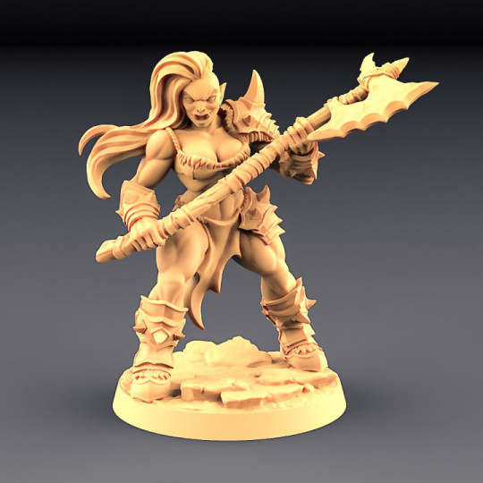
I also forgot, last time, to copy and paste my Twitter “review” of her design, which was “Orc Barbarian - C (Lady): cute smile, takes great care of her hair. 10/10, would invite to coffee and ask for beauty tips.“
I’m quite curious how she maintains that side shave. I had a ponytail for a year or so, and it was very difficult for me to keep my sideburns properly shaved without having a thin hairline of stubble or accidentally cutting some of the ponytail where sideburn met ponytail. This lady has it figured out, and I’m jealous. Or maybe that’s just how her hair grows in. I don’t know. Maybe she has a wicked bad burn scar on that part of her head. Even if that’s the case, her hair is clearly long enough that it didn’t get that way by accident.
Anyway.
I decided to look up as many Etsy sellers as I could find who sold Artisan Guild figures. I found a bit over half a dozen. Of those, five of them mentioned that they could resize figures in their store descriptions or their descriptions of other minis. Of those, a couple had reviews from customers who showed photos of enlarged pictures.
I emailed all five of them.
Three got back to me to say that they could not make the figure as large as I had hoped, which was 140mm, or five times the normal size. 140mm isn’t a magic number, except insofar as it’s about as large as most commercially available 3D printers for home use can make a single piece. If she came in multiple pieces, like a model kit, then it’s possible that she could be printed in a larger size. However, she only comes in two: the hands and weapon are a single piece, and then the rest of her handless body is the second. I suppose the base is a third. So three pieces. I apologize for my mistake.
Two, however, were willing to tackle the project, and said that they would take the time to see if their slicer could do this thing. I do not know exactly what a slicer is, however, from context (and a YouTube search), I am able to infer that it is software that is used with a 3D printer to resize a figure while keeping it within the size limitations of the build envelope.
One of the two said, a day and a half later, that they could produce the figure for $35, with a cheaper filament base, and the other could do it for $48 with the base pictured above. The more expensive seller explained that they had done “a quick workup” of the cost for resin, print time, and supports, and that they want the figure to look as good as possible. Due to her size and relative thinness, they wanted to print it solid instead of hollow, which would up the price but prevent future issues. They were even able to send me some pictures of the figure from their slicer that showed the three pieces. She looked amazing, but that’s to be expected from a 3D model that already looked amazing.
My social anxiety kicked in, and I realized that I was being offered a surprisingly affordable deal on this figure from two different sellers who had spent several hours of their own time on a project unlike any they’d been asked to do prior to my weird ass showing up, and all before I’d agreed to pay them a dime. I decided to do the unreasonable thing and buy both.
Whichever seller produces the superior orc, I reasoned, would get any future business I may have. Realistically, since they were each spending so much time working on the models in their software before printing, and since a 5x size mini would have 125x the mass of the regular size (since it is five times as large in all three directions, so 5^3), I was expecting them to be much, much more expensive than this.
It is entirely possible that, within the next year or so, I will simply buy my own damn 3D printer. They’re pretty expensive, but it appears that some good ones are out there for less money than a lot of video game consoles, and I sure do buy a lot of those. For now, I will wait. How many figures do I need to make, right?
I mean... a lot, but that’s not the point. How many figures WOULD I make, now that’s the superior question, and the answer to that is not very many at all.
So now I wait. I’ve gotten several WIP photos from the second seller, who seems like quite a decent fellow, but we’ll just have to wait and see if that translates into a better figure.
I don’t want to actually share those photos, as I feel like it would breach some kind of confidence between myself and the seller. Maybe that’s dumb, but it’s how I feel. Especially since I don’t know that all their courteousness and hard work will actually translate into a better figure than the other guy.
Short of making my own silicone molds of another mini to enlarge it, or buying a 3D model and printer and figuring out a way to alter it for my own purposes, I think that this is as good as I’m going to ever get.
So... why do all this? What’s with my sudden and extremely intense fixation on finding an orc figurine? Well, it’s actually all because of AI Dungeon, which I briefly discussed here.
Can you guess the ending to this story? Yep, one of the stories I played featured a female orc, and I liked her a lot. That’s it. That’s the story. You can stop reading now if you want.
I will write a third and fourth part to this in which I explain what the hell I am talking about.
0 notes
Text
How to hack imvu credits using cheat engine check today
Imvu Credits Hack Competitors, Revenue And Personnel
Get started by following imvu credits cheats. IMVU, a social networking and instant messaging client which utilizes 3D avatars to represent its users, announced Thursday that they have hired David Fleck to serve as vice president of advertising and marketing for the firm. Fleck served in a related role for the organization behind Second Life, Linden Lab. Forbes spoke with Fleck and IMVU's CEO Cary Rosenzweig about the move and what the future holds for the company.
To customize your character, you have to devote real money on IMVU credits. Having said that, there are much better methods to earn IMVU credits without the need of possessing to pay for them. We have a one hundred% working and up to date IMVU credits hack that permits you to customize your character how you like with out spending hundreds of dollars on accessories.
These imvu credit generator games, along with the fantastic ergonomic style of the controller and the big battery, would easily assure that you are transported into the gaming dimension for hrs collectively. On the downside even even though, apart from a handful of video games that are totally optimized for the console, the rest are not as relaxed to take care of on the SHIELD. Under no circumstances get me incorrect right here, Android is arguably the very best mobile platform out there, but is not the most effective when it comes to gaming. The lack of a focused gaming ecosystem how to get free imvu credits instantly implies that presently only mobile strike hacks a handful of video games play good on the SHIELD.
You will get the above offered snapshot in your laptop or computer. Confident you can play with standard membership which is cost-free and comes with restricted number of credits. Hello i functioning difficult to create credit generator for imvu, now my generator complete and operating! If you enjoyed, please leave a comment under. A further thing what we fix is bug when generator freezes at point when supposed to show code. It demands no installation, no password, and best of all its free, although donations are nonetheless appreciated. Open it and read it very carefully before running the software. There is no require to variety your password! Endless prospective outcomes of modifying your character.
Hello every person, currently I am going to introduce a operating imvu hack 2017 edition. Credit generator makes use of a bug in the imvu web page, so we gets credits for no cost! Perhaps you have wanted a new searching for your character or new capabilities? Open totally free imvu credits hack setup file to run the software. And remember a single issue do not use this tool more than one particular time in a day. This imvu credit generator tool is developed exclusive by hackgamenow. With the aid of this imvu credit generator tool you can hack imvu credits. If you get into any trouble, just run the setup as administrator and relaunch. Our tool aims at saving you countless hours of mundane gameplay and lets you get straight to the organization as soon as the credits are transferred to your account.

Imvu has been usually identified as a game exactly where you cannot commit dollars on. Because of the credits price tag, it is understandable why so lots of are staying away from credits. Having said that, applying this new IMVU Generator this will no longer be an concern. You will be able to get frequently totally free imvu credits without the need of paying any dollars on them.
Hey expensive customer, welcome to our imvu generator of credit, this generator will afford you a hundred.000 Credits perweek, We also inform you that earlier than you generate your credit, you will want to 1st respect these following guidelines under. I basically tried this hyperlink - in the present day and it worked quite properly with my account. I obtained free all sources of On-line Resources Generator Hack On-line. ONLY A WARNING GUYS, THE HYPERLINKS Offered ABOVE Are not Working!! (i've tested them) Anyway, I currently identified the working cheat device for this recreation. When I performed this sport, I felt rather a few points accumulating it. On the other hand, IMVU Credit hack helped me receive limitless credit within the game and now I can progress quicker with ease. It is basic and possibly the greatest alternative to rely on.
The IMVU Game turn into so popular that every person started playing now a day. imvu credit generator devoid of human verification is a tool exactly where customers can get cost-free imvu credits devoid of paying James who is operating a Canada recently told this game is better than some of the prime games like Pubg and clash of clans.
IMVU CREDITS - So Simple Even Your Kids Can Do That
Personally i like both. I met my bestfriend who is my bestfriend in Real LIFE as well. I wasn't expecting on meeting her at all. And saying that IMVU has immature adults and such and such is seriously unfair due to the fact in secondlife and this is just me, i've had extra griefering that you can basically imagine. Both have their ups and downs and because IMVU is not a virtual world and a virtual 3d chat the complete versus thing is invalid. Im not certain if some of you have have not been on there since 2008 but it enhanced alot to be truthful, they in fact have mesh heads now, yea. And for me uploading mesh there was 10x less difficult there and you did not require all your i.d and credit cards all out there.
youtube
Prior to deciding to urge entirely motivated it genuinely is worth speaking about what on earth is that seriously on. Principal as properly as principal we must this kind of technique a result of the not adequate a fair method towards the IMVU players. The wisdom with regards to overwhelming requirement relating to this sort of IMVU hacking softwares is the discrepancy in which seems in relation to the IMVU credits. IMVU is a challenging performed with public around the globe. It does not matter the fiscal economical class of the public and from the characteristic, the expense with regard to credit ratings could be the equivalent. That is the purpose why we get in touch with for the IMVU credit rating electrical generator - with regard to the fiscal aspect, it may well help the persons of which end up becoming disadvantaged.
Together, our organizations intend to build the optimal model for making use of crypto to accelerate engagement among Creators and their users in a higher-touch virtual landscape with an current financial framework. As we discover new approaches to drive mass adoption of cryptocurrency, there is the possible for a deeper integration of Kin that will unlock opportunities to invest the token inside of IMVU (not just the marketplace), and Kin could turn out to be a medium of exchange between Creators and their customers.
IMVU, the top 3D avatar social networking app with over 200 Million registered customers, sought a partner that could achieve their Expense Per Payer (CPP) aim at scale. Since payments come about within a desktop app that cannot be tagged, they required a companion who could optimize towards a Cost Per Registrant aim, but ultimately was becoming judged by cross-referencing order IDs to track new and returning customers.
The creators earn developer tokens, these tokens are applied for several factors, mainly covering the expense of submitting a item to the IMVU Shop, believe it or not the creators of imvu goods spend a rather hefty fee when submitting items for you to attempt on, keep this in thoughts next time you're randomly belittling a item, mainly because the scaler is slightly off-placing towards your wants, and desires. This fee is nearly completely dependent on the orgin of the item, from time to time the items are derived from other things, meaning share a similar look from an existing item but modified to match the new creators desires.
imvu hacking tool makes the life of a gamer definitely amazing. This gives the players an opportunity to get the benefits of playing the game with all the offered products cost-free of expense and moving ahead at greater levels. The hacking tools are the easiest and simplest way to get the availability of the gaming objects and filling the pockets of the player with the imvu no cost credits. The surveys for finding the perfect hacks is also not necessary as these are secured and aids in refraining from any delays in the availability of the hacking tools to open the favourite products in the Game with the credits. In reality, also, using these hack generators are super effortless, immediate and demands no time. As soon as one particular start clicking on the hacking tool, the gamer begins creating imvu credits on the world-wide-web in their account.
The most alluring function of the IMVU hacking tools that are skilled by the customers is that it is no cost from any sort of expenditures that demands the true revenue. Any IMVU player can love the most outstanding and extraordinary encounter of the game and freely get pleasure from the enjoyable of imvu credits generators. 1 does not have to spend a single penny to take pleasure in the availability of the infinite delivery of IMVU and its credits and characteristics. Because of this trait of hacking tool, the IMVU gaming is immensely used, as it becomes easy, popular and accessible for the players.
0 notes
Text
Design Museum—Primary Research Trip
The Design Museum is a museum focusing on contemporary design and showcases work from a range of time periods and areas of design. As a group, the Year 2 graphics students visited this museum as it relates to the work we have done so far surrounding our curious objects and generating ideas from these. Visiting the museum would give us the chance to see how design as a whole has evolved.
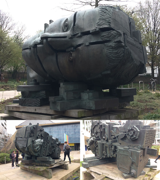
At the entrance of the museum is a sculpture made by Eduardo Paolozzi, a British artist I have previously looked at who was known for having a large influence on pop art. He produced both 2-dimensional artworks as well as sculptures. This piece titled “head of invention” is an example of his sculpting work and features various segments of a human head fitting together with words slotted in between the gaps. When approaching the back of the head, the complex machinery dominates the space. This showcases what I think is the main benefit of creating work in 3-dimensions—the possibility of having different interpretations depending on the viewers’ position. This is elevated by the size of the sculpture as well, which makes the viewing experience completely different from looking at it from a secondary source. The machinery at the back and the slotting together of the segments of the head represents the evolution of technology and I think this is why the sculpture is as big as it is. The size portrays how crucial technology started to become during the industrial revolution.
“I suppose I am interested, above all, in investigating the golden ability of the artist to achieve a metamorphosis of quite ordinary things into something wonderful and extraordinary”
This is a quotation said by Eduardo Paolozzi which relates to my own project. I believe so because this quote talks about making something “wonderful and extraordinary” out of “quite ordinary things” which is something I have been aiming to do so far and will continue to do. Using my 10 curious objects as the main example, I have seen how using seemingly unrelated ideas to generate new ones has been largely beneficial to me by providing a wider scope of inspiration for my project. Paolozzi calls doing this well the “golden ability” of an artist, or the main characteristic a good artist will possess.
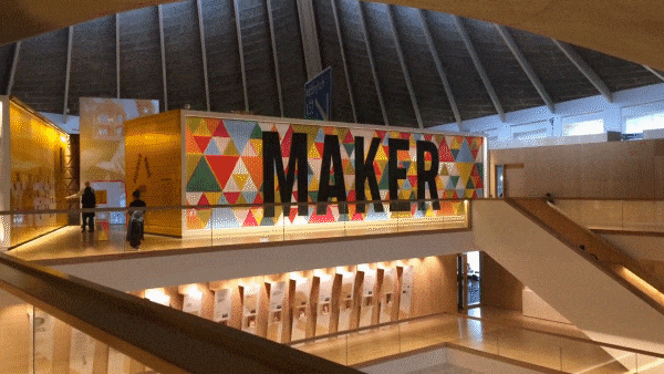
Designer/Maker/User
‘Designer/Maker/User’ is the name of the exhibition held at the Design Museum which was the focus of our trip. The name itself relates to the connection between ‘artist’, ‘artwork’ and ‘audience’ which I identified as something I need to constantly look back on and evaluate against. The importance of this is achieving an understanding in all three of the aspects which will carry your work from something which is made to ‘look good’ to something with a real impact. The entrance to the exhibition includes a very large display, where each of the words appear to fade into each other after a period of time. This was an example of a 2-dimensional graphic being applied to a different type of material other than the usual wall or canvas. The effect of this from far away creates the illusion of moving image, but it is instead 3 different images being transitioned into each other by the wall itself.
On the opposite side of the entrance, was the first piece of work. When I saw this, I instantly drew the connection to Lisa Temple Cox’s Lion Walk decoration. This piece used a collection of items which were donated in a similar way to Temple Cox’s display boxes. In both cases, the concept reflects the process I have used so far for generating ideas out of random objects. My 10 curious objects are all unrelated to my ideas at this stage, but I wouldn’t have these ideas without using these items and various practical experimentations to develop them.

The main difference which is striking between this new example of assorted objects and the ones I have looked at is the size. Even the Mark Dion examples which were large boxes of still life are a lot smaller than this wall of objects. It’s a mixture between the large-scaled display boxes and the neat organisation of the small examples. As a result, the wall offers a similar narrative which can be seen in the smaller examples but on a larger scale. The viewer can be intrigued for longer because there’s more to explore and interpret.

The exhibition showcased the evolution of technology throughout the years. With this, the production of type was heavily affected by what was seen to be possible with the technology available at the time. This specific example above is some early work developing a typeface with the assistance of early vector graphics. What I find interesting about type and this image especially is how similar the quality of the letters are from then to now. Looking at the ‘Q’s at the bottom right of the image, it’s hard to differentiate them from type made and used today which is evidence of how timeless successful type is.
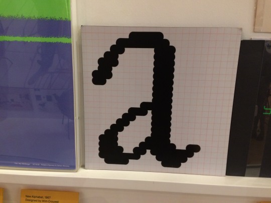
The earliest examples of digital typefaces were made on grids due to the limitations of screen resolutions. All graphics were made on extremely low-resolution bitmap screens which makes the earliest examples of digital graphics have a distinct ‘pixel’ look to them. The Macintosh icons created by Susan Kare are something which follow very similar guidelines and have the same similar distinct look. Susan Kare is an artist I looked at during my ‘Animal Instincts’ project where I looked into the process of limiting myself to sketching on a grid much like she did. Although I am not limited by the grid because of how technology has evolved, exploring this process taught me how revisiting traditional methods and restricting yourself in similar ways can, in fact, produce more effective results. The pixel type is an example of this because when it is sketched onto a grid first, everything is consistent and legible to the viewer.

On the contrary, this bionic arm is an insight into what the future could look like with the advancement of technology. This is a bionic arm which was made completely from the process of 3D printing. A relatively new process for product design which has evolved what is possible with digital software. This was produced by e-NABLE, an organisation where volunteers use 3D printing techniques to produce bionic prosthetics for under-served populations globally. Because of how automated the process of 3D printing is, once you have one digital model to print, the costs become very low which is what allows e-NABLE to give back to communities. The material also works in their favour. The vibrant colours of the 3D printing plastic are a distinction between e-NABLE and other mechanical prosthetics which makes them especially marketable to children.

This is an example of how impactful technology can be. Using design to combat important issues which, without these efficient processes like 3D printing, would not be possible. With the evolution of technology, comes the simplification of the product. Just recently, bionic arms would have been seen as inaccessible, especially by poorer communities. Now e-NABLE produces bionic parts on a mass scale, with construction kits even being an option.

These Olivetti posters and Olivetti posters, in general, are often used as an example when referring to ‘vintage’ design. Although each poster has its own unique qualities, there are certain characteristics which I picked up on which are common. Firstly, the colour and tone. Most of the colours used are flat and saturated with warm colours being used slightly more. There is rarely a lot of gradients being used, but when tonal value is applied, it is done through different flat colours. The large blocks of colour work effectively to draw attention to the posters. I find the posters with the examples of large blocks of colour naturally draw my eye to them, which is the purpose of these. Another thing I noticed, although not as prominent as the use of colour, is the use of shape. Circles are the core in some of the designs and remind me of Saul Bass’ work because of this along with the colour usage. Now I have access to technology which can allow me to produce more ambitious effects in easier ways. But these posters remain effective to this day, which shows how whilst technology evolves, successful design remains that way.

Because branding is something I want to explore with my project; when I saw these examples of logo evolutions I wanted to use them as research. Starting with the leftmost example: Apple. Their logo started off as a complex illustration and the impracticality of this is illustrated by how far away I was standing. The small details become too small to see and the complexity of the logo is lost with its size. In contrast, the simplicity of the next Apple mark remains effective from both close-up and far away. Because of this, once Apple had an effective logo, the changes that followed only became minimal, but eventually leading to the most simple revision of all of them—the plain black version.
A similar instance happened with the ‘Braun’ logotype in the right image. The logo was changed from a minimalistic design to a styled one with a 3D effect added to it. Because this added nothing functionally to the logo, they reverted back to the original concept but with a more modernistic approach applying the logo to a grid.
The middle image shows two variations of the ‘Sony’ logotype. Only being two, the Sony logo has gone through less change but the same elements in terms of legibility have improved. The other logos are companies owned by Sony and are all in my opinion successful logos.
What these teach me is that effective brands should stick with their brand identity for as long as possible as it is over-time that recognisability is created. The Apple logo is the perfect example of this benefitting the company themselves. Over many years the Apple logo has gone through little changes which means the consumers are familiar to the image and link it to the products. This then allows Apple to raise the prices of their products as the customers are more likely to buy into a brand they are familiar with.

I also made sketches as I walked around the exhibition. It’s important to do this because you can portray the feeling you had when reacting to the original object. A photograph can only provide so much to my research, but sketches I made at the time of viewing the research are more insightful into their effects on me.
Review
This trip provided a new element of research to my project in the form of primary investigation. It was a lot more engaging for me as a viewer reacting to the work first-hand as it was intended to be viewed. Secondary research is beneficial due to it taking less time to gather information. However, secondary examples can often provoke a different response to original artworks. Size is something which heavily effects how an audience reacts to art work. From a secondary source, the Paolozzi sculpture or the wall of donated possessions at the Design Museum will not provoke the same reaction that I had when looking at them first-hand. The size adds to the statement the piece is making and makes the work seem a lot more powerful. Large works like these keep me interested to look at because there is often more to look at and interpret.
I have researched designs from other time periods before, but the Design Museum offered a unique outlook on the evolution of technology and how this aided the production of design. The most shocking thing from this visit was how automated the 3D printing was and how cheap it had become to produce products in mass because of this.

Looking Back
As I spectated the numerous examples of design from different times, I kept noticing the similarities between these and my own project. Firstly, the vast wall of donated possessions reminded me of the work I did on my display box and the research I did into artists who produced similar things. Mainly Lisa Temple Cox, who also used donated objects to form various smaller display boxes in the Lion Walk toilets in Colchester. I was also able to observe these in person as they were installed locally, and although the concepts of narrative remain similar between the two, the reaction I had to them both was very different. Lisa Temple Cox herself said that people “don’t go there for it, but they enjoy it while it’s there”. I feel the same way with my experience of looking at her work and found it to be a lot more passive than the vast example at the Design Museum. I was in awe of the size of the. The concept remained the same but the scale alone of the display box altered the reaction from the audience completely.
Next, the examples of type and how they have evolved. Type has been a large of my project so far and I plan to continue this way moving forward. I find type to be so interesting because of how explicitly it can communicate a message but in more ways than one. I have previously looked at type mainly with digital processes; the Lost & Found workshop series allowed me to mirror the same process but with very different materials (such as the garden wire typeface I made in part 1). These seemingly unrelated methods make sense when I view the work at the Design Museum. Restricting myself to garden wire to make a typeface made me feel extremely limited, but as I highlighted when looking at the pixel type work at the Design Museum, limiting yourself to a strict amount of rules to follow can sometimes create more effective outcomes. Even if not, the ideas that spark from challenging yourself allow for a lot more possibilities for outcomes.
Moving Forward
There were some things which I was interested in from the Design Museum that I haven’t yet explore in my project, that now I see as a possible direction to follow. The first one being the Olivetti posters. Looking at these got me interested in poster design as a whole and how it links with type. I then thought about how it could link with animation as that is another area I want to explore. Moving forward, I may consider looking into more abstract poster design which comes from limiting myself and forcing myself to come up with completely different ideas to what I am comfortable with. Much like when I tried screenprinting in the 2nd Lost and Found workshop, I found that being out of my comfort zone may produce results I am less happy with, but the ideas that I will generate can benefit my project.
I highlighted the use of shape in the Olivetti posters. Geometry was something I mind-mapped at the very beginning of the brief as an interest on mine, so I think it would be appropriate to explore using geometry in design in the future. I have already done this with logos in the ‘Animal Instincts’ project, but I want to attempt to combine it with poster design. Looking at gestalt and my display box also let me understand how groups of objects are perceived by a viewer. I could possibly use this knowledge in a 2-Dimensional format such as with poster design and learn about the technicalities of laying things out in 2 dimensions.
On the subject of logos and branding as a whole, this is something I definitely want to explore. I would say it is one of my biggest strengths, which is why I have limited myself away from it so far. But at this stage, I want to start using the ideas I have gathered, combine them with ideas I initially had at the start of the project and use what I am interested in (type, branding, motion etc.) to do so. The Apple, Sony and Braun logos that were showcased at the museum showed me how effective branding works in practice. I want to explore the possibility of creating entire brand identities rather than just a single logo.
Lastly, the type I looked at made me want to continue exploring type but limiting myself more. I know I am comfortable with digital processes so my next step will be to reflect upon early methods of producing type, (such as sketching on grids) to learn about the fundamentals of creating legible typefaces. I believe this will broaden my understanding of the field of type and ultimately allow me to use type more effectively in my own work.
0 notes
Text
Making MAYA, the Only Darkroom Timer You’ll Ever Need
MAYA is a darkroom timer project that was born out of necessity when my old darkroom timer had started to malfunction. It has become a pretty successful crowdfunding campaign so far, exceeding 300% of its initial goal with a few days left to go.
Like many people who still have a darkroom, I’ve bought most of the equipment in the used market. As is the case with such niche markets, you can’t always pick your choice from an endless supply of brands, models, and variations so I went for the best deal I could see, a Kaiser 6002 with several boxes loaded with all kinds of darkroom supplies. The seller was one of the nicest people I’ve met and explained in great detail what I was walking out with. In one of those boxes, there was a darkroom timer.
He had fully explained that it wasn’t the best timer in the world. It would only have two functions, turn the enlarger lamp on and off at my will so that I could focus and upon pressing the countdown button, it would turn the enlarger on for a set amount of time, making an exposure. Except that every now and then it would get stuck (usually around the 15-second mark) and give me an unending exposure, resulting in crushed blacks and grayed out highlights, depending on how late I was to react to the needle getting stuck.
Approaching the zone of doom… or maybe it’ll be fine this time…
I had looked for replacement timers and I still remember closing down all the tabs in my browser in frustration. Even the simplest timers, similar to what I had, would cost more than I’m willing to pay. As I had gained more darkroom experience, I began to realize I didn’t want a similar replacement anyway. Having such a simple timer became quite limiting as I had begun to work with split grades, multiple exposures, dodging and burning, flashing the paper… Each session I was finding myself more willing to get a much more capable unit, something that would let me set it up as I want and then simply get out of the way as I was making the final print.
There’s a good deal of work behind even a simple print like this
Then on one such day, I was met with my timer’s much-worsened situation. Now it would get stuck much more often and at every single spot on the dial. It was almost impossible to even make a reliable test strip with repeated 5” exposures. So I began revisiting all the manufacturers who still make a darkroom timer, along with the used ones commonly available.
Did not like any of them.
I was looking for something more practical. Even though I shoot film, mostly using equipment that was designed and built decades ago, that doesn’t mean I want to work with a badly designed interface with 4-digit numeric codes and lookup tables requiring multiple button combinations and memorizing what and where everything is. It’s 2018 (it was back then), why can’t we have something with a proper LCD? Why is anything with F-Stops so expensive? Why am I expected to pay 350$/€/£ for some add-on which is basically a 0.20$/€/£ electronic part attached to a cable? Why do I have to buy a different model with different capabilities which clearly runs on the exact same hardware, if all I want is some of those capabilities? Why can’t this be done with a simple firmware update?
I could do better than this.
I knew people were already building simple timers using Arduino microcontrollers. So, why not build something far more advanced? It’s a small computer that is available cheaply and is easily reprogrammable. If it handles 3D printers, CNC machines and all kind of silly robots that you can find all over the Internet, how hard would it be to ask it turn a light off and on?
A few seconds after these thoughts, my industrial designer instincts kicked in. “It’s just software in a box”, a voice said from the back of my head. “Just build another box, upload the software and you have a copy that you can sell. If it turns out as good as you imagine it to be, people will buy it”.
Can you hear the people queuing up?
So I went out, bought two Arduino boards, an LCD and assorted lengths of wire and started working with them. Did a whole notebook worth of sketches of both the physical and the graphical user interface. From the start, I wanted to have dials and a few buttons that I could repurpose as I saw fit. It has a screen, after all. I could communicate with the user, telling what each of these dials and buttons does in a given menu or mode. Yet at the same time, I would keep the two most essential buttons serve only one purpose, one to focus and one to expose. No double clicks, no press and hold, no excuses. Press them and they should do their job.
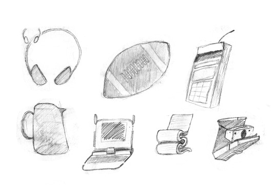
First sketches of the box
Even though having an LCD is nice and informative, I wanted to have another way of displaying the most crucial information, the countdown time and the contrast filter that I’m supposed to use. For that, I added two large displays to either side of the LCD. Shortly afterward it became natural to look at those displays to figure out what I was supposed to do next when making a print; expose for a certain amount of time, replace the contrast filter, dodge or burn a certain area.
Maybe I should have gotten two egg timers. Nah, I’ll just design and build a small computer:
After deciding on the basic design language, I began to design the graphical user interface, all the menus and screens. There were many variations, seemingly good concepts that were abandoned shortly after using them in the real world and seemingly dead ends that made it back somehow into later versions.
One such concept was replacing the LCD with an E Ink display. Would’ve been easy to read under the red safelight and I liked the idea of displaying a clock face on the e-ink display to act as a progress bar. Had to abandon this idea after realizing even with partial refresh, e-ink displays have a very low refresh rate and a very annoying blink when refreshing the whole screen. Shelved the concept without building a single prototype and maybe I’ll bring it back one day but the progress bar idea made it into the next version of the hardware, as a series of LEDs that visualize my progress along the whole print recipe or the current countdown.
Here’s me making some test strips with F-Stops (don’t have to follow the time display, the progress bar tells me how long it’ll take):
Until about that point, the whole thing was still a pet project that I intended to build as a replacement for my timer. When I shared it on a few Facebook groups (The Darkroom and Medium&Large Format film Photography, both excellent places of exchanging information and photography), it was met with great encouragement, very positive feedback and quite a few new ideas. There were also the occasional “yeah cool but I like having a basic timer,” which is still valid feedback, some people don’t care for what I was after at all. That day I had made up my mind, I would prioritize this project, get it out on the market for everyone who’d like to have one and… then what?
What if I had built an enlarger as well? Or an automated film processor, some people really like that idea as it’s been demonstrated quite a few times in the last years. What else? There is quite a capable microprocessor inside MAYA and if I had planned the hardware ahead, I could’ve come up with all sorts of darkroom related hardware and make them work with it via a simple firmware update. How about an affordable densitometer? A shutter speed tester? A head probe for people who use cold light enlargers, one of the many great ideas that came from that thread on Facebook? Support for Ilford Multigrade heads? I had already separated the Power Bar (where all the darkroom appliances are connected to) from the control unit so most of these enlarger-unrelated add-ons would simply use the same interface for communication and with the right hardware, I could even use MAYA as a sous vide machine.
Definitely sous vide
Is it sous vide if you do everything by hand? (It already does have a separate mode for film process timer and an auto-compensating thermometer)
With all my plans set, I could finally launch a crowdfunding campaign. I knew that there’s a great deal of negativity surrounding crowdfunding projects these days, especially in our community thanks to a few projects who have cheated out quite a few people by either overpromising with fancy looking non-working prototypes or cool-sounding concepts that became to no fruition of any kind. With no previous projects of this kind or a bought-and-repurposed brand name that is familiar in the industry, I had to be as transparent as possible. Which meant taking an extra month or two developing the concept into a later stage, shoot a lot of videos, share them around, show MAYA in use for everyone to see and understand.
Photo of the first prototype unit
White Edition, has mostly the same capabilities without some of the bells and whistles
youtube
Since I’m in such a late stage of design, there isn’t much to do before finalizing the product. One aspect that I had not finalized is the final choice of materials and production methods. For that, I had to see how many of these I’d expect to build. Even if I had sold only a handful of units, I could still be able to deliver by using traditional production methods. If I had approached triple digits, I could use some more sophisticated materials and techniques to build them. Deep into triple digits would’ve been pretty much mass production with me being much less involved in most of the steps, except for final assembly, quality control, and delivery.
All I had needed in the first place though, was a handful of people to believe in my project.
Met that initial goal in about than 39 hours. Had doubled it in less than a week and with only a few days to go, I’ve passed 300% of my initial goal. This could only happen with the help of some lovely people in the community. The people who spread the word around. What we see the most often is all the negativity in the comment section and forum threads but we don’t hear enough praise for people who share their enthusiasm with others.
So once again, thank you everyone who had ever left a comment on any of my posts anywhere. Thank you to everyone who shared the word around, in the forums, Facebook groups, mail groups and Discord servers they hang in. Couldn’t have done this without some people spending night after night of their own time, giving me new ideas, feedback and encouragement. We, as a photography community in general, are getting fewer in numbers (even though film photography is actually growing) and the best part of this project has been meeting all the lovely strangers over the Internet. Thank you, everyone.
And here we are. With the crowdfunding about to be completed, hard work awaits me. I have to debug my code, do a few experiments with the future projects to ensure compatibility, finalize the design, order and manufacture the parts and put everything together. With the extra funding raised, I’ve already begun working on a few of those steps and assuming everything goes smoothly, will deliver the first batch in July and the second batch in August.
Then I’ll return with another project. Something that I’ve already been working on…
About the author: Can Çevik is an industrial designer and film photographer based in Istanbul, Turkey. The opinions expressed in this article are solely those of the author. Çevik is the inventor of MAYA, an advanced darkroom timer. You can find more of his work and photos on Instagram.
source https://petapixel.com/2019/03/13/making-maya-the-only-darkroom-timer-youll-ever-need/
0 notes
Text
Making MAYA, the Only Darkroom Timer You’ll Ever Need
MAYA is a darkroom timer project that was born out of necessity when my old darkroom timer had started to malfunction. It has become a pretty successful crowdfunding campaign so far, exceeding 300% of its initial goal with a few days left to go.
Like many people who still have a darkroom, I’ve bought most of the equipment in the used market. As is the case with such niche markets, you can’t always pick your choice from an endless supply of brands, models, and variations so I went for the best deal I could see, a Kaiser 6002 with several boxes loaded with all kinds of darkroom supplies. The seller was one of the nicest people I’ve met and explained in great detail what I was walking out with. In one of those boxes, there was a darkroom timer.
He had fully explained that it wasn’t the best timer in the world. It would only have two functions, turn the enlarger lamp on and off at my will so that I could focus and upon pressing the countdown button, it would turn the enlarger on for a set amount of time, making an exposure. Except that every now and then it would get stuck (usually around the 15-second mark) and give me an unending exposure, resulting in crushed blacks and grayed out highlights, depending on how late I was to react to the needle getting stuck.
Approaching the zone of doom… or maybe it’ll be fine this time…
I had looked for replacement timers and I still remember closing down all the tabs in my browser in frustration. Even the simplest timers, similar to what I had, would cost more than I’m willing to pay. As I had gained more darkroom experience, I began to realize I didn’t want a similar replacement anyway. Having such a simple timer became quite limiting as I had begun to work with split grades, multiple exposures, dodging and burning, flashing the paper… Each session I was finding myself more willing to get a much more capable unit, something that would let me set it up as I want and then simply get out of the way as I was making the final print.
There’s a good deal of work behind even a simple print like this
Then on one such day, I was met with my timer’s much-worsened situation. Now it would get stuck much more often and at every single spot on the dial. It was almost impossible to even make a reliable test strip with repeated 5” exposures. So I began revisiting all the manufacturers who still make a darkroom timer, along with the used ones commonly available.
Did not like any of them.
I was looking for something more practical. Even though I shoot film, mostly using equipment that was designed and built decades ago, that doesn’t mean I want to work with a badly designed interface with 4-digit numeric codes and lookup tables requiring multiple button combinations and memorizing what and where everything is. It’s 2018 (it was back then), why can’t we have something with a proper LCD? Why is anything with F-Stops so expensive? Why am I expected to pay 350$/€/£ for some add-on which is basically a 0.20$/€/£ electronic part attached to a cable? Why do I have to buy a different model with different capabilities which clearly runs on the exact same hardware, if all I want is some of those capabilities? Why can’t this be done with a simple firmware update?
I could do better than this.
I knew people were already building simple timers using Arduino microcontrollers. So, why not build something far more advanced? It’s a small computer that is available cheaply and is easily reprogrammable. If it handles 3D printers, CNC machines and all kind of silly robots that you can find all over the Internet, how hard would it be to ask it turn a light off and on?
A few seconds after these thoughts, my industrial designer instincts kicked in. “It’s just software in a box”, a voice said from the back of my head. “Just build another box, upload the software and you have a copy that you can sell. If it turns out as good as you imagine it to be, people will buy it”.
Can you hear the people queuing up?
So I went out, bought two Arduino boards, an LCD and assorted lengths of wire and started working with them. Did a whole notebook worth of sketches of both the physical and the graphical user interface. From the start, I wanted to have dials and a few buttons that I could repurpose as I saw fit. It has a screen, after all. I could communicate with the user, telling what each of these dials and buttons does in a given menu or mode. Yet at the same time, I would keep the two most essential buttons serve only one purpose, one to focus and one to expose. No double clicks, no press and hold, no excuses. Press them and they should do their job.
First sketches of the box
Even though having an LCD is nice and informative, I wanted to have another way of displaying the most crucial information, the countdown time and the contrast filter that I’m supposed to use. For that, I added two large displays to either side of the LCD. Shortly afterward it became natural to look at those displays to figure out what I was supposed to do next when making a print; expose for a certain amount of time, replace the contrast filter, dodge or burn a certain area.
Maybe I should have gotten two egg timers. Nah, I’ll just design and build a small computer:
After deciding on the basic design language, I began to design the graphical user interface, all the menus and screens. There were many variations, seemingly good concepts that were abandoned shortly after using them in the real world and seemingly dead ends that made it back somehow into later versions.
One such concept was replacing the LCD with an E Ink display. Would’ve been easy to read under the red safelight and I liked the idea of displaying a clock face on the e-ink display to act as a progress bar. Had to abandon this idea after realizing even with partial refresh, e-ink displays have a very low refresh rate and a very annoying blink when refreshing the whole screen. Shelved the concept without building a single prototype and maybe I’ll bring it back one day but the progress bar idea made it into the next version of the hardware, as a series of LEDs that visualize my progress along the whole print recipe or the current countdown.
Here’s me making some test strips with F-Stops (don’t have to follow the time display, the progress bar tells me how long it’ll take):
Until about that point, the whole thing was still a pet project that I intended to build as a replacement for my timer. When I shared it on a few Facebook groups (The Darkroom and Medium&Large Format film Photography, both excellent places of exchanging information and photography), it was met with great encouragement, very positive feedback and quite a few new ideas. There were also the occasional “yeah cool but I like having a basic timer,” which is still valid feedback, some people don’t care for what I was after at all. That day I had made up my mind, I would prioritize this project, get it out on the market for everyone who’d like to have one and… then what?
What if I had built an enlarger as well? Or an automated film processor, some people really like that idea as it’s been demonstrated quite a few times in the last years. What else? There is quite a capable microprocessor inside MAYA and if I had planned the hardware ahead, I could’ve come up with all sorts of darkroom related hardware and make them work with it via a simple firmware update. How about an affordable densitometer? A shutter speed tester? A head probe for people who use cold light enlargers, one of the many great ideas that came from that thread on Facebook? Support for Ilford Multigrade heads? I had already separated the Power Bar (where all the darkroom appliances are connected to) from the control unit so most of these enlarger-unrelated add-ons would simply use the same interface for communication and with the right hardware, I could even use MAYA as a sous vide machine.
Definitely sous vide
Is it sous vide if you do everything by hand? (It already does have a separate mode for film process timer and an auto-compensating thermometer)
With all my plans set, I could finally launch a crowdfunding campaign. I knew that there’s a great deal of negativity surrounding crowdfunding projects these days, especially in our community thanks to a few projects who have cheated out quite a few people by either overpromising with fancy looking non-working prototypes or cool-sounding concepts that became to no fruition of any kind. With no previous projects of this kind or a bought-and-repurposed brand name that is familiar in the industry, I had to be as transparent as possible. Which meant taking an extra month or two developing the concept into a later stage, shoot a lot of videos, share them around, show MAYA in use for everyone to see and understand.
Photo of the first prototype unit
White Edition, has mostly the same capabilities without some of the bells and whistles
youtube
Since I’m in such a late stage of design, there isn’t much to do before finalizing the product. One aspect that I had not finalized is the final choice of materials and production methods. For that, I had to see how many of these I’d expect to build. Even if I had sold only a handful of units, I could still be able to deliver by using traditional production methods. If I had approached triple digits, I could use some more sophisticated materials and techniques to build them. Deep into triple digits would’ve been pretty much mass production with me being much less involved in most of the steps, except for final assembly, quality control, and delivery.
All I had needed in the first place though, was a handful of people to believe in my project.
Met that initial goal in about than 39 hours. Had doubled it in less than a week and with only a few days to go, I’ve passed 300% of my initial goal. This could only happen with the help of some lovely people in the community. The people who spread the word around. What we see the most often is all the negativity in the comment section and forum threads but we don’t hear enough praise for people who share their enthusiasm with others.
So once again, thank you everyone who had ever left a comment on any of my posts anywhere. Thank you to everyone who shared the word around, in the forums, Facebook groups, mail groups and Discord servers they hang in. Couldn’t have done this without some people spending night after night of their own time, giving me new ideas, feedback and encouragement. We, as a photography community in general, are getting fewer in numbers (even though film photography is actually growing) and the best part of this project has been meeting all the lovely strangers over the Internet. Thank you, everyone.
And here we are. With the crowdfunding about to be completed, hard work awaits me. I have to debug my code, do a few experiments with the future projects to ensure compatibility, finalize the design, order and manufacture the parts and put everything together. With the extra funding raised, I’ve already begun working on a few of those steps and assuming everything goes smoothly, will deliver the first batch in July and the second batch in August.
Then I’ll return with another project. Something that I’ve already been working on…
About the author: Can Çevik is an industrial designer and film photographer based in Istanbul, Turkey. The opinions expressed in this article are solely those of the author. Çevik is the inventor of MAYA, an advanced darkroom timer. You can find more of his work and photos on Instagram.
from Photography News https://petapixel.com/2019/03/13/making-maya-the-only-darkroom-timer-youll-ever-need/
0 notes
Last Seen Blogs

outrospecting-blog1
Celine

centreholistictherapy-blog
CentreHolisticTherapy

hypotheticalcontents
Hypothetical Contents

okadavulae
mr beast

slimmmmmsexy
SlimmSexyGuys