#while my camera doesn’t pick up the subtle pink -> white gradient of the second attempt
Text
painting the lotus flowers!
always improving (1st try vs 2nd try)
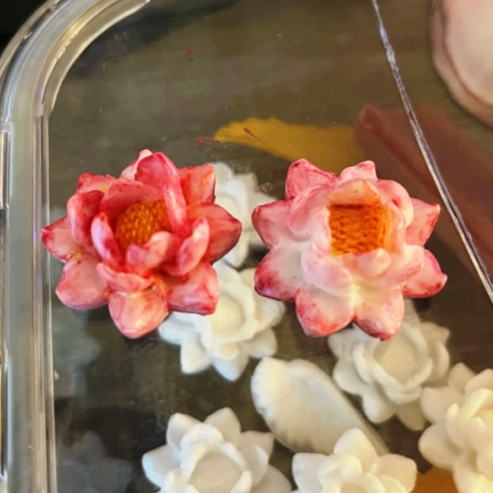

#tbh I think my first attempt looks better on camera but shittier IRL#while my camera doesn’t pick up the subtle pink -> white gradient of the second attempt#soap tag
11 notes
·
View notes
Photo

Fire Flower
Note: I originally made this painting and typed most of the description towards the end of March. I meant to upload this sooner, but things happened it obviously got pushed way back.
Oh gee, would you look at that. It has somehow been 8-9 months since I last made a full acrylic painting... But! I have a video for this one to make up for it! Link: youtu.be/8IgVvgTiZjM
I promise I've been trying (and failing) to come up with ideas to do more with this medium. Acrylic paint just isn't my thing. I swear I said this somewhere before, but I have no idea where; It's just hard for me to commit to an acrylic painting when I know I can get the look I want usually much faster and much more easily with other supplies. Acrylic painting just takes so much more time, set up, and patience. This very painting I know I probably could've had done in half the time using primarily watercolor instead, for example.
So why is this an acrylic painting instead of something quicker and easier? Because my dear Sparklers, I made this painting and filmed it as a bit of a blending demo for a friend. They tried their hand at an acrylic painting with a sky going from red to yellow...except they lost most of the yellow in the process, and even they weren't really sure how it happened. So since I'm in sort of an art teaching/mentoring position to them, I decided I'd pull out my paints and take a shot at a similar look.
Now, to be fair, my end result is very different from their's intentionally. They painted a boat on the water during sunset, I wanted something different and more me, so after some browsing around on Pinterest, I settled on this flower silhouette. I made my own job harder because the reference image had a blue and orange background with lots of black, almost like a vignette, so once I got past the stage of putting the base background colors down, I had a lot more work cut out for myself in trying to replicate that.
Speaking of which, you can see most of my process in the video, but a recap just in case:
I started by picking out my paint colors, and to be fair I could've gotten away with less or slightly different colors, but I got extravagant and picked a total of nine colors from my Liquitex Basics set (also known as currently the only decent acrylic paints I have):
• Mars Black
• Ivory Black
• Titanium White
• Cadmium Red Deep Hue
• Cadmium Red Light Hue
• Portrait Pink
• Naples Yellow Hue
• Cadmium Yellow Medium Hue
• Primary Yellow
Why the two blacks? Mars Black is a "denser" black so to speak, it's more opaque (less transparent/see-through). The Ivory Black is less opaque, and it's a bit warmer in color than the Mars black. I used the Mars black in areas where I wanted a total and complete black and the Ivory black where I wanted some of the colors from the background to leak through a bit. It's subtle, more of a "feeling" to the eye than something you can clearly see.
Also, I used the Portrait Pink, which like the name implies is a very pink flesh tone, and the Naples Yellow Hue (think a shade similar to Yellow Ochre...or fancy Mustard if "yellow ochre" doesn't help you visualize) primarily for blending and not so much for the colors themselves. And the Cadmium Red Light Hue is much more of a reddish-orange in person than it is red, which is why I picked it. It's also pretty transparent (yellows and oranges often are in acrylic paints, especially more student grade ones like the Liquitex Basics) so it also got lost in the mix fairly easily and I had to build it up a lot.
In the video, you can definitely see as I start that I do indeed do a lot of back and forth with the paints, blending and layering to my heart's content to try and get the right color balance while also getting a smooth transition. And this goes on for quite a while; the background was definitely the part that took the longest.
Initially, I did sketch in a couple of lines as markers for roughly where I needed certain parts of the gradient to begin and end, and with the paints, I went in and got down the base of red and yellows so I could then start working on marrying the two together. And I have to admit, even I let my yellows get a bit lost/pushed down more so than I would've liked. It's a difficult balance to strike; red is already a strong color that easily overpowers yellow. It's even easier when the yellow and your transition colors are more transparent while the red is more opaque. And even more so when your painting has a vignette feel to it.
But once I finally had something I was comfortable with and blocked in most of the black (which was a pain in the butt to blend out, by the way, as I'm sure is obvious by how much I go back and forth with it in the video, misusing a fluffy watercolor brush as a mop brush to blend), I then took my outline for the silhouette that I'd already prepared on another piece of paper and used a Faber Castell Gelato (first a gray, then later I'd use a black) on the back to be able to transfer it on the canvas by tracing it with a mechanical pencil with the point pushed in. Personally, I really do think the Gelatos are the best method I've tried for making faux-transfer paper. They're soft so they transfer the color without much fuss without making a powder smudge-y mess (like charcoal, chalk, or pastels might), and they're also water-soluble so they play nicely with the wetness of the acrylic paints, especially if you've thinned them with a bit of water.
Then I got the lovely challenge of trying to paint and blend out a nice bright setting sun on top of the blackish mess I'd made. (It actually wasn't that bad; the Titanium White is pretty opaque so once it mixed with the yellow and I got a couple of layers on it really didn't have any problem covering the darkness that it had to.)
After that, I transferred again some of my lines I'd covered up and then got to work on the black silhouette parts. I did have to alter the look slightly because I wasn't quite as careful with lining up the placement of my "transfer paper" that second time and also because the brush had different ideas about how much black should be in some places than I did, but it wasn't too much of a hassle.
And then, of course, the real challenge of blending the black up to meet the silhouettes without completely covering up my sun or messing up my other blending. Although, this also wasn't as tricky as I had thought it would be. Ironically, I think by the time I got this far I was finally starting to get a handle on the acrylics after having been away from them for so long.
Believe it or not, this tiny 4"x6" painting took well over two hours to complete. I had at least two hours of footage that I trimmed down and sped up like four times, and that doesn't include the dry time in between two background layers, the background and the sun, and then the sun and the silhouette. I'd say it was probably closer to 3 and 1/2 hours total, although technically longer because I kept getting interrupted by things and I had to figure out how to set up the camera and everything before I actually started painting.
Once I was done with the painting, I also had to actually edit the thing together, which took many more hours than I bothered to document or care to admit. (P.S. Whoever decided all free video editors that don't come pre-installed on a computer either must have stupidly low export limits and/or super obnoxious watermarks, I hate you.)
Yeah, there's a reason it's been almost a year since I last posted an actual video of me making art... It just takes so long to edit everything together and I also have to make an extra effort to get stuff set up before and after for filming...Like, maybe it would be different if I had the space and resources to have an area where I could just leave everything and have a camera set up that doesn't move, but right now when my space is limited and my phone is my camera it's just so much easier to...well, to not.
At any rate, here's one. One acrylic painting, and one video. A two-for-one special! Sort of! And I think both turned out pretty okay in the end, at least for someone that 1. Doesn't acrylic paint and 2. Doesn't make videos regularly. I call that a win, wouldn't you?
Although, I have a few canvases stockpiled. I really should work on trying to squeeze more acrylic paintings into my art regimen somewhere to use those up, if nothing else...
____
Artwork © me, MysticSparkleWings
____
Where to find me & my artwork:
My Website | Commission Info + Prices | Ko-Fi | dA Print Shop | RedBubble | Twitter | Tumblr | Instagram
2 notes
·
View notes
Last Seen Blogs
helltel
𝐇𝐀𝐏𝐏𝐘 𝐄𝐍𝐃𝐈𝐍𝐆.

disruptbreakawaywin-blog
My New Blog

sunnyslalaland
DO EPIC SHIT ✌🏻

fy887137
(Assistir VEM) ~ Filme Patrulha Pata: O Filme Completo Dublado P

akatukimg-blog
genさんの雑感