
✨ Published Author, Artist, Cat Mom, My Chemical Romance Fan, & Magnetic Poet ✨ Like my art & want to support me? Follow the links!
Don't wanna be here? Send us removal request.
Statistics
We looked inside some of the posts by mysticsparklewings and here's what we found interesting.
Average Info
Notes Per Post
158
Likes Per Post
112
Reblog Per Post
45
Reply Per Post
1
Time Between Posts
8 days
Number of Posts By Type
Text
15
Photo
2
Last Seen Tumblr Blogs


Fun Fact
In 2020, Tumblr had 29.4 million users in the US.
Text
How NOT to DIY Marker Storage

Over the past couple of weeks, I put up a total of 4 image posts on my Ko-fi documenting a journey in trying to DIY a new storage solution for my Ohuhu markers.
I already had more to say about the process than would fit in the image captions, and was already sort of planning ahead to compile the information in a more digestible format for a singular public reveal [the individual posts were Ko-fi-Members-only since in the moment they were more like "behind the scenes" content and I usually reserve that kind of thing for members anyway] and considering how things turned out, I think ultimately a long blog post like this compiling the images and properly fleshing out the story only makes sense...
So let's go ahead and start by recapping the first post I made:


Original Caption:
Hey it's the project that's been getting the bulk of my attention this week! Some people over on r/Ohuhu figured out that "mug organizers" work well & similarly to the original Ohuhu markers bags for storage, & after some research, my brain caterpillars insisted I could probably DIY something structurally similar from the oodles of cardboard boxes we have around the house and save a whole $20. Pro Tip: Don't listen to the caterpillars, just buy the mug organizer. 😅 I'm going to finish and use what I started because I'm in WAY too deep now, but I have definitely put more than $20 worth of effort into this thing already...and I'm not even done yet. 🙃 And for the record, I will share more info/make a blogpost about how I put this thing together once it's finished, I just had too much to say for the image caption length and the sooner I can get back to work (mostly just need to finish painting and then any last-minute/decorative touches after that now) the sooner it will BE finished!
Oh if only Past Mystic knew! So a little more background on this situation that I didn't have room to explain in the post caption:
For those that don't know, prior to this DIY adventure, I kept my Ohuhu markers in their original bags, but kept the bags turned on their sides and used a honeycomb system developed by Reddit User Spare-Cartoonist6276 [See her original post here] to give each marker an individual slot within the compartments of the bags.
That setup has worked wonderfully for me, but as I already had three bags (216 + 104 + Skin Tones) and then recently added a fourth (Japanese 80 set), stacking the bags and searching between them for markers was getting a bit unwieldy for me. I didn't want to give up the honeycombs, but I at least needed one place to unite them all.
So when people started posting about the mug organizers, that seemed like the perfect solution. At first glance, they look like they're constructed identically to the original Ohuhu bags, just with a much larger 12 compartments instead of the 320 set's maximum of 6. So one mug organizer could easily hold a full 320 set with plenty of room left over, which sounded exactly like what I needed.
But the plan from the beginning, even if I had gone with a mug organizer, was always to end up modifying the honeycombs I'd already made (and making more as necessary) to still give each marker it's own slot, but have just one container full of Ohuhu markers instead of 3-4. I would honestly still agree with Past Mystic that listening to the brain catapillers that kept insisting I should not spend additional money on marker storage was probably a mistake, but I also know now that Past Mystic was admittedly overly optimistic about the $20 mug organizer being the answer. We'll get to "why, exactly" later.
Anyway. By the time I made Post 1, I had already spent a few days measuring boxes, picking one out, and then hours measuring and cutting up other boxes to make the dividers for the compartments. [And as you can see in the photos, I had already started painting the dividers, which I'll elaborate on a bit more for Post 2.]
And while I do stand by my original sentiment of "don't do this to yourself," if you for some reason have a masochist streak in you that is tied to DIY'ing things rather than spending money (like I apparently have if this project is any evidence), I will very reluctantly tell you:
I picked a based box based on the dimensions of the mug organizers, hoping to end up with similar "how many markers will this hold" estimates: The main mug organizer I was looking at was roughly 16" by 13", and 6" deep. The box I picked out is approximately 17 inches on the longest side, 14 inches on the short side, and closer to 5" deep. [6" would've been more ideal, but anything over 4" would've worked so I decided to not be too picky about that.]
I then made two long divider inserts that were just a little smaller than the 17" length with 4 evenly-spaced slits approximately 2.5" deep to fit with the smaller dividers I needed to make. And those smaller dividers, naturally, are just a little bit shorter than the 14" width of the box, also with 3 evenly-spaced slits. [And you can see one of the smaller dividers that I cut the slits just slightly too big laying on the box on in the first two photos of that first post, Sharpie included for scale.]
And that leads us fairly naturally to the second post in this journey:


Original Caption:
If you'll excuse the bad artificial lighting, you Sparklers can see I was able to finishing painting all of the cardboard black and added some galaxy-print Duck Tape to the front-facing edges, which serves and both decoration and a little extra support/protection for said edges. And today, though not pictured, I also added some felt "feet" to the back and a full layer of felt along the bottom so hopefully it won't have issues sliding or bumping up against other things. The journey isn't quite over yet, but we're so much closer now! The box/organizer itself is finished now, but the next step is to see how much modification the paper honeycombs I already use to give the marker individual slots will need to fit snuggly in these compartments. It probably won't be *that* much, but it will unfortunately be time-consuming. 😅
Once I had finished cutting up all of the dividers, I did my best to remove any tape or packing labels that might resist a paint job, then "sanded" any remnants that wouldn't come off with a nail file. [Because the only sandpaper I own is tiny, meant for cleaning/"sharpening" blender stumps and I did not want to buy sandpaper just for this purpose, but I did have a thick, brand-new nail file on-hand.]
Then I had to glue a couple of pieces of cardboard in place on the base box. With the tape from the back seam gone, I needed to glue the back flaps down, and then I had to fill some gaps left by the flaps with extra cardboard pieces and glue those in place, too. You can see a thinner extra panel on the inside of the box in the first picture, and later on you'll see a super-thin strip down the back of the box.
Then I got to spend several hours and 1.2 bottles of black craft paint...Well, painting everything.
I went with black because I had some extra bottles of both it and white craft paint on-hand that I picked up for cheap without a project in mind, and I figured black would both cover better and not show stains/wear as much over time. And while I wasn't totally sure I'd be taping any edges yet, I also had more tape options that would match the black rather than the white.
I did test the paint on a cardboard scrap first before I committed, though. I was pleasantly surprised that it did in fact cover amazingly—It sank seamlessly into the cardboard with one thin coat and will only rub off with harsh, deliberate effort, even only a few minutes after drying. [It also dried pretty fast, which was a bonus.]
And a really unintended bonus was that even though the black paint isn't supposed to be "chalkboard paint," it does leave a vaguely chalkbord-ish kind of texture on the cardboard.
On the flip side, it didn't totally hide some of the textural imperfections where I pulled tape off, but I more or less expected that.
But then, as the original post says and as you can see from the photos, after attempting to paint the very edges of the cardboard didn't gussy them up as much as I had hoped, I finished them off with some galaxy Duck Tape (brand name, not a typo) I had. I also considered a different decorative duct tape, but you'll see that in a different way a bit later.
I also took this post/these photos as an opportunity to better show the dividers in full + the extra padding/support piece of cardboard I made to slide into the bottom of the box, and what the dividers look like when slotted together, but outside of the box.
The photos also show something a little bit better than I thought I could describe it without a visual aid, which is why I didn't mention it before: To get the dividers to slot together properly, you cut the slots on opposite sides. So the slots cut into the "back" of the two long dividers, and they cut into the "front" of the three smaller ones.
I'm not 100% sure if it matters which set of dividers got which cuts as long as they fit together properly, but I thought it might look better if the long dividers had the smooth edge in front, so that's why I went that way.
And you'll see the felt "feet" on the back of the box mentioned in that post in a photo in a bit, but I did admittedly still neglect to take a photo of the felt along the bottom. But I promise you're really not missing much if you already know what a flat piece of felt looks like! Besides, the felt was just an optional extra step that I took, as I said, to get ahead of any issues with the box scraping up against other things. If for some reason you're crazy enough to try making one of these yourself, you don't have to do that.
Past-Mystic was also so very naïvely optimistic that the box was "done" at this stage and next up would be figuring out exactly how much modification the honeycombs were going to need to fit comfortably in each compartment.
In some ways I'm jumping ahead a bit, but I didn't mention this in any of the previous posts even though I made the decision between Posts 2 and 3, so I'll go ahead and explain here:
After figuring out how the existing honeycombs would need to change (adding onto them) and how many wholly new honeycomb pieces I'd need to make, I did got ahead and have my Cricut cut the necessary cardstock pieces I'd need...But I also recognized that even at my fastest, that modification process would take a while and I didn't want to wait that long to get the markers in the box.
So I made the decision to go ahead and make some flat dividers so that I could go ahead and put the markers in the box in the meantime and they'd at least be divided up by rows of 6-7. Lots of people use dividers like that anyway instead of going the individual slot route, so I figured I could live with it temporarily.
That means I got to spend another few hours cutting up some different, thinner cardboard boxes (like cereal boxes) to make said dividers. Technically, I could have gotten the Cricut to either do that or cut some out of cardstock, but we had the boxes, I didn't feel like using more cardstock when I already needed a good chunk for the honeycomb modifications, and honestly for as much effort as it would have taken to cut the boxes into Cricut-Mat-friendly pieces, make the file for the Cricut, and babysit while the Cricut did the cutting, it made about as much sense to just do that part by hand anyway.
That said, I did not opt to try and paint the temporary dividers mostly because all the boxes have glossy-ish printing on one side and they're thin enough I did not see trying to remove that going well and trying to "sand" them all sounded like actual torture...And also, keyword: temporary.
So when we get to the finished photos, you may see some of the color from the unpainted temporary dividers here and there. If that bothers you...I'm sorry, I guess?
With that said, once the temporary dividers were made, then came what I expected to be the moment of truth: Actually putting the markers in the box.
And well, if you saw Post 3 when it went up, you already know how that went, but for those who didn't...

Original Caption:
Well Sparklers, I started this journey hoping to save a few dollars on marker storage & was hoping Part 3 would be a nice shot of the DIY organizer in action...But instead, as you can see last night while attempting to move my markers into it, before I could even get all of the compartments filled, one of the end compartment supports [divders] collapsed under the weight of the markers. 💔 I'll explain a bit more in the blogpost I intend to compile (get the full saga in one place!) but TL;DR, I think I'm about ready to admit defeat on the DIY route and just buy some storage like I probably should have in the first place. 😅 *Do Note: The organizer is laying on its "back" in this photo so that markers are upright, which is why some of the markers towards the top look like they're levitating. I had it standing on end so the markers lay horizontal (the way it was intended to be used) while I was filling it, but when the support collapsed laying it down before the markers in that section could get too scattered was the best option. And the photo isn't a great one anyway because I was naturally very upset at this turn of events and just quickly snapped one for documentation purposes, then scrambled to get the markers back in their original bags and horizontal again so I could put everything away and get some space from the situation. 😓
This time, the photo and the original caption actually cover most of what actually happened, but I did want to clarify a few things.
Namely: I had been a little bit wary that the main supporting dividers, especially on the ends, might be prone to doing this, because I had seen as much as more community posts about the mug organizers came in.
I would consider that a key flaw of the mug organizers, really. As far as I can tell, none of the easily available ones have the ends of the dividers sewn in place, unlike the Ohuhu marker bags. Some of the cheaper ones even use plain, thin (white) cardboard for the dividers, so the potential for collapsing like this is even higher than my DIY cardboard version.
However, after some further consideration, I made the assumption that collapse wouldn't be as much of an issue if the compartments were completely full, because the weight of the markers above would fall on the markers below, etc.
Allow me to make this abundantly clear: WRONG.
BAD.
NO.
Past Mystic made a BIG mistake in thinking that!
I was trying to be "smart" and had started filling the box more or less upside-down, thinking that I'd fill the lower compartments up and gravity would handle the rest when I turned the box rightside-up.
Clearly, gravity did not wait for me. 🙃
All that work. All that effort, all that time, and for nothing, because it didn't work.
It happened so suddenly, and I was so upset...But before I could walk away and get some space from the situation, I couldn't just leave all the markers I'd moved in the box. I had to sit there and move them all back. So rubbing the salt all the way, deep into my wounded pride.
Technically, I did sleep on it, but the next day I was entirely 100% ready to just buy some marker storage and be done with this "D. I. Why??"...But then I actually tried to price-shop around for options.
If you have a smaller amount of markers to store, there are actually plenty of reasonably priced options ($30 and under) available to choose from and it's mostly a matter of picking your preferred format: Fabric-y travel case, wood or acrylic shelves, plastic trays, etc.
But uh, let me save you all a few hours and some heartache and just let you all know right now that if you're looking to store nearly 400 markers, you're going to have to be prepared to spend $50-$70 minimum.
I thought I was being extremely generous and "splurging" when I wasn't having any luck in the $20-$30 range and decided I could spend as much as $40...And I can't help but feel like maybe a few years ago that would have been a reasonable budget, but whether it ever was or not, that's not the reality we're currently living in.
I even went pretty far off the beaten path and was looking deeply into other DIY options, hoping to find something where maybe I'd have to buy some supplies for $20-$30 but would have a much easier time putting things together and still come out ahead...But again, for the amount of markers I needed to store, I kept coming up short in various ways.
Now, with that said, I would like to take this opportunity call attention to one DIY option I found that I was genuinely impressed with the ingenuity of and I would maybe still be open to trying with a smaller marker assortment in the future...But I wasn't brave enough to try it for my Ohuhus this time around because I am big-time concerned it wouldn't work well for this many markers (especially with one epic failure under my belt already):
youtube
Anyway. I would be glad to talk at length about the landscape of the "marker storage market" (and DIY options) some other time if you Sparklers would be interested in such ramblings, but for the here and now, the moral of my window-shopping: I (somehow, very likely incorrectly) did not feel like I had made $70+ worth of effort with my DIY marker box and still could not justify throwing $70+ at the problem no matter how badly I wanted to just be done and move on...So I went back to brainstorming what modifications I could do to make the box work without having to start over completely.
I toyed with a few possibilities and I'm reasonably sure there are probably a couple of other solutions that could have also worked, but I was looking for an intersection of "make it work, but also let's limit how long this modification is going to take," because in the event that it still didn't work, I wanted to limit how much additional time I would be wasting.
That leads us to one of the images for Post 4 in the saga, but I'm going to go a little out of order and go ahead and show that image to give a better look at the fix I went with for context, then we'll recap and discuss Post 4 properly:
[Possible Trypophobia Warning?]

I decided the best thing to do both in terms of time and the materials I had was to make 3-sided "frames" to give each box compartment additional support to hold up the market weight.
4-sided frames or making straight up mini-boxes that fit in each compartment were also things I considered (and might have been even more secure still, if done right), but either of those would've required a lot more cardboard cutting and potentially having to find a way to securely "stitch" multiple pieces of cardboard together, meanwhile I had a few scrap pieces of cardboard already pretty close to the size(s) I needed ready and cutting a few more wouldn't be that complicated.
Also to be clear, I am fairly certain that the center column of compartments didn't really need the extra frames because they were already really solid, and the two top corners didn't necessarily need them either [because I don't plan on sitting anything terribly heavy on top of the whole box], but I knew it would look weird if I made them for some compartments but not others, so every compartment got one anyway.
Each of the frames, size-wise, is actually just a little bit shorter than the length of the shorter dividers. I can't give an exact measurement both because I didn't bother, but also because each compartment (and therefore each frame) is just slightly off by like 1/4 of an inch in one direction or the other (or both), so I scored and folded each piece to fit the top side of each compartment, then trimed the "legs" of each frame little by little until they fit properly in the compartment.
Related: If you have no idea how to get things thicker than paper to fold easily: I've done that before by using the back/dull side of an X-acto knife, but in some tests found either that was too harsh or I was too heavy-handed to do that here without just cutting into the cardboard, so I ended up using a Cricut scoring tool by just...holding it like a pencil. A bone folder would probably also work, but I don't have one of those. [I had the scoring tool on-hand already for my actual Cricut machine.]
I then repeated the process of painting each cardboard pieces with black paint so they'd blend into the full box, and I taped the edges that would face outwards. Only this time, instead of the galaxy tape, I used a rainbow-leopard print [very Lisa Frank-esque] mostly because I didn't want to totally use up the galaxy tape, but also I knew when folded you'd mostly just see blue and black on the edges of the leopard tape and thought that could be a fun extra pop of color. And as it turns out, the little bit of rainbow hiding just inside the compartment edges is kinda fun in its own way.
Also: I didn't take any pictures of this specifically, but if anybody cares, after everything was a painted, I did label all of the removable cardboard pieces (including the new support frames) with silver Sharpie in discreet places, just to try and future-proof the whole thing in case I ever need to take it apart or maybe replace specific pieces or something.
Now, if you're wondering why I did make a post just about the frames and why I held off on the reveal in this compilation, it's because at the time, while I felt odds were good the frames would work, that previous failure was haunting me and I was, frankly, terrified either they wouldn't work after all or that I'd start putting things together again and discover some other fatal flaw I'd missed.
So I procrastinated a bit by double-checking to see how the new frames might affect how the honeycombs would fit in the box, and trying correct some bowing along the sides of the exterior box by tying some yarn tightly around the box and letting it sit like that overnight.
And here's a related visual that I thought about including in Post 4 but ultimately decided not to:

You can see one of the corrective yarn strings peeking in at the bottom, but the main point of this photo was a reminder to myself of how the honeycombs should be arranged when the time comes.
Specifically, the pinks/purples that take up 6 of the columns are actually in one "complete" 36-cell honeycomb that currently lives in the my 216 set bag, and that last column with a blender, black, and the Honolulu fluorescent colors is a "standalone" column that was made from "leftover" honeycomb pieces.
Before the support frames were added, I was already expecting that I would be able to get a 36-cell section in each compartment plus an additional column pretty much just like this (based on estimates from the mug organizer posts I'd been seeing), and early tests told me that would work with a little bit of breathing room. So each compartment would hold 42 markers, and I'd end up with a box that could hold a whopping 504 markers total.
Another test was necessary once the frames were added because I needed to see if having that extra layer of cardboard would only use up the breathing room or if it would make the fit too tight to get a whole extra column in. It wouldn't be the end of the world if it did, because I'd still be able to get 432 markers in there and that would still hold all the markers I needed with some space left over, it just wouldn't have as much room for new additions.
As you can see from the photo, I do think I'll still be able to get an extra column in for at least 10 out of the 12 compartments; The top right and bottom left corners are the tightest and may have to settle for the original 36-cell structures, but that would only be a loss of 12 marker spaces (492).
Granted, the frames do take up enough space that only the staggered nature of the honeycombs will make it possible to get 42 markers in each one. As you'll see in a moment, with the flat temporary dividers, there just isn't quite enough room to fit a whole extra marker in each row, so for now the compartments are only holding 36 markers each anyway.
Once those two tasks were done, I was out of ways directly related to the box to procrastinate, so it was time for the moment of truth, which brings us properly to the fourth and final post:


Original Caption:
Sooo....After what happened last in this saga, I really was prepared to give up & just buy mrker storage...until I actually looked & realized how much it would cost to get what I wanted. That price tag said: "Maybe you should give the DIY route one more try..." So I ended up. making some extra cardboard "frames" for support, visible in unpainted-form in Photo 5, and so far they seem to be doing the trick! There's a bit more to the story, but I do still plan on compiling the details in a full blogpost to properly explain. For now, the point is I think I have FINALLY come out the other side of this and I'm thrilled! ✨
For this second filling of the box, instead of turning the whole thing upside down so I could fill it "in order," I opted instead to just start at the bottom and fill it "backwards" so the weight would be increased from the bottom-up. It might not have mattered at this point, but I didn't want to take any chances of my box-filling strategy having a negative impact on the final result if I could help it.
And ultimately, I'm kinda glad I did it that way because with 36 markers per compartment, once I got through my 216 and 104 sets, I had room for just 3 markers in that first compartment of the second row left, and it's probably better to have that space near the top and less affected by gravity that it would have been in the bottom corner. You can see I opted to fill those 3 slots with two extra blenders and an extra black, which also means I've got black and a blender acting more or less as "bookends" for the 320 range.
That probably begs the question though about what's going on with those two compartments full of markers in the first row, yeah?
The very first compartment is my entire Old 24 Skin Tone set (note the presence of GY163) 6 extra Skin Tone colors I had on-hand, plus a row on top of Arteza Everblends (which we'll come back to), and the second compartment is all of the other "exclusive" Ohuhu colors I was missing (+ the blender from the Japanese 80 set)...And then another row of Arteza Everblends on top (which again, we'll come back to).
Basically, until I can get the honeycombs ready, I wanted to have both of those compartments full to limit how much the markers can move around on their own. The "extra" Ohuhu colors on their own would've only filled up one compartment and then a partial one, and it's the potential for movement in the partially-filled one I was worried about.
Otherwise, I really don't need the duplicates from the 24 set in there (they can live in the 80 set bag with those duplicates), and long-term I think I would actually want to try and integrate the exclusives so that all of the markers are in order together following my swatch chart.
The Artezas (told ya we'd come back to them!) are there both to fill the space and also because I'd like to use them more and that just isn't going to happen if I leave them in the cardboard box they came in. So even once I get the honeycombs sorted out the Artezas will probably get to stay, at least for a while. [There should certainly be room for them!]
Now, there aren't any markers in that last top compartment, but there is something there, so here's an additional photo of that, and let's talk about it:

Oh, and while we're at it, there's your better look at the leopard print tape on the frame pieces. 😜
Sticking out of the bottom of this compartment are the final temporary dividers that I would use if it was also filled with markers, then on the side there's a small folded piece of paper with a very simple diagram I drew as a very simple guide for where each of the frame pieces go if I ever have to take them out and put them back, and then the most noticeable thing: That little zipper case.
Once upon a time, that was a travel manicure toolkit, but the nail tools have long since been lost. Currently, I'm using it to hold a bunch of very small swatch cards—One for each Ohuhu color I own.
Those cards are for the very long-term ongoing project I have of sorting out my own "proper color order" for the markers. The zipper case is where they live when I'm not using them, and it just worked out really well that the case fits right into the width of the box compartments.
It's not necessary for the case to be there—It was doing just fine on a shelf with some other art stuff—and it probably won't stay there forever, but I thought it would be kind of nice to let it at least temporary live with the markers since that compartment was mostly empty anyway.
And from the full photos you may also notice I also decided to take advantage of what bowing is still on the right-hand side of the box:

By wedging the swatch cards from the 216 and 104 sets in there!
I use my own chart more for making art, but it's nice to have these cards on-hand as quick reference for what comes in those specific sets.
And then just to make sure I have all my bases covered: The last photo from Post 4 specifically shows the box in place near my desk, it's permanent home. And we can see that where it sits, I have space in front to use as a little "catch all" area for other things I might need to have within quick-reach but there isn't room on the desk for them. [The other Post 4 photos were taken in another room that had better window light on the day the photos were taken.]
And now that I think I've explained everything that's in the box (and in front of it) so hopefully you won't be too busy wondering about that to focus on anything else...
I must point out: I was still nervous the entire time I was filling the box that it was going to spectacularly fail at any moment. And since the timing worked out that I finished filling it up right before bed, I also got to turn in for the night worrying that I was going to wake up to some kind of horrid noise and markers all over the floor.
Good News: That didn't happen! 🎉
It's also now been a few days with the box full-up and it seems like it's going to hold, at least for a while!
I do expect if left as-is for too long that some of the cardboard will start to bow from the weight of the markers (as do many of the DIY foamboard marker cases I've seen), but if that's the worst thing that happens, I can live with that. And I also think if I can get the honeycombs ready before that happens, the tighter fit on those might help counter/prevent at least some of it. But only time will tell for sure.
But the point is: The box is holding up so far, and so I feel more comfortable letting myself be happy that it is actually DONE! 🎉
It does just look and feel so nice to have all the markers contained in one home, and the box fits pretty much exactly as I expected in the same spot where I was keeping the marker bags before. It's roughly the same height as the 216, 104, and 80 set bags were stacked together, it's just a little bit wider than the 216 bag was (maybe two inches more?).
And while it's not technically as portable as the bags because it doesn't close up or have handles, I was able to carry it around the house to a different room to take photos without spilling markers everywhere.
I think I could potentially make a lid/cover and maybe some kind of removable carry strap in the future if gaining back that portability for this many markers really mattered to me, but after everything I've already been through to get here, I'm perfectly content with the box as-is.
Speaking of: I would like to call extra attention to the title and the fact that this post is not written at all like a tutorial for how to make one of these boxes yourself.
Remember, even back when I made Post 1, I was already saying a variation of "Don't do this to yourself," and the main reason I continued on at that point—even before the collapse that had me ready to quit—was because I felt I was already in too deep and had to see the project through.
And I said at the beginning of this post, I stand by that sentiment. Even going in with the knowledge of "you'll have to make extra frames to support the marker weight," I think generally the trouble of sourcing and preparing all of the cardboard to get to that point is more trouble than it's really going to be worth for a lot of people.
Especially when you consider that I kind of lucked out that we had a box close to the proportions I wanted already in the Cardboard Hoard.
I don't even want to know what the alternate reality looks like where I would have had to make the base box itself out of other boxes. 😖
So while I can't in good conscience say "just save up and spend $70+ on storage," [because, as we discussed, even at my very lowest in this adventure, I still couldn't justify doing that myself,] I will at least say: "Spend $20-$30 on a mug organizer" and then optionally "spend a few hours making cardboard frames to give it the support it needs."
Had I known ahead of time how much trouble I was going to have in this process, that's what I would have done. I probably could've been halfway through the honeycomb modifications by now.
What will I do if/when I outgrow the box I've made? Right now, I don't know—That's Future Mystic's problem. But also, hopefully, that question won't need answering for a while. [Especially if I can in fact squeeze 504 markers in this thing with the honeycombs.]
So this blogpost exists as:
A cautionary tale
Personal validation that I did it
A very loose point of reference so that if you do feel an inexplicable urge to try making a box like this yourself, you have a little more insight on how best to go about it.
And if you take anything away from this, whether you feel compelled to try making your own marker box or not: Try to remember that some things in life are just not worth torturing yourself over if you have another choice.
And if you're in a similar headspace to mine at the beginning of this journey and you need someone to give you "permission" to spend a non-ridiculous amount of money on something that would make your life easier: Consider this my personal blessing to do so, please.
On that note, I think I've covered about everything that I could think to. And in fact, believe it or not it actually took me roughly 3 days to type all of this out in a way I was satisfied with, so I hope you Sparklers can forgive me that I don't have a more eloquent outro in me at this point. 🫠
So I will leave you all to make your own marker storage related decisions and excuse myself—After all, I have a bunch of extra honeycomb cells and half a dozen other [Ohuhu] marker projects on my to-do list.
Thank you to anyone who actually bothered reading through all of my ramblings, and hopefully you will all be hearing from me again very, very soon.
Sparkle On ✨
~Mystic~
#mysticsparklewings#xxmysticwingsxx#artists on tumblr#adult coloring#ohuhu#ohuhumarkers#ohuhualcoholmarkers#ohuhubrushmarkers#copic markers#alcohol markers#art supplies#marker storage#craft storage#art supply storage#diy#diy storage#art tools#marker organizer#organization#blog post#dont do this to yourself#Youtube
3 notes
·
View notes
Photo
It’s that day of the year again when I get to repost one of my favorite art pieces I’ve ever made! 💖
(P.S. I do intend to draw the other Winx girls this way…eventually…it’s just a lot of work and my life has been too hectic to accommodate. 😅)
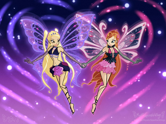
I’m 2 days late, but at long last here’s my Valentine’s Art 🥳
Inspired by a lovely necklace I own & Bloom’s “Pink Enchantix” Doll, it seemed fitting to me to celebrate love with my favorite pair of “sisters by choice” from Winx Club 💖
Please also enjoy the primary reasons this got posted late:
1. The Time Lapse Video on my YouTube Channel: https://youtu.be/nYMT0AF8MdU
2. The long written description on my DeviantArt: https://sta.sh/0z6gsr8xkbz
Now excuse me while I go take a nap because this DONE and I am TIRED 😴
#repost#reblog#mysticsparklewings#xxmysticwingsxx#digital art#winx club#winx bloom#winx stella#winx enchantix#Enchantix#fairy of the dragon flame#fairy of the sun and moon#dark Enchantix#dark Winx#fanart friday#winx fanart#valentines#valentines day#valentines aesthetic#illustration#fairies#magical girl#art#artists on tumblr#happy valentine's day
39 notes
·
View notes
Text
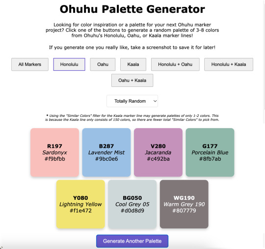
Ohuhu Palette Generator
----------
Hey look, I am actually capable of finishing & posting something!
What can I say? Life was just too chaotic the past couple of months and something had to give. Art posts were unfortunately the easiest thing to cut. 😅
Anyway. I have managed to chip away at a few projects in between other things, and this in particular was kind of a spur-of-the-moment decision I spent most of January working on: A very basic website where you click a button (or two) and get a random assortment of Ohuhu marker colors to then use however you see fit! ✨
If you are interested in listening to me ramble about how exactly we got here, that's what the "Keep Reading" button is there for. 😉
Like My Art and Want to see more of it? Here's All My Links! ⭐️
----------
Well Sparklers, this is certainly not how I expected to start off 2025 (nor did I plan to end 2024 as silently as I did as far as art posts go), but here we are! 🤗
Quick Recap: I made a very bare-bones website that will generate palettes of randomly selected Ohuhu markers colors for you!
I've probably said this somewhere before, but it bears repeating: I've been slowly but surely chipping away at various projects behind the scenes, a couple of the bigger more involved ones being related to yes, Ohuhu markers. [And for the record, no I really didn't forget about OhuHueVember, this past November just turned out to be one of the most chaotic and busiest of my entire life, and unfortunately putting art posts on Pause was what made the most sense at the time, and then December was just naturally busy what with Christmas and Family and all.]
A few days into the New Year, while I was taking a break and scrolling social media, since I am pretty deep into the wider Ohuhu Community at this point, I saw a kind of post that I've seen a few times before: Someone asking about generating color palettes of Ohuhu markers for coloring (as in adult coloring books). Usually, the "answer" to this is to use an existing color palette generator (of which there are many) and just manually match your markers to the colors, but that's not usually as easy of a solution as people are looking for.
I think there's at least one generator out there that can tell you Copic marker (and maybe Prismacolor pencil?) matches for the colors it generates, but it hasn't quite caught up with the boom in popularity that Ohuhu has had, so instead of matching to the color itself, you'd just be trying to match to the Copic color instead, which I would argue might actually be harder to do, even with some community resources that are out there.
The point is I know in the Coloring Community, people tend to like easy solutions and there really wasn't one for this specific problem. And I've known this for a while—since the first time I saw a post asking for something like that, which was many, many months ago (maybe even a year or more), but yet for some reason this most recent, totally inconspicuous post sighting was the straw the broke the camel's back and made me finally snap:
Surely there has to be something out there were you can put in a custom list of colors and it'll randomly spit like 5 of those colors back out at you. There are all kinds of random generator tools out there, surely at least one could do something like that, couldn't it?
So down the rabbit hole I went.
There wasn't a terribly straight line that lead me here and I went back and forth to a few things a few times, so I'll just give you a list of the highlights that had the most influence in how we got to this point:
I tried just about every keyword combination I could think of for "custom palette generator," "make your own palette generator," "make random color palettes," "color randomizer," etc. Even if it wasn't terribly fancy and the absolutely barest of bones of the concept I described. No real luck there, but it's very possible I just totally missed something.
I eventually checked Flippity.net because I love their Flippity Manipulatives tool (for digital Mini-Magnets), and their "Flippity Randomizer" would have worked except it has a very strong default color palette for what the final randomizer looks like. While it still would have been totally functional otherwise, I know the strong color mistmatch could very well be a dealbreaker for some people to not want to use it at all. (And, to be fair, the final Flippity links tend to be...long and suspicious looking if you've never seen one before.) You can use images with the Flippity Randomizer, but the thought of having to make 300+ separate small image files that would also need to include the color names and numbers directly in the image and then also put them in order in a Google Sheet sounded torturously tedious (even for me), so I filed that idea away as "Plan C" and kept looking.
Flippity did give me the idea to try looking for more generalized randomizers that could be re-purposed for what I wanted since theirs' was originally for making sentences. Through that, I finally stumbled upon perchance.org
Perchance all by itself was a big step in the right direction because it's entire purchase is making your own generators and you can use existing Perchance generators as a starting point to make new ones.
So imagine my delight to learn that there have been a few color generators already made with Perchance, and buried among them even a couple of Ohuhu ones!! 😃
But you'll notice my final generator isn't running through Perchance. Suffice to say, I know just enough about coding to be a menace, but not enough that I could truly say I ever really "know" what the heck I'm doing. My "coding experience" consists of:
Messing around with CSS and Journal Skins on deviantArt, back before the Eclipse update when those were still Things™
Many half-hearted attempts to make a Blogger blog, all of which were eventually deleted and lost to time
Creating and Maintaining Fandom Wiki pages (and, within the last couple of years, a whole Wiki for my own personal use)
Relatedly, I briefly tried messing around with some code on Toyhou.se but that ended up going nowhere
Playing with a premade theme here on Tumblr to make my page look nicer
And anyone with real coding experience might gather from that list that I certainly don't have the skills to build anything from scratch, but I can generally fumble around with existing code and figure out how to change things to make the end result look the way I want. So, as I said: I know just enough to be a menace.
This means that I started off by spending a lot of time hopping back and forth between different palette generators that had already been made with Perchance and Google while trying to combine various elements I liked in a way that ran smoothly...and also trying to not "break" anything so it would run at all.
I kept hitting walls with Perchance because, as I eventually figured out, I kept finding solutions and suggestions that were for "regular" HTML coding, not Perchance's specific variety.
After some Googling, this led me to move over to Glitch.com so that I could use regular HTML code but also still see the "live" results alongside the code, which was something I really liked about Perchance (and was familiar to me from Tumblr themes).
I also thought I'd end up making posting the final site through Glitch too, but we'll get to why that didn't happen in a bit.
The primary culprit that had me switch from Perchance to Glitch was the fact that I realized the code would be so much longer and probably what would be considered "messier," and I would guess more difficult to update at a moment's notice if I had to manually type 300+ color number codes, names, and hastily-selected hex codes (just to have a visual representation of the color) in there, let alone if I decided to basically do that twice to cover both the Honolulu and Oahu lines.
I keep a few different spreadsheets for Ohuhu markers already, so I wondered if there was a way to get the code to reference something like that instead to keep the code itself "cleaner" and maybe make edits/additions to the color list easier in the long-term. And lo and behold—There is! You can, apparently, paste in "CSV" Google Sheets links in a specific way into the code and it'll look at those instead of having to type everything directly into the code itself. I did have to make three separate spreadsheets—One for Honolulu, one for Oahu, and one for Kaala—but I was able to copy and paste a lot of the information I already had in my other spreadsheets into those, so overall that was still way easier than the alternative! The catch is that, as I alluded to, there might be a way to do that using Perchance, but the results I was finding were all for regular HTML code and I really did not feel like chasing down Perchance-specific instructions. So to Glitch I went.
Moving to Glitch did have the additional bonus of me being able to paste in the widget for my Ko-fi Page, which I only thought to do because I got a Ko-fi notification in the middle of working on the code and while I was checking that, I remembered: "Hey doesn't Ko-fi have like an HTML thingy you can put on your website?" [They have two, actually!] Anyway. I got what I'd already been working on moved over to Glitch, which was most of the basic set up for the page; I was just using a placeholder list of colors from OhuHueVember so I could get the Categories and page layout taken care of first. Then I did kinda the same thing—I set up the basis for the spreadsheets I'd need using the OhuHueVember list as placeholders since I already had hex codes picked out for them and wanted to make sure the whole spreadsheet thing was actually going to work before I went any farther.
Once I did verify that method was working, I got to take a very tedious detour and actually fill out the spreadsheets with the proper information. As I said, I was able to paste in a lot of what I needed from my other spreadsheets—The number codes and names for all the colors—but it was that last piece of information I needed for each color that ended up taking the longest: The hex codes. Since I wanted to have this thing at least functional sooner rather than later, I did not have time to go through and meticulously curate matching hex codes for each color like I did for OhuHueVember, and technically I couldn't have done that even if I wanted to for the Oahu and Kaala lines since my collection is all Honolulu. So I relied mostly on quick eyedropper color-picking from swatch photos from my collection and photos/images online for the rest.
From that, I know a lot of the hex codes are not good matches, but again: The point was to get everything functional first. Especially since I was able to switch to using spreadsheets to store the information, I can always (and intend to!) go back and update the hex codes to better matches later on.
Still: Once I got all the hex codes filled out, the most basic version of the generator was in fact functional! 🎉
That by itself was super exciting and I had to spend several minutes generating palettes just because I could now...But me being me, and not always knowing when to quit when I'm excited about a project...I wanted to do more, especially now that I was working in regular HTML coding.
So I spent the next couple of days trying to figure out how to add a Filter so people could narrow down the types of palettes a little more. My very first thought was Pastel, since I know soft/pastel palettes tend to be kind of popular in coloring communities, and then I figured if I was going to do Pastel, why not include bright "Vivid" pastels and dark "Moody" ones, too? [And a little later on I ended up adding a "Neutral" filter for greys + earth tones too, just because I could.]
Getting the little dropdown button in there for the Filter wasn't actually that bad, but getting it to actually filter like it was supposed to was another story. I lost count of how many times I accidentally broke the whole generate (mostly buttons not working like they should) while trying to get the filter to cooperate with me. 🫠
I did eventually....mostly get both the filters and the marker line buttons to work at the same time after enough trial and error, though.
And originally, this was the point in the story where I had to explain that I did run into issues with having "Kaala" + "Similiar Colors" in the dropdown selected at the same time causing the generator to freeze up about 7 out of 10 times, even though everything else was working fine, and I couldn't figure out how to fix it to save my life. 🙃
But! Shortly after I started writing this description I took a procrastination break and I went back in to try and clean up some of my notes I'd left in the code to tell the different sections apart...And I couldn't help myself. I had the code in front of me, so I started fiddling with it again.
Finally I hit the right keyword search I needed and was able to find a solution that actually worked and I could mostly just copy and paste in without breaking anything else in the process! 🙌
As I had suspected, the problem mostly stemmed from the fact that there are just a lot less Kaala colors to pick from—150, vs. the over 300 for either Oahu or Honolulu. So sometimes the generator would try to pull 3-8 "Similar Colors" and it just...couldn't because there weren't 3-8 colors that fit the "Similar" range it was calling for.
So I put in a few lines that basically force it to just use whatever colors are available even if it's not the intended 3-8...This does mean (as noted in the preview image and on the site itself) now you'll sometimes get just 1-2 colors with that specific combination (Kaala + "Similar Colors") but I think that works a whole lot better than the entire page bugging out.
But so, okay! Generator is (mostly) working as intended and I even added some extra things I hadn't originally planned on—I even got really crazy and tried adding some SEO things to the code because I found a template and you hear so much about how important that is now [I can't tell if it's really working or not, but it's in there)—Great! But there was one last thing that was bothering me...
Glitch has a limit of 1000 active hours per month on a project, and that includes both hours I spend editing the code and time people spend actually using it. Logically, do I really think I need to be worried that my very basic site that will only appeal to a very niche community within a niche community will come anywhere close to actually hitting 1000 hours of activity in a month? No.
But I also know this is the internet and sometimes you post things and they get way more attention than you expect (as sort of became the case with Ohuhu markers themselves), and to be fair I have no statistics whatsoever on the kind of time people usually spend on palette websites, so I really have no way to know if 1000 active hours is even an unrealistic expectation or not, in either direction.
Between that and past experiences with "Oh, I'll worry about that limitation later when it actually proves to be a problem," I decided to look into other options that wouldn't be limited by hours, and after a cursory look around, GitHub is probably way more complicated than what I really need, but it felt like the obvious choice. At least I'd actually heard of it before!
I can't edit the code "in real time" like I can with Glitch (at least not without signing up for a subscription, I don't think), but so far I can still edit in Glitch and just copy & paste the updated code into GitHub, so that'll work for me. And it might be for the better anyway since that's another layer between my trial-and-error editing and the final site, so if I go back and try to change or add to the site in the future (which I very well might) and I accidentally break more things, it won't effect the "live" site people are actually using. 😅
I must admit I kind of want to keep toying with the site to see just how far I can push it...And it's given me some ideas for other projects, too, but I have to draw the line in the sand somewhere so people can actually use it and it's not just a private project I tinker with sometimes for all eternity 😆 😊
At least I did accomplish what I originally set out to do + a few extra things, so I don't feel like it's really "missing" anything and it should be plenty usable even if it's not totally perfect. (And I'm speaking mostly of the imperfect hex codes when I say that, for the record.)
Like I said at the beginning: This is definitely not how I expected to start the year off, but I'm really happy with the end result and I'm cautiously optimistic about where/how things might go from here.
In any case, I hope any of your Sparklers that chose to try it out like/enjoy the generator too...Or at least that you got some enjoyment out of my rambling about it here. 😆 (Which I'm assuming you have if you managed to get this far....)
The Ko-fi widget is there on the final site, but I would like to get better at promoting myself and my work so it bears repeating: If you do like the generator and feel like sending a little monetary support my way, my Ko-fi Page has a few different ways you can do that. And if it means anything to anyone: My Ko-fi Supporters got a little early preview of the generator before today and if I add anything to it in the future, they'll probably get an early look at that too. 😉
I think that's going to do it for me here today, though. It's been a while since I made a "big" public post so I have to go get re-acquainted with my cross-posting process...Which I'm not really looking forward to, but oh well—has to be done!
I look forward to seeing you Sparklers again (hopefully) very soon...! 👋
----------
Website created by me, MysticSparklewings
The Generator/Website is not officially affiliated with or sponsored by Ohuhu
----------
⭐️ Like My Art and Want to see more of it? Here's All My Links! ⭐️
#mysticsparklewings#xxmysticwingsxx#ohuhu markers#alcohol markers#copic markers#limited palette#palette challenge#color challenge#art supplies#art resources#resource#free resource#cool websites#coloring tools#adult coloring#coloring challenge#colors#art inspirations#palette generator#markers#art tools#color palettes#ohuhu.
15 notes
·
View notes
Photo

I will be with You
When you go, just know that I will remember you If living was the hardest part, we’ll then one day be together And in the end we’ll fall apart, just as the leaves change in color And then I will be with you, I will be there one last time now –My Chemical Romance, “It’s Not a Fashion Statement, it’s a Deathwish” ____ It’s rare that I’m this proud of an artwork I’ve created. ^_^ Usually, there’s some glaring issue or just an assortment of small things I’d still change if I had the patience and/or artistic ability to do it. Or even just some things that I feel like could’ve been done better, even if I know it did the best I could. This time? No. Not right now, shortly after it’s been completed, anyway. I’m sure years down the line from now I’ll look back and feel at least slightly different. But as it stands now, while I’m sure it has its faults, I am truly happy and truly proud of what I’ve created here and whatever faults are there aren’t bothering me at all. So what then is this, exactly? This my dear Sparklers is a visual love letter to the band I discovered just a little too late but was still there for me when no one else was all the same. Earlier this month, I uploaded a different piece of art to celebrate the announcement of My Chemical Romance’s Return, but even when I uploaded that one I was already thinking of doing another one, this time something that was more obviously fan art. But not just fan art as I’ve done for them in the past (Exhibit A, Exhibit B, and Exhibit C), but something extra-special and fun. I really did go into creating this wanting it to be as I described it above; a visual love letter to this band that I love so much and could not be happier that they’re back. As such, I’ve squeezed in as many references as I could: 1. The female figure is molded after Helena from the album Three Cheers for Sweet Revenge 2. The male/skeleton figure is supposed to be Pepe (that’s what Google said his name was, anyway), the icon and seemingly marching band conductor from The Black Parade album 3. On Pepe’s hat, I replaced the usual symbol with the Candle symbol that’s been featured in the band’s Return artwork 4. They fade into leaves based on the line from It’s Not a Fashion Statement, It’s a Deathwish (a song from Three Cheers) that I quoted at the top of the description 5. behind them is Party Poison’s mask, as featured in the Danger Days music videos 6. on the mask, I replaced one of the black triangle shapes with the hanging man silhouette from I Brought You My Bullets, You Brought Me Your Love 7. The rest of the background is inspired by the covers for the Conventional Weapons releases (which in my mind I count as essentially an unofficial fifth album) (Debatable) 8. Their touching hands could be an indirect reference to the line “And as we’re touching hands, and as we’re falling down” from Demolition Lovers, a song from Bullets. That’s at least one reference each (Three Cheers technically got two) for each of the main releases, plus one directly related to this new era we don’t know much about yet. It’s not an exhaustive “spot the reference” game, but I’m glad I was able to incorporate as many as I did. Now that I’ve explained them, maybe I can talk about my process without having to stop to re-explain each reference as they come up. After some brainstorming, I got this image in my head of Helena and Pepe in this pose (inspired at least partially by this pre-existing fanart I’ve seen many times before) , which to me is a “renaissance dancing” pose but I’m sure there’s some other better way to describe it I haven’t thought of. I tried for a very long time to find a reference image of this exact pose to help me get the proportions and general anatomy right within my own stylization, but for the life of me, I couldn’t find anything close enough to suit me and I really didn’t want to have to settle for something else. As such, I’m sure the proportions and anatomy are off, but even so, I think I did pretty good considering. The main issues I ran into during sketching were mainly balancing the energy between the two characters–which I do think I managed in the end–Helena’s skirt, as she’s supposed to be holding onto it with that hand you can’t see, and Pepe’s torso. Originally, I was planning on doing this piece traditionally, but once the sketch was finished it almost immediately clicked into place that I’d be better served to do it digitally, considering what I wanted to do with the mask in the background already, as well as the leaf-fade. (The Conventional Weapons reference hadn’t been planned yet, and it was technically only made possible later on by this piece being digital.) Luckily, doing things digitally meant that Pepe’s torso was fixed pretty easily. It was too thin in the sketch, but all I had to do was select the right lines and move them out a bit in Photoshop. He’s still a bit thin and not super buff, but personally I’m letting that go because…I mean, he’s at least part if not all skeleton. If anyone’s going to be too thin, wouldn’t it make sense that it’s him? Helena’s skirt I did end up happy within the sketch but…we’ll come back to the skirt in a moment. Pepe’s…face? looked a bit odd in the sketch, but other than that, once I was happy with that foundation, I scanned it in and got to work on digitizing everything. I went over my lines for Helena and Pepe the way I normally would for something like this if a little intentionally messy instead of trying to get them super clean–as I thought that might be appropriate here–and then I paused with them to work on the mask behind them. The mask admittedly came out very poorly in the sketch, just because I bothered to look up no references for it whatsoever once I decided I was going to make this digital and I knew I could just draw half of it and flip it over. And I’m glad I didn’t start trying to follow my sketch lines for it at all because looking up actual references showed me that would’ve been way off. While I had my reference up, I ended up going in and basically full-coloring and detailing the mask right then. That’s the beauty of digital work; a lot of steps can be done basically out of order from how you’d have to do them traditionally and it doesn’t matter because you can just move layers around and adjust effects later. I went with this pseudo-soft shading based on the colors and shadows I was seeing in my references, even though I wasn’t sure yet exactly how I was going to shade Helena and Pepe. I figured that even if I used a different method for them that I could either go back and adjust the mask as necessary or that it wouldn’t matter since the mask was part of the background anyway. Once that was done, I went back to ponder my two figures and the leaf effect that I wanted to do with them. And again, I went a little out of order here, as I ended up filling in the silhouette of Helena and Pepe with a blanket layer of gray so I could see how them blocking the mask was going to look (and I figured based on past experiences I might need the blanket layer in white later). From there, I went into working on the fading-to-leaves effect. My logic was that I’d need mostly the silhouettes of the leaves and then I’d get what I wanted after playing with layer effects or something. This assumption ended up being correct, but we’re not there yet. As I worked, I kept looking at my “finished” messy lines. Something just didn’t feel right. Honestly, I couldn’t tell you where the idea to do this lineless look came from, but it got in my head as I was working and I kept looking at the lines I had and not being happy to just color those in as I normally would, shade it, and call it a day. I tried. I tried really hard to ignore the urge to at least try it and carry on as I was. I’d already come this far, and I’d be done so much faster if I stuck to the plan…But!! Clearly I lost that argument with myself. You know what though? I’m glad I did! I don’t think I’ve ever done lineless art like this before, not counting my watercolor work where that’s just part of the process to me. But digital? Certainly not. Human figures? Also no. I’ve come close in the sense that I’ve shaded my art before, turned off the line layers before, and thought, “oh hey that almost works without the lines because of the shading,” but not much farther than that. Naturally, I wasn’t even sure how or where to begin, so I went with what came naturally to me. I started by just filling in the lines as I normally would have, and then I went back layer by layer and went back and forth between having the line layer (with the opacity brought down somewhat already so I could sort of see what I was doing) on and off to try and balance the shapes between what they looked like with and without the lines. It’s weird because if you ever try this, it’s a little like having to figure out a bunch of individual silhouettes that make one whole one, except you need them to be a little more defined if you want them to make visual sense. That step and the next one, the shading, are tied in my mind for which one took me the longest. For the shading, I really just went in blind, using hard-edge cell shading, though originally I planning to come back with some soft shading in certain areas later. The soft shading ended up not happening partly because I liked it much better than I thought I would without it, and I thought the hard-edge shading made the figures pop a little more compared to the background. The thing about this was the same issue I run into with my lines nowadays; to get smooth shapes I spend a while going back and forth between putting color down and erasing it, and sometimes undoing and redoing the same line a dozen times to get it right in one stroke. But that’s really my own fault for being stubborn and trying to work solely within Photoshop and not use other programs, as I know good and well I’d have less of that issue if I’d hop into Paint Tool Sai and use the linework layers in there. What can I say? I live up to my Capricorn sign by being as stubborn as a goat. Anyway. The biggest challenge to figure out the shading for was Helena’s skirt. I think I would’ve still had issues with that though even if I colored and shaded my normal way, with the lines and everything. It’s just the position it’s in that complicates things. I actually did a good amount of shading in reverse here, where I’d make the base layer the shadow color and then the layer on top would be the regular color, as in some cases it just seemed easier to do that than the other way around. The part of Helena’s dress around the top, for example. Or Pepe’s pants (what little you can see of them). Additionally, I ended up leaving the feather attached to Pepe’s hat alone and not really smoothing it out, as I thought the roughness and inconsistencies worked really well to make it seem more feathery. With enough patience and persistence and much back and forth among the various layers, I made it through all of that. I was a little concerned at first about some of my color choices and if the shading was too harsh in some places or not, but I mellowed out as I worked and ended up not making make adjustments after the fact. For instance, originally I thought I’d go back and make Pepe’s…skin? closer to a true white and this fleshy off-white color was more of a placeholder, but the longer I worked with it, the more I didn’t want to change it. It actually makes sense, given that his hands are normal (as they are presented in official artwork and other fan art not made by me) and that bones usually are naturally more of an off-white color. And I also think it just looks really good next to Helena’s pale skin. The hands were a special challenge in regards to both shading and coloring, as hands like to be the more complicated part of a drawing more often than not, but even that I managed to get through with a lot more ease than I would’ve bet on. The other thing about that is that I was surprised once I got through the steps at how much better Pepe’s face looked in comparison to the rest of the drawing. As I mentioned before, it looked odd in the sketch. But one I had most of the colors for him and Helena filled in digitally, the contrast or something just made it look infinitely better. (Combined with a hefty dose of earlier back-and-forth making adjustments to his jawbone area.) Originally, I thought I might use the same cell shading for Helena’s eyeshadow. However, while I was still thinking of adding some selective soft shading, I added it using one of the brushes I’d used on the mask earlier. It looked so good to me that even after I tried added the soft shading with it like I planned and decided I didn’t want/need it anywhere else, I kept it. And for the record, Helena’s hair is kind of the wrong texture (it’s officially more straight than this) and she’s missing this little netted veil thing she’s supposed to have, but I had a very specific vision in mind, so those were the two creative liberties I took with her design. I say it’s fair game since I took a liberty with Pepe’s hat to get the Return reference in. And besides, those two details being off doesn’t make her totally unrecognizable if you know who Helena is in the first place. Once they were done, I spent longer than I bothered to document playing with the leaf layer I’d made earlier to try and figure out how to get the effect I wanted. Sparing you the boring details of my trial error, as I’m sure this description will be long enough without them, I eventually determined the best thing to do was to have one layer of the leaves on top set as an “overlay” layer, and another behind/beneath Helena and Pepe. Then I went back and extended my color and shading layers to extend down over the leaves, and I arranged and clipped the layers accordingly. Technically, the overlay layer wasn’t necessary, but it added a little extra dimension that I really liked. By that point, it was my second day of working digitally and getting late, but I had to do one more thing before I could go to bed with my mind at ease that night. With Helena and Pepe done, I turned the mask back on (I’d turned it off so I could focus on them without it distracting me or otherwise getting in the way) and I felt like they weren’t standing out enough against it. The bright yellow color was competing too much for my eyes’ attention. So, after trying the “stroke” blending option in white and that looking God-awful, I added a new layer between them and the mask and manually gave them a white outline. It wasn’t a perfect solution, and I knew that even then, but it was enough that I could sleep soundly knowing how far I’d gotten with the artwork. The next day I had to take a break from working on this to bust out a painting for the challenge I decided to take on this month, but I went back to this as soon as I could after that was taken care of. When I came back to it, I acknowledged that I technically could’ve left it as it was and call it finished. But I still didn’t like how obnoxious the mask seemed for a background piece and it felt…I don’t know. Almost hollow, in a way. It was a cool graphic, sure, but I wanting something more than that. Again, I’ll spare you most of the nitty-gritty details. But long story short, I played around with layer effects and filters for a while until I had blurred the mask out just enough that it wasn’t so obnoxious but also so looking at it directly didn’t make me nauseous, and the edges were softened so it felt more like a true background piece and not just an accessory that had been plastered carelessly back there. It was only after I started saving off versions with different backgrounds–one with no background, one with white, one with black–that I realized I was missing a golden (semi pun intended) opportunity to incorporate a Conventional Weapons reference/allusion. Which was exciting because I’d previously been disappointed that I couldn’t think of a good way to do that. I went back and forth on layer styles and adding texture with brushes and things for a while on that too, but you can see what I ultimately settled on. It’s not a 1:1 to the CW covers, but I’m really pleased with it anyway. I did end up adding a bit more to the white outline in a few places and adding a drop shadow to Helena and Pepe so they’d pop a bit more (it almost makes them look like paper cutouts to me!), but really the only other thing I had to do after that was add my watermark. It took roughly 3 days of work from start to finish, but I was honestly surprised by how fairly smooth the process went. Especially considering the new things I’d tried along the way. I can only assume it’s because of just how much my heart was really into making this piece. As I said before, I am truly proud of how this piece turned out. I love it. I love it, and I love the band that inspired its creation. Even the title says a lot here, I think. I picked this line that’s repeated at the end of It’s Not a Fashion Statement, It’s a Deathwish, as it was a leading inspiration with the leaves and everything, and after looking at the lyrics I realized how fitting that line is for this. I discovered My Chemical Romance two years too late, two years after they broke up in 2013, but I’ve stuck by them ever since, and I will continue to do so, with whatever the unwritten future holds. They’ve changed, as anyone would over the course of six years, but they came back anyway. Even if it’s just for a few shows and they’re gone again. Or if it’s going to be so much more than that. They. Came. Back. And that’s not an easy thing to do a lot of the time. And so, I show my solidarity. I will be with you, MCR, no matter what comes next. You were there for me, and now it’s my turn to be there for you, even if it as just another fan among the crowd. And that’s really all I have to say on the matter. ____ Artwork © me, MysticSparkleWings ____ Where to find me & my artwork: My Website | Commission Info + Prices | Ko-Fi | dA Print Shop | RedBubble | Twitter | Tumblr | Instagram
#reblog#five years ago today#my chemical romance#mcr#mcrmy#mcr fanart#my chemical romance art#fanart#it’s not a fashion statement it’s a deathwish#three cheers for sweet revenge#Helena#the black parade#danger days#long live the black parade
7 notes
·
View notes
Text

OhuHueVember Week 1 💛
----------
Featuring Johanna Basford’s 30 Days Of Flowers 💐
In case you thought I forgot about this challenge: Nope! I decided early on it would be best for me to only do the *posts* once a week since that’s the part that really wore me out during October. 😵💫
…I also wanted to post this yesterday, but suffice to say this past week was a wild ride so it just wasn’t possible. 😅
Same as always: Click the "Keep Reading" and we'll talk a bit more about my general thoughts/process. ✨
Like My Art and Want to see more of it? Here's All My Links! ⭐️
----------
Featured Ohuhu Colors:
Day 1: GY6 Anise
Day 2: Y3 Barium Yellow
Day 3: Y1 Pastel Yellow
Day 4: YR2 Marigold
Day 5: YR4 Salmon Pink
----------
Did any of you Sparklers question if I just posted the prompt list for OhuHueVember and then forgot all about it? 😆
If you read my epic-length write-up when I posted the list, probably not, but for those who saw that wall of text and understandably said, "no thank you," this post itself should make it pretty obvious: Nope, I didn't forget!
At the tail end of the super long write-up, I disclosed that while I would be doing OhuHueVember daily, I would only be making posts once a week since it was the daily posting that wore me out the most during Inktober.
...And for the record, I wanted to make this post yesterday, the true "end" of OhuHueVember Week 1 (at least the way I laid the days out) but, naturally, this past week was one heck of a wild ride in my offline life (and not for the reasons you'd assume if you're from the US) and so I begrudgingly came to the difficult conclusion that "waiting one more day to post won't hurt."
That's also why this post is considerably later in the evening than I had hoped—I thought doing them once a week would mean I could at least get the weekly posts out around lunch time!—and I was also unable to post at least two other things I was hoping to have finished this week. 🫠
With those things in mind, I hope you Sparklers will understand that I'm going to handle the rest of this description as briefly as I can manage so that I can go ahead and get this posted and go about the rest of my evening—So if I seem to be jumping around a bit more than usual, that's why. Hopefully, next week will be a bit of a different story (in a positive way).
As also stated towards the end of my super-long OhuHueVember write up: "I've been wanting to get back into just coloring in Adult Coloring books (or single pages made for that audience) occasionally, as I've unintentionally moved away from that hobby for a few years when I used to do it all the time. When I first started, the hobby was still pretty new and niche, and sharing finished pages felt "wrong" to try and mix in with my regular art posts, but things have noticeably changed since then.
And in particular, using Ohuhu markers in adult coloring books has actually become pretty common.
So that's part of what I'm going to do to try and scale this challenge back...I've printed out Johanna Basford's 30 Days of Flowers on small, 2.5" x 3.5" cuts of my favorite mixed media paper—Artist Trading Card size!—and those are what I'm going to color for the month." I did try to find some information on what each of these 30 flowers is supposed to be so that I could better match the OhuHueVember colors to the appropriate ones, but I couldn't find anything definitive for every single one and I didn't have the patience (or time, for that matter, considering I was running way behind on prep for the challenge as it was) to try and manually research each one. So I ended up using what finished colorings Johanna had posted as a starting reference, then made adjustments and filled in the blanks based on a combination of feelings and what I thought would work best for the marker colors. (Which as you'll see later in the month proved to be a bit of a challenge for the greens, but I'm getting way ahead of myself.) You'll notice though that I didn't use just the single Color of the Day. I used the light/dark blends that I also listed in the Spreadsheet for the challenge, plus I'm using my old 72 set of Schpirerr Farben pencils for any additional color beyond the three markers for each day. I meant it when I said you could use as many other colors as you want for the challenge, because I knew I myself wouldn't be able to resist the temptation! 🤭
And in case anyone cares, I'm going with the Schpirerr Farben instead of my true favorite Prismacolor partly because I just want to use them more—they are my third favorite behind Prismacolor and the Brutfuner Macarons (which you Sparklers have yet to hear me talk about, but I promise it is on the to-do list!) afterall—but also because the 72 selection is more limited and therefore a tiny bit more challenging than the Prismas would be. And I semi-recently set them up in a zipper case so they're easier to reach for than they used to be.
Believe it or not, the backgrounds were actually the most difficult thing to decide. And I'm still not 100% sure they'll stay exactly as they are. 😅
I thought about either using the Color of the Day itself, or maybe during the Weekly Colors for each flower for that week, but both of those had trivial problems I couldn't think my way around when I did some experiments on a test sheet.
And I did not want to spend a whole lot of time or color on the backgrounds outside of those options either way because I didn't want to take any more attention away from whatever the Color of the Day would be than necessary.
So ultimately, this soft cool gray with a gel pen outline was where I landed. But I'm still debating if I want to go back and add stars/sparkles with the white gel pen to each one too, as I did that a lot in my smaller tests to try and jazz things up a little. I've held off for now because once I got these actual cards done with just the white outline, I liked them more without the stars than I expected...But I'm just not ready to fully close the door on the star idea yet. So at the end of the month, if you see some stars have magically appeared on these, you'll know why!
Oh: And if you couldn't tell, one more way I'm attempting to limit how difficult this challenge is for me is by just photographing each week's 5 flower cards together instead of trying to scan and then color-correct each one. The photos still need some slight tweaks—especially on days like today where it was gloomy overcast and I couldn't photograph in natural light—but it's an order of magnitude less work than trying to scan, crop, and correction each one would be.
I might bother to scan them all at the end of the month for optimal preservation, but I make no promises.
Beyond all that, I'm trying to just handle each day in whatever way I think gives the Color of the Day a chance to shine while still making the final look something I like. Which is a relevant thing to say because YR2/Day 4 and YR4/Day 5 here are not typically colors I would pick for coloring flowers; I was really worried about how both of them would turn out, but YR4 might actually be my favorite of this batch! YR2 is probably still my least favorite just because it's so earthy, but if I pretend the earthiness of the color doesn't bother me, I do still think it turned out nice.
And if you're wondering what happened with the leaves for Y1/Day 3, I was trying to switch things up a bit with a more jewel-tone dark teal and some pink like what I now know are called Caladium plants. It's weird and not really what I had in mind, but I actually still like the results quite a bit.
I think until we hit the actual green colors on the list, that's going to be one of the trickier parts of choosing to handle this challenge with flower illustrations—Figuring out how to keep the stems and leaves from all looking the same. 🤔
But hey, I feel like I managed decently enough here, so maybe I'm anticipating a bigger problem than I should be. Only one way to find out...!
One last thing I will say: As I sort of expected, for as chaotic as everything else in life has been, yeah being able to sit down and just worry about putting colors together in a way that looks nice has tended to be a welcome little reprieve each day. And also expected, not having to worry about posting every day has been kind of a relief, even though I've still had plenty of other stuff on my plate—See what I mentioned before about not having at least two other things done and posted by now that I wanted to. 😅
So now it's that time again for me to leave you Sparklers to chew on what I've laid out here while I move onto cross-posting. I may only be doing it once a week this month, but that doesn't really change how involved the process itself is when the time comes.
Either way, whether you've chosen to join me on this colorful adventure in some way or not, I hope we've all started the month off as strongly as we can and that if nothing else, we can all look forward to some more forthcoming colorful flowers. 💐
I'll see you all again definitely next week, but with any luck, hopefully a little sooner than that! 👋
----------
See the Prompt List
Coloring/Photo by MysticSparkleWings (me)
Linework from Johanna Basford's 30 Days of Flowers
----------
⭐️ Like My Art and Want to see more of it? Here's All My Links! ⭐️
#OhuHueVember#Huevember#Ohuhu#ohuhu markers#ohuhu art#alcohol markers#copic markers#traditional art#art challenge#artist trading cards#colored pencils#adult coloring#johanna basford#flowers#mixed media#WorldOfFlowers#30DaysOfFlowers#30 days of flowers#warm colors#marker art#XXMysticWingsXX#MysticSparkleWings
3 notes
·
View notes

Text
OhuHueVember Prompt List


Finally, I can share the surprise I’ve been working on! 😆 (Though admittedly later in the day than I really wanted...)
After years of wanting to try out Huevmber, I finally thought of a way to make it work for me, all because I spend far too much time thinking about markers. 🤪 And I did my best to make it easy for others to join in, if you want to!
I tried to get all the essential information on the images themselves but y’all know me by now—If you need more information, I’ve got a MUCH longer write-up hiding behind the "Keep Reading" button + a Spreadsheet, if you need it, too! ✨
⭐️ Like My Art and Want to see more of it? Here's All My Links! ⭐️
----------
Before I get into my usual long-winded description (and trust, it will be long), if you want to actually follow this prompt list—Or the Weekly version—here's what you need to know (some of which is already stated in the image, but I want to keep things as clear and easy to understand as possible!):
Here's the "Official" Spreadsheet that has all of the color codes, Honolulu color names, and some additional information like recommended Light/Dark blend pairings for each color typed out, both in case the image format doesn't work for you and also because some things like the Light/Dark blends just wouldn't all fit in one image. [A sample photo of the Light/Dark blend pairings will also be available soon, and I'll add a link here when they are, but I unfortunately ran out of time to have them ready to post alongside the list
As the upper right corner says: This challenge is not officially affiliated or sponsored by Ohuhu, I just like the markers and have had them on the brain a lot lately!
This is open to all mediums! While this challenge was inspired by working with Ohuhu markers traditionally, as the image says: If you don't have these specific markers or colors, use what you do have! This includes doing the challenge digitally if digital tools are what you have, or whatever other medium you're comfortable with and have access to: Original Art, Coloring Pages, Card Crafting, etc. The point is to play with color and have fun, so as long as you're doing that, pretty much anything goes!
Likewise, as the image says: The idea is to focus on 1 Color ("Hue") Everyday in November, but you can use as many colors as you want each day as long as the "Color of the Day" is the main focus/main visible color.
I've provided a Weekly version of the list in case the full 30 is too much, but you can pick-and-choose words from the full list however you'd like if you're not crazy about the colors I picked for the Weekly version, or if you want to shorten the challenge in a different way. - Do note though that the 5 colors I chose for the Weekly version were selected to specifically work well as a 5-color "mixing" palette to make those 5 colors stretch farther as a limited palette, if you're up for a little extra challenge. Based on this video by Peter Donahue.
Tagging me is appreciated, but not required! However, do note that I will Like & Share posts that I can easily identify as being related to the challenge on platforms where I'm able to do those things. If you want me to see and share what you made, Tagging me makes it easier!
Remember that my views on these Month-Long Daily Challenges is that it's about the challenge of completing a certain amount of creative pieces in the time given...And that's pretty much it, so as long as you're doing that and having fun, I'm really not bothered about how you choose to follow the list! My Inktober motto has always been "work smarter, not harder," and this is no different!
I think that's all the stuff you need to know to participate, but if you're curious in hearing more about my thoughts/process in putting this challenge together, read on!
----------
Would you Sparklers believe that I was so excited about sharing this that I had trouble staying asleep until time to get up this morning? 😆 It's true!
Either way, some of you are probably wondering just as much as I am what exactly has gotten into me lately: First I make my own prompt list for October—something I can't say I ever previously thought I'd do—and now here I am just having finished that list with yet another daily, month-long challenge...And I made this list, too! 😱
Some of you may have noticed that as we went through Obscutober this year, there were various points where I hinted at working on something marker-related and/or something for November. If you haven't figured it out already, this is what that was about! 🤭
And you'd think I would have learned my lesson about taking on one Daily Challenge after another back in 2021...
I'm sorry, Sparklers, I just had the mid-typing realization that the last time I took on a daily challenge in November was also immediately after the last time I did Obscutober instead of Inktober and my brain froze for a second. How did I not notice that before??
What was I saying? Oh.
At that time, I took on @ProjectEducate's 30 Days of Art Challenge, but I also attempted to dial things way back for myself by using it as an excuse to playing more Animal Crossing: New Horizons rather that making full-blown artwork everyday..And while that did help, it still turned out to be my challenging than I expected. 😅
That's one of the primary [ha] reasons I've never participated in the "traditional" Huevember challenge for November, even though I found it very appealing when I discovered it existed. I know myself, and just the same as I typically don't have the stamina to do Inktober in a "normal" way, I know I definitely don't have the stamina to do Huevember in a "normal" way immediately following Inktober (even if I do account for the fact that I do Inktober in weird ways).
Making my own list makes that no different, but then...What are we doing here? 🤔
Well, all of this really stems from the fact that—as I believe I've mentioned somewhere before, maybe multiple places—I've been spending quite a lot of time over on Reddit discussing and answering questions about Ohuhu Markers. As it stands, Ohuhu themselves doesn't provide a ton of resources for the markers, so it largely falls back on the user community to fill in the gaps, and it happens that I know, keep track of, or otherwise have close-at-hand a lot of "gap" information specifically for the purposes of keeping my Ohuhu Swatch Chart up to date.
I also do just really like the markers, so as much of a chore as it can be to keep track of all the information at times, I really don't mind getting the opportunity to just nerd out about them a few times a week.
The thing is, as is not too difficult to notice if you look at my art posting history, I haven't actually had a whole lot of time or allowed myself as much opportunity as I'd like to make actual art with my Ohuhu markers.
So back in September while I was trying to figure out what in the world to do for Inktober this year and one of my friends offhandedly suggested a "Swatch Challenge" for Inktober, in a matter of minutes my brain connected dots from "Swatches" to > "Colors" to > "Huevember" to > "Ohuhu" to > "OhuHUE"!! "Huevember but with Ohuhu markers, specifically!!" 💡
While obviously not really at all helpful for figuring out Inktober, that did sound like a great way to take advantage of how much the markers have been on my mind lately and participate in the Ohuhu community some more beyond being, essentially, a sentient FAQ page. 😆
So, as crazy of a move as it felt—and still does—What time I wasn't planning for and then working on Obscutober during September and October (and wasn't spent either dealing with IRL things or giving myself some much-needed break time in between), I spent trying to pull things together to make this challenge possible.
Those things included (not really in a particular order as a lot of these things I went back-and-forth with at various stages):
Picking the 30 colors that would be featured. The more natural choice probably would have been to "match" Ohuhu colors to the existing Huevember colors, but after thinking it over, I decided it would be better to try and keep things more accessible, if I could. Not everyone will have the big 320 set of Ohuhu Honolulu colors to choose from, but I know a lot of people will probably have at least the "standard" 48 colors that the Honolulu line started with—Either because like me, that's the set they started with, or because those 48 colors are all included in quite a few other "standard" sets.
For what it's worth, I did consider starting with the 24-count Honolulu set colors to try and make the colors even more accessible, but that set has NO orange in it for some reason and I wanted this challenge to be as colorful as possible, so I didn't really want to include black or grey if I could help it.
In the other direction; I very nearly included R13 from the 72 set to try and flesh out the purple sleections more, but I noticed that while I was putting the suggested blends together, the light/dark blends that make the most sense with R13 made the trio-blend look nearly identical to the trio blend for PB2. So in the end, I decided to just shift the Dark blend on PB2 to a slightly more purple-y blue and leave R13 out after all.
In exchange, P3 got added to the list...which made things a little harder in figuring out the trio blends for P4, but my only other option for purple in the 48 set was R11, and in my blend testing it proved even trickier to deal with. 🙃
Picking said Light/Dark blend for each color. This most involved a lot of swatching and test blends, which was easily the longest and most laborious part of the process.
And as stated at the top of the description, I fully intended to have a sample photo to show you those blends in action—I have swatch cards all labelled and everything!—but I simply ran out of time to have that ready to post alongside the list today. 😅
I'm still going to do the samples, it'll just be either later today or tomorrow before they're ready. Either way, I'll post a link here when they are!
I'll spare you the nitty-gritty on the process of picking out said blends, but suffice to say there was a LOT of back-and-forth that took up 5 pieces of cardstock—some of them front and back—because I wanted blends that stayed "true" to the hue of each color, and still actually showed variation in the lightness or darkness of the color, but also were relatively "easy" blends that didn't take too much work to look smooth. At least on the type of paper I like to use (60-80 lb. cardstock or 80-100+ lb. mixed media paper). I did learn from another test that these blends do still mostly work on plain printer paper, for example, but it's not quite the same, so your mileage will vary a little bit on how easy the blends really are. Why did I find this step even necessary to bother with, for as much trouble as it was? Call it a symptom of the wider Ohuhu and alcohol-marker using community. People are always wondering what/how to blend clothes together well, and between that and trying to provide what accessibility to the challenge I can, offering pre-selected blends seemed like a good idea. [And, if I'm being totally honest, I didn't realize exactly how much work figuring the blends out would be and thought getting the chance to just play with color blends sounded fun when I made the decision to do it. 😅]
To that end, I also of course Determined reasonable Hex Code "matches" for each color. Again, this was largely an accessibility thing trying to account for people that either don't have the specific colors/markers listed and want to attempt to match the colors in some way, and to provide an option for any digital artists just in case any see the list and want to give it a try, especially since digital brushes that mimic alcohol marker behavior have become more popular in recent years.
As noted in the Spreadsheet, I both looked at multiple swatches of the actual real marker colors and was using some of those digital "alcohol marker" brushes to text how the selected digital color would behave. I'm quite sure some of my final choices aren't completely perfect picks, especially if you're working in a different program than I was (Procreate), but I at least stand by them as "reasonably close" options.
And just in case anyone passed by this post and is wondering, because I know I've seen people ask for it—I would in fact like to one day provide "reasonably close' Hex code matches for all of the Ohuhu Honolulu markers, but that is definitely a far-off project you should not expect from me any time soon after seeing just how challenging it was to do for these 30 alone. 🫠
Worth an additional here that I actually originally wanted to include hex matches for the Light and Dark blends to make "Light" and "Dark" versions of the prompt list itself for people who do have access to the 320 range and maybe wanted to play with color in different ways than the "base" tones, but again: Figuring out the hex matches for these 30 was trouble enough and I could tell I really, really was not going to have time to do that and the other prep work I still had left to do at that point.
Speaking of, I had to Determine Oahu matches or "close enough" alternatives for each color. Yet again the magic word is accessibility, and I've also noticed that the Oahu (no brush tip) markers just sorted get left out when it comes to Community Ohuhu Resources. Since we now have a Spreadsheet reportedly from Ohuhu themselves listing which Oahu and Honolulu colors match, it was important to me to include them, even if it was a little more work.
For all of the colors that had 1:1 matches, it really wasn't too bad. What through me for a loop was the few colors that didn't have 1:1 matches, so I had to go track down some swatch examples and make an educated guess which other Oahu colors would be closest. So there's your acknowledgement right now, just like the image says, I know at least a few of the Oahu colors aren't exact matches. Both because exact matches don't exist, but also the "closest" matches I did pick may not be fully accurate either since I don't own the Oahus and had to pick based on swatches over the internet. I'm sorry, this is the best I could do!
And of course, what I consider a key component of making Month-Long challenges accessible: I had to Put together a Weekly version!
As noted at the beginning and in the description for the Weekly version: I chose for the Weekly version were selected to specifically work well as a 5-color "mixing" palette to make those 5 colors stretch farther as a limited palette, if you're up for a little extra challenge. Based on this video by Peter Donahue. I had actually previously picked out 5 colors from the 320 Honolulu range after seeing Pete's video purely for fun. Alcohol markers notoriously aren't usually good for "mixing" to get new colors the way you would paints or pencils, but I was intrigued by his limited palette since he was working with oil paints, which kind of notoriously don't mix as vibrantly as other media. For the record, my original 320 set picks for the 5 colors are:
Y080
B070
PB2
RV080
YR3
Two of which were already in my selection of 30 for this challenge, and B070 was naturally super close to PB7. Initially, RP1 was a closer match to RV080, but in testing I found that R10 mixed better for this selection.
So really the only color I had to make a big compromise on was Y080. There's really nothing else quite like in the entire Honolulu range, but in my testing GY6 worked better than I expected as a substitute, considering the limited options I had to choose from here. And then I just lucked out that November technically takes up 5 weeks on the calendar, I just had to figure out the "spacing" so each color would get a reasonable number of days to work with, the same way that I adjusted the days for the Weekly version of Obscutober. [And frankly, that was easier to do here since November has 30 days and 30 divides evenly by 5.]
I did briefly re-visit the idea of sticking just to colors from the 24 Honolulu set so the Weekly version could be as accessible as possible, but long story short the longer I look at the color selections for that set, the weirder the stranger they seem, so I ultimately I couldn't help myself and just went with the colors I thought would be more versatile even if they're not likely to be as accessible.
I mean, after all, I was going to have a disclaimer that you can use whatever you want even if you don't have these specific colors anyway, so hopefully it won't be too big of a deal that I opted for the palette that I personally saw more use in. Oh, and for what it's worth: I did consider making a "Lite"/every-other-day version of this list like I did last month, but after seeing the "Lite" version was not a popular choice last month and acknowledging I already had my work cut out for me, I decided it didn't really seem worth the extra effort when I fully believe everyone is capable of skipping days on their own as they see fit.
And then, of course, another step that ended up being trickier than I expected: I had to figure out how to compile all of this information, or at least most of it, in a single image. (Well, okay, two images including the Weekly version, but you get the idea.)
Again, I'll spare you the nitty-gritty, but I will say that while I did clearly figure something out, I nearly completed another version in a more typical list format before deciding I didn't like how little you could actually see the colors themselves in it. I don't know about you Sparklers, but "Huevember" makes me think colorful, so that's how I wanted the list/post image to be.
In the midst of trying to figure out a better way to do the list for maximum information + maximum color + maximum clarity, I paused to work on the wrap-up template for this year's Obscutober (which yes, is still a thing I'm going to do, probably tomorrow), and it was from doing the calendar format for that from which sprang the idea to try a calendar format for this! 😃
If you look at one of my usual Inktober wrap-ups, you'll notice it's still not 1:1 because I had a lot more text information that needed to be here, but y'know I think it was a pretty great solution, all things considered. 😊
Though, for the record, the Weekly version was originally going to have the bars for each "week" in proper calendar format too—spread over the actual calendar days each one would take up—but that was scrapped because the longer I looked, the more confusing that layout looked for the actual information. So I sacrificed the cheekiness in the name of making it clear and easy to get the information you need from that version.
You might have guesses that even though I was working on this in the background for nearly two months that I still maybe bit off more than I could chew by the fact this is going up both on November 1st instead of a couple of days in advance (like I was very fortunately able to manage with Obscutober) and it's also going up in the very-late "afternoon" instead of more like around lunchtime. 😅
I really, really did my best to have everything ready before now, but the last couple of weeks of October proved much busier than I expected. I probably should've seen that coming because that always seems to happen when I'm working on a time-sensitive project that's big and important to me, but I can't see the future and I can't just never work on another big, important project again because I'm afraid that'll happen, so... 🤷♀️
I just have to accept this is the way things turned out and try not to be too hard on myself about it. It was a lot of work and still deserve credit for that, at least!
Speaking of: Some of you might be wondering about that long-ago mentioned point: "I know myself, and just the same as I typically don't have the stamina to do Inktober in a "normal" way, I know I definitely don't have the stamina to do Huevember in a "normal" way immediately following Inktober..." That is still true, and I do not plan to approach my challenge here in a "normal" way either, for that reason.
But, much like my logic of "well, I made the list, I should use it," for Obscutober, after all the work I put into this, I am still going to use the list/participate, and not just the Weekly version either. [Though I fully admit just doing the Weekly version would probably be the smarter thing to do for me...]
I'll try and keep this brief since the description is certainly enough of a book already and the sooner I can wrap this up and get it posted so other people can actually participate if they want to, the better, but:
I've been wanting to get back into just coloring in Adult Coloring books (or single pages made for that audience) occasionally, as I've unintentionally moved away from that hobby for a few years when I used to do it all the time. When I first started, the hobby was still pretty new and niche, and sharing finished pages felt "wrong" to try and mix in with my regular art posts, but things have noticeably changed since then.
And in particular, using Ohuhu markers in adult coloring books has actually become pretty common.
So that's the first part of what I'm going to do to try and scale this challenge back so I can still particpate be hopefully not overwhelm myself: After some consideration of options, I've printed out some of Johanna Basford's similar illustrations on small, 2.5" x 3.5" cuts of my favorite mixed media paper—Artist Trading Card size!—and those are what I'm going to color for the month.
The second part of how I'm going to scale back is that, while I am going to actually color something every day for the challenge, I'm only going to post my finished results once a week. Because I found/remembered during Obscutober that since I both like to type out these long descriptions (even when it's not really necessary) and cross-post to about a dozen places, the actual posting-everyday-process is what really wears me out and gets me down, often far more than making the art itself typically does. 🫠
I admittedly had much grander plans and was hoping to still post every day in some way when I first set out to make this challenge, but I think if you've read the description this far, you'll understand why I had to change course for my own sake. 😅
Speaking of...Let me think for a moment if this might be it, if I've explained everything I wanted to both about the challenge itself and my approach to it...
I think so, but there was a lot to cover so hopefully if I did leave anything out, it wasn't that important and I can either edit this description or just touch on it at some later point during the month.
Either way, I hope if anyone does want to participate—as I am boldly assuming at least a few people will—I hope you're not too upset and/or can forgive me for not being able to post this sooner so you could get started sooner. As discussed, I did my best and I feel any frustration or disappointment you may have with the posting time of the list, 100%. But I am unfortunately only one human that can only do so much in a day's time that does not have the budget to hire an assistant to help me do stuff like this at this point in my life. 🙃
Oh! For the record, I don't plan to make this a yearly thing, which is why I've not put a year on the image or in the title. Mainly because having to pick all-new colors would really mess with the various points of accessibility I've tried so hard to keep, so if this does turn out to be a thing people want to do again, my plan would honestly be to just use the same list in perpetuity, and maybe just add onto it with some of the things and ideas I didn't have time to flesh out the way I wanted this year. However, that said, I'm not fully opposed to revisiting the idea of wholly new color assortments in the future if this version proves successful enough. What exactly that "enough" is I won't know until I see it, but I did just want to lay all my cards on the table for people who might be curious about long-terms plans here. Now, if you all will excuse me, I best go ahead and get this cross-posted while there is still some sun in the sky and, as mentioned, after that I still have a few other things on my plate that need my attention for the day—including my own participation in the challenge!
So, whether you choose to participate or not: Here's to starting the month off strong and having fun! 🥂 And good luck to us all!
----------
List Design © me, MysticSparklewings
This Challenge is not officially affiliated with or sponsored by Ohuhu
----------
⭐️ Like My Art and Want to see more of it? Here's All My Links! ⭐️
13 notes
·
View notes
Text
OhuHueVember Prompt List
Finally, I can share the surprise I’ve been working on! 😆 (Though admittedly later in the day than I really wanted...)
After years of wanting to try out Huevmber, I finally thought of a way to make it work for me, all because I spend far too much time thinking about markers. 🤪 And I did my best to make it easy for others to join in, if you want to!
I tried to get all the essential information on the images themselves but y’all know me by now—If you need more information, I’ve got a MUCH longer write-up hiding behind the "Keep Reading" button + a Spreadsheet, if you need it, too! ✨
⭐️ Like My Art and Want to see more of it? Here's All My Links! ⭐️
----------
Before I get into my usual long-winded description (and trust, it will be long), if you want to actually follow this prompt list—Or the Weekly version—here's what you need to know (some of which is already stated in the image, but I want to keep things as clear and easy to understand as possible!):
Here's the "Official" Spreadsheet that has all of the color codes, Honolulu color names, and some additional information like recommended Light/Dark blend pairings for each color typed out, both in case the image format doesn't work for you and also because some things like the Light/Dark blends just wouldn't all fit in one image. [A sample photo of the Light/Dark blend pairings will also be available soon, and I'll add a link here when they are, but I unfortunately ran out of time to have them ready to post alongside the list
As the upper right corner says: This challenge is not officially affiliated or sponsored by Ohuhu, I just like the markers and have had them on the brain a lot lately!
This is open to all mediums! While this challenge was inspired by working with Ohuhu markers traditionally, as the image says: If you don't have these specific markers or colors, use what you do have! This includes doing the challenge digitally if digital tools are what you have, or whatever other medium you're comfortable with and have access to: Original Art, Coloring Pages, Card Crafting, etc. The point is to play with color and have fun, so as long as you're doing that, pretty much anything goes!
Likewise, as the image says: The idea is to focus on 1 Color ("Hue") Everyday in November, but you can use as many colors as you want each day as long as the "Color of the Day" is the main focus/main visible color.
I've provided a Weekly version of the list in case the full 30 is too much, but you can pick-and-choose words from the full list however you'd like if you're not crazy about the colors I picked for the Weekly version, or if you want to shorten the challenge in a different way. - Do note though that the 5 colors I chose for the Weekly version were selected to specifically work well as a 5-color "mixing" palette to make those 5 colors stretch farther as a limited palette, if you're up for a little extra challenge. Based on this video by Peter Donahue.
Tagging me is appreciated, but not required! However, do note that I will Like & Share posts that I can easily identify as being related to the challenge on platforms where I'm able to do those things. If you want me to see and share what you made, Tagging me makes it easier!
Remember that my views on these Month-Long Daily Challenges is that it's about the challenge of completing a certain amount of creative pieces in the time given...And that's pretty much it, so as long as you're doing that and having fun, I'm really not bothered about how you choose to follow the list! My Inktober motto has always been "work smarter, not harder," and this is no different!
I think that's all the stuff you need to know to participate, but if you're curious in hearing more about my thoughts/process in putting this challenge together, read on!
----------
Would you Sparklers believe that I was so excited about sharing this that I had trouble staying asleep until time to get up this morning? 😆 It's true!
Either way, some of you are probably wondering just as much as I am what exactly has gotten into me lately: First I make my own prompt list for October—something I can't say I ever previously thought I'd do—and now here I am just having finished that list with yet another daily, month-long challenge...And I made this list, too! 😱
Some of you may have noticed that as we went through Obscutober this year, there were various points where I hinted at working on something marker-related and/or something for November. If you haven't figured it out already, this is what that was about! 🤭
And you'd think I would have learned my lesson about taking on one Daily Challenge after another back in 2021...
I'm sorry, Sparklers, I just had the mid-typing realization that the last time I took on a daily challenge in November was also immediately after the last time I did Obscutober instead of Inktober and my brain froze for a second. How did I not notice that before??
What was I saying? Oh.
At that time, I took on @ProjectEducate's 30 Days of Art Challenge, but I also attempted to dial things way back for myself by using it as an excuse to playing more Animal Crossing: New Horizons rather that making full-blown artwork everyday..And while that did help, it still turned out to be my challenging than I expected. 😅
That's one of the primary [ha] reasons I've never participated in the "traditional" Huevember challenge for November, even though I found it very appealing when I discovered it existed. I know myself, and just the same as I typically don't have the stamina to do Inktober in a "normal" way, I know I definitely don't have the stamina to do Huevember in a "normal" way immediately following Inktober (even if I do account for the fact that I do Inktober in weird ways).
Making my own list makes that no different, but then...What are we doing here? 🤔
Well, all of this really stems from the fact that—as I believe I've mentioned somewhere before, maybe multiple places—I've been spending quite a lot of time over on Reddit discussing and answering questions about Ohuhu Markers. As it stands, Ohuhu themselves doesn't provide a ton of resources for the markers, so it largely falls back on the user community to fill in the gaps, and it happens that I know, keep track of, or otherwise have close-at-hand a lot of "gap" information specifically for the purposes of keeping my Ohuhu Swatch Chart up to date.
I also do just really like the markers, so as much of a chore as it can be to keep track of all the information at times, I really don't mind getting the opportunity to just nerd out about them a few times a week.
The thing is, as is not too difficult to notice if you look at my art posting history, I haven't actually had a whole lot of time or allowed myself as much opportunity as I'd like to make actual art with my Ohuhu markers.
So back in September while I was trying to figure out what in the world to do for Inktober this year and one of my friends offhandedly suggested a "Swatch Challenge" for Inktober, in a matter of minutes my brain connected dots from "Swatches" to > "Colors" to > "Huevember" to > "Ohuhu" to > "OhuHUE"!! "Huevember but with Ohuhu markers, specifically!!" 💡
While obviously not really at all helpful for figuring out Inktober, that did sound like a great way to take advantage of how much the markers have been on my mind lately and participate in the Ohuhu community some more beyond being, essentially, a sentient FAQ page. 😆
So, as crazy of a move as it felt—and still does—What time I wasn't planning for and then working on Obscutober during September and October (and wasn't spent either dealing with IRL things or giving myself some much-needed break time in between), I spent trying to pull things together to make this challenge possible.
Those things included (not really in a particular order as a lot of these things I went back-and-forth with at various stages):
Picking the 30 colors that would be featured. The more natural choice probably would have been to "match" Ohuhu colors to the existing Huevember colors, but after thinking it over, I decided it would be better to try and keep things more accessible, if I could. Not everyone will have the big 320 set of Ohuhu Honolulu colors to choose from, but I know a lot of people will probably have at least the "standard" 48 colors that the Honolulu line started with—Either because like me, that's the set they started with, or because those 48 colors are all included in quite a few other "standard" sets.
For what it's worth, I did consider starting with the 24-count Honolulu set colors to try and make the colors even more accessible, but that set has NO orange in it for some reason and I wanted this challenge to be as colorful as possible, so I didn't really want to include black or grey if I could help it.
In the other direction; I very nearly included R13 from the 72 set to try and flesh out the purple sleections more, but I noticed that while I was putting the suggested blends together, the light/dark blends that make the most sense with R13 made the trio-blend look nearly identical to the trio blend for PB2. So in the end, I decided to just shift the Dark blend on PB2 to a slightly more purple-y blue and leave R13 out after all.
In exchange, P3 got added to the list...which made things a little harder in figuring out the trio blends for P4, but my only other option for purple in the 48 set was R11, and in my blend testing it proved even trickier to deal with. 🙃
Picking said Light/Dark blend for each color. This most involved a lot of swatching and test blends, which was easily the longest and most laborious part of the process.
And as stated at the top of the description, I fully intended to have a sample photo to show you those blends in action—I have swatch cards all labelled and everything!—but I simply ran out of time to have that ready to post alongside the list today. 😅
I'm still going to do the samples, it'll just be either later today or tomorrow before they're ready. Either way, I'll post a link here when they are!
I'll spare you the nitty-gritty on the process of picking out said blends, but suffice to say there was a LOT of back-and-forth that took up 5 pieces of cardstock—some of them front and back—because I wanted blends that stayed "true" to the hue of each color, and still actually showed variation in the lightness or darkness of the color, but also were relatively "easy" blends that didn't take too much work to look smooth. At least on the type of paper I like to use (60-80 lb. cardstock or 80-100+ lb. mixed media paper). I did learn from another test that these blends do still mostly work on plain printer paper, for example, but it's not quite the same, so your mileage will vary a little bit on how easy the blends really are. Why did I find this step even necessary to bother with, for as much trouble as it was? Call it a symptom of the wider Ohuhu and alcohol-marker using community. People are always wondering what/how to blend clothes together well, and between that and trying to provide what accessibility to the challenge I can, offering pre-selected blends seemed like a good idea. [And, if I'm being totally honest, I didn't realize exactly how much work figuring the blends out would be and thought getting the chance to just play with color blends sounded fun when I made the decision to do it. 😅]
To that end, I also of course Determined reasonable Hex Code "matches" for each color. Again, this was largely an accessibility thing trying to account for people that either don't have the specific colors/markers listed and want to attempt to match the colors in some way, and to provide an option for any digital artists just in case any see the list and want to give it a try, especially since digital brushes that mimic alcohol marker behavior have become more popular in recent years.
As noted in the Spreadsheet, I both looked at multiple swatches of the actual real marker colors and was using some of those digital "alcohol marker" brushes to text how the selected digital color would behave. I'm quite sure some of my final choices aren't completely perfect picks, especially if you're working in a different program than I was (Procreate), but I at least stand by them as "reasonably close" options.
And just in case anyone passed by this post and is wondering, because I know I've seen people ask for it—I would in fact like to one day provide "reasonably close' Hex code matches for all of the Ohuhu Honolulu markers, but that is definitely a far-off project you should not expect from me any time soon after seeing just how challenging it was to do for these 30 alone. 🫠
Worth an additional here that I actually originally wanted to include hex matches for the Light and Dark blends to make "Light" and "Dark" versions of the prompt list itself for people who do have access to the 320 range and maybe wanted to play with color in different ways than the "base" tones, but again: Figuring out the hex matches for these 30 was trouble enough and I could tell I really, really was not going to have time to do that and the other prep work I still had left to do at that point.
Speaking of, I had to Determine Oahu matches or "close enough" alternatives for each color. Yet again the magic word is accessibility, and I've also noticed that the Oahu (no brush tip) markers just sorted get left out when it comes to Community Ohuhu Resources. Since we now have a Spreadsheet reportedly from Ohuhu themselves listing which Oahu and Honolulu colors match, it was important to me to include them, even if it was a little more work.
For all of the colors that had 1:1 matches, it really wasn't too bad. What through me for a loop was the few colors that didn't have 1:1 matches, so I had to go track down some swatch examples and make an educated guess which other Oahu colors would be closest. So there's your acknowledgement right now, just like the image says, I know at least a few of the Oahu colors aren't exact matches. Both because exact matches don't exist, but also the "closest" matches I did pick may not be fully accurate either since I don't own the Oahus and had to pick based on swatches over the internet. I'm sorry, this is the best I could do!
And of course, what I consider a key component of making Month-Long challenges accessible: I had to Put together a Weekly version!
As noted at the beginning and in the description for the Weekly version: I chose for the Weekly version were selected to specifically work well as a 5-color "mixing" palette to make those 5 colors stretch farther as a limited palette, if you're up for a little extra challenge. Based on this video by Peter Donahue. I had actually previously picked out 5 colors from the 320 Honolulu range after seeing Pete's video purely for fun. Alcohol markers notoriously aren't usually good for "mixing" to get new colors the way you would paints or pencils, but I was intrigued by his limited palette since he was working with oil paints, which kind of notoriously don't mix as vibrantly as other media. For the record, my original 320 set picks for the 5 colors are:
Y080
B070
PB2
RV080
YR3
Two of which were already in my selection of 30 for this challenge, and B070 was naturally super close to PB7. Initially, RP1 was a closer match to RV080, but in testing I found that R10 mixed better for this selection.
So really the only color I had to make a big compromise on was Y080. There's really nothing else quite like in the entire Honolulu range, but in my testing GY6 worked better than I expected as a substitute, considering the limited options I had to choose from here. And then I just lucked out that November technically takes up 5 weeks on the calendar, I just had to figure out the "spacing" so each color would get a reasonable number of days to work with, the same way that I adjusted the days for the Weekly version of Obscutober. [And frankly, that was easier to do here since November has 30 days and 30 divides evenly by 5.]
I did briefly re-visit the idea of sticking just to colors from the 24 Honolulu set so the Weekly version could be as accessible as possible, but long story short the longer I look at the color selections for that set, the weirder the stranger they seem, so I ultimately I couldn't help myself and just went with the colors I thought would be more versatile even if they're not likely to be as accessible.
I mean, after all, I was going to have a disclaimer that you can use whatever you want even if you don't have these specific colors anyway, so hopefully it won't be too big of a deal that I opted for the palette that I personally saw more use in. Oh, and for what it's worth: I did consider making a "Lite"/every-other-day version of this list like I did last month, but after seeing the "Lite" version was not a popular choice last month and acknowledging I already had my work cut out for me, I decided it didn't really seem worth the extra effort when I fully believe everyone is capable of skipping days on their own as they see fit.
And then, of course, another step that ended up being trickier than I expected: I had to figure out how to compile all of this information, or at least most of it, in a single image. (Well, okay, two images including the Weekly version, but you get the idea.)
Again, I'll spare you the nitty-gritty, but I will say that while I did clearly figure something out, I nearly completed another version in a more typical list format before deciding I didn't like how little you could actually see the colors themselves in it. I don't know about you Sparklers, but "Huevember" makes me think colorful, so that's how I wanted the list/post image to be.
In the midst of trying to figure out a better way to do the list for maximum information + maximum color + maximum clarity, I paused to work on the wrap-up template for this year's Obscutober (which yes, is still a thing I'm going to do, probably tomorrow), and it was from doing the calendar format for that from which sprang the idea to try a calendar format for this! 😃
If you look at one of my usual Inktober wrap-ups, you'll notice it's still not 1:1 because I had a lot more text information that needed to be here, but y'know I think it was a pretty great solution, all things considered. 😊
Though, for the record, the Weekly version was originally going to have the bars for each "week" in proper calendar format too—spread over the actual calendar days each one would take up—but that was scrapped because the longer I looked, the more confusing that layout looked for the actual information. So I sacrificed the cheekiness in the name of making it clear and easy to get the information you need from that version.
You might have guesses that even though I was working on this in the background for nearly two months that I still maybe bit off more than I could chew by the fact this is going up both on November 1st instead of a couple of days in advance (like I was very fortunately able to manage with Obscutober) and it's also going up in the very-late "afternoon" instead of more like around lunchtime. 😅
I really, really did my best to have everything ready before now, but the last couple of weeks of October proved much busier than I expected. I probably should've seen that coming because that always seems to happen when I'm working on a time-sensitive project that's big and important to me, but I can't see the future and I can't just never work on another big, important project again because I'm afraid that'll happen, so... 🤷♀️
I just have to accept this is the way things turned out and try not to be too hard on myself about it. It was a lot of work and still deserve credit for that, at least!
Speaking of: Some of you might be wondering about that long-ago mentioned point: "I know myself, and just the same as I typically don't have the stamina to do Inktober in a "normal" way, I know I definitely don't have the stamina to do Huevember in a "normal" way immediately following Inktober..." That is still true, and I do not plan to approach my challenge here in a "normal" way either, for that reason.
But, much like my logic of "well, I made the list, I should use it," for Obscutober, after all the work I put into this, I am still going to use the list/participate, and not just the Weekly version either. [Though I fully admit just doing the Weekly version would probably be the smarter thing to do for me...]
I'll try and keep this brief since the description is certainly enough of a book already and the sooner I can wrap this up and get it posted so other people can actually participate if they want to, the better, but:
I've been wanting to get back into just coloring in Adult Coloring books (or single pages made for that audience) occasionally, as I've unintentionally moved away from that hobby for a few years when I used to do it all the time. When I first started, the hobby was still pretty new and niche, and sharing finished pages felt "wrong" to try and mix in with my regular art posts, but things have noticeably changed since then.
And in particular, using Ohuhu markers in adult coloring books has actually become pretty common.
So that's the first part of what I'm going to do to try and scale this challenge back so I can still particpate be hopefully not overwhelm myself: After some consideration of options, I've printed out some of Johanna Basford's similar illustrations on small, 2.5" x 3.5" cuts of my favorite mixed media paper—Artist Trading Card size!—and those are what I'm going to color for the month.
The second part of how I'm going to scale back is that, while I am going to actually color something every day for the challenge, I'm only going to post my finished results once a week. Because I found/remembered during Obscutober that since I both like to type out these long descriptions (even when it's not really necessary) and cross-post to about a dozen places, the actual posting-everyday-process is what really wears me out and gets me down, often far more than making the art itself typically does. 🫠
I admittedly had much grander plans and was hoping to still post every day in some way when I first set out to make this challenge, but I think if you've read the description this far, you'll understand why I had to change course for my own sake. 😅
Speaking of...Let me think for a moment if this might be it, if I've explained everything I wanted to both about the challenge itself and my approach to it...
I think so, but there was a lot to cover so hopefully if I did leave anything out, it wasn't that important and I can either edit this description or just touch on it at some later point during the month.
Either way, I hope if anyone does want to participate—as I am boldly assuming at least a few people will—I hope you're not too upset and/or can forgive me for not being able to post this sooner so you could get started sooner. As discussed, I did my best and I feel any frustration or disappointment you may have with the posting time of the list, 100%. But I am unfortunately only one human that can only do so much in a day's time that does not have the budget to hire an assistant to help me do stuff like this at this point in my life. 🙃
Oh! For the record, I don't plan to make this a yearly thing, which is why I've not put a year on the image or in the title. Mainly because having to pick all-new colors would really mess with the various points of accessibility I've tried so hard to keep, so if this does turn out to be a thing people want to do again, my plan would honestly be to just use the same list in perpetuity, and maybe just add onto it with some of the things and ideas I didn't have time to flesh out the way I wanted this year. However, that said, I'm not fully opposed to revisiting the idea of wholly new color assortments in the future if this version proves successful enough. What exactly that "enough" is I won't know until I see it, but I did just want to lay all my cards on the table for people who might be curious about long-terms plans here. Now, if you all will excuse me, I best go ahead and get this cross-posted while there is still some sun in the sky and, as mentioned, after that I still have a few other things on my plate that need my attention for the day—including my own participation in the challenge!
So, whether you choose to participate or not: Here's to starting the month off strong and having fun! 🥂 And good luck to us all!
----------
List Design © me, MysticSparklewings
This Challenge is not officially affiliated with or sponsored by Ohuhu
----------
⭐️ Like My Art and Want to see more of it? Here's All My Links! ⭐️
#mysticsparklewings#xxmysticwingsxx#OhuHueVember#ohuhu markers#alcohol markers#copic markers#huevember#art prompts#art challenge#prompt list#limited palette#palette challenge#markers#copic sketch#sketch markers#olo markers#color challenge#november challenge#art inspiration#colors#rainbow#art supplies#use what you got#resources#free resource#art resources#hex codes#ohuhu
13 notes
·
View notes
Text

Obscutober 2024 Day 31: Paracosm 🦄
----------
Paracosm (n.)
a detailed imaginary world, especially one created by a child
----------
Inktober is officially OVER!! 🥳YAHOO!! 🎉
…Oh, and Happy Halloween, too. 🎃
I did my best to go out on a high note, and I think I largely succeeded…even if the results aren’t very Halloween-ish. 😅
Click the "Keep Reading" and we'll talk a bit more about my general thoughts/process. ✨
Like My Art and Want to see more of it? Here's All My Links! ⭐️
----------
At long last, we end very similarly to how it all began: In a "world" of sparkle and starlight. 😉
I could wax poetic here about how glad I am to be done, but I think me just saying those words alone is plenty enough of that for tonight. Besides, if you really want to split hairs, it's not over until we do the wrap-up image you Sparklers know I usually like to do...
Anyway. I'm not sure my posting time will reflect this by the time I get done with this description, but I did start on this one early enough in the day to give myself plenty of time to brainstorm and play with the concepts a bit. Though, in fairness, I don't think I actually ended up scratching that many ideas or changing my mind all that much as I worked; I think the bulk of my time was just spent trying to figure out where to squeeze in more detail. After all, the definition does say a detailed imaginary world.
Now, I will admit that I'm not entirely sure this really evokes "world" so much as "little house," ("playhouse?") but this is very much another word I put on the list thinking it would be fun to play with in poetry format. More specifically, I was thinking of how satisfying it was to end Obscutober 2021 with "Phantasmagoria"Obscutober 2021 with "Phantasmagoria" as the final word and was hoping for a similar experience.
But as we discussed yesterday: I'm not working in poetry format this time! 🙃
So I relied on the same "Adult Coloring Book Vibes" that I was trying to channel yesterday, because when I think of trying to encapsulate a tiny imaginary world in a detailed but simple drawing, a lot of Johanna Basford's work comes to mind, particularly her book "Small Victories."
From there, a tiny house as an "easy" way to communicate this is meant to somehow be representative of a whole world wasn't a far leap of logic, so that's what I ran with.
I will also take this opportunity to point out that I deliberately drew the houses to point inward, towards the center of the mandala, to kind of go along with the idea of an "inner" world. It was also just a nice change because I somehow did not really notice until today that every other Obscutober piece I've done this month except maybe Day 7 all "point" outward in some way. 😦
Not that which way they "point" matters all that much, I'm just surprised I didn't really notice I hadn't taken advantage of the ability to "point" inward. That could've been fun to play with on Day 23 in particular!
It also doesn't really show at all, but I was thinking about Haunted Houses when I drew the little house, since tonight is Halloween, which is part of why it doesn't use very many properly straight lines...And you might be able to see a the tiniest bat I have ever drawn in my life over the door! But that's about as far as I got with making the house look "haunted." I had thoughts of pushing it further, but I held back because I knew I wanted to get kind of rainbow-y with the color scheme and didn't want the house to clash too much with that.
And as you can probably tell, I also just didn't have a ton of space to play with a lot of fine "spooky" details and have them actually be recognizable. The windows on the house were pushing the limits as it was. 😅
Speaking of windows, I'm not sure how well it comes across, but I did try to put some edging around the houses to create kind of a cathedral/stained glass window effect. Ironic as heck considering I mostly tried to avoid that kind of thing all month previously because I had two glass-specific words I wanted to let have that option on the table...And then I mostly didn't even use that effect for those specific days. 🙃
But! Go big or go home, I wanted to have fun and I like stained glass, so here we are!
I kind of tried to tie the "world" aspect back into it by filling some of the "glass" spaces with those cobblestone-ish spaces. Obviously it's not a "yellow brick road" as in a certain imaginary world because it's not all yellow, but calling it a "rainbow stone road" in similar fashion would be fair, I think. 😉 It's cute and goes super well with the stained glass impression...In fact that might be carrying the whole stained gladd impression by itself, but I'll let Sparklers decide that for yourselves.
Also, to my credit, I did try to bring in a little more "spook" by going with moths to help fill out the rest of the space rather than my first choice, butterflies. Butterflies don't really specifically have anything to do with imaginary worlds, I know, but they seem to have gotten filed in the same folder in my brain. At the very least you could draw the connection between butterflies (and moths), fairies, and magic, which would fit in nicely with an imaginary world.
However, my compromise was starting with the very butterfly-esque Luna moth, which is more colorful but they do have a very eye-like marking on their wings, which I attempt to use to my full advantage here (while still attempting to keep it at least a little abstract).
I was actually going to have all Luna moths all the way around, but when I copied & rotated the layer I discovered they were too long and go cut off on the other 4-points, which I did not like the look of.
So rather than have to figure out something else to draw in their place or re-draw new months from scratch, I erased the bottoms of the wings, altered the shape of what was left a bit, then changed the antennae and the "eyes" on the wings to be a bit different. Boom! New "normal" brown-ish moths. 🦋 And y'know, the brownish moths don't get enough love compared to their flashier counterparts anyway, so they deserve to be here and I'm happy to have them.
To polish things off, I felt it essential to have a rainbow border. More than anything else, I associate rainbows with the concept of imagination. I very nearly put some clouds in there too, but then I remembered how surprsingly annoying it's been to get cloud shapes I'm happy with in this format at various points earlier in the month. So no clouds, just more rainbow bits to fill the space where the clouds would've been.
Besides, this way it kind of looks like the moths are going to fly over the houses, bringing the rainbows with them, which is a pretty cute idea. 😊
And then I topped things off with some stars/sparkles because one of my earlier ideas was to get some trees in here and maybe evoke the idea of laying out under the stars at night, letting your imagination run wild. But as evidenced by my little trees stumps, I did not actually get very far in entertaining that particular idea. 😅
Setting the scene at night does go better with the hints of more Halloween-ish themes, though, so all is well.
The colors then are about as self-explanation as you can get. The only thing I didn't really touch on is that I tried to make the house black/purple with red roofing, but I kept the layers light because I didn't want the coloring in those spots to stick out too much. I think it's better if the house can kind of "blend in" as just a small final nudge to the idea that they're just a small part of a larger world, rather than their own central figure. If that makes any sense.
In the end, I do think this turned out as one my better more doodle-y attempts for the month. Just goes to show what a difference actually having time to think about what the heck I was doing can make. [I say knowing my past self cannot hear/see this yet because that's how the past works.]
And I do think this is among my favorites for the month, but I'm still not quite ready to say it's my favorite-favorite. It is missing some more "traditional" mandala touches that make it harder to compare with those that strike the doodle vs. traditional balance better. I tried to squeeze a couple things in there, but ultimately my other ideas literally and figuratively took up to much space to really leave room for that.
It looks good—great even!—though! So I'm thrilled to go out on a relatively high note, especially after the last few prompts both gave me trouble and were a bit of a whirlwind to make since I was so bad at giving myself enough time to make them in. 😅
...Well, it's a high note for now. We'll see how hard of a time I have with cross-posting and if that dampens my mood too much or not. 🫠
Still, that won't change the fact that I am DONE. I DID IT!! And now I can safely focus all of my attention on a certain other project I've been working on prepping for November in the background all the while.
Still, that won't change the fact that I am DONE. I DID IT!! And now I can safely focus all of my attention on a certain other project I've been working on prepping for November in the background all the while.
I'll see you Sparklers tomorrow, bright and...colorful. 😉 👋
----------
See the Prompt List
Artwork © me, MysticSparklewings
Obscutober Concept Inspired by nikolas_tower
----------
⭐️ Like My Art and Want to see more of it? Here's All My Links! ⭐️
#happy halloween#halloween#inktober#mysticsparklewings#xxmysticwingsxx#drawtober#illustration#procreate#digital art#obscure words#rare words#subtle halloween#tiny house#house#imagination#imaginary world#paracosm#colorful#rainbows#moths#luna moth#mandala art#obscutober#obscutober2024#mysticsobscutober#inktober2024#IT'S OVER
3 notes
·
View notes
Text
Obscutober 2024 Day 30: Vitrine 💎
----------
Vitrine (n.)
a glass display case
----------
I may have still be short on ideas for this one, but I think I was mentally prepared for it a bit more, which helped considerably. 🙌
My best? No, but I do like it! Let’s just hope I can say at least that much tomorrow…😅 So close to the end!!
Click the "Keep Reading" and we'll talk a bit more about my general thoughts/process. ✨
Like My Art and Want to see more of it? Here's All My Links! ⭐️
----------
I admittedly yet again did not have a ton of ideas for this one, and it probably shows. 😅 However, I do think I managed a little bit better because I actually remembered this one was on the list for most of the month, so it's been kind of living in my subconscious all the while. I think that shows, too.
This was though a word I originally put on the list because of the fun I thought it would be if I'd chosen to work with the mini-magnets. Yes, a glass display case itself is a very specific thing, but the cases can be designed in a few different ways, serve different purposes, and hold a multitude of different things. I had it in mind that toying with the different expectations and contents of a glass display would lend themselves well to poetry.
...But I'm not working with poetry here, am I? 🙃
At least not literally; If you want to argue figuratively, I won't stop you.
Still, in another timeline where I had more than just a single day—probably more like a whole month to itself—to play around with the concept, and maybe if I had decided to work on a bigger canvas, I might have ended up with an outcome more like some of the designs you see in Adult Coloring books. I'm thinking along the lines of Johanna Basford's work, but she's just the one I know best by name, plenty of others I think could also do wonders with, "A glass display case full of interesting stuff."
I did try to capture a little of that general idea, still, but some of Sparklers are probably familiar enough with what I usually have to say about these mandalas by now that you might guess: I wanted to lean more in the "traditional mandala" direction. Both just for the aesthetic-y reasons, but yeah I will be frank that that way, particularly with this kind of subject, was much faster, too.
Speaking of, I would also like it on the record that I initially didn't back myself into quite as tight of time-crunch corner tonight...But I neglected to notice my Apple Pencil needed charging before I got started, so at one point I had to both break for dinner and just to let the pencil charge, and that basically ate up whatever tiny bit of "extra" time I had when I got started. 🫠
Anyway. I started with a vaguely French/Rocco Vitrine-inspired shape as my base, then "decorated" it a little, and tried to"fill" it with a few things—A crystal ball, something that lightly resembles perfum bottles, and a gem. Then I went around filling space with a little Art Nouveu and little Art Deco, kind of thinking of a jewelry store that's maybe been around for years and years, that would have a bunch of antique-y display cases hanging around instead of the sleek, boxy modern kind.
So not the most elaborate design in the world, but I do think this is one of my better attempts to marry the more doodle-y nature a lot of these have come out with and some more typical mandala motifs and ideas. It's still certainly not perfect in that regard, but I do think it kind of stands out in a good way because of that.
This is thought probably another where the colors are doing a lot of work to help things along. 😅
White lines were a must. They felt kind of essential to the "glass" feel, much like back on Day 21. And now is a good time to note that I also fought with myself quite a bit on the colors to keep the two of them—today and Day 21—from feeling too similar to each other. This was mainly accomplished by sticking with teals and avoiding "true" blues. Which, I do think that made for a nice nod to how a lot of glass has kind of an underlying green tint to it.
I still can't say I necessarily avoided them looking similar as much as I would've liked, all the things considered, but the clock was ticking, so it is what it is. 🤷♀️
...And I think that's kind of everything I have to say, really. Probably for the best since typing this out took longer than I expected and I still have to get to cross-posting, but I do feel a little bad that I managed to enjoy this one more than the last few and feel like I have even less to say about it. 🫤
Oh well. At least I am happy with it. I hope I can say at least that much tomorrow...And naturally, I really hope I can get tomorrow's posted earlier so I can be DONE and work on some other things, but after the way last week and this week is going so far...I have my doubts.
Even so, wish me luck either way, Sparklers—We're so close to the end!! 😵💫
----------
See the Prompt List
Artwork © me, MysticSparklewings
Obscutober Concept Inspired by nikolas_tower
----------
⭐️ Like My Art and Want to see more of it? Here's All My Links! ⭐️
#inktober#mysticsparklewings#xxmysticwingsxx#drawtober#illustration#procreate#digital art#obscure words#rare words#obsuctober#obscutober2024#mysticsobscutober#glass#glass case#display#case#on display#jewels#jewelry#mandala art#inktober2024
5 notes
·
View notes
Text

Obscutober Day 23: Sylvan
-consisting of or associated with woods; wooded -pleasantly rural or pastoral
hes 110% ok i promise. hes fine. he likes it in there
the list, and list maker: @mysticsparklewings
3 notes
·
View notes

Text

Obscutober 2024 Day 29: Bemire ☔️
----------
Bemire (v.)
to soil with mire (mud); dirty or muddy
to cause an object (or person) to sink in mire
----------
TWO DAYS. Just two. More. Days. And October/Inktober will be over!!
I’m both so ready and so very not. Does it show? 😅
Also: What’s with the shortage on gardening emojis?? First no shovel, now no dirt/mud/soil! 🤨
Click the "Keep Reading" and we'll talk a bit more about my general thoughts/process for the artwork. ✨
Like My Art and Want to see more of it? Here's All My Links! ⭐️
----------
Okay, cross-posting and a late dinner later: We have another (probably) short and sweet description tonight, Sparklers.
I fully admit to procrastinating on this one. 😅 both once again did not have a ton of great ideas and after how chaotic last week was, I really wanted to just rest and focus on something else for the bulk of the day.
Clearly, that ended up costing me in posting time, but we're so close to the end that my patience with October is starting to wear thin (as it normally does), so I think I really kinda needed that procrastination time today.
This was also not helped by the fact that I've been trying to balance working on Obscutober with working on another project for November, which you can see a very vague preview of as a Member of my Ko-fi page, if you're interested. As I said in that Ko-fi post, I'm not quite ready to reveal what exactly this project is, but I bring it up because my brain has latched into it as the more interesting project, so there have been several days where it's been a genuine struggle to tear my attention away from it when I know the Obscutober clock is ticking. 🙃
So suffice to say, everything is just starting to pile up and my brain has largely checked-out early for Obscutober. 🫠
But! Part of my brain also insists on seeing this through since we've come so far already, so here we are!
I should also mention: Part of the problem is also definitely yet more evidence I did not look over the final prompt list as closely as I maybe should have. Had I realized I had a string of fairly one-note prompts lined up right near the end of the list, I would've tried to break them up.
You could make the argument that even I had gone over the list more carefully that I wouldn't have realized these last few words wouldn't give me much to work with, but I had enough sense to make sure "Smaragdine" and "Feuillemort" had some space between them since they were both color words. 🤷♀️
Anyway, I think it's probably pretty obvious my one good idea here was the combination of rain boots and mud puddles—or at least something resembling a mud puddle—since "mud" is a primary feature of this definition. Then I just played with some wiggly mud-inspired lines and the idea of rain clouds.
There were so conscious efforts and choices made so this one hopefully wouldn't look too much like Day 11. And while I do think I managed to generally keep them separate enough, I concede that it also kinda still looks like maybe they were designed to do together in some way. But, given the subject matter for both, I think that's fair.
Kind of to that end though, things I should note that I did not expect to be revisiting so many times this month:
Brown
Clouds
pops of yellow
I also made an effort to try and add some more typical mandala elements in where they maybe didn't belong. I don't really think I pushed hard enough on that front, though, so if it feels lacking in "typical" mandala elements to you, yeah me too.
At some point I did kind of give up, given the circumstances described. But y'know, for something I "gave up on," I think it still looks decent.
My best? Same as yesterday: No. However, It could have been much worse considering how uninspired I was and the time constraints I accidentally gave myself. 😅 At least it is presentable!
I will also say to be fair since I've complained about this so much previously: Picking out a companion song for Instagram surprisingly wasn't that bad time around. I had just barely started setting up one song I wasn't totally sure would work when I different one popped into my head like a ton of bricks. [I Never Told You What I Do For a Living by My Chemical Romance, if anyone's curious.] It doesn't actually talk about mud or rain, but it does talk about being unclean, so I ran with it. That's the funny thing about those song picks—Even when I pick out a song super easily, that's not a guarantee it will actually be 1:1 relevant with the art/prompt. 'Tis the nature of the beast, the one that insists I use music I actually like a listen to instead of just whatever the most relevant-sounding thing I can dig up.
And you might have guessed by lapse into talking about Instagram that I think I covered the very minimal things I had to say about the artwork itself. 😅 I know I've said before: They can't all be super complex, and that definitely rings true for this one!
Will I be able to get a little more depth into tomorrow's? I doubt it, but there's only one way to find out for sure.
I do hope if nothing else I'd be able to get some more depth for the final day, but that's getting a bit ahead of myself. Let's just see if I can make it through tomorrow with my sanity intact first. 🤞
----------
See the Prompt List
Artwork © me, MysticSparklewings
Obscutober Concept Inspired by nikolas_tower
----------
⭐️ Like My Art and Want to see more of it? Here's All My Links! ⭐️
#inktober#mysticsparklewings#xxmysticwingsxx#drawtober#illustration#procreate#digital art#obscure words#rare words#mandala#bemire#mud#dirt#soil#rain#rainboots#rainyday#mud puddles#mandala art#artists on tumblr#digital artist
3 notes
·
View notes
Text

Obscutober 2024 Day 28: Gorget 🪶
----------
Gorget (n.)
a piece of armor protecting the throat
an ornamental collar
a specially colored patch on the throat, especially a bright patch of feathers on the throat of a bird
----------
Did I have much better ideas for the art today compared to yesterday? Nope! But we are closing in on the final countdown and after a very busy last week, I opted for the path of least resistance. 🫠
Click the "Keep Reading" and we'll talk a bit more about my general thoughts/process. ✨
⭐️ Like My Art and Want to see more of it? Here's All My Links! ⭐️
----------
This description is going to be short and sweet tonight Sparklers; Yes partially due to time constraints (what else is new?), but also because I'm reasonably sure I don't have that much to say about this one. 😅
Because I really had just the two main ideas which are probably obvious:
What seems to be a fairly common shape (or maybe a slight amalgamation of the shapes I was seeing) when I searched the word "Gorget" to see specific examples
A bird with a brightly colored throat. It's kind of crane-inspired, but isn't based on any one particular kind of bird. Partly because i just could not be bothered to look up a bunch of different birds to pick one, but also because I did have a kind of pose/impression in mind and I thought it would be easier to just squish typical bird elements together to fit what I had in mind.
And considering I don't draw birds in general very often, I think I did reasonably well! 🙂
Everything else really was just whatever I could think of that felt like reasonable filler. If I think about it too hard, I can see how the whole design here might come off as a little boring compared to some of the others, but at the very least I am happier with it than Day 17, the other one involving a bird.
As I said at the time, I do like the inidivudal elements for Day 17, it's the whole package that doesn't do it for me. This time around, it may not be as exciting as some of the others, but at least I do think the total package still looks pretty good, even if it is a bit plain.
The colors were also very simple; I stuck mostly to metal colors—and silver in particular, naturally—for the "armor" part of the definition, but fire truck red felt necessary for the bird's throat...Especially since the bird and its neck did come out considerably smaller than I anticipated. 😅
But even if it is a bit small, I am quite pleased with the decision to put the bird on the "gorgets." There weren't a ton, but I did see a few examples pop up of gorgets that had designs etched kind of in the center like this.
In fact, I very nearly did white lines for this one, but I ended up sticking with black because I was worried it might come out a little too much like Day 16 with the white.
And in some ways maybe this one did still come out a little more like Day 16 than I necessarily intended, but I do think they're still different enough that it doesn't really bother me, either.
So. Is it my best? Probably not. However, I think it's safe to say I'm at least satisfied with it. I do appreciate that this one has a little more to do with the prompt than yesterday's did, which is nice. And I do like how the bird came out more than I thought I would.
...See? I thought this one would be pretty short! I could keep going, but I'd really just be repeating myself, and I think I do that enough as is. 🙃
Hopefully, cross-posting will be just as short and sweet. As always, I doubt it, but I will hope for the best anyway! 🤞
See you Sparklers tomorrow...preferably a little earlier in the evening, but ya'll know I can't make any promises about that... 😅 👋
----------
See the Prompt List
Artwork © me, MysticSparklewings
Obscutober Concept Inspired by nikolas_tower
----------
⭐️ Like My Art and Want to see more of it? Here's All My Links! ⭐️
#inktober#mysticsparklewings#xxmysticwingsxx#drawtober#illustration#procreate#digital art#obscure words#rare words#mandala#gorget#birds#cranes#storks#armor#armour#silver#mandala art#artists on tumblr#digital artist
5 notes
·
View notes
Text

Obscutober Day 21: Hyaline
-having a glassy, translucent appearance
-a thing that is clear and translucent like glass, especially a smooth sea or a clear sky
Frilled Jellyfish cookie you will always be famous
the list, and list maker: @mysticsparklewings
8 notes
·
View notes

Text

Obscutober 2024 Day 27: Whelve 🕳️
----------
Whelve (v.)
to turn (as a dish or vessel) upside down usually to cover something
to bury something deep; to hide
----------
Whichever one I was the most lost on how to handle before? Scratch that, this one takes that cake now. If it wasn’t obvious. 😅
It was also yet another chaotic day with not much time to play. I hope that doesn’t continue for the remaining 4…🫠
Click the "Keep Reading" and we'll talk a bit more about my general thoughts/process. ✨
⭐️ Like My Art and Want to see more of it? Here's All My Links! ⭐️
----------
😮💨 Sparklers, I'm tired. Remember how I said yesterday was a chaotic day around the house? That was true again today. And now you know why this piece both went up particularly late for the Obscutober pieces and spent a fair bit of time without a proper description afterward, too. 😅
Now, also to be fair, I wasn't as upset as I probably should have been about the chaos and the delays it caused because I had exactly one idea for this mandala, and it did not feel like a good enough idea to carry the mandala on its own.
...And yet, that's essentially what I did: Go with that one idea and make it carry the whole mandala. Care to take a guess what said idea was?
Granted, if I'd had more time when I was finally about to sit down and worry about the art for today, I probably would have experimented and dug for more ideas, at least to see what my options were even if the outcome wasn't that different. But that was time I just didn't have today.
So. In case you couldn't guess, my main idea was shovels, after the whole "bury something" part of the definition.
...Alright, I admit that I did briefly toy with the idea of turtles, since they tie in well with concept of hiding. But I didn't end up incorporating that both because the longer I thought about it, the less it seemed to fit, and also I really could not be bothered with the amount of trial-and-error I knew it would take to get a turtle in this style that was to my liking. 👎
I think generally this word, for me, would've been better suited to a mini-magnet approach. I could just as easily be wrong, though.
Still, with shovels as my base, the next logical thing I could think to do was just make some ground surrounding the shovels; Emphasizing how you'd use a shovel to dig down deep, through multiple layers of dirt. And that explains the bulk of the mandala, except...
Those square not-quite-flower things at the end of every shovel. What's that about?
Honestly, I just wanted something else that was less doodle-y, less specifically tied to the ground/shovel concept, and maybe kinda felt like it tired more into hiding.
It's a very loose connection, but I was sort of thinking this square-ish motif at least vaguely went with "hide" since the edges are dark and the center almost looks like a mid-bloom flower or something. So maybe in some sense you'll get a "flower hiding secrets" kind of vibe from it?
Similarly, the fill-in colors for those wasn't really thought out. I just went with colors I thought would look good—Which I think was a success, at least!
There might have been hints of "gold for treasure, like you'd bury" or "red like an X-marks-the-spot would be on a map" influencing me there, but I won't swear to it, and I'm genuinely still not sure of where the blue came from other than making a nice primary palette. 🤷♀️
Sooo...That's kinda it. 😅 I do think visually, as a piece of art, it came out well—pretty, even! My hang up is purely that it doesn't tie back into the definition for the word super well. Quite possibly the worst so far on that front.
But, given the events of the day, I'm going to mostly let it go and just be happy that it does look nice and that I was able to get it done and posted in time.
I am hoping though that this coming week, things will calm down a little bit so we can end the month on a higher note...I'm expecting that, because I know how these things tend to go, but I can dream, can't I? 🫠
Now if you Sparklers will excuse me, I need a bit of a rest before it's time to start on the next one of these. 😴
----------
See the Prompt List
Artwork © me, MysticSparklewings
Obscutober Concept Inspired by nikolas_tower
----------
⭐️ Like My Art and Want to see more of it? Here's All My Links! ⭐️=
#inktober#mysticsparklewings#xxmysticwingsxx#drawtober#illustration#procreate#digital art#obscure words#rare words#mandala#dig#bury#dirt#shovel#hide#mandala art
4 notes
·
View notes