
Last Seen Blogs

iroha-168
EVER

hellmouth-blog
really good noodles

irl-august
irl-august

tomorrowskiwii
Kiwii’s Stream (Of Consciousness)

jugs-and
perplexed but not driven to despair
Audio
Today is April 1st! While it is April Fool’s Day, it is also our favorite pudding lover, Yotsuba Tamaki’s birthday! ♪ Enjoy the full version of his sweet solo song “Four Leaf Ring”.
If you haven’t yet, don’t forget to scout for his 12 SONGS GIFT SR in his birthday audition! :)
438 notes
·
View notes
Audio
Today is the release date of MEZZO”’s new CD “雨” (Rain), also used as the special ending song for episode 12 of the IDOLiSH7 anime. Enjoy the full version!
884 notes
·
View notes
Video
What moms are like when guests are about to be coming over…
478K notes
·
View notes
Text
art cheats
hello i am here today to not lose track of the art cheats i have discovered over the years. what i call art cheat is actually a cool filter/coloring style/way to shade/etc. that singlehandedly makes art like 20 times better
80’s anime style
glitch effect
glow effects
adding colors to grayscale paintings
foreshortening ( coil )
foreshortening ( perspective )
clipping group (lines)
clipping group (colors)
dramatic lighting ( GOOD )
shading metal
lighting faces
that is all for today, do stay tuned as i am always hunting for cool shit like this
318K notes
·
View notes
Photo


Create a floor/Wall/Ceiling quick with this guide!
Transform 2D space into 3D space right before your eyes without having to mess around with a perspective ruler.
Adjust your camera angles!
Create better and more dynamic illustrations with this quick fix!

Sketch at the bottom:
Shima belongs to @baoxuu
Legion belongs to me
(overwatch is fun)
TRASNFORM INDEED (I’m not changing it)
Psst:
Like what you see? Consider following me!
ALL THE ART THINGS! :>
2K notes
·
View notes
Note
Tips on shading?
Hmm you’re incredibly vague so I just did a process thing. Hope this helps! Also generally don’t shade with black/gray unless you know there’s a certain look you’re going for.


Et voila! Sweet little sugar free lolly gunslinger Kyle as reference :’D Feel free to change up the shadow colors to get different effects. Have fun!
4K notes
·
View notes
Note
how do you pick your colours? your art in general is very beautiful but the colouring always pops out at me
Hm… It’s pretty interesting to analyse.
It looks like that in general.

Most of the times I use greyish colors as a base, and then I can add a “BOOM-effect” with one or two saturated and bright colors (lighting, clothes, background or some other details). It gives me a contrast and I like contrasts with all my heart.
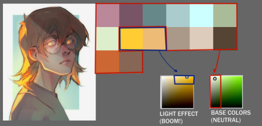
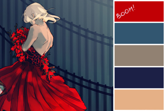
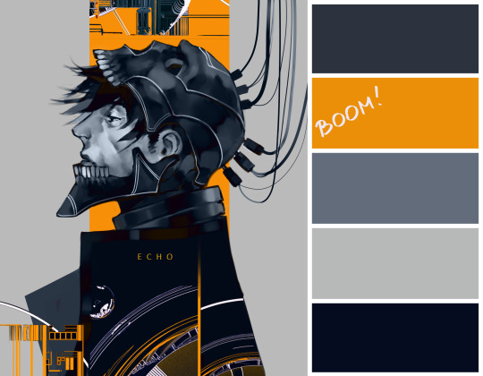
Actually I recommend to read a few articles or watch a video about color theory. It will really help you to understand how it works. With time passing you’ll just learn to do all of it instinctively.

Thanks for the question :)
12K notes
·
View notes
Photo


Tutorial on how I color hair! It’s very stylized, but easy to do.
[Note: only works for straight hair, but i hope it’s still helpful!]
:commissions:
17K notes
·
View notes
Photo

Da, da, da, daaaaaaaa…… that’s a little more dramatic than I had intended. I love all these wonderful Sai tutorials that get posted on here but I haven’t seen much attention payed to Sai’s Lineart tool which I can’t get enough of. I’m sure there probably are Lineart Layer tutorials out there - I just haven’t come across one so I’m just adding to the pile. The Lineart tool is so awesome it deserves any number of tutorials anyway. It’s so easy to use, it saves me so much time, and it offers so much control which I really love. Honestly, the tool is so easy to use that this is less of a tutorial and more of just a general encouragement to just whip it out and start playing with it. Yeah. So say we start with a simple line like this swirly-wirly thingy that I drew with the marker tool. Well, the first step would be to create a linework layer by clicking the linework layer button.

There we go. Now, a lineart layer in Sai is different from any other regular layer in Sai and it will bring up a completely new range of tools. I’m gonna briefly go through them but the best way to understand exactly what each does is to just try them out for yourself. There’s no substitute for experience or however the saying goes.
Pen - This is your freehand lineart tool and to best honest I don’t really use it that often. That’s just me personally. I have an expensive gaming rig that has all sorts of magic running under the hood but we all know that Sai’s memory management is pretty crappy and I don’t need the lag or crashes that come with this tool when working at a high DPI. You may have a different, entirely pleasant experience with this particular tool but for me, if I’m doing freehand inking, I’d much rather just use the regular Pencil tool.
Eraser - Kinda speaks for itself.
Weight - This one I do love. Say you’ve drawn a line - or a path as Sai calls it. With this tool you can adjust the thickness of the particular line by simply selecting the brush size and then clicking on the line.
Color - Same as Weight. Simply select your desired colour and then select the desired line you’d like to change. Very useful. For the aesthetic.
Edit - This one comes with its own subset of mini-tools that I’ll get into in a moment. But this is definitely a useful tool - for me it’s probably the most useful.
Pressure - This is the one that adds the character to your linework. I’ll explain further below.
SelPen - A selection tool. Pretty standard. Since the Lineart layer works in ‘Anchor’ points (which again, I’ll get in to further down below) I don’t really use this one.
SelErs - Selection Erase. Goes hand in hand with the SelPen. I can’t say that I personally use this one much.
Curve & Line - The Curve and the Line tools are the cornerstones of the Linework layer. I’m explain both further down.
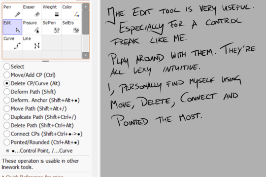
The Edit tool, as I mentioned, brings up its own list of sub-tools. And they definitely have their uses. Again, it’s best to play around with them to truly get a grasp of what they do but I’ll just run through them quickly before I get on with the main tutorial.
Select - For selecting anchor points of paths. Honestly, I don’t really use this one too much simply because hovering over a point or path and clicking will select it.
Move/Add - Now this one I use a lot. Moving an anchor will affect the curvature of your line if you’ve used the ‘Curve’ tool, or you can add curves to a straight line by clicking and dragging in between anchor points.
Delete CP/Curve - Kinda speaks for itself. It will delete an achor point in your line. Sometimes this can be useful for making your curves rounder if you’ve added too many points to it.
Deform Path - Again, kinda self explanatory. It will warp your line. I don’t really use this one myself but that’s not to say that it couldn’t have its uses.
Deform Anchor - See above.
Move Path - Instead of moving just an anchor or adjusting the curvature of your line you can move the entire line at once. Can be useful.
Duplicate Path - Does exactly what it says - creates a copy of your line. Haven’t found much use for this simply because I don’t particularly like copy/paste stuff in linework. Faults or differences add character.
Delete Path - deletes a line you’ve drawn independently of other lines on your linework layer. Can be useful as well.
Connect CPs - This is difficult to explain the benefits of. It’s one that should be experimented with. It basically joins lines together. I use it quite often. Just pick this option and drag from one anchor point to another to join them.
Pointed/Rounded - See the diagram below for this one. I find it very useful.
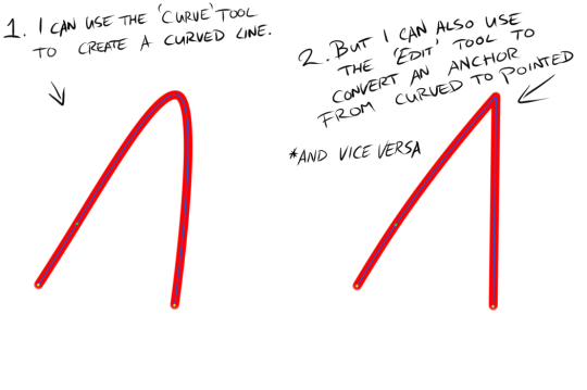
As you can see I used the Curve tool to draw a simple curve (left) and then I used the Pointed/Rounded tool to convert the curve into a point (right) by selecting the tool and then clicking on the anchor point at the height of the curve. I find it very useful. Anyway, back to our swirly-wirly thingy.

Because our swirly-wirly thingy is basically one long curve, I simply select the curve tool and start clicking. Starting at the centre point on one end, I click to add anchor points as I trace the shape of the object. Each point adjusts the curvature from the last point. It’s kinda hard to explain verbally or even visually but try it out and you’ll quickly see how it works.
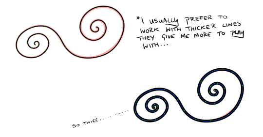
Once I have a line over whatever I’m inking done I like to adjust the weight to suit my preferences. I like to work with thicker lines because they give more room to play around with weight. So to adjust the weight you click on the Weight tool, select a brush size and then click on your line. If only it were that simple in life.
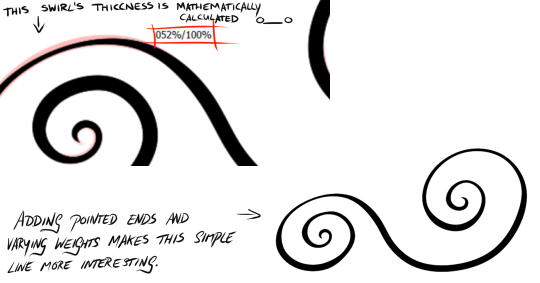
Once I have a good weight selected I move on to the Pressure tool. The pressure tool gives you two options. Pressure for width and pressure for density. Width is like controlling the weight of the line at individual points and density controls the transparency. I don’t usually use the density option. As with traditional inking I prefer to denote depth, shadow, etc. with weight as you can see in the image above. To adjust the pressure, simply select the pressure tool and then select an anchor point. Click, hold and drag to the left to make the line thinner of more transparent and to the right to make the line thicker and more dense. As you drag, a percentage will appear over the anchor point you’ve selected. This can be useful for keeping things consistent.
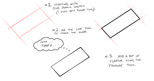
That’s all well and good for curved lines but what about straight lines? That’s where the line tool comes in. It works exactly the same way except it won’t add a curvature to your anchor pints. Still very useful though. Especially when combined with the Weight and Pressure tools.
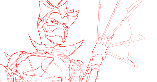

Here’s an example of one my drawings. It’s Dark Empress Kitana from Mortal Kombat. The one in red is the pencils which if converted to black would probably make a pretty good linework layer. I’m a firm believer in taking the time to clean up your sketch/pencils layer because it will dictate your entire drawing. The one below in black was done using Sai’s linework layer feature. Although not entirely.
As much as I love Sai’s linework layer, it can look a little too clean which is not great when you’re drawing people. Although, it’s all art so it’s all up to personal preferences and personal style. There’s no wrong way to do it. For me though, I prefer to do skin, facial features, hair, etc. by hand using Sai’s Pencil tool on a normal layer and reserve the Linework Layer for architecture, clothing or any non-organic substances. I inked Kitana’s eyes and eyebrows freehand ( or as freehand as you can be with Sai’s amazing stabilisers) but everything else such as her armour or her fan weapon thingy was done using the Curve and Line tools on the Linework Layer.
I hope this tutorial has been useful. Or if not useful - then at least encouring to try out Sai’s linework layer. It’s such a robust feature that I don’t see get much attention and I can’t even begin to describe how much time it saves me or how much I adore it. If you have any questions (because I’m well aware how unsuited I am to writing tutorials - this is so damn rambly - sorry!) then feel free to drop me an ask here at keithbyrneart.
P.S, sorry about my handwriting in the stills. It’s gotten a lot messier these days.
12K notes
·
View notes
Note
do you have any tips for palettes? i tried twice and they turned out like absolute shit :///
I usually just eyeball the colors when I draw but this site is very helpful when it comes to choosing colors!! http://www.tigercolor.com/color-lab/color-theory/color-theory-intro.htm
I just sorta summarized it into pictures so you don’t have to go back and forth but i didn’t put the in depth meaning behind it so i still recommend checking the site out!!:
I’m only a self taught artist, no school or professional background so a huge disclaimer
I’m pretty sure most people knows the basics like neutral, primary, secondary and tertiary as well as subtractive primary colors (CMK) so I’ll skip through that along with the cold and warm colors:


Volume and Saturation plays a big role on making palettes. It plays the part of the appeal and what colors to choose, palettes that are too saturated or high on contrast are quite painful to look at (some artist make it work by balancing it out so they still maintain the bright colors) and unsaturated, low on contrast palettes are dull to look at and not very a appealing.
Tints, Shades, and Tones are sub terms you can use, this chart is to help you differentiate them
Now the fun part!!

Color harmonies are basically techniques for choosing colors. Since SAI’s color wheel is kinda a disaster I recommend just looking up a color wheel on google or you can use this one here.
You can pick any of the techniques there (heres a more in depth explanation of each technique) and just start experimenting with them! Here’s some tips to get you started:
Don’t take the techniques literally!! You can toggle your colors all around, just use it as a base
Saturated colors =/= good color scheme balance it out!
Contrast is your pal remember that but too much of it can hurt your eyes :(
I usually use a maximum of 5 [or 6] colors and a minimum of 3 for making palettes. 4 is usually the most common one used
I pick 1-2 very saturated colors and the rest are up to the mixing
HAVE FUN!!
Here are some palettes I made using each techniques:

Hope this helps!!
12K notes
·
View notes
Note
I hope you don't mind me asking, you do your shadows so well and was wondering how you do them?! They set such an incredible dark mood, it makes your artwork instantly recognizable!! Thanks for your time
Im pretty shit at explaining things so i’ll use this for basic example. Firstly if you know how shadows work and stuff then it shouldnt be to hard. Otherwise go study that shit.
So you got your flat colors down for the first step

Next lay down a dark tone set to multiply, idk about 70% i guess? up to you

Start adding some shadows set on another multiply, shadows can be however dark. 50-70%

The add your light source, i used color dodge in this one. Dont use super bright color or it will look like blinding light. (again if you know light/shadows shouldnt be to hard)

I add a touch more dark in the shadows for effect…or something like that.
And there you have it, this maybe helpful lesson was brought to you by a potato, chur.
11K notes
·
View notes
Photo

A very fast shadow study since some peeps from my last stream seemed interested in how I handle shading~
More tutorials on Patreon | Commission Info
21K notes
·
View notes

Photo
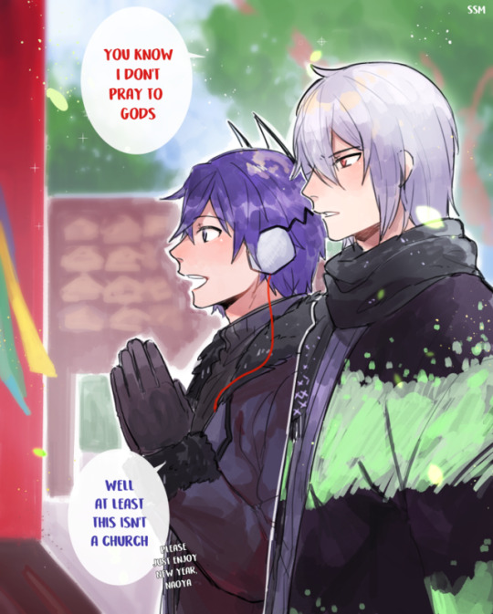
Happy New Year!
#never change naoya#never. change#at least now you can pray to kazuya :D#i mean... he is an overLORD#ごめんなさい#thank you op
281 notes
·
View notes
Photo


My website – My Facebook page – See me on LINE Webtoon!
86K notes
·
View notes
Note
what is the meaning behind your url?
my life story, I was born with glass bones and paper skin. Every morning I break my legs, and every afternoon I break my arms. At night, I lie awake in agony until my heart attacks put me to sleep
262K notes
·
View notes