
Don't wanna be here? Send us removal request.
Statistics
We looked inside some of the posts by tendaisagwetethink-blog and here's what we found interesting.
Average Info
Notes Per Post
1
Likes Per Post
1
Reblog Per Post
0
Reply Per Post
0
Time Between Posts
4 days
Number of Posts By Type
Text
17
Last Seen Tumblr Blogs


Fun Fact
28.6 is the average number of monthly visits per US mobile user.
Text
Final Evaluation
Overall I think that the module was a relative success. We created a multitude of ideas that tackled the objectives we saw before us from a large and interesting variety of angles as we were trying to.
One thing I could improve next time is my communication skills as I don’t think that I adequately explained what my ideas were of where I was coming from on occasion to my partner. So we could have evolved a few other ideas further if I had done this. I also somewhat think that we acted a little too much as separate entities sometimes so there wasn’t enough intercommunication between the two of us. I probably should have talked about my research with my partner more often and generally I should have talked about the campaign from a theoretical viewpoint more often. I think that as a team we should have tried harder to stick with Thinks tone of voice more and found a greater balance between appealing to our target audience and sticking with the general tone of a think campaign poster or design.
I probably should have shown the time lapse video concept to my partner to see what her opinion was.
Overall I do think that make skills with image manipulation in Photoshop somewhat improved thanks to some of the stuff I’ve done throughout the module.
I also think that the campaign relied a little too much on a knee jerk reaction when it comes to the posters as the posters existence wasn’t sufficiently justified like the online elements of the campaign.
In hindsight I probably should have explored the interactive data visualisation idea more thoroughly as it had the potential to get information across to our target audience in an engaging and somewhat unfamiliar way.
0 notes
Text
Sketches

For the paper to the left I drew out a series of basic concepts for what I thought the interactive data visualisation might look in order to have a basic building block before I went digital with the idea.
On the paper on the lower right I was trying to compare drink driving with driving while look at your phone because there’s more of a stigma attached to drink driving then there is with driving while looking at your phone. So considering the fact that they both have relatively the same effect on peoples ability concentrate while driving I thought that taking advantage of the stigma of drink driving here would have been a good place to take our campaign.

For the sketches on the right I was trying to show how detrimental the effects of looking at your phone while driving can be on your perception of the outside world by comparing it to alcoholism.
On the sketches to the left I was trying to show how dangerous driving and looking at your phone can be by literally comparing the act with driving with death himself.

With the soldier at the very centre I was thinking about using imagery similar to the game Call of Duty as the game series is rather popular with our target audience. This doesn’t exactly completely work as the game series isn’t known for its few mobile instalments it’s known for its console and PC instalments.
1 note
·
View note
Text
My Movie Test 11.mp4
My Movie Test 11.mp4
This was a concept for the time lapse video. One weakness this concept has is a lack of audio as audio in videos can usually help develop a certain tone or mood. So tonally it feels incomplete at that level.
If we did go forward with the idea the video probably should be more fluid and animated as this current concept feels a bit too static.
In some ways this video is too gradual as it doesn’t show the sudden and usually unexpected burst of violence car crashes usually entail. So thanks to this it doesn't feel true to life pacing wise.
0 notes
Text

This was my first attempt at creating a visualisation for the injured driver idea. My intention with the design was to call attention to how obsessively using your mobile phone distracts you from the very real consequences. That’s why the driver here looks completely disinterested despite the fact that they have a large seemingly recently acquired facial scar.

I made the background here white and the text black in order to be consistent with the Digg brands colour scheme.

This design doesn’t work as well because the Flicker font isn’t as recognisable as the other fonts we’ve used in our past posters.

In this story board we were trying to show how while playing Candy Crush Saga while looking their phones they could potentially be simultaneously endangering the lives of a multitude of innocent people. We replaced the bird with a a car being hurled at people because we noticed the visual similarity between driving a car and smashing into people and how the bird in the game is used to smash into the pigs. We chose a car with a red colour scheme her because we wanted to have a car that was visually similar to the bird colour wise so our target audience would more quickly understand what the message of the animation is. That’s also why we replaced the pigs with innocent bystanders as we thought that the storyboard would be too abstract if we didn’t include that element.

We designed a poster based on Pokemon Go due to the recent popularity of the game. And we also based the poster on Pokemon Go because there was an actual report of someone actually playing Pokemon Go while driving.
Our basic idea was to visually display the cause of and the consequences of playing the game while driving in one simple image without having to create a design that’s needlessly complicated. The Pokemon characters chalk outline is a reference to the white chalk outlines that are often seen in the crime scenes of crime dramas.
The questionable aspect of this design is that it relies on a cross section of people who are both aware of and have played Pokemon Go and who have watched crime dramas and we don’t exactly know how much of a cross section there is there.
http://www.edp24.co.uk/news/crime/driver_caught_playing_pokemon_go_at_the_wheel_1_4857872

We added tyre tracks here to indicate that this was a car accident as people might have misinterpreted the last poster design as perhaps the site of a murder.

To communicate that this is the site of a car crash accident we decided to change the background into an actual road. We added blood to the design because we thought that using it would make the poster design less comedic and more in line with other Think campaign posters. We also made the car tack swerve to the right because we anted to indicate that the driver was trying to move away from the creature they were on a direct collision path with. We also thought that this would make the scene feel more true to life as there’s more of a narrative to the poster design now.

This concept feels a little too comedic for a think campaign poster. I added the think logo to the right of the poster because I wanted to see if it made the design feel more as though it was something that belongs in a think campaign more. I placed a tagline to the left of the poster because I felt that the Pokemon character was a little to obscured by the blood stain and the car track mark so there was a risk that the viewers might mistake the chalk silhouette for something else entirely. In hindsight I should have added two tyre tracks to be more true to life.

We chose this stock image because the person in it was the same gender as our target audience and he also looked to be in about the same age range as them so we thought that it would be easier for them to relate to the design. So the poster could potentially have greater emotional reaction from our target audience.


We tried this concept out because we were trying to create a sense of visual comedy by having the seemingly dead or unconscious take selfies. We felt that this visual comedy called the inherent ridiculousness of driving and looking at your mobile phone as it can be potentially lethal with very little gained. In the end perhaps I could have dimmed or darkened the colours on the top one as it does seem a little too bright when you consider the message we’re trying to get across.
0 notes
Text

I tried vector traced the YouTube rounded rectangle instead of using the pre-installed rounded rectangle on illustrator because I was trying to make the poster feel true to YouTube's brand as people who visit the site regularly would immediately notice something as small and as subtle as a the rounded square being slightly different on the poster.

We added the words look at the screen because:
We wanted to make the YouTube poster feel like it fits in with the other posters as they’re all statements.
We wanted to make it clearer to the viewer we were talking about road safety.
We were afraid that it would mistaken for an advertisement for a pornography site and that was so far away from our message that we felt that it was absolutely necessary for us to clarify what our poster is trying to communicate.


I change the background colour from white to red as the background kind of felt rather unremarkable. And it was also because we had already produced a poster in this series that had a white background. The red background also goes with YouTube's branding as they also make frequent use of the colour red in their backgrounds.
0 notes
Text

This poster design is supposed to show the viewer how using your phone while driving makes you lose track of crucial details. One thing that’s not great about this poster design is that it doesn’t make heavy use of negative reinforcement as campaigns by Think usually try to use negative reinforcement. This makes the poster designs feel somewhat disconnected from other Think campaigns and the lack of the Think logo on these posters also doesn’t help.

We mainly went with this idea thanks to the extremely positive reaction we received.
We made the background the exact same shade of blue that Facebook uses in order to clarify what aesthetic our poster is going for to our target audience. We made the text white on this poster because it was consistent with the Facebook theme while at the same time standing out on the blue background.
In hindsight perhaps we should have tried to make sure that the logo and the text at the top aligned more to make the poster look more uniform and consistent.

We increased the size of the text at the centre here because the poster when the text was smaller felt a little bit empty.

I tried to use visual metaphor for this design in order to compare driving while using your mobile phone to drink driving. That’s why the I phone has alcohol on it’s screen. The idea unlike the earlier ones does make use of a decent level of negative reinforcement but it isn’t as consequentialist as Think posters normally are so it’s a bit inconsistent with the brand.

I changed the texture on the phones screen because I thought that it was more representative of people stereotypical vision of what alcohol looks like. I thought that using more stereotypical visuals would help the audience understand what the image is supposed to represent more easily. That’s also why I paced a lemon on the phone as it isn’t uncommon to see a lemon on the glass of a drink.

I went with a black and white colour scheme here because I thought that it would better fit the dark subject matter tonally.

Me
______________________________________________________________
I placed a background of a bar on this image in order to make viewers more quickly understand what the image on the screen of the phone is supposed to represent. That’s also why I place the phone so close to an alcoholic beverage.

Me
______________________________________________________________
I placed a multitude of phones next to one another here because it’s not uncommon to see a multitude of beers in one anothers vicinity like this in the real world.

I used the bar background here because I wanted to see if the idea of using repeating phone images would be more understandable thanks to the real world context. It doesn’t really work as the background calls attention to the unrealistic lighting. I also changed the proximity between each phone image to be more true to life as so far as know drinks aren’t usually as close as they were on my last design.
0 notes
Text
13-letter words that start with tub
tubocurarines
12-letter words that start with tub
tuberculosis
tubocurarine
tuberculoses
tuberosities
tuberculated
11-letter words that start with tub
tuberculous
tuberculoid
tuberculate
tuberculars
tubbinesses
tuberculins
10-letter words that start with tub
tuberculin
tubercular
tuberosity
tubulators
tubulating
9-letter words that start with tub
tubbiness
tubenoses
tubercles
tubifexes
tubeworks
tubeworms
tuberoses
tubulator
tubulated
tubulates
tubularly
tubulures
8-letter words that start with tub
tubercle
tuberous
tuberose
tubeworm
tubenose
tubiform
tubulate
tubulous
tubulure
tubulose
tubulins
tubework
tuberoid
tubeless
tubelike
tubbiest
tubbable
tubaists
7-letter words that start with tub
tubular
tubulin
tubifex
tubfuls
tubbing
tubbers
tubbier
tubaist
tubules
tublike
tubists
tubings
6-letter words that start with tub
tubing
tubule
tubate
tubbed
tubber
tubful
tubers
tubist
5-letter words that start with tub
tubby
tubal
tuber
tubed
tubas
tubae
tubes
4-letter words that start with tub
tube
tuba
tubs
3-letter words that start with tub
tub
Me
_________________________________________________________
I searched for similar words that start with tub for the you tube idea because I thought that using words that are similar to the word tube would make it easier for the poster to resonate with viewers as it makes the type more familiar to them.
0 notes
Text
Tumblr
Tumble
Youtube
Yourube
Youtubulre
Youboob
Youtubs
Youtard
Youtwat
Youtit
Youbasterd
Youthundercunt
Youfucker
Youtwats
Youfuck
Youcock
Yourcock
You’re looking at the wrong screen
Look at the right screen youcock
You’re Cocking Up
Youtalk youlock
Google+
Gooch+
goddamn+ goddamnit+
Google +wat
Look ahead while you drive Youcock
Facebook
fu if you comment while driving
fu if comment and drive
If you like fu
If you see more fu
If you don’t look ahead fu
What’s on your mind fu
What’s on the road fu I don’t care
Whats App
Whats Up you Ass
Whats Up your Ass
Shove that phone up your ass
Me:
________________________________________________________________
These are a few ideas for the social media swear words idea. I chose words that sound similar to the names of the sites because I thought that doing so would make it easier for our target audience to recognise what we’re making reference to.
0 notes
Text

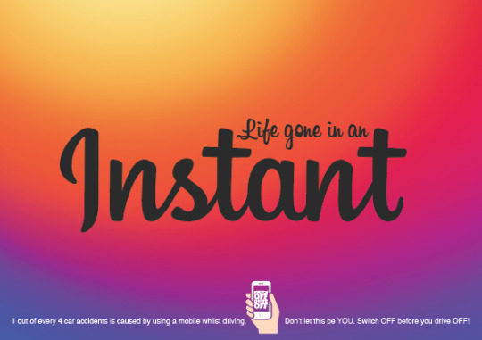
For this series of posters we chose to focus on social networks because they’re rather popular for our target audience. Although Instagram is substantially more popular among women there are still a decent amount of male users that use the site so it isn’t too much of a problem for the campaign.
We used the same font and we used the same logo as Instagram to help our target audience make a quick visual association with Instagram. That’s also why I made the type the same shade of black as Instagram's type usually is.

For this final version Roxanne altered the background of the poster in order to make the poster be connected with the Instagram brand without having to show the logo.
0 notes
Text
Potential Stats
The Department for Transport said that of 88 deaths caused by distractions in 2012, 17 were due to mobile use
http://www.express.co.uk/news/uk/490393/Mobile-phone-use-the-biggest-cause-of-road-fatalities
Me
________________________________________________________________Here I was collecting a few stats that I could have used for the data visualisation idea.
0 notes
Text
http://www.facebookstories.com/stories/22341/mapping-music-on-facebook
http://paperscape.org
http://hotshotcharts.com
0 notes
Text
Statistics
In 2014, 3,179 people were killed, and 431,000 were injured in motor vehicle crashes involving distracted drivers.
As of December 2014, 169.3 billion text messages were sent in the US (includes PR, the Territories, and Guam) every month. (CTIA)
Ten percent of all drivers 15 to 19 years old involved in fatal crashes were reported as distracted at the time of the crashes. This age group has the largest proportion of drivers who were distracted at the time of the crashes. (NHTSA)
Drivers in their 20s are 23 percent of drivers in all fatal crashes, but are 27 percent of the distracted drivers and 38 percent of the distracted drivers who were using cell phones in fatal crashes. (NHTSA)
https://www.distraction.gov/stats-research-laws/facts-and-statistics.html
Chapter 1. Introduction
Why Data Visualization?
Our information age more often feels like an era of information overload. Excess amounts of information are overwhelming; raw data becomes useful only when we apply methods of deriving insight from it.
Fortunately, we humans are intensely visual creatures. Few of us can detect patterns among rows of numbers, but even young children can interpret bar charts, extracting meaning from those numbers’ visual representations. For that reason, data visualization is a powerful exercise. Visualizing data is the fastest way to communicate it to others.
Of course, visualizations, like words, can be used to lie, mislead, or distort the truth. But when practiced honestly and with care, the process of visualization can help us see the world in a new way, revealing unexpected patterns and trends in the otherwise hidden information around us. At its best, data visualization is expert storytelling.
More literally, visualization is a process of mapping information to visuals. We craft rules that interpret data and express its values as visual properties. For example, the humble bar chart in Figure 1-1 is generated from a very simple rule: larger values are mapped as taller bars.
Figure 1-1. Data values mapped to visuals
More complex visualizations are generated from datasets more complex than the sequence of numbers shown in Figure 1-1 and more complex sets of mapping rules.
Why Write Code?
Mapping data by hand can be satisfying, yet is slow and tedious. So we usually employ the power of computation to speed things up. The increased speed enables us to work with much larger datasets of thousands or millions of values; what would have taken years of effort by hand can be mapped in a moment. Just as important, we can rapidly experiment with alternate mappings, tweaking our rules and seeing their output re-rendered immediately. This loop of write/render/evaluate is critical to the iterative process of refining a design.
Sets of mapping rules function as design systems. The human hand no longer executes the visual output; the computer does. Our human role is to conceptualize, craft, and write out the rules of the system, which is then finally executed by software.
Unfortunately, software (and computation generally) is extremely bad at understanding what, exactly, people want. (To be fair, many humans are also not good at this challenging task.) Because computers are binary systems, everything is either on or off, yes or no, this or that, there or not there. Humans are mushier, softer creatures, and the computers are not willing to meet us halfway—we must go to them. Hence the inevitable struggle of learning to write software, in which we train ourselves to communicate in the very limited and precise syntax that the computer can understand.
Yet we continue to write code because seeing our visual creations come to life is so rewarding. We practice data visualization because it is exciting to see what has never before been seen. It is like summoning a magical, visual genie out of an inscrutable data bottle.
Why Interactive?
Static visualizations can offer only precomposed “views” of data, so multiple static views are often needed to present a variety of perspectives on the same information. The number of dimensions of data are limited, too, when all visual elements must be present on the same surface at the same time. Representing multidimensional datasets fairly in static images is notoriously difficult. A fixed image is ideal when alternate views are neither needed nor desired, and required when publishing to a static medium, such as print.
Dynamic, interactive visualizations can empower people to explore the data for themselves. The basic functions of most interactive visualization tools have changed little since 1996, when Ben Shneiderman of the University of Maryland first proposed a “Visual Information-Seeking Mantra”: overview first, zoom and filter, then details-on-demand.
This design pattern is found in most interactive visualizations today. The combination of functions is successful, because it makes the data accessible to different audiences, from those who are merely browsing or exploring the dataset to those who approach the visualization with a specific question in search of an answer. An interactive visualization that offers an overview of the data alongside tools for “drilling down” into the details may successfully fulfill many roles at once, addressing the different concerns of different audiences, from those new to the subject matter to those already deeply familiar with the data.
Of course, interactivity can also encourage engagement with the data in ways that static images cannot. With animated transitions and well-crafted interfaces, some visualizations can make exploring data feel more like playing a game. Interactive visualization can be a great medium for engaging an audience who might not otherwise care about the topic or data at hand.
Why on the Web?
Visualizations aren’t truly visual unless they are seen. Getting your work out there for others to see is critical, and publishing on the Web is the quickest way to reach a global audience. Working with web-standard technologies means that your work can be seen and experienced by anyone using a recent web browser, regardless of the operating system (Windows, Mac, Linux) and device type (laptop, desktop, smartphone, tablet).
Best of all, everything covered in this book can be done with freely accessible tools, so the only investment required is your time. And everything we’ll talk about uses open source, web-standard technologies.
By avoiding proprietary software and plug-ins, you can ensure that your projects are accessible on the widest possible range of devices, from typical desktop computers to tablets and even phones. The more accessible your visualization, the greater your audience and your impact.
What This Book Is
This book is a practical introduction to merging three practices—data visualization, interactive design, and web development—using D3, a powerful tool for custom, web-based visualization.
These chapters grew out of my own process of learning how to use D3. Many people, including myself, come to D3 with backgrounds in design, mapping, and data visualization, but not programming and computer science.
D3 has a bit of an unfair reputation for being hard to learn. D3 itself is not so complicated, but it operates in the domain of the Web, and the Web is complicated. Using D3 comfortably requires some prior knowledge of the web technologies with which it interacts, such as HTML, CSS, JavaScript, and SVG. Many people (myself included) are self-taught when it comes to web skills. This is great, because the barrier to entry is so low, but problematic because it means we probably didn’t learn each of these technologies from the ground up—more often, we just hack something together until it seems to work, and call it a day. Yet successful use of D3 requires understanding some of these technologies in a fundamental way.
Because D3 is written in JavaScript, learning to use D3 often means learning a lot about JavaScript. For many datavis folks, D3 is their introduction to JavaScript (or even web development generally). It’s hard enough to learn a new programming language, let alone a new tool built on that language. D3 will enable you to do great things with JavaScript that you never would have even attempted. The time you spend learning both the language and the tool will provide an incredible payoff.
My goal is to reduce that learning time, so you can start creating awesome stuff sooner. We’ll take a ground-up approach, starting with the fundamental concepts and gradually adding complexity. I don’t intend to show you how to make specific kinds of visualizations so much as to help you understand the workings of D3 well enough to take those building blocks and generate designs of your own creation.
Who You Are
You may be an absolute beginner, someone new to datavis, web development, or both. (Welcome!) Perhaps you are a journalist interested in new ways to communicate the data you collect during reporting. Or maybe you’re a designer, comfortable drawing static infographics but ready to make the leap to interactive projects on the Web. You could be an artist, interested in generative, data-based art. Or a programmer, already familiar with JavaScript and the Web, but excited to learn a new tool and pick up some visual design experience along the way.
Whoever you are, I hope that you:
Have heard of this new thing called the “World Wide Web”
Are a bit familiar with HTML, the DOM, and CSS
Might even have a little programming experience already
Have heard of jQuery or written some JavaScript before
Aren’t scared by unknown initialisms like CSV, SVG, or JSON
Want to make useful, interactive visualizations
If any of those things are unknown or unclear, don’t fear. You might just want to spend more time with Chapter 3, which covers what you really need to know before diving into D3.
What This Book Is Not
That said, this is definitely not a computer science textbook, and it is not intended to teach the intricacies of any one web technology (HTML, CSS, JavaScript, SVG) in depth.
In that spirit, I might gloss over some technical points, grossly oversimplifying important concepts fundamental to computer science in ways that will make true software engineers recoil. That’s fine, because I’m writing for artists and designers here, not engineers. We’ll cover the basics, and then you can dive into the more complex pieces once you’re comfortable.
I will deliberately not address every possible approach to a given problem, but will typically present what I feel is the simplest solution, or, if not the simplest, then the most understandable.
My goal is to teach you the fundamental concepts and methods of D3. As such, this book is decidedly not organized around specific example projects. Everyone’s data and design needs will be different. It’s up to you to integrate these concepts in the way best suited to your particular project.
Using Sample Code
If you are a mad genius, then you can probably learn to use D3 without ever looking at any sample code files, in which case you can skip the rest of this section.
If you’re still with me, you are probably still very bright but not mad, in which case you should undertake this book with the full set of accompanying code samples in hand. Before you go any further, please download the sample files from GitHub.
Normal people will want to click the ZIP link to download a compressed ZIP archive with all the files. Hardcore geeksters will want to clone the repository using Git. If that last sentence sounds like total gibberish, please use the first option.
Within the download, you’ll notice there is a folder for each chapter that has code to go with it:
chapter_04 chapter_05 chapter_06 chapter_07 chapter_08 …
Files are organized by chapter, so in Chapter 9 when I reference 01_bar_chart.html, know that you can find that file in the corresponding location: d3-book/chapter_9/01_bar_chart.html.
You are welcome to copy, adapt, modify, and reuse the example code in these tutorials for any noncommercial purpose.
Thank You
Finally, this book has been handcrafted, carefully written, and pedagogically fine-tuned for maximum effect. Thank you for reading it. I hope you learn a great deal, and even have some fun along the way.
http://chimera.labs.oreilly.com/books/1230000000345/ch01.html
Me
______________________________________________________________
I considered making the campaign rely heavily on data visualisation because I thought that it would be good way to get statistical information across well to our target audience. This is because instead of communicating statistical information through potentially intimidating large blocks of text I wanted to use data visualisation to communicate to my audience through simpler visual means. We ultimately didn’t go along with this idea because my partner wasn’t enthused by the idea. I did draw a few starter ideas for what the ultimate results might look like.
0 notes
Text
As a content marketer, one of my jobs is keeping on top of the latest trends in the field. It’s safe to assume I see countless of articles, whitepapers, and eBooks on any given day. Often, the content I find is great and the information is solid enough to hold my attention. However, there are many times when it won’t matter how helpful the content is—I don’t have the time or patience to read and comprehend it. Typically, the problem is that the content is too long, lacks engaging elements like visuals or videos, or feels impersonal. If a professional in the field can’t get through your content, chances are your consumers and prospects won’t be able to, either.
It’s these issues with static, traditional content marketing that make interactive marketing so exciting. Interactive marketing allows you to break down the barriers static content types present and unlock more creative ways to tell your brand’s story. Rather than simply tell your story to your audience, interactivity lets you have a conversation with them. And most consumers want a dialogue with brands rather than a one-way barrage of long, impersonal content.
There are many different types of interactivity you can use in your own content marketing program. Read on to learn more about the 5 main interactive content types and how you can use them to drive audience engagement.
Quizzes & Assessments
If you’ve been on the internet anytime in the past decade, chances are you’ve taken a quiz to assess which Hogwarts House you belong in, or to find out how well you know early 90s pop culture. As much as I try to resist, I can’t help but give in and take some of the Buzzfeed quizzes my friends post on Facebook. Quizzes tap into that psychological need for order in our lives. According to narrative psychologist Robert Simmermon, a personality quiz also “gives some credence of ourselves as heroes of our own story.” We want to be seen as individuals, while also associating our personality traits with popular places and pop culture icons.
The reason quizzes are such a successful form of interactive content is because they’re highly personalized. They’re an easy way to pique audience interest while allowing them to customize the experience they have with your content. And quizzes are a valuable asset for your brand because they give you greater insight into your audience. The information and data collected can help you better understand your users, which in turn helps you produce better content.
Quiz Example
Source: Refinery29
Refinery29’s “Which Old Hollywood Icon Are You?” quiz uses a simple design which allows for the choices to shine through. As you hover over your selection, the colored square gets darker, indicating that it’s the option you’re choosing. This adds an additional layer of interactivity and confirms with the quiz taker that they’re selecting the choice they intended to. Refinery 29’s clear, easy-to-use quiz helps move viewers through the content while keeping them engaged until they learn their results.
Calculators
One of the earliest examples of interactive marketing, calculators are typically found on real estate and banking websites. Having calculators integrated into a website’s layout makes it easier for people to do their research in one place. Giving your consumers and prospects the option to calculate directly on your site also provides a layer of transparency and keeps them invested in your company. After all, if you’re the one letting them easily crunch the numbers, they’ll most likely stick with you.
Calculators are fairly simple: the user inputs their information into designated fields and receives personalize results based on the information given. As far as engagement goes, calculators are one of the most user-driven types of interactive marketing. Because they rely on the information provided by the user, calculators are entirely hands-on and create a fully customized end result.
Calculator Example
Source: Federal Student Aid
Calculators aren’t just for mortgage and auto insurance estimates. As a recent grad, one of the most common calculators that pops up in my life is this loan repayment estimator. Letting users estimate loan repayments directly on the site where they pay loans makes the entire process less of a headache. This easy-to-use calculator lets users plug in my loan information, tax filing status, and income to produce a variety of repayment estimates based on the plan parameters. Instant results makes the process of calculating loans much less stressful and allows users to make decisions based on their personalized results.
Interactive Data Visualization
Let’s face it: sometimes data isn’t the prettiest or easiest to understand. I remember checking out in math class when learning about graphing because it was such a difficult concept for me to wrap my head around. This still happens today, and I know I’m not the only person whose eyes glaze over when confronted with a particularly intimidating data set. If people are already having difficulty making their way through longform content, it’s most likely even more of a challenge for them to stay engaged long enough to digest your data.
Data visualization involves finding a more eye-catching way to portray data for your audience. When made interactive, data visualization becomes a more approachable and interesting way for people to view and comprehend information. Rather than present the stats in a two-dimensional, uninspired format—data visualization lets you develop a narrative around your stats. Pairing that with an interactive design, data becomes easier to understand and more interesting to audiences.
Interactive Data Visualization Example
Source: Visage & Ceros
Just because data is more scientific doesn’t mean it needs to be dry or difficult to understand. Made in partnership with Visage, our Data Storytelling infographic uses interactive visuals and an engaging narrative to provide viewers with an easier way to comprehend data. Rather than obscure the stats with boring information or intimidating graphs, this infographic puts data front and center with a unique and compelling treatment. Interactivity also lets people engage with the graphs they find most interesting, allowing them to follow the story and understand the data at their pace.
Interactive Storytelling
Everyone has a favorite book, one that keeps them up late at night or has them so absorbed they miss their train stop. It’s easy getting wrapped up in a good story. Stories make us feel whole, as if the world isn’t such a big place. Brands can also use stories to connect with people. Riveting, impactful content that shows a brand’s human side inspires and provides value rather than trying to push a sale.
Interactive storytelling follows a similar process to traditional storytelling, but includes elements such as animations, multimedia, and branching narratives. These interactive elements allow the audiences to actively participate in the narrative and control which parts they engage with. Typically, we see storytelling in narrative-driven content types like eBooks, microsites, and whitepapers.
Interactive Storytelling Example
Source: Tully
Tully Luxury Travel’s interactive microsite takes readers on a journey through different vacation spots around the globe and invites them to learn more about what makes these places so unique. Told from multiple points-of-view, readers are encouraged to explore the microsite either by place or by travel agent. These different POVs let readers choose their own narrative, allowing for them to control and interact with the story in a way that’s more hands-on and immersive than a static story.
Interactive Video
There’s been a lot of buzz around video marketing over the past few years. From the snackable content that pops up on Facebook to live-streaming sessions on Periscope, video has become a major component of many brands’ content marketing programs. Video is effective in getting your audience’s attention and is one of the most engaging forms of content. Over half of marketers believe video is the best content type when it comes to ROI.
One of the reasons interactive video is such an effective marketing tool is because it can be used to tell many different kinds of stories. Clickable elements within the video give viewers the unique opportunity to choose what they want to learn and in what order. By making videos that are less passive and more hands-on, brands are able to deliver the personalized experiences audiences want.
Video Example
Source: Rapt Media
Maybelline’s interactive makeup guide allows viewers to choose which tutorial they want to see. After giving an overview of the types of high fashion make-up trends, viewers are then prompted to choose between exploring day or night looks. The video also includes a menu bar at the bottom so viewers can watch the other three tutorials and browse the collection at their own pace in a non-linear fashion. This kind of interactivity drives even more engagement than the typical video and allows for viewers to take full control of their experience.
The Bottom Line
From calculators to videos, interactive content can help you create more engaging, personalized, and flexible digital experiences for your audience—while also driving results for your marketing program.
https://www.ceros.com/blog/5-types-interactive-marketing/
Me:
______________________________________________________________
Here I was researching in order to discover a way for us to utilise interactive elements in our campaign. As video games are highly interactive as well as rather popular with our target audience both age wise and gender wise.
0 notes
Text
youtube
youtube
youtube
https://www.youtube.com/watch?v=MwkIcPblhLw
https://www.youtube.com/watch?v=omBfg3UwkYM
One direction we wanted to take our campaign video time lapse as we thought that using time lapse would produce a near universal relatively easy to understand video. So I looked at a couple of examples.
0 notes
Text
Timelapse Campaigns

Me
______________________________________________________________
I looked at a previous poster from think because I wanted to see how we could potentially use this time lapse idea in our posters instead of making it a theme that only appears in our videos.
vimeo
http://www.dailymail.co.uk/video/news/video-1086048/Unique-body-painting-time-lapse-new-Amnesty-campaign.html
0 notes
Text
These are some ideas that were supposed to replicate the popularity of a campaign by a previous student.
Fuck your selfie
Instabambot
Instadamn
0 notes