
Don't wanna be here? Send us removal request.
Statistics
We looked inside some of the posts by terryinterdesign and here's what we found interesting.
Average Info
Notes Per Post
0
Likes Per Post
0
Reblog Per Post
0
Reply Per Post
0
Time Between Posts
2 days
Number of Posts By Type
Text
17
Last Seen Tumblr Blogs


Fun Fact
China blocked Tumblr because of pornography and censorship problems in 2013.
Text
Start of Project 2
^ ^ ^ ^ ^
^ ^ ^ ^ ^
^ ^ ^ ^ ^ PROJECT 2
0 notes
Text
IFE Summative Submission
vimeo
Reflection
One of the most important thing that I have learnt from this project is that time is definitely the most important thing to design, UX and in life. From this project I have learnt how time could affect the design and how the user could perceive time in how things react when interacted with, but also how I am utilising time in life with the balance in design.
I have learnt a lot in this semester and there is A LOT more that I have not touched on in this project that I want to learn which will have to be in my own time. I learnt about feedbacks for users and how each action and interaction is connected altogether in a cybernetic way. I delved more into the philosophical aspect of design with thinking into affordance and metaphor of interactions and I believe that this aspect is crucial with user testing which I have to do more in the future.
Another thing I learnt from this project is that I should ask my peers in class a lot more often in the future as I did not do it enough in this project and it shows, it lacks the certain quality that could be improved on from receiving feedbacks from users that would otherwise lift my IFE to the next level. I have to thank Molly for giving really good blunt but amazing feedbacks and motivating me to do better and also Kate for seeing how amazing her work that motivated me to improve myself to do better, which I believe being physically in class makes a lot of difference especially when our course is based on User Experience and interaction.
This project has been quite a journey for me. Coming into this semester I lacked the energy and the momentum to do my best that I had last semester, and it got a lot worse as the COVID lockdown happened. This recent lockdown affected me much more than the previous lockdown have as I just felt mentally fatigued and lost all motivation. I really enjoyed getting into the momentum towards the end as I got more into principle. As G have stated to me in my formative that I haven’t really delved into Principle as I should have, I have to agree as I spent more and more time looking at Figma with a blank face and not knowing which direction I would take the design to which is something I have to improve on.
The biggest disappointment in this project is myself and my lack of motivation throughout this lockdown. I have never been so disappointed at myself for not fully finishing the IFE to a quality I would like to achieve. I spent a lot of time designing an aspect of the project only to not have enough time to actually include it into the IFE demonstration, this mistake only drives me to do better for the next project. As I was discussing this with Molly and G that I believe having a partner for this project would have been a great motivator in this, which is why I have been really looking forward to project 2.
0 notes
Text
Not enough time...
Unfortunately there isn’t enough time to fully implement something I wanted to do - which was set out a full meal order menu process in which shows the selection, cart sorting and interacting with the ordering process with the expanded menu.

youtube
Just a showcase of what I designed and what I wanted to do in user flow of the user ordering a meal from the expanded menu. This was designed after having a discussion with Molly and G and the motivation.
0 notes
Text
Flow of things
Work in progress with the flow of things

There’s so many things going off being inconsistent that needs to be polished
youtube
0 notes
Text
Using drives to fade while scrolling content
Using drivers and experimenting with scrolling while having the content’s opacity fade while it scrolls

This was done to make things more consistent of how things were fading in and our from left and right so when contents were to go out of the screen, the opacity changes to 0%
Here’s what it looks like:
youtube
There are spelling errors within this video but it has since been fixed.
0 notes
Text
Spending too much time on figma
Finishing up on the last touches of the design ui for the meal service pages... but i’m spending too much time on figma than I should have. Although I have experimented a lot during the earlier stages of the project that i got too focused on the design elements during the later stages.

0 notes
Text
Wednesday 8th September
Just a diary entry but I found my momentum!
It was a nice catch up with Molly and G on zoom today, listening to how Molly worked on the vaccination app made me more motivated to work harder! This was something that I needed because during the mid semester break I was feeling absolutely unmotivated and also felt mentally drained due to the lockdown. Finding this momentum was a wakeup call I needed especially with G giving some in depth knowledge about using previous experiences within how the user is use to operating certain elements and components of UI should be carried over into our IFE designs - also breaking down the IFE example we saw before the break and giving us info about what was good about the IFE and what it could be improved on gave me tips on how I would go into the next phase of my design.
Thank you G and Molly for the motivational sessions!
0 notes
Text
Time... in a different sense - Fantastic Fungi
Fantastic Fungi from Netflix with Louie Schwartzberg and how he takes creates timelapse masterpieces. I remember having a discussion about time with G and how we all experience time differently and how it is applied to design, UX/UI. Coming across this on youtube and thought back on the discussion but this time it’s how photography gets involved too. Louie Schwartzberg, connects us the elements of nature through the nature’s POV because “human point of view is not the only point of view”. Where as in UX/UI design, the human POV is the only POV and everything we create in our design has to be in relative to how people and humans experience it.
youtube
0 notes
Text
Thought this was quite funny to share in regards to using colours

0 notes
Text
What I envision versus reality
What I envisioned

Reality below

Upon redesigning elements based on my feedback from Siobhan, I realised something inconsistent with Principle and how importing components with glassmorphism doesn’t really blur the background. This is quite frustrating as it helps provide the user with a clearer visibility of the content/menu and options.
My way of fixing this is to change the colour of the base colour in order to provide a clearer visibility and readability - a darker base colour.

I have added the pre-linked credit card info into the design and user pathway towards ordering a meal. As stated previously in my formative feedback, while analyzing the feedback and thinking over what is needed I have designed around the concept of a prelinked credit card scenario which the user have attached their card to the seat they sit in from when they order their flight ticket. This is so that there’s no privacy breaches from sitting next to a stranger and having the need to input your credit card info.
0 notes
Text
User testing with Siobhan
In my user testing, I tested it with Siobhan and see how my design and my envision for my IFE is going - I had some really good feedbacks in which my design is heading towards.

Upon my feedback I redesigned my menu and options for when content is playing.
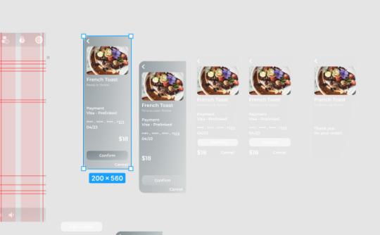
Below is the after - which needs to be fixed with better positioning for the components.
0 notes
Text
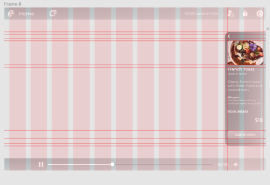
Implementing Food Options
I was granted permission for using my girlfriend’s food photos in this project. Source of images: https://www.instagram.com/eatfirstnz/

0 notes
Text
Feedback Durations
200-500ms is optimal https://uxdesign.cc/the-ultimate-guide-to-proper-use-of-animation-in-ux-10bd98614fa9
Article’s source: https://valhead.com/2016/05/05/how-fast-should-your-ui-animations-be/
0 notes
Text
Loading Screen
Initially I wanted to use a spinning animation but couldn’t come up with an idea of how i would do it, instead would be using the Air New Zealand logo as the loading it self. The reasoning behind this is because in my research into loading animations, it’s been stated that a never ending spinner/loading animation sort of gives anxiety - the anticipation with no signs of progress even though it provides a progress bar I wanted to do something different with how the loading/transitioning to keep it consistent with what I wanted to do with the rest of the IFE.
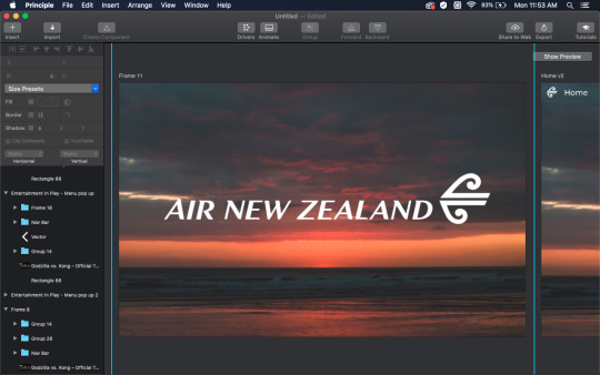
https://uxdesign.cc/stop-using-a-loading-spinner-theres-something-better-d186194f771e
0 notes
Text
Greet screen redesign - The additions of information
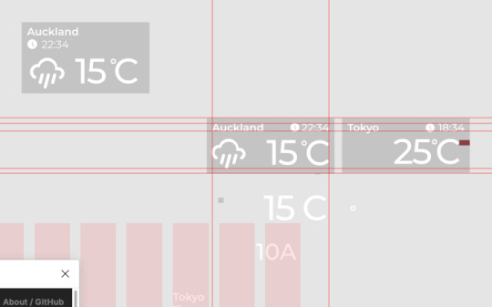

Also addded my photos as background images, which was suggested by Molly. This is because she believes that this is a great time to show off my photography. It also provides a nice colour system that could be implemented into my design.
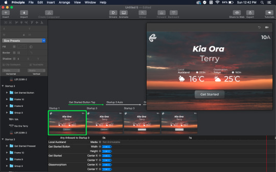
There’s a weird visual discrepancy with the spacing in between Kia Ora and Terry which sort of throws me off
0 notes
Text
Selection Feedback
https://material.io/design/interaction/selection.html
0 notes
Text
Different States of Buttons
https://material.io/design/interaction/states.html#usage

Source: https://xd.adobe.com/ideas/process/ui-design/designing-interactive-buttons-states/
Work in Progress
Current design that needs to be worked on, also I need to think about the colour of the button to which it should switch to as it currently becomes a solid colour which I could experiment with in my next iteration.

0 notes