
Don't wanna be here? Send us removal request.
Statistics
We looked inside some of the posts by theanswerto3is5 and here's what we found interesting.
Average Info
Notes Per Post
0
Likes Per Post
0
Reblog Per Post
0
Reply Per Post
0
Time Between Posts
3 days
Number of Posts By Type
Photo
13
Text
1
Video
3
Last Seen Tumblr Blogs


Fun Fact
Tumblr has 411 employees.
Photo
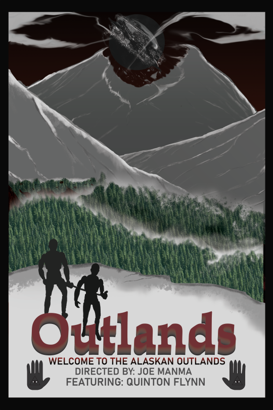
PR4 Poster
This became the end result. I added tree patterns from photoshop onto the trees and darkened the ones in the back to make them darker. I added fog to also make them a bit more spooky, then topped it off with gradient lighting on the mountains for that ominous shading leading up to the center one crumbling to a black hole rift thing. This is the Outlands.
0 notes
Photo

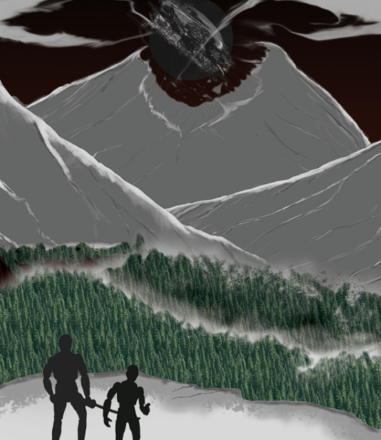
PR4 Progress
I didn’t actually do the moon thing like I thought I was going to do because it looked too peaceful. So instead, I did a black hole or a rift of some sort in the middle of the mountain to better exemplify the dangers of the world in the movie.
0 notes
Photo


The three sketches for the poster plus a progress picture, all of which are slightly different but they have the same idea; a character in the foreground while everything else is laid bare to them. The wasteland, the environment, everything as it is in the Alaskan tundra. One of the main things in the tundra are mountains and boreal forests, so I plan to add something like those into the poster. The main design is overall the same, matching the badge I made in the progress picture in Illutrator, which is a badge with mountain peaks, lights, a blue sky, and the moon behind it. So I want to capture something like this to show that it’s their destination or something like it is a major part of their journey
0 notes
Text
PR4-1 Elevator Speech of the Poster
For this poster, I wanted something that appealed to an audience that enjoyed horror. A post-apocalyptic survival horror with elements of cosmic horror sprinkled in. Forget the zombies, forget nuclear annihilation, forget rampant diseases -- a survival in the tundras of Alaska with supernatural horrors and reality-bending anomalies is the new kid on the block!
0 notes
Photo

PR4-1D Logotype Prototypes
For Outlands, it’s supposed to be a serious kind of movie, so the first line, OUTLANDS in black and titling font was ideal for the original idea of making it straightforward and punctual. The tone of the poster was also supposed to be dark and everything was set in a tundra, so putting it in black font upon the snow was ideal.
I started to get a bit more proactive with the Blend Tool in Illustrator on the 2nd attempt. With the guide below, I saw that a liquid font was interesting and could work with what horrors lurked in the Outlands. So I tried it out and while it was unique and looked like it was bleeding, melting, or drowning in something, this didn’t really capture the Outlands’ dark tone or anything, especially with the white text and liquified on top of it.
On the third, I felt more satisfied with the straightforward design. I used the same technique from the guide below, but instead of using them for making a unique and cool text, I just made it pop out more in red text. This one I’m still not sure about, but I think it works for the moment.
Credit for guide: https://www.youtube.com/watch?v=7KzRm_W-wtk
0 notes
Photo


PR 4-1C Image References, Planning phase
For my movie poster, I wanted it to be a post-apocalyptic sci-fi film, but at its core, a post-apocalypse story. So I looked up some post-apocalyptic movie posters for ideas, and most of them have a similar idea of posterizing the main cast on the front to acknowledge the people in their journey through their world. For STALKER however, it posterizes one of the main obstacles in their journey which is a bird anomaly. The Road and Peninsula use these posters to emphasize the characters in the foreground, or the setting. Peninsula does its job at surrounding the center character with encroaching darkness to encapsulate the overall danger of their situation. Combining these aspects of STALKER, The Road, and Peninsula, I had an idea to make the characters a set piece in the foreground while also putting up a setting that presents one of their main obstacles in the “movie”, so all of these will come together in the world that my movie, Outlands, will create.
images found credits:
STALKER - https://www.allposters.com/-sp/Stalker-French-Style-Posters_i8035489_.htm
The Road - https://en.wikipedia.org/wiki/The_Road_(2009_film)
Peninsula - https://www.hellokpop.com/tv-movies/train-to-busan-follow-up-film-peninsula-reveals-first-posters/
0 notes
Photo

Ex 7
It’s a tiny guy on a restaurant tabletop looking at a paper and his phone
0 notes
Video
tumblr
Ex6 Animation
It’s a moving still image of the Earth as it gradually appears from right to left
0 notes


Photo


Mask Research
I liked the Japanese Mempo, its design is very aggressive while also serving as a bit of facial protection. It masks the user’s emotions to make them appear less human and has resonated with its style for generations.
Spiderman’s mask has always resonated with me, and I watched him a lot since I was a kid. I always enjoyed the goodness and relatability of Spiderman, but I wanted to explore something more on the negative side of things to compliment the japanese memo aesthetic on this sci-fi mask.
0 notes


Video
tumblr
Ex 2 Ball Animation
It’s a simple ball, but quite the bouncy one
0 notes
Video
tumblr
Ex 2 Ball animation
It’s a simple ball, but quite the bouncy one.
0 notes