
Don't wanna be here? Send us removal request.
Statistics
We looked inside some of the posts by thebakedbeanproject and here's what we found interesting.
Average Info
Notes Per Post
3
Likes Per Post
3
Reblog Per Post
0
Reply Per Post
0
Time Between Posts
5 days
Number of Posts By Type
Text
17
Last Seen Tumblr Blogs


Fun Fact
The average Tumblr user visits about 67 pages every month.
Text
Beans....

I really liked the idea of the ice cream creature, and the shell being the cone- but seeing the Hermit Crab living inside the bottle lids made me want to do something similar to that.
I'm thinking of using a tin as a shell, though I'm unsure what will inhabit it at the moment...
0 notes
Text
Drawing a character digitally (ALWAYS SCREENSHOT)

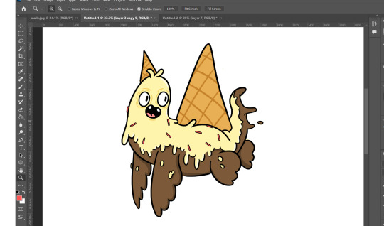
Now I am going to digitally draw on top of one of my pencil sketches, I've scanned in my design sheet, and copy and pasted this singular drawing onto a blank sheet. First I selected the type of brush I wanted to use from the top left, and then chose the thickness required.

I created a new layer called outline. This is where the digital outline will be when I begin to trace on top of the original drawing.

Here you can see the progress I've made, tracing over my original pencil drawing with the Photoshop paintbrush. I turned down the opacity of the original drawing, to make my paint brush lines easier to see.

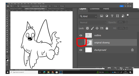
Once completed I clicked the eye icon to switch off the original drawing layer, I now have a completed digitally drawn character outline- next I'll add colour.

I made a new layer, underneath the paintbrush outline, that way I can colour to fill in these lines, without going over the line itself at any point.
Here you can see, the outline layer is above the colours layer, if it were the other way around, the colours would be on top of my outlines, like this:

This is why colours go beneath the layers!

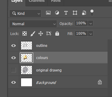
Here is my fully coloured in creature- now to add shading and other details. Remember, you don't have to trace the original sketch to be line for line the same- this is your opportunity to perfect parts, or change pieces.
Shading and sprinkles added, I copied and pasted the same sprinkle multiple times and used the transform tool (ctrl + T) to move and rotate them.

I always like to experiment with my drawings once they're finished, I often experiment with different colour palettes just to see how they'd look. You can always push work that bit further! Here I went up to Image > Adjustments > colour balance, this let me change the Hue/Saturation of my character (see below).

You can see here, I made a blue frosty variation of my creature- which I really like. I'm going to create a few more digital characters from other sketches next.
0 notes
Text
Further Personification Character design examples:


This is a good example of personification, a real worm has no features, it's like a piece of living organic string. The green worm from Adventure Time, has an exaggerated big head, so the audience can immediately identify which is the front and back of the worm. Because of this, they've been able to add facial features, giving it some actual emotion, I can't tell if the worm on the right is happy, but I can see that the one on the left is.

Beauty and the Beast - Lumiere
Lumiere's an interesting one, as it really has elements of personification and anthropomorphism, it's a candle with a face, so it's a blank object that shows emotion- but they've animated the movements of the hands to replicate human arms/hands.

Spongebob and Patrick These characters also demonstrate elements of both personification and anthropomorphism, Spongebob is essentially a rectangle with legs and arms- but he does move similarly to a human- for the most part.
0 notes
Text
Further Anthropomorphic Character design examples:

Snail from Bojack Horseman- this is a snail designed by character artist; Lisa Hanawalt. All of the characters in Bojack Horseman are animals that walk on two legs and act like humans, with jobs and emotions.
Compare that to the Snail from Adventure Time, which keeps the snails real form (apart from the arms).


Baby Mansnails (toy)
This is a designer toy created by Sad Sales Man, again it's a snail stood upright on two lets in the form of a human. I really like the design, and the fact that it's semi-transparent. I like the small shell on his back as well.

Cuphead:
Cuphead doesn't lie, his head is a cup. I thought that this was an interesting design, as it's a character that uses the human form, but not an animal. In terms of design, it's extremely similar to Mickey Mouse, big white gloves, big shoes etc. I think these character designs show both elements of personification and anthropomorphism. It's a cup with emotions, and a human-esque bod.
0 notes
Text
Character Designs: Anthropomorphic & Personification
This is something I want you to consider every time you design a character! Examples below:
I'm unsure if my character design should be anthropomorphic or a personification depiction of a snail- now I know what you're thinking, what does this even mean? Well here's a drawing sheet and list which should hopefully help to break it down:

1.) Image one is a sketch of a snail, it's an image I found on google and drew out in pencil. It's just a regular ol' snail. 2.) Anthropomorphic- Image two is an example of an anthropomorphic snail. This means that I'm treating an animal or object as if it's human in appearance, character and behavior. It's standing upright on 2 legs, with 2 arms and smiling.
Other examples of anthropomorphic characters would be Bugs Bunny and Bojack Horseman.


3.) Personification- Image three is an example of a snail with personification applied. Personification is a device illustrators and animators can use in order to give inanimate object such as plants or lifeless creatures human characteristics. Snails do not look like this. Their eyes are at the top of the antenna, and they don't have big toothy grins, yet we can still tell it's a snail. The rock from Over the Garden Wall is an example of Personification.

Copy these onto your own blogs as a reminder (it will help):


0 notes
Text

Although not a prominent character, I’ve always been a fan of this candy corn character from Adventure Time, I love the idea of having a face on each segment, it almost looks like it could come apart and be 3 different characters. I do wonder if I could turn this candy corn shape into some kind of snail shell?

I really like each of the boss designs from Cuphead, and there are a few food related characters. The one that came immediately to mind for me though was the onion, and how it cries and using its tears to attack the player- I like that the develops have given it moves relating to the fact that onions make our eyes water. The design really reminds me of the food in Tom and Jerry.

Chop Chop Master Onion is a character from Parappa the Rapper, he’s more of a humanoid with an onion head. I don’t really know why he’s an onion though? There might be a reason, but I can’t see it. This is the sort of character design I’m not a fan of as it just seems random, with not as much thought behind it. Good game though.

Donut Head Homer is from a Halloween episode of the Simpsons when Homer is cursed to become a donut, as donuts are his favourite food, he can’t help but pick at bits and eat the crumbs. I think Homers face works really well on a donut, and love the fact the he eats himself.

Wattam is a game where you take control of various different little items and work together to unite them all. There are a variety of food characters, and they mostly just look like real food but with simple arms, legs, and a face. I’m not a fan of these designs as they’re not creative enough for me, for example I think they could’ve done so much more with the sushi pictured, why does the salmon bit not have a face like the Adventure Time candy corn? Couldn’t they have done wore with the rice and have the arms and legs look like rice grains? I do appreciate that they wanted to go for a simple and consistent style, but I think it would’ve been better to experiment more with each food for more interesting results.

Cake Bash, a party game starring an array of desserts does something similar to Wattam, but in my opinion it does it much better. Like Wattam the cakes just look like real food, but they have expressions and arms and legs that look as though they’ve just been scribbled on top of them, it’s simple but gives them a lot more personality. Look at that angry little chocolate cake on the right. Also everything in this game is cake themed, the mini games involve decorating cakes, collecting sprinkles, and fighting on the cafe desk.

I’ve never been a fan of the art style used in Aqua Teen Hunger Force, the characters and overall animation quality just isn’t there for me. I don’t know, maybe it’s intentional- but something just looks washed out here, when I think of food I think of bright colourful characters and these don’t have that. I appreciate that it is something different, but to me the designs don’t stand out, and it’s not something I want to replicate.

This was a character I found when researching food mascots, I don’t think it’s actually from anything, I think someone just designed it as a little burger character, but this is way more in line with the sort of look I want to implement in my game, very bright and colourful with lots of energy. This is the complete opposite to Aqua Teen Hunger Force, the colours here are so much more inviting and it has a lot of movement to it, even as a static image.
2 notes
·
View notes
Text
Lil’ Scoopy was a character initially painted by an artist called Nouar, it was then turned into a 3D toy and re-released in a variety of different colours and flavours. It has a retro sort of 1950s Americana feel to it, which I think is intentional, and reminds me a bit of Cuphead. I really like the eyes as they remind me a lot of the old mascots I’ve been looking into.

I couldn’t find what this picture was from, but i believe it was a mobile game, I’m not a fan of the ice cream or the cones designs- but I love the little pixelated faces, they have a lot of character to them.

Both of these plushies below were made by Kidrobot as part of their Yummy World Brand, and to me they highlight instantly how creative you can be with Ice cream, one of them is sat in the cone and has a great rainbow colour scheme, the other has been dropped, and it beginning to melt. The cone also looks like a hat here, both of these designs are giving me ideas on different ways in which I can begin tackling Ice Cream Character designs.


However, out of the two, I much prefer this pink one , I like the detail on the cone, as well as the sprinkles and two tone ice cream. This is the Nomwhal Mint Chip Plush created by Tastypeach, it’s a really unique design and again highlights how much you can do with character design with a particular food type- here the idea is that the cone is like a narwhals tusk, so the ice cream is shaped like a narwhal. Really simple cute design idea, and I love that it’s an actual ice cream flavour with appropriate colours.

Luckily Adventure Time has every type of food as a character, here is their Ice cream character called Dr ice Cream, he’s only in the show a couple of times and is a Doctor in the candy kingdom. I do like the design, but think the body is way too long and skinny. I do like that he’s starting to melt though.
Simple character design, and I like the colours, but I think it could’ve been better when compared against other side character designs from the show.

This idea is similar to the Narwhal, originally this was a little dinosaur toy character, but they’ve cleverly used the shape to create an ice cream variant, the tale works as the cone, and the body becomes the ice cream- I love stuff like this, it’s such a clever way of reimagining something, by making slight alterations, without ever changing the original shape.

I really like this as a character design, it almost looks as if the ice creams come to life, and it dragging the cone behind it as it walks. Really cute little character and I think it works well as both an ice cream character, and a dinosaur character. These are designer toys created by Unbox Industries.

1 note
·
View note
Text
Now, I've made a project about shells, become a project about Ice Cream...
THAT means research
0 notes
Text
Different ice cream designs
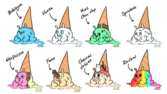
Something we like to encourage is for your character designs for go through a variety of different designs and concepts before you land on the 'one'. Digitally, this is easy, as you can copy and paste a character multiple times, and edit it with new details and emotions.
Here is a collection of character designs, each of them as a different flavour, some have chocolate chips, another has a flake etc. It's a simple way to multiply your work- and create a design sheet without redrawing the same thing over and over. My favourite is he Flake one, but I really like the face of the vanilla one. Maybe I'll combine the two designs going forward?
0 notes
Text


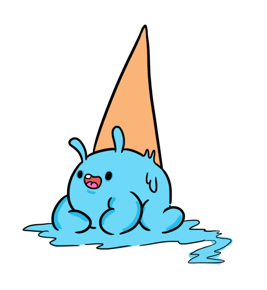
...To this. The shell looked like an ice cream cone, so I decided to make some ice cream character designs, using a cone as a kind of shell.
You can see my initial character designs on paper, a quick variety of sketches, working out where the shell would be positioned and where the creature would wear it. I then scanned these in, and drew on top of them, digitally, you can see the initial outlines, and then the colour added. The idea was that it was bubblegum flavoured Ice Cream
0 notes
Text
Initial Character designs:


These are some quick character designs I created- I downloaded some images from Google (below) and drew some simple sea creatures emerging from them.
The idea was to work out how something would fit inside the shells, or pop out from inside, some are wearing them as hats, others live inside them. My favourite is the snake like one on the top left. The shell reminded me of an Ice Cream Cone, so I thought it may be interesting to something with that!
Connections like this are always good, but realistically very difficult to do- in an ideal world every project would unfold like this...

0 notes
Text
Nelly Le

Nice simple snail design, really like the painted aesthetic and the shading, I'd like to see a more colourful exaggerated version of it though.
0 notes

Text
Fallout - Mirelurks

Mirelurks
Mirelurks are an enemy type in the Fallout video game series, they're mutated crabs- and therefore a type of crustacean. In game you can kill them, and cook and eat their meat.

Mirelurk King These are Mirelurk Kings, they look less like crabs and more like the Gill Man from The Creature From the Black Lagoon- I assume that this was an intentional design decision, replicated to capture the setting of the 1950's/60 world of Fallout.

I've always loved the unique design of the Gill Man, it's skin looks less like a shell and more like armor and scales though. He looks like a man/fish hybrid. Anthropomorphic?

Mirelurk Queen
These are huge, and look more like swamp thing than a crap or crawfish.
0 notes
Text
How Hermit Crabs choose their shells
youtube
Hermit crabs choose their own shells that they find on the ocean floor, there have been accounts where they've used litter as a shell replacement. Because of this artist shave taken to 3D print custom shells for them.
These are clear, so you can see how the crabs body wraps around inside.

youtube
This Japanese artist went one step further, and designed shells with houses/buildings extruding out of them, I like this idea and may play around with some design ideas.

0 notes
