Name's Real! I like art, I love soup, and sometimes I draw.☆ for my art: the brainrotsreal's art tag ✧˖°:*♡☆ for art only sideblog: @straightfromthismindofmine
Don't wanna be here? Send us removal request.
Statistics
We looked inside some of the posts by thebrainrotsreal and here's what we found interesting.
Average Info
Notes Per Post
27K
Likes Per Post
16K
Reblog Per Post
11K
Reply Per Post
21
Time Between Posts
3 days
Number of Posts By Type
Text
17
Last Seen Tumblr Blogs


Fun Fact
Tumblr has a 66 index score for customer satisfaction in the US.
Text
will be alive again in 30 years ok. art block back with vengeance </3
#or whenever invincible comes back#it activates something in my brain despite my dislike of s3 idk#real's rambles
5 notes
·
View notes
Text
One whole person asked about the Invincible suit design variants I did (a while ago, my bad fam) so FINALLY! WORD VOMIT ABOUT THE DESIGNS below!!! >:D


Coherency is for losers but for my own sanity, I’ll probably go suit by suit, which is going to be repetitive asf, since there’s recurring elements, purposefully so, but I will make my thoughts someone else’s problem istg, so before I begin I wanna clarify!
One! Mark and Nolan’s og designs are incredible and I won’t stand for any slander. Their suits work in such incredible contrast. The usage of primary colors for Mark, sans red, makes it so any red stands out against him, thereby suggesting how ill-fitting blood suits him, when it draws your eye so quickly! On the other hand, Nolan’s white (Viltrum color), and red suggest red, ergo blood, fits him, because when his hands are already covered in red, it’s hard to distinguish if the blood’s even there, because he already looks bloody, because violence suits him. Like the color usage + the line for the “O” to match Viltrum? Iconic. They ate this the fuck up.
Now, I’d rather watch paint dry than see Mark in his new blue-black suit a second longer, because it’s so horribly boring. And before you say a damn thing, I know the purpose of the suit, I’ve said it before, it is a visual representation of his darker era with literal darker color scheme, the removal of bright yellow (like his casual outfits s2 onward), represent the loss of joy, and this continues as he suffers, and his outlook on heroism is soured by Nolan’s actions, plus, he is literally beaten black and blue often. It’s a literal reversal of Nolan’s red-white, even. I KNOW. It’s still so boring because the COLOR works but the DESIGN doesn’t. So it just feels palette swapped. The only meaningful change is shorter boots, AND THAT’S IT? BLASPHEMY.
Hence the suits. First batch sports the yellow-black-blue, explorations to keep the color scheme, but to keep the message about ruined joy, the colors are dulled!


Now, first primarily focuses on incorporating elements from Conquest’s design, because his suit has a variation on the Viltrumite uniform. The double lined belt, the bit of pants cuffed by the low boots, are slapped onto Mark’s suit, here, while general, simplified shaped of Conquest’s robot arm (half circle, then straight line), are added to Mark’s gloves, as well as a chunky/puff cuff to the wrist to, again, give an attempt homage to Conquest’s arm. If you notice, Conquest’s robotic arm, when it meets his uniform, is half circle and straight line, but Mark has a bottom half circle, then line, because, again, homage. An extra emphasis on black because, y’know, darker era, with both the Viltrumite classic line cutting through Mark’s yellow, with black mask. Generally, I’m trying to keep the eye drifting up, but it’s an attempt while balancing the colors.
Second suit (is me fucking around lol), again, explorations by shifting the colors to minimize yellow as Mark’s joy shrinks but hasn’t died yet, with an emphasis on the black and blue. Double lines around the neck portion, Conquest has two lines around his upper arm instead of the standard one, and generally speaking, if you see double lines that’s what I’m trying to pull from. Plus, around the hip are stripes of blue with a shape vaguely mimicking the shapes around Viltrum/Nolan’s waist but vertically, not horizontally. And again, Conquest belt, but Viltrumite geometric shape, with a higher end at the slides, and a slightly lower end in the middle, line-wise. Like a really flattened U, if that makes sense. Boot size to mimic Nolan’s, rather than Conquest’s shorter boots.
Third of the yellow-black-blue batch follows similarly. Muted colors, double lines around the arm to mimic Conquest, but keeping the og suit’s higher boots without the knee brace, geometric lines rather than the smooth curve because sharp edges = scary, danger whatever, line language, idk, higher gloves to balance the colors, added blue to the upper leg to shake things up.


Beautiful mutual @/ talked about the fuck would you add red to the blue-black and I took it as a personal fucking challenge, and why the og post even exists, so this me figuring that color scheme and I DID IT. Hence, the second batch of three, blue-black-red. First of this batch has lines around the glove like Viltrum uniforms have a line around the lower arm, keeping the og suit’s fingerless look without actually being fingerless, big ol’ emphasis on red in particular while blue and black take second change. Same Conquest homage belt, og suit high boots, sharper shapes rather than smooth curve, with added dark blue around the upper arms as homage to Conquests’ lines around the upper arms.
Second of the second batch looks color to Nolan here with tiny adjustments; red is an inkling not the focus, while a soft baby blue takes center stage, ‘cause Mark is darker yeah, but he’s still soft, he’s still Mark. Forgot to mention all fingers in this batch are red because of Nolan, and the visual idea of them all have blood stained hands, much like how Nolan’s gloves are red! A little red on the boots to keep the color more of an accent, and a red line on the upper chest/neck as another Nolan homage!
Third of the second batch has way more red, an emphasis of violence, as the gloves are just as red and longer, being short of the elbow this time around. Pale blue-grey is the smallest color used now, but a sharper version of Mark’s og knee pads are included! Sharper, because it’s hard edges and not smooth, circular Mark wore initially. The red bleeding into Mark’s shoulder and a bit of the chest instead of switching to blue farther up, mimicked Mark’s original suit as well. That’s where Mark’s og suit had blue dipped in the shoulder of chest!
LAST one!!!! Entirely blue and black. Ran outta steam to finish anymore, and was itching to post, so the last batch has the only one suit. Only suit with a cape, which is black/dark on the side despite having blue on the outside, intentionally. Not only does he wear a cape like Nolan does, but the darker inside is supposed to emphasize a darker heart, like whatever the fuck that demon said at the end of s3. This suit keeps Mark’s canonical second suit (black, blue) glove but they’re not fingerless anymore but completely covered. The squarish shape to flat line that Nolan has around his waist (where red needs white there), is mimicked on a very minor scale around Mark’s own waist/blue around his chest, where it meets the darker grey.
And that’s all of them! :)
#real's rambles#invincible rotating in my mind#the brainrotsreal's art tag ✧˖°:*♡#invincible fanart#THANK YOU TO THE PERSONS ASKING ABOUT THEM I THOUGHT SO DEEPLY ABOUT THESE#used all my power... for invincible suits LMAO#but in all seriousness i seriously hate the design of the suit but love the colors#its so BORINGGGGGGGG DESIGN WISE LIKE WHYYY
28 notes
·
View notes
Text


Rotating this show in my mindddddddddd, so back to my usual of translating these mf's in my style, delightfully going insane for minute differences because I WANT THEM. Below for thoughts :3
I know the point is Lin Ling and Nice are identical, (hence kept the EXACT same face shape), but the subtle horror of having one’s face permanently layered, even AFTER you tried stepping outside the role you got shoved in is too yummy. SO!!!
NICE! Slight curl to the hair, sharp eyes, slightly duller pupils! Heroes get white rings around the pupil, like a default eye glow. He is symmetrical except in hair, nose.
Lin Ling, as Nice, retains all the same as above EXCEPT his eye shape, iris, which is slightly rounder. SLIGHTLY, pupils are darker, less dull. Symmetrical in all but hair, nose.
OG! Lin Ling, hair's completely straight/spiky, utterly asymmetrical, and slightly longer than Nice's. Rounder eye shape and iris. Rounder ear shape, subtle. Bags underneath the eye. Smile is asymmetrical.
Commoner! Lin Ling!!! Hair RETAINS slight curl from Nice, plus the eyes, iris, and ears! They’re the exact same when he was Nice. Hair style is asymmetrical. Smile is slightly asymmetrical. Latter two only changes.
MOON! Stays entirely symmetrical, including smile, mouth, nose, but her hair is more loose and as straight as possible once quitting, and is ofc messier. Kinda darker upper lip, like she's wearing lip stick, stays permanently. IDK! I LOVE HER!!!! FREEE MY GIRLLLLLLLLLL.
BONUS HC, horror edition! Nice + Moon could stay up for days but CAN'T have any eye bags because they're not expected to have any, so it literally cannot appear, visually. They can still feel the effects tho. Same with not eating. They won't look different (ex. they cannot gain or lose any weight because people don't believe/trust anything different) but they'll feel it. Unsettles them both!
#the brainrotsreal's art tag ✧˖°:*♡#procreate art#fanart#digital art#to be hero x#tbhx lin ling#tbhx nice#tbhx fanart#tbhx#artist on tumblr#digital artist#character design#tbhx moon#no rambles in the tags because i AM TIRED#overthought which photo to put first because i am soooooooo normal about these mfs#havent seen episode 5 yet too busy pacing about this mfs#i need to know everyone's pysche by the back of my hand#my lovely subtle body horror show hehehehhehehehehehe <- horror fan brain pleased by the Implications#ILY OG!NICE I MISS YOU EVERYDAY KING#wreck i get it fr#praying we get toxic yuri in this PLEASE
109 notes
·
View notes
Text
literally have nothing to add but HEAVY AGREE. I will come back with coherency when I finally process, and excitedly word vomit, lmao.
caught up to episode 4 of to be hero x... losing my mind. as one does. no coherency only spinning png's of this mfs in my SKULL .
24 notes
·
View notes
Text
literally so grateful to be dragged. I wish I could be coherent about this episode but I am actually losing my shit. I AM NOT OKAY EITHER. WHAT THE FUCK. Everyone needs to watch this show rn because what. WHAT. W H A T. DUDE!!!! WHAT!!!!!
caught up to episode 4 of to be hero x... losing my mind. as one does. no coherency only spinning png's of this mfs in my SKULL .
#real's rambles#trying to remember a tag lol#BUT OMGGGGGGGGGG#I would love to say an essay but i am SPINNING these mf's inn my head at scary speeds instead
24 notes
·
View notes
Text
YES WE AREEEEE!!!! Legit some of your reblogs kept reminding me of it, and I'm sure you pushed me to watch it in the tags once (or I'm forgetting thingss lol), AND FINALLY CAUGHT UP! IT'S SO GOOD.
caught up to episode 4 of to be hero x... losing my mind. as one does. no coherency only spinning png's of this mfs in my SKULL .
24 notes
·
View notes
Text

Translation:
Hero name: Lin Ling [Chinese] / The Commoner [English]
Slogan: "Everyone can be a hero!"
Birthday: 5/22
Star sign: Gemini
Height: 180 cm
Sponsor: Treeman
Interests and talents: making PowerPoints, creative director. Details of personal interests are unknown.
Superpower: Bastard Fist*. A chaotic flurry of punches that his opponent is unable to make sense of.
*Slang term that refers to throwing an overwhelming array of wild punches with no form or strategy; a technique used by drunks, cats, and divorcing couples
#yessssssssss THE canon design for my pookie. my good time boy. the best guy in the world. new guy of the week.#BASTARD FIST IS KILLING ME#USED BY DRUNKS CATS AAND DIVORCING COUPLES IM CRYING
758 notes
·
View notes
Text
caught up to episode 4 of to be hero x... losing my mind. as one does. no coherency only spinning png's of this mfs in my SKULL .
24 notes
·
View notes
Text


Doodles of my tigersona
2K notes
·
View notes
Text
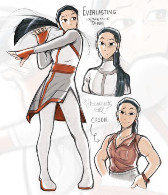
ROLE SWAAAAAAAAAAAAP. Debbie can now be eligible for the worst parent award! No real thoughts for plot ideas yet, just messing around with a design.
#the brainrotsreal's art tag ✧˖°:*♡#invincible rotating in my mind#digital art#fanart#procreate art#invincible#invincible fanart#debbie grayson#invincible au#viltrumite Debbie#And If I call this AU mommy issues what then? HUH#she wears red instead of green cause evil murder color.#I am tired rn lol#but yeah opposite Debbie so opposite color#Much like Nolan she doesn’t deviate far from viltramites uniform either#Keeping some elements#Obliviously the red. Blood on her hands. You get it.#Everlasting just sounds fun. Like she’ll outlast all of humanity. If she hunts you down you’ll run out of energy. You cannot escape her.#Her success is inevitable type feel? Yknow?#His uniform is slightly diff to reflect her but idkkkkk#Lighter pallets for her cause Viltrum uniform. Red and pink and grey is always on her#some way even if it’d just one color#Using brain rot to make me get better at anatomy because I am a genius#She tells mark why the fuck did she give birth to such a failure#For all the months she created him. Felt sick. felt fucking awful. And this is how it turned out! He will earn the life he’s been given.#Fucked up in a diff way lol.#Finale has just as much violence but diff psychological damage#Mark ends trying to prove why he deserves to live why he’s born#self esteem is in the negatives here#he clings to heroism to prove his worth. Desperate for public approval. He is always patrolling. Ends up paralleling his mom by working all
265 notes
·
View notes
Text
The purpose of life is to get really into stories that drive you so crazy you sometimes feel the need to throw up from how much you love them
23K notes
·
View notes
Text

would love to say some coherent analysis of Soleum and Braun but instead catch me rambling incoherently and giggling to myself <3
#the brainrotsreal's art tag ✧˖°:*♡#sketch#drawing wip#kim soleum#gsgw braun#gsgw#Can feel Art hibernation kicking in so either I find something new to be insane about or see y’all in a couple months maybe#MAYBE#it has not escaped me Braun will be like hey king maybe not USE YOUR OWN BLOOD and Soleum is like hey don’t kill this guy. Soleum wins btw.#Somewhat sacrificial (BRO LOST A LIMB) x would just kill that guy for you. Braun doesn’t get to kill#Soleum does get to lose blood.#Mind you Soleum will act sadistic to saheon so Braun is like oh the layers of my beloved cohost#No wait I need to draw OG sped squad thinking about how they can’t let Soleum go + blue dragon +#Brain rot so bad drew incomprehensible yearning
48 notes
·
View notes
Text


IT’S DONE AT LAST! A real short excerpt from around chapter 115 ??? Literally one of my favorites lmao, so it deserved to come to life! Tweaked the dialogue a tad, so might be wonky! Tho, I got to draw my fav guy in the planet excessively so who’s rlly winning? :] Might do an alternate colored version sometimes soon! :3
close ups below because I can.


Can you tell who my favorite is? It’s rlly difficult.
#the brainrotsreal's art tag ✧˖°:*♡#fanart#digital art#procreate art#gsgw spoilers#baek saheon#kim soleum#ghost story work#gsgw#goedamchulgeun#Brainrot took a massive step back from completing this lol#I ammmmmm tired y’all#Forgot how much effort comics are lol#there are no spelling errors thanks to our lord and savior Kim Soleum amen. Fav cult leader I love this fucking arc smmmmm#fan comic#artist on tumblr#Fun fact this was gonna be 4 pages but then I regained my sanity#Loving my style lately too might use my blorbos for some real anatomy practice I’ve been lackingggggggggg#KIM SOLEUMMMMMMM BEST GUY EVER ILYYY#hope I am not just an artist to you guys but become that one “Kim Soleum” artist lol#Might get into JJk or dmc or to be hero x next idk#I need a poster of this mf on my CEILING I LOVE HIM
241 notes
·
View notes
Text


more snippets because I am impatient lol. getting so much practice drawing my fav guy in the world, tho slowly whittling away at nailing how to draw Saheon, too. but it's so funny to me every panel with Soleum is perfection and Saheon is...there. I have favorites. Clearly.
Changed the lines a lil', but literally Saheon and Soleum's interactions are so interesting to me. Like, imagine your batshit insane coworker is a fucking improv cult leader. Meanwhile, Braun's thrilled to see Soleum being Fucking Sadistic to this One Guy.
#the brainrotsreal's art tag ✧˖°:*♡#gsgw spoilers#i mean im being cautious but this is the train cult arc??? whatever the name is#kim soleum#comic wip#drawing wip#fanart#TOOK 5-8 LINES TO BE FOUR PAGES#BECAUSE I AM NORMAL ABOUT THE NOVEL#ghost story work#fan comic#guhhh it's supposed to be you'll not you'd ugh
50 notes
·
View notes
Text
getting better at art means some stuff just goes slower because I'm checking I like it before moving on, practicing skills or whatever, but also it goes slower so I wanna flip a table.
#I WANT SOLEUM AND SAHEON SCENES MADE REAL NOW!!!!!!!!!!!!!!!!! <- rightly practicing comic skills that got rusty + forced anatomy practice#rotsreal rambless#I SUMMON A THOUSAND MOLOTOV COCKTAILLLLLLSSSSSSS UPON THE SITUATION#RAHHHH
3 notes
·
View notes
Text

WIP: This is gonna take me like a bajillion years and it's like maybe a handful of lines (I am impatient lol), but BEHOLD, the REAL reason behind finalizing designs >:] Making scenes REAL. Or, like, visualized.
#art wip#comic wip#the brainrotsreal's art tag ✧˖°:*♡#everytime soleum threatens saheon i get 10 years added to my life span#it's soooo funny to me#it tickles me even more braun is witnessing his pookie terrorize a coworker for like no fucking reason#like braun doesn't know EXACTLY why soleum is like this to THIS GUY SPECIFICALLY. soleum my tight lipped king. lying ass.#but braun is delightfully entertained nonetheless. while soleum is like lying for everyone/his sake. noble omissions lol.#but like no wonder braun is gleefully offering to end mfs for him. besides being like an entity. LOOK AT SOLEUM#gsgw#CULT TRAIN ARC CULT TRAIN ARC MY LOVEEEEEEEEE#SOLEUM WHY ARE YOU SO NOT NORMAL#WHY ARE YOU A GOOD CULT LEADER#rusty asf making comics ngl but im enjoying myself.#i forget i love these#fun to see how i make comics changes as my art style does too.#gsgw rambles#<- tag for me.
13 notes
·
View notes
Text
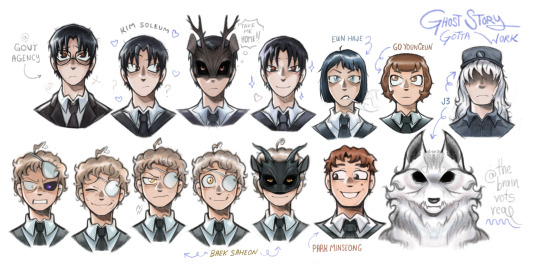


Gsgw HC designs :D Not entirely canonically accurate tbh, took liberties. I'm totally right guys tho, trust. Saheon implied to have dark eyes? Smh, they're gold, guys, source? Trust me bro. Minseong totally has a mole + double dimples, Haje rocks a bob, J3 has long hair, and gov't agency standard suits are open suit jackets with warmer color palette leaning into dark purples/brown, while corp has blue/grey with closed/button up. Youngeun has curly hair guys, trust me :/ she told me.
But, had so much fun with these omfg? Fought the same-face demons and actually won, I'm so happy messing with shapes! Literally kept drawing until I got winded/stuck.
#gsgw spoilers#i mean baek's eye tbh counts? i suppose?#needed to finalize some of these designs. for me.#the brainrotsreal's art tag ✧˖°:*♡#fanart#digital art#character design#kim soleum#baek saheon#goedamchulgeun#ghost story gotta work#gsgw#park minseong#j3#eun haje#go youngeun#wanna fiddle with some more tbh. like saheon's purple eye.#already dreading drawing some more of the guys while still not having the Same Face Shape all the time#but agent choi.... agent bronze.... ily#anyways j3 is described as wolf-LIKE i think so I think (making shit the fuck up) there's another mouth along the neck#but i think he cannot control how curly/thick/color of his hair because of the wolf contamination so he lets it rock#also I SWEAR chp.151 confirms he wears a cap? which YAY because his face is hidden in the shadow all the time. to me.#hes not even trying to be ominous.#my bad if theres spelling errors locked in drawing too hard#crying screaming throwing up when i imagine drawing lizard guy because protag and him look similar apparently#LIKE WYDM SIMILIAR#THE SHOULD HAVE TOTALLY DIFF SHAPESSSSSSSSSS.#i joke not totally accurate but there's a lot of wiggle room tbh#ref official art if there was any and used wiki to get descriptions
153 notes
·
View notes