
Hey there! I'm Nicole, the brain behind the UI/UX and art stuff for @noodletsstudio's upcoming VR Party Game.
Don't wanna be here? Send us removal request.
Statistics
We looked inside some of the posts by thecatnoodlet and here's what we found interesting.
Average Info
Notes Per Post
54
Likes Per Post
41
Reblog Per Post
13
Reply Per Post
0
Time Between Posts
8 days
Number of Posts By Type
Text
11
Last Seen Tumblr Blogs


Fun Fact
Tumblr’s reach among the 26-to-35-year-olds in the US is 11%.
Text
Particle Effects
Tuesday, 4 August 2020
Brain much, much drier than that chicken breast I had for lunch the other day…
Back with another devlog this week! I’ve finally gotten some particle effects for the game done, so I’ll be showing what I’ve completed so far. Particle effects provide some visual feedback and just ties all the animations and actions together nicely, along with the sound effects. There are quite a few effects that are similar to one another, so I’ll just be grouping those together.��
Here’s a look at all of them playing at once!

Besides the smoky and sparkly effects that I’ll cover below, there is also (from left to right in the top row) a heart PFX to indicate customer satisfaction, a ring of fire for the stove, liquid splashing, and PFX for liquid overflowing out of a pot onto a surface!
Getting...steamy

These are the smoke / steam-related effects! Because recycling is good for the environment, all of these use the beautiful smoke sprites made by @theeggnoodlet, with varying sizes, speeds, colours and shapes depending on the usage of the particle system. For example, negative feedback like burning food has darker smoke particles compared to lighter particles when the food is still undercooked.
Sparkles

These effects will play to indicate:
that a dish was cooked well
that a customer has disappeared (currently, customers just shrink and disappear into the void, so we wanted to add some sparkles to show the pop as it disappears!)
Constraints
In a previous school project done on mobile, usage of unoptimised particle effects and post-processing was like sweet torture on the device. Since the platforms that we are developing for are mobile and VR, which require quite a bit of optimisation to keep the FPS at a decent level, I had to keep the number of particles for each particle system as low as possible without compromising the quality of the effect. This meant a lot of tinkering with particle sizes to ensure that the effects don��t look too sparse at lower particle counts (10-20, max).
Review
That’s mostly it for the particle effects! We can’t get too fancy lest the devices we’re developing for start screaming whenever we test the game out. In any case, I do hope the particle effects we have can spice the gameplay up a little.
I’ll mostly be working on a little of everything in the following weeks: extra UI and particle effects as they come, finding more sound effects, probably get to lighting? We’ll see. Or, well, I’ll see. And then you’ll see. Anyway, bye for now!
4 notes
·
View notes
Text
UI/UX #2
Tuesday, 21 July 2020
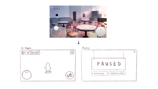
This devlog entry will be a short update and a continuation from last week’s post; I talked a lot about the designs and the individual UI elements, so this week I’ll cover what we’ve managed to implement so far.
Mobile UI
youtube
The screen backgrounds are unfortunately not ready yet, so we’ve put in placeholder backgrounds for now. The UI’s starting to come together though! As shown from the video by @thepinknoodlet above, we have a splash screen that fades away on tap to the menu screen, which then goes to the lobby screen when the VR player hosts a room, and then to the game screen. (I flexed my dried chicken breast brain to code the splash screen’s functionality...yeah)
Here’s a look at the screens in the prototype compared to their wireframe counterparts!
Splash Screen:

Menu Screen:

Lobby Screen:

Game Screen:

So far it’s all coming together pretty okay, though the layouts might undergo some minor adjustments (placements of buttons and all that) after we’ve done more playtesting and user testing.
Review
Yup, that’s all for now. It’ll probably take some time before the VR UI is implemented, especially since the workload is starting to pile up from other module assignments again. That said, I’m quite pleased with how the mobile UI is coming along, much thanks to our hardworking developers!
Adios for now <3
4 notes
·
View notes
Text
Environment Concept Art Tutorial
Intro
Hey everyone, it’s Nicole, Noodlets Studio’s Visual Director! I also happen to don the hat of the team’s concept artist. That’s what this article-slash-tutorial is all about!
So, what exactly is concept art? Concept art falls under the umbrella of illustration; its main purpose is to be a visual representation of an idea (or concept…!) for usage in games, films, etcetera. There are many different types of concept art - characters, environments, props. We’ll be focusing on the latter in this tutorial!
I will not be covering any digital art software basics here; I’ll assume that anyone reading this knows their way around their drawing software.
I’d just like to preface by saying that I am, by no means, a master at this craft, and that I too am learning more about creating concept art day by day. Nevertheless, I’d like to share my process and some tips and tricks I use that I’ve picked up over my years exploring the realm of digital art. Let’s begin!
The Process
Step 1: Thumbnailing
Thumbnailing is an important step in the concept art process. It facilitates the speed of the initial idea flow, allowing artists to try out different angles and compositions before deciding on the one they wish to detail further.
The Conventional Way
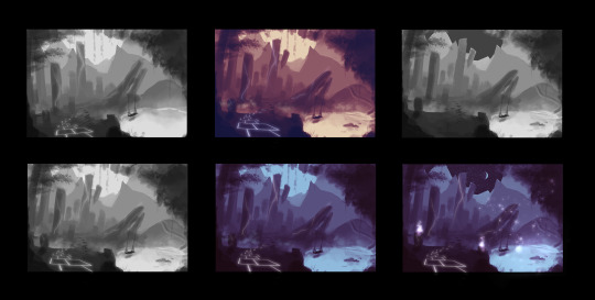
I start out in grayscale. Which means completely black-and-white, like the two thumbnails on the left!
I personally like keeping my thumbnails loose by blocking shapes in with a medium-sized textured brush and the lasso tool. At this stage, I play around with the composition, placement of items, and try out different colour palettes to see which would fit the best. Some tips:
Keep values in mind! When in the grayscale stage, the balance of lights and darks should be there, with ample contrast so that the elements do not look muddy when colour is added later on.
Check if your composition is balanced. The placement and size of objects can carry significant ‘weight’.
Separating stuff into the foreground, middleground and background helps to create depth. Use values to show the distance!

(Notice how the closer the plane is to the camera, the darker it gets?)
The Time-Saver Way (art purists, close your eyes)
*Note: These time-saving methods are just that: methods to work faster. They do NOT replace learning the fundamentals of art, though they can be helpful for studies! They should mostly be reserved for studio projects.

Usually people would sketch or block their thumbnails out, but well…when you’re really pressed for time...using your own 3D assets and shifting the camera around to try out different compositions might speed up the process. (Here, I’m using @theboynoodlet’s environment block-in assets)
There’s been an age-old debate about ‘cheating’ in art but really, when you’re on a tight deadline, digital tools have opened a vast array of options to speed up your work. Lots of concept art pieces are created by photobashing and using 3D models. As long as you don’t trace over other people’s work and claim it as 100% your own effort, there’s nothing stopping you from using tools to get your work done fast on a deadline. Remember: work smart, not hard.
Step 2: Blocking

Once you’ve selected the thumbnail you like best, it’s time to enhance it! Start blocking in the details with a smaller brush. I still do this step in grayscale, so I can keep an eye on the composition and values as I’m painting.
Step 3: Detailing and Colouring

After blocking comes the colouring! The method I use to add colour is by using adjustment layers on top of the grayscale layers. The adjustment layers I usually use are:
Colour Balance
Curves
Levels
I play around with the shadow, midtone and highlight hues until they fit the colour scheme that I’m looking for.
I then render more using normal raster layers and a round watery brush. Don’t be afraid of multiply and luminosity layers! They can help with adding shadowy and light areas.
Textures
In the event that you’re working on concept art that is more photorealistic, using textures from stock images and free brushes can help to add a whole other layer of realism to your piece! Play around with layer modes and lighting to help integrate the textures more seamlessly. My usual go-to layer modes for these are multiply, overlay and soft light.
Step 4: Final Touches
At this stage, I add lighting, particles and textures to spice up the environment art more. With the power of digital magic, adding final touches is much easier than in the traditional medium. Many free brush packs are available online for download. (I recommend Brusheezy for Photoshop brushes and Clip Studio Assets for Clip Studio Paint!)
I also use more adjustment layers to balance the colours and ensure that the picture has a decent contrast overall.

Conclusion
That’s it for this tutorial! While there are many techniques that other talented artists use for doing concept art, these are the steps that I take. I hope it’s been informative and at least a little bit helpful <3
Till next time!
9 notes
·
View notes
Text
UI/UX #1
Tuesday, 14 July 2020
It’s been a long time coming. While I had been working on UI/UX sporadically throughout the span of the project so far, I felt I hadn’t made enough progress to warrant an entire devlog about it. BUT! The time has finally come! She’s finally got some content in the bag! This post is going to sum up the progress on the UI/UX design from the beginning to now. Let’s go!
Wireframes
As a result of crippling creative burnout, I was having some trouble with creating the initial layout of the screens. So, @theeggnoodlet kindly helped with creating the first set of wireframes. You can check out her thought process from her UI devlog post!
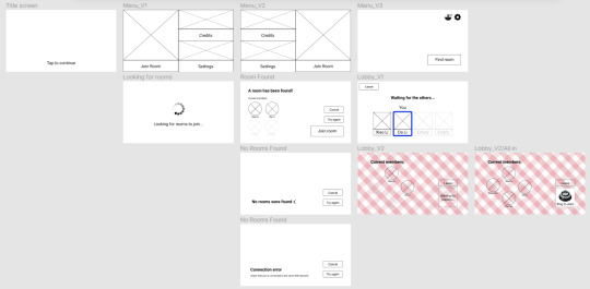
After I’d gotten back on my feet, I modified the wireframes a little and put a very simple prototype together in Adobe XD to show the links and flow between each page. The modifications were more simplifications than anything else - I felt that the boxy menu design was too squeezy, so I changed the buttons to the layout used by the Join Room screen.
Here’s a video showcasing the initial flow of the UI!
youtube
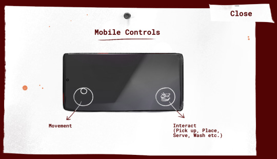
Mobile Game Screen
This screen underwent a bit of improvement after we’d fleshed out more of the game mechanics and the values we’d have to display on the screen for players to see. To keep from making the interface too cluttered, I kept all static elements along the borders of the screen. The joystick and interact buttons are placed at the two bottom corners, where players’ thumbs can reach most easily when holding their phone horizontally.
UI Assets
Icons and Pop-Ups
After creating an asset list for all the in-game UI assets required, I got to work creating every icon and pop-up. These mostly consisted of 2D illustrations drawn by hand. Unchanging elements (like instruction pop-ups and certain indicator icons) have the illustrations and their respective backgrounds combined into a single layer. However, assets like the illustrations that appear in the interact button depending on what the player interacts with has been separated for the developers to enable or disable the icon easily.

The pop-ups have been designed to look like written notes, since technology was not yet rampant among hawkers of that era.
Buttons
I have created two sets of buttons, each with different themes:
The first is used in the menu / lobby screens, and is themed after Chinese shophouse signs from the 80s. They usually have a long framed board with all-caps red words painted on them.
The second is used for the pop-ups. Following the same theme, the buttons look like a piece of paper stapled to the pop-up background.

4 notes
·
View notes
Text
Sound Effects
Monday, 29 June 2020
It’s been a while! No excuses except for a genuine need to hibernate for a while to recoup after one heck of a month of assignment deadlines. Whew. Anyway, upon my return to continuing work on the project, I went foraging for sound effects for the game. (We had initially planned to leave sound effects for later on in the production timeline, but with a prototype deadline coming up, we moved it to our current sprint.)
Sound effects are undoubtedly extremely important to any game, and there is a certain pressure involved with finding that ‘perfect’ sound bite for every action. The team unfortunately does not own the proper equipment to make high quality foley, so I tapped on audio repositories to find the sounds I needed. The two main sites I perused were Prosound and Zapsplat, both containing a comprehensive library of sound effects that met my needs. (Fair warning: be really careful with the licensing on these kinds of assets. Make sure to check that they can be used for games or commercial projects!)
It’s pretty interesting how creative one can get with finding appropriate sounds. Sometimes you can get away with using a sound created by something entirely different from the action you’re finding a sound for. Sometimes you can never find the sound you want. It just plays over and over in your mind, taunting you because you can’t find it.

(Screenshot of the SFX I gathered)
There were certain sounds that I just couldn’t find on either site: the sound effect for washing dishes, for example. I had to fire up Audacity and combine two sound bites together - running tap water and scrubbing sounds, adjusting the levels and pitch so they mesh together properly.
Suffice it to say that sound effects were not the biggest hurdles of the game’s auditory field - we still have the looming threat of music left. But well - that’s for another devlog entirely. Farewell for now!
2 notes
·
View notes
Text
Props and Misc Concept Art
Thursday, 7 May 2020
Tableware

Lots of research (and checking with my Credible Source) went into the tableware art. It’s nothing particularly innovative or fantastical. I just tried to keep it as close to the 1980s cutlery designs as possible. In those times, plastic utensils weren’t as prevalent - instead, most shops used porcelain or metal cutlery, with the exception of wood for chopsticks.
But! The pepper, soy sauce and chilli containers were made of plastic and were usually see-through so that customers can see what’s inside. Soy sauce bottles had little spouts on the top to facilitate pouring. These shops usually didn’t provide salt (salt’s more of a western thing), so salt was taken out of the condiment rotation.
Kitchenware
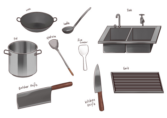
Pretty standard - most cooking tools were made of metal with wooden handles, sinks were utilitarian and taps were the kind that had to be turned.
Misc

This took a little more time to complete since we were still fine-tuning the details of the game and the objects that were present in the scene. It took some research and studying hawker center stalls / 80s mama shops to get the appliances looking as close to how they should look as possible.
4 notes
·
View notes
Text
Environment Concept Art
Monday, 4 May 2020
Ah, the bane of my artistic existence.
Right off the bat, starting on drawing the environment was an absolute pain. The bulk of the game is played indoors, after all, so I focused on an indoor environment. Challenges I faced...drawing with proper perspective, especially with so many circular objects, was just extremely taxing on my brain. Eventually I muscled through and blocked out the flats for the base of the environment.

The shop I envisioned was cozy, welcoming, and hopefully a little nostalgic for those who have visited such coffee shops before. The furnishings, decorations, and placement of tables were all cross-checked with my Credible Source - marble-top round tables, wooden chairs (specifically of that design), and wall decorations like Chinese calligraphy were commonly seen in coffee shops in the 80s.
Here’s the final concept after adding some decorations, colour adjustments and lighting.

I tried to balance warm and cool tones to create some contrast and highlight the sunlight streaming in from the outside. Gives it a more cozy feel, like the shop is just opening at daybreak
Some points I’d like to improve on in the future:
Practise and study using perspective
Incorporate more textures! My shading tends to look too smooth
Get better at using harmonious colours
That’s it for the environment art! While working on this reminded me constantly of my struggles with drawing backgrounds, it was good practice in rendering and creating the right mood with proper lighting and effects.
4 notes
·
View notes
Text
Food Concept Art
Monday, 4 May 2020
One of the most important pieces of concept art for this game is the food, since it’s a game about cooking. Our initial discussions entailed the creation of five dishes in total, and it’s my job to decide on the placement of the ingredients on the plates and the colours used.
So came the first draft, which was completed on the 27th of April.
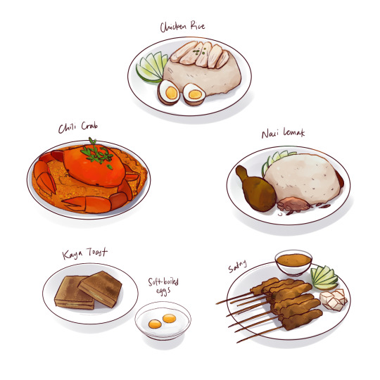
After more discussions, we decided to cut down on the number of dishes being served to one - chicken rice. We would still keep several variations of it, including Hainanese chicken, roasted chicken, normal rice and rice balls. That reduced the number of ingredients by a lot. I also realised, after checking with a Credible Source, that the chicken and rice were usually served separately back in the 80s. Hence came the separation - rice in bowls, chicken on an oval plate.
(Also drawn are the chickens that will be displayed in the display case for the chef to chop, as well as cucumber for garnish!)
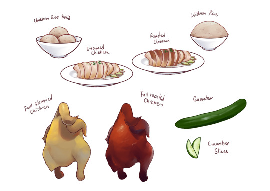
I had a surprisingly high level of motivation while working on this, so I’d say that it went smoothly and that there weren’t many bumps besides the need to cut the dishes down.
That concludes the food concept art!
10 notes
·
View notes
Text
Game Logo
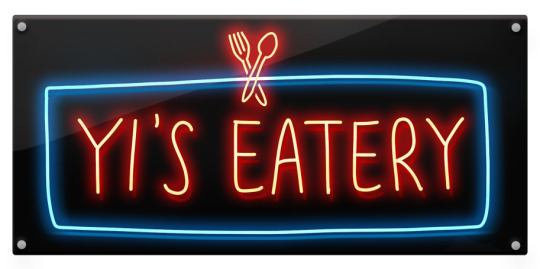
Monday, 27 April 2020
The logo for the game was something I spent days mulling over. Logo design in general is difficult in its own right, and having to design something with the 80s Singapore Chinese Shop Aesthetic made it...slightly more difficult.
I’d settled on some key points first - I’d be using the font Bebas Neue, the all-caps sans serif typeface we’d decided to use for title text. I did research on the logos of other cooking games; most made use of 3D text and little icons of food or food-related items somewhere in it to indicate that it’s a food-related game. Thus came the first iteration of the logo: an attempt at 3D text as shown below.
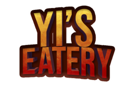
We decided it looked a little too Hell’s Kitchen and not so 80s Chinese Restaurant, so I scrapped it. Back to the drawing board!
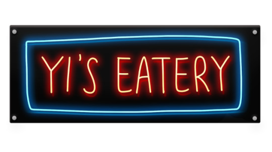
After some discussion, neon came up as a plausible idea. Many old Chinese Restaurant signs made use of neon in the 80s, which were bright and gaudy and kind of exactly what we wanted. I dove back into designing and came up with the second iteration of the logo - a black plastic signboard with ‘Yi’s Eatery’ placed across it in red neon wiring, boxed in by a blue rectangle. The bright neon colours give a nice contrast against the black, and ties in nicely with the 80s theme and aesthetic.
The logo was nearing completion. It just needed a final touch - a fork and spoon icon, to indicate that it’s food-related. Perfect.
This is how the logo was born. I went through multiple iterations and the constructive criticism was extremely valuable to improving the design to where it is now!
4 notes
·
View notes
Text
Character Concept Art
Wednesday, 22 April 2020
Designing the characters was a bit of a head-scratcher, especially since there were a lot of factors that had to be taken into consideration, along with finding a suitable style that would fit the theme and feel of the game succinctly. Something simple, something that can suit the cartoonish palette, something that can show our characters’ personalities.
While still in our discussions phase, we didn’t have a solid storyline laid out just yet. That’s where the first round of character design comes in - the barebones, simple server character, just with different coloured shirts, and two customer characters.
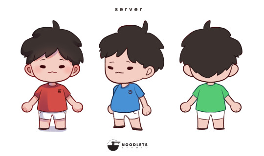


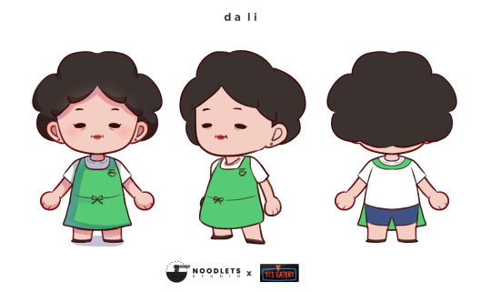
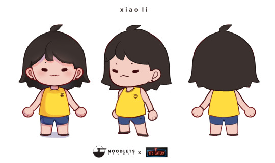
After deciding on our finalised story, four more characters were introduced: Da Fan, Da Li, Xiao Li, and Xiao Ben (not depicted). The initial server design was revamped into the design for Xiao Fan!


Thus began the serious head-scratching. Simplifying the designs while still maintaining a noticeable difference between each character was my biggest challenge. Some points I tried to adhere to were:
Design them such that there is less reliance on modelling the characters and more on texturing (Since the platforms we are working on are VR and mobile, we have to try and keep the number of tris on each model as low as possible so users’ devices don’t combust mid-game!)
Keeping bodies and head shapes mostly similar
Changing up hairstyles and clothing designs and colours to ensure each character can be differentiated easily
So came the final designs - while mostly similar in proportion (sans some added height for Da Fan), each character was given differing features, indicating age and personality differences. (Hint - smiles, shapes of eyebrows, clothing choices). Helps that they also look clearly Chinese, as they’re supposed to!
The character designs set the base tone of the game - lighthearted and simple. More concept art will be coming up very soon!
7 notes
·
View notes
Text
An Introduction

Hello! I’m Nicole - the visual director, UI/UX designer and concept artist of Noodlets Studio. I’ll be documenting the stuff I’ve done during the development process of our game, Yi’s Eatery! As my roles in the team would suggest, there’ll be a lot of concept art and user interface design on here, maybe sprinkled with a bit of extra art here and there.
Now then, let’s get this show on the road!
Come watch our game come to life at noodletsstudio!
2 notes
·
View notes