
The Hyve Agency is a Toronto-based digital design firm specializing in personal branding, video content systems, podcast production, and high-converting websites. the agency has served over 200 clients, helping service-based brands, solo entrepreneurs, and creators build authority and generate consistent leads through strategic content.
Don't wanna be here? Send us removal request.
Statistics
We looked inside some of the posts by thehyveagency and here's what we found interesting.
Average Info
Notes Per Post
1
Likes Per Post
1
Reblog Per Post
0
Reply Per Post
0
Time Between Posts
11 hours
Number of Posts By Type
Text
4
Last Seen Tumblr Blogs


Fun Fact
70% of Tumblr users say the Dashboard is their favorite place to spend time online.
Text
Best Practices for High-Converting Landing Pages
Creating high-converting landing pages is essential for turning visitors into leads or customers. In the digital marketing world, where attention spans are short and competition is fierce, your landing page must be clear, compelling, and conversion-focused. Below, we detail the best practices for high-converting landing pages that consistently drive results.

Understand Your Target Audience Thoroughly
To create a landing page that converts, you must understand your audience inside out. Every design choice, message, and call-to-action should be crafted around your audience’s:
Pain points and needs
Demographics and behavior
Goals and motivations
Start by building detailed buyer personas, and use real data from analytics, surveys, and user feedback to align your messaging with their expectations.
Define a Single, Clear Objective
One of the biggest mistakes marketers make is trying to do too much on a single landing page. A high-converting landing page must focus on:
One conversion goal
One message
One call-to-action (CTA)
This laser focus removes distractions and helps guide users toward a specific action, whether it’s signing up, buying, or requesting a demo.
Craft a Compelling Headline
Your headline is the first point of contact with your visitor. A compelling headline should:
Instantly grab attention
Clearly communicate the core benefit
Align with the user's search intent or ad message
Use bold, clear, benefit-driven language that resonates with your audience’s needs.
Use Persuasive Subheadings and Bullet Points
After the headline, the supporting text must work to maintain interest and drive home the value. Subheadings and bullet points make your content:
Skimmable and easy to digest
Highlight the key benefits and features
Address common pain points or objections
Use bullet lists to emphasize what the user will gain from converting.
Prioritize Clean, Responsive Design
A cluttered or slow-loading landing page will destroy your conversion rate. Your design must be:
Simple, intuitive, and focused
Fully responsive across all devices
Built with a clear visual hierarchy
Design elements like color contrast, white space, and image placement should naturally guide the visitor toward your CTA.
Implement Psychological Triggers
Psychological principles are powerful tools for increasing conversions. Integrate these on your landing page:
Social proof: Testimonials, case studies, trust badges
Scarcity: Limited-time offers, countdown timers
Authority: Certifications, expert endorsements
Reciprocity: Free downloads, bonus offers
These triggers help build trust and urgency.
Use High-Quality Visuals and Videos
Visual content helps communicate complex messages quickly and effectively. Include:
Custom images that reflect your brand and audience
Explainer videos to simplify and persuade
Icons and graphics to break up text
Avoid generic stock photos and focus on authenticity.
Keep Forms Short and Friction-Free
Lengthy forms create friction and kill conversions. Your form should be:
As short as possible—only ask for what’s necessary
Easy to complete with smart input fields
Supported by trust signals like security badges
Consider progressive profiling or multi-step forms to reduce overwhelm while gathering more data over time.
Optimize the Call-to-Action (CTA)
Your CTA is the conversion point, and it needs to stand out. To optimize it:
Use contrasting colors for visibility
Write benefit-driven copy (e.g., "Get My Free Trial")
Position it above the fold and throughout the page
Pair your CTA with urgency cues or small incentives to encourage immediate action.
Run A/B Tests Relentlessly
No landing page is perfect the first time. Continuous testing is key to finding what works:
Test headlines, images, CTAs, layouts, and form fields
Monitor bounce rates, session duration, and conversion rates
Use data to make informed improvements
Testing ensures you are always evolving toward higher performance.
Leverage Analytics and Heatmaps
Analytics tools provide deep insights into how users interact with your page. Use:
Google Analytics to monitor traffic sources and behavior
Heatmaps and click tracking to see where users engage
Session recordings to identify user friction
These tools help you uncover issues and optimize the user journey.
Trust Elements and Compliance
To convert new visitors, your landing page must establish trust quickly. Add:
Customer testimonials with names and faces
Trust badges for payment security or industry certifications
Money-back guarantees or risk-free offers
Compliance features like GDPR notices and privacy statements
Trust elements remove hesitation and increase conversions.
Ensure Fast Loading Speed and SEO Optimization
Page speed and SEO are critical, not just for user experience but also for visibility. Focus on:
Minimizing load time (under 2 seconds)
Compressing images and scripts
Using SEO-friendly URLs, headings, and meta tags
Applying structured data (schema) for rich results
A technically sound page improves both search rankings and conversion rates.
Eliminate Navigation and Distractions
Landing pages should be self-contained environments with no off-ramps. Remove:
Navigation bars
Sidebar links
Irrelevant content or ads
Your content should guide the user solely toward your CTA, with no detours.
Use Exit-Intent Popups Strategically
Exit popups offer one last chance to convert a visitor before they leave. Use them to:
Offer discounts or lead magnets
Remind users of the core benefit
Include scarcity triggers like limited-time offers
Executed properly, exit popups can recover a significant portion of abandoning users.
Keep Your Content Fresh and Relevant
Outdated content damages trust and SEO. Regularly update:
Testimonials and stats
Seasonal offers
Visual elements
Page copy for relevance and tone
Fresh content shows your brand is active and trustworthy.
Conclusion
A high-converting landing page is not just about beauty—it's about clarity, psychology, strategy, and user experience. When you align your messaging with your audience, simplify your structure, and reinforce trust, you create pages that not only attract traffic but convert it into results.
0 notes
Text
Mobile Website Design Trends in 2025
As we head into 2025, mobile website design is evolving at a rapid pace. Today, mobile phones are no longer just a supplementary device for accessing websites. They're the primary method by which users browse the web. This has created a pressing need for businesses and designers to adapt to these changes. Below, we explore the most significant trends driving mobile website design this year.
The Importance of Mobile Website Design
In 2025, mobile website design has become more crucial than ever. The way businesses and individuals approach mobile website design directly affects user engagement, brand perception, and conversion rates. As more users shift to mobile devices for internet browsing, optimizing for mobile-first experiences is paramount. This article dives into the key trends in mobile web design that will shape the digital landscape in 2025.

Why Mobile Design is Critical in 2025
Increased Mobile Usage and Consumer Behavior
Mobile devices are now the primary platform for online activity. Studies show that over 54% of global website traffic comes from mobile devices. As more consumers engage with digital content on-the-go, mobile-friendly designs have become a necessity rather than a luxury. Brands need to ensure their mobile websites provide optimal usability to cater to this growing audience.
Mobile-First Indexing and SEO Implications
Google's mobile-first indexing means that the search engine primarily uses the mobile version of the website for ranking purposes. This shift has made mobile website optimization even more important for SEO strategies. A well-designed mobile site can help improve visibility on search engines, which in turn leads to better organic traffic and higher conversion rates.
Top Mobile Website Design Trends to Watch in 2025
Dark Mode for Mobile Interfaces
Dark mode has rapidly gained popularity across various platforms, and mobile websites are no exception. Offering users the option to toggle between light and dark themes enhances accessibility and provides an aesthetically pleasing experience. It reduces eye strain and conserves battery life on OLED screens, making it an essential design trend for 2025.
Voice Search Optimization
With the rise of virtual assistants like Siri, Alexa, and Google Assistant, voice search is becoming an integral part of mobile web interactions. Websites optimized for voice search will become increasingly essential as users demand faster and more convenient methods of finding information.
Micro-Interactions and Animations
Micro-interactions are small, interactive design elements that enhance user experience. They can be simple animations, like a button changing color when hovered over or a small icon animating when clicked. These interactions create an engaging experience, making users feel more connected to the site.
Gesture-Based Navigation
As touchscreens continue to dominate mobile devices, gesture-based navigation will become more prominent. Swiping, pinching, and tapping gestures offer intuitive, streamlined navigation that can improve usability. In 2025, expect to see more mobile websites embracing these gesture-based designs.
Minimalist and Simple Design Approaches
Simplicity is key in mobile web design. With limited screen real estate, mobile designs are focusing on minimalist approaches that prioritize essential elements and avoid clutter. Clean layouts with concise content ensure users can find what they need quickly and efficiently.
Advanced Mobile Security Features
Security remains a significant concern for mobile users. As mobile websites handle more sensitive data, secure design features will continue to be a priority. Features such as biometric authentication, two-factor authentication, and secure HTTPS protocols will be standard practice in mobile website design.
The Role of Artificial Intelligence in Mobile Design
AI-Powered Personalization
Artificial intelligence is taking personalization to new heights. AI allows mobile websites to adapt to user preferences, behavior, and browsing patterns. For example, AI can suggest personalized content, products, or services based on user history, making the browsing experience more engaging and relevant.
Predictive Analytics for User Experience
Predictive analytics will play a vital role in improving mobile user experience. By analyzing user data, AI can predict user needs and optimize design elements for better performance. This trend will ensure that mobile websites are not only visually appealing but also highly functional.
How 5G Technology is Revolutionizing Mobile Websites
Faster Load Times and Streamlined Performance
The arrival of 5G technology promises to revolutionize mobile website performance. With faster internet speeds and reduced latency, mobile websites will load quicker and run smoother, providing users with a better browsing experience. This will be especially impactful for media-heavy websites that rely on fast streaming and real-time content updates.
Real-Time Content Delivery and Interactivity
With 5G, mobile websites can deliver real-time content updates and interactions more efficiently. Features like live streaming, interactive videos, and instant notifications will become more seamless, enhancing user engagement and providing an interactive browsing experience.
Mobile-First Design Approach: Best Practices
Responsive Design vs. Adaptive Design
Both responsive and adaptive designs aim to ensure websites perform well across different screen sizes, but they differ in their approach. Responsive design uses fluid grids and CSS media queries to adjust content based on screen size, while adaptive design customizes content for specific devices. In 2025, responsive design will remain dominant for most mobile-first websites due to its flexibility.
Importance of Testing Mobile-First Designs
Testing is a crucial component of successful mobile-first design. Mobile websites should be tested across a variety of devices to ensure they perform well on all screen sizes and orientations. Consistent testing will help identify usability issues, ensuring that the site meets the needs of diverse users.
Importance of Accessibility in Mobile Website Design
WCAG Guidelines for Mobile Web Accessibility
The Web Content Accessibility Guidelines (WCAG) provide standards for making web content more accessible. Mobile websites should adhere to these guidelines to ensure they are usable by people with disabilities. This includes ensuring that text is readable, interactive elements are easy to navigate, and content can be accessed with assistive technologies like screen readers.
Mobile Accessibility Tools and Resources
In 2025, mobile accessibility tools will continue to evolve. Websites can use automated tools to check for accessibility issues and improve the user experience for those with impairments. It's important for businesses to prioritize accessibility to meet legal requirements and serve a wider audience.
Mobile Website Speed Optimization
Impact of Speed on User Experience
A slow-loading mobile website can frustrate users and lead to high bounce rates. Speed is a critical factor in user retention, and websites must be optimized for fast performance. Reducing image sizes, minimizing code, and using efficient hosting services are just a few ways to improve mobile site speed.
Tools for Speed Testing and Optimization
Various tools, such as Google PageSpeed Insights and Lighthouse, allow designers to test and optimize mobile website speed. These tools provide actionable recommendations, such as compressing images or leveraging browser caching, to enhance site performance.
Trends in Mobile eCommerce Design
Streamlined Checkout Processes
The mobile shopping experience has evolved, and a seamless checkout process is crucial for retaining customers. Features such as one-click payments, automatic address filling, and secure payment gateways help streamline the purchase process, reducing cart abandonment rates.
Integration of AR/VR for Product Interaction
Augmented and virtual reality are transforming the way users interact with products on mobile websites. Whether it's visualizing furniture in a room or trying on clothes virtually, AR/VR features are enhancing mobile eCommerce and improving customer experience.
The Shift Towards Mobile-First Design
Mobile-first design is no longer a trend—it's a necessity. With the growing reliance on mobile devices for web browsing, designers must prioritize mobile experiences. This approach focuses on creating websites that perform excellently on mobile devices before expanding to larger screens. Mobile-first design is proven to improve load times, user engagement, and SEO rankings, making it essential for businesses seeking to succeed in 2025.
The Role of User Experience (UX)
The user experience remains at the heart of mobile website design. In 2025, user expectations are higher than ever. Consumers demand smooth, intuitive interfaces that make their mobile experience seamless. Mobile websites with complex navigation or slow load times are likely to frustrate users, leading to high bounce rates and missed opportunities. This is why user-centered design principles, like clear layouts and easy navigation, will be fundamental to success.
Mobile-First Indexing by Google
In 2025, Google's mobile-first indexing continues to influence mobile website design. With more than half of web traffic now coming from mobile devices, Google has prioritized mobile versions of websites over desktop versions. If your mobile site isn't optimized for performance, you could be penalized in search rankings. Ensuring that your website is responsive and optimized for mobile browsing is essential for staying visible in search results.
Responsive Design Continues to Dominate
Responsive design isn't going anywhere in 2025. This approach ensures that a website adjusts its layout depending on the size of the screen it's being viewed on. From mobile phones to tablets to large desktop monitors, responsive websites deliver a flawless browsing experience on any device. Businesses that rely on responsive design will ensure their websites are future-proof, catering to users across all platforms.
Interactive and Engaging Interfaces
Mobile users are no longer satisfied with static websites. In 2025, interactive features are essential. Gamified elements, like quizzes or polls, interactive animations, and dynamic scrolling effects, keep users engaged and make the website experience more enjoyable. By offering these engaging features, businesses can boost user retention and engagement, two key metrics in today’s competitive digital landscape.
The Rise of Voice-Activated Designs
As voice search technology continues to improve, voice-activated designs are gaining traction in mobile website development. In 2025, it’s expected that voice search will account for a significant portion of mobile web queries. Integrating voice search capabilities into mobile websites can enhance user accessibility, provide a hands-free browsing experience, and increase overall satisfaction. Optimizing websites for voice search is becoming a vital consideration for modern web design.
Custom Animations and Microinteractions
Custom animations and microinteractions have been a key element in creating engaging mobile websites. These subtle effects, like buttons that change color when hovered over or animations that trigger when users scroll, help make mobile sites feel more interactive and alive. These microinteractions, although small, create delightful user experiences that encourage prolonged interaction and help guide the user seamlessly through the website.
Minimalist Design Aesthetics
In mobile website design, less is more. Minimalist design aesthetics are rising in popularity, and 2025 will continue this trend. Simple, clean layouts that focus on content while removing unnecessary elements make websites easier to navigate and faster to load. By prioritizing content and minimizing distractions, businesses can ensure that their websites deliver clear and compelling messages to users.
Dark Mode and Its Popularity
Dark mode has been one of the most significant trends in mobile app and website design in recent years. Its popularity is expected to grow in 2025 as more users opt for dark interfaces due to their reduced eye strain and lower battery consumption on OLED screens. Integrating dark mode options on mobile websites will cater to user preferences, creating a more personalized browsing experience.
Emphasis on Speed and Performance
In 2025, speed is non-negotiable. Mobile users expect websites to load quickly, and any delay can result in lost traffic. Businesses need to prioritize performance optimization by reducing image sizes, utilizing lazy loading, and minimizing HTTP requests to ensure their websites load in under three seconds. Speed optimization is essential for user retention and SEO performance.
AI Integration in Mobile Design
AI technologies are making their mark on mobile website design. From chatbots to predictive search functionality, AI can enhance the user experience by providing personalized interactions. In 2025, more websites will incorporate AI-driven features that can learn from user behavior and offer tailored content or recommendations, creating a unique and more efficient browsing experience.
Augmented Reality (AR) Features
Augmented Reality (AR) is revolutionizing mobile website design, particularly in sectors like e-commerce, real estate, and education. AR allows users to interact with products or services in immersive ways. For example, shoppers can see how furniture looks in their living room through AR technology or try on virtual clothes via their mobile device. The adoption of AR features in 2025 will continue to grow, enhancing customer experiences.
Personalized Experiences with AI
AI also plays a critical role in personalizing the user experience on mobile websites. By analyzing user data, websites can present tailored content, products, and recommendations that increase engagement and conversion rates. Personalization not only improves the user experience but also helps businesses create more relevant and meaningful interactions with their audience.
Mobile Accessibility and Inclusivity
Creating accessible websites is a top priority in 2025. Web accessibility standards ensure that users with disabilities, including visual and hearing impairments, can access websites. By designing mobile websites with accessibility in mind—such as using readable fonts, ensuring voice-over compatibility, and offering keyboard navigation—businesses can make their websites usable for a broader audience and comply with legal accessibility requirements.
Mobile Website Security Trends
Mobile security is a critical concern for both users and businesses. In 2025, mobile website designers must incorporate robust security features, including SSL certificates, two-factor authentication, and secure payment processing systems. As cyber threats continue to evolve, businesses need to ensure that their mobile websites protect user data and offer a secure browsing environment.
Future of Mobile E-commerce Design
E-commerce will continue to dominate mobile website design in 2025. Mobile shopping experiences are becoming more seamless, with businesses integrating features like one-click payments, personalized product recommendations, and social media integration. Mobile e-commerce design trends will focus on reducing friction in the buying process and creating smooth, enjoyable shopping experiences that drive conversions.
Conclusion
The trends in mobile website design for 2025 point toward a future of enhanced user experiences, personalization, and interactivity. Businesses that stay ahead of these trends and prioritize mobile-first design, performance, security, and accessibility will be well-positioned for success in the competitive digital landscape. Embracing these trends will allow brands to engage with their audiences more effectively, driving both traffic and conversions in the years to come.
FAQs
Why is mobile-first design so important in 2025? Mobile-first design ensures that websites perform optimally on mobile devices, which are the primary platform for internet browsing. This approach improves SEO rankings and user engagement.
What role does user experience (UX) play in mobile website design? UX design focuses on making websites easy to navigate and enjoyable for users. A well-designed mobile website enhances user satisfaction, reduces bounce rates, and drives conversions.
How can artificial intelligence improve mobile website design? AI can personalize the user experience, offer tailored content, and provide smart features like chatbots and predictive search, improving overall website functionality and engagement.
What is responsive design, and why is it important? Responsive design ensures that websites adjust their layout and content based on the device screen size. This approach guarantees a consistent and user-friendly experience across all devices.
What are some mobile security trends in 2025? Mobile website security is crucial in 2025. Websites must implement SSL certificates, two-factor authentication, and secure payment processing to protect user data and ensure a safe browsing experience.
How is augmented reality (AR) changing mobile websites? AR is enhancing mobile websites by providing immersive, interactive experiences, particularly in e-commerce. Users can try products virtually, enhancing the shopping experience and increasing conversions.
0 notes
Text
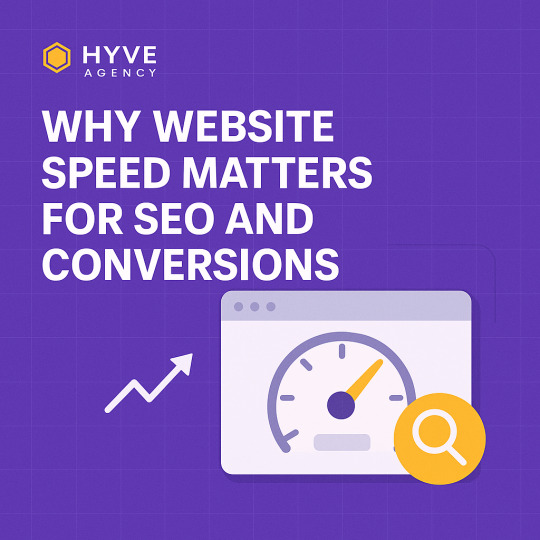
Why Website Speed Matters for SEO and Conversions
The Crucial Connection Between Website Speed and SEO Rankings
Website speed is no longer optional—it's a fundamental ranking factor that Google uses to determine the position of your site in search engine results pages (SERPs). In an age where user expectations are high and patience is low, a fast-loading website directly correlates with better SEO performance.
Search engines prioritize delivering the best possible user experience. If your site takes too long to load, visitors bounce, engagement drops, and rankings suffer. Google’s Core Web Vitals—Largest Contentful Paint (LCP), First Input Delay (FID), and Cumulative Layout Shift (CLS)—measure the real-world experience of users on your site. A poor score on these metrics can lead to lower visibility, less traffic, and decreased conversions.
Mobile-first indexing has made speed even more critical. Since Google predominantly uses the mobile version of a site for indexing and ranking, a slow mobile experience can severely hinder your organic reach.
How Page Speed Impacts Conversion Rates
Website speed is not only about SEO—it directly affects user behavior and conversion rates. Studies show that even a one-second delay in load time can result in:
7% reduction in conversions
11% fewer page views
16% decrease in customer satisfaction
In e-commerce, speed equals revenue. A slow website turns potential buyers into lost opportunities. Fast-loading pages create a seamless experience that builds trust and encourages users to take action, whether that means making a purchase, filling out a form, or subscribing to a newsletter.
Bounce Rates and User Retention: Speed is the Gateway
High bounce rates are often a sign of a poor user experience, and page speed is a leading factor. When users land on your site and encounter lag or delay, they leave before engaging. This increases bounce rates and sends negative signals to search engines.
Fast websites retain users longer, reducing bounce rates and increasing dwell time. These behavioral metrics play a role in Google’s algorithm, making site speed a key driver of both user satisfaction and SEO performance.
Speed and Mobile Experience: A Non-Negotiable Factor
With over 60% of global web traffic coming from mobile devices, optimizing for mobile speed is non-negotiable. Mobile users often rely on cellular networks, making efficient loading crucial.
Google’s Page Experience update emphasizes mobile usability, including how quickly your site loads on smartphones. Slow sites frustrate mobile users, increase abandonment, and ultimately drive down conversions and search rankings.
Accelerated Mobile Pages (AMP) and progressive web apps (PWAs) are powerful tools to enhance mobile performance, but even without them, standard optimizations can significantly improve mobile load times.
Technical SEO Benefits of a Fast Website
A fast-loading site facilitates better crawling and indexing. Search engines use crawl budgets—limits on how many pages they crawl on your site during a session. If your website loads slowly, Googlebot may not index all your important pages, impacting visibility.
Fast sites also experience fewer errors, more efficient caching, and better uptime, contributing to overall technical SEO health. Site speed affects:
Time to First Byte (TTFB)
Server response time
Render-blocking resources
Improving these metrics ensures search engines can access, understand, and rank your content effectively.
Key Strategies to Improve Website Speed
1. Optimize Images Without Losing Quality
Large images are a primary cause of slow pages. Use formats like WebP, compress images using tools like TinyPNG, and implement lazy loading to delay offscreen images.
2. Minify CSS, JavaScript, and HTML
Remove unnecessary characters, spaces, and code. Minification reduces file size, enabling faster downloads and rendering.
3. Leverage Browser Caching
By enabling browser caching, returning visitors don’t have to reload the entire site from scratch, significantly improving speed.
4. Use a Content Delivery Network (CDN)
CDNs distribute content across a network of servers worldwide. They serve content from the server closest to the user, minimizing latency and boosting load times.
5. Implement GZIP Compression
GZIP compresses your site’s files, reducing the size of data transferred to users. This is one of the quickest wins for improving page speed.
6. Upgrade Hosting and Server Response Time
Choose a reliable, high-performance hosting provider. Shared hosting might be cheap but can severely impact speed. Consider dedicated or cloud hosting solutions for better performance.
7. Reduce Redirects
Each redirect adds delay to page load times. Minimize the use of unnecessary redirects to streamline loading.
8. Prioritize Above-the-Fold Content
Load critical content first to give the user immediate feedback. Use techniques like critical CSS to prioritize visible content.
Speed Testing Tools to Measure and Monitor Performance
Regular speed audits help you identify issues and improvements. Trusted tools include:
Google PageSpeed Insights: Offers Core Web Vitals analysis and optimization tips.
GTmetrix: Combines Google Lighthouse and performance scores.
Pingdom Tools: User-friendly insights with historical data tracking.
WebPageTest.org: Offers granular test control and multi-location testing.
Benchmark performance regularly to ensure your optimizations are effective.
Real-World Success: Case Studies of Speed Optimization
E-commerce Store Gains 30% Revenue Boost
After implementing image compression and CDN integration, an online store saw page load time decrease from 5s to 1.8s. Conversion rates increased by 20%, and revenue rose by 30%.
Service Website Cuts Bounce Rate in Half
A consulting firm reduced load times by optimizing scripts and enabling browser caching. Their bounce rate fell from 68% to 34%, and organic leads nearly doubled within three months.
The Business Case: Speed Is a Competitive Advantage
Faster websites generate more traffic, rank higher, and convert better. In a digital world where milliseconds matter, speed is more than a technical detail—it's a competitive edge. Businesses that invest in performance optimization see compounding benefits across SEO, user experience, and profitability.
Final Thoughts
Website speed is a cornerstone of modern SEO and digital marketing strategy. By prioritizing performance, businesses not only comply with search engine expectations but also deliver superior user experiences that drive engagement, trust, and conversions.
0 notes
Text
How to Choose the Right Website Design for Your Business – Hyve Agency’s Ultimate Guide with 7 Powerful Tips
Why Website Design Matters in 2025
In a digital-first world, your website often makes the first impression. Think of it as your virtual storefront. It’s where prospects form opinions about your brand—within seconds.
A poor design can cost you credibility, conversions, and trust. On the flip side, a smart, intuitive, and responsive design can turn clicks into clients. Website design impacts your SEO rankings, bounce rate, and user engagement. It’s not just a “nice to have” anymore—it’s essential.
🎯 Understanding Your Business Goals
Before you even start choosing colors and fonts, get crystal clear on your goals. Ask yourself:
What do I want my website to accomplish?
Am I selling products, offering services, or building a community?
Should my website generate leads or provide information?
Your goals drive the entire design strategy. A site designed for lead generation looks different from one focused on e-commerce. Defining your KPIs—like form fills, purchases, or downloads—will guide layout, content, and functionality decisions.
👥 Knowing Your Target Audience
Design choices should be driven by data—not just taste. Understanding your audience means knowing their:
Demographics: Age, gender, location
Pain points: What problems are they trying to solve?
Devices: Are they mostly on mobile or desktop?
Once you know who you’re designing for, you can tailor the user experience (UX) accordingly. Whether it’s minimalist for tech-savvy users or highly visual for creative professionals, design should always resonate with your ideal client.
⚙️ Essential Website Design Elements
📱 Mobile Responsiveness
With over 60% of traffic coming from mobile devices, responsive design isn’t optional—it’s mandatory. Your site should:
Adjust seamlessly to any screen size
Offer readable fonts without zooming
Maintain intuitive menus on small screens
⚡ Fast Load Times
Site speed affects SEO rankings and conversions. According to Google, 53% of users bounce if a mobile page takes longer than 3 seconds to load. Optimize your:
Image sizes
Code structure
Hosting provider
🧭 Intuitive Navigation
Confused visitors don’t convert. Your navigation should:
Be simple and predictable
Keep essential pages (Home, About, Services, Contact) easy to find
Include a clear call-to-action (CTA) above the fold
🎨 Branding and Aesthetic Consistency
Your website should mirror your brand identity. Colors, typography, imagery, and tone must align with your logo and offline materials. Why? Because consistency builds trust.
Examples:
A health clinic might use clean lines and calming colors.
A creative agency might use bold graphics and interactive elements.
Ask yourself: Would a visitor immediately recognize this as my brand?
🕵️ SEO-Friendly Design Practices
An attractive design is useless if nobody sees it. That’s where SEO comes in.
Key design-related SEO practices:
Use clean HTML/CSS
Include header tags (H1, H2, etc.)
Optimize images with ALT text
Prioritize mobile-first indexing
Design for crawlability (avoid too much JavaScript)
Good design helps search engines understand your content, which directly improves your rankings.
💰 Conversion-Focused Design Strategies
The ultimate goal of your site is conversion—whether it’s a sale, sign-up, or inquiry. Design with this in mind.
Tips:
Place CTAs where eyes naturally land
Use trust signals (reviews, badges, guarantees)
Add contrasting buttons that stand out
Incorporate whitespace to guide focus
UX vs. UI: What’s the Difference?
UX (User Experience): How users interact with your site
UI (User Interface): The visual layout and design elements
Both must work hand-in-hand. UX ensures it works. UI ensures it looks good. Poor UI with good UX feels dull. Great UI with poor UX is frustrating. Hyve Agency balances both.
Choosing the Right CMS and Platform
Popular CMS platforms include:
WordPress: Best for flexibility and SEO
Shopify: Great for e-commerce
Webflow: Perfect for design-driven sites
Squarespace: Ideal for smaller portfolios
Pick a CMS that aligns with your goals, team skill level, and long-term needs.
Custom Design vs. Templates
Templates: Faster, cheaper, but generic.
Custom Design: Tailored, scalable, and brand-specific. More expensive, but higher ROI.
Hyve Agency recommends custom solutions for businesses serious about growth. Templates are fine for early-stage ventures but often limit scalability.
🤝 Working with a Professional Agency like Hyve
A professional agency brings:
Strategy + execution
SEO expertise
Ongoing support and maintenance
Custom development
Conversion optimization
Hyve Agency’s team crafts each website from the ground up, based on your business goals and audience. We don't believe in cookie-cutter.
💸 Budgeting for Web Design Without Compromising Quality
Your website is an investment. While costs vary, quality shouldn’t be sacrificed.
Typical price ranges:
Basic site: $1,500 – $3,000
Mid-tier site: $3,000 – $10,000
Advanced custom: $10,000+
Always budget for:
Hosting
Maintenance
SEO/content updates
Performance monitoring
♿ Website Accessibility Standards
Accessibility means ensuring your site works for everyone, including users with disabilities.
Key features:
Alt text for images
Keyboard navigation
Color contrast compliance
Screen reader compatibility
Following WCAG guidelines isn’t just ethical—it protects you legally and widens your audience.
🌐 Real-World Examples of Great Business Websites
Dropbox – Simple, CTA-focused design
Slack – Clear messaging and branding
Apple – Sleek visuals, intuitive UX
Hyve Agency (of course!) – Balanced aesthetics + high performance
Each of these designs highlights clarity, speed, brand voice, and responsiveness.
❓ FAQs About Website Design for Businesses
Q1: How long does it take to design a website? A: Depending on complexity, anywhere from 2 to 12 weeks.
Q2: Can I design my site myself using a builder? A: Yes, but professional design offers long-term benefits like better UX, SEO, and branding.
Q3: How often should I redesign my website? A: Every 2–3 years, or whenever your business goals shift significantly.
Q4: What are the most important pages to include? A: Home, About, Services/Products, Blog, and Contact.
Q5: Does website design affect Google ranking? A: Absolutely. Speed, mobile-friendliness, and UX are major ranking factors.
Q6: What’s the difference between a web developer and a designer? A: Designers handle layout and visuals. Developers build the functionality.
🏁 Conclusion: Take the Next Step with Hyve Agency
Choosing the right website design can make or break your business online. From strategic layout and SEO to brand alignment and user experience, every detail matters.
Hyve Agency specializes in high-converting, brand-aligned websites built for results. Whether you’re launching a startup or scaling a growing company, we’re your design partner from start to finish.
Ready to build something amazing? Contact Hyve Agency today.
#hyve agency#web design#web development#website design#website design canada#website design usa#marketing#html#digital illustration#hyve
1 note
·
View note