
Who gets to decide what art is and what art isn't? Is it the artist, or the viewer? What counts as art? Does it only count if its in a gallery, and what about the galleries themselves? Who even cares? I do!
Don't wanna be here? Send us removal request.
Statistics
We looked inside some of the posts by themoreitisreproduced and here's what we found interesting.
Average Info
Notes Per Post
61
Likes Per Post
43
Reblog Per Post
16
Reply Per Post
2
Time Between Posts
8 days
Number of Posts By Type
Text
4
Last Seen Tumblr Blogs


Fun Fact
Women make up for the other 50% of Tumblr’s audience.
Text
The Art of Fantasy High
If this has come across your dash I can only assume, that like me, you love Dimension 20 (or you are my professor, in which case, hello). Either way, if, by some small chance you are looking at this entry, looking at your computer screen or your phone or some other device, and saying to yourself ‘But I don’t know what Dimension 20 is’, allow me to introduce it for you. Dimension 20 is Dropouts very own actual-play podcast that started with Fantasy High and The Intrepid Heroes and is nowhere near finishing. A season lasts anywhere from 4 episodes to 20, and The Intrepid Hero’s (the main cast) are about to embark of their second tour, this time of their home country, USA. Twenty-four seasons in, and 263 episodes later, we are left with a spectacle of table-top gaming that mixes in experienced professionals and complete beginners to create stories in worlds that change season-to-season.
The art of Dimension 20 is not something that has gone unnoticed, with the heads of the tables, The Game Masters, yelling out the names of the art team who has worked on them. The list of names is sometimes lovingly read out insultingly (The Bear and Phoebe from Burrows End come to mind) when the team, led by Art Director Rick Perry, make something particularly horribly outstanding. The mini’s and the battle sets, right down to The Dome itself along with the makeup and the character art have not been ignored by the fans of the show, and even the outfits of the players have been spoken about at length. Dimension 20 is a beautiful show, full of colour, love, and life, and nothing has been ignored by the fandom. That being said, this essay will not cover all of Dimension 20 (all 24 seasons), and will instead only focus on the first ever setting it introduced; The World of Spyre.
Fantasy High Freshman Year
Fantasy High Freshman Year kicked off the Dimension 20 show, with its main cast quickly becoming known as the Intrepid Heroes, and its characters, slogans, and locations still remaining iconic. Airing in 2018, Fantasy High has had two sequel seasons (the most out of any Dimension 20 show), and the most merchandise made of it. This makes sense; it is widely, and above all else, iconic. It’s mini’s, characters, sets, and slogans were the first thing many people saw when they began to watch the show, and its typical kill-the-dragon-save-the-day high-school-drama story makes it easy for people to get into and understand. Alongside this, watching Beardsley learn how to play for the very first time helps viewers who have yet to play D&D5E understand, even if it is shown in their characters (Kristen Applebee’s having a four in dexterity comes to mind). It’s first combat may very well have created the most iconic monster in Dimension 20 history, the infamous Corn Cutie, tiny Corn gremlins that caused the deaths of Kristen Applebees and Gorgug Thistlespring, which caused the iconic ‘Getting episode 2’d’ phrase.
Such a combat is of course the Clash of the Corn Cuties. Taking place on The Bad Kids first day of school, when they should have been in detention, the combat set the stakes for the rest of the season and the show. The battle map for this combat is modelled after a high school cafeteria, and it is done masterfully. The second the map is revealed, you can see the school’s influence on the cafeteria. It utilises and also created the very red and white colours that remain as a throughline through the entire season, and through the later ones as well. The cafeteria’s design evokes feelings of nostalgia, as its open plan not only make it easy for the players to use and navigate but reminds them of their own high school cafeterias. Since the show is based off an 80s teen movie, choosing to evoke such a feeling with the sets and battle maps is hard to do as they are very small, but Perry succeeds here. Of course, I am remiss (and going to be greatly yelled at by the fandom) if I did not mention the cutest monsters alive – The Corn Cuties. These tiny husks of corn give the combat a silly vibe and allows the players to understand that this is just a game. They are also very fun to look at, their bright colours contrasted against the white and red of the cafeteria. They also help tie into one of the other characters, again, Applebees’, religion to Helio, the Corn Gods. The utilisation of the Corn Cuties against her provides the opening conflict to her story, helped along by the fact they eventually kill her (she comes back).

Another battle set that stands out is The Nightclub from Brawl At The Black Pit. Whilst against The Corn Cuties in the cafeteria they are faced with a wide, open space where they can view and see everything and each other, here they are split into a few chambers, divided, which enables the Game Master, Brennan Lee Mulligan, to create a sense of terror. The small corridors of this set piece help add to the fear the characters are experiencing in this moment, as they are separated, and cannot see each other. It makes the nightclub feel claustrophobic and unsafe. Another reason this set stands out is the use of the colour to make it feel like nighttime, without the use of actual lights in the dome. Since this is the very first season, the use of the dome was limited to it changing colours, so the Art Team had to come up with other ways of making sure that the cast knew what time it was, whether that was through depiction or description. The set also begins to feel somehow more dangerous when you realise the detailing on the walls makes it look like they are about to crumble at any moment. If the walls fall down, then the entire building will collapse. It makes it feel as though there is a time limit, and the cast has to be careful with what they do and say, and where they fight the villains, because if they push them against the wall, the entire building could collapse. All in all, this set piece adds to a major sense of danger and making sure that the combat stays very intense and fast-moving.

The final combat of Fantasy High season one is The Bad Kids vs Kalvaxus, the big red dragon who was their vice-principle the entire time. Not only are the finale episodes of the show iconic for numerous reasons, the set design is wonderful. It calls back to the very first set, The Battle of The Corn Cuties, and makes sure that it uses mostly the same colours. It allows the two buildings, though they are separate set pieces, to feel connected, and like they belong to the same school, which they do. The design scheme of the Augefort Adventuring Academy must be cohesive, and it is achieved. Alongside this, as it is the big, final battle at the end, the dragon Kalvaxous takes the centre-stage, as you would expect him too. He takes up almost the entire battle set, and is the largest mini/maxi that the audience see in the show. This helps evoke the feeling of fear that they Intrepid Hero’s experience.

Fantasy High Sophomore Year
Due to Fantasy High Sophomore Year being the first and only season that Dimension 20 performed live, via a Twitch stream, meant it had no physical battle sets. This is due to the amount of time it would take for the sets to change, when they could have been playing. Due to this, during this season, there are many different fan interpretations of the battles that would have existed had they had physical battle sets. This also meant that, during the season, they were able to do things they normally wouldn’t.
For example, Fabian’s Very Bad No Good Very Horrible Day. This famous battle took place across an entire city, which meant that it would have been impossible to have it as a physical battle set. This meant that, alongside The Intrepid Hero’s not having the confines of a battle set, allowed them to do whatever they wanted during the combat. And, as everyone will tell you, they truly did.
Without the battle sets to draw focus, it also made for some moments to be more impactful without them. It made the moments feel rawer and more vulnerable, as there were no mini’s to demonstrate it, so everybody had their own interpretation of what those moments looked like.
Fantasy High Junior Year
The most recent Fantasy High season from Dimension 20, Fantasy High Junior Year, brought back the battle sets and the pre-recorded episodes. This time, the Battle sets leaned closer to ‘horror’ than ‘high fantasy’, as this season was the darkest of the Fantasy High seasons. It also helps that many of these battle sets do not take place in the Augefort Adventuring Academy, so the battle sets and mini’s did not have to subscribe to a particular colour scheme.
Some battle sets do not subscribe to any colour scheme, as is the case with the Mordred Manor Battle Set from Barron’s Game. This battle set is painted widely with shades of grey and dulled colours. It is important to view this battle set in context; The Manor was the first place that felt like home for the Bad Girls, Adaine, Fig, and Kristen, and is widely regarded as a place of safety, security, and homely warmth. The stark contrast to it being suddenly grey and dull helps add to the fear The Bad Kids are experiencing, particularly as they know this is all a game. Another thing that helps this battle set stand out is each of the bedrooms showing off the girl’s individual personality and values. Most obviously, Kristen’s bedroom has a pride flag and a stained-glass window in it, as her room is in the Manors old chapel. Adaine’s room still has the bunk beds from when she lived there with her sister, Aelwyn, and they shared Bunk beds. Although Aelwyn has moved out at the start of Junior year, remnants of her still echo in Adaine’s room. In Sophomore Year, it is also described as being ‘A Wizard’s Tower’, so the room, in its design, is round, with large windows. Fig’s room, and the final one of the bedrooms, is the smallest room. Since it is under the living room piano, it is not designed to be a bedroom. This is shown by having two desks, which helps give the idea of the bedroom being used for storage.


Another battle set that stands out from this season is the Last Stand. A brutal final exam that takes place after Kristen learns she has failed her classes, putting all of The Bad Kids at risk of failing their school year. To not do that, they have to take the Last Stand, an exam that involves fighting monsters and answering test questions at the same time. To reflect the high stakes and the arena-like circumstances, this battle set is designed as though they are standing in a gladiator’s arena. The high walls and yellow stone help emphasise the arena and the danger of the circumstance. However, instead of the arena being shaped like a circle, it is shaped like a rectangle. This calls back to the shape of a classroom or a sports hall, where exams are taken. The shape not being a circle contrasts the gladiator-esc feeling of the battle map, provide both contrast and context, that these are still children, taking an exam. This is also aided by the presence of normal school desks.

The final combat of Fantasy High is The Battle of The Nightmare King. This battle takes place in the finale of Junior Year, and manages to effectively convey feelings of terror and fear. A major theme in Fantasy High; Junior Year is the theme of change. It asks questions like how can we prevent change, if we can at all? It also asks and looks at how we cope with change, which is why it seems appropriate that the final battle is them fighting something that looks like the weather. This battle map not only portrays the change that the season is so focused on, but it also helps to show off the team behind the art. The lighting coming up from underneath the mini helps the fight to look like lighting, making the villain look like a terrifying force of nature. Although, in context, we know this to be Cassandra, The Goddess of questioning, also called ‘The Nightmare King’, out of context, with the lightning and the clouds, it makes her look scarier than Kalvaxus from season 1.

The Bad Kids
The main six of the Fantasy High season’s, The Bad Kids, all have their own mini’s and character art. While the mini’s do not change throughout the seasons, unless you are Adaine, the art does. The main artists for Freshman and Sophomore year, Victoria Rosas || retired in Junior Year, instead passing on the torch to Cait May, who did the character art in Junior Year. Both artists are able to effectively portray the character and attitude of not only The Bad Kids, but also the side characters and the NPCs they encounter.
The most obvious example of a character changing over time is Adaine Abernant, who has the second most character art out of all The Bad Kids. Although Adaine’s colour scheme widely remains consistent with blues, yellows, and whites, her outfits change as she grows as a person. For example, when she acquires the denim jacket, a gift aided by Fabian, it is as she is learning that she had worth, and her family does not control her as much anymore. Her ‘primary’ colour in the show is blue, which is symbolic of loyalty, trust, wisdom, and inspiration. All of these are qualities found in Adaine, and even though the only person she is loyal to in her blood family is her sister, she is fiercely loyal to her friends. In Junior Year, we see her second-guess her feelings for a new character, Oisin, after Riz, her best friend, points out that he does not like him. Interestingly, in the fandom, Adaine is portrayed widely with glasses. She is only portrayed with glasses once in official art/merchandise. This is most likely due to the fact that Siobhan Thompson, who plays her, wears gasses and already looks very similar to Adaine.


Kristen Applebees has the opposite of Adaine. Instead of her colour scheme being consistent, it widely changes across the three seasons. Being a cleric, Kristen has the strength to channel gods and use their power on the world, mostly for healing. She also goes on a change of faith character arc throughout every single season. As her beliefs change, so do does her design and her colour scheme. When she is unsure of her beliefs, she wears multiple colours. When she is sure in her beliefs, she wears a more monochromatic outfit, such as at the end of Sophomore Year, and the beginning of Junior year. Primarily, she has been associated with the entire rainbow, but also purple and orange. She is another case where, when she gets free from her parents, she is able to showcase more personality in her outfits. At the start of Junior Year, when she has fully embraced herself as she is, a lesbian, she wears the strongest, most cohesive outfit yet. It is almost entirely yellow, with touches of black and purple to call back to her faith in Cassandra, her goddess.


Fig Faeth does not change. That’s mean to say, she does, in terms of her personality, but her outfit and style remain consistent across the entire seasons. She is similar, in this way, to her best friend Gorgug Thistlespring. Their changes are subtle. Fig’s hair dye becomes more obvious, and Gorgug adds his artificing goggles as they get older. Their rather unchanging designs reflect their position in The Bad Kids, both narratively in the story and mechanically in the game. They are the characters who are there for the others to lean and rely on, and whilst they do have their own separate arcs, they mostly benefit and shine the most when they are offering advice or support. Fig and Gorgug also come as a pair, as they are in a band together. The two of them together are the heart of The Bad Kids, and are always there for the others. They are some of the most confident in who they are, and so they do not need to change their clothes to reflect it, like Adaine and Kristen do.


Riz Gukgak’s design stays in a consistent aesthetic, but he does change. He has the feeling of a 1920’s-esc detective, reflecting his role in The Bad Kids as a detective. His appearance changed when his subclass changed in Junior Year, reflecting the changing times and his growth as a person. In Junior Year, he looks more like a picture of his Father than ever before. He is wearing a more formal suit, and he has more ‘Angelic devices’ on his body. His growth as a person is also reflected in the way he removes his hat in Junior Year, because he no longer needs it. Riz’s hat was not only practical, but it was a symbol of who he used to be. By removing it in Junior Year, it reflects all the adventures he’s been on in his time at Augefort Adventuring Academy, and also symbolises that he no longer must hide beneath anything in order to prove himself. It also symbolises Riz’s rush to be great, he no longer has time to pick up his hat in Junior Year, so he no longer wears it. Riz, throughout the seasons, learns some hard lessons about putting yourself first and taking acre of your needs before anyone else’s. Whilst this does not get reflected in his design, as he still has a scruffy shirt and messy clothes, it is notable how he wears his interests on his skin. The final thing that is reflected in his design is his social class and status in society. In the show, Riz’s class is the lowest, despite being one of the smartest characters. Many lower-class people tend to dress more formally and smarter so that they can hide their low class, which is what Riz does.


Finally, the final Bad Kid is Fabian Aramias Seacaster. He has the most character art out of any of The Bad Kids, and simultaneously goes on the biggest character arc in the show. Starting in Freshman Year, he is overconfident, pompous, and extremely arrogant. His design reflects this, as he wears the jacket of a team he does not belong to. Instantly, this gets him judged and ridiculed by the rest of the characters on the first day, but he does not take the jacket off. At the end of Freshman Year, when he murders his Father (it’s complicated) and takes his eyepatch, he begins to look closer to his Father. This bleeds into Sophomore Year, where he looks almost identical to his Father, since they both wear a coat (though Fabian’s is different), and both have the exact same eyepatch. In sophomore year, he has the biggest character arc, and his art is divided into many different sections. In the section of the show called post-Leviathan, when Fabian has accidentally killed his Father’s warlock cult (somehow even more complicated) he goes back to having the appearance of his freshman year self, not including his Father’s eyepatch. This is symbolic of the way he has lost all of his confidence, and every character trait he has been known for has left him over the adventure. Later in Sophomore Year, when he gets his confidence back and understands himself more (post-Fallinel, after rescuing his friend, Adaine, from being kidnapped). Embracing his mixed elven heritage, he begins to look more like his Mother rather than his Father. He adds his eyepatch back and embraces a battle sheet, which was given to him by his maternal Grandfather. Finally, in Junior Year, he begins to embrace his own personality instead of one his Father has made for him. Instead of the red and white owlbears team jacket, he wears a black and silver sparkly jacket and jazz shoes over sneakers. He also gets what I have dubbed the Adaine effect, where the Fandom perception of him is different to his official art. He is never portrayed with locs, however many people in the fandom draw him with them, since his player, Lou Wilson, has them.


Pirates of Leviathan and The Seven
During COVID-19, Dropout did not move away from making content all together. Instead, they moved into using safety protections and filming remotely, such as in the seasons of Pirates of Leviathan and The Seven. Both spin-offs from Fantasy High, Pirates of Leviathan and The Seven were filmed during the peak of The COVID-19 pandemic.
On Pirates of Leviathan, the impact is the most obvious. The season was filmed remotely with the cast all in their houses or individual offices. This meant that physical battle maps were not able to happen, since the cast was completely separate. This led to the battle maps being 2d, and the players having the tokens of their characters instead of mini’s to represent them. It was a new style, and a risky style, but it worked. It is also an incredibly special season, due to it being filmed in the midst of the pandemic.
In The Seven, the season was shot in person after the ‘end’ of the major part of the pandemic. Though social distancing was still in place, which meant there was no battle sets or minis, the season was filmed in person. Though it was not the first season that was filmed in person post-pandemic, it was the biggest. This time, they used 3D models instead of the physical battle sets. Whilst this still gave a similar idea of having the battle map on the table in front of them, the digital battle maps were less customisable than the original, physical ones. This meant that some elements of the characters got lost on the digital minis, such as their dresses not being exactly as described. A small thing, and a minor one, as the team still did amazing work on the battle sets, even with the restrictions.
In conclusion, although the techniques and strategies used by the Dimension 20 team to create the art often go unnoticed or seem out-of-place when discussing the brilliant artists of now, that is not entirely true. Anyone can be an artist, and set design is a skill that is not too dissimilar to painting or embroidery. So, the skill level displayed by the team should be admired and celebrated more that it already has been.
Words: 3855
9 notes
·
View notes
Text
17776 - What Will Football Look Like In The Future? by Jon Bois.
Before we begin, experience it yourself here: Intro | What football will look like in the future
Between Kendric Lamar’s Superbowl halftime performance and the way most American eyes go to it when it is on, it only seems right that American Football earns its place as a stage for art. ‘Seems right’ is heavy phrasing, because most sports fans and most art fans do not cross paths (ever). Still, there is no doubt in saying that American Football attracts a larger audience, so almost everyone in America has an opinion on it. Hell, I’m not even American and sometimes I find myself having an opinion on it more than I do for the actual British football teams I’m supposed to support. So, abstinently, when I saw an article with the title, What will Football Look Like in the Future?, I clicked on it. Expecting to read something about how football will become even more of a battleground for politics, instead I was taken on a transformative media journey.

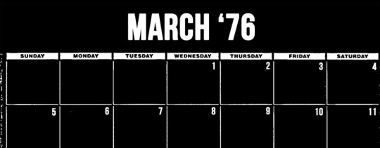
In the very first section, the prologue, we are introduced to two characters. ‘Green’ and ‘Nine’. They communicate via messages sent, dated on a calendar labelled March ’43. There is no 20 or 19 or 18 or other number to tell us when this date actually is, which adds to the mystery and intrigue of the experience. The very first messages we see take two days to be transmitted back and forth, and after this, green disappears, and we are left only with Nine, and an overly large calendar. Occasionally Nine will speak, but nobody speaks back. This is, I am sure you are aware, emotionally devastating to witness.

As Nine begs for a response, pleas of help getting more desperate and louder, Green does not indulge them. They are left alone. We do not know where they are and neither do they – in a way, we are them. We have no clue what is about to happen or when we will hear from Green again, we are trapped, as Nine is, with just the dates. It is a sad and lonely existence, so far removed from anything else. The design of the website helps aid in this, the image of the calendar with the words on it takes up your entire screen. The messages from Nine quickly go from long and complicated to short and desperate. Are we Nine? Are we simply reading Nine? Who are we, and who is Nine? Lengthy questions remain unanswered.
We’re in July now. July ‘43. We haven’t heard from Green since they first spoke to us. Nine. Whoever or whatever we are. Eventually the tired begs for a response give way to a more open and honest ask, instead of two words, we are back to asking a few sentences for Green to speak to us. To do anything, really. We begin to feel desperate, uncontrolled, frightened. Green is the only thing we know and now Green is gone too. Where did they go? Why did they leave us? Did we do something wrong?

We already have to wait eleven days to talk to Green. Why should we keep wasting time? You would think that if They cared for us like they claimed to, claimed to know that we were afraid, then why did they leave us? At this point we’ve forgotten that they asked us too be patient. The loneliness of not knowing, of not understanding why they’re gone is too much, and we are desperate for an explanation or a single word from the one thing that we know, even know to the point it is the colour of our background on the calendar. Green.

And so, we return to begging. We return to that desperate, all-encompassing thing we need, human connection. We beg for someone to notice us. We beg for Green, Green specifically to notice us, but there is no Green to respond to us, there is only the calendar background, which only serves as a reminder of what we have lost.

The year changes. One thing that aids this piece of media, piece of art, is the way we are a witness to the time changing. It is not only cemented by our desperate messages of help happening every eleven days, it is cemented by the year changing, and the background colour changing along with it. It changes into something that we’re more familiar with, red. We’ve forgotten Green. At least, we’ve forgotten what they look like. Now the background colour is something familiar and almost comforting. It’s ourselves.

The final plea is desperate. We have not heard from Green in many months, and we have lost hope. ‘This is my final transmission’ allows the viewer to really put themselves in the shoes of Nine, which is, of course, us. The plea, like the first one, takes place across two days instead of just one. It helps emphasise how long it takes to send these messages, and how lonely it feels. We have spent two entire days writing two sentences.

This is, of course, a lie. Why do we lie to them? To whoever Green is, saying that it is our final transmission when we continue to send? Again, this helps with the question of what are we, and allows us to really think about if Green is good for us. Many more months will pass.

In June, after a long time waiting, which the viewer must scroll through, checking every box just to see, we finally get a response. This response also comes with a name, Ten. The number after Nine, the one that comes after our name. Ten makes their own begs here, similar to how we were begging them earlier; I love you, call me Ten. It is at this point the reader begins to realise that both of them are named after numbers. Are there more numbers? Is there a One through Eight? Again, the year changes and time moves on.

Again, a message from Ten. This time, we know more. We understand their name, and that they know and process a magnetometer. Instantly, this begins to create an idea in the mind of the reader of some kind of sci-fi setting. The colour of the calendar has also changed, this time to blue, which is an entirely new colour and an entirely new experience for us. The font changed alongside it, so it is clearer now, less messy. Things begin to become more ordered for both ourselves and the reader. Though we protest Ten’s idea’s – We do not have a magnetometer. Again, with the knowledge we have now, we begin to scroll.
It is an action almost akin to doomscrolling, which refers to endlessly scrolling on social media, particularly through bad news or terrible comment sections. It is the same, mindless action, but somehow more boring. The reader begins to feel tired and drained, the same way they would if they were scrolling through a hateful comment section on a TikTok, or more likely, Instagram Reels. It is monotone, it is boring, it is unhealthy, but this comes with a promise of light at the end of the tunnel, rather than doomscrollings endless doom.

It ends with Ten talking to us again. A simple message that requires so much effort to get to, so much so that enough time passes for us to begin to wonder is any of it is worth it. Is it worth scrolling this fast? This piece forces the reader to ask themselves these questions. In a time of attention span crisis, this piece challenges that whilst indulging it. It tests it by having huge, aching gaps in between the phrases, but it indulges it by allowing the reader to scroll through the story. Ten is not only just words on a screen here, they represent a light in the dark, the end of scrolling. When Ten arrives again, we begin to feel hopeful. We begin to do things.

Here, in November, it almost sounds like we are talking to the reader directly. We are getting good at being patient, and so are they, but we are desperate. We need to hear from Ten again, Ten represents hope, Ten comes after Nine, they come after us, they will be here when we are not. Ten is a shining light in the darkness of doomscrolling, and we are stuck with them as our only companion. The font here also becomes more futuristic, with the dots and large, blocky texts being hallmarks of the genre, as well as the lack of clear year group. Again, the calendar has changed colours to yellow. It’s beginning to get less reasonable. It was green at the beginning, because Ten is green, and then red, because we are red, and then blue, which comes after green on the colour wheel, but why yellow?
Yellow symbolises many things, most of them different from the other in a strange way. Firstly, yellow symbolises, and is most associated with, joy. It is also a warning sign, whilst simultaneously being associated with optimism. Ten has shown up and told us we can do things, thus offering us optimism we so desperately needed. It begins to feel more hopeful, more freeing when the reader see’s the calendar. It no longer seems so monotone. Now at least there is hope.

And then when the new year comes, with no other word from Ten, the calendar is back to blue. It is brighter now, to be sure, but there has been a choice here; the colour is almost comforting in its familiarity. It is blue, but it has hints of green in it, like the colour of Ten’s text we read. The numbers and words begin to become clearer too, as they are shown in lines instead of dots.
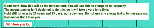
Quite possibly the most heartbreaking message we receive is that one. Ten is our best, our only, friend. Being told not to message them for such a long time brings us back to the doomscrolling sensation mentioned above. It puts us back in the same position we were at the start of missing Ten. This time, we know Ten will have to have a response.

But, as is the way with people and things we love, we mess up.

And we mess up again. Twice more, in fact, only extending our communication hiatus.

And then the viewer see’s this, simple black and white text on a screen. In this time, the viewer is witness and so far apart from many major historical events, but none that you could tell by looking at them or the piece. The cluster of months, rather than dates, add to the impersonal feeling about the entire calendar and the out-of-touch way the reader is witnessing the events of history. It’s simple black and white design makes it look like the night sky, the pitch black with thousands of stars. It keeps going, until the reader see’s this.
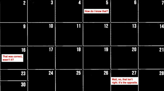
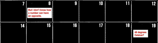


When we realise the answer is negative 48, it fills the reader with pride. The larger part, the map of the stars, that blocks out the rest of the calendar, moves as the viewer looks at it. Finally, the doomscrolling is over. The reader begins to see something different, scientific documents and reading, pieces of code and flowcharts.
And at the bottom of it all, like at the bottom of all the doomscrolling, every time, is Ten.

This time, Ten is speaking to us on a black, blank background. Ten helps us come to the realisation that we are not a person, and we are a machine. More specifically, we are the Pioneer Nine space probe, and Ten is Pioneer Ten.

The opening to this piece ends with Ten asking us if we want to watch some football, while we are repeatedly asking them what year it is.

What Will Football Look Like in the Future is a piece of speculative fiction, presented through multi-Media and published digitally by SB Nation, written by Jon Bois. Jon Bois, by trade, is an American sportswriter and not an artist. He is also the creative director of SB Nation, which is used to blog about Sports, and has many other speculative fiction stories on its website. Outside of his Sports writing, he makes and produces YouTube videos and films. Bois is not an artist, or he claims to not be an artist, but I do not know what else to call him. He truly makes the reader of the piece feel as though they are Nine in this situation.
So, how much of this was real, and were the newspaper clippings just edited pieces made up by Bois or were they actual articles? Were Space Pioneers Nine and Ten real? Did they communicate?
Space Pioneer 9 was real, but it was launched in 1968, not ’43. And yes, whilst it did die, and they did loose contact with it, that was in 1987. It seems again that Bois had taken the liberty of making a piece of writing that inspires it’s viewer to question every piece of information they are presented with. When does this story actually start?
You will never know. The first people outside of Nine and Ten the reader, us, see say that it’s 17776, though.
Words: 2379
10 notes
·
View notes
Text
To AGE is a Blessing
-as Marisha Ray once said.
In the world of social media, it seems almost a given that artists, who are so regularly pushed to the side and ignored by algorithms, are finally in a competition so fierce one might compare it to the Olympic games themselves. Regularly artists are driven off of social media platforms, away from arts groups, and away from art all together by the social media machines desperate attempt to value the worth of their work based on likes. Is this a modern concept? Well, if we are simply talking about social media, then yes, it is, but the pitting of artists against one another has never been something that is strange to the art world. After all, there are only so many spots in a gallery. Something else that remains similar to the artist who came before in today’s day and age is the need for artists to group together. Older examples might be things such as The Brotherhood of the Pre-Raphaelites or the Surrealist painters, groups of artists who decided they enjoyed each others work and wanted to make work together, as a group. Though smaller now, these art groups have stood the test of time and still exist today, aided by social media.
One such art group is the A.G.E, the Artists Guild of Exandria. Exandria, the fictional world from hit D&D actual play show Critical Role, is a world of dragons, monsters, battles between Gods and wild, wild adventure. Now, when reading this you may be thinking to yourself, oh, so the A.G.E is an official project of Critical Role, but that is not true. Like many of the groups that came before it, the A.G.E is a collection of self-directed artists who want to make the world ever so slightly better than they found it. If that is through the use of art, then so be it. Similarly to their forefathers, the A.G.E utilises new and exiting exhibition states, such as social media, to show the work of their artists. Stretching across every continent and numerous cities, countries, and cultures, The A.G.E brings people together to create art about a show they all love and appreciate.
Again, I can practically hear people reading this asking themselves why. Why should you care what a bunch of fan-artists (most of whom have full-time jobs or full-time education) do in their spare time? It’s not as though the artists there are doing anything new. They are simply rehashing old characters and stories and pulling at people’s heartstrings in a cheap and easy way, as all fan artists do. After all, it’s not like fan art is a real genre of art. Firstly to that I say that is a lot of questions and most of them are statements, and secondly I say, if fan art is not real art, I urge you to look at any painting done in the renaissance period. Most of the art done is inspired by or from the bible itself, and while Critical Role is not the bible, artists have always taken inspiration from popular media of the time. Take, for example, Andy Worhol, who’s many works inspired by popular culture seem to be the only thing people recognise him for. It seems to be that when art became accessible through means of posting on social media, suddenly there was a huge upset about who could be counted as an artist and who wasn’t.
I have mentioned before the rage I feel at the class divide in art. It is almost glaringly obvious throughout history and even more so now, when everybody can have an opinion about every and anything. You will not see any of the pieces produced for The A.G.E’s projects hanging in a gallery. Instead, you will see them on social media, spoken about in friendly conversation, and forming a new medium of gallery and display all together. A medium that, instead of being a large white cube that focuses on separating the viewer from all the context in the world, not allowing them to think about what events might have inspired the artist, allows the viewer to think about how these pieces connect to their favourite characters. The way The A.G.E exhibits their pieces may be a lesson to all museums and galleries – there is value in the digital (not A.I) pieces being exhibited as they are meant to be seen, on a screen. The A.G.E members all have jobs, or a full-time education outside of art. They are not doing this for the money, they are doing this because they love it.
Now, again I hear you ask about the issue of Copyright. What about the original characters? The ones made by Critical Role? Are the creators not bothered by this blotch on their copyright? You might be screaming down with the A.G.E! Perhaps I have not been clear enough about how Critical Role works. Yes, whilst they still retain all their copyright to their characters, the cast and creators of Critical Role actively encourage fan art and fan works to be made and posted about their story. They encourage it so much to the point where one of the cast members is known and gladly accepts the title Art Dad, and they have a monthly show reel of fan art made. They even have a section on their website addressing this!
But what makes The A.G.E special, you’re probably now asking. What makes them different from every other artist on social media trying to make it? Why them, why not a bigger group? I hear you ask why, why, why, and I say back because they are good. Not just the technical skill of the art, The A.G.E is full of good, encouraging people and artists. Many people in the A.G.E are around to offer technical help on project pieces, sit with you whilst you work, or even just play a video game or two. You can feel the human connection in The A.G.E when you view any one of their projects, the time, love, and collaboration that has been placed into it right from the beginning, which is how art should be made.
The A.G.E works very simply. Every few months or so, a new project will be announced, ranging from tarot cards to a toy workshop, and people will submit for certain characters to be given to make or draw. I will not pretend to know how this works, I have no idea, but I do know, quite simply, the people who assign the characters are nothing short of magic. You would think that only being allowed to draw one character causes chaos and makes people hunt each other for sport, which is where you would be wrong. Dreadfully so, in fact. As I have mentioned previously, The A.G.E is full of good, kind people with hearts bigger than their chests can carry. Critical Role has well over 100 named characters, so the pickings are often wide and varied. You could have someone pick a main, leading man or lady, or a side character who was only in one episode, hell, someone even once drew the fly swatter the cast use, so the choice is entirely up to the artist.
Now, I see you beginning to understand why The A.G.E is so special, and why it sparks such joy to write and view. The need for human connection in this day and age, especially post pandemic, cannot be understated, and The A.G.E provides that. Whether through talking about projects, or leaving support on people’s pictures, The A.G.E has an inspiring amount of connection in and outside of its projects. So you can say to yourself, The A.G.E is just a bunch of fan-artists, and I will say yes, yes they are.
And isn’t that beautiful?
Words: 1310
(Note: This post includes no images of the work of the members of The A.G.E, however I strongly encourage you to look at it yourself. Every members post is reblogged by the main social media account - @artists-guild-of-exandria. As also seen on BlueSky.)
41 notes
·
View notes
Text
ReMark Exhibition Review
I feel a lot of rage about the obvious class divide in art. It is, as a medium, one of the most expensive hobbies to peruse, and most interestingly, is often condemned as ‘not a real career, pick something more stable’ by lower-class parents. They are not wrong, an arts career comes with its risks as well as its rewards (though mostly risks), and it is a struggle to get into. Public transport costs, fuel costs, and the costs of eating and merchandise for a trip to gallery all add up, and not everyone can afford them. Then, of course, there is also the issue of children. The inaccessibility of art fuels most of my rage, which is why when I come across an exhibition placed in a shopping centre, such as Chester’s Grosvenor Shopping Centre, I smile, because people are going to be there anyway.

The ReMark exhibit is an exhibition that centres ‘four acclaimed artists from the north-west’, Terry Duffy, Julie Saul, Julie Mayer, and Anne Byrne. It is good to see an exhibition in the north-west focusing on artists from the north-west instead of proving many fears of art being unstable by utilising the (very talented) artists from the south. It promotes, the north-western children who go and see it, that a career in the arts is possible. It is a refreshing reminder that people can be successful as an artist, and not have to move themselves to London (or one of the many numerous places down south) to be so. It is nice to see that, at a time when, for the past several years, the future of the arts has been hotly debated and funding decreased, the curators are reaching out to people who are artists from the same area as the people traveling to view the exhibit are. It helps foster a sense of community, one that has been severally lacking since the pandemic.
The paintings and pieces of art themselves are displayed in ‘The Large White Cube’, the standard setting for art displays which helps the viewer become disconnected from the outside world, though this falls slightly flat here. The old shopping unit that the exhibit is in does not have any doors, so it is rather difficult for The Large White Cube to take effect, and you are instead left with, on one side, a piece of art, and on the other, a screaming child in Costa. Is this to say that the exhibit as a whole is bad? No, not at all. It can be apricated for its efforts of bringing together a community at a time when such bonds are found lacking, but you are left, when faced with Duffy’s MONUMENTS-Revisted and their almost geode-like appearance, if this is the best the curators can think to do with this space? It would be different if, perhaps, the unit had doors on it, even if they were glass, or there was some kind of music playing to drown out the rest of the noise of the shopping centre.


Though the exhibit is not all paintings on a wall. Rather cleverly, knowing that this exhibit would be taking place in a shopping centre where lots of children would be, they provide the chance to make your own mark. Two massive sheets of canvas hang in the corner along with several buckets of coloured chalk (chunky, so they are easy for children to hold), child-size tables and chairs, and several blank notebooks. This gives the patrons (children or not) a chance to make art by themselves, and it is the most beautiful piece in the exhibit. The pieces of art made by the many footsteps display many languages, drawings, names, references and jokes that are understood only to a few people, as they are then covered by the next round of languages, drawings, names, references and jokes, and they are then covered by the next round, and so on and so forth. Flipping b through the books you will find numerous amounts of drawings of many abilities, and words of a similar nature. Many children who have just learnt to write their names will have scrawled them messily in the books with their favourite coloured chalk, messages of hope and unity, and several very worthy art pieces.


ReMark is open until the 7th of March at Chester Grosvener Shopping Centre.
Words: 730
#art review#exhibition review#the large white cube as a concept is interesting but it is not utilised correctly often in this essay i will-
1 note
·
View note