theobservationsoverload
Ilham's Observations
Mainly a blog for my design subject alongside few life inputs.
16 posts
Don't wanna be here? Send us removal request.
Last Seen Blogs

m1s3ryyzxd
MYSTERION IS LIFE.

rubyecarterps
Ruby E Carter

abraxxos
sarah rose
mitmeatdecjurch
gay stuff
Video
This is a recording on how i use Adobe Photoshop to crop pictures. I use the pen tool to select and make points as close to the picture. The pen tool is great to make precise and clean cropping. For straight lines, simply just click on different points in the picture once. As for curvy lines, click on a point and don’t let go of the mouse, then move your mouse around. After connecting all the points, right-click and make selection, then simply copy and paste on a new layer.
6 notes
·
View notes
Text
Magazine Cover

A few weeks ago, our class was tasked to design a magazine cover using our own picture. The masthead of this magazine is Brulee. It’s a baking magazine. The picture I used is me holding a s’mores pie that I made. Firstly, I edited all visuals in Adobe Photoshop. I cropped my picture that included the counter-top and then insert a kitchen background. Then I adjusted the shadows/highlights of the main image to make it blend with the background. Next, after editing in Photoshop, I use Adobe Illustrator to edit in texts or bubbles onto the picture.
0 notes
Photo
the same art but in different forms! very interesting

Acrylic vs. Digital Study by Wee F
2K notes
·
View notes
Text
Magazine Covers
I’ve always adored looking at magazine covers because they always come out looking exclusive and portrays the aesthetic of the magazine well. Today i want to share 2 of my favourite magazine covers and analyse the elements. There are 7 elements of magazine covers which are; masthead (the name of the magazine), selling lines (description of the magazine’s marketing point), datelines (the month & year of publication), main Image (focal point that grabs attention of readers), main cover line (the main topic attraction for that issue), Cover lines (other contents that are in the magazine), and bar code.

1. Masthead: GLAM
2. Selling Lines: “Gaya Lebih Anggun Mewah”
3. Datelines: located at the right side of the masthead; “Mei 2020”
4. Main Image: the image of the local top model Shikin Gomez.
5. Main Cover Line: “Free Spirit Shikin Gomez”
6. Cover Lines: very few cover lines, located at the side of the main image.
7. Bar Code: placed at the bottom right of the magazine cover

1. Masthead: PAPER
2. Selling Lines: no selling lines present
3. Datelines: located together with the bar code; “September 2012”
4. Main Image: the image of the actor, Ezra Miller
5. Main Cover Line: “The Perks of Being Ezra Miller”
6. Cover Lines: located at the right side of the main image.
7. Bar Code: placed at the left side of the main image
4 notes
·
View notes
Text
really cool Star Wars adaptation of the Malaysian culture!
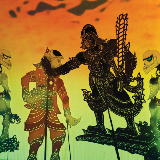
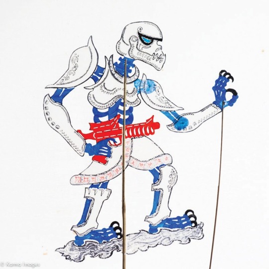


STAR WARS, wayang kulit style. (Wayang is a traditional form of shadow puppetry found chiefly in Southeast Asia.)
By Malaysian duo, Tintoy Chuo and Take Huat.
657 notes
·
View notes
Text
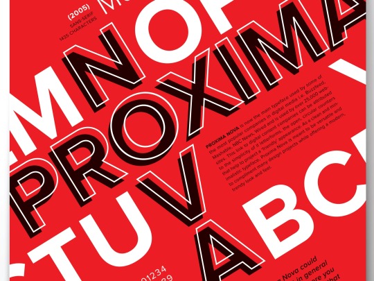
My Font Poster
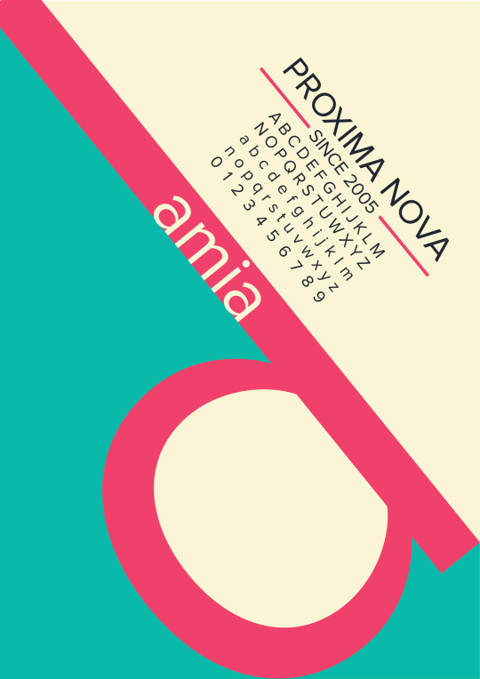
This is a font poster i learned to make last week! In the previous post i mentioned one of the fonts that i like is proxima nova, so i decided to use that font for this poster. As you can see there’s my name ‘damia’; with the huge letter ‘d’ placed as such to create spaces in the poster. Above it is the name of the font as well as alphabets and numbers to display the font. It is arranged as so to accentuate the askew letter ‘d’. Next, i used a combination of colours that i find attractive to make the font pop.
1 note
·
View note
Photo
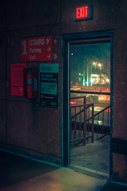
Exit
2020
Website Facebook Instagram Twitter
Memphis TN.
373 notes
·
View notes
Text
Favourite Fonts
Proxima Nova is a serif typeface designed in 2005 by Mark Simonson. Similar to Futura, this font is all about geometric appearance with modern proportions. To me, it looks sleek and clean, also very satisfying. It’s suitable to be used for headings and body copy writings. This font is also available in various weights such as thin, light, regular, semibold, bold, extra bold and black.
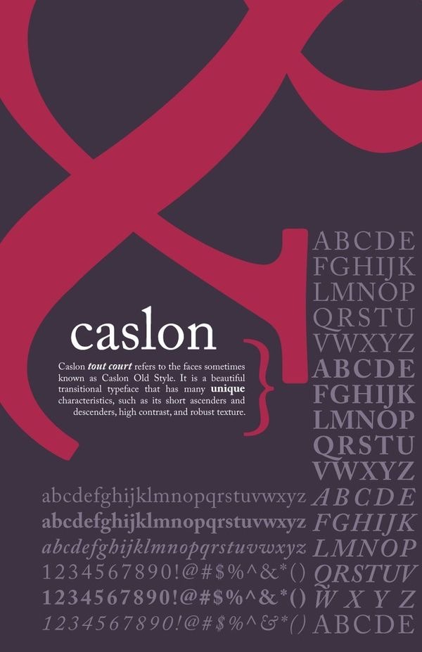
The next font that i like is Caslon. It is one of the oldest created fonts, created centuries ago where they are originally used for script of kings and political uses. However it was redesigned in 1990 by Carol Twombly and now known as ‘Adobe Caslon’. I think it is a nice alternative serif font rather than the usual Times New Roman. It would look great on headlines and body copy, either for formal uses or leisure writings.
2 notes
·
View notes
Photo
Elie Saab’s details in his designs are always amazing!


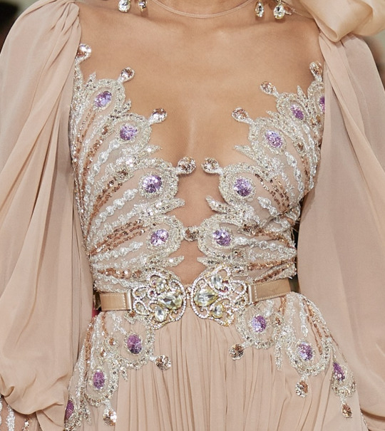
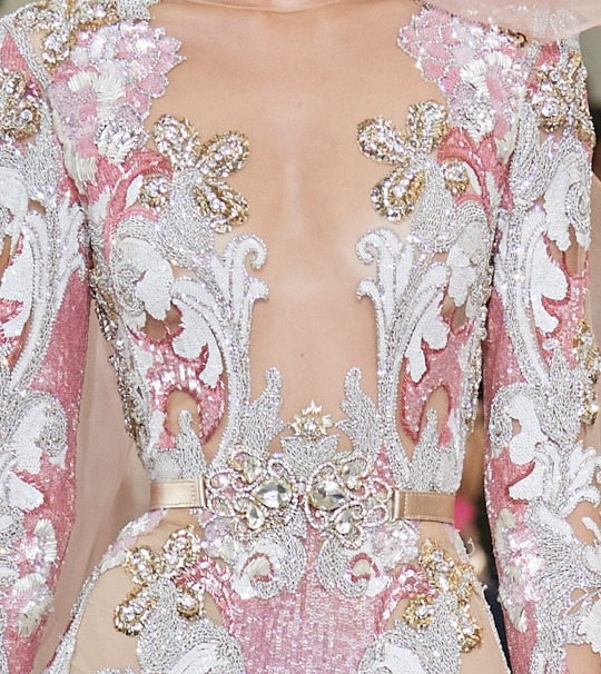
elie saab spring 2020 couture
18K notes
·
View notes
Text
Bad Typography Around Us
To me, typography plays a big role in making things more attractive while still sending a message. So a bad typography are the ones that don’t particularly take the arrangement of type into consideration. Here are a few examples of bad typography around me.

The first example is this gift box. I don’t think the typography on this box is appealing. I think it could’ve been in a better typeface and colour.
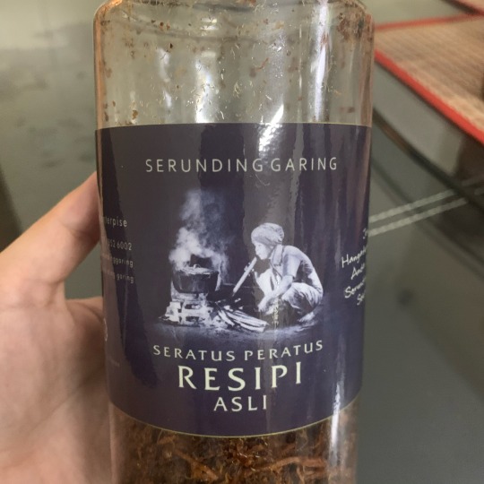
The next one is this Serunding label. I can’t help but to notice how the kerning for the type is not arranged well. Especially for letters that are around the letter ‘A’. On a side note, this Serunding actually tastes really good.

Lastly is the label for a baking soda. Like the Serunding label, the kerning is not arranged well here. Like the ‘S’ in “Soda” looks awkwardly isolated and while “Bikarbonat” should be one word, the kerning makes it look like its “bi kar bonat”.
0 notes
Photo
So last week i watched this movie called Rocketman. It’s a musical about the life of a famous singer Elton John. The movie gives a view of what Elton went through his life as a kid who grew up to be one of the biggest glam rock singer.
I really enjoyed watching this movie because of its music! It reminds me when my dad puts on Elton’s songs on the radio. Other than that, i admire the details in this movie. Since this movie is in a 70s era setting, I admire how the fashion styles and backgrounds are portrayed well. Also I really adore the main actor, Taron Egerton. Taron’s acting as Elton is on point and he’s great at conveying the right emotions in his acting. He even received praise from Elton John himself! also he’s an attractive lad.
Overall i think it was a well-made movie. I would rate it 8/10. I’m sure Elton’s fans would appreciate this movie while other people who’s new to Elton can get a better understanding of his life.


i just hope you realize you’re choosing a life of being alone forever.
1K notes
·
View notes
Text
The Elements of Design

The poster looks nice right? That’s because all elements of design are implemented to it! Let’s quickly analyse them.
Firstly, there’s lines. There are two green lines to emphasize and separate the event title from other texts.
Secondly, shapes that are used to enliven the poster. In this poster, there’s a game console shape to complement the event hashtag ‘#cancerisnotagame’.
Thirdly, the sizes. Each texts are of different sizes to direct the attention of readers.
Then, there’s colours. The main colours in this poster are purple, white, orange and green. These are fun colours maybe to indicate that this event is fun which can attract many participants.
Next, the value implemented is the contrasting colours of purple, white, orange and green. Without value, posters will look very dull.
Lastly, the texture. The background has like a bubble or paint splatter texture.
1 note
·
View note
Photo
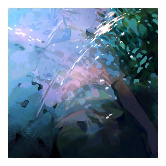
River.
–
Twitter / Shop / INPRNT / Patreon
7K notes
·
View notes
Text
Good Packaging vs. Bad Packaging
Packaging plays a big role in capturing consumers’ attention and demonstrating the utilisation of products through a first impression. So that is why packaging designs are important to make the product even more appealing.
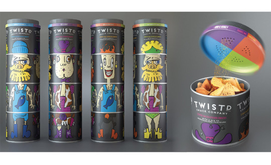
I really am intrigued with the Twistd Snack Company’s packaging. It’s packaged with 4 different compartments each containing different types of chips, and the lid contains 4 different flavours to spice up the chips. So customers may mix and match their own preferred chips, with variety of choices. It’s an innovative packaging i would say. This will give the buyers a chance to customise their own chips and giving variety all in one.

Meanwhile a bad packaging is like the Tesco products above. At first glance you may think it’s the same product but it is in fact a bleach and a strawberry flavoured yoghurt drink. This can be very dangerous as there is a possibility where someone may not realise and drink bleach instead of the yoghurt. The packaging for the yoghurt drink should be different in shape and colour so that customers won’t get confused.
0 notes
Text
Less Likes, More Love
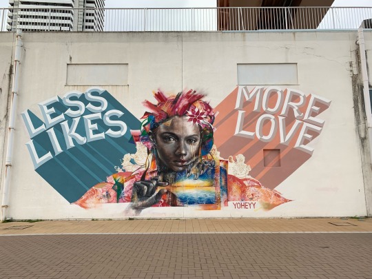
I spotted this artwork while i was walking around Kobe, Japan last year. It’s a big and colourful artwork so it was really hard to miss.
“less likes, more love”
I think it suits how most people in this era live based on the amount of ‘likes’ they get on social medias. Focusing on the content that can gain likes and acceptance of other people; but do those people really care? In the end its just a double tap to the screen. Just how many from those likes actually take their time to even read the caption? not much i would say. but that’s okay i guess, as long as the number of likes is large. The artist, Yoheyy, probably would want people to actually show affection directly instead in the form of ‘likes’.
2 notes
·
View notes
Quote
A man who stops advertising to save money is like a man who stops a clock to save time
by Henry Ford
After reading it a lot of times, i think the quote is referring to how the advertising industry is unstoppable. When a man stops a clock, time still goes on. As well as when a man stops advertising, money still gets spent. Meaning advertising does not affect the saving of money; but it could affect the profits of a company.
Let’s say the brand Zara doesn’t do advertising, they won’t get consumer’s attention to buy their products which may cause decline in sales. So if any, it’s better to spend on advertising to get attention that can bring in more money. Zara may not use traditional advertising, but they have their own online shop and social medias to display their products.
Thus, stopping advertising ≠ save money.
1 note
·
View note