
An increasingly important and common issue is the environment, not only in the Netherlands but all over the world. Just as environmental organizations, activists and other people who are committed to this global problem, are now artists speaking up to this problem. They come with creative solutions and try to make statements, to reach the widest possible audience and to make people aware of this worldwide problem. Like these artist I think it's an important issue that deserve attention and should urge people to come into action. We live from the planet and we must ensure that we do something in return. It's very important that more and more artists try to take control and come up with creative solutions, that people make aware of the problem. Through the internet I've been looking for these artists who incorporate this in their artwork or express this.
Don't wanna be here? Send us removal request.
Statistics
We looked inside some of the posts by think-kg-blog and here's what we found interesting.
Average Info
Notes Per Post
0
Likes Per Post
0
Reblog Per Post
0
Reply Per Post
0
Time Between Posts
3 hours
Number of Posts By Type
Text
17
Last Seen Tumblr Blogs


Fun Fact
28.6 is the average number of monthly visits per US mobile user.
Text
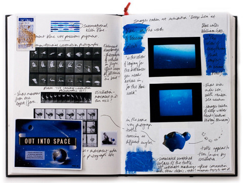
Topic article 1: Mandy Barker - ''SOUP''
The first article for my archive is called "Mandy Barker - ''SOUP'' from the FLIP Magazine for London Independent Photography written by Tiffany Jones. It's about the contemporary British artist and photographer Mandy Barker. Her project called ' SOUP ' it's about the large-scale pollution plastic in the Pacific Ocean which called the ''plastic soup''. I chose this article for my archive because this worldwide problem leads to more and more plastic waste in our oceans, and ultimately death of the sea-life what should stop. I think it's a nice way that Mandy Barker give an emotional response with her ''SOUP'' project' on people, and make this major social problem people aware.
0 notes
Text
Mandy Barker - ''SOUP''

SOUP: Refused
Mandy Barker‘s direction as an artist has evolved from graphic design to photography, having completed a BA in Graphic Design at Northumbria University and later an MA Photography (Distinction) at De Montfort University in 2011. She has exhibited both in the UK and abroad and also takes on private commissions.
For this Showcase we discuss Mandy’s project SOUP, which takes its name from a term describing “plastic debris suspended in the sea, with particular reference to the mass accumulation that exists in an area of the North Pacific Ocean known as the Garbage Patch.” Images in the series follow a narrative sequence that represents the disastrous environmental impact of dispersed plastics on the world’s oceans, and the consequential death of sea life.
Her photobook by the same title, recently won first runner-up in the student category of Blurb’s annual Photography Book Now competition.
LIP: What initially drew you to investigate the ‘garbage patch’?
Mandy: I was initially shocked by the images taken by Chris Jordan of albatross chick carcasses, the birds having died from ingesting plastics mistaken for food collected from the ‘garbage patch’, their stomachs full of cigarette lighters and bottle tops. Following further research of how plastics affect marine life and ultimately end up in the human food chain was a subject I felt I could not turn away from.
LIP: On first impression these images are strikingly beautiful; saturated rainbow bits of colour organised into decorative ensembles. Clearly this is a construct to deceive the viewer, was that your original intention setting out? Or how did your ideas evolve?
Mandy: The mass accumulation of plastic in the North Pacific gyre is almost impossible to photograph in reality as the plastic exists at differing sizes, from microscopic fibres in a soup-like consistency, (hence the title of the project) up to larger objects that are mostly submerged. It is because of these constraints that the intention for my project was to create a conceptual representation of the garbage patch based on scientific facts provided by organisations and oceanographers mostly based in the US. All the plastics photographed have been salvaged from beaches around the world and represent a global collection of debris that has existed for varying amounts of time in the world’s oceans. For instance the image SOUP:Turtle is composed from the original bath toys that escaped from a container ship in the mid Pacific in 1992, these particular toys were found in 2008 after having existed for 16 years in the North Pacific.
My intention aesthetically was to visually attract the viewer to the image and for them to question what it represented. I felt by enticing the viewer to discover the meaning in this way would create a more lasting impact and message of awareness.
Plastics never decompose but biodegrade into smaller fragments having a detrimental effect on marine life and ultimately ourselves. Awards and exhibitions have enabled my work to be viewed by a wider and global audience, allowing me to reach my aim of raising awareness through visual interpretation.
LIP: How does the process of collecting, construction and making the photographs physically play out for you?
Mandy: The plastics have been collected from the east and west coasts of the UK, from Europe, US, and even Alaska. I categorised the plastics by their colour, aesthetic similarities, for example, translucent or pieces that have text printed onto them. The particular area or beach in which the plastics have been found was another concept I used, for example, SOUP:Nurdle was constructed from six layers of nurdles (raw pellets of plastic before manufacture) collected from six different beaches. The intention for this image was to represent the fact that nearly all beaches around the world now have nurdles on them.

SOUP: Burnt
Each piece of plastic is photographed on a black background and in a group with other pieces of a similar size. These photographs are combined as layers that depict the smallest up to the largest pieces and combine to create a feeling of depth and suspension in the final image. All the images are created to represent the disturbing statistics of dispersed plastics having
no boundaries.
The sequence of images in SOUP reveal a
narrative that begins with the initial attraction of plastics to sea creatures, their
attempted ingestion, and ending with their ultimate death
represented by SOUP:Ruinous Remembrance. The final image in the series, SOUP:500+ is in contrast to earlier images and portrays the fatal consequence of ingestion, depicting a more compact arrangement by suggesting how the plastics would have existed in close proximity to each other within the stomach.
LIP: You created a ‘sketchbook log’ during the process, can you talk about what is in it and how this facilitated your work?
Mandy: My sketchbook log records the journey and concept behind the project showing the development of my ideas and process behind each image in the series. The compositions are inspired by the thoughts and ideas of other artists and photographers, and at the same time are underpinned by facts, a combination that compliments the final result.
LIP: By introducing a narrative element throughout the series, was this done in particular with your book project in mind, or do you see order and sequence as generally integral factors in your work?
Mandy: The narrative element was loosely planned at the outset but the order did change as other images were created along the way. Producing a book gave me the opportunity to experiment with the order and sequencing of the images, almost as a form of self-curation prior to exhibiting. I do see order and sequencing as a vital part of my work as it creates a storytelling concept and enhances communication.
LIP: How did you envision this project would ultimately be best presented to an audience?
Mandy: The images were created on a large scale and would be presented this way for maximum impact; the smaller objects in the image would then be visible by the audience. It is important that the plastic objects are recognised by the viewer so they can relate to the individual items of what is now presented as plastic debris. To further enhance the overall experience and message the images would be exhibited alongside pages taken from my sketchbook log and presented with selected plastic debris, allowing the viewer to engage at a deeper level.
LIP: Has working on SOUP impacted your interests as a photographer?
Mandy: This project has challenged my way of thinking and working as I had not previously been particularly interested in the conceptual approach but because of the reasons already mentioned I felt this was the only way I could represent this environmental problem. So essentially the direction was led by the subject itself and photography was just a way of delivering that message. To be able to visually stimulate interest and at the same time make the viewer think or question what the project is about has fulfilled my aspirations and intention for the work.
My future direction as a photographer will continue the same energy and motivation because I think if you feel something for the subject then this will be reflected in your work and hopefully then be of interest to others.
LIP: Will this project continue in some form, or are you on to something new at the moment?
Mandy: At the moment I am continuing to create additional SOUP images which will be exhibited in my solo exhibition in 2013 but at the same time I am planning a new project for next year that will continue to develop my work with plastic oceanic debris.
by Tiffany Jones, 26-10-11
0 notes
Text
Topic article 2: Henrique Oliveira - ''Baitogogo''
My second article called ''Henrique Oliveira: baitogogo at palais de tokyo, paris''. From the website Designboom posted by Nina Azzarello. It's about the architectural Brazilian artist Henrique Oliveira and his installation ''Baitogogo'' what he made from recycled wood from the Brazilian urban landscape. This wood is typical and comes from the streets and neighborhoods of Sao Paolo and is used for pillars and beams. It's interesting that he tries to give back to nature, to make trees and roots of the used wood. He gives it a second live, make unexpected combination, sculptures and forms. It's a nice way to give the wood back to the nature where it comes from. A beautiful way to response on the environment.
0 notes
Text
Henrique Oliveira - ''Baitogogo''
A complex network of organic material invades the architecture at the Palais de Tokyo in Paris, in Brazilian artist Henrique Oliveira‘s ‘Baitogogo’. The installation is a matrix of sculptural vegetation — unraveling, twisting, and plunging from existing pillars and beams. the massive form is both a hybrid of mediums and disciplines as well as a dimensional synthesis of site-specific structural elements. Oliveira, known for his architectural integrations, manipulates the space by both extending and multiplying the columns, encasing the viewer in a dizzying circuit of knotted, root-like material. in a communion of urban design, plant life, and biology, the artist generates an immense audience reaction to the unexpected fusion of sculpture and space.
Oliveira’s structural components are recycled from the brazilian urban landscape, consisting mainly of tapume wood sticks. the common construction material is typical to sao paolo streets, used to build fences or to isolate development sites from public access. using reclaimed wood native to his home as a medium, he references his brazilian culture and identity and reveals the physical and societal decay of much of the city’s urban fabric. Oliveira draws influence from medical texts, biology and the study of physical pathologies such as tumors — evident in the complexity of his web-like structures, which liken themselves to the inter-connectivity of a human neural network.
the making of henrique oliveira’s ‘baitogogo’
Henrique Oliveira Was born in sao paolo, brazil in 1973. he attended the university of sao paolo for fine arts (bachelors degree, 2004) and visual poetics (masters degree, 2007). oliveira lives and works sao paolo, brazil.
by Nina Azzarello, 22-07-13
0 notes
Text
Topic article 3: Stefano Boeri's - "Vertical forest" in Milan
My third topic article for my archive is called ''Stefano Boeri's "vertical forest"nears completion in Milan''. I've used this article for my archive because architectural buildings are becoming more and more populair for architects and for people to live in. People are becoming aware of the fast growing environmentally and climate change. They want to combine there living with the change of the environment and the climate. And want to live more sustainable. The world have become fuller with buildings and expense of the natural living. How nice would it be to combine this and solve this problem a little? There are many different, environmentally conscious way to give a little bit of help, by working with nature and the environment in architecture.
0 notes
Text
Stefano Boeri's - "Vertical forest" in Milan
A pair of skyscrapers by Milan office Boeri Studio are nearing completion in the Italian city, featuring as many trees as could be planted in a hectare of forest.
The studio led by Italian architect Stefano Boeri came up with the concept of Bosco Verticale, or Vertical Forest, as a way to combine high-density residential development with tree planting in city centres.
The first project born from this concept is now nearing completion in the Isola area of Milan's fast-developing Porta Nuova district. Two towers, measuring 80 and 112 metres, are set to open later this year and are already home to 900 trees.
"The project is set to create a new standard for sustainable housing," said engineering firm Arup, who is working alongside Boeri Studio to deliver the project.
"As a new growth model for the regeneration of the urban environment, the design creates a biological habitat in a total area of 40,000 square metres."
A mixture of large and small trees have been planted on balconies on all four sides of the towers, accompanied by 5,000 shrubs and 11,000 floral plants. The design team claim these will absorb dust in the air, helping to depollute the city.
"This is a kind of biological architecture that refuses to adopt a strictly technological and mechanical approach to environmental sustainability," said Boeri Studio in a statement.
The diverse vegetation will provide urban habitats for birds and insects, and will also create a humid micro-climate that produces oxygen whilst shading residences from harsh sunlight.
"The creation of a number of vertical forests in the city will be able to create a network of environmental corridors which will give life to the main parks in the city, bringing the green space of avenues and gardens and connecting various spaces of spontaneous vegetation growth," said the studio.
Bosco Verticale/Vertical Forest
The Vertical Forest project aims to build high-density tower blocks with trees within the city. The first example of a Vertical Forest is currently under construction in Milan in Porta Nuova Isola area, part of a larger redevelopment project developed by Hines Italia with two towers which are 80 metres and 112 metres tall respectively, and which will be able to hold 480 big and medium size trees, 250 small size trees, 11.000 groundcover plants and 5.000 shrubs (the equivalent of a hectare of forest).
The Vertical Forest has at its heart a concept of architecture which demineralises urban areas and uses the changing shape and form of leaves for its facades, and thus which hands over to vegetation itself the task of absorbing the dust in the air, and of creating an adequate micro-climate in order to filter out the sunlight. This is a kind of biological architecture which refuses to adopt a strictly technological and mechanical approach to environmental sustainability.
Biological habitats
Vertical Forest increases biodiversity. It helps to set up an urban ecosystem where different kinds of vegetation create a vertical environment which can also be colonised by birds and insects, and thus becomes both a magnet for and a symbol of the spontaneous recolonisation of the city by vegetation and by animal life. The creation of a number of vertical forests in the city will be able to create a network of environmental corridors which will give life to the main parks in the city, bringing the green space of avenues and gardens and connecting various spaces of spontaneous vegetation growth.
Mitigations
Vertical Forest helps to build a micro-climate and to filter dust particles which are present in the urban environment. The diversity of the plants helps to create humidity, and absorb CO2 and dust, produces oxygen, protects people and houses from the suns rays and from acoustic pollution.
Anti-sprawl
Vertical Forest is an anti-sprawl measure which aims to control and reduce urban expansion. If we think of them in terms of urban densification, each tower of the Vertical Forest is equivalent to an area of urban sprawl of family houses and buildings of up to 50,000 square metres.
Trees
Trees are a key element in understanding architectural projects and garden systems. In this case the choice of the types of trees was made to fit with their positioning on the facades and in terms of their height, and took two years to conclude alongside a group of botanists. The plants used in this project will be grown specifically for this purpose and will be pre-cultivated. Over this period these plants slowly got used to the conditions they will be placed in on the building.creating an adequate micro-climate in order to filter out the sunlight
Vertical Forest is a landmark in the city which is able to release new kinds of variable landscapes which can change their form in each season depending on the types of plants involved. The vertical forests will offer a changing view of the metropolitan city below.
by Amy Frearson, 15-05-14
0 notes
Text
Nava Lubelski - Tax returns and rejection letters into organic paper sculptures
Nava Lubelski creates these cellular sculptures using tightly rolled paper scrolls comprised of tax returns, rejection letters, and other collected waste paper.
Shredded paper sculptures, such as the Tax Files, reconfigure a mass of paper that has been grouped and saved due to written content, into slabs reminiscent of tree cross-sections where the climate of a given year, and the tree’s overall age are visible in a single slice. Historical information is revealed in the colors of deposit slips, pay stubs, receipts and tax forms. The cellular coils spiral outward, mimicking biological growth, as they are glued together into flat rounds, which suggest lichen, doilies or disease.
by Christopher Jobson, 12-05-11
0 notes
Text
Mark Reigelman - The reading nest
Using 10,000 reclaimed boards, New York-based artist Mark Reigelman designed a site specific installation outside of the Cleveland Public Library. The Reading Nest was a massive undertaking that was inspired by age-old objects that are often associated with knowledge and wisdom. The nest-like structure sits 35 feet wide and 12 feet high and allows visitors to interact with it and enjoy it while it’s there.
Trees are often associated with enlightenment and owls are known for being scholarly within the history of mythological objects. Then there’s the nest, which symbolizes growth and community. It seems only perfect to create a nest out of discarded wood, right?
A basic wooden structure was made out of 2x4s and reinforced with 200 feet of steel cable. On top of that, 10,000 pieces of pallet board were added and held in place by approximately 40,000 nails. The installation took a team of five men 10 full days to complete.
4,000 of the boards were left raw and weathered and 6,000 were painted with gold exterior paint. The outside of the nest combines them both while the interior is covered in the golden boards.
by Caroline Williamson, 02-02-14
0 notes
Text
First living Wall painting National Gallery in London honors Van Gogh
Living walls are essentially works of art, but now we officially have the world's first living wall painting - a replication of Van Gogh's A Wheatfield, with Cypresses hanging on the outside of The National Gallery in London. As part of a carbon reduction strategy, the museum is working with GE, who also sponsored the creation of this living masterpiece. UK-based ANS Group Europe, who worked on the living wall at the Mint Hotel, designed, grew and installed the living wall on the western side of the museum facing Trafalgar Square. Impressively, the designers needed over 8,000 plants and more than 26 varieties in order to recreate Van Gogh's genius strokes.
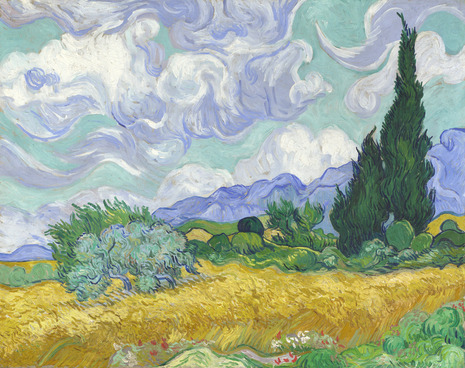
Vincent Van Gogh painted his masterpiece in September of 1889, when he was a patient in the St-Rémy mental asylum. Van Gogh was a firm believer in working from nature and through his paintings he attempted to render the “inner character” of the scene, rather than reproducing the landscape exactly. For the living wall painting, ANS combed through The National Gallery’s collection and decided on A Wheatfield, with Cypresses “because the strong bands of color can be reproduced effectively using living plants.”
To recreate the famous painting, ANS needed 26 varieties to try and match Van Gogh’s mastery of color. Making use of the ANS Living Wall System, 640 modules were grown beforehand at ANS’s southern nursery. The grid-like modules were planted according to a pre-determined design indicating which variety should be planted where to create the final image. When mostly grown, the modules were transported to London and hung vertically in Trafalgar Square in three days, meeting their tight deadline.
The living wall painting is part of The National Gallery’s carbon reduction plan and a “creative manifestation of GE’s commitment to the environment through its ‘ecomagination’ business strategy, which is concerned with meeting customers’ demands for more energy-efficient products.” Visitors to London can see the living wall painting on display throughout the summer and fall before it is taken down at the end of October 2011.
by Bridgette Meinhold, 06-07-11
0 notes
Text
Olafur Eliasson - Europe's Largest Glacier Comes to New York
Part of an Icelandic glacier on display at the art museum MoMA PS1, in Queens, New York.
By the time Olafur Eliasson came up with the idea to display chunks of glacier as an art exhibit, he had already spent a lot of time at the mouth of the Icelandic glacierVatnajökull, the largest ice cap in Europe, watching it melt.
"Vatnajökull is the only place in the world where you can stand off on the sand and watch big chunks of glacier break," said Eliasson.
The Danish-Icelandic artist believes most people are disconnected from the effects of climate change because they can't physically see it. His exhibit, which opened last month as part of EXPO 1: New York at MoMA PS1, in Queens, New York, aims to change that.
"It's not like New York is going to go see the glacier in Iceland, so it makes sense to take some piece of Iceland and bring it to New York," he said.
Six months before the exhibition, Eliasson asked two friends in Iceland to look out for pieces of fallen, transportable glacier. The two men went to Vatnajökull every day for three weeks until they had collected suitable pieces of ice, which were then carefully loaded into refrigerated containers normally used to export fish out of Iceland.
"You basically transport the ice like you would transport a container full of frozen salmon," said Klaus Biesenbach, director of the museum and curator of the exhibit. "Same way, same procedure."
Once the ice arrived at the museum, the trick was to keep the ice frozen so that it maintained its original shape. The museum turned one of their main galleries into a walk-in freezer chilled by an overhead air conditioner.
As some critics have pointed out, keeping the room sufficiently cool requires a lot of energy, although the air conditioner at PS1 is fueled in part by the museum's recently installed solar roof panels. The temperature ranged from 5°F to 20°F on the day of my visit.
Entering the gallery is an awe-inspiring experience. (This is especially true in the heat of the summer.) You are in the middle of a white, frigid room, surrounded by several glaciers scattered around seemingly at random. Each glacier has its own unique tint, shape, and character. Some are rhombic and upright, others curl like fists into the floor, and others are belly down on the ground, almost gliding, like stingrays. Colors range from pale blue to clear (the bluer the ice, the denser the glacier). Some were smaller than a porcupine, while others were larger than a black bear.
According to PS1, the pieces of ice chosen for the project are about 800 years old. That sounds about right to Ted Scambos, lead scientist at theNational Snow and Ice Data Center. Scambos speculates that the ice came from the "Little Ice Age," the period between the 16th and 19th centuries during which glaciers grew larger than they ever have since—and advanced quickly.
"These glaciers bear testimony to our history-being suspended and frozen for thousands of years-and now they are melting away, as if our whole history is fading," said Eliasson.
At the end of the exhibition in September, the glaciers "will do what they would have done without the exhibition weeks ago," says Biesenbach. That is, they will melt.
by Rena Silverman, 29-06-13
0 notes
Text
Patrick Dougherty - 'Ballroom' stickwork sculpture
‘Ballroom’ stickwork sculpture by Patrick Dougherty at Federation Square
City commuters will most likely have spotted this incredible structure taking shape at Federation Square in Melbourne in recent weeks… today we thought we’d share a little backstory about this special project!
Passionate about Patrick’s work, which has inspired some of his own event installations over the years, Christian was keen to secure a high exposure site at Federation Square for this very special project. ‘When we took the management team at Fed Square through a portfolio of Patrick’s work, they were immediately interested’ he says. ‘Fed Square are currently celebrating their 10th year anniversary, so the timing was perfect’.
Once the location was secured, Patrick visited Melbourne towards the end of 2011 to familiarise himself with Federation Square and choose a suitable location for the work. A great deal of time was also spent with Christian Wagstaff and his team, discussing and assessing suitable ‘sticks’ that would be in plentiful supply for the build.
‘Patrick had loads of ideas, but most importantly suggested we speak with some local basket weavers, who in turn put us in contact with a Cricket Willow Farm in Daylesford – a fifth generation family business that has been making Cricket Bats from willow for over 100 years.’ recalls Christian. The Tinetti family was able to supply an abundant supply of very high quality willow, which would eventually form the backbone of the sculpture.
The project was also fortunate to secure a partnership with Melbourne Water. ‘In Australia many species of willow cause substantial damage to the health of our waterways, so Melbourne Water were also able to supply a plentiful amount of raw materials’ explains Christian. ‘The project required far more sticks than we ever imagined, so the hunt for sticks was ongoing and arduous. We thought we did very well considering we knew nothing about ‘sticks’ before the project began!’
The design of this magical structure is inspired by many of the surrounding buildings along Flinders Street, Collins Street, Swanston Street and Russell Street in Melbourne’s CBD. ‘I think that a good sculpture is one that evokes in the viewer a wealth of personal associations’ says Patrick. ‘My viewers see stick castles, lairs, nests, architectural follies; and they remember moments in the woods building forts and hideouts. I hear stories about the Garden of Eden, favourite trees, and secrets about first dates. I like to spark people’s imaginations and connect them with nature in a surprising way.’ Patrick has affectionately named his Melbourne stickwork sculpture ‘Ballroom’.
Patrick Dougherty worked solidly alongside a team of volunteers for 20 days to realise this ambitious project. The installation will remain onsite at Federation Square until early 2013.
Patrick Dougherty onsite creating his Melbourne sculpture
‘Ballroom’ stickwork sculpture by Patrick Dougherty at Federation Square
by Lucy Feagins, 06-11-12
0 notes
Text
Anna Garforth - Moss graffiti
In an unusal take on traditional, spray-paint-approved wall art, anna garforth‘s moss graffiti emerges from brick walls as fuzzy layers of green grass. garforth creates typography and massive geometric designs and patterns with the living material, whose growth and flowering becomes a significant part of the constantly evolving piece. designboom asked anna about her creative influences, creation process, and what led her to the natural medium for her graffiti artworks.
DB: please can you tell us about your background and how you came to do the type of work you do today? AG: ironically, working with living materials was inspired by a trip to abney park cemetery – a woodland memorial and local nature reserve. I was fascinated by the beautiful script and moss that covers the grave stones, one stone had moss growing inside the carved out letters and it looked amazing. I collected moss from the surrounding gravestones and started to experiment, moss typography was born! from that trip the seed was planted, and the moss gave way to experimenting with many other materials and concepts that I am working on today.
the moss graffiti spells out the word ‘grow’ in a script typeface
DB: what do you find is the most effective method for creating the moss compositions on the wall? AG: everyone is keen to try and recreate moss typography, but I am afraid I cannot give away my tricks of the trade! what keeps my work unique is the precision of the moss art. This comes from years of working with the material.
‘natur’, growing from the wall
DB: what do you enjoy most about working with natural mediums? AG: I enjoy the tactility of working with organic mediums and learning how to craft it into something else. no harmful toxins or bad fumes are involved. It takes me to interesting places both through the process and working on commissions around europe. above all it gets a really positive response and people love it!
a detail of the letter ‘r’, before it is placed on the wall
DB: how does typography, and other forms of graphic design, factor into your creative process? AG: I notice typography everywhere, especially on shop fronts and old painted adverts on the sides of buildings. typography is an art form and often doesn’t need anything else around it. my guilty geek pleasure is scrolling through font lists online, there are so many great type foundries with reams of fonts. the term ‘graphic design’ has become very broad, and encompasses so many different ways of working. seeing how other designers have lifted their ideas off the page, inspired me to explore the more tactile and craft based side to graphic design. the handmade seems to play a significant role in design and creatives seem to be veering more and more towards the hands on approach, but a computer is never far behind, mixing technology with the handmade makes for a great synthesis, often one can enhance the other. a healthy balance of the two works well.
a geometric installation at kings cross
DB: how do you see your work evolving, and what has been the evolution so far? AG: the moss art so far has evolved into non typographic installations such as kings cross and the big bang. I have put moss typography on the back burner as there are new ideas to be had. from the moss came a love for working with raw materials, and I started to explore with different mediums such as cookie dough, paper, card, bioluminescent bacteria, wood etc. I want to continue to experiment with other materials, and I have a few projects in mind which will be stuff I haven’t ventured into before. my work aims to reflect the textured world we live in where many different species, plants, and manmade elements coexist.
a close-up of the zig-zag pattern on the wall
DB: besides your professional work – what do you have a passion for? AG: I have an obsession with seedums, this species of plant really cuts the mustard for me. I absolutely love the graphic shapes and clean lines of the foliage.
‘the big bang’, assembled from hundreds of moss tufts collected from stone walls
a detail of the moss used for ‘the big bang’
by Nina Azzarello, 30-09-13
0 notes
Text
Greenpeace calls for end Lego Shell partnership
Environmental charity Greenpeace has launched a scathing new ad calling for Lego to end its partnership with Shell, using the brand's toys to demonstrate the potentially devastating consequences of an oil spill.
Lego sold Shell branded toys from the 1960s until the 1990s and in 2012, signed a two-year deal to sell Shell Lego toys at petrol stations in 26 countries.
Greenpeace says Shell's previous attempts to drill for oil in the arctic make it an unsuitable sponsor for children's toys, and has launched a campaign urging Lego to end its affiliation with the company. Last week, it launched protests at the Legoland theme park in Windsor, where activists used Lego figures to stage mini protests.
Directed by Unit 9's Martin Stirling, the two-minute spot from agency Don't Panic begins with an idyllic arctic scene, complete with huskies, polar bears and tiny ice hockey players, set to a slowed-down version of the Lego Movie theme tune Everything Is Awesome.
Things quickly take a darker turn, however, as the sea and coast are flooded with thick black oil, engulfing puppies, children, teddy bears and even Santa Claus. The ad ends with the message: "Shell is polluting our kids imaginations. Tell Lego to end its partnership with Shell," and a link to the campaign's website, legoblockshell.org.
Greenpeace has adopted increasingly creative tactics to get its message across in recent years - in 2012, it launched an anime campaign urging fashion companies to reduce toxic pollution and last year, marched a three tonne mechanical polar bearthrough central London to highlight its Save the Arctic campaign.
The latest ad is an impressive production and is beautifully shot, from close ups of drowning figures with terrified expressions, to scenes of a pinstripe suited mini villain smoking a cigar by a Shell-branded lorry.
Targeting the world's most popular toy brand is a bold move but it's a clever campaign, and one that's bound to place pressure on Lego to end the partnership, which Greenpeace claims was valued at $116 million by Shell's PR company.
Brand advertising in games is a lucrative industry, but as an educational toy aimed at young children, Lego has a greater responsibility than most to pick suitable sponsors. Greenpeace's ad is unlikely to impact Lego's global popularity, but it does raise some serious questions over whether such a partnership is appropriate, particularly when the brand recently announced plans to substantially reduce its CO2 emissions.
by Rachel Steven, 07-07-14
0 notes
Text
Jean Nouvel - Vertical gardens Sydney
Sydney’s one central park by Jean Nouvel features lush vertical gardens
Forming the centerpiece of Sydney’s carlton & united brewery development, ‘one central park‘ climbs to a height of 116 meters, boasting what has been referred to as ‘the world’s tallest vertical garden’. designed by acclaimed french architect Jean Nouvel, the scheme is composed of two towers, 16 and 33 levels respectively, that rise above a four storey retail podium. the mixed-use project, which has been developed in collaboration with local practice PTW architects, provides the australian city with 563 apartment units, offering high-end living at the heart of the urban center.
The taller eastern tower features a cantilevered reflector installation (the heliostat), which incorporates 320 fixed and motorized infrared panels, designed to redirect sunlight to otherwise shaded areas of the plan. at night, the heliostat becomes a monumental urban chandelier that appears in the dark sky like a floating pool of LED lights that merge into a giant screen and simulate reflections.
Wrapping the structure in vegetation, planters, vertical vines and green walls extend the surrounding parkland upwards, bringing the a sense of nature into each residential unit. the plantation also helps reduce energy consumption with leaves that trap carbon dioxide, emit oxygen and reflect less heat back into the city than traditional fixed shading.
by Philip Stevens, 08-10-14
0 notes
Text
Dave Hakkens - Recycling plastic factory
Dezeen and MINI World Tour: in our next movie from Eindhoven, Design Academy Eindhoven graduate Dave Hakkens shows us how his Precious Plastic recycling machines work and explains why he made the blueprints freely available online.
Hakkens' Precious Plastic project is a set of simple machines for recycling plastic and making new products locally.
He says he got the idea for the project after visiting plastic manufacturing companies and discovering that they were reluctant to use recycled plastic.
"We recycle just 10% [of waste plastic]," says Hakkens. "I wondered why we recycle so little so I investigated it. I went to all these companies and I realised that they don't really want to use recycled plastic. So I wanted to make my own tools so I could use recycled plastic locally."
The Precious Plastic machines include a plastic shredder, an extruder, an injection moulder and a rotation moulder, which Hakkens made using a combination of new custom-made components and reclaimed parts he found at a scrapyard.
"I made these machines based on industrial standards," says Hakkens. "But they are all made very simple so you can produce locally. Like a craftsman, you can start working with plastic."
Hakkens designed a range of products to be produced using the machines, including a rotation-moulded waste paper bin, an injection-moulded spinning top and an extruded plastic lamp.
However, he says the machines can be used to make a much wider variety of products.
"You can make whatever you want," he explains. "Everybody can use [the machines] to make whatever they want and set up their own production."
Like Hakkens' Phonebloks concept for a modular mobile phone, Precious Plastic is an open-source project and Hakkens hopes other designers will adapt and improve the machines over time.
"I developed these machines and I shared them on the internet," Hakkens says. "People can make them on the other side of the world and send some feedback and say, 'hey, maybe you can do this better'. In the end you'll have this set of machines and you can start a local recycling centre."
by Ben Hobson, 11-11-13
0 notes
Text
Nils-Udo - Land Art
"Sketching with flowers. Painting with clouds. Writing with water. Tracing the May wind, the path of a falling leaf. Awaiting a glacier. Bending the wind. Directing water and light. The May-green call of the cuckoo and the invisible trace of its flight."—Nils Udo, from his artist's statement.
"Clemson Clay Nest" South Carolina, US, 2005.
Bavarian artist Nils-Udo is known for his site-specific installations built in situ with local, natural materials—leaves, berries, hay, bamboo, flowers. While he distinguishes these projects from his urban pieces, where he uses non-organic materials like concrete—again, materials that are appropriately "local" to the environment—both types of installations consider the relationship between natural and built environments, and the limited lifespan of the natural world.
In an interview with critic John K Grande (Art Nature Dialogues: Interviews With Environmental Artists, SUNY Press, 2004), Nils-Udo recalls his transition from studio to land art: "The aspect of art now completely faded into the background. What I wanted was to live, act and work in symbiosis with nature in the closest possible way. The sphere of nature simultaneously became the sphere of art, in which I inscribed myself."
"Waterhouse" Spruce trunks, birch branches, willow switches and lawn plantings. Wattenmeer, Cuxhaven, Germany, 1982
"Little Lake" Ground water, connect hazel tree, bluebells, dead sheets. Vallery, France, 2000
The artist was born in Bavaria in 1937. By the 1960s, while painting on canvases in Paris, he began using living plants in his work. He returned to Bavaria and completely eschewed the studio and its brushes for nature and its leaves.
Nils-Udo's signature piece is "The Nest." Over the years, it's evolved with different materials and designs, and has been installed in several locations around the world, including Lüneburg Heath, Germany (1978) and at the South Carolina Botanical Garden, United States (2005). The Clemson Clay Nest was constructed with 80 tons of pine logs harvested from the local Oconee County pine plantation and hundreds of bamboo sticks. Directed by Nils-Udo, a troop of students and volunteers layered the materials in a circular formation embedded in the garden's red clay earth.
"The idea of planting my work literally into nature—of making it a part of nature, of submitting it to nature - its cycles and rhythms, filled me on the one hand with a deep inner peace and on the other with seemingly inexhaustible new possibilities and fields of action." (—Nils-Udo, Art Nature Dialogues: Interviews With Environmental Artists)
"The Nest," pine, bamboo, clay. Clemson, South Carolina, 2005
by Anna Laurant
0 notes
Text
Joost Gehem - Chairs from Abandoned Household
Chairs, carpets and blinds cleared from homes in the wake of deaths, divorces and bankruptcies form the raw material for these stools by Dutch designer Joost Gehem.
The hundreds of thousands of deaths, divorces, bankruptcies and hospitalisations each year leave many household inventories without a home, says Joost Gehem of the inspiration behind his Transformation and Distribution Centre for Abandoned Household Items.
"You cannot imagine how cheap a complete interior can be and how much of it you can get," he told Dezeen. "I began to see it as a material and I saw a little factory in my mind."
Gehem found an advertisement for the clearance of a house owned by an elderly couple – the wife had passed away and the husband was about to go into a nursing home.
He bought up the whole interior and ground up carpets, window blinds, foam, textiles and a rattan chair.
The chipped remnants were then placed in a mould and pressed into stools. Gehem is currently working on improving the process and a new line of products is planned for later this year.
Last week we featured a project to transform waste plastic picked up by fishing trawlers into chairs, while in 2008, architect Greg Lynn won a Golden Lion at the Venice Architecture Biennale for a series of furniture made from recycled children's toys.
We've also published lots of stools, including one inspired by glass beakers used in science experiments and a set of narrow A-shaped stools that fit together to make a bench.
by Emilie Chalcraft, 23-02-13
0 notes