
Statistics
We looked inside some of the posts by thitaphornm and here's what we found interesting.
Average Info
Notes Per Post
4
Likes Per Post
4
Reblog Per Post
0
Reply Per Post
0
Time Between Posts
4 days
Number of Posts By Type
Text
13
Photo
4
Last Seen Tumblr Blogs


Fun Fact
When “GIF” was named word of the year in 2012, Oxford Dictionaries U.S.A. credited Tumblr for pushing the word.
Text
Bibliography
Batra, S., n.d. Building Connections: The Art Of Empathy. [online] The Teenager Today. Available at: <http://theteenagertoday.com/building-connections-the-art-of-empathy/> [Accessed 23 October 2020].
Bimal, N., 2020. 5 Easy Ways To Help You Build Self-Confidence. [online] The Teen Magazine. Available at: <https://www.theteenmagazine.com/5-easy-ways-to-help-you-build-self-confidence> [Accessed 24 October 2020].
Bramante, C., 2020. Why We Should Talk More Often About Bullying. [online] The Teen Magazine. Available at: <https://www.theteenmagazine.com/why-we-should-talk-more-often-about-bullying-0c8fb32c-e9a3-4f53-ba61-955c2421c149> [Accessed 24 October 2020].
Fussell, G., 2019. How Subtle Pastel Colors Can Make a Big Impact in Your Designs. [online] Shutterstock. Available at: <https://www.shutterstock.com/blog/use-pastel-colors-designs> [Accessed 21 October 2020].
Giant, N. and Beddoe, R., 2013. Surviving Girlhood. London: Jessica Kingsley Publishers.
Laderer, A., 2019. What To Do If You're Having Suicidal Thoughts. [online] Teen Vogue. Available at: <https://www.teenvogue.com/story/what-to-do-if-youre-having-suicidal-thoughts> [Accessed 21 October 2020].
Lipton, R., 2007. The Practical Guide To Information Design. Hoboken, New Jersey: John Wiley & Sons, Inc.
Lisitza, A., 2019. 50 People Shared The Best Advice Their Therapist Has Ever Given Them. [online] Teen Vogue. Available at: <https://www.teenvogue.com/story/best-therapist-advice> [Accessed 21 October 2020].
Oliver, M., 2020. Why It's Okay To Not Feel Okay As A Teen. [online] The Teen Magazine. Available at: <https://www.theteenmagazine.com/why-it-s-okay-to-not-feel-okay-as-a-teen> [Accessed 24 October 2020].
Pantone., 2016. PANTONE 13-1520 Rose Quartz & PANTONE 15-3919 Serenity. [online] Available at: <https://www.pantone.com/uk/en/articles/color-of-the-year/color-of-the-year-2016> [Accessed 21 October 2020]
Twersky, C., 2018. A Guide To Finding Your Self-Confidence And Dealing With Negative Thoughts. [online] Seventeen. Available at: <https://www.seventeen.com/health/a22653504/building-self-confidence-tips-teen-guide/> [Accessed 21 October 2020].
Wong, G., 2020. Does Journaling Actually Benefit Your Mental Health?. [online] The Teen Magazine. Available at: <https://www.theteenmagazine.com/does-journaling-actually-benefit-your-mental-health> [Accessed 24 October 2020].
0 notes
Text
ASU1 Reflective Journal User Guide
Magical Cereal Self-Help Kit
A self-help product to guide and support young people's mental health
My Creative Project
Cereal Box Design Sketch
Cereal Mascot Inspiration & References
Graphic Designer & Illustrator : Ms LUTRA
Colour Scheme Inspiration
Colour Psychology
Cereal Box Inspiration
Toys/Prize Inspiration
Meowgical Cereal Box Quick Design
Mood Board
The Overall Design
Potential Booklet/Zine (included in the cereal box)
Storyboard
Aqua Magic (Lifestyle Task)
How illustrations and characters affect emotions
A/B Testing
My Practice
Research Process
User Survey
Personas
How Might We Questions
Zine Inspirations
Reverse Engineering of Kellogg’s COCO Pops Cereal Box (Four Viewpoints Task)
Visual Hierarchy and Information Design
Choco Bear: A Quick Cereal Box Design
Independent Research - Modern Publication for Young People
One Book (Simplicity Task)
Twinnie Stationery x Cosmetics (Simplicity Task)
Colour & Composition Experiment
Recolour Experiment
Mascot Design (Iteration)
Zine Cover Analysis & Experiment
Zine Layout Analysis & Experiment
Cereal Box Cover Iterations
Cereal Packaging Design
Collectible Toys/Prize Conceptual Design
Self-care Zine Contents
Dinosaurs (Headline Task)
Bibilography
0 notes
Text
Zine Contents

According to the user survey result, most of the young people are likely to enjoy art tutorials to distract their minds, and to help destress during their difficult times. Along with self-care articles, mainly mental health and self-esteem related contents are to be included in the zine as well.
The problem that I am currently facing is my lack of experience about content creation. It requires a lot of knowledge and specific terms. Therefore, I may refer to other articles regarding the topics i wish to cover within my zine for inspiration and additional knowledge. As some of my desired content may be discussing mental health, it will be responsible to seek literature written by medical professionals for advice ideas. Content leaning towards the recreational side be built based the inspiration of popular zine games and art tutorials by other zine creators.
0 notes
Text
Collectible Toys/Prize Conceptual Design

Prioritising sustainability and practicality of cereal toys/prize, I came up with a few designs that potentially could be included in the box. Due to the limited time, I may not be able to complete the solid product design. Instead, I decided to design a set of stickers which can be used for a bullet journal helping with mental wellbeing.
Rough Sketch

Sticker Sheet Design (Finished)

0 notes
Text
Cereal Packaging Design
In order to design a package my own cereal box, I have decided to pick one of large sized cereal boxes currently available in the market as a reference. Quaker Kids Oatie Mix-Up Honey Cereal 400g has durable, stable package design with efficient, clear information as well as appropriate visual hierarchy.

I unfolded the cereal package to see its overall template

With a slight size difference, I still remain the same package design template. I have spent a fair amount of time on its dimension, to make sure that the box is deep enough to spare some room for the zine and small prizes.
1 note
·
View note
Text
Dinosaurs (Headline Task)
My idea came from the Bangkok student protests. A recent headline indicated that the Thai monarchy and government were being compared to the ancient "Dinosaurs" by the protesters.
My response was to convince those that, dinosaurs, are more liked and inspired than that of the rulers of Thailand. Thus, implying that the people in question are even worse and dinosaurs don't deserve to be associated.
A four-panel comic was an appropriate choice to get the message across quickly. I also utilised design techniques refined during my main ASU1 project to design the characters to appear visually appealing to reinforce their likability.
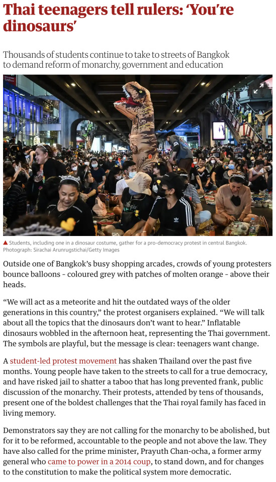


source: https://www.theguardian.com/world/2020/nov/22/thai-teenagers-tell-rulers-youre-dinosaurs
The four-panel comic

0 notes
Text
Cereal Box Cover Iterations
With feedback I have received from a few people, the current problem of my cereal box design that I am facing is ‘it is too cliché’, or ‘it does not communicate well enough’ as well as ‘it seems to aim to younger children, rather than teenagers.’.
Hence, iterations in various compositions. I tried to think of 4 different cereal box designs with total different compositions based on not only cereal box covers, but also book cover designs such as magazines, and fictions for young adults.
The top left: the cereal box cover focuses more on the product photography, which includes the zine cover. I personally like the design, even though it lacks proper visual hierarchy and balance. Baby blue background works well with dark blue, which complements the cat mascot to a large extent. I shall adapt that to my further design process.
The top right: this one is based on some magazine covers, making me think of a publication or book than a cereal box. I stylise the illustration to be more comic-like which allows more playful and vibrant feelings. Moreover, the mascot having cereal with the zine included in the background, communicates the purpose of the cereal box well.
The bottom left: I came up a new way to play with the product photography with a different composition. Yet, I terribly had failed to think about an appropriate representation as the mascot has its mouth open big showing the cereal inside might come off as ‘creepy’ or ‘cannibalism’. With the more defined version of it, I decided to change the whole facial expression of the mascot. As the result, it looks more pleasant and appropriate.
The bottom right: Prioritising the product photography, the cereal cover is more minimal than the others. The rough sketch did not satisfy me in terms of communication with young people, and lacked balance. So I tried to fix it by aligning the pieces of cereals to be more aesthetically pleasing. However, it does not turn out the way I want. Some even said that it looks too minimal that it could be a healthy food product, rather than a fun cereal box.
In conclusion, I have decided to work on the top right cereal box cover design with some elements from the rest that have potential for better outcomes. Mainly, because of the fact that it implies a book cover kind of design and has clear communication (the mascot having cereal), which leads to effective cereal box design for young people.

Rough sketches

More defined coloured sketches
1 note
·
View note
Text
Zine Layout Analysis & Experiment


‘Do What You Want’ is a zine about mental wellbeing by Ruby Tandoh and Leah Pritchard, which contains various interesting contents related to mental health issues, as well as story submissions by other writers. Each page is consist of different layouts which can be useful to study and adapt to my own zine.
I have gone through each page of the zine and analysed some graphics and layouts from the zine, with different illustration styles as well.
Mainly, I will be working on simplifying complicated topics with cute illustration and comics. It is also easier for young people to digest as most of them prefer content with more pictures, rather than just texts alone.
0 notes
Text
Zine Cover Analysis & Experiment


I explored through covers of zines mainly for older teenagers, hence more variety of art styles. Overall, what they have in common specifically is that the colours they used are less saturated and vibrant, as well as more limited colour palettes. Their illustrative techniques focus more on communicating the audience in a subtle way, which leave a lot of interesting messages behind.
I tried sketching eight zine covers with different compositions based on the inspiring zine covers above. Though still remaining the same colour schemes, as an experiment on how empty space and illustrative techniques affect the whole image.
The designs have become more clear when coloured, which is a highly effective process for my further design development, along with the cereal box.
0 notes
Text
Mascot Design (Iteration)


In order to refine my mascot design, not only have I iterated and redesigned by adding more volume to the character. But I also tried to portray them as gender neutral as possible to be more accessible to more groups of people.
The Apron makes the blue cat look more like an active, hard-working professional. With the light yellow colour complementing their characteristic to be bright, friendly, and cheerful.
1 note
·
View note
Photo


Recolour Experiment
I have gained feedback from a lot of people about the colour scheme of cereal box. Most of them found the colours too dull and pale to be for young consumers. Remaining the same mood and tone, I have altered the saturation and brightness of the colours, making the cereal box cover looking more vibrant. As the result, it looks more appropriate for the target group.
For the bottom ones, I have experimented by changing their colours to see the outcomes. With dark skies, it is obvious to be suitable for special themes such as Halloween or Night Time.
In conclusion, I will work towards the top right as the colours are more attractive to the young users. With further different compositions and designs, I shall remain the same colour scheme.
0 notes
Text
Colour & Composition Experiment

To refine the final design of my mascot cereal box, I needed to create some iterations to explore a multitude of colour and composition choices and techniques.
Firstly I used the colour palates of other mascot cereal boxes I enjoyed and stuck out to me. I identified the colour techniques used, such as complementary and triadic. I then applied them to my original composition.
The first uses analogous and monochromatic colours. This works well for a product that focuses on a specific flavour (malt in this case). Contrast between the colours despite the monochromatic technique allows the composition to stand out. The darkest colour represented the mascot amongst lighter hues. Similar to a silhouette, our eyes are drawn quickly to the mascot in the centre.
The second across takes a different compositional technique and with the mascot encompassing the bottom half. The monochromatic colours imply the flavour of the product and the complementary colours used for the yellow eyes allows the mascot to be clearly seen.
The bottom left uses triadic colours which became a harder task due to the stronger range of colours in use. The mascots arm directs the eye towards the golden honey cereal that stands out against the almost complementary blue background.
The final design removes the use of a mascot and focuses more on the multiple flavours by highlighting the four fruits included. I believe this gave a more healthy appearance to the box due to the focus on fruit rather than the cereal itself. The double commentary colours help to push forward the selling point of fruits included in the flavour of the cereal. The composition reflects this by allowing a corner an equal spacing for each fruit allowing all flavours to shine. This will hopefully increase the target demographic as at least one of their preferred fruits will be included.
My future design iterations are likely to include elements of each of these designs.
0 notes
Text
Twinnie Stationery x Cosmetics (Simplicity Task)


Balancing a morning makeup routine and getting to class on time as a woman is a complicated task. Most days result in picking one over the other, but carrying both stationary and beauty essentials on your commute is not an ideal solution either. Why not combine both with this new product!
Each piece has the functionality for stationery and beauty purposes. So instead of experiencing another stressful morning makeup routine, you can carry your beauty products to use when it is more convenient for you. This minimalises your bags space for other essentials and a lighter commute. Perfect for the modern woman on the go, to simplify her daily routine!
My creation process simply came from thinking of a way I could simplify either a make up product, or stationery product. Resulting in the idea to combine both as the solution to this task. The design of the product was intentionally a mix of luxury minimalism and cute but soft colour choices, this would intern appeal to both sides of the intended target audience of the product. Ensuring the product didn’t appear gimmicky or for children was a large factor, so the design lacks any patterns to remain strict to the default design of make-up and stationery products.
0 notes
Photo


One Book (Simplicity Task)
As part of the simplification task, I chose to redesign the way a kindle functions to simulate the feeling and limitations of a physical book.
The idea came from noticing the amount of time I typically waste deciding what book to read on my kindle with the endless choices of books on my device. Resulting in me unable to dedicate myself to one book, as the temptation to begin another is too convenient not to consider.
To prevent this issue, my product, named “ONE BOOK” is the solution. It functions as a digital ebook reader but only allowing a single book to be downloaded and used at a time. Meaning you are limiting to carrying one ebook, just like a real book and intern simplifying your choice to a single book. Allowing for better concentration and dedication to each book you start.
Its user-friendly designs function exactly as a book does and the cover allows for an added protection. The feel is purposeful to intend to immerse the reader in the simple book feel they may miss. This could also act as a product to transition non-kindle users to take up ebooks over physical books. Leading to less waste of book materials being disposed of and the saving of trees as fewer books are produced.
0 notes
Text
Independent Research - Modern Publication for Young People


As I intend to refine and cater my work towards a mass target audience of teenagers and younger persons, I decided to visit bookstores and newsagents to examine and research contemporary publications for young audiences.
A wall of magazines intended for young people has a noticeable use of saturated colours and instantaneously separates it from magazines catered for adults. The design choices seem to deliberately oppose the minimalist and conservative appeal of magazines for adults. It almost metaphorically is shouting out towards its target audience. This distinctive use of design contrast with other products could be an essential technique to tell a potential viewer if this product is designed for their demographic.
The interior layout optimises the use of accompanying graphics and illustrations, to direct the eyes and communicate the contents of the page before the limited amount of text does. This is essential for a younger demographic due to the proven lesser attention span, so by making each page easy to skim read to identify if it contains what they are after will improve the user experience.
The text itself is limited to the bare amount of information to retain the audience's attention. Large bold titles are used in regularity to draw the eye towards desired areas of interest, but the text still falls second in priority to the usage of images.
The magazines gave great insight into the best ways to capture the attention of my target demographic. However, my proposed project will contain a more mature insight into mental health, so books regarding this topic were my next source of inspiration.
The cover composition and use of colour resemble similar aspects of the magazines I observed. Words such as "stress" and "help" were accompanied by characterised drawings to smoothen the meaning behind these words.
An adult theme can also appear boring or overwhelming to a younger audience, but an overpowering use of colourful imagery could satirise and misrepresent the serious topic. Finding the core balance between the two is the struggle I imagine most publisher face and one I will find myself facing within my design process.
0 notes
Photo


Reverse Engineering of Kellogg’s COCO Pops Cereal Box
Visual Hierarchy and Information Design
To grasp a deeper understanding of how and why successful cereal boxes become popular towards target demographics. I analysed a popular cereal box from 4 perspectives to gain knowledge of the appropriate use of visual hierarchy and information design required for each side.
It is apparent that each side has a certain objective to deliver specific information to the consumer. The front cover is first seen, meaning the hierarchy is composed to first, catch the eye of a customer via the striking mascot design and second, to showcase the actual product which is centred with the mascot. This natural guidance of the eye will unsure both objectives are met and the customer shall be intrigued.
The back is broken into two halves, the top is designated to a younger person. This results in minimalist use of space with a focus on large buzzwords like "Free" and more imagery to convey information quicker than text. The bottom half contains required supplementary information such as ingredients and nutritional information. Its lowered location within the hierarchy is designed to be read last and the overcrowded small text makes it dense and tougher to look. The sides contain follow a similar format, appealing mascot designs and "fun" facts, with the barcodes and terms and conditions designated to the bottom, out of view.
This design choice follows a technique I studied in the book The Practical Guide to Information Design by Ronnie Lipton. It explains that only certain details are shown for the benefit of the audience, but from the side that the audience doesn't see, those details go missing.
To optimise my own cereal boxes visual design, I must not only rely on following the traditions of visual hierarchy set by popular cereal brands. But also, iterate and experiment further on how it is best to compose my boxes visual layout to appeal to my target audience and convey the correct information and key messages.
1 note
·
View note
Photo


Zine Inspirations
While exploring potential avenues to format the self-help guide. I began to take inspiration from a selection of Zines, the titles Nomads by Lizzy Stewart and Grilled Cheese by Catherine Ouellet-Cummings became my main source of inspiration.
The use of a limited colour scheme has an obvious aesthetic benefit, but also an easier task to read and identify information. Whereas a saturated amount of colours could detract from the messages and become distracting to view.
The comic panel layout is particularly intriguing and relevant to the concept of my project. It can act as conduct to portray visual storytelling over text. This relates to my research into the deterioration of young peoples attention span associated with reading large amounts of text. Images also can convey information quicker than text. This was taken from my analyses into the information design of cereal boxes to capture attention.
Limiting my text down to keywords will be something I must refine through further studies into this topic. However, the visual storytelling aspect via comic panels is a skill I possess. But, I still wish to improve via iterations into the best ways to convey the information I want to give.
0 notes