
Don't wanna be here? Send us removal request.
Statistics
We looked inside some of the posts by tillzzy and here's what we found interesting.
Average Info
Notes Per Post
2
Likes Per Post
2
Reblog Per Post
0
Reply Per Post
0
Time Between Posts
18 hours
Number of Posts By Type
Text
17
Last Seen Tumblr Blogs


Fun Fact
Forty percent of Tumblr users are between the ages of 18 to 25.


Text
FMP
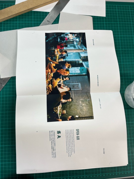
I hate the viscom printers
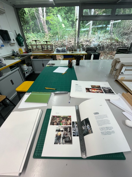
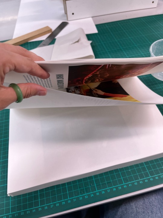
After hours of printing, gluing and cutting, we came to the final cut of the book along the bleed margins. Me and Joseph spent 2 hours trying to align the pages as the printers printed the spread quite wonky. We thought we had done a good job aligning the pages however when we finally trimmed the edges, a lot of the page numbers had been cut off/cut in half. Honestly this is really disappointing as I am really proud of this outcome and such a small thing has decreased its quality so much.
However, there is nothing I could have done better as we spent hours trying to fix it by hand. I am still really happy with the binding process and proud of myself for completing this.
0 notes
Text
FMP
Lay Flat Binding - Process (LO2)
after printing my outcome, the first step was to fold each individual page in half. the pages are all printed single sided
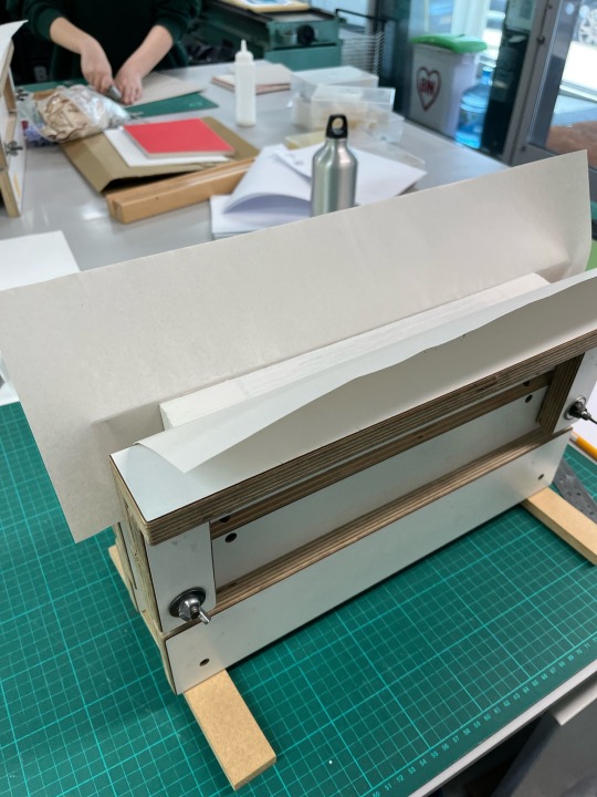
i then compressed all the pages together in order and glued the spine together
I then glued the back of each spread together so it opens seamlessly with no seam in the middle.
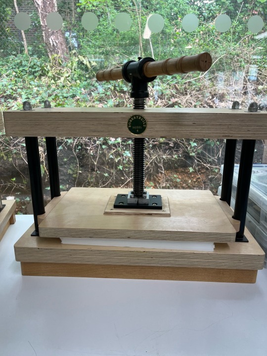
I then put my book into the press for it to be completely flat

printed cover and marked where the folds and creases have to be
glued edges to content of book
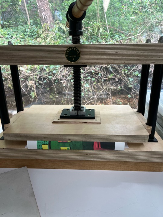
put into the press to flatten
0 notes
Text
FMP
Final Reflection
This unit has been a long, hard but also very enjoyable one. I have loved the creative freedom that has come along with this self led project and I feel that I have reached a really good level of both skill and confidence. Having the one week project at the beginning of this unit helped me to formulate my ideas and encouraged me to follow a path of personal interest. I think this is what really propelled me through this term as I was fully invested in the topic.
In terms of the learning outcomes, I feel that I did well to meet them. I have substantial amounts of primary and secondary research that has been refined and applied to my outcome in a visually interesting and exciting way. I showed a range of developments and experiments throughout this unit through spread designs and also sketches for my personal branding. I was well organised and managed my time to a good level without letting anything pile up. I also evaluated and reflected on my work continuously throughout the unit which helped me to refine my ideas.
I am really annoyed about the printing of my outcome. Due to the printers printing quite wonky and the colour quality being off. It has hindered my final outcome due to the page numbers being cut off at the bottom and misalignments. If this wasn't the case I would be a lot happier but me and Joseph spent 2 hours going through each page to try make them line up so there wasn't much more I could have done.
I am really proud of my outcome. It was a big project as a lot of the information was primary. Also the creation of such a big book and trying to find good quality images and also using my own images was a time consuming task. Binding my book in a lay-flat style pushed my abilities in this area as it was a completely self led idea that I was able to complete to a high standard through relevant research and help from Joseph in the print room. I am really thankful for all the tutors help, especially Rich, Emily and Jordy as they all pushed my ideas into a good direction and helped me continuously throughout. I am really happy to hand in my work and feel proud of what I have achieved.
One area that I could have developed or focused on a bit more was linking to a target audience a bit more. It could be seen as confusing who my book was directed towards. I tried to make this as clear as possible but I can see how it may have been lost. It was meant to be aimed at people who enjoy travelling, who have been to Hong Kong, who want to go to Hong Kong and people who live there. Other than this, I think I did well.
0 notes
Text
FMP
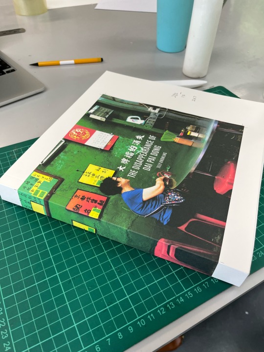
Front Cover
Now that I have my spine measurement, I can create my cover to the correct size. I really like the look of this cover, I think the image works well. The only thing is legibility and sizing. I will test print to see the quality of this and finalise after this.

Test printing

the quality of the image is good. I was recommended by Joseph to print on 250-300gsm. I will chat with Jordy to decide on this
i decided on 300gsm as it will be more protective and thicker. I am happy with this as my cover, it is legible and the quality of the image is good.
0 notes
Text
FMP
Printing
After a discussion with Geordie, we decided that printing on 120gsm slightly textured paper would be best for my outcome. I want the pages to be a bit thicker than regular printing paper because I don’t want my book to be flimsy.
The printing process went well and I am happy with how the images and text looks. One thing is that the colouring is a bit off due to the printer but that is out of my control.
0 notes
Text
Portfolio
Business Cards (LO2)
I designed my website in second year and I still really like the colour palette on the website. It is really colourful and stands out. For my business cards I want to use this colour palette for my business cards for a more cohesive personal brand.


The colours are a bit different as the website is RGB and business cards are CMYK. I still think they work well. I like the purple as it is less girlie and matches my design style a bit better.
0 notes
Text
FMP
Current Point Reflection and Organisation (LO3, LO4)
For the final week of this project, I feel that I am in a good place. I am happy with the quality of my outcome and I feel that I have met each learning outcome to a good level through demonstration of research being applied to a visual outcome and the gradual development of my practical work. This week I need to finalise my outcome through printing and binding. I also need to complete my process book and print and bind this as well. For my portfolio and personal design work, I need to continue with this through editing my old website design to improve it and also complete my business cards.

0 notes
Text
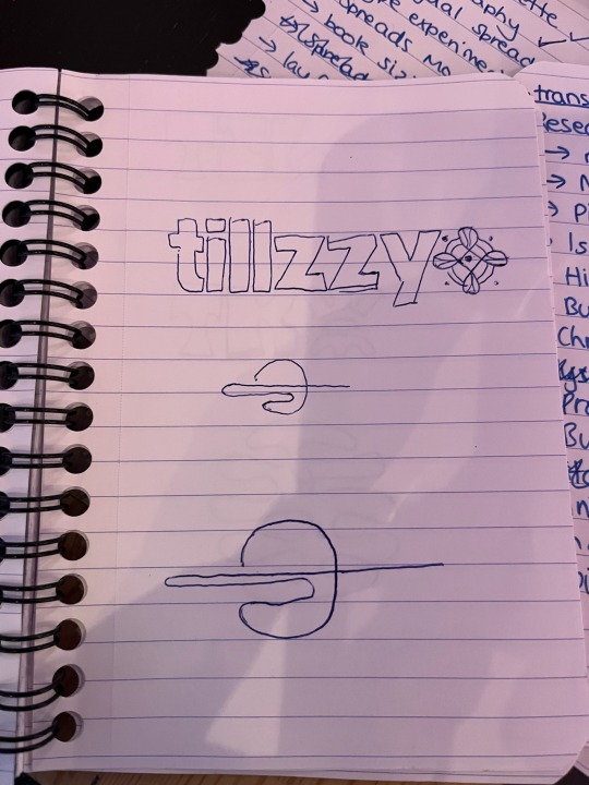
Portfolio
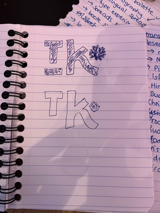
I think that Tillzzy is a bit too long. I wanted to shorten it to Tillz as this is what people tend to call me if we are close friends, and it looks better for logos. I like the simplicity of the logo below but it is also dynamic and legible. I will progress with this design.

0 notes


Text
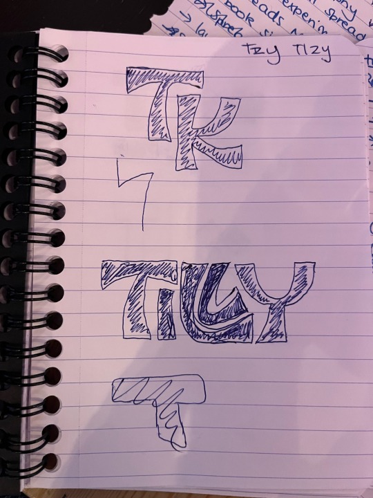
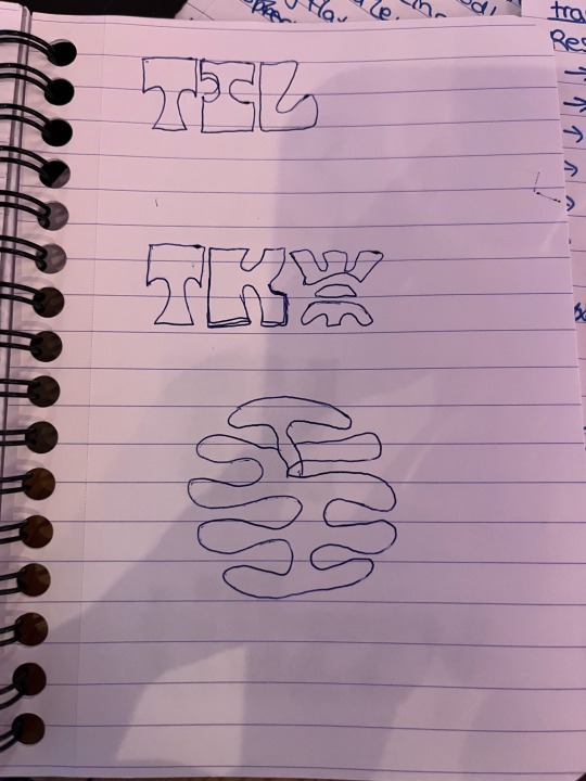
Portfolio
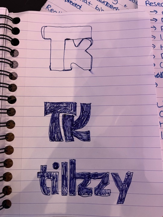
Branding Sketches (LO2)
Some sketches for redesigning my logo from second year. I want it to be more sleek and legible. My Instagram account for my design work is called Tillzzy. I want to use this or my initals TK for my logo
0 notes
Text
FMP
Test Printing
Quality of images all looks good, the only thing is that the printers in the library aren't good. I will definitely be asking uniprint to print my final outcome as the quality will be better. Thicker paper will also be better so the book is less flimsy. I need to look at paper weights to progress with printing.

0 notes
Text
FMP
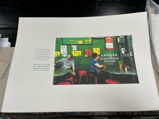
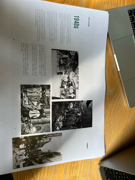
Cover Experimentations (LO2)
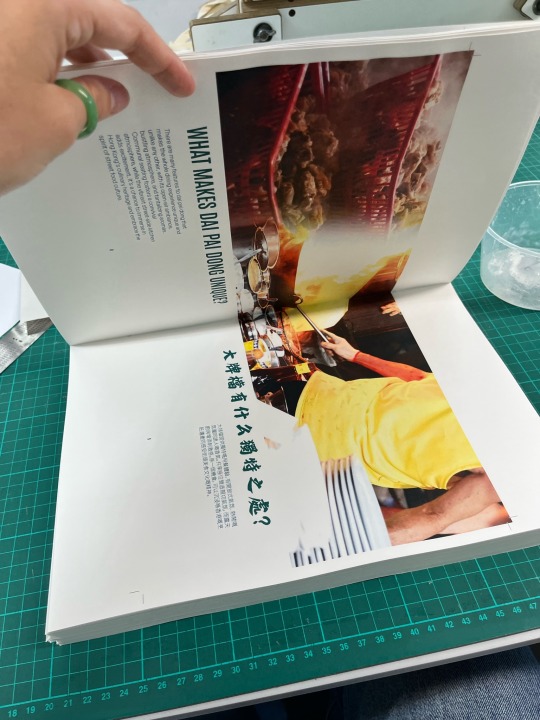
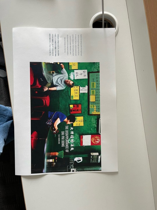
I am really drawn to this photo, the quality is really good and the actual image itself to be captures the essense of dai pai dong. the colours mixed with the randomness of menus and casual diners shows off the energy of dai pai dong but in a beautiful way.
I experimented with photoshop and indesign to create mock ups to help visualise my experiments.


0 notes
Text
FMP
Book Cover
One massive part of my outcome is the cover. It has to be eye catching but also communicates the concept of the book. I want it to be powerful. My target audience also has to be considered which is people interested in travelling, people from Hong Kong and people who are looking to visit/have already visited Hong Kong.
Inspiration/Moodboard


0 notes


Text
Interview
My interview footage won’t upload to tumblr as the file size is too big but this is the translated transcript
- when did you get your dai pai dong licenses
- 80 years ago
- can you share a story of your dai pai dong
- 80 years ago on this street both side have dai pai dong and the seating is very different. nowadays days and they had to sit on high stools and they would eat and sit on the high stools it is very different from todays seating and very vintage style. no there is only one dai pai dong, but before there used to be two and they used to face each other. nowadays, all the dai pai dongs are more modern than before as they used to be very antique. now all the seatings is just plastic chairs and all the tables are stainless steel so during typhoon 10s it doesn’t just fly away. the whole street used to be called food street, but now it’s called stanley street. now, hong kong tourism board is promoting dai pai dong to the whole world like uk, us, holland, etc. so a lot of tourists come to hong kong to come eat and visit here.
0 notes