Don't wanna be here? Send us removal request.
Statistics
We looked inside some of the posts by timothystillopf1 and here's what we found interesting.
Average Info
Notes Per Post
3
Likes Per Post
3
Reblog Per Post
0
Reply Per Post
0
Time Between Posts
4 days
Number of Posts By Type
Text
17
Last Seen Tumblr Blogs


Fun Fact
Tumblr was acquired by Yahoo for $1.1B in 2013.
Text
Fundamentals 1 - Overview and reflection.
I have really enjoyed my time the last 12 weeks in Fundamentals. i came in with semi-basic knowledge of Photoshop and that was pretty much it? While I had experience in a good portion of the photoshop section of this course, everything else I was either very rusty with or straight up didn't know! It felt very good to blow off the cobwebs of my photoshop knowledge while also learning new and innovative ways of creating and editing images and these skills I will be holding close and practicing for the rest of my personal and professional life. As for Adobe Illustrator. I had absolutely zero knowledge in this application coming into this course and I am happy to say that I feel I am coming out of this course with as much confidence in the program as I have in Photoshop/Lightroom (quite a lot). I view Adobe Illustrator as a very useful tool to have in my design tool belt not only just for drawing illustration but for creating posters/large scale images also. I had a very good time learning the ins and outs of this program and feel Toby did an amazing job teaching and helping us understand things such as Bezier curves and other such intricacies that Illustrator can bring. I will be keeping Illustrator close to my practice in future in personal and professional work. InDesign was another program I didn't have too much experience in before coming into this course aside from one class in my first year photography course making business cards. Despite that, I didn't really retain any of that information as not only was it so long ago but it as only one class. Regardless of that, again Toby did a really good job of guiding us through this program and I feel have a really good understanding of InDesign especially now which I will definitely be using future. Overall, the amount of technological knowledge I have received over the last 12 weeks is super valuable and I haven't taken any of it for granted. Had i not come to this course, these programs I would have never had touched or even looked to as tools of creation as a photographer and designer. I look forward to putting the things I have learnt from Toby into practice in future, working with clients, personal creation and for work. I do not consider myself a professional in some of these programs as of yet but I look forward to getting there through practice and general use of these programs in future.
0 notes
Text
Fundamentals Week 12 - Putting together my Children's book.
After finishing up my Hickory Dickory Dock illustration, It was now time to add it into my book. after exporting my finished illustration as a .png file, I opened my book file and placed my image onto pages 2-3.
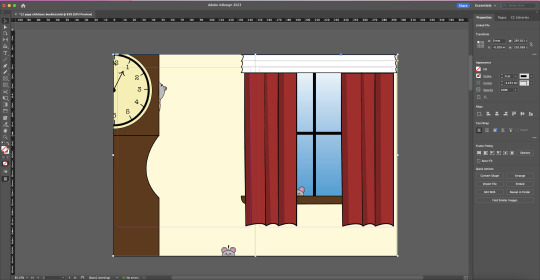
note: after looking over my 'blueprint' for my book, i decided a full page spread would fit better within the assignment. I expanded my file from an A5 size to an A4 landscape, enlarging the window and adding a mouse (command + C, command + V) behind the curtains by going into my layers, layers and dragging all components of the mouse to behind the components making up the curtains.

after placing my illustration into my Indesign file, I then had to solve the problem of my parent page numbers not being visible over the image. To get around this, I moved my illustration out of the way of the numbers and, while holding Shift + Command, clicked on the page numbers. This over rides the parent page settings and allows you to adjust the text without affecting the rest of the parent pages. After doing this, I right clicked and selected Arrange -> Bring to front.

repeating this step and placing my image back to it's initial spot reveals the page numbers over top of the image.

I then added a text box spanning the space I had left in the illustration and set the font size to 34pt selecting 'Big Caslon' as my font of choice as it, again, fit the vibe of a children's book to me. I filled the text box with my desired nursery rhyme. For this page in particular I do wish that I hadn't made the window so big as I feel like the page is a little too cluttered for my liking yet may translate well into print as it will create a flow between pages.

I repeated this step for my middle page spread of 'Hey Diddle Diddle' on pages 6-7.
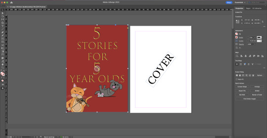

I also threw together a quick cover including some of the assets from the pages i had constructed. I decided to do this as it reminded me of story books i'd seen as a child where the cover would consist of text and a couple characters seen within the book which I always found fun as a kid coming back to the book and realising that and hunting them out from the pages. due to time constraints and workload, I was unable to complete the book yet I am very happy with what I managed to come out with. As long as it took me, the Hey Diddle Diddle spread i illustrated was super fun to create and put together with a mighty satisfying pay off after seeing everything together. Going into the Hickory Dickory Dock illustration, I knew it was going to be a little more simple compared to my other spread. With that in mind, I am still really happy with how it turned out! mainly the characters involved in the page but still all around fun. With more time I would have liked to add more detail and be able to put a little more care and thought into the illustration. on the note of time, I would have really liked to have finished the whole book. As i've already stated it has brought me such satisfaction putting these illustrations together and to have had all 5 finished and together in my book would have brought great satisfaction. i may still finish this in my own time but for now, I'm happy with the effort I put in to it so far.
0 notes
Text
Fundamentals Childrens book, Spread 2 - Hickory Dickory Dock.
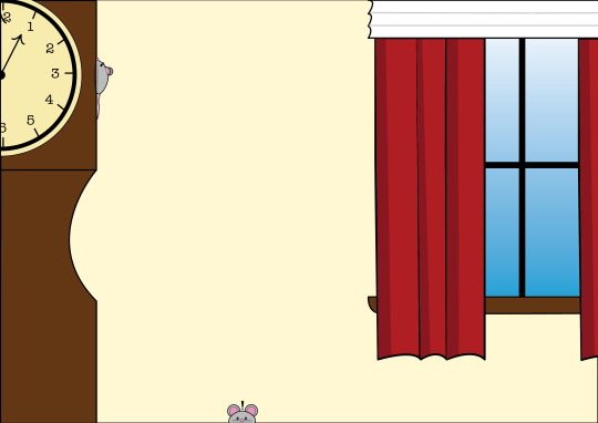
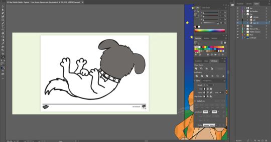
for my next spread in my Children's book i decided i'd illustrate nursery rhyme "Hickory Dickory Dock".

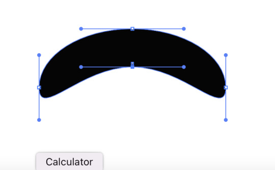
Made up of ellipticals (elliptical tool) and rectangles (rectangle tool). I started by drawing the grandfather clock, using pathfinder tool to cut out the indent seen in the side of the object. this would become the main visual in my illustration, used for scale and visual story telling.

from here I decided I wasn't too pleased with having nothing in the background and wanted to somewhat replicate the affect i'd created in my previous spread (adding an opaque text box over the top of the image) and added a window. using broken points on the curtains as-well as the tralice, I also made use of different shades on the curtains to add depth and texture.

I next added a clock face to my grandfather clock. Considering the story says "the clock stroke 1" I felt it sort of important to have a way of telling the time to add to the story. A simply elliptical was used and I traced an image of a clock face to ensure getting the correct lines in the correct spots for inputting the numbers on the clock face.


I knew I wanted my mouse to be quite simplistic, small and cute while also wanting to make sure it showed scale against the towering grandfather clock. I began by drawing an elliptical over the side of the clock face and removing half of the shape, then, adjusting the front and back ends of the 'mouse to create a mouse-like body shape. Adding more ellipticals for the eyes, nose, and ears. Sending one ear to the back of the Layer and discolouring it to add depth. I then, using the pen tool, added a tale made from bezier curves to my mouse, detailing it further with discoloured shapes acting as bands as they are commonly depicted through media. Finally I used an elliptical and adjusted it's shape, much like on my previous spread, to create a shadow on the side of the clock beneath the mouse.

once this was finished, I felt something was still missing. I decided to add another mouse, front facing, onto the bottom of my page, just peaking above the bottom as a sort of 'blink and you'll miss it' type easter egg, while also making use of the space. This mouse was made up primarily of ellipticals (same as the previous mouse) with added shine to the eyes and the addition of whiskers which were drawn with the Pen tool on one side, copied, pasted and reflected onto the other side to keep them somewhat consistent and symmetrical.
0 notes
Text
Fundamentals - Children's Story Book - Middle spread.
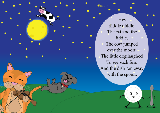
This week we began work on our final task which is to be a 12-page children's storybook that includes up to 5 children's stories, nursery rhymes, or songs. The stories I have chosen are This Little Piggy, Hickory Dickory Dock, Hey Diddle Diddle, Little Miss Muffet, and Thre Blind Mice.
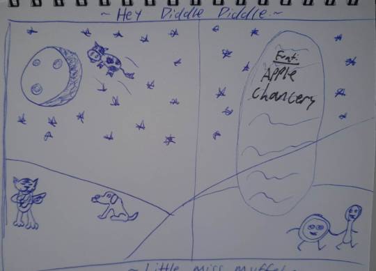
I decided to start with Hey Diddle Diddle as I figured it would involve the most amount of illustrative work and would take some time to complete as it was important to me that given the length of the story, all visual elements should be present. Because of this, I decided I would go for a 2 page spread in order to avoid clutter amongst the different elements within my scene. the text box (seen on the right of my sketch above) was inspired by memories of Nursery rhyme books I'd had as a child we're parts of the illustration would be whited out to make space for text. In my case though I plan on creating a transparent elliptical so that elements of the background will be able to be made partially visible to help integrate it within the overall image.
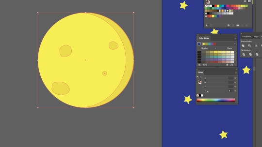
I began by creating the back and foregrounds (both separate layers) of my image using the pen tool with a green fill combined with a slightly darker green outline, to create rolling hills across the bottom as well as the rectangle object tool combined with the gradient tool to create the night sky. To polish this off I used the Star object tool and a lot of copy-paste (Command + C, Command + V; Option + Left Click + Drag) to fill the sky with stars. creating a new layer, the first of the elements I decided to draw was the Moon. I created this by using the Elliptical object tool, creating the basic shape of the moon, and then placing 4 ellipticals on the moon and adjusting them using the selection tool. I also made use of the Pathfinder tool in order to create a shadow on the right side to add depth to the subject. I grouped these and added them to the scene.

The first character I decided to draw was the dish (the dish ran away with the spoon) which I began by setting to its own layer and again with the elliptical object tool created the main body of the dish, followed by a light grey elliptical outline to create the center of the dish. the legs and arms of this subject proved to be my first hiccup within my process, while being rusty, I wanted to use simple outlines for the legs and arms of the subject but for reasons at the time, I couldn't get it to happen. I have since figured out why this was not working. Drawing the shapes for the legs and arms using the pen tool, I placed them behind the dish to avoid any clipping or disruption of flow between the body and limbs.
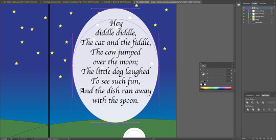
It was at this point I noticed I should have already planned out my text box and size so as not to make any mistakes further on with placement and spacing. I added this to its own layer and placed it at the top of my layers palette as nothing should be able to be placed over the top of it. I chose to lay out the text in a way that each section would be somewhat self-contained for it to be easier to read for children while also being able to follow the objects from left to right alongside reading. I also added a black line through the centre of the page to represent the centre of the spread to avoid my subjects falling into the fold of the book. I created another elliptical and lowered its opacity slightly and added a rounded text box. The font I chose was 'Apple Chancery' as it fits the fairytale-esque tones and nostalgic feeling I had envisioned within my sketch.
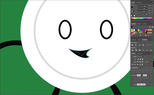
Moving on, I added eyes onto the dish and using the pen tool, created a mouth using Bezier curves.
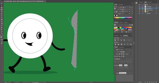

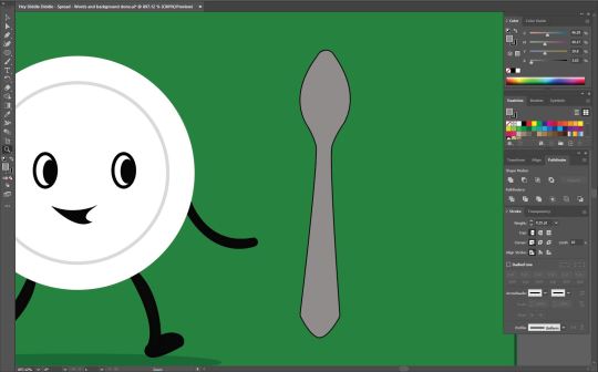
after adding pupils to the dish and a transparent black elliptical for a shadow, I began work on the spoon. I began by first drawing half of the object with the pen tool and reflecting it onto itself to create a symmetrical object and removed the middle line.
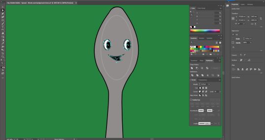
I copied the eyes and mouth from the dish and adjusted the curves of the mouth to make it unique from the dish. Also adding another elliptical around them to create the illusion of a face/add depth to the head of the spoon.

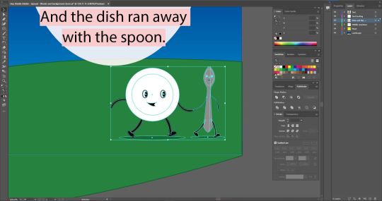
much like the dish, I drew the arms, legs, and feet to match the dish so it would appear that they were in motion and running away together as the story tells.


After creating a new layer, I began work on the cow. I started by drawing a long, uneven-shaped oval to act as the body of the animal. After switching the fill of the shape to white, I then added a snout using the elliptical tool with a black outline and fill, with two smaller ellipticals with a darker shade for nostrils. for the top portion of the head, I used a rectangle and pulled in the inner nodes to soften the corners as much as possible then altered the lines with the direct selection tool to create a less flat-topped head shape. The ears were free-handed using bezier curves and turned out far better than I was anticipating and exactly as I envisioned them.
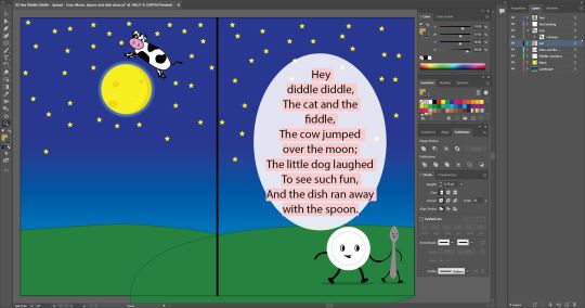
I grouped all objects making up the cow and placed it within my scene above the moon. I could not be happier with how it had turned out, the subject fit perfectly into the scene and didn't look out of place over the moon. I did however feel like something was missing. I decided to add some more depth to the moon by taking three, slightly bigger, ellipticals and layering them, changing them to different shades of blue, and placing them behind the moon to give the moon a glowing effect and have it feel more prominent within the scene.
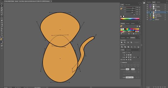

Now this, I was very nervous for. But I accepted the problem-solving to come. I began drawing the Cat and the Fiddle. I started again with two ellipticals and experimented with their shape using the direct selection tool to see what I could make in relation to a Cat. After a while of experimentation, I settled for what is seen in the screenshot on the right. But next came the really hard part. The fiddle.
Not having any idea how I would even begin drawing a fiddle, let alone one being played, I looked to the internet for some inspiration where I found an image that looked as if it would fit perfectly in what I had already created and what I was envisioning. Placing the image on its own layer and turning it's opacity down to 12%, I began tracing the image using the Pen tool.
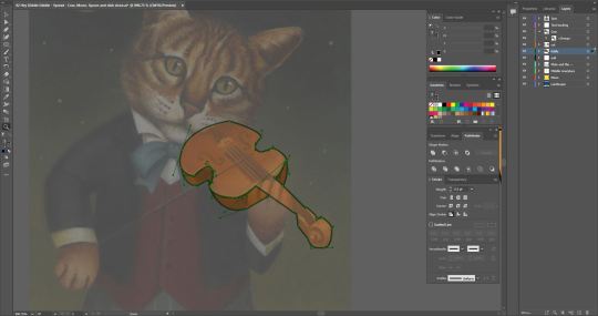
entering the layers within this layer, I was able to place the Fiddle onto my subject and it was a perfect fit! Out of curiosity, I decided to lay the image over my subject to get a sense of how my subject should be posed. This urged me to rotate the head slightly as if it were resting on the fiddle, holding it in place much like the image itself. This also aided me in figuring out where I should place the eyes and ears of my subject. I drew some eyes using the pen tool but felt they did not give off the very friendly or playful tone that the rest of my scene gave off. Because of this, I decided to remove the eyes and pupils and 'closed' the backing shape of the eyes to give the result seen above. I added some darker details to represent the patterns of the cats fur and added it to my scene.
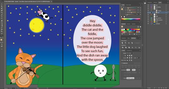
Even more so than the cat, I was very nervous about drawing my next subject. I again took to Google and found a .PNG of a laughing dog which would be used as a reference as I'm not very good at hand drawing dogs and wouldn't quite know where to begin digitally either.

Having the reference image made things a lot easier in this portion of my spread. I set the image to a separate layer and set it's opacity to 12%. I began tracing the image using bezier curves and broken points, occasionally hiding the image to make sure everything was looking the way it needed to and to clean up any stray lines. The eyes, mouth, Tongue, Nose, Studs on the collar (ellipticals), and bone (Bezier curves) were all made as separate entities and placed onto the subject after the initial shape was formed.
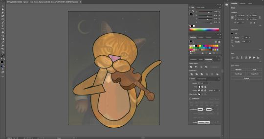
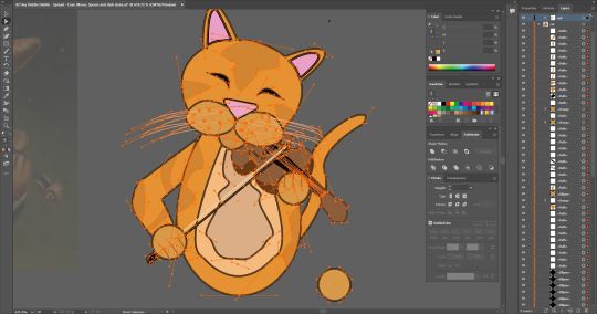
I added the dog to the scene and placed a Shadow beneath it and I have to say, boy did it tie everything together! After a few finishing touches (resizing the cat, recolouring the cat, adding a shooting star) I was over the moon with how well everything worked! (no pun intended...) I feel like there is a pretty consistent art style across the subjects present in the scene and don't feel there are any colours that don't belong or don't work together. I feel pretty confident that I have accomplished everything I set out to achieve with this in terms of art style and overall feeling of the image. I had so much fun creating this spread and look forward to moving on to the other pages in my book and the challenges they may present. Not only in subject matter but in the use of space also. (sizing restrictions A5 as opposed to A4).
#otago polytechnic#adobe#adobe illustrator#editing#student#bezier curves#design#digital art#digital artwork#Nursery Rhymes#Hey Diddle Diddle
1 note
·
View note
Text
Fundamentals Week 12 - Adobe Illustrator - Tessellations

Last week in Fundamentals we were given the task of creating a 12-page Children's book built up from a series of 5 (max) children's stories, nursery rhymes, and Nursery rhymes which we would design and illustrate from the bottom up. This week, to aid us in this task we were introduced to Endpapers and how to make striking visuals for them.


we began by creating a small black box using the rectangle tool and drew a silhouette (in white) within it. Then, after pulling out the swatches palette from the sidebar, we selected our entire object and dragged it into the top row of the swatches palette.

Next, both outline and fill are selected for the drawing and we drew a random shape. Once the shape was drawn and filled, we selected our newly created swatch that we had just previously loaded in.

(opening Select > Object > Direction Handles allows the user to see all nodes and handles of any given shape or drawing)


by double-clicking our pattern in the swatches tab, we are able to edit the orientation of and offset our patterns as well as overlap to create different tesselations.
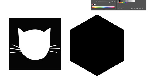

next, we created a hexagonal shape and copied our silhouette (command + Left Click + Drag), and repeated the process of dragging it into the swatches palette and filling it into a new shape.


Selecting hex by row with this new pattern allows the shapes to slot within each other creating a very pleasant, illusion-esque, honeycomb-like flow.


while in this menu, clicking on the shape in the center and selecting other colours within the swatches tab allows you to change the colour of your overall pattern.


while working with such things like type, which cant be manipulated the same way as shapes can be, by selecting 'Type' at the top of the screen and selecting "Create outlines" transforms the text into malleable shapes that can be adjusted in any which way and is often how company logos are often created.

This session was very useful and gave me tools that I will be making use of within my storybook as well as skills that I will keep with me in future projects both professional and personal.
0 notes
Text
Fundamentals Week 10 - InDesign Continued
This week in Fundamentals we began learning ways to create booklets. From the anatomy of a book, learning how many pieces of paper are needed to create a certain amount of pages and the fact booklet pages will most commonly come in multiples of 4. To How to lay out a page and how to make use of space, Hierarchy and tools like Parent Pages and how to use them.


We started by creating an A5 document and creating 8 seperate pages within that for our Demonstration booklets.

Next, using the text box tools, we marked our first page as cover and enlarging the text by holding down the shift key and selecting the font size arrows located at the top of the screen (Advanced display active).

Next we explored parent pages. By selecting A-Parent at the top of the pages palette we are then able to make adjustments that will take effect over the entire booklet as opposed to having to adjust individual pages as we go along i.e. page numbers, headers, columns, text boxes etc. Different copies and versions of parent pages can be made by simply dragging the A-Parent page in the pages palette and dragging it down to the + located at the bottom of the palette, allowing us to make a variation of the Parent page that, depending on circumstance, may come in handy if there are assets down the road that don't work with our current Parent page layout.


With the Parent pages making uniform changes across the entire document, This does also include changing the front and back covers of the document. To remove these effects on specific pages, simply clicking and dragging the *None* option (located above A-Parent) in the Pages palette and dropping it over the desired page, will remove all Parent effects on said page.


Going back to Parent Pages, we want to have our pages numbered chronologically without having to manually do it by page as we go along. To achieve this, we create a text box on the bottom left (or wherever you desire your numbers to be) and labelled it 1. Next, we selected the text and wen to Type-> Insert special characters-> Markers-> Current Page Number. This replaces our number with an A which, checking back to our pages, allows InDesign to chronologically number all of our pages automatically using the same fonts and sizes as we had on our Parent Page.


Margins and columns tool is used to help create a guideline for your pages and help seperate text from, in this case, the Header and the Page Numbers. adjusting columns allows you to better format your text layout by creating more sections for you to follow when applying text or images to your document.

Lastly as a class we discussed visual Hierarchy and how we should consider our Design approach to making Booklets in the future. This was a very helpful session as I feel it has furthered my understanding of InDesign and I am confident in our homework task which is to create a 12 page children's book, bringing together everything we have learnt thus far. Before this class i had no experience with this program and I now, knowing what I know, very much look forward to getting to know it better and using it in both personal and professional capacities.

Useful notes and keyboard shortcuts for InDesign.
0 notes
Text
Fundamentals Week 9 - Adobe InDesign Intro, Part 2

Next, we opened our supplied image, from our source folder (the same folder that we placed our image into InDesign from), and made quick adjustments to our subject. When we were finished with our masterpieces. We saved them over the original file (Ctrl+S).


Moving back into InDesign, our images now had an exclamation point located on the top left of the image signaling a change had been made to the original file. To resolve this, we opened 'Window' and selected the 'Links' palette which shows us our assets and where they are located/whether or not they are properly linked to our document. selecting the chain link icon at the bottom of the palette allowed us to relocate and re-link our original image. This updates the asset in question.

Holding the Shift + Command on the corner points allowed us to resize our image without affecting the outside frame supplied by InDesign. Then, holding the option key while clicking and dragging one of the points of our image, allowed us to free-crop our image without changing the shape of the overall image.

Next, placed our image within our text box selecting the 'Wrap Text' option located at the top of the screen (pictured above).


With the image selected, we are now able to adjust the size and spacing of which lies between our image and the text within the text box. Pictured above are the values I put in to achieve a satisfactory result and an example of what the 'Wrap Text' box looks like around the image.
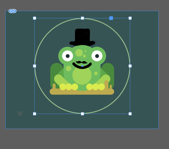


Next, we were shown how to insert a shaped image into our text. We first copied our image then using the Elliptical tool, created a circle around our image where we wanted our image to appear within the shape. We then cut our shape using Ctrl + X and right-clicked our shape, then selecting "paste into" which pasted our cut image within the shape creating a circular version of our image (you can use '/' to remove the outline created by the initial elliptical).


We then inserted our circular image into our text using a different wrap option. Much like before, using the Text Wrap palette, we are able to adjust the spacing between the image and the text by inserting values into the given boxes. Given that in this case our image is circular there is only one option available to change which adjusts the spacing all around the image as opposed to a certain side(s). We then inserted our circular image into our text using a different wrap option. Much like before, using the Text Wrap palette, we are able to adjust the spacing between the image and the text by inserting values into the given boxes. Given that in this case our image is circular there is only one option available to change which adjusts the spacing all around the image as opposed to a certain side(s). I thoroughly enjoyed this session and learned a lot in the time supplied. InDesign is yet again another one of those programs that I have not had a lot of experience using. We once touched on it during my Certificate Photography class for the use of making business cards, but nowhere near this in-depth. I'm sure there is a lot more to learn and I look forward to diving deeper into the intricacies of this tool and applying that to my Graphic Design project as well as personal projects.
0 notes
Text
Fundamentals Week 9 - Adobe InDesign Intro, Part 1

This week in Fundies, we began learning about InDesign. InDesign is a useful tool for graphic designers that allows you to combine and format documents involving text, vector illustrations, and images in order to create pamphlets, books, posters, brochures, etc... today we learned the basics of InDesign from how to set up a document to how to properly format paragraphs and text for a pleasurable and readable final product. As well as how to add/combine images with our words in a positive way.


We first started by creating an A4, blank page document and adding a text box to the page that fits the size of the box already outlined on the page. We then filled our text box with placeholder text by clicking 'Type' > 'Fill with Placeholder Text'.


Clicking Window (located at the top) we then selected 'Styles' > 'Paragraph Styles'. This pulled up the Paragraph Styles palette which is used for creating preset paragraph formats that can be reused throughout the document by selecting batches of text and applying the preset by selecting it through the palette. We also went back to this menu and selected the 'Character Styles' Palette which is functionally the same tool but is used for creating presets for typefaces making it easier to change fonts, font sizes, and spacing between letters between titles, headers, and words while keeping the overall work cohesive.

We then began by selecting our font. For this lesson, we used Arial Regular for our paragraphs and Aerial Bold for our Headers.


The menu pictured above is the 'Paragraph Styles' menu. This menu gives us information on our selected paragraph including font size, font, and leading. We renamed this 'Style' "Body Text" as it will be used on all of our main body text throughout the document. and with this preset, can be applied to the rest of the document by selecting all (Ctrl+A) and selecting the "Body Text" Style.


by dragging our "Body Text" style down to the '+' located at the bottom of the 'Paragraph Styles' palette, we created a copy of the style and began editing it (double click). By going into the 'Basic Character Formats' tab within 'Paragraph Styles Options' we were able to adjust our font size and font style (Arial Bold). This would become preset for our Headers.
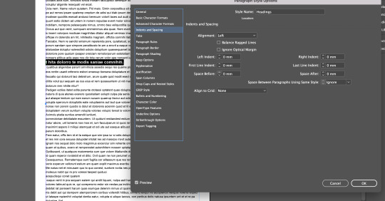

we then moved into the 'Indents and Spacing' tab and adjusted the spacing of our headers between paragraphs so that they would stand out from the body text to create a visual hierarchy, separating different paragraphs with different subjects from each other.

We then repeated the above steps in the Character styles palette, changing the fonts to Italic and Bold Italic which, in a real document, would be used for things like names or certain important words that would need to stick out within a sentence.


Back to formatting, Toby pointed out that some words that may be cut off by their length were hyphenated. While reasonable, these hyphens are not very pleasant to look at. By going back into our 'Paragraph Styles Options' and selecting the Hyphenation tab. Unticking the Hyphenate box within this reformats the words to fit within the text box in full without being cut off. While a good solution, this can cause some of the words to be pushed out of the text box and may require some resizing or editing.
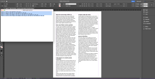

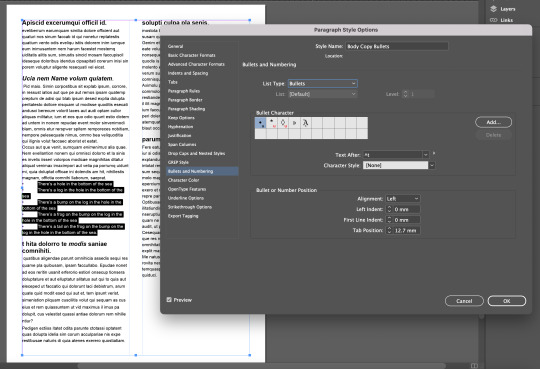
Next, we were given a poem to paste into our document with the object of applying bullet points to the text. We achieved this by once again going into our 'Paragraph Styles' options and selecting the 'Bullets and Numbering' tab and selecting 'Bullets' under the list type.


After this, it was time to format our bullet points. While we had achieved adding bullet points, the form in which they appear is not exactly ideal or visually pleasing. Within the 'Bullets and Numbering' tab in 'Paragraph Styles' is a box labeled 'Bullet or Number Position'. changing the values of 'Left Indent' and 'First Line Indent' applies changes to our bullet points formatting them in a more practical and more sensical way. It is important to note that the 'Left Indent' values must be positive with the 'First Line Indent' values being Negative in order to achieve a satisfactory result like the one pictured above. We also, within the 'Paragraph Style' options, adjusted the spacing of the text and position of our bullet points in order to separate them from the surrounding Body Text and have them stand out more on the page.


In addition to the text we were supplied by Toby, we were also supplied an image that we would be inserting into our text. After downloading our image, we clicked on File and selected 'Place'. This was used to insert our image into our document from the source file and would become important later on. In addition to the text we were supplied by Toby, we were also supplied an image that we would be inserting into our text. After downloading our image, we clicked on File and selected 'Place'. This was used to insert our image into our document from the source file and would become important later on. End of Part 1.
0 notes
Text
Fundamentals Week 7 - Adobe Illustrator Outro Part 3

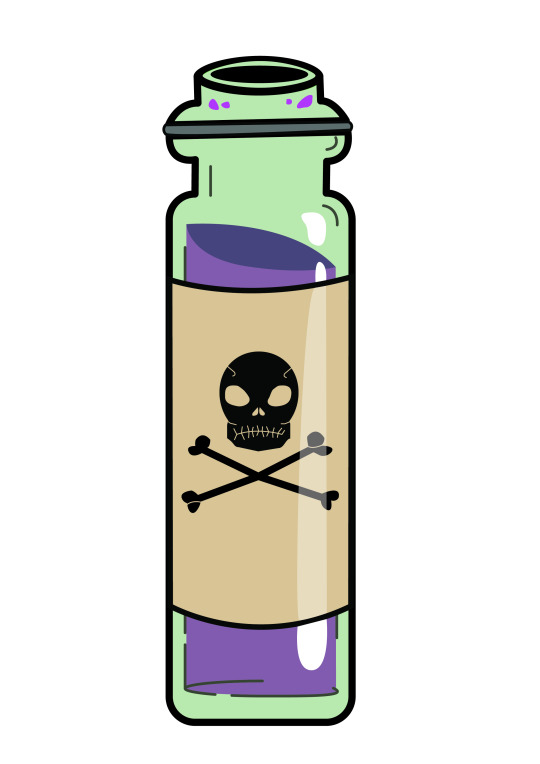
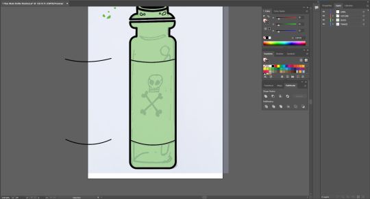
After detailing the liquid within my image, I unhid all my layers to see how it all fit together. Needless to say I was very happy with what I achieved. Having the darker colour at the top of the liquid worked extremely well for me in adding depth. On top of this, i made very sure that the colour of the glass layer wouldnt cancel out the colour of the liquid layer too much as i realy wanted the pink/purple to come through and add some more, pleasant colour to the overall image.

Next I selected the details on the top of the bottle and made them the same colour as the liquid inside the vial to compliment this and also give the effect that some may have been spilled or poured out already, showing off what the liquid on the inside would look like outside of the bottle.


Comparing this to my sketch, there was one detail I was missing which was the glare on the rightside of the bottle. This part was slightly difficult as I didnt like the way it appeared with one solid colour across the whole side of the image. As a result I ended up using the pen tool to draw the reflection on the glass areas seperate to that of the label as I felt the reflection of the label wouldn't be as strong as that of glass. I set my fill to white (no outline) for the glass reflections and then, as a seperate shape, followed the direction the reflection was going in and carried it on across the label. My reasoning for this was that this allowed me to adjust the opacity of the reflection on the label separately while also not interrupting the outline ouf the label.


I am super pleased with the end result. I once again had achieved more than I thought I was capable of and produced something i'm frankly quite proud of. The problem solving involved in making this drawing was super inspiring as it pushed me to try out different techniques and things that ultimately might not have worked in the end. Playing around with layering and detail to create something with depth was super fulfilling after seeing it all together at the end and knowing there wasn't too much else I could do. In saying that there are definately things I'd do differently if i were to do this again in terms of texture and shading for example, adding some scratches to parts of the glass to add "wear and tear" to the visual aswell as adding a shadow to the left side to add contrast and depth to the lighting. but for now, I am happy with the cartoon-ish/animated feel I have achieved with this already. I have enjoyed this entire module from start to finish, some of it easy and some of it quite challenging but despite this, I feel confident now that I know enough to atleast create something worth while in contrast to the start of the year where I had absolutley zero experience with this tool. I acknowlegde I am no master with illustrator as of yet, but i extremely look forward to getting better and learning more through time and experience both personally and professionally.
0 notes
Text
Fundamentals Week 7 - Adobe Illustrator outro Part 2

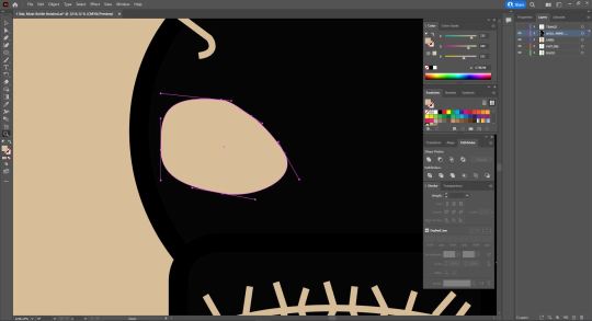
The second of our two artworks needed to be a drawing that involved colour and shading. For this, I decided to draw a glass Vial which would include a label with a graphic. I chose this as I found it exciting to do something that would involve a lot of layering, reflections and detailing and perhaps even a bit of play. I really wanted to explore the lengths of what I was capable of using this program. Like my previous work, i began by scanning my drawing into adobe illustrator and locked it to it's own layer to again, use as a reference while creating my shapes.
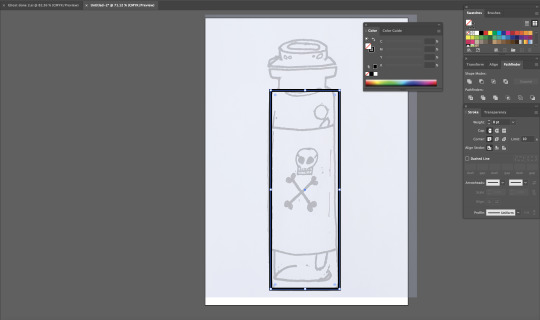
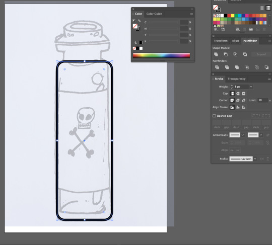
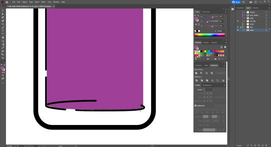
I started by using the Rectangle tool again to start off my general shape, selecting the inner point and dragging it inward to create curved corners that lined up with the shape of my drawing and increased the weight of my strokes to 8pt. I then deleted the top middle line of the shape to make way for the neck of the bottle which I drew with the Pen tool, tracing my base sketch.
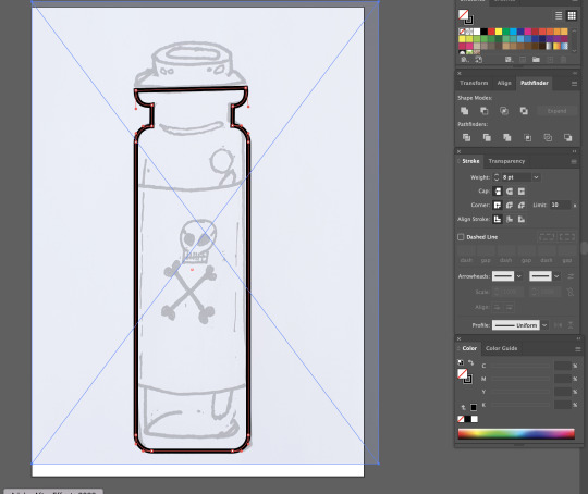
off to a strong start, I realised i had made it slightly difficult on myself by having the top of the bottle on its own seperate half meaning I'd have to create the shape on my own, tracing my drawing as best as I can.
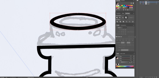
I decided to start with an eleptical, with no fill, and lining it up with the top of my image and to work down from there.
I proceeded to use the pen tool finish off the rest of this portion and I was pretty happy with how it cane out. I realised that I had made a mistake with the Horizontal lines in the way that they didn't turn out very straight yet, they were inline with eachother so I decided to keep it and see how it would effect the final outcome.
I then moved onto the circular details I had on my sketch. I decided to use the Eliptical tools again and manipulated them to fit the sketch which worked almost too well for me. I turned down the weight of the stroke on these outlines as It didn't need a main outline as it was not apart of the overally object and would come in to play later as detail.
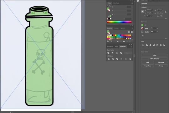
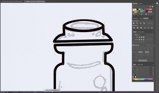
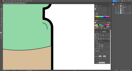
Next, I created a new layer labelled "GLASS" and selected all parts of my object and filled them with green. I then turned the opacity of this down to 30% to create a transparent glass effect.
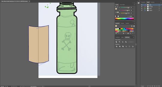
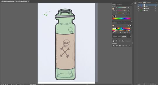
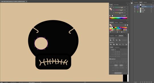
I then created another layer labelled "LABEL" and created to identical bezier curves on my bottle (as pictured above), selecting them both and copying them (Command + C) and pasting them to this layer. I chose to do this as it would allow me to connect the two bezier curves with Vertical lines, on a seperate layer, avoiding colliding with the already existing outline of my object. I filled this new shape with a tan/beige colour to simulate an old poison vial or medicine bottle you would commonly see depitcted in fantasy or gaming.
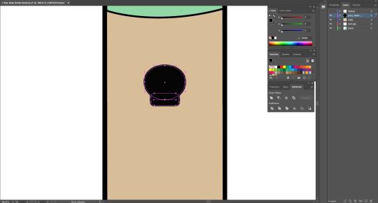
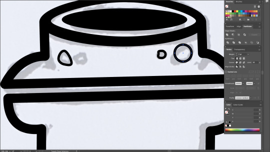
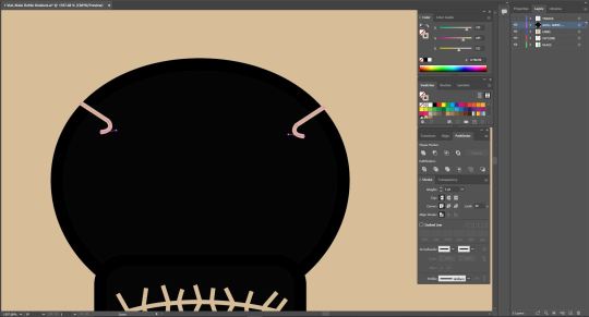
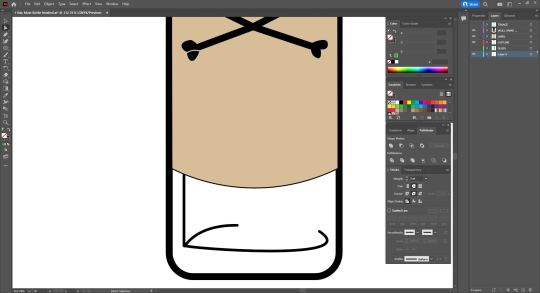
Next It was time to create the graphic on the Label. I first made a new layer labelled "SKULL AND CROSS BONES", then, using both the eliptical and rectangle tools, sculpting the beginning of my skull. With the rectangle selected, i again selected on of the inner nodes and dragged it inward to soften the corners as a standered rectangle felt too rough. I then began work on the mouth. I copied the colour values associated with the label and assigned them to my pen tool for my detailing. I did this to achieve a Stamp like feel to my graphic as if this skull and crossbones was painted on or stamped with the contrasting details being represented by the label. I then placed a bezier curve onto the lower portion of my skull and added lines going through the curve to serve as an outline for teeth.
next Iadded some detail to the top of the skull to add more depth to the "stamp-like" feel I was trying to achieve. I drew the first shape on the left using the pen tool, copied it (Command + C) and pasted it (Command + P) then using the reflect tool to flip it and placed it on the opposite side of the skull.
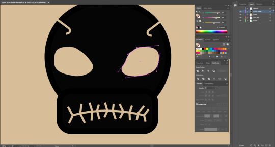
Moving onto the eyes, I again opted for using the eliptical tool to create one eye socket and then adjusting it to create a more realistic/detailed look as opposed to just having a circle for an eye. Different than before, I actually added 1 or 2 extra points to my eliptical with the Pen tool in order to manipulate my shape futher and create something that better resembled an eye socket to me.
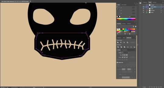
I wasn't entirely satisfied with the jaw portion of my skull so i decided I would manipulate the shape of it further to see what kinds of shapes I could achieve. I added more points using the pen tool and began pulling around different parts of the shape to closer achieve a more bone/jaw like shape.
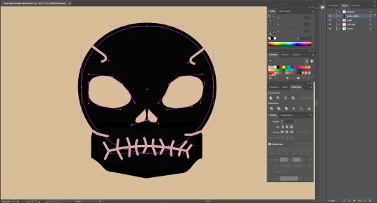
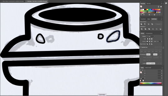
Sastisfied with my Jaw shape, I proceeded to add some more detail between the jaw and skull to add further depth by adding some seperation between the two. To do this I again began with one line on the left, replicated it (Cmd + C, Cmd + P), used the reflect tool and placed it on the opposite side of the drawing. I then added Nostrils which I again achiedved by using an eliptical tool and adjusting the points on it to create the desired shape. Then repeating the steos above to replicate it and reflect it.
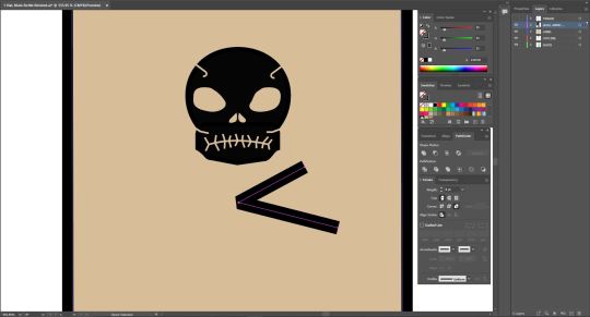
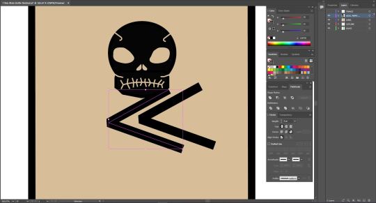
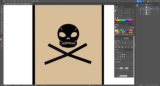
For the cross bones, I began by drawing half of the cross using the pen tool, duplicating it and reflecting it on itself.
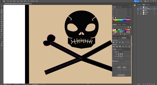
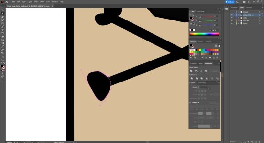
To create the ends of the bones, made use of the pen tool and, using bezier curves and broken points, began creating uneven heart shapes that resembled joints. This was quite fun to do as just by playing around with these techniques I was able to achieve quite a convincing and unique result for all 4 points. I decided to make each point different as bones aren't always exactly the same and I wanted that asymmetrical aspect to them.
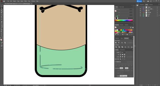
much like the details on the skull, I adopted the same technique ont the ends of my bone shapes to create some further depth and brak up the solid appearance of the cross bones. Also pictured above is the beginning of the inner detail of the vial that would ultimately serve in adding a more 3 Dimensional feel to my image. I started by selecting my outline layer and hiding my label layer and drawing a solid vertical line, lining up with my sketch, and then adding the two bezier curves serving as the inner reflections of the vial. I then added a couple points to the bottom curve and deleted the inbetween to split it up and sell it as more of an outline/detail rather than something thats inside the bottle also outlining where the inside begins and adding thickness to the glass. I also added an extra line to the top to further this aspect.
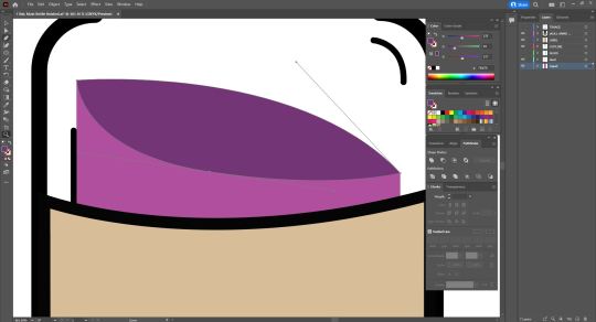
I became obsessed with this detail and started to feel like there was just something missing. I created a new layer labelled "LIQUID" and placed it at the very back of the image so it would also appear transparent. Hiding my label layer, I used my pen tool with no outline and a purple fill and followed the inner line. at the bottom I added a Bezier curve to fit in with the outline and back to the top where I then made another bezier curve curving inwards. I then created another shape out of two bezier curved to serve as the top of the liquid which I coloured with a darker Purple to seperate the top of the liquid from the rest of the liquid and give off the illusion that the liquid is moving . this also added an element of shading to my image.
0 notes
Text
Fundamentals Week 7 - Adobe Illustrator outro.
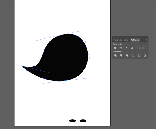
This week in Fundamentals we were tasked with creating two drawings in adobe illustrator, demonstrating our capabilities with the program that we had been taught over the last Term. The first of the two works was to be of a silhouetted subject, focussing on shapes and bezier curves.


I drew this Ghost which i chose due to the fact it involved a lot of curves of which I have not been very confident with in the past. I began by scanning my image into Adobe illustrator and setting it to it's own layer. I then turnd the opacity of the image down to 20% so I would be able to use it as a reference point while creating my shapes.

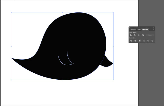
I was quite suprised with how this turned out considering my confidence levels coming into this, especially coming off of a two week break where I didn't really use Illustrator too much. Un-hiding my sketch layer, I then adjusted my cuves to better fit my original sketch. I then moved onto the arms.
I began with the inner arm. Removing the fill and setting my outline colour to white, I began by making a singular bezier curve, holding command to create a broken point, and created the second curve. I was very happy with this as it seemed I was able to achieve this quite effortlessly as it pretty much turned out exactly how I wanted it!
I repeated this process on the outer arm except this time, I removeed the outline and set the fill to black so that it would appear connected to my subject. I then opened the Stroke pallette and adjusted the weight of the inner arm outline to 4 pt, also adjusting the Caps and Corners of the shape to appear smoother and more rounded.
To create the mouth of my subject, I made use of the eliptical tool to create a circle of which I adjusted by selecting the middle point and dragged it upward to create an arch like shape.

looking more like a moustache in its current state. I then adjusted the nodes on either side of the shape, bringing them inwards to make a more satisfactory shape that closer resembled my sketch. I after this I then changed the Fill of the shape to white (no outline) and placed it onto my subject.
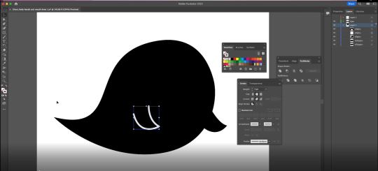
Using the rectangle tool, I created a shape on my subject that would become the eyes. With the shape selected I clicked on the top left node (located inside of the the shape) and dragged it inward, smoothing out the corners and creating a more pleasing shape.

I then changed my fill to white (again, no outline) and deselected it. I then created a copy of this shape by holding the Option key and dragging the shape across to the otherside of the face.

I also went back to the other arm and my main body shape, using the same corrections as I did to the inner arm (with the stroke palette). Making them match up with the inner arm by changing the Caps and Corners to appear smoother and more rounded. I then made a few more minor adjustements to the mouth and eyes to better represent my initial sketch as i wasn't quite yet happy with how it looked in terms of it's features. I continued to adjust the points around the mouth and slightly rotated the eyes to make them less uniform to eachother.

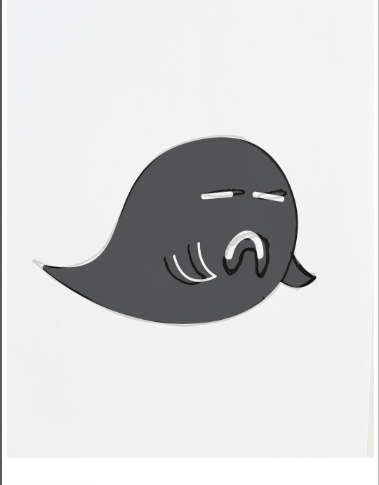
I am very happy with my end result and find it a very strong improvement to my initial sketch. I found it very enjoyable getting lost in the detail, granted there wasn't a whole lot of it, but I think thats what made it fun by the end. given the simplicity of the work, I personally found it more important that I got the features correct or to a standard I was happy with to achieve a satisfactory result. I had a lot of fun during this task and I feel that I blew myself away with just how much I remembered and was able to achieve without too much help. This whole module has been very informative and eye opening to me as an artist/designer and I am very glad to Have this as apart of my tool belt as it was something I'd never considered picking up in the past and I have had a blast getting to know this program and just what it can do for me. I look forward to using these skills in future projects both personally and professionally.
0 notes
Text
Week 5 Homework task - part 2.


For this image, I've decided to go a little out of the box and utilize more in the realm of masks by using hair selection. For this, I have chosen an old image of me behind the shoulder of a friend of mine. The intention with this image is to cut me out of it and place me on a red carpet image of actor Pedro Pascal (it was the first thing to come to mind.)
Seeing as this image is A .CR2 (raw) file, I have to make some adjustments before entering it into Photoshop. I decided to take advantage of this by using this as a way to adjust my image to fit in with my second image in order to give off the effect I am actually present in the photo.

I roughly went around my subject with the Lasso selection tool in order to make up a rough mask.

Before creating my Mask Layer, I decided to clean up my selection area with the Elliptical Selection tool combined with the 'Shift' Key to remove parts of my selection area.

Happy with my Selection, I copy my background layer and create my mask, Adding a layer between both "background" Layers with a pure green layer, This will be used to assist me with painting in and out my layer mask.

With my layer mask selected, I begin painting in (White with the brush tool) and painting out (black) sections of my Mask, mainly focusing on the swoop in my hair, This is a very effective way of masking as it allows you to remove portions of a selected subject making them smoother, more three dimensional and overall more believable when placed into other backgrounds.


With my mask being cleaned up to my satisfaction, It is now time to put it into my main image!

right away I can spot some glaring issues with my selection, there is an apparent outline around some of the features of my subject where I have overcompensated with my Masking and it's too bright, not necessarily matching my background image. To fix this, I went back to my Layer mask and used the Curves layer tool to darken my image in order to make it blend in a little bit more with my base image. I also went back to the brush tool to clean up the outer areas of my subject to get rid of the apparent glow.

Happy with this outcome for the moment. I hide my subject layer and make a selection of the shoulder on the person in the image in order to lay it over top of my subject to further immerse my subject into the background of this image. I also repeat this for the character out of focus to the far left of the image.

After cleaning up the blurred character to the left by using the Eraser with a soft edge, I move focus back to my subject as It still feels like it sticks out too much. I start by again using the soft-edged eraser around the outline. Since my subject is already out of focus, using this method adds more to the blur effect that comes with an out-of-focus subject.

Now begins the experiment. I still want to try and make my subject feel more natural within the image. I begin with the blur tool to solidify the 'out-of-focus' aspect of my subject Seeing as the light source in this image is coming from directly behind, I decide to use the burn tool (8% exposure) to darken my subject due to the fact that if my subject was present, it would be considerably darker with a light source coming from behind. I also used the Dodge tool on the lighter areas to accentuate the light source.


I am overall happy with my final result, it may not be perfect or entirely convincing, but I feel I have done a pretty good job of blending my subject into this image and making it feel as if it was real. I always enjoy exercising my Photoshop skills and this was no exception. I feel after this session I have an even deeper understanding of Photoshop masking tools and other tools at your disposal when working on a project like this i.e. burn, dodge, blur, and selection tools. I definitely feel like this could be improved and I look forward to future lessons going further into these tools and the ways you can sell the believability of your images using them.
0 notes
Text
Fundamentals week 6 - Homework task.
After the last session, we were instructed to improve upon the images that we made in class using the same methods as we were shown. I started by deleting the base shape I had started with in class. This removed the orange backing of my shape and left me with just the added lines and the blue shapes I had added during class. I turned the opacity of these shapes to 50% and continued to fix stray lines from my shapes that didn't line up with the left over middle line.


I did this by adding points (holding the 'alt' key with the pen tool equipped) to my 'problem lines' and conforming them to my curves that ran through the middle of the shape


once I had finished fixing my problem areas, I then filled in the white gaps with Orange to keep up the colour scheme I had previously but have a better and more manageable way of adjusting the colours and opacity.


The left over white areas within my shape was left on purpose as I planned on fixing them the same way I did previously by adding points and moving them the way I needed them.


This method was useful and effective yet not very tidy on account of my outlines poking through and leaving a slightly unappealing look. with my illustrator and Photoshop files still linked, I hit Ctrl + S (save) and checked how it looked on my Photoshop file.

Great! accept the colours seem to blend in too much to the background a little too much for my liking and I feel that instead of Orange it should be something that pops more within the image.

moving back into illustrator, I selected all my shapes and changed them to bright pink, again lowering their Opacity to 50% to give a glassy/see-through feel.

0 notes
Text
Fundamentals Week 6

This week in Fundamentals, we learned about compositing. We first started with an image of a man jumping and were tasked with making a clipping mask and with all tools at our disposal, cutting the man out of the image. I began by using the Quick selection tool which, in the short term, made things very easy when selecting the whole subject in one go but did leave me with a lot of cleaning up to do post-selection. I did this by using a collection of the Elliptical Selection tool, lasso tools (while holding Shift to add to my selection) and my clipping mask to fine-tune my selection.


*examples of areas that needed cleaning post selection*
After this was done we then found an image online to superimpose our subject onto.

For the shape seen in the image above, we then moved into Adobe illustrator and created an S shape that we would use to combine with our subject back in photoshop. By linking our shape to our photoshop project via adobe illustrator, we were album to make adjustments to our shapes and have them translated into photoshop just by saving our changes back in illustrator.


0 notes
Text
Fundamentals Week 5 - Homework task
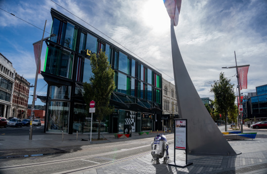
This week for fundamentals we were given the simple task of taking a Subject and placing it onto a background using the skills we were taught during our last session in Photoshop. For my background, I have chosen this image of my own I had taken in the streets of Christchurch.
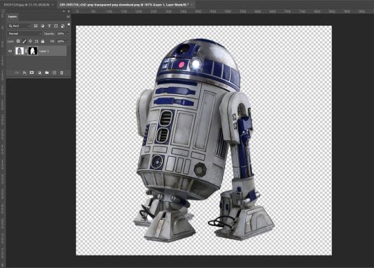
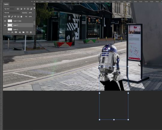
My goal for this image is to insert my subject onto the sidewalk of this image and adjust it in a way that it appears to fit in as if it was there when I took the photo. For my subject, I have chosen this image of R2D2.
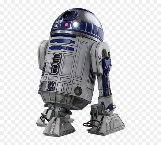
I have various other images of my subject as a backup in the event this one ends up not working the way I want it to, but for now, I chose this image as it fits with the vision I had when brainstorming an idea for this homework task, the angle of which he is facing in this image I think will definitely help sell the overall final product as my goal, again, is to have him blend into the environment as if it were just rolling through when the photo was taken. Another reason this picture was chosen was the fact that it had a solid coloured background which makes it easier for me to select and mask my subject.
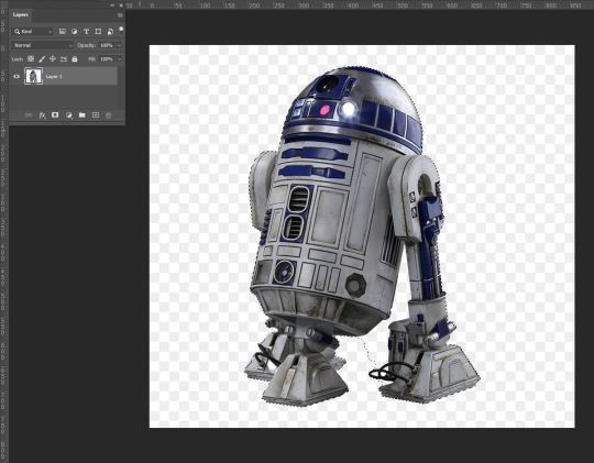
I started by using the object select tool which (thanks to the solid background) selected my entire subject almost perfectly. Almost. Because of this, I then used the 'Magnetic Lasso' tool while holding down the Alt key (PC) to tidy up the selection area toward the bottom right of my subject.
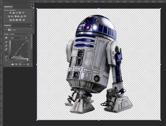
After making my clipping mask I then compared my subject to my background in order to ascertain what adjustments I may need to make before taking it over and placing it into my background image. Given my background image is already edited, I wanted to edit my subject in a way that I would have when I did my initial edit. I first pulled up the Curves palette and boosted the contrast and a little bit of the brightness to have it appear as if they were edited together as one image. I applied my layer mask and put my image over into my background.
Straight away there are a few issues I am noticing, A) there is no shadow, B) it may be just slightly too bright, and C) it sits over the sign within my background image. So first I went back to my subject image and reapplied my layer mask (Ctrl + Z and readjusted my curves
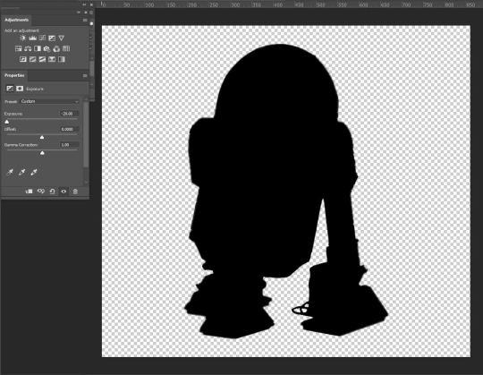
To make a shadow, I went back to my subject layer mask, and using the exposure palette, I created a silhouette. From there I took the eraser tool, decreased opacity by -40%, and put the hardness to 0. Gently going around the edges of my subject I, I softened the outline of what would become my shadow.

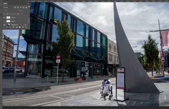
I then re-applied my layer mask and placed my silhouette into my background image.
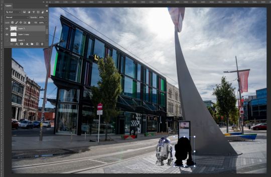
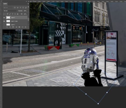
After placing it into the image, I then rotated it on an angle that matched the pre-existing shadows within the image, This was important as, given the time of day, If I wanted to sell the idea of R2D2 actually being in my image when this was taken, the angle and length of the shadow had to match. This was accomplished by Holding down the shift key and then clicking and dragging one of the corners of my image to elongate my shadow. I then flipped the shadow horizontally to create a complete shadow effect of my subject on the ground. Using the eraser tool, I cleaned up the parts that did not line up with my subject.
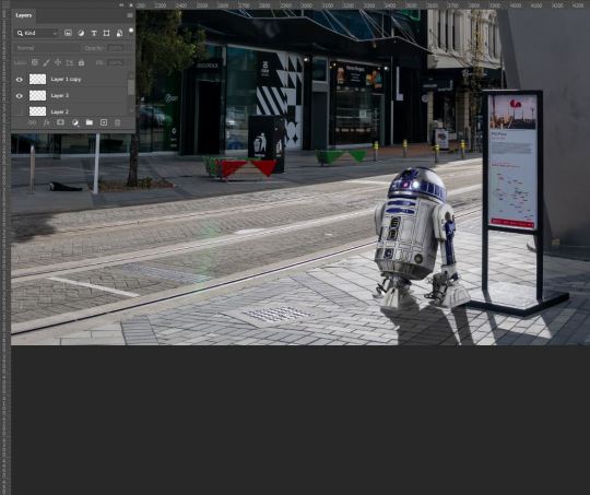
I then decreased the opacity to a point that matched up with the shadows on the ground in order to blend in. I was then faced with a new problem. The colours of the shadows did not match. To fix this, Selecting my Shadow layer, I used the Object Selection tool again to select my entire shadow. I then used the pipette tool to sample the colour of the shadow on the ground and used the brush tool (with my sampled colour and opacity at 61%) to colour in my selection area leaving me with this result.
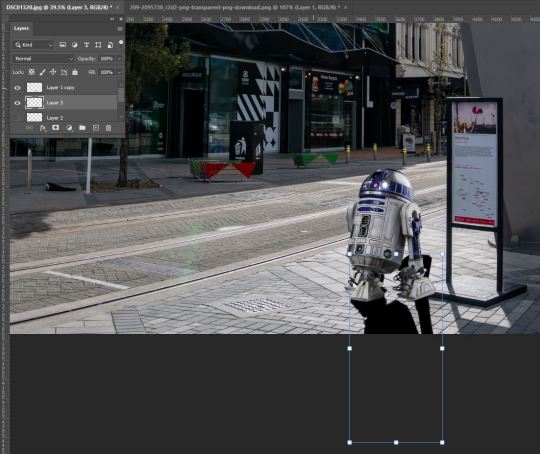
to deal with the issue of the overlapping of my subject with the sign, I want it to be behind he sign to add depth to the image and give it more of a feeling that R2D2 was present.
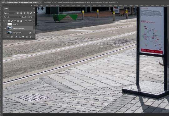
I hid my subject and shadow and again used the Lasso tool to select the corner of the foot of the sign and created a copy (Ctl+C, Ctl+V) to layer over top of my layer.
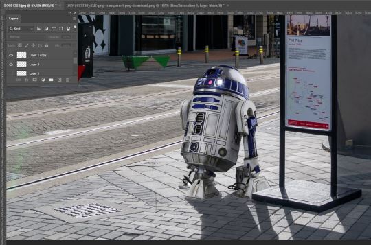
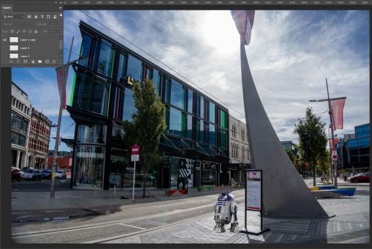
After tidying up This was my final result. Taking into account that my subject still sticks out a little too much for my liking, I then went back in with the object selection tool with my subject layer selected and used the Burn tool to make my subject darker and boost the shadows. This felt necessary as the sun is placed behind my subject and as such should appear a bit darker with the already existing shadows on my subject also being darker.
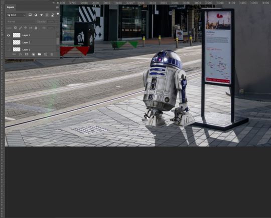
Finished! It's not perfect, but I am overall happy with the outcome. I thoroughly enjoyed this task as with the way I approached it, I was faced with a lot of trial and error and problem-solving which was super satisfying to play around and fix! I am enjoying sharpening my Photoshop skills and look forward to only getting better with these tools and applying them in the future.
0 notes
Text
Fundamentals Week 5 - Photoshop: Selection Tools, Cutting, Pasting, and Blending.

This week in Fundamentals, We continued to dive deeper into the basics of Photoshop and its tools. We began with the different pen tools used for drawing, selecting, Cutting, Copying, Transforming, and altering images.

We began by exploring layers and how they function. by drawing and scribbling on said layers and moving/manipulating them to further understand how photoshop functions. Key shortcuts we were shown are: B - Brush E - Eraser [ , ] - enlarge or shrink pen size (any drawing tool) 1-9,0 - Opacity level V - Move tool (used for moving entire layers) Option + Del - Fill Section with Foreground Command + T - Transform Command + D - Deselect. by the end of this section of the lecture, this was my final result.

Moving on, we were given a series of images to alter using our newfound tools. The first of which was an image of the Earnslaw that we were tasked with multiplying the ship itself and adding to the background of the image making it appear as if there were legitimately two ships in the image.

First, we were to drag our Background Layer from our Layers Palette down to the new Layer option found at the bottom of the said palette in order to create a copy of the layer. We do this to maintain our initial image and in some cases have it as a backup in case things go wrong and we need to jump back to the start of a work. In this case, given the task at hand, had the purpose of being the main image that we would be superimposing our miniature Earnslaw onto.


Next, we used our Square selection tool to make a selection box around our boats in order to make a Mask which we would use to remove the background of the copied image. This was done by using the 'Create mask' button located at the bottom of the Layers palette.


after selecting the masking tool, we were given two additional layers atop our copied layer which we were able to switch between by holding Option and clicking on either of the two options (pictured above). The option shown on the right was our main focus for this work because by using the Brush (B) or Eraser (E) tools were able to add and remove different parts of the mask in order to effectively cut out our image the way we desired. It is worth noting that we had a rather soft brush while doing this so that when placed onto the original image, it would blend in and look more in place than if we were to use a 100% hard brush, giving an unnatural and sort of cut and pasted look to our end result.

The main things we needed to be wary of were the Shadow on the water, the smoke trail, and the ripples in the water as these would be key to keeping the realism to our image. My example here is fairly rough but as you'll see in my final result I adjusted this accordingly. I did this by continuing to use the eraser tool to carefully remove as much of the background (or anything that I didn't list above, really). I also used the Eraser again with a very low opacity which I used to brush over my boat in order to give it a more distant feeling, similar to the mountain in the background.


Onto our next image. Still using Masks, we were shown different ways of selecting and Deselecting. We were tasked with selecting the Orange (pictured above) using the Elliptical Selection tool. Simple at first, yet, our next task was to remove the lemon from our selection so we would only be left with the Orange. It was here we were taught how to add and take away from a Selection. We learned that Holding Option while using the Selection tool again allowed us to adjust our selection area within our image.

From here we realized that our selection area was still not perfect, with some of the Pineapple still present in our selection area, Toby then introduced us to the Polygonal Selection tool which (again, while Holding Option) allowed us to more accurately deselect the areas in question


Once we were satisfied with our selection area, we again created a mask of our image. this left us with just our selected fruits, much like our previous image but instead of superimposing the image onto itself though, we pulled up our familiar Hue/Saturation Palettes.

With our mask layers selected, we then adjusted the Hue Slider which changed the colour of the Orange. I also adjusted the Saturation slider, desaturating the Orange in an attempt to make it blend in more with the other fruit in the image.


We then experimented with different selection tools, namely the magnetic lasso tool, adding them to our masks and repeating the previous process. I personally find this tool the easiest and quickest tool to learn and master within the Selection tool kit as it tends to do a good job of sticking to the object you're selecting, especially if it's on a solid background and isn't too difficult to correct if it begins to go astray.


This may have been the most difficult part for me personally in todays lesson. For our next task, We went back a couple of weeks and used the Pen tool. Much like in Adobe Illustrator, the Pen tool allows you to draw and select parts of images using bezier curves, which if you're a master when it comes to bezier curves; when selecting long flowing objects like the one above they can come out very smoothly. At first, it took me a while to get the hang of it again due to the fact that even though this tool is very similar to Adobe Illustrator, the Pen didn't seem to behave exactly the way it would if used in that program. After selecting our item we then used Image -> Image Select -> to create the selection area we had drawn with our curves.

After again creating our masking layers we then used the Colour Balance palette to adjust the colour of our selected area.

For our final task, we were to cut out the bird in the image above and superimpose it on an entirely different image, altering the shape and colours very subtly in order to make it fit into our second image.
for this, we started by using the object selection tool which, by clicking on our object (the Hummingbird) gave us an outline around our entire object. due to the motion blur on the wings of our object, some more adjusting would have to be done in order to achieve the desired effect we were to achieve.

Again creating a copy of our background layers, we then created our masking layers and created another Layer which we then colour-matched to the background of the image we would be superimposing our objects onto (achieved by using Option + Delete to fill the layer with our chosen colour).


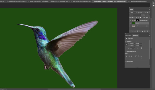

Next, we once again used the pen tool to trace the visible shapes of the hummingbirds' wings in order to get rid of any excess background colour the Object selection tool had missed due to the motion blur in the image. (Again, not so good with the curves so I went back over with the eraser to tidy up the more messy parts of the selection area to give a more natural feel) We then picked up the Blur tool which we used around the edges of our selection to take off the harshness of our mask and keep up the smooth, Blurred form of the wing in addition to using the Brush tool to darken the shadows on the front of our object to make it appear more realistic and give it more depth when placed into our final image.

After applying our layer mask by right-clicking the layer (image not available, ran out of space on post) and selecting "apply layer mask", we rotated our object and were ready to drop it into our second image.
From here we readjusted the sizing of our object and placed it within the image. As a final touch, I used the magnetic lasso to cut off a portion of the flower in front of my object and placed it over top of the beak of the hummingbird to make it appear as if it were drinking the nectar from the plant which I feel definitely gives it a more realistic and convincing appearance. Overall I've learned a lot today, as I always do, during this session with Toby. I do have prior knowledge and experience in using Photoshop but I find in every class that there's always more to know and that knowledge is expanded every week. I look forward to doing more in photoshop in future classes and future potential professional opportunities.
0 notes
Text
Photoshop, Session 1 - Homework Task

This week we were tasked with taking everything we had learned in our session and applying it ourselves to our own images. I am quite confident in this task as I have quite a bit of experience in photo editing although, not in Photoshop! So although I am confident I am equally excited to put these new methods to the test!.
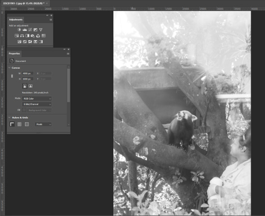
I began with this image that I took recently at Auckland zoo. After converting it from a RAW colour image into a Black and White JPEG, it was time to begin. I chose this image as it was taken through glass which unfortunately resulted in quite a blown-out and over-brightened image which felt like the perfect image to practice using the Curves tool.
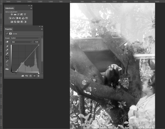
I began by pulling the bottom left node of the Curves Histogram to the right in order to bring more of the darkness into the image and give it more depth/contrast against the hard whites of the glass reflections.

Next, I then placed nodes across the line and first began dragging the light (top right area) parts downward, again, in an attempt to combat the glare coming off of the glass and to try and give more definition of the zoo keeper who was also masked by the glare. moving down the line I continue pulling the nodes downward trying to darken the image while trying to maintain all the information within the image and also tone down the contrast in order to produce a pleasant to-the-eye image. After this I feel I had achieved what I had set out to do, turning the previously harshly bright and almost unreadable image, into a more digestible and crisp image. I feel I were to change anything, I may have maybe brightened it just that wee bit more but even with that in mind, I think I have achieved my goal and have come out with something I am happy with.

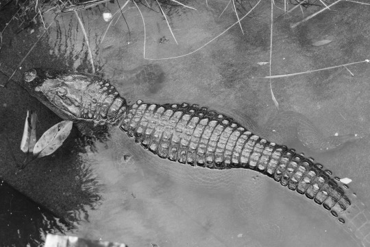
Next on my list was also from my recent trip away to Auckland Zoo of an Alligator. I chose this image because unlike the first, there aren't too many defects to fight within it, aside from the water glare, but I'm hoping by using the Curves tool I can bring out more of the white tones while trying to maintain definition under the water while also beefing up the black tones to make a more powerful, textured, contrasted, black and white working.
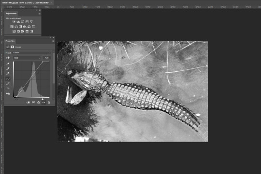
Unlike before, I began by bringing both corners of the histogram closer to where the activity of the histogram was to get a gauge of how these shades were going to cooperate. This produced results very close to what I intended but there are definitely still some issues to iron out. The lighting on the scales of the subject is almost the way I want them to be yet they are just a tad too bright and the details of the subject underwater are not quite as visible as I'd like them to be.
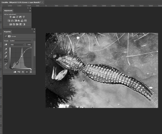
The changes I achieved seem subtle when compared to the previous image but as we were shown during our session, in some cases, just slight adjustments need to be applied to achieve your desired result. I managed to adjust the Curves in a way that I was able to accentuate the submerged parts of the subject adding depth to the image. I was also able to achieve the desired amount of contrast between the lights and darks not just overall but also on the back of my subject. Overall I feel I have achieved my goal.

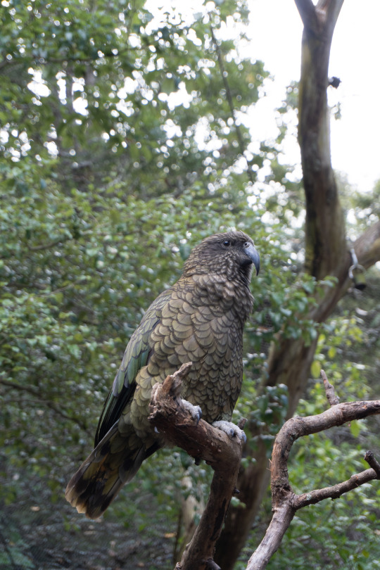
For this next image, I aim to use both the Curves, Hue/Saturation, and Colour Balance tools in order to breathe more color and life into the image. This image is reminiscent to me of a National Geographic image and I aim to edit it as such.

Beginning with Curves, unlike the Black and White images I was editing, there wasn't too much to do with this tool let alone much I could do as it wasn't very hard to start losing the information within the image. My main goal in using Curves was to bring down the brightness of the sky in the top right corner and bring up the shadows within the image to better highlight my subject matter, some changes may need to be made but for now, I move on to Hue/Saturation.
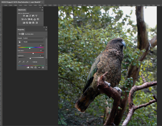
again making very minor adjustments with this tool, by using the Hue slider, I managed to bring out the orange/brown tones on my subject matter and the tree branch it is perched on. I decided to leave it here with this tool for now as any more or any less starts to drastically change the colours across the board leaving me with an undesirable effect. In saying this I think in comparison to the original message, I think I have managed to breathe a bit more colour into the overall image but I'm still not happy with the overall colour. Time for Colour Balance!
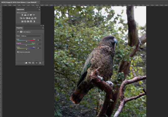
Making small adjustments, I start by tweaking the Mid-tones, moving the sliders into the warmer ends of the spectrum to try and knock out the blue tones within the image. In turn, I ended up adding more colour to my subject which, I this case, I don't seem to mind for the time being given.

the adjustments I made to the Shadows, by accident, returned me with an aesthetic akin to an old colour film still which I found quite pleasurable. Even though I was trying to add more warmth to the image, I am quite pleased with this effect. Typically when I edit my main intention is to get it more to how I would have seen it in person when I took the photo and tend to stay away from stylized editing. This has opened my eyes a little bit and is something I am going to lean into more while editing this image.

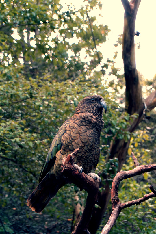
And lean in I certainly did. I decided to test the sliders' capabilities and dragged them in multiple different ways, giving me this. While it is now warmer as I originally intended, I feel it still gives off this old colour film still sort of feel which I'm still loving. As unexpected as this outcome has been, I do feel that it is slightly too dramatic for my taste and I will now go back and do some tweaking to try and make a slightly more organic image while attempting to maintain this Film-esque vibe I have created.

after going back through and making some re-adjustments, this is my final result. Funnily enough, it has come out as somewhat of a combination of both of the above images creating a colour contrast between the shadows (blue) and the Highlights (yellow) that I find quite pleasing and fits my intention of the old style, film-esque feel I was inspired to achieve.
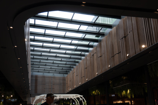
moving away from animals, my next image was taken in the New Market Mall in Auckland. I wanted to choose something more environmental and without a main focus point to give me more to account for/be aware of while editing. right away I know I want to make it more dramatic by accentuating the shadows and highlighting the lights within them. I really like the tone of the image already so colour changes may not need to be made but I'm sure I'll find a way to incorporate it as it may end up adding to my image come the end result.
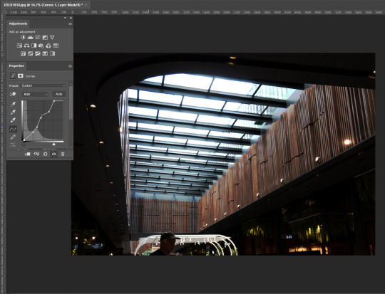
I found curves very useful in this image. Immediately I was able to intensify the light coming through the ceiling creating this great texture and colour I was not anticipating. The lights hidden in the shadows were a bit tricky to work around with curves as it was very tempting to just make it as dark as possible but it made things look and feel quite unnatural.

I pulled up the Exposure tool to balance out the darks and lights in the image by adjusting the Exposure and Gamma Correction sliders which added to the intensity of the blacks and whites within the image. I'm really happy with this image now but as I learned in the previous edit, It's always good to experiment and try everything!
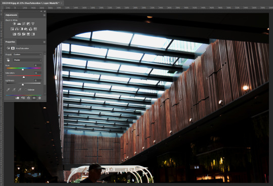
as a result of adjusting the Hue in this image, I managed to bring out more of the colour in the wood and turn the white light from the ceiling into a more of a blue shade which has left me with a colour palette I find quite pleasurable.
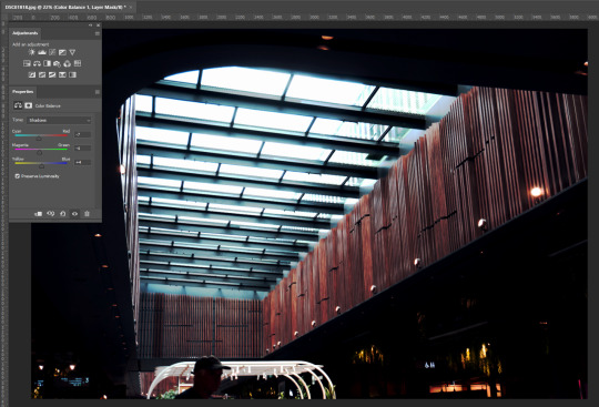
adjusting the Shadows in the Colour Balance tool allowed me to creat an overall feeling for the image. By moving the Colour sliders again to the cooler ends of the spectrum, I was met with a cold flow that matched the light coming from above while not disturbing the reds/magentas in the wood paneling.

Adjusting the Highlights within the colour balance tool allowed me to 'purify' the original colour palette i was working with before using this tool. I was able to work more with the reds/magentas making them stand out more through the blues/cyans aswell as make a more natural and more calm blue from the lights above.
This is my final result. I feel that with all the layers used in the editing process, I may have lost a little bit of detail in the overall image yet overall I am pleased with how it has turned out! I enjoyed this task. Applying what we had learned in class to these images has encouraged me to go a bit more out there with my editing, play with everything and see how it all fits together! Through this, I have made some stylized images I otherwise wouldn't have done using my normal editing process and I look forward to applying this in the future. In saying that, I can definitely see photoshop becoming a more regular tool in my tool belt. not as a replacement but as an alternative. To give different feelings to images. I did find there were times during this task when I would have found Lightroom more useful But nonetheless, I still find Photoshop I useful asset in Photography.
2 notes
·
View notes