
Statistics
We looked inside some of the posts by timtim-101 and here's what we found interesting.
Average Info
Notes Per Post
11
Likes Per Post
11
Reblog Per Post
0
Reply Per Post
0
Time Between Posts
3 days
Number of Posts By Type
Text
3
Video
1
Photo
13
Last Seen Tumblr Blogs


Fun Fact
In February 2021, Tumblr had 518.6 million blog accounts.
Text
Final Links
Jan 2020 - Apr 2020
Dash
Link Dashboard
All Research
Website
Blockframe Prototype
HiFi Prototype
Presentation
Launch Strategy
Launch Strategy
Colophon
Design Report
6 notes
·
View notes
Video
tumblr
Dash Walkthrough
This is a simple walkthrough of Dash. It shows the various features and functionality of the prototype.
You can view the prototype here
3 notes
·
View notes
Text
User Research
Here are a couple of results from my user research I completed with my target audiences. These show some areas I considered when refining the app's design and functionality. I also used this feedback to inform the stats section of Dash. The interviews proved to be extremely valuable for this.
As part of the sessions I got users to complete a SUS questionnaire. This allowed me to obtain a measurable figure for the usability of Dash. It can help me to measure the impact the design changes and refinements have made to the app. Once put through the algorithm, Dash's SUS score came to 96.3. This is well above the target set for good usability (68). I am pleased with how well this has performed.
Find the relevant results here:
Young Driver
Everyday Driver
2 notes
·
View notes
Photo

Mapping
I have been experimenting with how data mapping could be used for insurers and councils to provide information regarding accident zones and road surface quality. Using maps of the local area I played with the use of colour to highlight 'danger areas' and poor quality roads. More could be overlaid on these maps to provide even more in-depth data but as a base, this works well and provides users quick and simple visual feedback that can be interpreted by anyone.
0 notes
Photo


Stats
After completing my user research I analysed the results to help me shape how the stats section would look. Part of the research session was an interview that gave me an opportunity to ask questions around what users would find useful to have in a stat section as well as what would be interesting to give it long-term value.
I also wanted to provide users not only with a view of their own stats but provide a community they could play a part in contributing too. This is where the 'Community' section comes in. This breaks down stats across all users. It shows a counter of how many users there are in total. I hope to add a filter to allow users to break this down into more regional areas for more local stats. Stats can also be sorted by that day, past week, past month, and past year.
As I didn't want to overwhelm users with lot's of content at once I decided to hide more specific data until the users wants to access it. At the top of the screen is a scrolling set of stats that are all-time for the user personally such as total distance. I looked at all sorts of stats that could be presented and how best to display them. I broke these down into four main categories - Distance, Time, Location, and Environment.
0 notes
Photo

Permissions + Onboarding
When working through all the feedback I was given by other designers, I was challenged to look at how to grant permissions in my prototype. I wanted to create a method that would give people a way to receive feedback and allow them to see they had granted the various permissions required by Dash.
I had thought about using a checkbox of some sort to provide feedback but was not sure how to implement it. I came across this checkbox solution on the app Houseparty. As a user clicks to grant permissions a checkbox is filled to show it has been completed successfully. I am going to implement this idea into the onboarding process for Dash.
0 notes
Photo

Signup and Progressive Disclosure
After asking others for advice on how to improve Dash, I received some great responses. I took each piece of advice and created a task list, from this list I investigated each of them to understand their feasibility. Whilst some idea simply did not fit or work for the app, others inspired me to create a better product.
One of these comments was about using the idea of progressive disclosure on the initial login screens. I hadn't come across this term before and so it prompted me to explore and understand this concept in order to implement it.
Progressive disclosure is an interaction design pattern that sequences information across multiple screens, or more simply information is presented in smaller chunks over a number of steps. The idea is that by giving the user less information at once, they will feel less overwhelmed and there fore make it easier for them to interact with. Often this is used to display content to users only when it is required or requested by them.
I thought about the impact this idea could have on the Dash signup process. When users first open the app they are presented with an email input screen where they enter the relevant email address. No buttons need pressed as the app automatically moves the user o the next stage. If the email is registered with an account the user is asked to enter their password otherwise they are prompted to create a new password and accept the terms and conditions. This flow removes the user seeing all the fields at once, it also removes that annoying feeling users get when they cannot remember if they already have an account or not and if so which email is it linked with.
I want to explore how progressive disclosure could be explored further in this process and throughout the rest of Dash.
0 notes
Photo

Notion Planning
To ensure I kept on track throughout the project, I setup a Notion board to track each different type of task. I broke them down into three sections; research, design and testing.
Research consisted of areas and subjects I wanted to research and write about for my blog. I began by simply listing out all the things I wanted to write about, giving me inspiration and direction. These things would provide insights for various aspects of Dash.
Design was all the practical things that would have to be done throughout the project. This includes refinements to the app itself, creating test plans and ideation for new features. This allows me to see a very actionable list of tasks that need to be done.
Teating was all the results I got from my user research and usability tests. This allowed quick and easy access to user input to the project at any time without it getting lost.
This board allows me to keep track of where things are in terms of the project. The red indicates this has not been completed, the amber is been worked on, and the gree means it has been completed. As new ideas come up or problems arise I can make a new card to create visbility of it. This has helped me stay on top of all tasks and track what has been completed overall.
0 notes
Photo

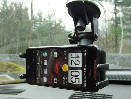

Phone Mounts and Spaghetti Sauce
One of the main points for consideration of Dash will be the phone mount. This is paramount to the success of the app working. The device must be positioned to capture events outside of the windscreen whilst also being kept in place in the event of an incident occuring. To add to this, it must be accessible in certain ways to the user, not so out of reach that it feels uncomortable for them to access and make use of, I want Dash to be a passive experience for them to the point that they don't even have to think twice about using it while driving.
I looked at some various ideas for phone mounts that could provide inspiration for the Dash mount. When thinking through this I had to consider how to make this a universal product that fits an ever changing range of car interiors. How do I think of something that works in every single car?
As I was thinking through this question, I remebered back to a TED Talk by Malcolm Gladwell entitled 'Choice, happiness and spaghetti sauce'. In this talk he refers to a gentleman by the name of Howard Moskowitz. Howard Moskowitz is a psychophysicist and most famous for reinventing spaghetti sauce for Prego. He come to the conclusion for Prego that to provide everybody with happiness they must provide them different choices, you cannot please everyone with one universal option. Although my question wasn't directly related to happiness (or spaghetti sauce) it made me think that I didn't need to have a single solution to the phone mount problem. There could be a range of different mounts to suit individual car needs such as stuck on the dashboard or stuck onto the windscreen.
I looked at a couple of options to get some visual ideas for possible solutions. My favourite solution is the top picture. This mount gives drivers flexibility to change the postion it sits in, it can also be used both on a dashboard or windscreen. The main long arm of this mount is also detachable providing the user with a shorter arm similar to that seen in the middle image. This mount provides a stable and strong mount for a device to be set into for any journey a user may take.
0 notes
Photo

Dash Stats
Part of Dash I am currently developing is the stats section. This will give users a view on various facts and data collected by the app. I want to make this an area that gives both useful stats but also interesting ones that add delight to the experience to encourage them to keep using the app.
I plan to have two sides to the stats; personal data that is collected about that specific user and community stats, these are a collective of stats that each driver contributes to.
I would like to give users freedom in these community stats to filter them down by locations as well as seeing them as a whole. This could provide some interesting insights for them to view.
This collection of wider would also be a useful source of information for other organisations such as insurers and councils. Using the data anonymously, it could provide a resource for better understanding driving habits and average figures.
To understand which stats Dash should present, I have been asking users this question as part of the user research interviews. At this point I have taken part in a few sessions but have more lined up in order to get a fuller picture. Once these have taken place I will have a solid understanding of what could be presented in Dash. I already have a few thoughts but want the needs of the users to be met over my own preferences.
In time these stats could be featured in an email update for all users to keep them thinking of Dash. This is seen for users of Nest products which updates users on the community stats adding some interest and brand buy in. These figures could also be used as a hook to get them to read your email updates.
Personal Stats
Average journey distance
Average journey time
Total distance travelled
Total journey time
Distance of The Great Wall of China have you driven?
Total number of locations visited
Most popular locations to visit
Amount of CO2 produced
Total number of recordings
Common driving tips collated from all journeys
Community Stats
Total distance travelled
Total journey time
Distance to Mars travelled
Total number of recordings
Amount of CO2 produced
Most popular locations to visit
Most travelled countries
Total number of users
0 notes
Photo

Collecting User Data Correctly
TL;DR Get users consent, don't confuse them with your copy and be strict about access to data
"People have entrusted us with their most personal information, we owe them nothing less than the best protections that we can possibly provide by harnessing the technology at our disposal. We must get this right. History has shown us that sacrificing our right to privacy can have dire consequences." Tim Cook, CEO Apple
In a time when data breaches are frequent and privacy is more valuable than ever, collecting user data needs to be done sensitively in order to create trust.
Dash hopes to give users various stats about their personal driving as well as their part in a wider community but in order to this effectively specific data will need to be collected, processed and stored to provide accurate and interesting stats. To do this I need to consider the best way to do this for users of the app and understand what builds trust with users.
Consent
Make sure to obtain proper consent from users, allowing them to be fully aware of where they stand in terms of data collection. Don't confuse them and present all sorts of strange options, give them clear options to choose from. Always assume they are out and offer them the chance to opt-in this way there can be no accidental data collection. This is an active method meaning collection only happens by their choosing.
Copy
Consider all of your copy when communicating with users about what is going to be collected. This aspect relates closely with obtaining consent, make sure the copy clarifies not confuses. Tell users what is going to be collected and how it will be used. Radical transparency is valued with users these days and by being upfront and honest in your copy it builds trust with users, empowering them to make the choices they want whilst feeling in control.
Access
Control and monitor carefully who has access to the data once it has been collected. By keeping it secure, this will help give reassurance to users that their data is not being sold or used in any way against what they agreed to. Building a reputation for not mistreating user data can become valuable in the long run with customer satisfaction and retention.
Whilst these ideas may seem simple and basic, many companies are not acting with these best intentions in mind. They are using data to pull in extra profit. This has come to light more significantly in the past few years with companies such as Cambridge Analytica and Equifax hitting the headlines, making users more aware of their need for privacy.
When collecting the user data for Dash I will be considering each of these areas to ensure collection is done in an ethical manner. I want Dash to be a truly transparent company with it's users, allowing them to feel a part of something bigger.
0 notes
Photo

Launch Strategy
When a product is launched it needs to have a strategy in place. This allows for effective communication of the brand to its users. This will include a number of different methods to be used to promote the product and brand.
To help launch Dash, I have put together a number of different ideas of how this could happen. It includes social channels, brand promotion, merchandise, and pricing. Each of these will have an effect on how successful the product could be when presented to consumers.
View the full strategy here
0 notes
Text
Design Refinements
To help refine my product I posted the Dash prototype on the NI Design Slack, a community of designers based in NI. I wanted to get some advice from them as to areas that could be improved and adapted to create a better experience. This digital critique raised some interesting ideas and questions for me.
I am going to investigate the suggestions and use these alongside the results of my user research to make improvements to the Dash app.
0 notes
Photo
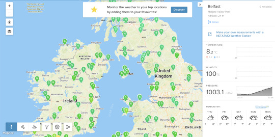


Netatmo Data Collection and Mapping
Netatmo is a French company which manufactures smart home devices. One of their products is a Smart Weather Station. This product allows you to monitor all of the parameters of your environment. The main pack contains a Netatmo Weather Station, a Rain Gauge, and a Wind Gauge for your home. Not only does this product capture and synthesise the weather at your location, it also publishes this data to a wider weather map that can be accessed by anyone.
The weather station connects to your smartphone via an app and can provide you with real-time updates and forecasts tailored for you. This gives the user a great personalised experience unique to them.
The wider collection of data allows a Netatmo weather map to be created. This can be accessed by anyone regardless of whether they have a weather station or not. This provides an alternative to common sources for forecasts such as BBC Weather and Accuweather. The interesting concept behind this and the appeal for users is how much more personal the forecast can be. Whilst BBC and Accuweather provide information within a certain accuracy, Netatmo can provide stats and forecasts to your exact location due to the number of weather stations collecting data.
The extra stats are also a draw for users as they don't normally get this sort of information such as humidity, pressure, and exact temperature at that precise moment.
This is a great example of wide-scale data collection. It shows how useful data can be when it is mapped out relevant to each other. Where the individual weather station provides a great experience for that single user, the collective of data provides multiple users with an even more valuable set of data. It could also encourage others to purchase their product to have their own location on the map.
0 notes
Photo

Data Visualisation
What is Data Visualisation?
Data visualisation is the graphical representation of information and data. By using visual elements like charts, graphs and maps, data visualisation tools provide an accessible way to see and understand trends, outliers and patterns in data. It provides an often simpler and quicker method for viewing large sets of data.
What are the Benefits?
Our brains can process visual information much quicker than when it is written down. It allows us to make data-led decisions much quicker and get a summary of patterns
It can provide a more creative way to present statistics and figures back to others. It can make this data more memorable for those looking at it and therefore create more of an impact
It allows us to easily understand trends in the data and form more meaningful relationships between it
It makes it more visible to others and can allow there interpretations to be voiced, which can add value to the overall understand and insights seen in the data. This also makes sure less insights are missed due to a lack of understanding or tunnel vision
Common Types of Data Visualisation:
Charts
Tables
Graphs
Maps
Infographics
Dashboards
How Does This Relate to Dash?
As part of Dash, I want to include some stats and data for the user. This adds retention value to the app and can incentivise users to continue using it. I want to provide understandable stats that relate on a personal level with each user whilst also showing their contribution to the Dash ecosystem as a whole.
To do this right, I am going to interview users and understand what stats would be important for them to know and what data they would be interested in seeing. This will give me an idea of places to begin. I also need to consider what data could actually be collected by a phone and use this to have an influence on the answers from the user interviews.
0 notes
Photo

Dash Button vs Dash Smart Watch
Whilst considering accessories to go along with the main Dash app, I had considered an alternative way to begin recordings for users. I did some research and talked to numerous different people to understand what solutions could work best. This resulted in the discussion of whether it could be presented as a smart-watch app.
This ideas was interesting as the smart-watch industry is booming right now. However I came across a couple of problems with this solution.
When looking into the laws views of smart-watches this made me very aware this would not work. Use of a smartwatch while driving is not banned outright - but improper use could result in charges for:
dangerous driving
careless and inconsiderate driving
failure to be in proper control of the vehicle
driving without due care and attention
Due to the nature and mission of Dash, to encourage better driving, creating distractions for drivers would be a serious flaw.
Another problem that arose was for the users that do not have a smart-watch. This could limit the number of people who are able to use this feature. Although it is a huge industry right now, not everyone has access to one. By using a more generic wireless button it give more people access and provides an unlimited market opportunity.
After considering this I felt that the best way to move forward was a simple wireless button, removing all distractions from the user and providing an easy way to record.
0 notes
Photo

Wireless Dash Button
Originally launched by Amazon, on 31st March 2015, in the United States, the Amazon Dash button is a small, Wi-Fi enabled device that has been designed to enable to make the ordering of products as simple as possible. Typically used for household products such as detergents, dishwasher tablets and cosmetics, the Amazon Dash button is designed to be hung or stuck near to frequently reordered products.
This button gave me inspiration for Dash. To help encourage drivers from not using their device at all whilst driving, they could connect a similar button via bluetooth and use this as a way to start recordings. This button would provide a simple, distraction-free alternative.
Similar to the original button, it would have two different functions. If the main button is pressed Dash will begin a recording. But if the logo is pressed, it will launch the Dash app on the users phone allowing for quick access when in the vehicle.
Due to it's size and the wireless connectivity, the button could be placed anywhere in the users vehicle allowing it to sit in the most convenient location for all users whether this be the sun-visor, steering wheel, or on the dashboard.
I have based the initial design and concept off the original Amazon Dash Button as it is an intuitive design and work well for this purpose. It also has been discontinued as a physical product by Amazon, leaving it an open opportunity.
0 notes