
Don't wanna be here? Send us removal request.
Statistics
We looked inside some of the posts by tjcapo and here's what we found interesting.
Average Info
Notes Per Post
0
Likes Per Post
0
Reblog Per Post
0
Reply Per Post
0
Time Between Posts
9 days
Number of Posts By Type
Text
17
Last Seen Tumblr Blogs


Fun Fact
China blocked Tumblr because of pornography and censorship problems in 2013.
Text
Title and Introduction
Title: The Association Between a Person’s Education Level and Whether or Not They Received a Flu Vaccine
Research question: What is the association between a person’s self-reported education level and whether or not they received a flu vaccine?
The purpose of the study was to identify the best predictors of whether or not respondents received H1N1 and flu vaccinations based on a number of factors, including behaviors and demographics.
With the current Covid-19 pandemic, and the development of a corresponding vaccine, the willingness of participants to get this vaccine in the coming months is going to be a major factor into how quickly society gets back to normal. Understanding the factors determining which portions of the population received past voluntary vaccines will be important to know, and with my past work in community outreach I hope to be able to increase people’s motivation to receive a Covid-19 vaccine.
I specifically want to learn how education level plays a part because access to and achievements in education could correspond to awareness of health risks. Understanding the varying willingness to get a vaccine may also help current vaccine distributors develop the right outreach strategies based on a person’s education level.
0 notes
Text
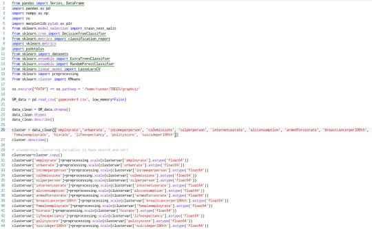
Machine Learning Week 4
This week I conducted a k-means cluster analysis in order to understand the similarity of responses for 14 quantitative variables and their relation to relectricperperson, a quantitative variable describing how much electricity is used per person in a country. I used python to analyze these variables, which came from the gapminder dataset. In the input below, I cleaned, clustered, and standardized all of the dataset’s variables other than relectricperperson itself:
Next, the k-means cluster analyses were conducted, before plotting the variance of the clustering variables. The following code conducted this analysis and then produced an elbow curve:

The elbow curve below was fairly conclusive in that the visually most significant bend happens at 3 clusters. I therefore aimed to further interpret the 3 cluster solution.

The following code was for producing a scatterplot based on canonical discriminant analysis, specifically using the 3-cluster solution:

Below is the scatterplot. The clusters themselves are not so densely packed, which may indicate that the observations within the clusters are not tightly correlated, as there is high in-cluster variance:

Next I produced code to further evaluate the variance within clusters, specifically the pattern of means on the clustering variables:

The results are below. What we can see is that countries in cluster 0 had the lowest employrate, co2emissions, femaleemployrate, and suicideper100th, but the highest armedforcesrate. Cluster 1 had the lowest urbanrate, incomeperperson, oilperperson, internetuserate, alcconsumption, armedforcesrate, breastcancerper100th, lifeexpectancy, and polityscore, but the highest employrate, femaleemployrate, hivrate, and suicideper100th. Cluster 2 had the lowest hivrate and the highest urbanrate, incomeperperson, co2emissions, oilperperson, internetuserate, alcconsumption, breastcancerper100th, lifeexpectancy, and polityscore:

Finally, I wrote python input to understand how the clusters differ on relectricperperson with an analysis of variance, means tables and a tukey test:

The p-value from the analysis of variance, well below 0.05, indicates that the differences between clusters was significant.
The means by cluster shows that cluster 2 had by far the highest average relectricperperson. This is not surprising since this was the cluster with high levels of other potentially energy-related variables including urbanrate, co2emissions, and oilperperson. Meanwhile, cluster 1 had the lowest mean relectricperperson while being low in other energy indicators.
Finally, the tukey test shows that the highest significant difference between clusters is between clusters 1 and 2, which seems to vibe with the means results.

0 notes
Text
Machine Learning Week 3
My first step this week was ensuring I had usable variables. I used the same panda cut process I have in similar weeks to turn the Gapminder dataset’s quantitative variables into binary categorical variables, but this time used 14/15 possible variables (with relectricperperson remaining as the quantitative target variable). All of the binary variables I created end with a 2 (e.g. income2).
The variables are economic, social, and environmental indicators from 213 countries and territories, with the binary versions indicating whether they are below or above average (a result of 0 or 1). Income2, for example, indicates whether a country’s income per person is below or above the worldwide average. Emissions2 indicates whether a country’s CO2 emissions are below or above average, while suicide2 indicates whether a country’s suicides per 100 people are above or below average. Additionally, the predictor variables were all standardized so that they have a mean of zero and a standard deviation of one. Below is my python coding for the initial data management.

Next I used python code to obtain the regression coefficients:

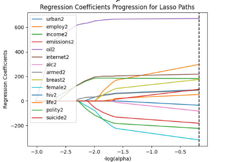
Based on the output of regression coefficients, all 14 binary variables remained in the final predictive model. Oil2 had the highest association with relectricperperson based on its positive 671.9 coefficient, followed by female2 (negative association, -318.5), employ2 (positive, 297.6) and polity2 (negative, -224.2):

Next I aimed to plot the progression of these regression coefficients using the following code, slightly altered to from the videos to include a legend:
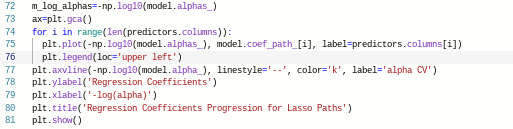
The resulting graph is below. Oil2, having the largest regression coefficient, comes first as the purple line. We can see that as more variables are added, each regression begins to level off.
Then I plotted the change in the mean square error at each step of the selection process for the penalty parameter alpha:

The graph below shows that there is a good amount of variability, though some of the mean square errors follow a pretty similar path, especially at the beginning. For some of the variables, there is actually an increase in MSE as more predictors are added, but in the end they all level off - indicating that more predictors would not change much.

Finally, I printed the average mean square error and r-squared for the training and test data:

We can see that the MSE for the test data was not nearly as high as that for the training data, though both are quite high. Meanwhile, the r-squared value is only a bit lower for the test data. The model explains 53.9% of the variance in relectricperperson for the training data and 51.6% for the test data:

0 notes
Text
Machine Learning week 2
I ran my random forest this week while continuing to focus on the relectricperperson variable from the Gapminder dataset. Using the panda cut tool in python, as shown below, I turned it into a binary categorical variable called electric2. I used the same cut tool to develop binary versions of other variables from the dataset as well, though ultimately did not use them all for this assignment.

Below is the code for producing the confusion matrix, accuracy score, and feature importances. As can be seen, electric2 was my target variable, while urbanrate, employrate, incomeperperson, co2emissions, oilperperson, and internetuserate were the predictors:

The confusion matrix below shows 82 true predictions, giving us about a 95.3% accuracy score. Then we can see which predictor variables have the highest importance in the model. The most important predictor seems to be internetuserate, with a score of .323. This is followed by (in order of most to least important) incomeperperson, oilperperson, urbanrate, co2emissions, and employrate.

My python code was then used to produce a random forest classifier, with 25 different accuracy values:

The plot graph output is below. We can see that with one tree, the accuracy was about 91%. It grows as high as about 96% as more trees are added, but also reaches as low as about 89%. As most of the accuracy scores hover around 94% or above, it seems likely that multiple tests are indeed beneficial.

0 notes
Text
Machine Learning for Data Analysis Week 1
For decision trees, I continued to use the gapminder dataset while focusing on relectricuse per person. For the purposes of having trees that will split in a logical way, I needed to clean up my data first. As can be seen, I took multiple quantitative variables, including relectricuseperperson, and used the panda cut function to turn them into binary categorical variables:

After testing out using multiple combinations of these variables, including using all of them at once, ultimately I decided to focus on urban2 and employ2 as my tree’s predictor variables since those are the ones I’ve been studying in previous courses (and to keep my tree from getting too huge and crazy). Below is the code for setting predictors, classifiers, and getting the data needed for producing a tree. For good measure, I also used code to get an accuracy score:

Unfortunately, with the version of python I have, and the operating system I use, I was never able to get graphviz to work within python. I was, however, able to get output for the code that would go into graphviz, and thanks to help from the discussion forums I was able to find a web alternative where I could produce a tree with that code. Here is my output before creating the tree:

Apart from the resulting code for producing a tree, we can also see that the accuracy score is 80.23%. Meanwhile, the tree I produced is below:

The decision tree’s binary target variable is electric2, which is split into countries with above or below 1000 kWh use per person, while the predictor variables are urban2 and employ2. As we can see, the tree starts with urban2. For countries with urbanization rates below 50%, the tree splits to the left. This is 40.9% of the sample, while 59.1% have higher rates and split to the right.
From there it splits again based on employ2. On the bottom far left are countries that have urbanization and employment rates both under 50%. This is only 3.1% of the sample, but 100% of these have electric use below 1000 kWh per capita.
The next block to the right shows that 37.8% of countries have low urbanization but high employment. 95.8% of these countries have low electricity use per capita.
Next we see that 14.2% of countries have high urbanization but low employment rates. Of these, 77.8 % have electricity use below 1000 kWh per capita.
Finally, on the bottom far right, we see that 44.9% of the sample have urbanization and employment rates both above 50%. Of these, 61.4% have low electricity use per capita.
0 notes
Text
Regression Modeling Week 4
Since I am using the gapminder dataset with only quantitative variables, I first used python to bin my employrate, urbanrate, and relectricperperson variables to make useable for categorical analysis.

For the OLS regression, I specifically used my new “employment” variable that uses 0 to 33% employment as the default (0) response (reference).


We can see that there are two regression coefficients listed, using 0 to 33% employment as the reference. While the 67-100% employment group is significantly significantly different from the reference group based on a p-value of 0.002, with a positive association. However, the 33-67% group is not statistically significant (p-value 0.372.
I then added code to use the middle group (33 to 67% employment) as the reference:

In this case, neither comparison group has a statistically significant difference from the reference group, as the p-values for both are 0.076.
I now move on to the logistical regression, which uses categorical response variables. The binary variables I used through binning above will come into play here.


We can see that using the electric2 variable I created as the response variable, and urban2 as the explanatory variable, there are 130 observations. The regression here is significance, with p-values of 0. There is a clear positive association, and the results support my hypothesis that there is an association between urbanization and electricity usage. The linear equation here would be electric2 = -2.89 + 2.72 * urban2.
However, since this is using categorical variables it is best to think about this in terms of probability. Therefore, I developed odds ratios and confidence intervals:


The odds ratio here suggests that countries with high urbanization rates (more than 50% urbanization) are 15.12 times as likely to have high electric usage (more than 1000 kWh per person) than countries with low urbanization.
And according to the 95% confidence intervals, countries with high urbanization rates (more than 50% urbanization) are anywhere from 3.44 and 66.54 times as likely to have high electric usage (more than 1000 kWh per person) than countries with low urbanization.
These results back up my hypothesis that there is an association between urbanization and electricity usage.
I next developed a logistics model, odds ratio, and confidence interval adding my employ2 variable to test for confounding.


Here we can see most notably that effect of employ2 is not significantly significant (p=0.263), whereas urban2 remains statistically significant; we can therefore reject employ2 as a confounder.
In spite of this, in an effort to understand the odds ratios and confidence intervals I still studied these results. According to the odds ratios, countries with high urbanization rates are 15.7 times as likely to have high electric usage while controlling for employment. Countries with relatively high employment (above 50%) are only 1.8 times as likely to have high electricity usage as those with low employment. However, because the confidence intervals overlap, we cannot confidently say that either variable is more associated with high electricity usage.
0 notes
Text
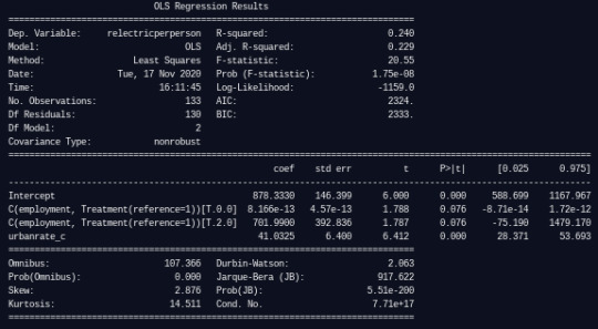
Regression Modeling in Practice Week 3
This week I continued to use python to analyze the association between the gapminder dataset’s variables urbanrate and relectricperperson, as well as the potential confounder employrate. My first regression model demonstrated the levels of association:


The p-values for urbanrate_c, as well as the potential confounder employrate_c, are both below 0.05. They both also have positive parameter estimates (6.741 and 3.097 respectively), while the coefficients are similar (41.12 and 42.56). We can conclude that urbanization rate is positively associated with relectricperperson after controlling for employment rate, while employment rate is also positively associated with relectricperperson after controlling for urbanization rate. It therefore seems that employrate is not a confounder for the relationship between urbanrate and relectricperperson.
Based on all of this, I can also accept my hypothesis that urbanrate is associated with relectricperperson.
I used a scatterplot to visualize whether a linear model is in fact the best model to use to view the association between urbanrate and relectricperperson. As an alternative, I produced code to view the scatterplot with a quadratic line, which appears to be the better fit:


I therefore reproduced the linear regression model for urbanrate and relectricperperson, followed by an additional regression model that includes a second order polynomial with urbanrate squared:


The results of the polynomial regression model shows that the linear coefficient is 35.76 while the quadratic coefficient is only 0.55. Furthermore, the r-squared value of the polynomial model is 24.9% while the linear model is only 22.1%, indicating that the polynomial model indeed captures more variability.
I then developed another regression model with employrate_c added:

The intercept of this model is 844.62, meaning the relectricperperson of a country is about 844.62 when employrate and urbanrate are at their means. In this case, while the r-squared value is 28.5% indicating a higher capture of variability, not all variables are significant since urbanrate squared has a p-value of 0.176.
To evaluate the model, I developed a q-q plot:
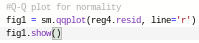
The q-q plot for the regression model shows that the residuals follow a pretty straight line, but with some clear variation especially at the lower and higher quantiles. This likely means that the quadratic urbanrate does not fully estimate the curvilinear relationship observed in the scatterplot, and there might be other explanatory variables that could improve my estimations.
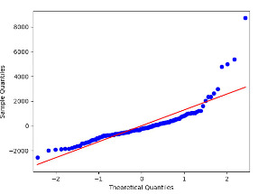
To further evaluate my model fit, I developed a simple plot of residuals:

The resulting graph shows that most observations fall within -1 and 1 standard deviations, and a further number fall between -2 and 2. However, there appear to be a fair number of outliers that fall as far as 6 standard deviations away.
Next, I used my python code to create additional regression plots:


The plot in the upper right hand corner shows the residuals for different levels of urbanrate. The absolute values of the residuals get higher as urbanrate increases, which suggests that relectricperperson is best predicted in countries with low rates of urbanization. The plot in the lower left corner, the partial regression residual plot, shows the relationship between urbanrate and relectricperperson while controlling for employrate. This similarly shows that relectricperperson is still best predicted in countries with low urbanization rates.
Finally, I developed a leverage plot:

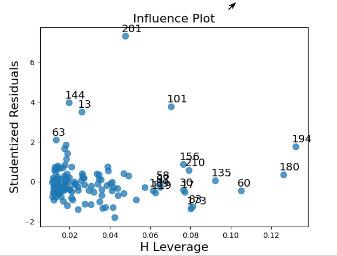
It shows that there are a number of observations that are outliers, with standard deviations not between -2 and 2, which we already identified. There are also, however, many other observations with higher than average leverage, and which are not outliers based on standard deviation.
0 notes
Text
Regression Modeling in Practice Week 2 - Code/Output
Code

As can be seen in the code, before the actual regression analysis I first centered the explanatory variable, urbanrate. Since it is a quantitative variable, I did this by subtracting the mean so that the mean would then be close to 0.
Once I did this, I wrote the code for the regression analysis using the smf.ols function with both variables, and printing a summary. Below is the output for my code:
Output

0 notes
Text
Regression Modeling in Practice Week 2 - Centering
Since urbanrate is a quantitative variable, I centered it by subtracting the mean so that the new mean would then be close to 0. It can be seen that the new mean for urbanrate_c after centering is 3.36e-15, which is basically 0.


0 notes
Text
Regression Modeling in Practice Week 2 - Results
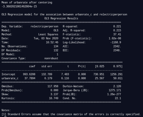
In the regression results above, we can see that the number of observations included in the analysis is 134. The F-statistic is 37.41, while the p-value 1.02e-08, which is far below 0.05. Thus, we can reject the null hypothesis and conclude that there is a significant association between urbanrate and relectricperperson.
We can further see that the p-value for the coefficient outputs is p < 0.0001
The R-squared 0.221, which means that this model accounts for about 22% of relectricperperson’s variability.
The coefficient for the centered urbanrate is 37.3894, while the intercept is 993.6202. This means that the equation for the best fit line is relectricperperson = 993.6202 + 37.7894*urbanrate_c.
Using this equation, we can predict a country’s relectricperperson by plugging in the urbanrate. Note that since this equation is based on a centered urbanrate, I must subtract the mean urbanrate (which is 56.769) from whatever number I plug in. Thus, for an urbanrate of 75% the solved equation would be: relectricperperson = 993.6202 + 37.7894 * 75 - 56.769 = 1682.56.
Therefore, the expected relectricperperson for a country with an urbanrate of 75% is about 1682.56. Of course, this only means that this is the value that would rest on the best-fit line, and it is not an observation or perfect prediction.
Overall, these findings from my linear regression model indicate that relectricperperson is significantly and positively associated with urbanrate.
0 notes
Text
Regression Modeling in Practice Week 2
For this assignment, I used the explanatory variable urbanrate and the response variable relectricperperson. I used the following python code for my regression analysis:
#Code

As can be seen in the code, before the actual regression analysis I first centered the explanatory variable, urbanrate. Since it is a quantitative variable, I did this by subtracting the mean so that the mean would then be close to 0.
Once I did this, I wrote the code for the regression analysis using the smf.ols function with both variables, and printing a summary. Below is the output for my code:

At the top, it can be seen that the new mean for urbanrate after centering is 3.36e-15, which is basically 0.
In the regression model that follows, we can see that the number of observations included in the analysis is 134. The F-statistic is 37.41, while the p-value 1.02e-08, which is far below 0.05. Thus, we can reject the null hypothesis and conclude that there is a significant association between urbanrate and relectricperperson.
We can further see that the p-value for the coefficient outputs is p < 0.0001
The R-squared 0.221, which means that this model accounts for about 22% of relectricperperson’s variability.
The coefficient for the centered urbanrate is 37.3894, while the intercept is 993.6202. This means that the equation for the best fit line is relectricperperson = 993.6202 + 37.7894*urbanrate_c.
Using this equation, we can predict a country’s relectricperperson by plugging in the urbanrate. Note that since this equation is based on a centered urbanrate, I must subtract the mean urbanrate (which is 56.769) from whatever number I plug in. Thus, for an urbanrate of 75% the solved equation would be: relectricperperson = 993.6202 + 37.7894 * 75 - 56.769 = 1682.56.
Therefore, the expected relectricperperson for a country with an urbanrate of 75% is about 1682.56. Of course, this only means that this is the value that would rest on the best-fit line, and it is not an observation or perfect prediction.
Overall, these findings from my linear regression model indicate that relectricperperson is significantly and positively associated with urbanrate.
0 notes
Text
Regression Modeling in Practice Week 1
Sample
The sample comes from the Gapminder dataset, which is a collection of socioeconomic indicators from countries around the world. Each country serves as the unique identifier for every record in the data set. 213 countries (observations) are represented in the sample, including all 193 United Nations members as well as other non-UN locations. Data on social and economic indicators is aggregated for each country from other sources. For my analytic sample, I am using every country in the dataset and three indicators: employrate, urbanrate, and relectricperperson.
Procedure
Gapminder began to use data reporting to collect indicators from various external sources in 2005, based on a goal to understand and promote sustainable development around the world. Observational data was drawn from sources such as the International Labor Organization, the World Bank, the United Nations, and the International Energy Agency (among many others, but these are a select few relevant to my variables), from 2005 to 2011 and beyond. The data was collected by Gapminder in Stockholm, Sweden. One year of data was collected for each of the various indicators, which suggest health, wealth, and development levels for a country. While not all indicators are available for each country, any data point that was available for a given country was included.
Measures
My first explanatory variable, employrate was assessed using data from the International Labor Organization, and indicates the percentage of a country’s total population, aged 15+ years, that was employed during the given year (2007). This has an quantitative, open-ended response scale, though I have managed the variable by making it categorical using a panda cut function.
My second explanatory variable, urbanrate measures the percentage of people (in 2008) living in urban areas, which are defined by national statistics offices and calculated using World Bank population estimates and UN World Urbanization Prospects. This has an quantitative, open-ended response scale, though I have managed the variable by making it categorical using a panda cut function.
My response variable, relectricperperson indicates how much residential electricity was consumed per person during the given year (2008), with data collected from the International Energy Agency and measured in kWh (kilowatt-hours). This has an quantitative, open-ended response scale, though I have managed the variable by making it categorical using a panda cut function.
0 notes
Text
Data Analysis Tools Week 4
This week, I used python to determine whether urbanization is a moderator in the association between employrate and relectricperperson, in the Gapminder dataset.
For these quantitative variables, I ran a correlation coefficient between employrate and relectricperperson within different subgroups of urbanization. As can be seen in the code below, I started by ensuring my data was numeric, cleaning all of the data by dropping na values, and testing the correlation coefficient without any moderator.
I then split urbanization into groups by defining an urbgrp variable, using if statements based on percentages with corresponding responses of 1, 2, and 3. I called for counts of each urbgrp response, created sub datasets using each urbgrp response, and printed a new correlation coefficient for each subgroup:

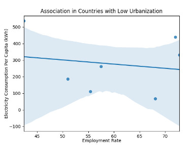
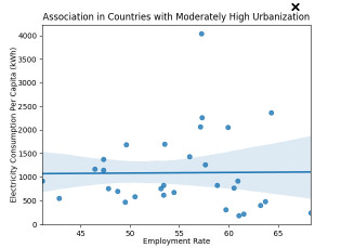
As can be seen, at the top of the results below, there is a small (.27) and significant (p-value 0.04) association without any moderator. With urbanization as a moderator, on the other hand, there is only a significant association between employrate and relectricperperson when countries have a very high urbanization rate (urbgrp 3, those countries with 75% or more). The association is 0.49, which seems moderate. But for countries with low or moderately high urbanization rates, the association is quite low and the p-values are more than 0.7, meaning I cannot consider these significant. For low urbanization, this could possibly be the result of the relatively low count of countries (only 7, as can be seen in the value count for urbgrp 1).
***note that the text in red is the same as what showed in the lesson videos, and does not seem to indicate any errors but rather a note or suggestion.

For good measure, I produced scatterplots for each subset of my data, using the seaborn tool in the code below:

The scatterplots illustrate the weak associations when there is low and moderately high urbanization, with stronger association for very high urbanization:

0 notes
Text
Data Analysis Tools Week 3
This week, using python, I continued to analyze relationships between employment rate, urbanization rate, and electricity use per capita for countries in the gapminder dataset. For this lesson, I was able to use the original variables employrate, urbanrate, and relectricperperson.
Below is the syntax I used for getting the correlation between these variables (employrate to relectricperperson, and urbanrate to relectricperperson).

The scatterplot graphs can be seen below. They show that there could be relationships between the variables, but perhaps not strong ones.


My syntax also brought up the Pearson correlation stats. The p-values for both relationships are below 0.5 (0.04 for employrate to relectricperperson, and .0003 for urbanrate to relectricperperson), implying the relationships are statistically significant. However, the Pearson correlation only comes to 0.274 for the relationship employrate to relectricperperson and 0.463 for urbanrate to relectricperperson, which means that neither correlation is incredibly strong:

This seems to create some doubt as to the strength of relationships between my variables, but most likely there is indeed a relationship.
For good measure, I looked at the r² for the two relationships which entailed simply squaring the correlation values (r-values) described above. The results are 0.075076 and 0.214369, respectively. This means that based on the first r-value, if we know the employrate, we can predict only 7.5% of the variability we will see in relectricperperson. If we know the urbanrate, we can predict 21.4% of the variability we will see in relectricperperson. Neither number is so high, which does not seem to strengthen our associations.
0 notes
Text
Data Analysis Tools Week 2
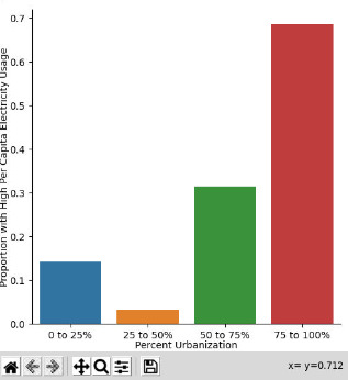
This week I continued to use python to analyze whether there is a relationship between a country’s urbanization rate and it’s per capita electricity use. I used the gapminder dataset’s urbanrate and relectricperperson variables, though for this exercise I used alternate versions of these to make them categorical rather than numerical. For urbanization, I created a variable called urbanization that puts countries in a group of 0 to 25, 25 to 50, 50 to 75, or 75 to 100 percent urbanization. For electric usage I created a two level variable called electric2 that puts countries in either a high (more than 1000 kWh/person) or low (less than 1000 kWh) per capita electricity rate group. Both were created with the panda cut function.
I ran a chi-square test for these two variables, followed by a bar graph. The syntax is below:

The bar graph shows that countries with a high rate of urbanization seem to be most likely to have a high electricity use rate as well:
The corresponding chi-square test shows a quite low p-value (2.98e-07), signifying that there is a relationship and I can reject the null hypothesis:
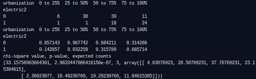
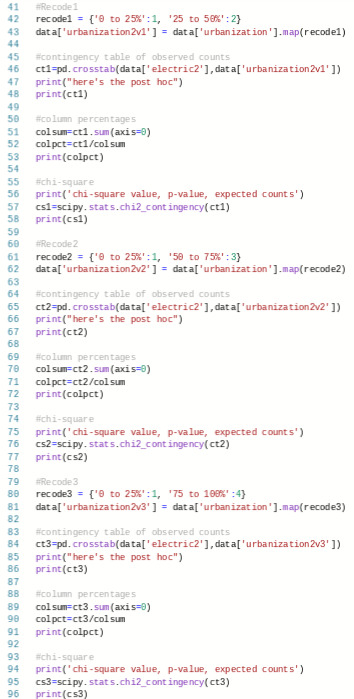
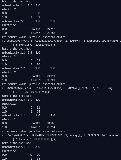
Next I did the post-hoc. Because of the number of pairings that can be compared (6), the relevant p-value for chi-square tests is .008. I recoded the urbanization values to be numeric (1, 2, 3, or 4 based on percentage groupings) and made new variables for each post hoc chi square test with these new values:

The results show a p-value lower than .008 for three of the pairings: 25 to 50% compared to 50 to 75%, 25 to 50% compared to 75% to 100%, and 50 to 75% compared to 75 to 100%. For this reason, I can safely conclude that no significant relationship exists when the 0 to 25% group is compared to other groups, but one does exist for all other pairings:

0 notes
Text
Data Analysis Tools Week 1
rele For this course, I am continuing to use python and the Gapminder dataset while focusing on the employrate, urbanrate, and relectricperperson variables. For the purposes of this and other exercises, I have converted these quantitative variables into categorical variables named employment, urbanization, and electric by using the panda cut / binning function (not all variables will be used in this exercise).
As the main goal is to understand the association between a country’s urbanization rate and its per capita electricity use, I ran my ANOVA tests based on the categorical/explanatory variable urbanization against the quantitative/response variable relectricperperson. urbanization has more than two levels, as a country can be within one of four ranges: 0 to 25%, 25 to 50%, 50 to 75%, or 75 to 100%. Below is the python code:

As can be seen, I first called for a summary of regression results using the smf.ols function, followed by mean and standard deviation summaries for relectricperperson against the four urbanization levels. Finally, I made a post hoc test using the tukeyhsd method. The results are here:
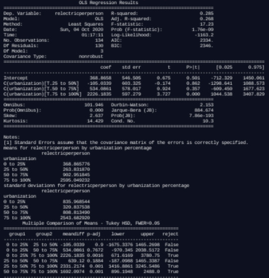
The f statistic is 17.23, and the p-value is extremely low at 1.76e-09, which indicates that I can safely reject the null hypothesis that there is no association between a country’s rate of urbanization and per capita electricity consumption.
We can then look at the means summary, and see that there are indeed differences in relectricperperson based on urbanization. urbanization levels of 75 to 100% are have a relectriperperson three times higher (2505.05) than the next highest at 50 to 75% (902.95), which is also much higher than that for 25 to 50% and 0 to 25%. The standard deviations show that the numbers are quite spread out within each urbanization level, but this does not appear to negate the findings.
Finally, the post hoc allows me to see the specific comparisons between urbanization groupings. This shows that the most significant differences fall between 0 to 25% and 75 to 100% urbanization, 25 to 50% and 75% to 100% urbanization, as well as 50 to 75% and 75 to 100% urbanization. Thus, for each comparison against countries with 75 to 100% urbanization, we can specifically reject the null hypothesis that there is no significant difference in per capita electricity use based on urbanization levels.
0 notes
Text
Data/visualization week 4
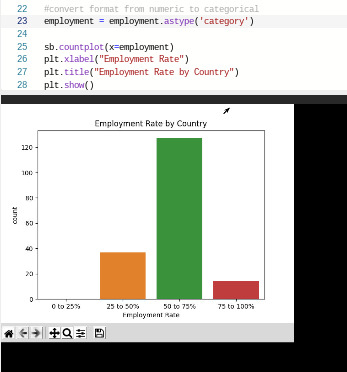
My basic python code, necessary for utilizing the data which makes my graphs, includes splitting the numerical gapminder data into categories (bins). The employrate, urbanrate, and relectricperperson variables were split into the categorical variables employment, urbanization, and electric.

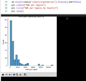
Univariate Graphs
To visualize the variables, I then produced univariate graphs. To experiment with different techniques, I used both numerical and categorical variables:

I also displayed the basic statistical elements of each variable:


As can be seen, employment, which is employrate converted to categorical bins, is unimodal with a strong mode of countries that have an employment rate of 50 to 75%.
urbanrate, on the other hand, is mostly uniformly distributed. It is perhaps best summarized by its mean, which demonstrates that the average urbanization rate across countries is 56.76936%.
relectricperperson is unimodal, but skewed significantly to the left, showing that most countries have a relatively low electricity use per capita.
Bivariate Graphs
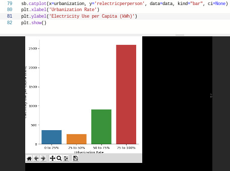
To examine associations between variables, I looked at two relationships. First, employrate is used as the independent/explanatory variable, with urbanrate as the dependent/response variable. Next, urbanrate is the independent/explanatory variable, and relectricperperson is the dependent/response variable.
Below are bar graphs and scatterplots that examine these relationships. For the bar graphs, I used a categorical to numerical technique, by using the alternative variables that I created using bins. Thus, my code uses employment for the x-axis with urbanrate in the y-axis, and then urbanization in the x-axis with relectricperperson in the y-axis:

For good measure and to practice alternative techniques, I also produced scatterplots to display the same relationships in a different way. These were numerical to numerical, and therefore used the original variables of employrate, urbanrate, and relectricperperson:


These graphs show a weak relationship between employment rate and urbanization. The bar graph indicates that high employment might be related to lower urbanization, but there is not enough of a trend to indicate any causal relationship. The scatterplot seems to back that up.
Urbanization and electricity use seems to have a bit more clear of a positive relationship, since in the bar chart those countries with the highest urbanization levels have a higher rate of electricity use per capita to a pretty high degree. The scatterplot does not show a perfect relationship, but the electricity use numbers do seem to skew higher with urbanization rates.
0 notes