
Don't wanna be here? Send us removal request.
Statistics
We looked inside some of the posts by tlgraphicsyear1 and here's what we found interesting.
Average Info
Notes Per Post
0
Likes Per Post
0
Reblog Per Post
0
Reply Per Post
0
Time Between Posts
20 hours
Number of Posts By Type
Photo
17
Last Seen Tumblr Blogs


Fun Fact
Tumblr has 411 employees.


Photo
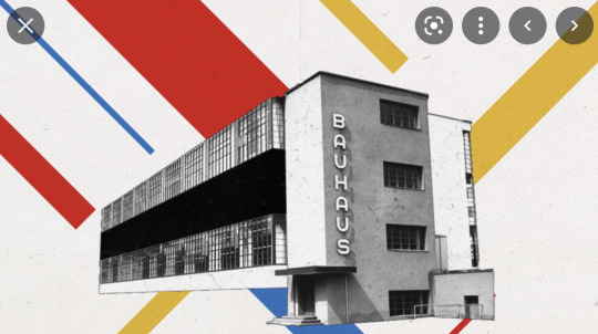
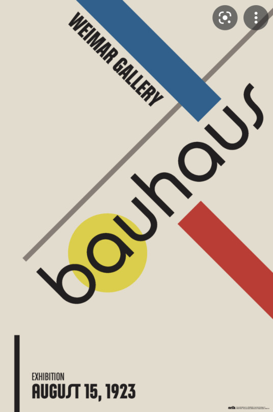


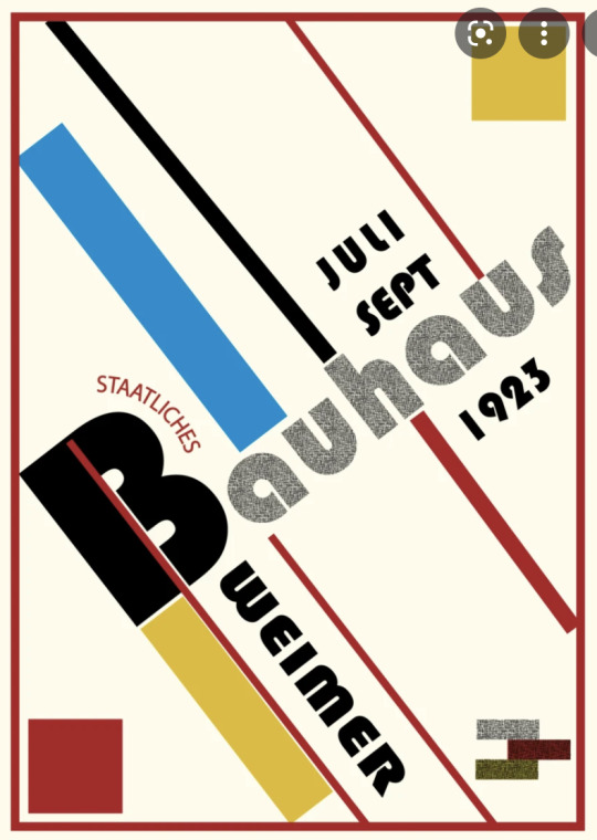


Bauhaus.
One of my favourite styles of design has been Bauhaus, not just as it is quite similar to the classic Russian style, but because of the simplistic shapes and the colours. The way they are always just slanted to one side works really well for the style and messages that they send through the designs. It is recognisable to pretty much anyone who looks at it as it has been around for many years and make quite the impact when it was introduced and was very popular. They are all aesthetically pleasing to look at and I just think they work really well.
0 notes
Photo


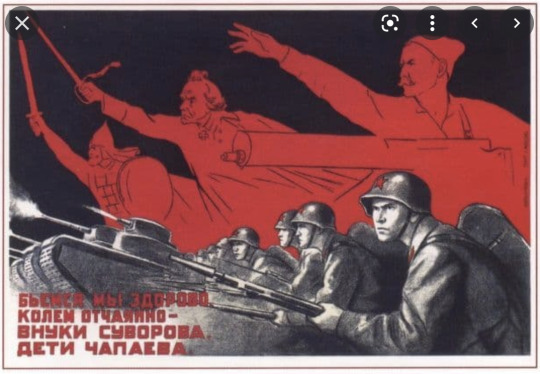


Russian posters.
Here we go then, the things I have mentioned so many times, the style of classic Russian posters. There’s nothing to dislike about these, they are all so bold, well thought out and just work really well. In terms of colours, there is a common theme of red, black and an off white colour which just work fantastically well together. There tends to be quite a gritty style to the main focus point of the posters, and what I mean by that is their use of textures over the designs that just works so well with the colours and the overall design style. I have also noticed that a lot of artwork in the designs tend to be placed above you, what I mean by that is that they have used their knowledge of perspective and placed their drawings to make it feel like you are looking up at them, which because of this, feels very Russian and I think it works really well, so these are all points that I can drag into my design ideas through the week.
0 notes


Photo


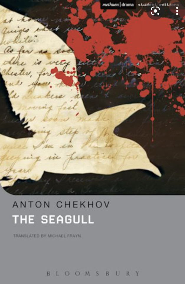


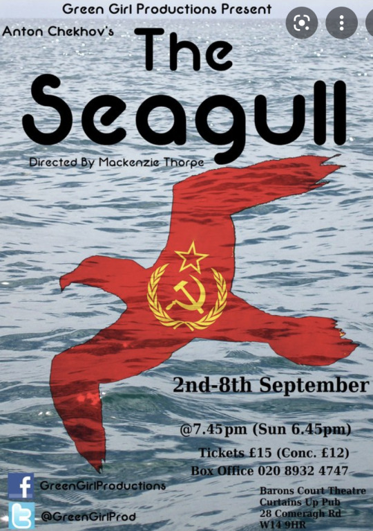

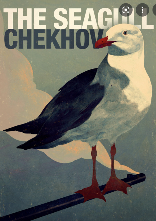
The Seagull.
To round off this three week long project, we have been tasked to create a poster however, we are not to finish the poster. Yes, I promise that makes sense, we will be showing our new hand drawing skills to create the visuals for a poster, so loads of different sketches for different ideas, a bit of colour as if you were going to show them to a client for some feedback. After we have got a wide range of ideas, we’ll be picking three and will start to refine the ideas until we have our favourites made a bit bigger and then present them on Friday.
In terms of what the poster is for, we were given a list of some plays and then would pick one, research it and then create some poster designs for it. Now, me not having ever watched a play, I had no idea what to choose so I went with The Seagull as it says seagull in the title, and because I heard it was Russian which I had some ideas for creating posters in the classic Russian styled posters.
It is usually a good idea to take a gander at some actual posters for the play that have been used, so that is what I have done here, these were just some that caught my eyes, and while they are all mostly different, they have a common factor being the use of a seagull in the design, so I think you can probably guess what I will try and include in my designs.
Other notable points about these, well there seems to be a fairly consistent theme of a Russian style within them, and what I mean by that is they are quite bold, and they just are designed to make you think of Russia when you see them, which is all done by looking at some classic posters done in this style, which I’ll be looking at shortly, and then using little nods to them to almost remind you of them so that you don’t need to get confused by the design, you can just naturally think of Russia.
0 notes
Photo

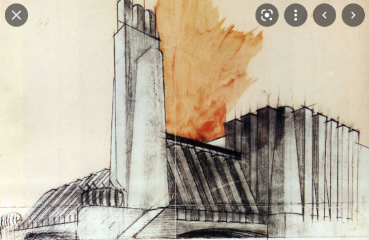


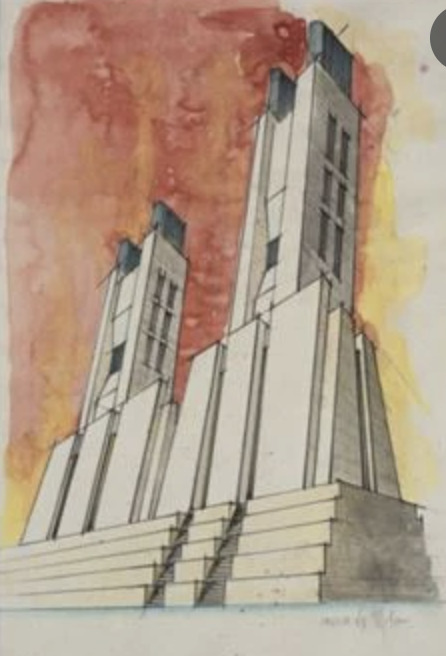
Antonio Sant‘Elia.
Antonio was a really unique artist when it came to perspective drawings as he didn’t just look at a house in front of him and use his knowledge to recreate it, no, instead he went all out and made his own futuristic styled buildings, often like a power station sort of thing, and they just looked really cool. The part I like the most is the weird little line details that he left in along the edges to show the building actually being designed, to me this just shows off a whole other angle onto an already unique style of work.
You may also think that this style of building feels a little bit familiar, and that could possibly be the fact that the makers of Star Wars really liked his work and decided to create some very similar looking buildings in some of the films, so in a way he was the inspiration to one of the most well known movie franchises.
Yeah overall, I really like his work, and especially once he has gone over some little details in watercolour afterwards too, just works a treat in my head.
0 notes
Photo

This is my attempt at freehand drawing using our new knowledge of perspective, and well I’m not the best at sketching, let’s say that. The big one in the middle looked a bit off as I didn’t give it a top to the shape which makes it look a bit off, then on the right we have one which has fairly okay shadows and light, but the overall shape still looked a bit odd and I didn’t quite line it up right. Then the one on the left, well I don’t even know what that one was, it turned out looking like a brick but still, I am fairly happy as I know actually understand the use of perspective.
0 notes


Photo


I think this is my one and only attempt of a cylinder so far, but for my first attempt of one, I was well chuffed with how it came out. While it might not be the clearest overall in terms of the actual cylinder, it still looks like a detailed perspective drawing and I really like the rough lines and the box that goes around the outside of the circle, and it could be something that I experiment more with later in the project and/or year. Yes, we were tasked to add light and shadows to this cylinder, but I really liked how this one turned out so I will give that another go at some point.
0 notes