
track7-cryptozoology
you just might exist
mage . 25 . any pronouns . icon edits . flag by tarnishedpride
30 posts
Don't wanna be here? Send us removal request.
Last Seen Blogs

onlinethinking01
Optimus01 - Online Thinking

honeydewandcake
HoneydewBoba

happyghostdonutapricot
Untitled


bojdusfucker
welcome to my world
Text
i'll learn how to make a psd and i WILL name if after a fall out boy lyric. or a soul punk lyric.
0 notes
Text


PINOT KISSED: a psd made for a challenge (don't modify red values). please credit when using + do not change heavily ! for non-commercial use only
9 notes
·
View notes
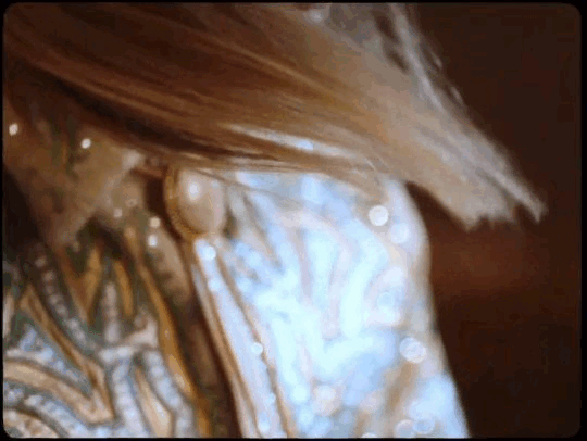
Text
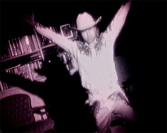

saturday // so much (for) stardust
222 notes
·
View notes
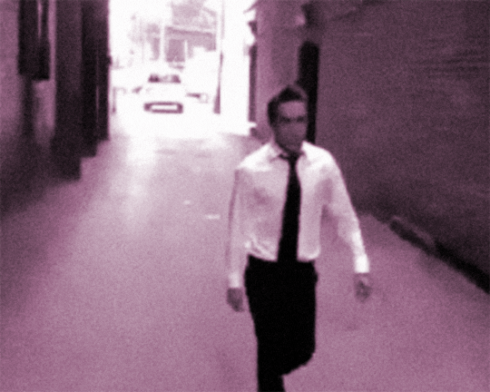
Text


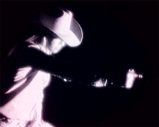
pete wentz in so much (for) stardust
412 notes
·
View notes
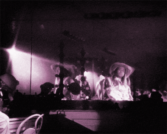
Text


325 notes
·
View notes
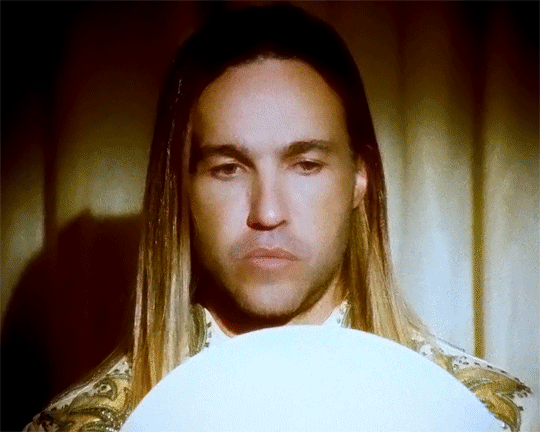
Text
can i force you guys to watch the so much (for) stardust music video. please.
youtube
#I WANT TO MAKE AN EDIT FOR THIS 💥💥💥#talkies#also. can you tell pete wentz watched nope (2022). and had his brain chemistry changed.#Youtube
0 notes
Text
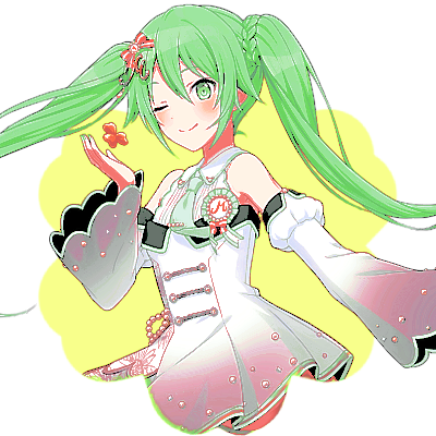
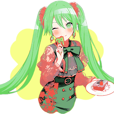

green miku icons && reblog and credit if using!
psd by cutesieplushi mask by ashenscion
13 notes
·
View notes
Text

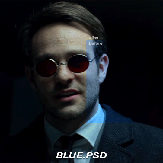
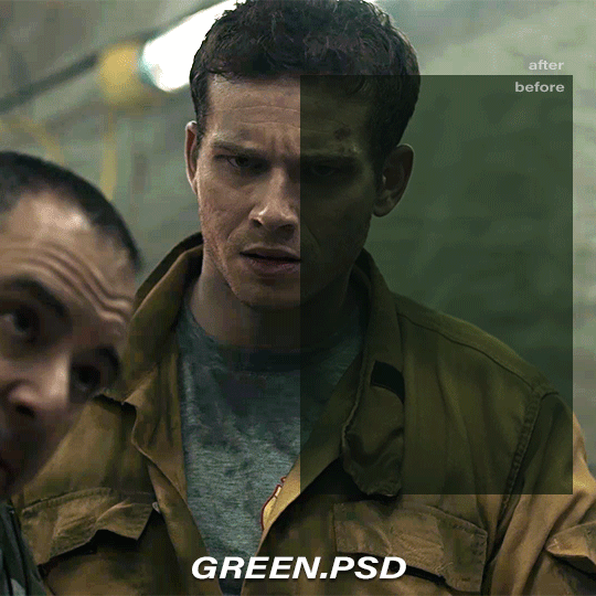
COLOR CORRECTION BASE PSD PACK
please reblog if you plan to use!
credit is super appreciated but not required:)
don't repost/claim as your own
optional: tag me in your creations with #usercam!!!
download here (mediafire) | more gif help
more info + instructions under the cut
these are base PSDs which each include two adjustment layers for color correcting scenes with various oversaturated colored lighting. the gifs above have additionally been brightened and sharpened.
you will still need to play around with all the adjustments to make your gifs look perfect! these are just meant to get you started:) please send me an ask if you have any questions. if you use these psds and choose to give credit (thank you!) please add a link to this post!
Instructions for use:
1. Save the PSD files to your computer
2. Open your gif in photoshop. In a separate tab open the PSD file
3. CTRL + click or right click on the adjustment layers folder (titled: group 1) in the “layers” box. Click duplicate folder, and choose your gif as the destination for the duplicate.
4. Finish editing your gif and save!
431 notes
·
View notes
Text
one day i'll learn how to make gifs and on that day i am going to be the 19364957th person to make a little less 16 candles a little more touch me gifs. that or gifs of the dance dance trilogy.
1 note
·
View note
Text
giggles as i see people making ybc edits. yessss… YEEEEEEEES…
1 note
·
View note
Text


aya maruyama circle icons for @focalettes !! reblog and credit if using
22 notes
·
View notes
Text


@happyediting edit challenge part 2 prompt 1: don't touch red!
official fanart by chie_rico & reblog and credit if using!


16 notes
·
View notes
Text


-> kokoro tsurumaki sun trans icons!
original flag by @bisexual-cat
transparents from official game media
reblog and credit if used please!
#kokoro tsurumaki#bang dream#bandori#bang dream girls band party#garupa#girls band party#hello happy world#kokoro icons#icons#my edits#SHAKES AND FROWS UP A LIL. TADA.
3 notes
·
View notes
Text
i did make my icon For Me so i won't do the ghostly fade in like 90% of my icons but when my url literally has the name cryptozoology in it. i'm allowed a little ghostly faded aya. as a treat.
0 notes
Text
what’s like. the protocol if i wanna use album art for icons.
#wanna make franklin ioh icons…#he's the sheep so i'm not using anyone irl and would not do that#talkies
0 notes
Text

— as written by a dummy.
welcome back to photopea for dummies, the series where eos makes things more confusing instead of less. today, we’re talking about blending modes!

what is a blending mode? a blending mode is something you use on a color to change how it adheres to the layers beneath it. blending modes are sorted into five main categories: dark, light, overlay, what the hell, and color. that’s how i think of them, at least.

first category: dark.
darken replaces lighter pixels with your color, and doesn’t touch the darker pixels.
multiply multiplies the lower pixels with your color. white is multiplying by one: the color is always the same. black is multiplying by zero: the color is always black.
color burn increases contrast and darkens the lower pixels to reflect your color.
linear burn darkens the lower pixels so they reflect your color.
darker color wipes out the lighter pixels and keeps the darkest pixels.
the dark blending modes are commonly used on threshold layers to give the shadowy effect, but you can also use them on any of your layers. i like to use them on a reversed black and white gradient map to make my whites less harsh.

second category: light.
lighten replaces the darker pixels with your color, and doesn’t touch the lighter pixels.
screen multiplies the inverse of the lower pixels with your color. screen over black produces your color; screen over white produces white.
color dodge decreases contrast and lightens the lower pixels to reflect your color.
linear dodge brightens the lower pixels so they reflect your color. (also known as add on other platforms)
lighter color wipes out the darker pixels and keeps the lightest pixels.
sound familiar? the dark and light categories are inverses of each other. lighten is to darken what multiply is to screen, and so on. these blending modes are commonly used to color mangacaps, since they replace black with whatever color you choose.


third category: overlay.
overlay uses a mix of multiply and screen, depending on how bright or dark the lower pixels are, and preserves the highlights and shadows.
soft light is a subtler version of overlay, applying your color as if it were a diffused light.
hard light also uses a mix of multiply and screen, acting as if your color were a much harsher light.
vivid light uses a mix of burn and dodge, decreasing the contrast of light pixels and increasing the contrast of dark pixels.
linear light is a combination of linear burn and linear dodge (seen above.) linear burn is used darker pixels, while linear dodge is used on lighter pixels.
pin light is a combination of darken and lighten (seen above) that adheres to and replaces the midtones of your lower pixels.
hard mix functions similarly to a posterize adjustment layer, breaking the image down into its simplest colors—highlights, midtones, and shadows.
— author’s note: hard mix is best adjusted using the fill slider instead of the opacity slider. this is true for blending modes such as color burn, linear burn, color dodge, linear dodge, vivid light, linear light, and difference as well. remember to mess around with fill and opacity if your colors don’t look right!
as you might have guessed, these blending modes are mostly a mix of the blending modes above, combining the dark or light blending modes depending on what’s necessary. i like to use blend modes of this category for things such as gradient maps or photo filters.

fourth category: what the hell. *could also be known as the inverse category. what the hell is funnier
difference uses the difference between the lower pixels and your color as the result. white produces an inverted color, and black produces no change.
exclusion is similar to difference, but is much lower in contrast.
subtract is used to subtract the lower pixels’ values from your color, making the image darker and retaining black.
divide does much the same as subtract, except instead of retaining black it retains white. it’s similar in effect to inverting the color and using color dodge.
i never use these blend modes, if i’m being honest. a divided black and white gradient map at about 8% opacity is an insane man’s contrast layer. but like, don’t do that. these can be used to fix your psd if it has too much of one color—as long you keep them at a low opacity.

fifth category: color.
hue applies your color to the original image while retaining the original image’s saturation and luminosity values.
saturation applies your color’s saturation values to the original image’s hue and luminosity values.
color applies your color to the original image using both hue and saturation values. it ignores the original image’s saturation and only applies it to the luminosity values.
luminosity applies your color’s luminosity to the original image’s hue and saturation. it’s the inverse of color.
my personal favorite category! hue and saturation are extremely fun to use on gradient maps and photo filters, and color is extremely fun on photo filters and color fills—usually at a low opacity. luminosity is one of my favorite blending modes as well! i use it on brightness adjustment layers (such as brightness/contrast, levels, curves,) and on black & white layers and black and white gradient maps. it’s a good way to ensure your brightness layers don’t interfere too much with your coloring.
and those are all of the blending modes! i recommend applying these to various layers and seeing what you like, and make sure to mess around with your fill and opacity sliders as well! blending modes can make or break a psd, and are super fun once you get the hang of them!
sincerely, eos
40 notes
·
View notes