
trashfire-art
trashfire-art
| your girl ain't productive so here's the art only blog no one asked for | follow me on main @2dollarsworth |
24 posts
Don't wanna be here? Send us removal request.
Last Seen Blogs

donkiwi
Untitled

happyifihavefood-blog
Aussies Rant

kaoskukaosmu
kaosku kaosmu

dateandounestafador
DATEANDO UN ESTAFADOR Y MITOMANO

katchudon
Katchudon
Photo

If you know someone who has been discouraged from pursuing their love of art by those close to them, please show them this post. Tell them they are amazing, that they CAN do it, and that no-one has the right to stop you learning. Here’s 200 FREE tutorials:
Lorenzo!
How to draw ANGRY EXPRESSIONS
How to draw BATTLE DAMAGE
How to draw BIRD HEADS
How to draw BOOKS
How to draw BOTTLES and GLASSES
How to draw BOXES
How to draw BREAKING GLASS
How to draw BRICKWORK
How to draw CABLES and WIRES
How to draw CAR CHASES
How to draw CATERPILLAR TRACKS
How to draw CAVES
How to draw CHARACTERS (3-SHAPES)
How to draw CHARACTERS (FLIPPED-SHAPES)
How to draw CHARACTER SHAPES
How to draw CITYSCAPES
How to draw COMIC COVERS
How to draw COMPOSITION
How to draw CONTRAST
How to draw CONVERSATIONS
How to draw CREATURE TEETH
How to draw CROSS-CONTOURS
How to draw DETAIL AT DISTANCE
How to draw EARS
How to draw FABRIC
How to draw FEET & SHOES
How to draw FEMALE HANDS PART ONE
How to draw FEMALE HANDS PART TWO
How to draw FLAGS
How to draw FOOD TRUCKS
How to draw FOREGROUND MIDGROUND BACKGROUND
How to draw GAME BUILDINGS
How to draw GEMS and CRYSTALS
How to draw GHOSTS
How to draw GIRL’S HAIR
How to draw GOLD
How to draw GRASS
How to draw HAIR (1940s styles)
How to draw HAIR IN MOTION
How to draw HAPPY EXPRESSIONS
How to draw HEAD ANGLES
How to draw HOOVES
How to draw HORNS
How to draw HORSE HEADS
How to draw IMPACT DEBRIS
How to draw IN 3D
How to draw INTEGRATING LOGOS
How to draw INTERIOR BASICS
How to draw IN-WORLD TYPOGRAPHY
How to draw JUMPS
How to draw JUNGLE PLANT CLUSTERS
How to draw JUNK HOUSES
How to draw LAMP POSTS
How to draw LAVA
How to draw LIGHTNING and ELECTRICITY
How to draw MECHANICAL DETAILS
How to draw MUSHROOMS and FUNGUS
How to draw MONSTER HEADS
How to draw MONSTER TENTACLES
How to draw MONSTER TRUCKS
How to draw MOUNTAINS
How to draw NEGATIVE SPACE
How to draw NEWSPAPERS
How to draw NOSES
How to draw OVERGROWN VEGETATION
How to draw PEBBLES AND GRAVEL
How to draw PERSPECTIVE BOXES
How to draw PIGS
How to draw PILLOWS and CUSHIONS
How to draw POD HOUSES
How to draw POURING LIQUID
How to draw ROBOT ARMS
How to draw ROCK FORMATIONS
How to draw RUNNING FIGURES
How to draw SAND
How to draw SAUSAGE DOGS
How to draw SEA WEED
How to draw SHADOW COMPOSITION
How to draw SHOULDER ARMOUR
How to draw SIEGE WEAPONS
How to draw SILHOUETTE THUMBNAILS
How to draw SMALL FLAMES
How to draw SMALL, MEDIUM, LARGE
How to draw SMOKE EFFECTS
How to draw SNOW
How to draw SPACE BIKES
How to draw SQUIRRELS
How to draw STICK FIGURES
How to draw SWORD FIGHTS
How to draw THE HORIZON
How to draw TIKI STATUES
How to draw TREASURE CHESTS
How to draw TREE BARK
How to draw TREE ROOTS
How to draw USING THE SHATTER TECHNIQUE
How to draw VEHICLE STANCE
How to draw VINES
How to draw VINTAGE PLANES
How to draw WATER
How to draw WOODEN HOUSES
4K notes
·
View notes
Text
honestly? starting to flip the canvas during the drawing process improved my art so much yeehaw
70K notes
·
View notes
Text
Know what I’m salty about?
In all my art classes, I was never taught HOW to use the various tools of art.
Like yes, form, and shape and space and color theory and figure drawing is important, but so is KNOWING what different tools do.
I’m 29 and I JUST learned this past month that India Ink is fucking waterproof when it dries. Why is this important? Because I can line something in India Ink and then go over it with watercolors. And that has CHANGED the ENTIRE way I art and the ease I can create with.
tldr: Art Teachers: teach your students what different tools do. PLEASE.
186K notes
·
View notes
Photo

Update on the Jack and James sketch from a while back
#fanart#pirates of the caribbean#Jack Sparrow#James Norrington#possible sparrington#yes? sparrington#WIP#update#my art
111 notes
·
View notes
Photo

lil self portrait from earlier this weekend
1 note
·
View note
Photo

The holy trinity of Jack and his devil-may-care aesthetic
#finally finished the bottom one#he's honestly my favorite#it's the gaygles#ratbird is aesthetic#jack sparrow#potc#fanart#my art#modern AU
31 notes
·
View notes
Photo

Here’s a messy Jack and James, I’ll keep working on them seeing as neither of them have hands yet. Hands are irrelevant.
#you can perceive this as Sparrington if you wish#or just the rat bird annoying poor commodore#both are acceptable#I also made Jack really short and I don't plan on fixing that#smol bird is smol#art#fanart#wip#potc#pirates of the caribbean#sparrington#jack sparrow#james norrington#bros or hoes you decide#my art#yeet
62 notes
·
View notes
Photo
Just in case you forget this exists.
It exists.
486K notes
·
View notes
Text
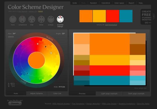
random thing but i realized it might be helpful for some people so uh. theres this thingy where you can upload an image and it gives you a color palette based on it !
heres an example
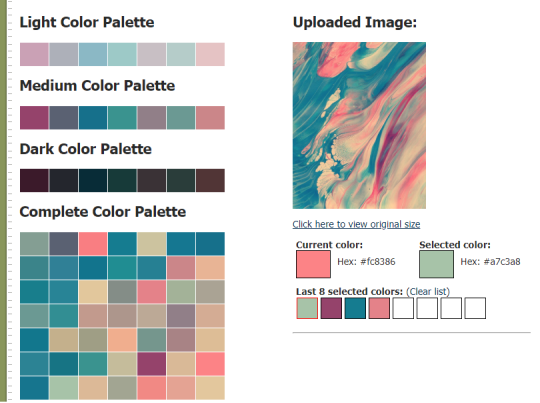
and it also gives you the hex code values for them too its p neat !
here’s the link to the website !
164K notes
·
View notes
Photo

Jack enjoys making statements
11 notes
·
View notes
Photo


!! Woah guys! Pixelovely’s new tools are finally out, one for hands & feet, and one for faces!
There’s now 429 photos of hands & feet, and 314 photos of faces. Dang!!
This is super cool news and I certainly can’t wait to start using them haha
I’ve got tons of tutorials on hands, feet and faces in their relevant tags, so be sure to check those out too nwn
54K notes
·
View notes
Photo
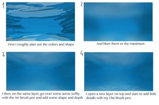
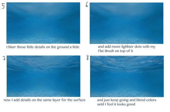

THANK YOU!! <3
I’m always very bad in explaining what I’m doing. Cause there is just a lot of trying and painting over it and mashing and mixing colors until I feel it’s good.
So I tried to show you.
I hope this helps!
50K notes
·
View notes
Video
youtube
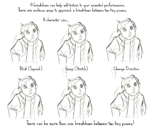
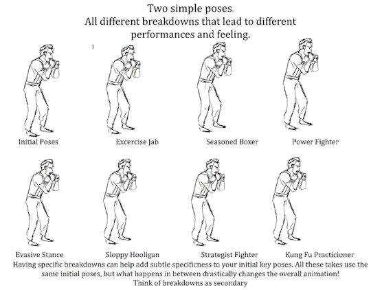
Today’s episode on the Powow Workshop (Formerly Stringbing Workshop), I introduce the animation breakdown, what it is, and how it can be used.
Please check out my patreon page and give it a support:
https://www.patreon.com/StringBing
Gumroad (Buy exclusive tutorial material):
https://gumroad.com/stringbing
Music:
Boom de Boom - Aaron Lieberman
FunkDown - MK2
Happy Mandolin - Media Right Productions

39K notes
·
View notes
Photo

his name is Thomas and he’s tired
#art#wanted to try some new stuff#my art#deer person thing?#i love my dead deer son#finally finished something#yeet
7 notes
·
View notes
Photo

one of my friends asked if he was trying to kill the butterfly...
...i mean probably not intentionally but yeah i guess...
#sorry had to add that little detail#finished art#fan art#water color sucks i hate it#edward scissorhands#tim burton movies#Johnny Depp#johnny depp characters#this is my son i love him
4 notes
·
View notes
Photo

hold me
I can’t...
25 notes
·
View notes
Text
HIIRAREFS: Basic and Intermidiate guide to colouring in
What better day to end the year then with a basic guide to colouring- This is for beginners or intermediate artists. Colouring is a big part to an art piece, whether you decide to use colours or not, that’s up to you, but for the most part, having some knowledge on appliance of colour will really help you out!
____________________________________________
ARTISTS WITH AN INSPIRING KNOWLEDGE OF COLOUR APPLICATION!
Please take the time to have a look at other artists work so that you ca research and get inspired!
Gullacass: Uses brights, dulls and pastels to create brilliant guro, pop and macabre pieces| DA + TUMBLR
TinyCalcium: Old friend of mine who explores brights and mustard colours and places them as a foundation for their work | TUMBLR
BeastPop: Talented with opposing and Triwheel colours. Outstanding cell-shading, and knows how to flexibly bend colour form to their will in popart. | DA
H0stel: Fantastic composition of light direction and applies colour to bodies based on ambient occlusion. | TUMBLR
_____________________________________________
COLOUR SLANG:
I use some strange slang to express colour types and shades as well as groups. Although they may not be canonically correct, I will use these terms to describe colour palates to the best of my ability!
Analogous: Colours that are near or adjacent to each other on the colour wheel, EG: Red and Orange

Oppositional/complimentary: Colours that are opposed or opposite from each other on the colour wheel, EG: Cherry and Green

Triadic: Colours that form a triangle on the Colour wheel, EG: Cyan, Magenta and Yellow. These three colours when mixed together will make black.

Arrowtype/Quadcolour: Four colours, that generally form an arrow shape on the colour wheel.

Tetradic: Colours that form a rectangle or square in the colour wheel

Neons: The very brightest you can get a colour, be careful where you use them as they can look ugly together at the most. Try to use neons when you are adding bright glowing objects to your piece. Neons are great for highlights.

Brights: Slightly washed Neons. Appropriate if you have characters that are colourful.

Washed: Very washed brights with a hint of grey. These are also useful for colourful characters.

Pastels: Colour with white in them to make them seem light.

Baby Pastel: Pastel with even more white in them, good for subtle highlights.

Darks: Colour with black added to them. Used mostly for lineart.

Mustards: Colours with dark grey added to them

Earthen: Colours with brown added to them

Warm and Cool colours: Warm colours are colours that range fromMagenta to Yellow. Cool ones range from Lime to Fuchsia.

Straight tones: A greyscale palate. or a straight scale of one colour from black to it’s neon form.

Warm and cool tones: Warm tones are a greyscale mixed with warm colours and cool tones are greyscale mixed with cool colours.

Skintones: Warm washed or pastel colours generally used to colour in skin, but they don’t have to be warm at all! ( I will not show you a palate for this however)
______________________________________________
WHAT TO AVOID WHEN COLOURING:
beginner artists, tend to go ahead and start by colouring their line art with neon and mustard colours. Neons are not necessarily good for base colours unless the character has a glow.

I often see lazy attempts to shade, often a beginner artist with use an airbrush and use black and white to shade and highlight their piece. This is not very effective, and I’m sorry to say… It’s kind of gross as well. Try to avoid being lazy. If you have a piece that has bold black lines, avoid using soft shading and airbrushing at this point of time.

Black and white isn’t always the best option when colouring in your piece, but it also depends on the style you are trying to convey. If you plan on only using straight tones to colour in a piece, black and white is good.

A GOOD BASIC WAY TO COLOUR
For this basic tutorial I will show you a nice way to colour in a piece with bold lines. I will be using Minty’s Classic character as an example.

Begin with using brights that have been washed down a little and washed skin tones if your character is human based. Avoid using neons or mustards if you are able. If there is white on the character, such as the white on an eyeball or the teeth, consider using baby pastels. For Minty’s eyeballs I have used a baby pastel blue. I have chosen to use a darker and more washed version for her Irises.

With you foundation colours placed down, use a washed warm colour for the skin tone, such as a salmon. If the character’s hair or fur is warm coloured, use a pink or red orange to shade that as well. Use the cell shading technique. This may mean you will have to erase some of your shading so be sure to do this on another layer. For your baby pastels, you can use a regular pastel to shade it. For Minty’s eyes I have used pastel blue and lowered the opacity by a little.

For Highlights, I have chosen to use baby pastel yellow. I wanted the piece to be warm.

Applying a light airbrush over the top of the piece makes it feel a little softer. I have also applied the airbrush over the initial borders to create colour bleed, giving a very subtle reflective approach.

Colouring your line art layer, particularly if you have bold lines, can really make a piece look more interesting! I like to leave the overall outline black. You can gradient and bleed colour in your line art as well

Light tracing is a technique lots of artist’s use, where they run a sharp line of highlight next to line art to divide borders.

This looks a lot nicer than the black and white shading, doesn’t it!?
__________________________________________
This is a very very simple guide to applying colour to your piece! If This helped, please reblog and share this guide around!
If you have any questions or feedback, don’t be afraid to send me a message!
135K notes
·
View notes