
Don't wanna be here? Send us removal request.
Statistics
We looked inside some of the posts by tutorialsoftomorrow and here's what we found interesting.
Average Info
Notes Per Post
3K
Likes Per Post
2K
Reblog Per Post
766
Reply Per Post
13
Time Between Posts
3 months
Number of Posts By Type
Text
7
Photo
1
Last Seen Tumblr Blogs


Fun Fact
When “GIF” was named word of the year in 2012, Oxford Dictionaries U.S.A. credited Tumblr for pushing the word.
Text
Let Your Minis Have a Religious Experience: Stained Glass - The Miniatures of Tomorrow Method.
Hey there true believers, today I’ve got the long promised tutorial on how to create your own stained glass for diorama & display. This method, creates a very true to life effect, that while not as fast as printing on transparencies, replicates both the texture and actual principle of stained glass. This means that it casts a colored light like stained glass, and has the same high gloss as glass proper.

We’ll get started with supplies after the jump.
Stuff You’ll Need

ESSENTIAL BITS A bit of blister plastic, from anything with a plastic clamshell container.
A Fine Point Sharpie, or similar (black)
High Gloss Mod Podge
Tamiya Clear Paints, Red, Orange, Yellow, Green, Blue
OPTIONAL BITS
An image you want to stained glassify.
A printer
INSTRUCTIONS
First off, you’re going to want to figure out what you want to portray in stained glass. This can be a bit harder than you think, initially. You’re going to want something iconic, that won’t be too distorted by the heavy black lines of “lead” that separate the individual colored panels. For my tutorial example, I chose a fairly recognizable bit of Dark Angels iconography. The personal banner of Supreme Grand Master Azrael of the Dark Angels in Warhammer 40k.

This piece already features strong blacklines, and is broken up into very distinct blocks of color. Additionally, it has that two dimensional bas relief feel to the positioning, making it a figure ideal for a stained glass treatment. I resized the image to my needs in paint and printed it out on normal printer paper. My printer is running low on toner (as it’s more expensive to buy toner than it was the printer proper) but that didn’t really matter. Then it was a simple matter of taping a cut square of blister plastic onto the paper, over the image; and beginning to trace the outlines with the fine point Sharpie.

I ended up adding some blacklines to break up larger contiguous panels, which you wouldn’t see in stained glass. I recommend getting some photo examples and then following the rule of cool (if you think it looks cool, then it is). When you’re satisfied with tracing on this side, it’s then time to flip the plastic over and trace over your tracing on the otherside. We’re going to be repeating every step on both sides of the image, as it’s important to insure that you’ve solid coverage and the correct opacity. If you just blackline one side, the “lead” will be less than 100% opaque in some areas and diminish the effect.
With both sides blacklined, then it’s onto the next step. We’re going to paint high gloss Mod Podge over the panels themselves. If you’ve been a follower of the Miniatures of Tomorrow tutorial series for any amount of time, you’ll know that I practically drink this stuff. It has so many applications to the aspiring dioramist that I think it should be in every miniaturists toolbox. We’re applying the mod podge to bring texture and depth to the glass, so that it catches and refracts light more like actual colored glass than just a flat plastic pane. This step is essential to nailing the look, so take your time here. It’s essential to apply a thin coat to every glass panel and avoid covering the black lines. This will make them pop out against the lead and really convey that this is more than a plastic sheet with some stuff painted on it.

Below, you’ll see a clip of the shimmer in action. Note the difference in the way the light plays off of the panels with Mod Podge, VS the naked blister plastic. Quite a distinction.
youtube
With the one side done and given time to cure (it’ll be completely transparent when set), it’s time to flip it over and do it all over again. Not the least tedious task in the world, certainly, but we get the results that we work for in life, our craft included.
With both side textured and allowed to cure, it’s onto the coloring bit. You can’t use normal hobby paints for this, as they’re opaque and the whole point of the window to to catch light, so we’re going to reach for the Tamiya “Clear” series of paints.

These are both a blessing and a curse. They dry transparent and with a high gloss, staining whatever is beneath them while still allowing light through. This saves us a ton of hassle in mixing inks and mediums, and allows us consistent coverage and color, throughout the project. On the flip side, they’re a damned nightmare. They don’t play well with paint mediums and additives, nor do they mix well with other paints (themselves included). They dry into a sticky gelatinous mess very rapidly, but take several hours to cure to the touch. This means you have a very short window to remove or tinker with the paint, but hours to ruin the effect of leave a perfectly defined fingerprint in your glass. This is exacerbated by the fact that we have to color both sides of the glass to get a convincing effect, as just one side will be blotchy and inconsistent. While stained glass does generally have some variation in the color intensity within a panel, it definitely doesn’t have any clear patches in it. The extra effort goes towards eliminating that issue. At any rate, this step is pretty much paint by numbers. Color in the panels with the color you find appropriate, flip and repeat.
THE RESULTS
Now for the final product. This example is MUCH larger than the pieces I’ve done previously, and would represent a massive stained glass piece on the 28mm scale. Even with this bit of grandiosity, the effect is still convincing.


Now it’s just a simple matter of cutting it out of the surrounding plastic, and placing it in your scene. I hope you folks enjoy this tutorial in my neverending series to make you a better craftsperson. As always, feel free to send questions, comments and commission inquiries to [email protected]. Keep your bristles damp! Will
125 notes
·
View notes
Text
Getting Salty About Weathering
Hey there True Believers, today we’re going to talk about how to create your own convincing weathered metallics using a really simple technique. This whole project is done using Warcolours and an airbrush, but you can use these techniques just as effectively with any acrylic craft paints and a brush.

SUPPLIES Coarse Salt
Hair Spray
Hot Water
GETTING STARTED First off, we’re going to need the the prepped model surface we’re going to be working on, in my case, it’s a spaceship corridor that I sculpted for a diorama out of cardstock and some other stuff. In your case, this can be for old pipes, rusted out cars, Land Raiders, junked planes, really, anywhere where enameled metals have been left to the elements.
We begin by priming it black, in the standard fashion. Ensuring even coverage and allowing it to dry for several hours, prior to applying the next layers. Once we’ve got that established, we begin to build up the basis for our rust layers. We’re going to start with a neutral, high saturation brown, and warm it up with each step into a terracotta.

Below you can see the browns applied with an airbrush, Make an attempt to focus the warming in specific spots, but avoid allowing the redder browns to achieve 100% opacity. We’re developing “filter” layers at this stage, and will be altering the texture in the next steps.

You can see how I’ve focused the filter towards the bottom of the wall. This will be the area with the heaviest weathering, representing where it has interacted most with moisture and wear and tear. If you were doing this on a Land Raider (for instance) this focal area might be around the treads, instead. It’s important to have an idea of which areas will be most heavily influenced by the rusting out, and begin to develop them. Next up, we’re going to be moving up into proper oranges. In my case, Warcolours Orange 4 and One Coat Orange. Were going to be applying these differently than we did the brown, as we’re going to use these to develop an erratic, rusting texture on top of the browns. We’ll need a bit of blister foam or sponge for this next step. The idea is to daub a bit on a sponge, and then stipple a paper towel or piece of carboard until you get a nice erratic pattern. It’s similar to the amount of paint you’d want on your brush, if you were drybrushing.

Above, you can see the texture developed, post stippling. Note the areas where I’ve concentrated it, that will become important shortly. When you’re satisfied with this, it’s time to seal the project using the matte varnish of your choice. In this instance, I’m using Warcolours matte varnish. Apply a couple of coats of varnish, and allow to dry 100% before moving on from this step. You need the layers under this to be well protected, as we’re going to be applying salt and scrubbing the model after this. If you’ve not thoroughly sealed this layer, you will work your way down to the primer/plastic, ruining the effect and all the work you’ve done so far. Learn this lesson from me, as opposed to the hard way… Trust me. Next up, the real meat and potatoes of this technique, coarse salt and hairspray.

We’re going to be using the hairspray as a temporary glue, to hold the salt crystals in place. To that end, decant a little into a dixie cup by turning the hairspray upside down and spraying it into the container. This will smell like the 80’s, so it’s best to do it in a well ventilated area. After you’ve got enough liquid hairspray in the cup for your needs, take an old brush and start to apply it to the model, sprinkling the coarse salt over the top, and knocking away any excess. Focus these sticky salt piles on top of the regions of heaviest wear, where you developed the texture with the oranges.

When you’ve developed enough sticky salt piles to satisfy, allow it to dry and then apply the paint/wall/enamel color. In my case, I’ll be using a mixture of Warcolours One Coat Yellow Green with a little One Coat Green mixed in. Now it’s magic time!

Dip an old toothbrush in hot water, and allow it to saturated the salt crystals. When they begin to loosen, scrub them away. You’ll immediately begin to see the rust pattern develop. In addition to the salt texture, you can scratch or rub any amount of weathering into the paint. Since the lower layers are well sealed, and this layer is sitting on top of a water soluable hairspray base, it is very easy to manipulate. You want to make sure that you’ve removed all the salt from the peice, even going so far as to rinse it in cold water. Any residue left over will dry a chalky white and damage the paint over time.

After that, it’s a simple issue of sealing it with another layer of Matte Varnish. And you’re ready to move onto the rest of your project. This method is not only simple, but provides a higher degree of verisimilitude than painting the rust effect over the green. Not only is it actually beneath the paint (like rust would be), but it ends up with a randomness that is near impossible to replicate with the brush, and is far closer to the actual effect for it.


That’s it for today, true believers. I hope you find this useful. Keep your bristles damp! Will
356 notes
·
View notes
Photo

Pocket Guide to Color Mixing
30 notes
·
View notes
Text
Go With the Flow: Modeling Liquid in Motion, the Miniatures of Tomorrow Way!
Hey there true believers, here I am with another Tutorial in my never ending series to help you become a better miniaturist! Today, I’ve got a real treat for you. I’ve been working on this technique for a few months now, and have finally mastered it. It’s one of the effects I’m asked about more than any other. I’m talking about capturing liquid in motion.

Most of the time, when you see blood in miniature, it’s thin tendrils of UHU Glue, painted over with a transparent red paint. While the effect can be neat, I wanted something with both a higher degree of verisimilitude, and capable of withstanding tabletop caliber handling. After an inordinate amount of trial an error, I’ve created an incredibly cheap effect that is more durable than the miniature itself ( it’s pretty much completely flexible), and can be used to create any liquid shape you’d like. The only limit being the depths of your imagination. Lets start with the materials you’ll need, after the jump.

SUPPLIES REQUIRED 1) Blister Packaging Plastic 2) Super Glue (Thick) 3) Cutting Implement 4) High Gloss Mod Podge 5) Paint for Coloring the “Liquid” It’s really that short of a list. Most of you will only have to procure the Mod Podge, some of you already have all of this in your hobby spaces. INSTRUCTIONS The first thing we’re going to want to do is cut the blister plastic into a rough “skeleton” of the shape we’re going to want the liquid to take. Don’t worry about any sharp/squared edges, as we’re going to take care of those in the next steps, but take care to make it slightly smaller than we’re going to want the effect to be eventually.

(Some Freshly Cut Drips of Blood) After we’ve got our skeletons cut to size, we’re going to glue them in position. You want to be mindful of the direction they’re lying, in relation to the motion you’re attempting to capture and gravity. The rest of the effect rests on the skeleton, and once it’s glued into place, it’s final. For this, I recommend a thick super glue and accelerant. The thick super glue is nice, because you can dab it on with precision and it won’t run all over the place. I recommend the accelerant, because the surface tension of the wet glue is often enough to pull the tiny plastic skeletons out of position. Locking the plastic skeleton in place immediately totally circumvents this issue, and a lot of swearing, in my experience.

(Plastic Skeleton, Glued into Position) Once we’ve gotten the skeleton locked in, it’s time to coat it in a thick layer of Mod Podge. Mod Podge is wonderful stuff for this purpose. It doesn’t shrink when it dries, so you can “sculpt” shapes on top of the skeleton that stay how you formed them. You use this to round off all the squared edges, and build up drops and splashes. Sometimes it takes a couple of layers to really create a good splashing effect, but you’ll be surprised how easy it is to work with after a little experience.

(The Skeleton, Coated in Fresh Mod Podge) Take care to build liquid shapes, with drops forming at the ends of shapes, and smooth liquid gradients. Whatever shape you leave while it cures is the shape you come back to. make sure to paint on both sides, so that you create organic shapes. I like to build up a layer around the point the skeleton is glued to the miniature. This both reinforces the connection point when dried, and covers up any rough areas from the point when the two parts are glued together. The Mod Podge is opaque when wet, but dries crystal clear. What’s more is that the rounded edges warp the light around the plastic interior, rendering it completely invisible. At this point, it’s quite elastic, and can be handled without distorting. It’s a simple matter of painting it to emulate whatever liquid you’d like. I’ve used it for blood, sewage, pus, beer, icicles, fountains, etc. Really, you’re only limited by your imagination. Just seal it when done with a high gloss sealant, and you’re already done!

(The Finished Effect)
That’s it for the instruction. It’s really that simple. You’ll be creating amazing effects on your own pieces in no time! Below are some of the results I’ve gotten with the technique. I hope you folks enjoy!

(Beer: Step by Step)

(Blood: Step by Step)

(Icicles, Blood, Blood and Saliva, More Blood. All the same Technique) I hope you folks found this tutorial useful. This was a result of a bunch of experimentation, that I hope I’ve saved you. Feel free to share this tutorial far and wide. You can follow me on Facebook and Twitter @minisoftomorrow, or check out my blog at www.miniaturesoftomorrow.com I’m always interested in professional and collaborative opportunities. Including studio contract and freelance work. I’d love to see what you come up with using the effect as well! All inquiries and examples should go to [email protected] Keep your bristles damp! Will
259 notes
·
View notes
Text
Blood FX and Theory Tutorial

Hey there, true believers, today’s topic is Blood effects and how to make ‘em work for you. Blood is a substance like few others. It has several unique visual properties, depending on the state you come across it. This effect can prove very difficult to capture in miniature. If you can nail it, you can add a ton of visceral carnality to a piece and really evoke an emotional response using subtle (and less than subtle) visual cues. There are a couple of tailor made products for the effect, Citadel’s “Blood for the Blood God” technical paint, and Tamiya’s “Clear Red X27″, but I’ve found you can get a higher degree of verisimilitude mixing your own gore. If used appropriately, You can use it to create motion/action in your pieces, whether through the direction of a splatter or even active bleeding. SPLATTER EXAMPLE

BLEEDING EXAMPLE

Being able to capture these moments successfully can lend a ton of dynamism to a medium that is often comparatively static. Combine that with the emotional response that blood evokes in people (up to the extreme of some people feeling unwell at the sight of it), and you can see how carnage can be a powerful tool to employ as an artist - Provided you have mastered the effect. In the same way a well done blood effect can tie a bow on a scene, a poorly executed one has a decidedly more distracting and comedic effect RED FOR THE RED GOD

Enough Jibber Jabber, lets talk blood theory! THEORY
Blood has several different distinct visual states, depending on its age, viscosity, depth, source, etc. For simplicity sake, and since we’re limiting the application to miniatures, we’re only going to discuss three types of blood, as these will be the ones most often visually depicted in miniature. This is also the reason why painting a bit of red on your weapon never really looks right. The stuff has depth, yo. These are new blood, old blood, and dried blood. The whole point of blood is to carry oxygen around to the cells of the body it resides in. Even the blood within your body has different colors, depending on how recently it was oxygenated. The difference can be quite dramatic, especially taking into account how much we need to exaggerate color contrasts in miniature for the effects to play correctly on the eye.
NEW BLOOD VS OLD BLOOD

Both of the examples in the image above are fresh and from the same body. The one on the left is freshly oxygenated arterial blood, and the one on the right is less oxygenated venous blood. Both are still fresh, in that they have the same viscosity, but there is already a pronounced color difference in between the two. For the sake of miniature, we’ll generally be trying to capture the gem like quality of venous blood, in our pieces, as it has a greater visual interest in it’s depth of contrast, and will play more like blood at the scale. Another thing you’ll need to take into account, is the characteristics of dried blood. BLOOD MEAL

Blood has a very high iron content, and iron oxidizes (rusts) when it is exposed to oxygen. The image above is literally freeze dried blood. Notice how brown/violet it becomes when drying. If you’re creating a scene with old blood smears, or trying to tell a story where something violent has been happening for a long time in one spot, it is important to incorporate these colors (in a matte finish) along with the fresher, ‘wet’ blood effects. LIQUID DYNAMICS
Blood is clearly a liquid, though to see the way some people apply it to miniatures, you wouldn’t know. I’m a big fan of the “Rule of Cool” with regards to art. If it looks awesome, I don’t care if the kid couldn’t life a giant sword, the mech would snap in half at the waist or a dude would melt from wearing armor made of lava. The real problem is that in order for blood to look awesome, it has to follow the physical properties that govern stuff in the real world.

It’s important to be aware of the sense of motion that you’re attempting to create with your splatters. Look at how both the angle changes the shape/direction of the splatters, and what the depth of the blood does to it’s opacity and overall color. See how it darkens substantially as it lies thicker against the white backdrop. These are all factors to be mindful of, when generating the blueprint of your effect in the mind’s eye, prior to execution. COLOR THEORY

The painting of blood, without the use of a gloss medium, requires usage of the range colors above. Often, the mid tone red is selected, and then taken down the spectrum utilizing purple, blue or black, until it reaches the desired deep tone. You can accomplish this using any particular brand of paint you find most desirable… We’re going to cheat though. I’m going to cut through the color theory lessons, and show you how to get a convincing depth of blood using low opacity paints and gloss medium. WARCOLOURS WAY

Warcolours are fantastic for this application, as they’ve a lower opacity than other paints, allowing you to layer them on top of each other without entirely masking off the surface layers below them. This special translucency allows you to build up depth, without worrying about your blood effects become opaque and homogeneous blocks of red. The steps are exceedingly simple. 1. Mix Red 5 with gloss medium (and a tip of purple/black, if you’re feeling rowdy). 2. Dip a course bristled brush in the pool of paint (I use an old toothbrush) 3. Drag your thump across the bristles, flicking the paint in the direction you want it to splatter. 4. Mix Red 4 with gloss medium (and a tip of Red 5, if you’re feeling rowdy) 5. Repeat Steps 2 and 3. EXAMPLE


This should get you well on your way to conquering your own blood effects. I’ll do another tutorial on pouring liquids here in the near future, if that particular effect catches your fancy. Until then, keep your bristles damp!
177 notes
·
View notes
Text
Greenstuff Basics: Or, How to Make Something Other Than a Lumpy Snake
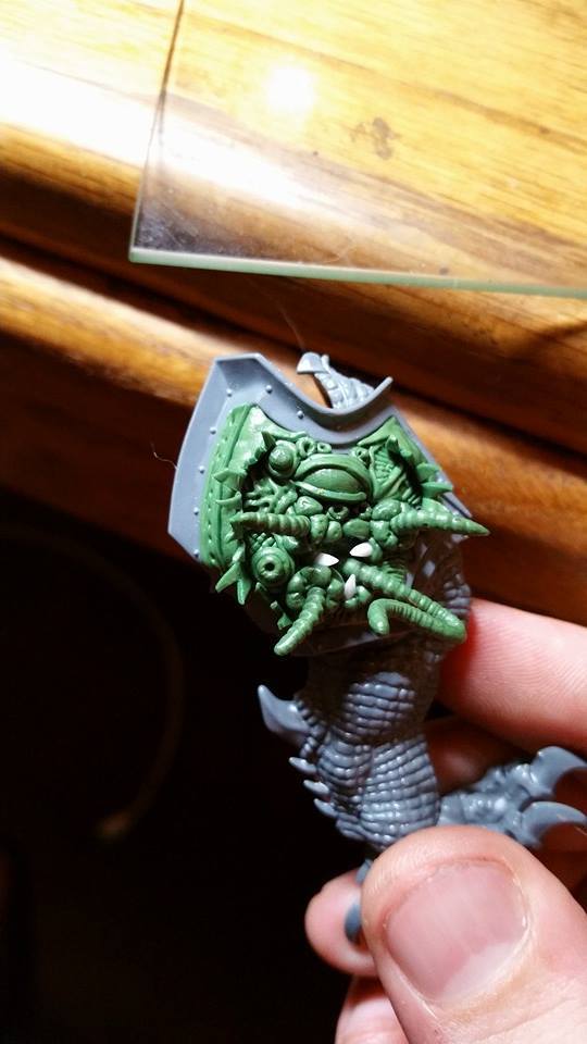
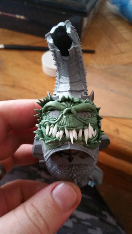
Hey there, true believers! Today I’m going to walk you through the tools and techniques required to begin your foray into sculpting/modeling your own custom miniatures/details using Polymerics Sytems Kneadatite (Repackaged with a 300% markup by Games Workshop under the brand “Greenstuff”). The example today will be a simple 3D Insignia with a relatively flat plane. You can take these tools and techniques and do much more complicated sculpts, of course, but for the sake of the demonstration, we’re going to keep in simple. In your own endeavors, I highly recommend starting simple and getting a feel for the tools and the Greenstuff itself. It can be a cruel mistress to the uninitiated, but we’ll get there in due time. First up, the tools of the trade.
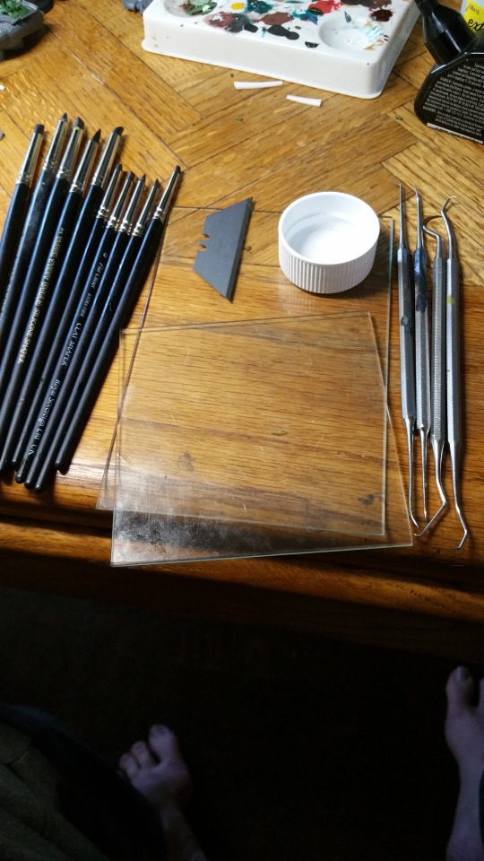
In the picture above, you see everything we’ll use to sculpt our insignia, sans the Greenstuff itself, and plus my especially ghoulish looking feet. On the left, you have the silicon sculpting tools. They’re, as the name implies, tipped with a semi-pliable silicon shaping tool. They’re indispensable for a couple of reasons. First off, you’ll find that greenstuff sticks to everything but the surface you’re trying to attach it to, this includes your tools. There is little more frustrating than finally getting a seam perfect in the fold of a cloak and then having the effect mangled by it sticking to your shaper. Silicon tools (plus a touch of good old fashioned MK I saliva) fix that issue quite nicely. Additionally, given that they generate a soft pressure, they can be used to smooth over rough areas in the sculpt without leaving tool marks of their own. I highly recommend finding a set of Size 0 silicon shaper tools. They’re not cheap (around $30 for a proper multi tool set), but if you’re trying to get serious about mini sculpting, you’ll be hard pressed to improve the quality of your work without these at your disposal. In the middle of the picture, you have two sheets of picture glass. You use these to mash balls of greenstuff into flat sheets (sans fingerprints) of the thickness you need for your next detail. With a little vegetable oil (also indispensable) and a straight razor, you can lift anything you’ve sculpted right off the glass sheet, and place it on your model. This allows for a 1:1 transfer of what you’ve sculpted, without it warping or distorting when picking it up. When combined with an illustration of what your attempting to sculpt, it can function like an animators lightbox, allowing you to “trace” the image with greenstuff by laying it in position on top of the glass over the image. To the left, you have the dental tools. They’re what you use to generate crisp & sharp lines, where you’re looking for hard contrasts between surfaces. They are for more fine detail than the silicon shaper tools, but lack the malleability of the silicon tools. Every tool mark will show the exact pressure exerted. You have to have a delicate touch when utilizing these (and just get comfortable with the idea that you’re eventually going to accidentally stab yourself with one), but after you’ve gotten acquainted with them, you’ll be amazed at the details you’ll be able to generate, down to the 10th of a millimeter or so. The rest is just a razor blade, a capful of vegetable oil and the greenstuff, but the greenstuff requires some explanation in and in of itself.

Kneadatite, or Greenstuff is a two-part epoxy/polyamide sealant/adhesive. It comes separated into two colors, The yellow, which is the basis of the putty, and the blue which contains the chemicals that activate the curing process. When you get it in the strips like this (it’s also shipped in tubes), make sure to cut away the bit in the middle where the two colors are joined. Otherwise you’ll find bits of cured Greenstuff in the surface you’re attempting to work with, and I can assure you that they rarely enhance the aesthetic. You can mix and match the ratios to make it harder or more malleable when cured, and to adjust the working time, but for just starting out, I recommend just cutting off equal lengths and mixing them together. They start out as a tie dyed mess of blue and yellow, but eventually form into a contiguous green ball. When it has softened from the warmth and pressure or you kneading it, and you can’t see anymore yellow or blue bits, then you’re good to go. Well, almost... I wasn’t kidding when I said that Greenstuff is a cruel mistress. Part of learning how to use the material is to understand its life cycle. When you first mix Greenstuff, it is very soft, and can easily be formed into whatever shape you please, but it will not hold sharp detail. Any fine lines you place in the sculpt at this point will be greatly diminished by the next stage in the life cycle, what I call the “Puffy Stage” The Puffy Stage begins about 15-25 minutes into having formed the greenstuff, when the curing process really starts to begin. you’ll note that the material becomes less pliable, and that any fine detail work you’ve put into it prior has been undone as the putty relieves the pressure you’ve accumulated on it with your tools by “puffing” back into the fine lines and rivet holes. If you’ve done deep lines or sharp clean edges, you’ll note that the edges of them have become slightly rounded and aren’t holding the crisp and sharp edges originally sculpted. Don’t fret. keep working with the shape until you have what you’re looking for, as the detail work can begin in earnest in the next step of the life cycle, the imaginatively named “Detail Stage”. The Detail Stage starts about 30 minutes after you first finished rolling the putty, but can be in as little as 20 or as long as 45, you’ll get a feel for it after working with the stuff for a while. You can tell that it is ready to hold detail work, as it ever so slightly attempts to hold it’s shape when you manipulate it. You don’t want it so firm that it won’t take a tool mark (the next stage) but you want to be confident that it is on it’s way to curing in the shape it’s going to set in. Another advantage of this patience is that since the putty has begun to cure, the area around the spot you manipulate with a sculpting tool will react less. This means you can be slightly more aggressive with your pressure and motions, and not have to worry so much about warping or distorting edges around the detail you’re working on. Then we’re onto the “Soft Cure Stage”. At this point (anywhere from an hour to an hour and forty five minutes), your silicon tools are useless. Any indentation you leave in the surface of the Greenstuff will pop right back into it’s original position. The putty will even begin to resist the dental tools. By now, you should have 99% of your sculpting done. Sometimes I remove a piece from the glass plate at this stage, if I’m going to wrap it around a part of the miniature. It’s still soft enough that it’ll bend into a different shape, but hard enough that it won’t warp dramatically while doing so. The final stage is the “Cured Stage”. At this point, you can poke it with a tool and it’ll hold it’s shape. It can be handled, shaved, sanded, clipped and glued, just like any other bit, but changing the sculpt has long since sailed. You’ll often find yourself waiting until the next day to attach Greenstuff bits to your miniatures, as they’ll have ample time to have cured, and you don’t have to worry about mashing a cheekbone with your sausage fingers, or leaving your fingerprints on a pauldron. SO! How do you apply all of this? Well, I’ll show you!
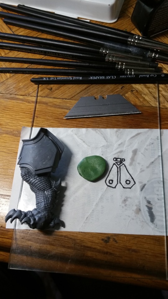
We start with the aforementioned tools, the surface we’re going to attach the new bit to (in this case, a dragon’s thigh armor) and an image of what we’re going to be sculpting. Sometimes, I draw the reference pic perfectly and precisely to scale with the space I’m attempting to fill, and then sculpt over the top of the image. For this example though, I figured I’d show you how you can use it as a loose guideline.
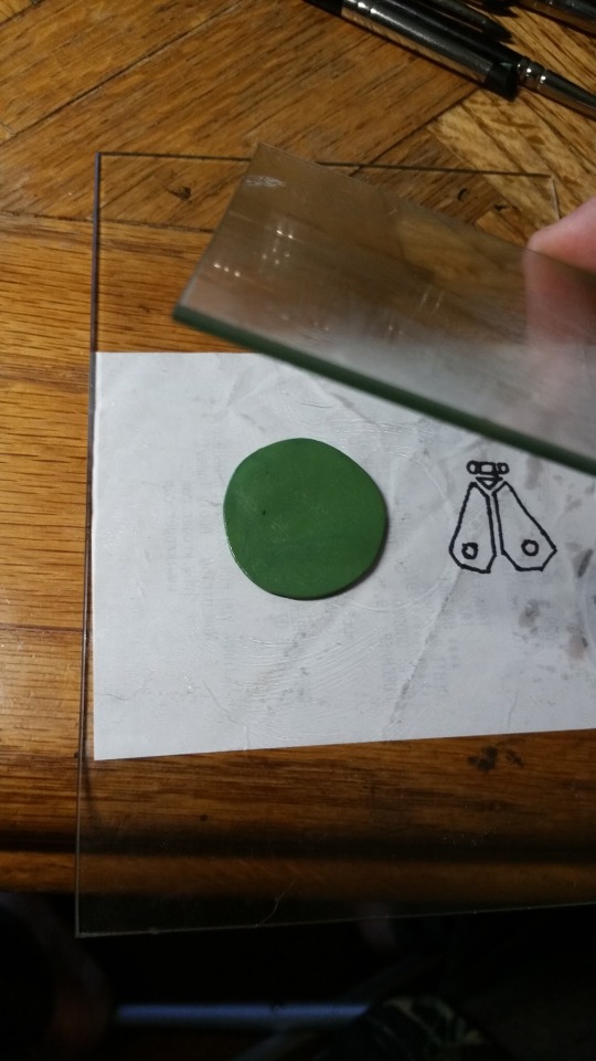
Using the two pieces of veggie oil lubed picture glass (just a dab will do you!) we mash our greenstuff ball down until it is flat, at the thickness we want and free of sausage fingerprints.
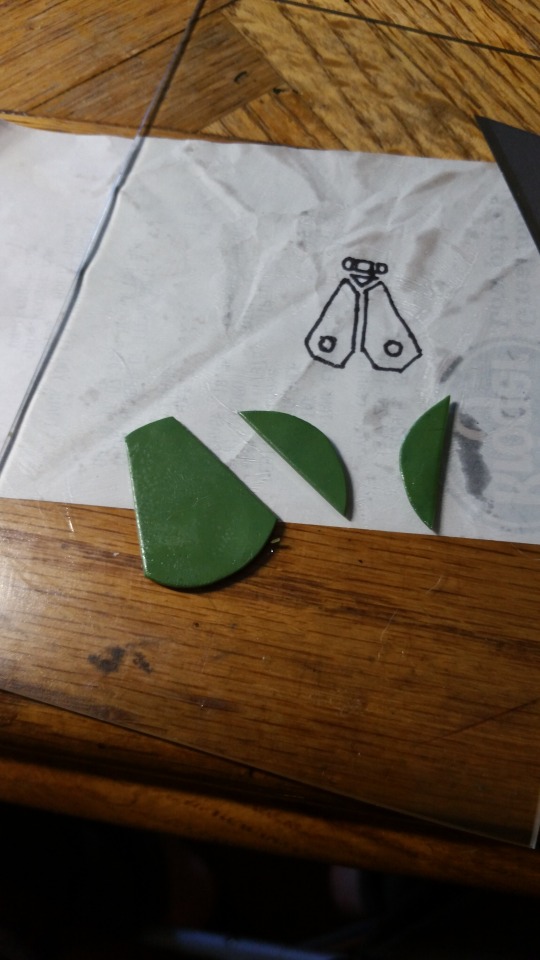
Next, we lubricate our straight razor, and begin making the cuts that’ll form the wings. In this case, it’s a simple geometric pattern. Straight lines are nice and easy with the razor, but symmetry can be hard to eyeball. I generally do this on a grid mat to assist with that, but it’s for Papa Nurgle, so it can be a touch sloppy.
Having gotten our wings established, we use a lubricated tool to make the circular indentations. Can’t stress the importance of the oil enough.
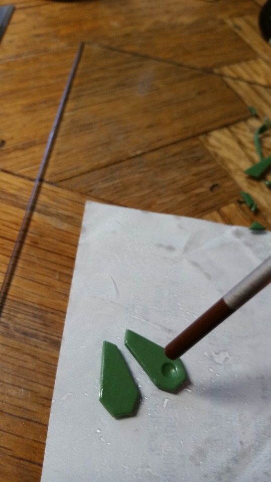
At this stage, we’ve cut out all the shapes of the fly symbol, and affixed them to the model in location using a dot of super glue for each piece. Word of caution. Make sure that you have the piece exactly where you want it to be when you have it superglued. Superglue and greenstuff LOVE eachother and want nothing more than to immediately settle down together forever. The pounded brass texture was accomplished using a rounded silicon tool. You can really see how they can be used to develop soft and subtle detail work, without leaving individual tool impressions. In the picture, you can see me using a normal (lubricated) mechanical pencil to make the rivets.
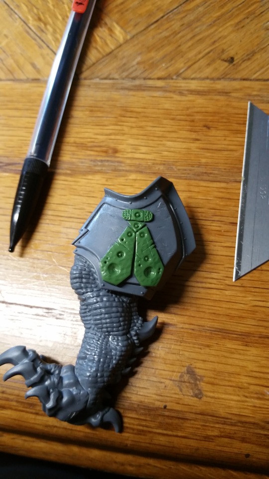
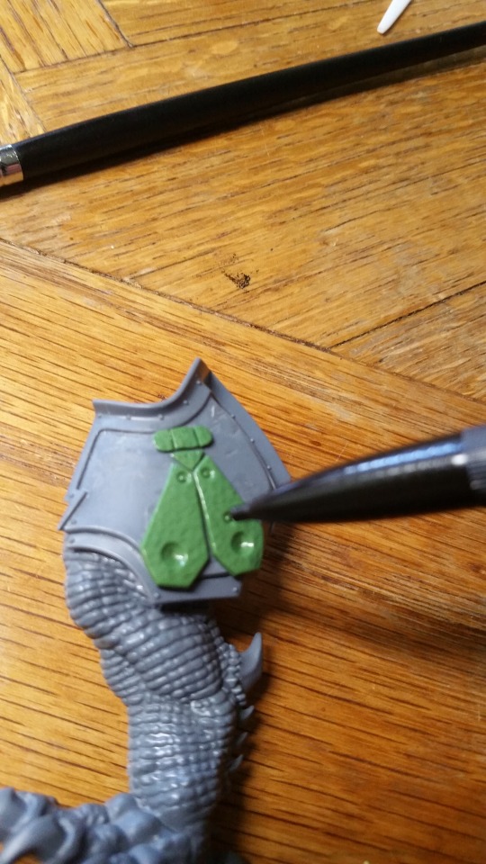
Finally, the result. I used the dental tools to create the wear and tear on the piece. took some little knicks out of the side to correspond with the scratches. There is no right or wrong answer at this point, you’ve got to go with what is most aesthetically pleasing to you as an artist. Go wild with it! Following these beginner guidelines, and practicing, you’ll find yourself turning out professional quality pieces in no time!
If you’ve any questions, feel free to drop me a line [email protected]. Check me out of Facebook by seaching for Miniatures of Tomorrow or go to My Website to check out a gallery of my completed works, or inquire about painting techniques or commissions. Keep your bristles damp! Will Tomorrow
1K notes
·
View notes
Text
Tutorial Tuesday: An Absolute Beginner's Guide to Washes and Highlights
Hey there true believers, it's Tuesday, and that means it's time for another tutorial from The Tutorials of Tomorrow! (echo implied) This week, we're going to be going over the very basic application of washes, and how to successfully apply them to your miniatures. If you're already familiar with washes, you'll probably not get much out of this, as it's meant for the novice painter. Fear not, there will be more advanced tutorials in the future, where we'll go over mixing your own washes, flow improver, matte medium, washes in relation to color theory, washes and the interplay of light and shadow and other, even more esoteric subjects. If you found the second half of that last paragraph confusing or intimidating, you're in the right place! To get started, lets lay out the materials we'll be using for this endeavor. I'll be using a combination of three paints and a wash to illustrate the basics today.

I’m painting the cloak of the Night Goblin in a purple scheme, so I’ve gone with various purples and the Citadel wash, Druchi Violet. I personally use P3 Paints and Citadel Washes, but since we're discussing basic theory, I'm not going into mixing your own colors in this tutorial. That being said, Citadel has a wide array of premixed colors, and more than enough to use them in lieu of mixing your own shades. The normal prep work is done on the model In this case, a Night Goblin Body from Games Workshop. It’s removed from the sprue, mold lines are cut away, it's been washed in soap and water (to remove any residual mold release) and it’s been primed black. The first step is to paint the area with your base color. This will be the primary color on the finished area of the model. It should be the darkest paint you use in your color scheme (your wash will be darker). In my case, it’s Citadel’s Xereus Purple, thinned to the consistency of 2% milk (always, always, always, thin your paints).

You’ll note that it’s not a perfect application of paint. It’s a bit inconsistent and the primer shows a little in some thin patches. Don’t worry at all about it, so long as the whole area is covered. The additional layers of paint will ensure that the whole area will be covered evenly with paint when finished. Besides that, using the thinnest layers possible will keep the paint from erasing any fine details.
Next, the application of the Druchi Violet wash.

It’s important to note that you use a wash differently than the other paints in your arsenal. You want your brush to soak up enough of the wash to cause it to pool in the crevices of your model. You can see an example of this in the folds of the robe, pictured above. You want to focus on applying the wash to the areas that would be wreathed in shadow, as it will darken whatever color it's applied on top of.
On the flat/raised areas of a model, the wash tends to dry unevenly, leading to discolored spots. While it's best to try and keep the wash to the areas that you want darkened, it's not a huge point of concern. We’ll be cleaning up the edges of the wash with another coat of our base color. In my case, that means another layer of Xereus Purple.

As you can see in the above photo. I’ve re-applied the Xereus Purple over all of the raised areas, where the light would hit the cloth of the robes. If you want to sound like an artiste/pretentious, you can refer to this as 'reclaiming your base color'. If you don't want people to think you think too highly of yourself, just call it cleaning up your wash. Make sure that all of the recessed, shaded areas are left the color of the Druchi Violet wash.
Already, you can see a much bolder contrast between the two colors. We’re going to make the variances even more pronounced with our first highlight layer. In this case, I’m going to use Genestealer Purple along the ridges and raised edges of the robe to give the illusion of direct light on the fabric. These are going to be some fine lines, so I’d recommend a fine brush (I like a size 1 or 0, personally).

You can see now how much more detail has been drawn out of the robe. All the the folds are dark and the edges have the lighter purple highlights to throw them into relief. The majority of the robe is still Xereus Purple, but now it forms soft shadows in areas, starkly contrasting with the brightness of the highlight and darkness of the exposed wash. This effect really adds to the perception of depth and makes your model appear to have more detail than actually exists. Close inspection will show you where I’ve used the highlights to form small wrinkles in the robe, where none actually exist (above the left knee, in the picture). You could really go nuts with it, but I’m keeping it simple for the sake of illustration (there will be more advanced tutorials on the subject in the future).
Nearly done now, just the extreme highlight remains. In my case, I’m using a very light purple, Daemonette Hide. This highlight is used sparingly, inside of the first highlight layer. The idea is to pick out areas that recieve the most light. In this case that is the most pronounced folds in the robe and the very bottom edge.

Above, you can see the finished result. The last highlight layer is very subtle, but in this case, subtlety wins the day.
There you have it, not so complicated after all, at least in this basic form. There is a lot of intricacy in some of the more advanced uses of washes, but you can get perfectly satisfactory tabletop quality results out of this simple technique. May your bristles never bend, Will Tomorrow
22 notes
·
View notes
Text
Snowy Water Feature Tutorial
Today we’re going to go over my technique for creating striking water features in your miniature basing and terrain work, like this.

This piece is the basework for a Cygnar Storm Strider, back when I thought that I was interested in Cygnar as a faction. Boy was I wrong!
First off, a list of essential supplies for the project.
A Base Corkboard Wine Cork Super Glue (gel/thin) PVA Glue 2 Part Acrylic Resin Baking Soda Acrylic Paints (I use a mix of P3 & Citadel) Primer Plasticard Milliput (or any modeling putty) Sand/Shale
Scissors Hobby Knife Dremel Tool A Pen
You start off by cutting a circle of your corkboard and gluing it in place on the base of your choice. This provides the start of your soil layer and provides a nice elevation for the edges of any water features you might place. Do not glue down any part of the corkboard that will later be cut away to form a pool, as it will be a bitch to remove if you do.
After you’ve glued the cork in place, use a pen to mark out the edges of your water feature. Try and avoid perfectly round pools, unless you’re going for a cartoony vibe. After making your mark, cut the shape out with your hobby knife.
It’s at this point that you glue/pin any of your major terrain features/props in place onto the base. In the case of the base at the start of the article that meant wine cork, cut at sharp angles, to simulate boulders.
After your props are in place, it’s time to Dremel out the plastic of the base where the bottom of the water feature will be. This will leave you with something that looks like this.

Now you’ll want to cut out some plasticard in a large enough shape to completely cover the bottom of the pool. When you’ve got that sorted, it’s as simple as gluing it in place.


Next up, you form the walls of the pond with a bit of milliput, making certain that it is sealed against both the upper lip of the corkboard and the plasticard bottom.The end result should be both organic looking and watertight. After the milliput sets, use some PVA glue and sand/shale to cover the cork and plasticard, just like you’d use them to base anything else.

I use several different grits and shale pieces to add depth to the soil profile. You rarely see uniformity in nature after all. I also picked shale as it’s sharp edges really math the rock profile of the wine cork boulders. I’ll be picking out individual pieces with gray paint to tie the terrain together.
After that all dries and sets, it’s time for some black primer.
The first thing you paint is the bottom of the pool, so you can pour your resin and let it sit overnight (not a project for the impatient). You do this by wet blending a gradient of blue tones across the bottom. The deepest part of the pool being Citadel’s Teclis Blue and working up the highlights with a mix of Teclis and working P3 Morrow White. A 1/1 mix for the first transition and a 1/2 mix for the lightest highlight. I like to pick any large rocks with the highlight color brighter than it’s surroundings as it really makes the detail POP, when the underwater effect is applied.

When that paint has dried, it’s as simple as carefully mixing and pouring the 2 part resin and waiting for it to set. A word to the wise, most of the acrylic resins give off toxic/carcinogenic fumes, so it is a good idea to do the pouring and setting in a well ventilated area. Always make sure to follow the instructions on the tin when working with potentially hazardous substances.

12-24 hours later, you’re ready to paint your piece. I recommend a triad drybrushing technique for ease of application and awesomeness of appearance. For the browns in the soil I start with a ample basecoating of Citadel’s Dryad Bark followed by a drybrush of Citadel’s Gothor Brown and a fine drybrushing of Steel Legion Drab. I use the same technique for the boulders and shale pieces, only in grayscale using Citadel’s Eshin Gray, Dawnstone and Administratum Gray, Respectively.

Now it’s time for some PVA glue and flock, got to mix in those grass elements!

Finally, and most dramatically… Snow. Snow is not a science, it is an art. I can give you the ingredient list, but not the ratios. Snow is not a static thing. There is wet snow, dry snow, powdery snow, yellow snow, compact show… you get the picture.
For wet snow, use a paintbrush to paint an area with realistic water effect then sprinkle a little baking soda on it. Use just a dash, and you’ve got a sheet of ice, a little more, wet/melting snow. Experimentation is key.
For dry snow, mix the baking soda with PVA glue, it will become doughy and hold its form, giving you ample time to shape it into a billowing snowbank or the dense snow swept aside by a passing tank. You’re limited by your imagination. As a word to the wise, if your snow seems too wet, sprinkle more baking soda on top, if it seems too dry, wet the edges with your acrylic resin or some gloss medium.
In the end, you should have something akin to this.

Well, that’s all for this tutorial. If you like what you see, let me hear about it! If you’ve got a tutorial you’d like to see, let me know! May your bristles never bend, Will Tomorrow
#water feature#tutorial#miniature painting#basing#terrain#snow#ice#wargaming#modeling#art#warhammer#warmachine
205 notes
·
View notes