
I am the typeface of the new horizon. Existing in media and pop culture, I am omnipresent. The display type. The attention seeker and the eyeball grabber. I am beautiful, but dazzling. I exist to impress. And I am no quiet servant to the communication process. Oh, you shall marvel at my spectacle and behold my worth.
Don't wanna be here? Send us removal request.
Statistics
We looked inside some of the posts by typobodoni-blog and here's what we found interesting.
Average Info
Notes Per Post
0
Likes Per Post
0
Reblog Per Post
0
Reply Per Post
0
Time Between Posts
4 minutes
Number of Posts By Type
Photo
13
Quote
2
Text
2
Last Seen Tumblr Blogs


Fun Fact
Forty percent of Tumblr users are between the ages of 18 to 25.
Photo

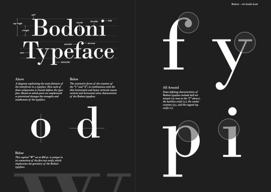
Bodoni Characteristics
(Source: 1)
0 notes


Quote
The letters don’t get their true delight, when done in haste and discomfort, nor merely with diligence and pain, but first when they are created with love and passion.
Giambattista Bodoni
0 notes

Text
Early Bodoni interpretations
Bodoni's original designs are periodically revived by new font designers. Indeed, during the age of metal type, every serious foundry had its own adaptation of Bodoni. Thus, today there is not a single typeface design called "Bodoni", but a range of adaptations, each with its own distinctive flavour.
Some adaptions, such as Bauer Bodoni, emphasize the extreme contrast between hairline and main stroke, which can be made considerably more pronounced using modern techniques of typography and printing than even the most skilled work of the 18th century. In text sizes, such hairlines almost disappear visually, resulting in reduced legibility.

Other designs, such as the ATF Bodoni designed by Morris Fuller Benton, capture the flavor of Bodoni's printing, emphasizing legibility rather than trying to push against the limits of printing technology.
Chauncey H. Griffith’s Poster Bodoni displays characteristics of the advertisement fonts of the first half of the 20th century. The font was most often used for posters and signs, eventually including neon signs. Most recognizably in the poster for the movie and play Mama Mia! as well as the movie poster for Black Dahlia.


Bodoni typefaces can sometimes suffer from a particular kind of legibility degradation known as "dazzle" caused by the thick vertical lines.
Source (1. 2 . 3 . 4 . 5 . 6 . 7 . 8)
0 notes


Text
In search of the TRUE BODONI
There are two problems with Bodoni. Firstly, although not everyone is enamored with it, everyone has an opinion (type foundries have their own interpretations of Bodoni). It´s similar to the way we British feel about our Royal family: if you are a pro-Bodoni monarchist then the face can do no wrong, but if you are a republican then the whole mystery and romance of Bodoni is just a subterfuge, which at best should be ignored and at worst needs to be done away with. The second difficulty surrounding Bodoni is one of proliferation: there are numerous siblings, third and fourth cousins, plus poor relations of doubtful parentage, cloaked under the protection of the Bodoni name, creating confusion and ultimately disenchantment.
Naming revivals with the original maker´s name can be seen as a way of honoring the original. But to the many users of fonts who have neither the time nor inclination to compare the subtle differences among fonts from different foundries, it doubtless appears that there are as many Bodonis and Garamonds as there are stars in the sky.
EARLY BODONIS
1. ATF Bodoni, by Morris Fuller Benton 1910 The first modern revival of Bodoni’s work was drawn for the American Type Founders Company in 1910 and was one of Morris Fuller Benton’s first designs as the company’s director of typographic development. In his research for the project, Benton tried to choose the best qualities from several examples of books printed by Bodoni. As a result, Benton’s Bodoni is not a replication of the Parma printer’s work, but more of an interpretation. Benton’s design was an instant success, and it served as the foundation for virtually every new Bodoni to follow for more than 80 years.
2. Bauer BodoniTM design, released in 1926 3. Ludlow Bodoni Trueface, created in 1928
MAJOR FLAWS All of the Bodonis drawn before the late 1900s, however, suffer from two major flaws: they all have the cold, uncompromising hairline serifs that are caricatures of Bodoni’s (albeit minutely) softer, friendlier designs, and none capture the spirit of Bodoni’s original italics. Most are hybrid adaptations of Didot’s more rigid and geometric designs.
BETTER INTERPRETATIONS
4. Bodoni Old FaceTM, by G. G. Lange for Berthold in 1983 The Bodoni Old FaceTM design, drawn by G. G. Lange for Berthold in 1983, took the first steps toward a true representation of Bodoni’s original typefaces. Lange’s design faithfully captures many of the character shapes and proportions of Bodoni’s designs. Its serifs, however, lack bracketing and are as straight as a die.

More recently, the Bodoni Classic, ITC BodoniTM, Filosophia, FB Detroit Bodoni, Lanston Bodoni, ParmaTM and Linotype GianottenTM typefaces have been added to the list of new Bodoni designs. There are also large Bodoni offerings with extended multilingual character sets from URW++ and Elsner+Flake (E+F). The more notable of these newer designs are Bodoni Classic and ITC Bodoni.
5. Bodoni Classic by Gert Weischer Bodoni Classic is one of the closest interpretations of Bodoni’s original roman. The face includes several characteristics normally not found in previous revivals. The ball serif on the tail of the cap “R” is a good example. Authenticity is also exhibited in italic lowercase letters such as the “v,” “w,” “x,” and “y,” in which cursive strokes replace the more common straight diagonals. Bodoni Classic also sports the softer serif designs found in the original 18th-century original.

6. ITC Bodoni  ITC Bodoni is one of the most carefully researched and accurate interpretations of Bodoni’s typefaces ever attempted. The process involved two trips to Parma, Italy, hundreds of hours of research, and thousands more hours carefully designing fonts using one of the original copies of Bodoni’s 1818 Manuale Tipografico (a collection of Bodoni’s type-design work published posthumously by his widow in 1818), as a benchmark for accuracy. (There were several copies printed of the book.)

0 notes

Photo


0 notes
Quote
Conformity without ambiguity, variety without dissonance, and equality and symmetry without confusion.
Giambattista Bodoni
0 notes