
Ember. Queer. Trans. Disabled. Slow loris when it comes to conversation. I like to make things. This blog is a hate-free zone. Member of Renegade Bookbinding Guild as Feral Stitch Press. Keep fandom free.
Last active 60 minutes ago
Don't wanna be here? Send us removal request.
Statistics
We looked inside some of the posts by undefinedkosmos and here's what we found interesting.
Average Info
Notes Per Post
548K
Likes Per Post
308K
Reblog Per Post
240K
Reply Per Post
312
Time Between Posts
12 hours
Number of Posts By Type
Text
14
Photo
1
Note
1
Video
1
Last Seen Tumblr Blogs


Fun Fact
Tumblr has been banned in Indonesia for providing people with access to pornographic content.
Text


Friday Keeps Coming Next by @rattyjol
March 2, 2025 - March 19, 2025
Full cloth case binding with design in heat transfer vinyl.
This was technically not my first fanbinding, but it was the first fanbinding I willing to share with the world. This fic is a groundhog day AU, in which the characters have to relive the same day over and over again. I chose the belltower as the central image to design the cover around because it is A) the setting for a scene that particularly stood out to me and B) representative of the "time" theme without being too on the nose. The white and gold color scheme is appropriate to both the fandom and the setting of the fic. One detail I am particularly proud of: At one point in the fic, a character spends several days in bed in a fit of depression and grief at his circumstances. The author conveys this by using several of the "Day ###" headings that are present throughout the fic, but with no content in between, showing that nothing happened on those days (at least from the narrator's POV). When I saw that I knew I had to do the twilight thing.
Materials: covers - 2 mm grey board spine stiffener - 2 mm grey board covering material - cream linen bookcloth vinyl - cricut brand gold foil
endpapers - white cardstock with gold foil endbands - bookcloth rolled over twine textblock paper - Hammermill 20lb printer paper, cream, 8.5x11 Typeset: Designed in Microsoft Word. The body font is Baskerville Old Face, headings are in Brotherland Signature, and "handwritten" sections are in Weddingday Revisited. Cover Design: Designed in Photopea. The belltower image came from Alamy. Title font is Brotherland Signature, author name is in Alegreya Sans.
dimensions: 5.5"x8.5"
Fun fact: I actually made 3 copies of this book! The first copy, then an author copy, then I actually remade the first copy a few weeks later to fix a few issues (using bookcloth instead of random cotton, not scorching the cloth when applying the vinyl, using more appropriate font size/margins in the typeset, fixing some problems with the spine dimensions so the book would open properly. Here are the original copy and remake side by side:


58 notes
·
View notes
Text
Finally figured out how to permanently disable google assistant on phone

54K notes
·
View notes


Text


Shou Xin aka 手訫 aka Xin Shou (Chinese, based Henan, China) - A group of mischievous little line-drawn cats is pouncing your way!, Drawings: Pencil, Eraser, and small Knives for added texture
14K notes
·
View notes
Text


Sometimes I forget I have a tumblr account and I should also share things here. So here’s one of my recent rebinds, The Knight and the Moth by Rachel Gillig! It actually had signatures so I was able to sew my own endbands.
Originally I set out to do this all with inlays but for many reasons that was a complete failure and heat transfer vinyl does not have enough shades of blue, so I ordered a custom direct to film transfer which thankfully was a lot cheaper than actually buying a dtf printer.
Cover inspired by gothic windows, stained glass, and used the chapter header art for the moth and sword.
130 notes
·
View notes
Text
Stop All the Clocks (This Is the Last Time I'm Leaving Without You) by firethesound @firethesound


This fic... THIS FIC. If you know, you know. It’s one of my all-time favorite fics, and I had to pick it for the #TreatYoShelf2025 exchange. The story is about grief, and it DESTROYED me (and I dragged some of my friends down with me, cause why the fuck not, right?).
As I read it, the whole concept basically came to me all at once, because there’s something so surreal about living in a world after the love of your life has died. Salvador Dalí’s The Persistence of Memory fits this story so fucking perfectly, I can’t even explain it, and in a way, I feel like I don’t have to.
I sobbed while reading, talking about, typesetting, and binding this fic — and I even teared up while taking pictures of it. Talking about self-care, huh? Cry it out and give yourself time. That’s what I call self-care. Do things you love, for yourself, and let yourself feel all the feelings. Be kind to yourself. Allow yourself to cry when you need to. Time will heal. It doesn’t last forever. Nothing does. No one does. It does get better.
Anyway. First time using printable Canva and just — Look. At. This!!! Don’t even get me started on the perfect charms I managed to find for this project, or the drawings I did for the typeset. And again — if you know, you know. (The mugs!!! The jumpers!!! The ring... Fuck, I’m actually crying again as I type this lol.)
Typeset and artwork by @jessonel :)
Except for the part that is clearly Salvador Dalí, obviously, hah.
More photos here (fucking Tumblr limit)
89 notes
·
View notes
Text
A Man of Honor by @astolat
I continue in my quest to bind all of Astolat’s fic in the fandoms I read! This is another GOT fic, but a Regency Romance AU.


The cloth jointed endpapers and cover inset are hot foiled, but the spine text and my logo are HTV because it turns out this Japanese book cloth does not take foiling well! I modeled the title page after the 1697 edition of Dryden’s translation of Virgil (yes, I’m that kind of nerd), hand painted the red because I still don’t have a color printer, and I used IM Fell as my primary font. The images of swords and pistols come from public domain photos of appropriate weaponry that I digitally traced and edited. Endbands are a simple bead on front with silk.
As always, Astolat, if you would like a copy let me know!
#respectfully#what the fuck Med this looks so good#sharp and clean and classy#bookbinding inspiration
26 notes
·
View notes
Photo
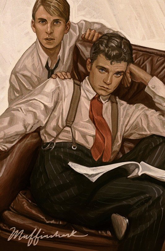
obligatory leyendecker-style bucky and steve
27K notes
·
View notes
Text

"The unassuming magnificence of the common and ordinary good" - "The Hands of the Emperor" by Victoria Goddard
Every so often I get the urge to practice my hand-lettering. Out of the many (many!) excellent quotes in these books this one might be the one closest to my heart.
89 notes
·
View notes
Text


The Arrest of Cliopher Mdang by astrocryptographer
April 22, 2025
Three-piece bradel with paper overlay and design in heat transfer vinyl.
This fic is a fun twist of genre; it takes a character who is very much not your typical action hero and thrusts him into the role of Indiana Jones, going on a cross-country adventure to track down the artifacts needed to break a curse (all while avoiding arrest). It's thrilling and cinematic, and so my vision for the typeset is very much inspired by the "action movie" theming. All of the "location headers" are meant to be reminiscent of the LOCATION IN BOLD IMPACT FONT WHITE TEXT ON AN ESTABLISHING SHOT that was a staple of 2000s action movie editing. The font and color choices were meant to add to the bold, adventurous vibes. The "forest fire" paper is in reference to a specific scene in the fic, and the overlay technique is heavily inspired by @zhalfirin's work. This was also my first time sewing endbands.
Materials: covers - 2 mm grey board spine stiffener - paperboard covering material - black and red linen bookcloth overlay - "Forest Fire" chiyogami paper vinyl - cricut brand gold foil, siser easyweed black vinyl
endpapers - green cardstock with pearlescent finish endbands - faux double core french endband, with cotton embroidery floss textblock paper - Hammermill 20lb printer paper, cream, 8.5x11
Typeset: Designed in Microsoft Word. The body font is Amasis MT Pro, headings are in Poppins, and "handwritten" sections are in Brotherland Signature and Weddingday Revisited. Images from Pexels.
Cover Design: Designed in Photopea. Font is Cinzel.
dimensions: 5.5"x8.5"
58 notes
·
View notes
Text


My most ambitious bookbinding project to date, a gift for author Christopher Buehlman for his incredible book Between Two Fires.
More info and process below the cut!
Since the book is set during the 14th century, I really wanted to do a typeset that included semi-contemporary art as accents. Before even printing the book there was a lot of work to do in the typeset process, including researching the artwork for chapter pages and dropcaps, as well as the title page image, all taken from woodcuts from the 15th-16th century (most of them are from Hans Holbein the Younger). It's not quite the same time period as the story, but I liked the more austere look of old woodcuts to illuminated art from the 1300s.
After typesetting and formatting, it was time to print, fold, and sew!


Then trimming the sawtooth edges with a chisel...


...and gilding the edges, weaving faux double-core endbands, and painting a hidden fore-edge image that reveals itself only when the book is flexed. These were all Firsts for me, and while they are far from perfectly executed, I'm obsessed. Every book is getting gilded edges and fore-edge paintings now.


I really wanted this book to have a leather cover, both because I've been eager to try my first true leather case, and because it felt so fitting for the rough, Medieval vibes of the book itself. Unfortunately, I got influenced by my local leather supplier, who convinced me that dying my own leather was the way to go...
...and she was right 🙈 I love how much control over the color and texture of the finished leather I have this way, and I will definitely be using up this veg-tanned hide that I purchased for future projects.


The symbol on the front (matched on the back) is my own design, and meant to evoke a comet. The detail of the protagonist Thomás witnessing a comet in the sky, and thus standing between the fires of the heavens and earth, was one I wanted to emphasize for the title.
I'm so thoroughly proud of the finished project, hiccups and all, and I'm so eager to make more leatherbound books now. Thank you so much to Christopher Buehlman for his blessing in creating this bind, which is now safely within his possession!
141 notes
·
View notes
Note
Upsizing clothes! There are a million upcycling tutorials for clothes that are too big, but so few on how to make too small clothes you still love bigger!
Thank you for your suggestion! We all go through weight fluctuations in life, so it stands to reason our clothes should be able to fluctuate with us.
Resizing your clothes used to be a very common practice before the advent of fast fashion. Fast fashion sizing is extremely flawed, especially when it comes to plus size fashion, and we're stuck with a lot of vanity sizing, so it's a good skill to have regardless of whether you're looking to mend something old or buy something new.
How to upsize clothes:
Introduction:
There are many different ways to make a garment larger. The following list is not exhaustive, just a few ideas to get you started.
Grading patterns:
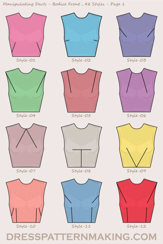
If you're making your own clothes, it's always useful to know how to modify a sewing pattern. The easiest way to adjust a pre-existing pattern to your size is slash and spread grading. First, you need to define which spots on the pattern need extra space. You then cut your pattern in that spot, and slide the resulting pattern pieces away from each other until you've got the size you need. Use paper to fill in the gaps. To ensure the resulting pattern makes for well-fitting clothes, make a mock-up and add, move, or remove darts where necessary to adapt it to your body type.
The image below shows potential slashing lines on pattern blocks for an AFAB body. Unfortunately this was the only diagram I could find, but know that other types of patterns use similar line placements. Each line is a spot that allows you to add extra space. To read more about this process, check out the corresponding article by Threads Magazine.
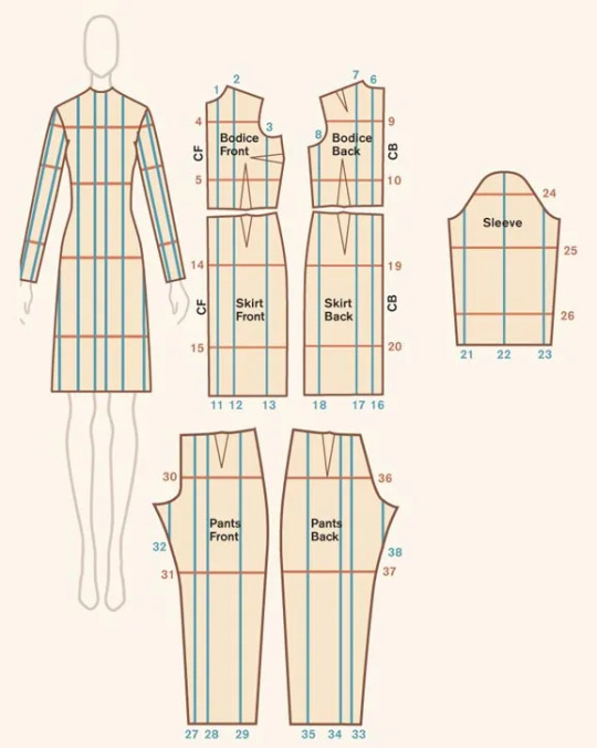
(Image source)
To make your clothes easier to let out in the future, make sure to provide ample seam allowance when cutting out your pattern pieces. This surplus fabric has several different uses, including giving you some wiggle room for when you need to size up your garment.
Now, let's take a look at pre-made garments.
Lengthening clothes:
A garment that's too short on you is easy to modify. Just add more material!
If it's a skirt or a dress, add ruffles to the bottom. Ruffles are easy to make by hand or with a sewing machine. You could also add lace, or wear the item with an underskirt.
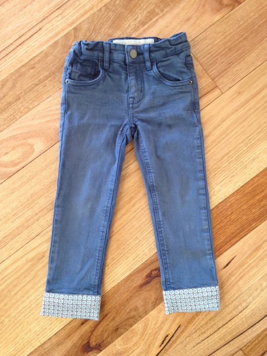
For pants, let down your hem or sew on a new cuff. If this isn't enough, maybe consider turning your trousers into capri pants or shorts.
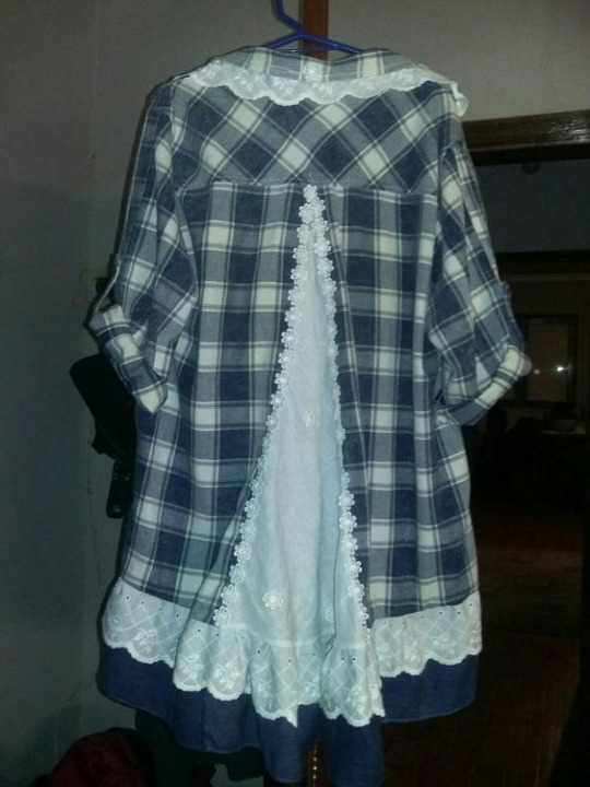
As for shirts, sewing an extra layer to the bottom edge is the easiest way to go, too. You could even combine two shirts into one to get an extra long shirt.
Another option is to cut your item in two and insert extra fabric between your separated garment parts.
(Image source)
(Image source)
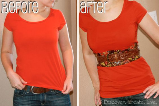
Letting out seams/darts:
Remember how we made sure to have ample seam allowance earlier? When a garment has surplus fabric in the seams and you only need a little extra space, you can undo the seams of your garment and sew them back together again, this time with a smaller seam allowance than before. The Spruce Crafts has a pretty good tutorial on how to let out seams. You won't be able to make major size changes using this technique, but if you only need a few centimetres, this is a good way to go.
A lot of garments also have darts. Darts are fabric folds that are sewn down in strategic places to help the fabric follow the body's curves. If a dart doesn't fit you the way you want it to, then unpick the dart and try on the garment. Either leave the dart open, or pin the dart in place however you want it, then take off the garment again and sew the dart back together.
Be careful not to rip the fabric when using a seam ripper. Also note that removing entire darts may change the garment's fit.
You can also add custom darts to achieve a better fit, but that's a topic for another time.
(Image source)
Adding extra fabric to your garment:
If we need to add more room than seam allowance or darts can provide us with, we need to add extra material. Remember those slashing lines we looked at earlier? If you're working with a pre-existing garment rather than a pattern, those are the perfect places to chop up your clothes and add in extra fabric.
Check your sewing stash for fabric that's similar in weight and material to your original garment, or go thrift shopping for an item you could use to upsize your garment. Long skirts and maxi dresses are a great source of fabric for alterations like these!
Lace inserts are also a fun choice to add some room, and if you're working with a knit item, you could even knit or crochet your own custom insert.
Define the area where you want to add extra fabric on your item, and measure how much you need. Draw a straight line on your garment with chalk/soap. Make sure the line doesn't cross any important structural or functional parts of your garment like darts or button holes: refer to the slashing diagram we saw earlier if you're not sure what spot to pick. Cut the line open (or unpick the seam if it's situated on a seam), and add in your extra fabric. Finish off your new seams so they don't unravel later on, and you're done!
You can add straight strips of fabric for extra width or length, or you could use flared panels or even godets to make your item flair out.
Want to see this technique in action? Check out this video by Break n Remake:
youtube
Some ideas:
This Pinterest user cut a straight line down the front of a t-shirt and inserted a lace panel to add extra width in the front of the garment.
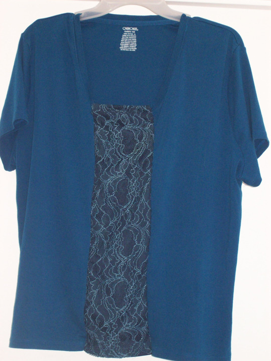
(Image source)
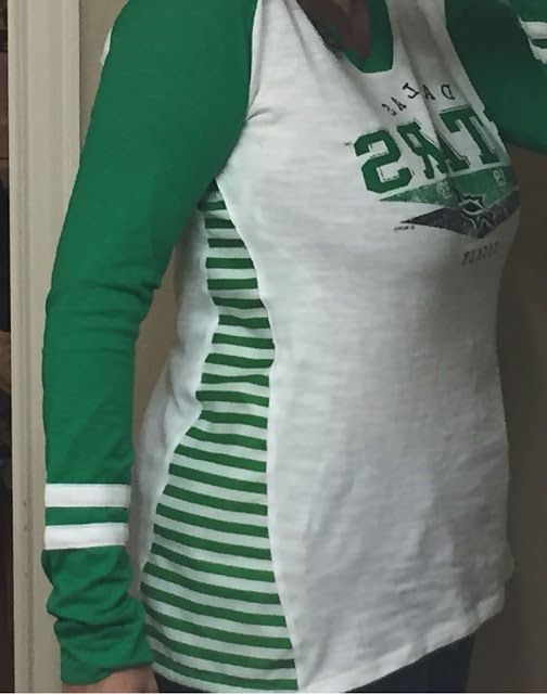
Busy Geemaw cut open the side seams of a shirt and used flared panels to add some extra width in the bust and hip area.
(Image source)
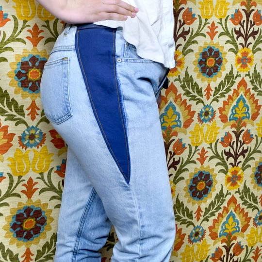
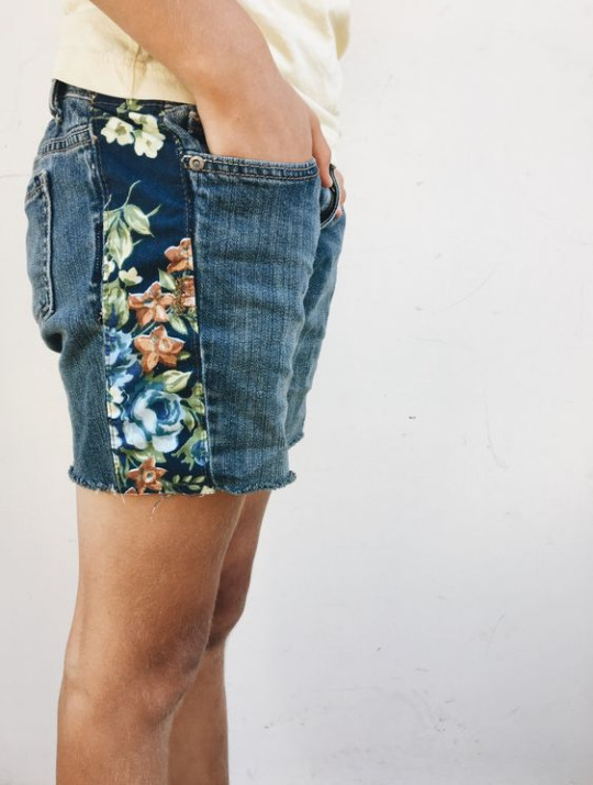
This person added a panel to the sides of a pair of jeans to give them more space in the hip area. You could easily use a long straight panel or a panel that flares at the bottom to resize the entire garment instead of just the hips, or use a wide piece of elastic for extra stretch.
(Image source)
This person added a godet in the back of their shirt in order to get more space in the back.
(Image source)
Blue Corduroy enlarged a pair of shorts by opening up the side seams and adding in strips of fabric.
(Image source)
You don't need to resize the entire garment if you don't want to. For example, One Brown Mom turned this ankle-length skirt with a too small waistband into a well-fitting knee-length skirt by taking advantage of the skirt's flared shape.
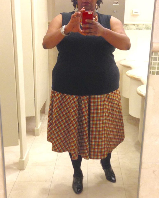
(Image source)
Conclusion:
Throughout our lives, our weight will fluctuate and our bodies will change. There's no shame in this: it's just a fact of life. Therefore, knowing how to upsize an item that is too small for you is a useful skill to learn.
If you want more inspiration, check out these projects by Confessions of a Refashionista, One Brown Mom, and Thriftanista in the City.
48K notes
·
View notes

Text
no sentence fills me with utter loathing so much as "i asked chatgpt"
65K notes
·
View notes
Text
Bound: First Watch of Night by @tackytigerfic
It finally arrived so I can share!
This one was a swap with @sits-bound (and you can peep the amazing bind I got from them here) and hoo boy, did I pack in the learning on this one! First rounded and backed book, first book weighing in over 600 pages, first case constructed to sit in the shoulders...

But before I go on, let me rave about this fic, which doesn't get talked about enough. Drarry fandom has more than its fair share of longer fic, but I don't think it's as common to find something this long that is so immaculately planned, plotted, and written. It has earned every one of its 270K plus words! It's rich and engaging and lovely and gripping, and it's Tacky, so the characterization is amazing and the storytelling is excellent. If you have not read it, you need to! (And tell Tacky about how much you loved it.)
Okay, on to the photos. There's a very subtle poppy theme here, not sure if it's noticeable lololol...
End bands are sewn with silk on a 2mm leather core. Sewing on a backed spine was new/tricky but worked out barring a few little snags getting the needle into the middle of a signature. @maleekamolscreates, acknowledged lovely mistress of end bands, has also let me know I’m fully bonkers for persevering with this tiny-ass silk thread. It’s like wrapping leather cord with angel pubes. I…have some regrets. But it’s so pretty!?
I need to continue to work on rounding/backing but this went okay and the swell was mostly handled?


(Last photo courtesy of sits because I forgot to photograph the delightful way the spine throws up!)
The punctuation in the pull-quote on that back was my personal Battle of Hogwarts.
The dust jacket was a whole adventure. Big thanks to @phoenixortheflame for support and advice on that one, and apologies to sits that I couldn't actually provide a perfectly laminated version. I did have to shout out her comment on the top of the back cover though... Also featuring @lemonlimelea whose comments are always super quotable!


I also failed to take photos of the endpapers, but they are the chiyogami pictured under the bind above!
On to the insides... I did some silver foiling on the full title page just because I felt like it and the needle-device (from the story!) seemed to call for it. I drew that needle in Illustrator, which is probably not impressive except I found it very hard and so I need a cookie.


Why poppies? Tacky prefaced every chapter (and named each chapter) with a bit of war poetry, and for me this evokes images of poppies in fields because Canada, probably. But happily, Tacky also likes poppies!
All told, it was a big undertaking! But also went surprisingly well? This is officially my 40th fanbind (and I've racked up a few more since then) and I'm happy to see how far I've come, and excited by how much more there is to learn. I continue to be challenged and delighted by this craft.
Thank you to @sits-bound for doing this swap with me! It was such an exciting project and a great experience.
133 notes
·
View notes
Video
goat fight. non-negotiable.
116K notes
·
View notes