
unit1illustrationfashion
unit 1 illustration fashion
13 posts
Don't wanna be here? Send us removal request.
Last Seen Blogs
pabaon
Pabaon News

hjaltemod
THE SHOW MUST GO ON.

juanelindio
coco

hanyatulisan
Hanya Tulisan

snow-bellarke-barry
Untitled


Text

Keratin Wacker work
i enjoyed doing this collage as it was fun to do on the different card.
0 notes
Text

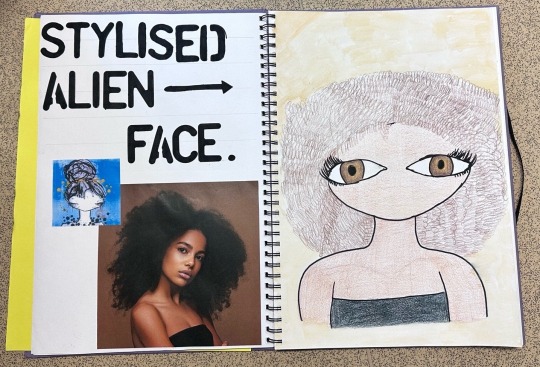
stylisted alien faces
I found these drawings easy to do because i used a grid to make sure i evened the faces out. However one thing i did struggle with was the chins because i couldn’t get them straight and it made the faces look a little wonky. Next time i do these/or faces like these i will use the grid method to make sure i can even them out. Another thing i liked about drawing these were that they all were different which made me learn how to draw faces from different angles. (e.g. side, front and at an angle).
1 note
·
View note
Text

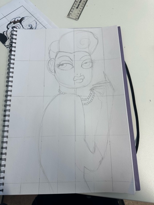
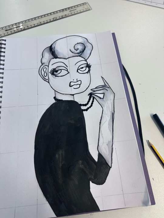
face
I found the face tricky to do as it was hard to get it symmetrical on each side. One thing i did like about doing the face was that it helped me learn proportions of where your eyes go. Next time to do this i will spend more time on it and not rush it once i get frustrated that it isn’t perfect even though this was my first try.
0 notes
Text


half and half (with graph paper).
This is where you have one half of the drawing and then on the graph paper you copy the other half to create the whole sketch. I found this easy as you had the size already meaning you didn’t really have to draw the graph or the 9 heads as a guide to it. However for me i did portion them into 10 pieces so then it was easier to make sure i was doing the size of the sketch right and not having the pieces of clothing or the other leg off size to the other one.
0 notes
Text


9 headed sketch
3 heads at the top which show how long the shoulders should be to. I found this sketch easy as the heads as-well as drawing a graph helped me make sure everything was proportional and made it look well done. One thing i found difficult was making sure all the heads were the same shape as if they weren’t it means the body and legs may have been out of proportion and therefore would have made it not symmetrical
0 notes
Text


s curve
The model shows movement in her body and isn’t just straightly sat. By giving the sketch more movement and giving it a pose makes it more human like and not just a person stood straight. I found this sketch good as i used a graph and it helped me keep all the features proportional. One thing i disliked about the s curve was the s as if it was a bit out of place it would mean that the whole sketch could look off.
0 notes
Text


A big model drawing with extended feet
(Which some off the page) Had to add paper and celetape to fit it on. One thing i found difficult was the long extended feet as it was hard to see if the model was drawn right and was even. Next time i draw this i will do it diagonally across the page so the whole drawing fits onto the one page and therefore i won’t need to extend it and will be easier for me to look and check if it’s right.
0 notes
Text

sketch of model of a basic head and figure
This was my first sketch. I found this one a bit tricky as it was my first sketch however by using the grid it helped me make sure i was proportioning the body right and made it look all even. One thing i found tricky was the feet and hands. It was hard for me to make sure the feet were long enough so that they didn’t look small (as in my drawing it looks like she’s got no feet). Next time i’ll make sure i draw the ankle shape so therefore it makes it look better and for the hands i have to make sure i don’t keep the sharp lines

Extended version
Another one with extended feet/legs to make the model taller and to look more boss.
0 notes
Text
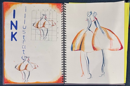
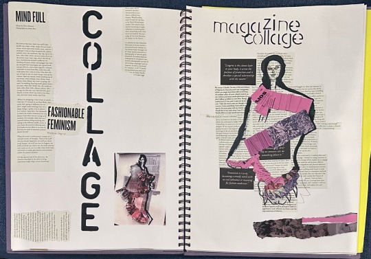
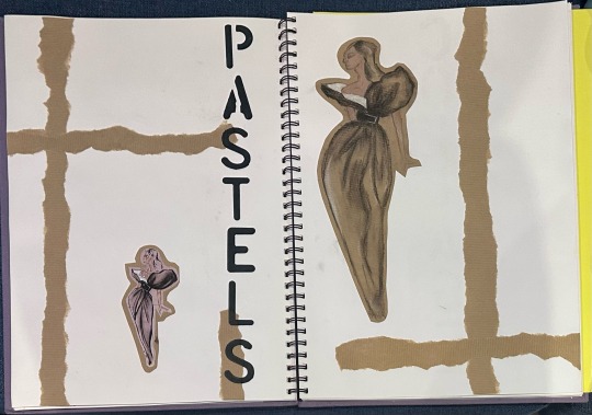
Six Media Pieces
• ink - I found the ink pieces really fun to create. I really love how the colors blue and orange look together and they combine really well to do the lines. One other thing i really liked was that the inks weren’t spreading really far through the paper. This made it easy to create smaller lines with the ink (e.g outline for the skirt).
•collage - The collage wasn’t my favorite one to do as i found creating the scrunches with the paper a bit challenging and then that also made it difficult to place the paper in the right place. However i do really love how the background for the collage was writing from new articles and books and i would definitely use that technique with some other pieces i’ll create.
•pastels - I loved working with the pastels to create the drawing. Each color was easy to layer up and created a really nice blended effect. One downside was that it was really easy to smudge the colors together on accident if you were still working on it. But when you had finished the piece and sprayed it then it all stayed well and looked really good.
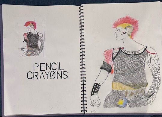
•pencil crayons - I have a love and hate for working with the pencils. I really liked how you can make sure you’re in the lines and can create defined lines. Coloring all together is something i will use in future projects. However one thing was that in some places you can see the paper underneath the colors as it didn’t cover it.This makes you have to press harder which can sometimes ruin how your making it look
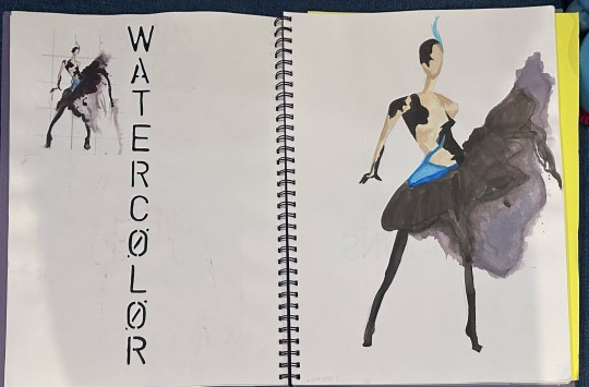
•watercolor - Watercolor was my favorite to work with. I love how easy the colors go onto the paper and how they blend with each other. One thing which i don’t like about this page was that i ran out of ideas on how to present the other page but when i saw other people’s in my class, i had the idea of the water drops but i realized i did too many and the page had some brown from the drawing on making it look unprofessional. I also find layering up the water colors hard but have learnt to let one layer dry before trying to mix other colors over it.
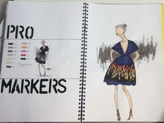
•pro markers - I really enjoyed creating the drawing with the pro markers. I liked how easy they were to work with as there was many colors and shades making me able to add more dimension into the skin. One thing i found hard with the pro markers was that they leaked out a bit meaning some came out of the lines and made it look uneven.
2 notes
·
View notes
Text

stylists alien faces.
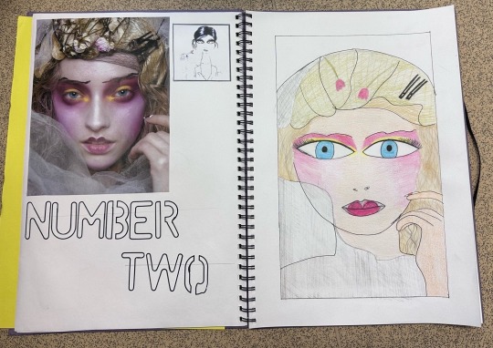
These were really fun to create because it gave me freedom to do what i wanted. We choose 3 photos which all had to have different styles. For the first one i found it easy however the hair was difficult because the hair. However when i got the hang of it it was fine to do. Next one i struggled with because i didn’t really know how to draw her but then after a few attempts i just added some color and it made the drawing look better. I wasn’t confident with this one and it is my least favorite one i created out of the three. Lastly, the water color one is my favorite . I found drawing the face with a graph was easier then just free drawing it. I enjoyed using the water colors and mixing the colors together to create the tones and shades. I also enjoyed doing the pop of colors into it.
2 notes
·
View notes
Text
ink bleeding
This is work i copied from Cassandra Rhodins. I found the colour bleeding to be hard at the start because i thought it would go all over the page and bleed outside the lines. However when i finally got to it it didn’t bleed and i was able to control where it went by using not a lot of water on the paint brush. I used the grid method to draw it because it meant i was able to do it in porto on s and make sure it wasn’t uneven.
1 note
·
View note
Text

colour theory
We did three sketches with 3 ways to match color. One was monochromatic. It’s is where you use colors the same on the color wheel. Next is analogous. This is when you choose colors next to each other on the color wheel such as orange and yellow. Last is complementary which is where you choose the colors opposite each other on the color wheel as they compliment each other.
I found these to be difficult with the sketching as some of the lines went to nowhere making me confused but when i had completed it, the drawings came out good. I liked using the colour as it gave me an idea of which colours go together and how to make shade on the clothes too. Next time i would use other colours to expand and do different things.
1 note
·
View note