Don't wanna be here? Send us removal request.
Statistics
We looked inside some of the posts by unit85and86deantemjit and here's what we found interesting.
Average Info
Notes Per Post
0
Likes Per Post
0
Reblog Per Post
0
Reply Per Post
0
Time Between Posts
18 days
Number of Posts By Type
Text
4
Last Seen Tumblr Blogs


Fun Fact
130K people were victims of a chain letter scam that affected Tumblr in May 2011.
Text
Task 4 - Final Piece
For this task 4, after having a complete plan of what I wanted to do, which was one of the ideas from my pitch. It is now time to start sketching ideas for the types of characters I will be using for the set stickers. However, I’d need to keep in mind that the character needs to be cute and friendly.
I begin the project by sketching ideas of what my characters would look like in different expressions and which I liked the best. I kind of like the idea of keeping my character simple with flat colours, which is something that would stand out in the LINE application.


After sketching out different characters in different expressions and emotions, I have decided to go with the character that has a head that looked like a box. The reason why I chose this character was because it looked simple, silly, and the type of character that I would personally like to use in daily communication. The next step is to sketch all 24 expressions and emotions digitally, and the reason why I am sketching it digitally as opposed to traditionally was that I could save the time of having to scan everything in the sketchbook into the computer. Another important reason was I wanted to have clean lines to show for my presentation on Behance instead of having a scanned in drawings which sometimes could look inconsistent with the lines.
The was the hardest part of the project - coming up with different expressions and emotions. I used the survey which I asked my family as a reference point which I could look back to as to what expressions I’d need to create. There are probably about more than 15 emotions in total, which my family have come up with, and I’d need to try to fill in the remaining amount of stickers.
For certain expressions that I have difficulties with, I’d do research into the existing stickers on the market and what type of expressions are there and how I could incorporate that into my own character. However, it was mostly expressions and emotions that I would really like to see and use in the set stickers. Designing the remaining set of stickers was really difficult as I was running out of expressions ideas; however, I try to think of something that I would like to use in daily communication without the need to type anything which is: cooking, eating, exercising, love, etc.

Once all 24 sketches are completed, it is now time for me to move on to the designing part of the character. However, before I begin, I just wanted to explain why there are only one character and the colour concept behind this character. I have researched and looked into existing stickers set available on the market, and most of them have one thing in common - which is there are at least two characters in them. This makes it convenient for the creator to create more emotions and be more expressive with them, and it is also to target both genders effectively. The reason why I chose to only create one character for this project was that my target audience is mainly male gender, and another reason was that I wanted to keep the sticker set consistent.
I feel that having two characters could ruin the flow and consistency of the sticker set, and another thing which I’d need to consider was my colour concept. I didn’t want to implode my character design to have lots of different colours as this could distract the audience. What I wanted was to have the character in the same consistent colours to still keep the flow of the stickers.
Adobe Photoshop certainly has options which I would really like to use such as creating a sketchy feel to the character to get that authentic drawing feel to it and adding gradients to character design to make it pop. However, the reason why I chose to use Adobe Illustrator as opposed to Photoshop was that the size of the stickers is going to be at 240 x 240 in pixels. These are extremely small, and I’d also add at least 10 pixels margins for each individual stickers so the actual stickers size would be 230 x 230 pixels.
The reason is pretty apparent as Adobe Photoshop is a pixel-based software whereas Adobe Illustrator is vector based. In Photoshop, the smaller the size of the document is, the more you can see the pixels in character, and let’s be honest - it doesn’t look right. Which was the reason why I chose Illustrator as no matter how small the document is, there will be no pixels in character and will always have that smooth consistency line.

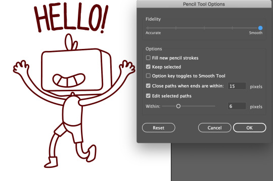
After deciding which software I am going to be using for this project, I then start drawing the character in Adobe Illustrator. I used the pencil tool and changing the setting to ‘smooth’ to get the smooth lines that I was after. I then started drawing using this option, and whenever the lines are a bit off, instead of redrawing it again, I’d use the ‘direct selection tool’ to edit and change the points to save time.
Once the lines are completed, I duplicated it and set it aside from the artboard to use later. I change the drawing lines on the artboard to fill colour and change the colours according to how I wanted it to be.
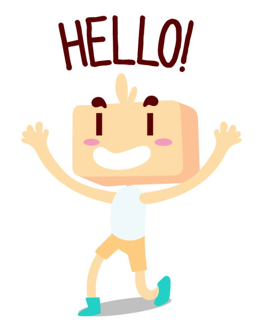
Next, I add the shadow by using the pen tool to draw the shadow and change to appropriate colours for the shadow. I then used the ‘shape builder tool’ to erase the excess areas of the shadow.

Once completed, I used the drawing lines that I left it aside from the artboard and try to align it to the character with the colours fill to create this cartoon look to the character which is what I was looking for. I then repeat the process for all 24 individual stickers.

I then add some text to certain stickers as some do need a text in there to express certain emotions, such as hello or thanks. However, most of them will have no words or text as this is going to be on the market in all regions which is why it is important that the stickers will be able to portray certain emotions or expressions without the need of any words behind them.
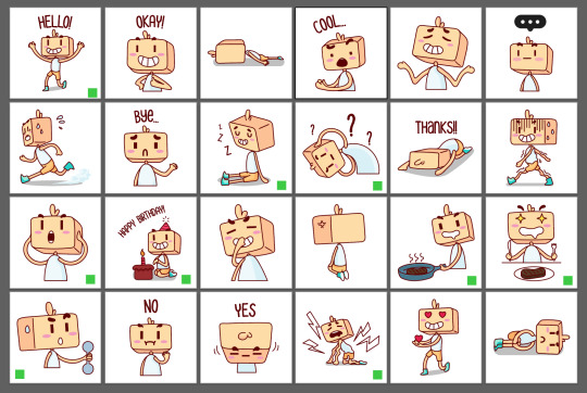
After having every sticker in its own individual artboards, I now make a decision as to which stickers I wanted to animate and give emotions to. I create a green square as a marker to know which stickers I need to animate, and I ended up choosing 9 stickers to animate in total.
The method which I am going to animate is using Adobe After Effect and a little bit of Adobe Animate. My main focus for the animation is to keep everything simple with a maximum time of 4 seconds for the animation. After Effect is used for the movements of the character and Adobe Animate will be used to animate the moving of the mouth which I will import it as .SWF file later to After Effect for the final edit. The animation will be looped and saved as a GIF file so that it can be played on Behance.
However, before I begin animating the stickers in After Effect, I’d need to make sure that the stickers I wanted to animate are in separate layers. To avoid confusions, I have decided to create 9 new document files for each individual 9 stickers that are going to be animated.
Animation
Once everything is sorted, I then start to animate 9 stickers in After Effect. The file document I created is 400 x 400 pixels as I wanted to leave some spaces for the stickers, and at 29.9 frames per seconds.
The movements of the stickers are relatively simple as mostly it was just animating the position, opacity, and rotation keyframes to create simple actions. The mouth animation was also simple to create as I animated it in Adobe Animate and export the file as .SWF to After Effect.
As soon as the stickers are completed, I then try to submit a sticker form on LINE Creator Studio and try to get these 24 set stickers approved as quickly as possible so that it will be available when the deadline comes. However, one thing which I made a mistake was I thought that it was possible to have a mixture of static stickers and animated stickers all in one set, but after I reached the submission page, I realised that I could choose one option or another which is either static or animated.

This changes my goal entirely as I now can’t submit animated stickers on there with a mixture of static stickers. Therefore, I decided to just submit all the static stickers on there anyway as I’d really need to get it sent off as soon as possible. However, I will still be keeping my animated stickers around as I’d need to present them on Behance for the final presentation anyway.
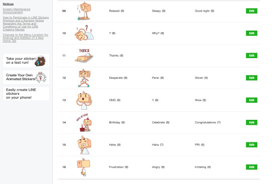
To submit the stickers, there would need to be a total of 26 PNG images altogether, and each individual PNG need to be less than 1 MB. LINE requires the creator to have one main image and one tab image. The main image is the image which will show the character in the market page as its main image, and this is the first image which the consumers will see, so it is essential that the main image reflects how your characters would look in the stickers set. A tab image is used as an icon which will be displayed on the screen to show that particular sticker set.
Main image:

Tab image:

Next step is to tag every 24 individual stickers to its appropriate tags. This is used when the users type in that specific tags, it would automatically tag that sticker.


The date which I submitted my stickers for approval was on 15/05/2019, a week before the deadline, and I am hoping that it gets reviewed within one week for it to be available before the deadline, but it really does depends. However, to make sure that I still have something to present, I’d create a mock-up to show my stickers being used in the application, and there is also a LINE simulator which you can test your stickers in the application which is just handy. However, since the deadline has been extended for this project by three more weeks, I received the approved signal and published my stickers on the LINE store.
The response I got from the stickers are well received and it seems to be used by some people. Here is a chart which displayed numbers of users who sent and received my stickers:

What inspired you?
I have always wanted to create a set of stickers and publish it on the market for people to download, and what better ways to make the stickers as my last project for College. Moreover, I thought it would be pretty good to have my family members using my set stickers on LINE application as they are frequent users of LINE and uses stickers quite often. This inspired me to create a set of stickers that my family and I would personally use, and some expressions which we thought are necessarily needed in the pack.
What was your final idea?
My final idea for this project is creating LINE set stickers, and it can either be 8, 16, 24, 32 or 40 stickers in total. I chose to go with 24 stickers because I think it is reasonable going with that amount given the amount of time that we have for this project. What I didn’t realise initially is that I thought LINE would let you add static stickers and animated stickers in the same set similar to how iMessage is. However, I was wrong, and it’s either static stickers or animated, one or the other.
What went well?
What went really well for this project is that I managed to create set sticker pack that I would personally use, and I also successful in being organised and staying true to my schedule as I was able to send the stickers early and get it approved by LINE for it to be on the market just before the deadline.
What didn’t go so well?
What I dislike and the things that didn’t go well for this project is the overall look of the stickers. I wish I could re-design the whole thing entirely and resubmit the stickers; however, it isn’t possible this late into the project unless and I start over again from scratch which I don’t have time for that. Moreover, I didn’t correctly check LINE stickers guidelines for creators as I initially thought that I could submit static and animated stickers all in the same pack, which I was wrong. Had I checked it beforehand, I could have planned out everything better than this.
What have you learnt during this project?
Creating stickers and submitting them is in itself learning, but the things which I learned the most during this project is drawing the character digitally. I initially wanted to do all of the drawings of the stickers in Adobe Photoshop. However, it isn’t possible once I thought about it as creating stickers as small as 240 x 240 pixels would create pixelated stickers in Photoshop. This forces me into coming up with a solution and creating it in Illustrator just make much more sense than it would in Photoshop.
Furthermore, I had never tried to draw in Illustrator before as I thought it was weird, but after searching for tutorials and choosing the right settings and tools, I was able to draw really smooth lines in illustrator which is precisely what I was after.
What would you do differently next time?
The things that I would do differently next time is to give myself time to think and do more research. I definitely didn’t give myself much time for the research as I planned my schedule to research and write up the Tumblr blogs all in one week, where I would design the stickers for the remaining three weeks. However, that definitely backfire on me as I am now stuck with set stickers that I totally not satisfied with. It is a lovely sticker set that has all the expressions that I expected in the set; however, the character is a little bit inconsistent and looks weird in general. I would definitely redesign the character entirely and coming up with at least two characters: boy and girl to target a wider audience. I would also design the characters to be more cute, friendly and engaging.
Another thing which I would do differently next time is publishing my set stickers on a different application. The reason why I said that is because even though I wanted my stickers to be free, LINE forces you to put a price on the stickers. The free stickers on the market are usually the official released from LINE themselves. While this may look like it is a good thing for creators, it is actually a disadvantage. The reason being is because they take 50% of your profit from your sticker, and it is their way of making money off from creators.
Overall did you do a good job? Did you manage your time effectively?
I believe I did reasonably well getting all of the work completed and have the stickers on the market on time before the deadline, even if the deadline has been put off for another three weeks, regardless of that, I’d have completed it in one month anyway. Moreover, I was also successful at managing my time really well. Before I begin the project, I created a work schedule in which I would follow to get my work completed efficiently. For the first week, I would dedicate myself into researching everything in regards to creating stickers and writing everything up on Tumblr. This way, I would be able to spend the rest of the time creating all of the stickers and get it sent off for approval so that the stickers will be available on the market before the deadline.
Link to the sticker in the store:
https://store.line.me/stickershop/product/7732307
Final work on Behance:
https://www.behance.net/gallery/81273713/Line-Box-Head-Stickers-Set
0 notes
Text
Task 3 - Pitch
1 - Message stickers
What is the theme? This could be one theme for 3 potential projects or three separate themes.
What will you be creating?
Why are you creating it? Who is the audience, what is the purpose behind the work?
There are many things to consider and think about when creating message stickers, for instance, the target audience. I’d need to really do primary and secondary research to find out what’s the market needs are for message stickers. For example, the illustrations can absolutely be anything I wanted; however, I have to think as a consumer perspective whether it is something that I am going to be using as often or not in daily online communication. Having a specific target audience is the key to success in creating a successful set of message stickers. Personally, I’d use the stickers that have a wide variety of emotions and a character that could represent myself. This means that the character illustration I am looking for is going to be a male character, so this sets a target audience specifically for the male gender as they are likely will be using it more than women.
However, this is only my own personal opinions, which can be biased. To really tackle the problems, I will need to do primary research by creating a survey and ask my family members what they would like to see in the stickers set since all of my family members use stickers pretty often on an application called ‘LINE’. The secondary research will also be conducted to see the results on the internet and what people would like to see.
There is no specific theme at this moment in time as I’d need to conduct a research first before deciding what the theme is going to be. However, I do have a clear goal as to what I wanted to do, for example, animate at least 9 stickers to provide more expressions on the character and this would need to be expressions that can be used in daily online communication. Another thing I have planned is my target audience, the target I have decided on is the male gender as my character will be a male character, and this is something that I would personally use. However, I am going to be making the character cute enough so that women audience can still use it as well to express certain emotions in their online chat.
I aim to create stickers set that are cute and friendly. This means that there will be no swearing words or something inappropriate to the young group of people. The set stickers will have a wide variety of expressions that can easily be used in daily conversations such as hello, sad, angry, cooking, and eating etc. Although the target audience is for the male gender, it still has that cute aspect which female can even use and also target at any age group, which I believe my stickers could stand out in the market.
In an extension of this, my aim for the stickers is that it needs to be easy to use in daily conversation and communication, and stickers that consist of easily understandable expressions, messages, and illustrations. Things I’d really like to avoid is to create stickers that are difficult to use in daily conversation, such as objects and scenery and sets that significantly lack variety, such as stickers made up purely of pale colours or strings of numbers. Lastly, I’d like to avoid content that offends public order and morality, for instance, suggestive of under-age drinking or smoking, contain sexual or violent imagery, or may fuel nationalism.
I have an idea of how many stickers I wanted initially, which is 20 stickers. However, this is not possible if I am going to be publishing these stickers for LINE as they have a certain amount of stickers that I’d need to meet, such as 8, 16, 24, 32, and 40. I know I wanted to create somewhere between 16 stickers to 24 stickers, but this could change if I have enough time to create more than 20 stickers or not as I’d also need to be animating half of them too.
There are many things to consider when creating message stickers, as I’d need to stick to the application’s stickers’ guidelines as this will help me create a successful set of stickers. While making sure that the requirements for the stickers are met with their policy and send them for a review. I have heard that the process for the review can take anywhere from 3 to 4 weeks, although some people have to wait for 2 months until they can get their stickers onto the market. I planned on submitting them as early as I can, but I know it won’t be in time for the hand in of the project. However, I might get lucky and get reviewed in a few weeks anyway.
2 - UI design
What is the theme? This could be one theme for 3 potential projects or three separate themes.
What will you be creating?
Why are you creating it? Who is the audience, what is the purpose behind the work?
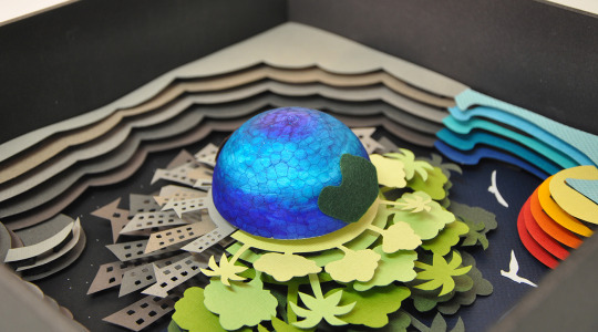
Three themes came to my mind when coming up with this project idea, which is: music application, travelling guide application, and saving the planet application. All three themes are interesting to me, and probably the one that stands out to me the most was saving the planet application. I wanted to create an application explaining all of the problems with plastic and how we could help our planet, and the impact that plastic has on our marine life.
The application will be interactive and easily accessible with one click that takes you to different pages. Each pages explaining how plastic has made an impact on our environment, ocean, and marine life.
Although I have made a UI design before for a mobile phone application. I really wanted to go much more in-depth than I did before. This means researching how to create a successful UI design application that is interactive and easy to understand for the viewers. Moreover, investigate more into what techniques or skills I’d need, such as knowing the grid systems or are there specific layouts I could use for a UI design to make it successful.
The target audience will be for any gender and at any age group as this is targeting to a broader audience. The purpose of this project is to explain the information about how plastic has an impact on our planet and what we can do to help. However, I am not going to be creating an application that takes the reader to a page and make them read a piece of lengthy information that would be boring.
I planned on creating different animation, which will be played when the users clicked on a particular page, and my aim for this is to grab the users’ attention with movements, colours, and images. All of which will be displayed throughout the pages to keep the users stick around and read the information on that page. Sounds simple but it is something that I’d need to research on and is it even possible to even pull something like this off.
3 - 3D paper crafts
What is the theme? This could be one theme for 3 potential projects or three separate themes.
What will you be creating?
Why are you creating it? Who is the audience, what is the purpose behind the work?
Two themes came to my mind when coming up with this project idea, which is a papercut poster and papercut calendar. To be honest, I am more interested in creating a papercut calendar as I believe it would require more technique and skills to design a calendar, let alone designing a papercut for it.
For the project, I’d need to research more on the different types of the calendar as they all come in different sizes and shapes. My idea for the calendar is to keep the overall look simple and play around a lot with the white spaces.
My idea is to create a papercut of a big letter acronym to each month - in a total of 12. The letter representing each month will be large and there will be graphic paper-cut in the background to create some interests. The colour scheme is going to be rather simple, which are black and white, which would contrast really well and make it all comes together.
Furthermore, the reason why I came up with this project idea was that 3D papercraft is another aspect of graphic design which I have never tried before, and I believe that doing this project could potentially help me with my design skills. For example, I’d need to learn and use the grid system and apply the technique when designing the calendar. I’d also have to plan how I am going to be cutting the paper, what sort of paper do I need, and I’d need to make sure that the cut out is equal for all 12 pages to keep it consistent.
The target audience is aimed at any gender, and there is no specific age group. However, it is likely aimed more towards adults considering the design backgrounds that I am going to have on there. The purpose of this project is rather simple-minded, I just wanted to create a calendar, but in 3D paper crafts. This means designing it in Adobe Illustrator before trying to papercut it to create a cut-out design that I am looking for. Moreover, I’d need to consider what materials I am going to be needing for this project, and how all of this is going to come together as this is something that I have never created before.
Conclusion
In conclusion, I have decided to go with my first idea, which is designing message stickers. However, before I begin generating ideas on characters and emotions, I’d need to do extensive research into what are the processes involve into creating message stickers and are there other things I’d need to know before I begin the project.
My focus on my message stickers:
Suitable to use for all age group and any gender
Easily understandable emotions
Can be used in daily conversations
In an extension of this, the skills and techniques which I could potentially learn from this project are:
Learning different emotions
Animation principles
Visual communication
Motion
Upon my research, I found that there are three ways of expressing feelings in chat, which is through the uses of emoticons, emojis, and stickers. All of which has a history of its own with emoticons being the oldest form of expressing emotions on online communication.
Emoticon history:

Emoticons are used in computer communications that are meant to represent a facial expression to communicate the author’s emotions. When the internet was entirely text-based, and this is between the late 1960s and the early 1990s - when emotions were rendered in ASCII and were read sideways, for example, :-) which indicates “smiley”.
However, it has been claimed that the first emoticon appeared in 1979, the first substantiated use of an emoticon came from American computer scientist Scott E. Fahlman on September 19 in 1982. He suggested that :-) could indicate humorous posts on a message board, and :-( could indicate serious posts.
The use of emoticons has caused controversy online. Critics of emoticons argue that they erode the ability of people to communicate clearly and use language creatively in cyberspace, as well as in other forms of writing. However, some have said that they are a lazy means of communication, and other note that they negatively affect the credibility of the author in an e-mail message.
Emoticon supporters insist that they help online communication more than they hurt it. For example, emoticons are the way to address emotions and feelings among users in online communication as the barrier for nonverbal communication is not having face-to-face contact. They help clarify the tone of the message without the need for lengthy exposition.
Emoji history:
The first emoji was created in 1999 by Japanese artist Shigetaka Kurita. Kurita worked on the development team for “i-mode,” an early mobile inter-platform from Japan’s leading mobile carrier, DOCOMO.
Kurita wanted to design an attractive interface to convey information in a simple, succinct way: for example, an icon to show the weather forecast rather than spelling out “cloudy.” This was when Kurita sketched a set of 12- by 12- pixel images that could be selected from a keyboard-like grid within the -mode interface.
Kurita’s original 176 emoji is now part of the permanent collection at New York’s Museum of Modern Art. DOCOMO’s goal was to find new ways to express information. There were characters to show the weather (sun, clouds, umbrella, snowman), traffic (car, tram, aeroplane, ship), and technology (landline, cell phones, TV, GameBoy).
However, those characters weren’t informational. Emoji simply offered a way to add emotional subtext to a message. For instance, “I understand” might sound cold or passive on its own, but add 😊and the message offered a sense of warmth and sympathy, and this was the beginning of a new visual language.
Sticker history:
The origin of stickers goes back to post-tsunami Japan in 2011 when Korea’s top internet company, Naver began developing LINE in Japan. Naver opted against focusing on Korea because it felt the market was too challenging, mainly due to the dominance of Kakao Talk, which is said to be installed on more than 90% of Korea’s smartphones today.
LINE was the service that first pioneered emoticons, and its rise in Japan - where it is more used than Facebook, Twitter and other social networks - helped turn stickers into a communication tool for users.
Stickers are a mix of cartoons and Japanese smiley-like ‘emojis’. Both are popular in Japan, and when bought together, they gave Japanese smartphone owners an addictive new way to communicate emotions and feelings with quirkiness. Not to mention that the challenge to accumulate your own personal collection appealed to the market too. Moreover, using stickers means users spend less time tapping out words on the phone, making communication easier and more rapid.
Research into stickers:
Stickers offer a fun, engaging way for people to express themselves in a messages conversation without typing or using emoji. A sticker is an image or an animation that can be sent or placed on messages, photos, and other stickers to add emphasis and communicate emotions.
Things to consider when designing message stickers:
Design for expressiveness - people use stickers to visually convey moods and reactions. Strive to deliver stickers that connect with people at an emotional level. Also consider incorporating imagery, words, and phrases to add new dimensions to conversations.
Think globally - messaging is a universal form of communication. Aim for stickers that have broad, international appeal to it.
Use descriptive image names or provide alternative text labels - although they aren’t visible on the screen, image names and alternative text labels let voice over audibly describe stickers, making navigation easier for people with visual impairments.
Add vitality through animation - although stickers can be static images, animated stickers are a great way to impact energy in a conversation. Another thing to consider when creating animated stickers is to use a frame rate high enough to keep motion fluid.
https://www.wired.com/story/guide-emoji/ https://yalantis.com/blog/stickers-a-mobile-messaging-lingua-franca-or-a-powerful-marketing-tool/ https://www.fastcompany.com/3065406/how-stickers-are-helping-humanize-chat-apps https://www.britannica.com/topic/emoticon
0 notes
Text
Task 2 - Investigate and practice
For task 2, I am going to be doing brief research into the different idea generations methods that are being used to effectively create a plan for my project. There are many forms of ideas generations, and each is effective in their own perspective ways, but this does depend on how it is being used as well.
1 - Reverse thinking
Instead of adopting a logical, reasonable manner of idea generations, you reverse the idea and think of the opposite of it. For example, ‘how can I double my fan base’ can be changed into ‘how do I make sure I have no fans at all’. This may sound strange, but coming up with opposite ideas actually is more comfortable than spending hours trying to come up with great ideas.
2 - SCAMPER
This is an idea generation technique that utilises action verbs as stimuli. It is kind of like a checklist developed by Bob Eberie that assist the users with coming up with ideas. SCAMPER is an acronym with each letters standing for an action verb:
S - Substitute
C - Combine
A - Adapt
M - Modify
P - Put to another use
E - Eliminate
R - Reverse
3 - Random words
A straightforward and fun way of coming up with ideas. The process of this is to generate two random words and try to tie your content to it in the most imaginative way possible.
4 - Mind mapping
The method of mind mapping is to imagine the connections between various pieces of information or ideas. Each idea is being written down and then connected by curves or lines to its minor or major fact or opinion.
5 - Listing
The list is compiled of ideas generations that are broken into a list to make it more comprehensible and easier to understand.
6 - Storyboarding
This has to do with developing a visual story to explain or explore ideas. A storyboard is useful as it helps creative individuals to represent information that they have gathered from research and explain it in a visual story.
7 - Brainstorming
This process involves generating a vast number of solutions for specific problems or design ideas for the project. In the course of brainstorming, there is no assessment of ideas, and this means that people can speak out their thoughts freely without fear of criticism.
8 - Crazy 8
Crazy 8 an idea generation technique that uses Design Sprint method. The process for this idea generation is that it is a fast sketching exercise that challenges people to sketch eight different ideas in eight minutes. The purpose of this technique is to push an individual beyond their initial idea and generate a wide variety of solutions to the problem.
9 - Brain dump
Brain dumping is an idea generations technique that allows users to dump all kinds of different ideas, whether they are good or bad onto paper, and the focus here is the quantity rather than the quality.
10 - Mood board
The purpose of creating a mood board is to gather images that you find inspirational, such as the style of it, the colours, or the composition. However, the disadvantage of using a mood board is that it is likely that you will plagiarise the artist’s works as your own without notice.
After the research into different ideas generations is completed, it is now time for me to actually applying those ideas generations methods in my own project and start coming up with ideas. I decided to use the mind mapping method and listing method as I found both ways to be really useful and practical, and I feel more comfortable in using them to come up with really great ideas.
I started coming up with 5 ideas and expanding them into its minor or significant parts of the ideas of what I could actually be doing for that particular idea. Moreover, these ideas are not ideas that I’d feel comfortable doing them. For instance, I feel excited and comfortable in designing a logo, but I cannot do this as my project as the primary purpose of this project is to further my skills in my particular specialist field. Therefore, it is necessary that I choose projects that I believe will improve my skills - even if they are something that I have never done before.
Mind map:

Book cover
The first idea that I came up with is to design a book cover. The reason I chose this idea is that I have never designed a book cover before, and I am intrigued as to what techniques I am going to have to learn to create a successful book cover. For example, knowing what colours to use in association with the moods to portray a certain mood that fits the theme or story of the book. Another example is how I could use the grid system effectively to create a design that can be easily followed by the readers. I can say that these techniques are not my most often used in projects and by doing this project, I believe it could further my skills in using colours and the grid system.
Message stickers
The second idea that I came up with is to design message stickers. This is something that I have never done before, and I am interested in the process of creating them. Moreover, once the stickers are completed, I planned on getting the stickers approved LINE, which is a messaging platform. Creating a message sticker is in itself, a challenge. However, I am going to be creating at least 16 to 24 stickers and are planning to have at least 9 stickers fully animated. There are things which I could learn from this project, such as learning about the animation principles and learning different emotions to express it on my characters.
In an extension of that, I needed to make sure what the size and resolutions requirements for LINE are before beginning the project as this could save me a tremendous amount of time.
UI design
The third idea is to create a UI design. The reason why I chose to create a UI design is that I had touched upon UI design when I created a UI application for my portfolio and I was really excited when I first created them. I believe that by doing this project, I could improve on my existing knowledge on UI design and improving them even further. Moreover, I really wanted to see the functionality of how the UI works in real-time, and to do this - I have decided to create them in either Adobe XD or Figma. Both of which I have never used before so I would definitely be learning something from doing this project.
Poster design using Cinema 4D
My fourth idea generation is to design a poster. However, it isn’t going to be the usual approach to how I would generally do it, which is to create a poster in either Adobe Illustrator or Photoshop. For this approach, I wanted to take things more challenging, and I have decided that I’d design abstract models in Cinema 4D before importing it into Adobe Photoshop for the final edit of the poster.
The reason why I wanted to use Cinema 4D was that I have never used it before, so I thought it was a good idea to learn how to use the software to enhance my skills. I have seen so many creative artists uses the software to create exciting abstracts shapes and design an effective poster with it.
3D papercraft
For my final idea generations, I came up with an idea to design a 3D papercraft. The reason why I wanted to create 3D papercraft was that I find it to be something challenging to do and learn. This could improve on my skills as I have never really created something like this before, and I gave myself some options to either design 3D papercraft poster or a calendar.
Designing 3D paper calendar sounds interesting to me as I’d need to design them in Illustrator first before I could papercut them to get the desired results. All of which is something that I could learn from and improve my skills and this is a practical project which I have never done before as I would typically go the digital route. However, there are a lot of things that I’d need to prepare, such as the materials to use for the project and planning the time to get the best out of this project.
What do you need to do in order to prepare and plan a successful piece of work (time manage, develop a workflow)?
What I’d need to be doing for this project is planning my working schedule for each week, and I’d need to have a clear idea of what I wanted to improve my skills on and make as a project to save time. Moreover, I planned to complete every research the first week and spent the remaining weeks designing and creating the stickers.
However, I also need to keep in mind that I need to finish these stickers as soon as possible as it needs to be sent for approval to be on the market. This is because I wanted the stickers to be on the market before the deadline so that I can show the mock-up on Behance.

0 notes
Text
Task 1 - Specialist Field
What is your specialist field?
Graphic design communicates certain ideas or messages through visuals whether it is through text, images or symbols. It is a way of communicating and connecting people together through visuals and it is about being creative, solving problems, and finding solutions.
What does a graphic designer do?
A graphic designer’s job is to create visual concepts that communicate solutions and ideas that inspire, inform and captivate consumers. Moreover, goals can be different upon the type of graphic design, but a graphic designer primarily focused on making whatever organization they are designing for recognizable. A graphic designer is there to help build a brand identity and boost that company’s brand as well as communicate their messages through visually-pleasing content.
There are 3 types of settings if you’re going to choose work in graphic design:
Agency Graphic Designer
Many companies hire graphic designer agencies to handle their designs for them. Moreover, if you’re working as an agency graphic designer, then chances are you’ll be receiving a creative brief from companies to work on projects for many different brands. Agency designers are expected to be a design expert and often times, agency designers are very specialized in areas of graphic design.
In-house Graphic Designer
An in-house graphic designer is employed by an established company and your work revolves around that single brand only. In this particular case, you’re more of a graphic design generalist so that you can meet all the creative needs of your organization.
Freelance Graphic Designer
Working as a freelance graphic designer is possibly the most difficult. This is because not only you’re expected to handle all design requests, but you’re also responsible for running every aspect of your business. Although this comes with perks such as working on your own time and your own space, you will need knowledge in more areas than just graphic design.
References: https://learn.g2crowd.com/what-is-graphic-design
What is your specialism? Are there common materials and techniques involved in the practice of this specialism?
In the simplest term, graphic design is the art of combining ideas, images, and text into something that engages and informs an audience. It’s about creating visual designs that communicate to the audience. It makes sense that communication through imagery would evolve over time just as human communication continues to change and develop.
Common materials and techniques
The design process for this particular field had evolved tremendously with the continuous digitization in our world today. However, even how much evolved the process of graphic design has changed, this doesn’t mean that designers aren’t still using traditional graphic design tools such as pencil and paper.
Most graphic designers today use a hybrid process which includes traditional and digital technologies. It is common and important that designers start the process by sketching out concepts with traditional graphic design tools before going digital. This helps designers to get their ideas across and generate ideas quickly on paper as opposed to jumping to creating a design in a digital software straight away.
How long has this specialism been practised? Does it have a history and can we trace the development of this specialism through the research of key individuals?
Upon my research for the history of graphic design, I found that graphic design is a form of art, and people have always been drawn to expressing themselves through art. There are some areas where some people would argue that the history of graphic design can be traced all the way back to cave drawings, like the pieces created in Chauvet in 30,000 BC. in 1436. In addition to that, the concept of graphic design took a huge leap forward when the “Gutenberg Press” was invented, which allowed content to be mass-produced for the first time in history.
These are some important graphics developments and key individuals through history:
In 1796, Aloys Senefelder developed the concept of “lithography” - the first printing method using a flat surface.
In 1880, the rise of the halftone screen allowed for photos to be printed in a range of shades.
In 1932, the “Times New Roman” typeface emerged, designed by Stanley Morrison and named the “Times of London”.
Much of the development within the graphic design as we know it today began in the early twentieth century, and it is when hundreds of fonts have been created by graphic designers around the world. This was also when advertising and mass media began to evolve, and professional designers found more jobs filling the pages of newspapers, magazines, and much more. Thus, the first graphic design school, Bauhaus, opened its doors in Germany in 1919.
How graphic design has evolved over the years, and these are the most significant style movements throughout history:
Art Nouveau

Graphic design response to the industrial revolution, Art Nouveau formed the bridge between modern graphic design and historical academic art. The “New Art” movement involved organic vine-like lines,, elegant curves, and ornate typography. In a world where digital displays require design to be far less complex, Art Nouveau design has become an outdated element of graphic design for most. However, the soft colours and flourishes may contribute to vintage graphic design strategies.
Modernism
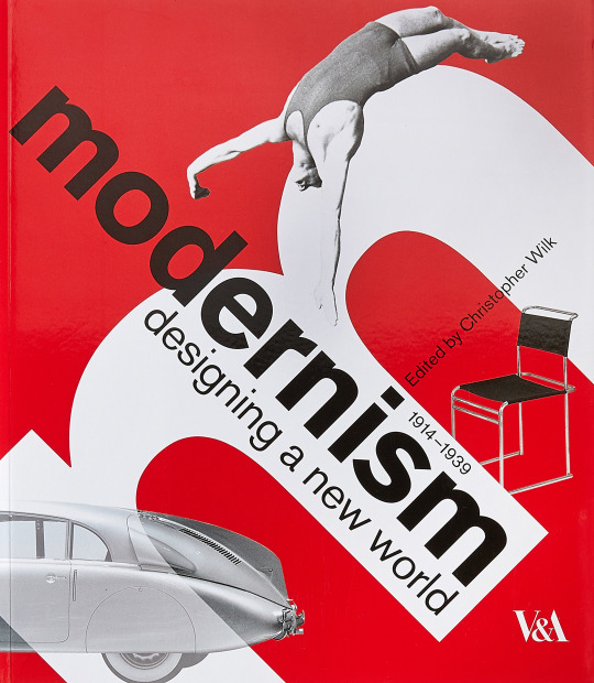
Modernism became part of the history of graphic design during the 1950s. This style is characterized by the deliberate decision to reject artist styles of the past, emphasizing experimentation with the new materials and techniques instead. The main focus of the modernist graphic design was to create artwork that reflects the nature of modern society - this means bold colours, simple shapes, and modern fonts are all being used and are common elements of modernist graphic design.
Art deco
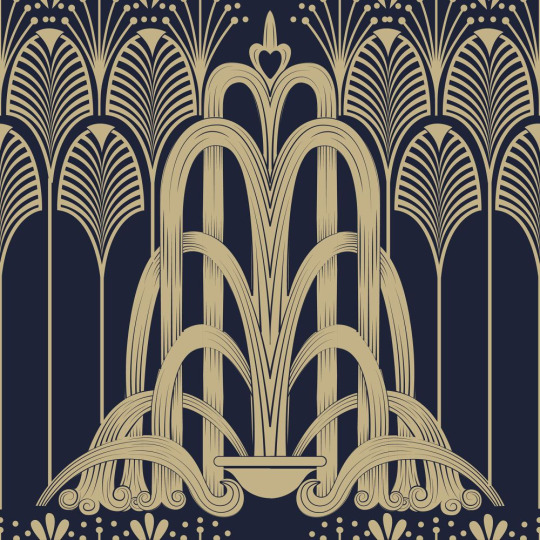
The Art Deco graphic design movement became popular during World War 1. For many, it was a spin-off of modernism and a way for graphic designers to show the luxury and beauty of simple shapes and typography. The art of Art Deco is lavish and authentic, with plenty of geometric shapes, contrasting colours, and symmetrical patterns.
Swiss style
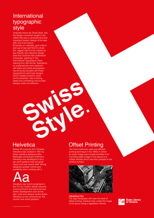
Swiss style is often referred to as “international typographic style”, Swiss style unsurprisingly originated in Switzerland during the 1950s, and it’s the basis for a lot of the development within the history of graphic design throughout the 20th century. Swiss design continues to influence the field today, thanks to its focus on legibility and simplicity. Graphic designers that use the Swiss-style will focus on typography and sans-serif fonts, rather than sketches.
The digital era

Modern graphic design has come a long way from traditional hand-drawn glyph and imagery of decades pasts. Ever since the launch of Mac computers, graphic designers had access to hundreds of tools and solutions that make graphic design more efficient but also complex at the same time.
To create a logo that is timeless, or establish a unique image for their brand, modern companies are looking for a way to appeal to their target audience by analyzing current trends.
How is your specialism practised today? You need to know where it came from and where it’s at, to have a good guess at what will happen next. If you’re really clued up you might be the first to develop new ideas and processes.
Graphic design can also be known as communication design, is the art and practice of planning and projecting ideas and experiences with visual and textual content. In today’s graphic design practice, the form of design can be physical or virtual and can include images, words, or graphics. The experience can take place in an instant or over a long period of time.
The work can happen at any scale, from the design of a single postage stamp to a national postal signage system. It can be intended for a small number of people, such as a one-off or limited-edition book or exhibition design, or can be seen by millions, as with the interlinked digital and physical content of an international news organization. It can also be for any purpose, whether commercial, educational, cultural, or political.
In extension to how graphic design is practised today, one of the most basic graphic design practice, and one that’s stood the test of time is KISS - Keep It Simple, Stupid. To put it simply, don’t overcrowd your piece, don’t use a convoluted collection of colours and fonts, and don’t forget that white space is your friend. A simple design communicates your message much more effectively.
Another basic best practice in graphic design is understanding the messages your colour choices send. Warm colours feelings of passion; cool colours have a calming effect. If you reference a colour wheel, colours side-by-side are analogous and communicate unity and balance. Colours across from each other are complementary; using complementary colours brings a bit higher emotion to your design.
What kind of workflow and process is followed within these specialisms to achieve creative outcomes, what can you learn from research into specialist and implement into your own working practice?
In graphic design, a workflow comprises all the necessary steps that have to happen for a particular job to be completed. This means that whatever your final results are supposed to be is going to determine what workflow is. If you’re designing a piece that will be output to the Web, it’s going to have a different workflow or process, then a project that will end up on a printing press.
It’s important to realize that every workflow is different, and this is because every project has different goals, but also because there is usually more than just one way to accomplish a task. Workflows are also affected by factors you might not necessarily think about. For example, if you’re a designer who is putting together a newspaper, you might be incorporating some photographers who need to submit their images digitally.
There are organizations or design firms that handle nearly all the aspect of a project, and there are designers who may work on only one portion of a project. Some firms offer services from concept all the way through design. Some people are just photographers. Even so, photographers who understand the entire workflow not only provide better services to their clients but also can be more efficient and avoid having to redo work later in the process.
Traditionally, one was required to possess and learn several software tools, each one working differently. A tremendous amount of work was required to make sure that all of these tools worked together in some useful way. And maintaining them was challenging, because each of the tools had different upgrade cycles, causing constant workflow changes.
References: https://99designs.co.uk/blog/design-history-movements/history-graphic-design/ http://fabrikbrands.com/the-history-of-graphic-design/ https://www.aiga.org/guide-whatisgraphicdesign http://asteriskcreative.com/2018/02/27/graphic-design-best-practices/
0 notes