
Don't wanna be here? Send us removal request.
Statistics
We looked inside some of the posts by unit85and86graphics and here's what we found interesting.
Average Info
Notes Per Post
0
Likes Per Post
0
Reblog Per Post
0
Reply Per Post
0
Number of Posts By Type
Text
1
Last Seen Tumblr Blogs


Fun Fact
Women make up for the other 50% of Tumblr’s audience.
Text
What Is your Specialism?
The specialisms that I am passionate about and enjoy doing are graphic and a little bit of illustration. I am not very good at drawing or digital art but it is something that I enjoy doing and I feel like I have never really given digital illustration a proper go so I would like to try and learn more about digital art and illustration. Within graphic design I really enjoy and mainly make things like posters and cover art for things as branding and advertising is definitely a route I would like to go down with graphic design.
Are there common materials and techniques involved in the practice of specialisms?
With graphic design lots of work is usually made digitally with digital software such as Photoshop or illustrator. Graphic designers might also use more traditional methods like sketching and experimenting with colors and materials to influence there work. Techniques used within graphic design are things like color, gradients and composition. With illustration both digital and traditional methods are heavily used because illustrators could be using a variety of pens and pencils onto different papers or textures but then lots of it is all done digitally with drawing software and tools like digital drawing pads.
How long has this specialism been practiced ?
Graphic design has been around for ages some say it started in the 15th century and this is because graphic design is not all digital but modern design really started around the 1919 with things like the Bauhaus school creating posters and typography work. For illustration people have been drawing forever which you can see with cave paintings, there is also lots of different types of illustration such as scientific and fine art but digital illustration started around 1985 with artist like Andy Warhol using the Commodore Amiga and software called Pro paint making imagery with pixels. There are lots of influential illustrators like David Hockney and Butcher Billy but one of my favorite illustrators that I follow is a smaller artist called lumps who is a illustrator from Cardiff and creates work that’s unusual, grotesque and wacky.

Lumps always enjoyed drawing and started by doing it on the side for fun whilst he was at university but he gained client work and became a full time illustrator. His preferred techniques are drawing with pens like fine liners and markers onto paper but he also does digital illustration with a iPad and adobe draw. He usualy goes to instergram and other social media platfroms for inspiration but he says he is influced by artist Alex Gamsu Jenkins and Pollynor
Pollynor
Alex Gamsu

Lumps makes his money by doing freelance client work and using Instagram to sell prints of his work and promote his website. I really like his artwork and am drawn to how dark but funny his peaces and characters.
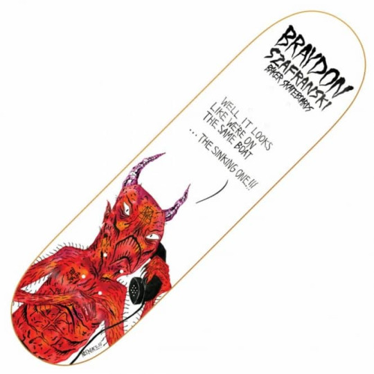
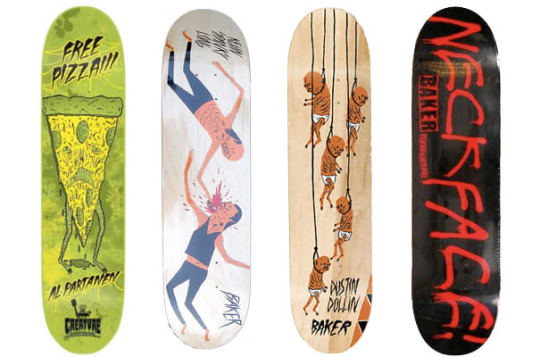
Neck Face
Neck Face is a anonymous graffiti artist and illustrator and is know for his more dark and grungy work which is also commonly comedic. He was born in California in 1984 where his work is featured on the streets but also in art galleries around the world, his first gallery show was when he was 18-years-old and was sponsored by Rich Jacobs and held at New Image Art gallery in West Hollywood, California. His drawing style is said to be rough and scratchy with bloody violent themes attached to his work. His first skateboard design was for krooked skateboards creating a pro model for skater Mark Gonzales. Neck face uses lots of mediums from marker pens spray paints and pencils but sharp metal masks, felt installations, and sculptures have been featured in his work.

Christoph Niemann
Christoph is an illustrator, graphic designer and author of several books but out of these things he is mainly known for his illustrations. He was born in 1970 in Waiblingen in west Germany. He studied in Germany and developed his art but his career really took off when he moved to New York in america in 1997 and worked on and created many covers for the popular magazines and news papers such as the new Yorker, Atlantic monthly and the new York times. His work follows lots of different styles as he uses lots of things to create his work from pencils to paints and painting with coffee.

I do really like his illustrations and I think the reason why there so good is because of how creative and abstract some of the ideas are. He does things to help his imagination go wild and to help him create interesting ideas, for example he has multiple sketchbooks with one shape on the front and then he will fill the hole sketchbook with drawings incorporating the shape. One of the things he does to help his work be as creative as possible is that he says when things are going well you should always pick another direction allowing him to really experiment and create complex ideas.
The reason I am looking into this illustrator is because I watched a Netflix documentary and I really like the way he works.
His design process.
He usually does all his work in his office as he says he cant do it anywhere els and he will work from nine in the morning to six at night. He has everything he needs with him before he starts working allowing him to just start and create something. the thing that I like about his approach is that he doesn’t plan or wait for inspiration to hit him he will just start drawing and let the ideas come to him, he says “you haft to trust that crazy things happen”. He dose not like to put words or titles to his work as he feels that the illustration should explain itself and represent the contents its associated with. When he works to deadlines he dose not allow himself to experiment to much and he will just jump right in by putting pen to paper. He says that its not about waiting around for hours waiting for inspiration to arrive its about turning up and starting because once you start creating something creations and ideas take place and this is something that I really like the idea of and would like to try in my work.
After looking into artists and how they work within there specialisms I started creating ideas using idea generation techniques.
I set my self the task of coming up with 5 ideas and then I would narrow that idea down to one that would be ready to pitch or be approved to go forward with.
The main thing I did to come up with ideas was just let things and ideas come to my head randomly much like Christoph Niemann would, but the one thing I need to keep in mind is that with this project I want to step out of my comfort zone and try something new or tackle a project using new techniques or styles that I haven't used before.
I mainly used mind maps to help me build ideas.
The first mind map was titled buildings and this is because I really like modernist architecture and would like to learn more about perspective and making illustrations look more 3d and less flat.

This mind map is me thinking about the things I could lean and try like isometric architecture or designing floor plans but I also had the idea to create a set of building designs with a variety of buildings that shows different wealth levels so you could have run down houses for poor people and then some designs for middle class people and then luxury and billionaires.

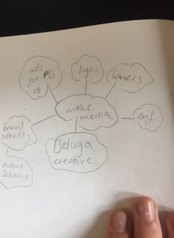
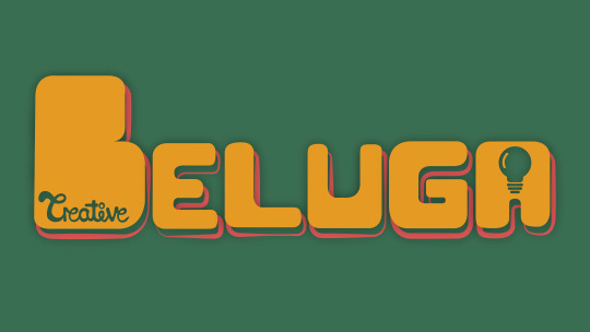
Beluga creative is a creative agencies that is being made so I thought I could make different advertisements such as social media ads and banners. Its my brothers company and he is a cinematographer and there is a model maker/animator and another artist involved, I already created the logo but more collateral would be helpful to help launch the project so that Is something I could do.
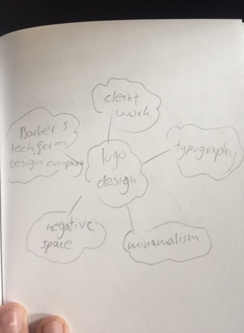
The next idea was logo design just because I have only really created a very small amount of logos and haven't really tried using different styles like negative space or custom hand drawn typography, also I really struggle to make simple design look good and a lot of logo design is very minimal so making some sort of logofolio I might get better at minimalism and logo design. Also there is a very high demand for logos to be made for short freelance project and If I get good at logo design I might be able to get some small logo design jobs.
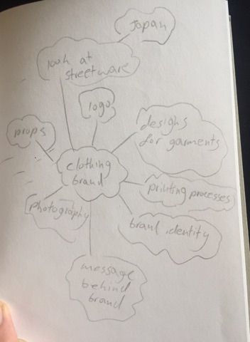
Another idea that I explored was creating a clothing brand as it is something I have always wanted to do and I enjoy street ware but I feel like lots of it is to simplistic and lots of it looks the same so I would like to create a brand and garment using my designs. With this project I could explore lots of new things such as making a brand identity, putting graphics onto clothing and possibly doing some model making.
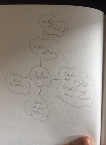
The next thing I thought about was tattoos because I am currently very interested in tattooing and all the styles so I thought I could look into different tattoo styles like traditional, realism and new school and try and design tattoos and could experiment with drawing or painting on people or projecting something onto someone and then inking over it.
one of the ways I came up with these ideas is a technique called crazy eights and the concept is to come up with 8 ideas in 8 minutes forcing yourself to think quickly and come up with ideas off the top of your head.
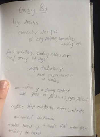
The eight ideas I came up with were, logo design, character design, food branding, illustrations of dogs and there experiences on walks, animate a staring contest that goes on for hours, coffe shop interior art, animated drawings, a leader board of animals that mark there territory the most and which areas they own.
After doing all this idea generation I came up with five ideas:
1 - set of buildings showing different levels of wealth.
2 - looking into tattoo styles and creating tattoo designs.
3 - create a clothing brand and garment design.
4 - create advertising and collateral for beluga creative.
5 - design logos working on things like minimalism and create a logo folio.
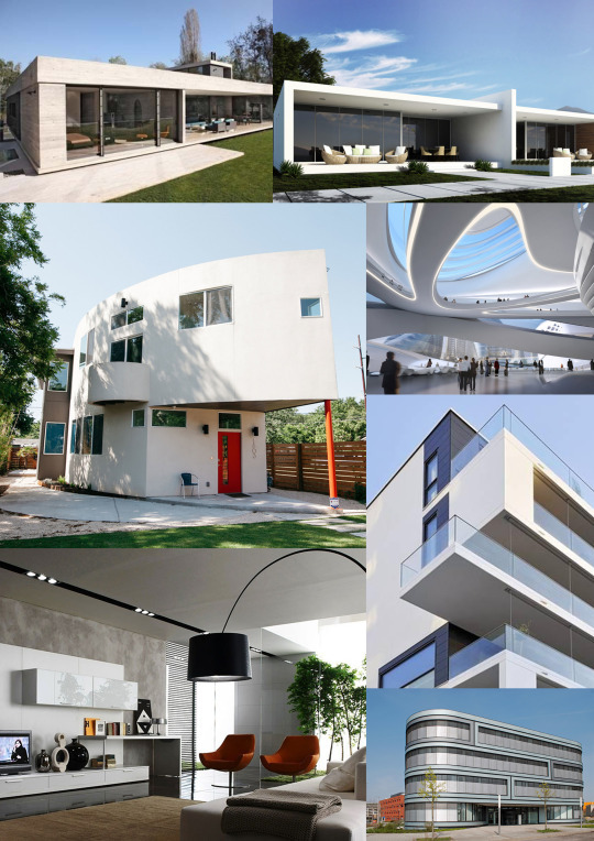
From these five ideas the two that I liked most are the building designs and clothing brand. The next thing I did was create mood boards for each one looking at others peoples work to see which topic inspires me most.
I have decided that the idea that I am going to go with is the idea of creating a verity of buildings that people might live in at different levels of wealth. I am picking this because I really like modernist architecture and like the idea of creating buildings but one of the main reasons I picked this is because of all the different techniques I can use to create the buildings for example I really struggle with perspective drawing and 3d drawing as I cant wrap my head round it so I would like to possible try and make some flat designs not look as flat. There is also software where I could create 3d models of buildings and I would also like to bring things back to basics and learn more about simple geometry and form as that is a big park of modernist architecture, i’m still not sure if I want to do my final piece in illustrator or Photoshop or something else but hopefully after this project I will have learnt more about drawing and will try some new things out.

I went onto Behance to look at other artists work of buildings and here is was I found.
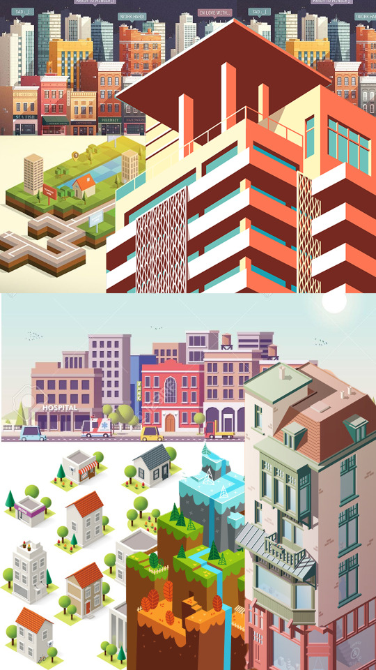
Oumomo - https://www.behance.net/gallery/24416351/building-illustration-and-motion-practice

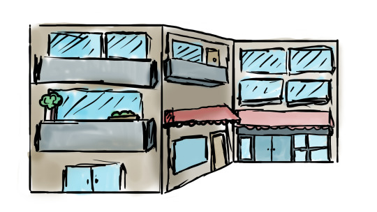
This work is by a designer called oumomo who is based in china, I really like the work in this project because I looks great but also shows very simplistic techniques using simple geometric shapes to construct the buildings. I really like the soft color pallet used and my personal favorite building is the barber shop as I think it has a really cool old possibly western feel to it and I think oumomo work is impressive because of nice his buildings look just by using a few shapes like squares and rectangles.
Anna Kajda - https://www.behance.net/gallery/16479195/3d-city
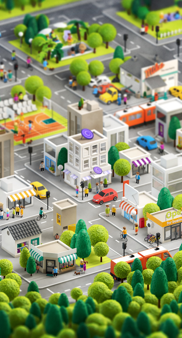
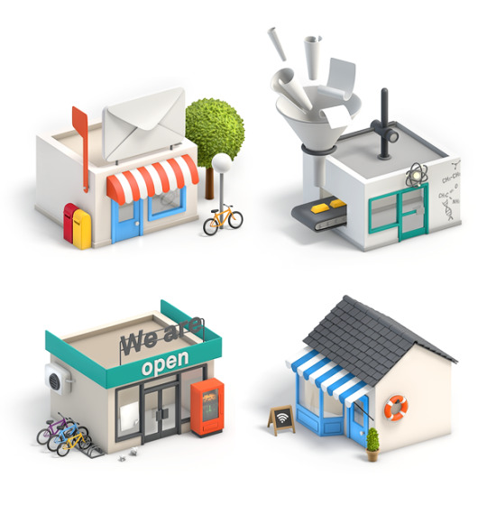

Anna Kajda is a 3d artist and illustrator from Germany. I looked at a project where she has created a 3d city and I really like how it looks. All the models have a very toy like feel and I think the people look a little like the old playmobeal toys. I really like all the shops and how fun the hole city looks with the vibrant colors and large shop signs like the large envelope on the top of the post office.
Rafael Varona - https://www.behance.net/gallery/16854501/Self-Promotional-Work?tracking_source=search%257Cbuildings&fbclid=IwAR1Xs9NIVsmgAbFcWK-o3YKaycbAHsgRQ79MZVqe9QI1jlNjtlirgwxB7wo


Rafael Varona is a illustrator and animater based in Berlin and Amsterdam. I really like this project because I think all the buildings and illustrations come together really well as one big scene, you can see in the buildings that they use simple geometric shapes but the main thing that I like about this project is a really like the pastel color pallet with the pink and blues but also the noisy dotted texture which makes the illustrations have a bit more depth with mild gradients.
lots of buildings today use simple geometric shapes and this comes from art movements such as the influentially art school the Bauhaus who helped pioneer modernist architecture. I have previously done a project on modernist architecture looking at movements such as the Bauhaus and Russian constructavism where I created museum in some game design software.
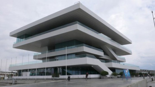
What is modernist architecture?
modernist architecture came around when the technology in material advanced for construction so more industrial materials came back and were used in sleek simplistic building designs. Materials That were heavily used were glass, steal and concrete. The main concept is that form should follow function and minimalism was modernism. The general building design within modernist architecture uses strong geometric shapes like squares and ovals and commonly use lots of glass like large windows and balconies, There general look of a building can look sleak and simplistic as large elements of structures are made of rectangles and squares. This style of architecture came around in the first half of the 20th century and is now heavily used for large buildings for banks and office buildings.
What are the key design elements of modernist architecture that will help you design your Museum.
If you look at buildings around places in London like kings cross or Liverpool street were there is lots of banks you can see theirs lots of examples of modernist architecture. The use of glass is heavily used as buildings have large windows either in separate squares but you also see very big large strips of glass that are windows which can wrap around buildings. Concrete is heavily used in buildings within this style and you will sometimes see large concrete rectangles layered on top of each other for floors or levels to a house. Its also about whats inside the building in terms of decoration, now this is going a little more into interior design but modern interior design follows the same principles and uses large amounts of geometry and minimal color pallet in furniture and wall paintings.
Modernist architecture mood board.
The Bauhaus.
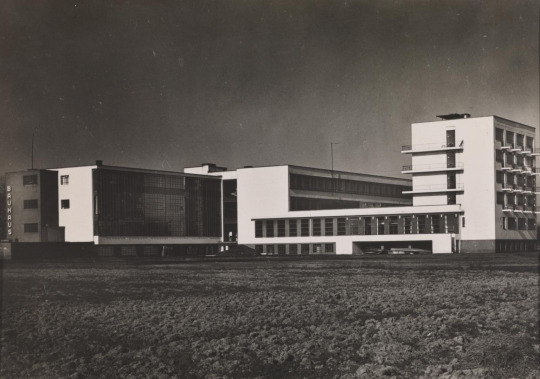
The Bauhaus was founded in 1919 in the city of Weimar by German architect Walter Gropius. It was around this time when the first world war ended so the economy was being rebuilt. Technology is always on the rise but it was around this time that large factories were built and were appearing making the process to build things quicker as large factories would now start mass producing things. The Bauhaus was created because the creators though art and design was fading away and one of the reasons was because of all this industry mass producing things making things less personal and more generic and they wanted to step away from this and merge lots of different elements of design together to bring back more freedom within the art world and less mass produced items making more personal pieces of art.
Design theories.
the Bauhaus’s main deign theory was that form follows function. The school educated there student on basic design and focused on composition and color theory to help the students follow this design theory making sure that a design also relates to how something works.
Production.
One of the reasons the Bauhaus was such a influential school was because they taught so many different things and tried to merge as much as possible together. Students of the Bauhaus were creating all sorts of art pieces from large installations made out of metal and clay or posters and advertisements using more traditional techniques like paint and different types of papers and fabrics to create textures. Because computers were not around everything was mainly hands on.
use of science and new technologies.
When the Bauhaus opened in 1919 art technology was very basic and most techniques and procedures were very traditional so like a said in terms of materials a lot of it was collage work/Photo montage pieces which were created by using fine blades and scalpels, papers and inks. Lots more technologies were being improved on like bottle making and Pyrex and clothing technology was advancing like the use of zippers on clothing items so there was lots of metal work, glass work and fabric being used to create.
Influence:
Photography
Graphic Design
Product Design
Architectural
Fine art
ceramics
metal work
interior design
fashion
sculpting
Function:
The Bauhaus wanted to open up a variety of subjects and different mediums to students and this is why they didn’t keep everything on one subject they gave students the opportunity to dabble in a variety of subjects and materials which is why it was so revolutionary with large amounts of work being produced that would change and inspire the design industry. The Bauhaus is well know for teaching with the concept of form over function meaning that what every look and design something is it should relate back to the form or function of the object or building. Looks are important but if one is not put with the other you could have bad design that is why you need to think how a look or design will affect the purpose of an item like a kettle for example.
Design Characteristics.
If you look at the Bauhaus and how it influenced architecture, art and design you can see recurring themes and styles. You can see a heavy use of geometry in furniture, buildings and art. composition and layout was heavily thought about as students made collages and posters. If you look at buildings that were possibly inspired by the movement you could possibly see sharp edges and geometric shapes like rectangles and oval elements within the construction and a large amount of glass from big windows and lots of smaller rectangular ones.
I went ahead and tried to do some perspecive drawing and just tried to work with simple geometric shapes.
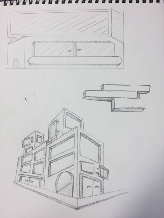
I found it really hard to get my head around how to make thin look more 3d and drawing things at different angles. I think I will really strugle to make my perspective drawings look good so I don’t think perspective drawing is for me so instead I will try working with a more 2d flat design but also try and make it look a little more 3D.
I started trying to work out how I want to make my building designs and what software I wanted to use so I thought the best way would be to test them.
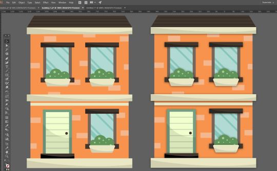
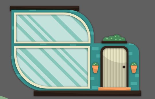
The first specialism that I wanted to try and use for this project was illustration so I went into Photoshop and gave my self the challenge of drawing both a old run down abandoned house and a more wealthy modern looking house. I tried to go into this like the artist Christoph Niemann and he says that you should just start and let the ideas come to you, so I went into these drawings doing no sketches or tests I just started drawing and sure enough ideas came to me of things like where to place windows and the shapes I wanted to involve in the buildings designs. Here are my illustrations.
I really like the illustrations but I think the abandoned house looks better than the modern house, It might be cause I did it in a more rough scratchy style which makes it look like theirs more detail.
I am now going to try and create a building in illustrator and then compare the two specialisms to see which one I want to use.
Digital Drawing VS Vector Art.
I think both specialisms can come out with different looks but I think with digital drawing its easier to make things look a certain style and I feel like a lot of the time vector work in illustrator can often look very similar and just like one style bu with drawing you I think its possibly easier to create if you have the drawing skills. With vector work you can get exact shapes and make everything extremely precise with aligning things and tools but if your drawing it might be harder to get things lined up perfectly or create perfect curves and shapes. But I personally find it harder to get started when working with illustrator and it takes my longer to work out the sizes of shapes and color but this is possibly because its so easy to change the size of things and manipulate the vectors so I spend to long doing that but with digital drawing I tend to work quicker and spend less time manipulating things and just start sketching and drawing. I have only started digital drawing and am enjoying it but with my skill set of digital drawing and vector work my vectors can look very clean and professional whilst my drawings are rough and have a more scratchy look to them but I enjoy both but for this project I want to keep things looking clean and sleek so I think I might stick to illustrator rather than hand drawing in Photoshop.
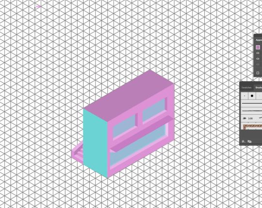
I like the 2d vector art i have created and then I tried to used shadows gradients and opacity variants to try and bring some depth to the building and make it look a little more 3d. Because I wanted to experiment further into 3d I learnt some new things in illustrator about mapping pre made vector graphics to the perspective grid. I tried to place my flat house design on two sides of the grid to see what it looked like and here it is.
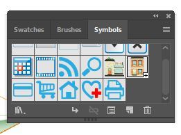
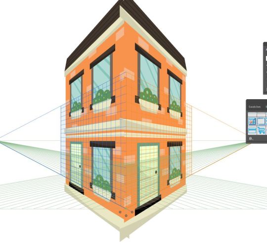
I did this by opening up my symbols panel and draged the building design into it turning it into a symbol, I then took the perspective selection tool and draged the new house symbol onto the grid and illustrator mapped it on.
I think this does show perspective and you can tell its a house but I think I would really struggle to use this technique and make it look clean and not tacky so I am most likely going to use a more common graphic design 2d style for my buildings and then use thought out shadows to give them more depth.
Before I 100% decide to make my buildings as flat vectors in illustrator I want to try and create some isometric buildings to see how difficult it is and if I like it.
I have created some isometric artwork before using the extrude and bevel options within illustrator to make 2d shapes 3d.
But I want to try a different way and make my own isometric grid using equilateral triangles and then I will used the pen tool to create shapes that will make a building.
I made the grid by taking the line tool and making a large row of long lines, I then grouped the lines and duplicated them and rotated the duplication 60 degrees with the rotation tool. I then duplicated that and reflected it creating my isometric grid. I then used the pen tool and tried to use perspective to build some sort of simple isometric building.
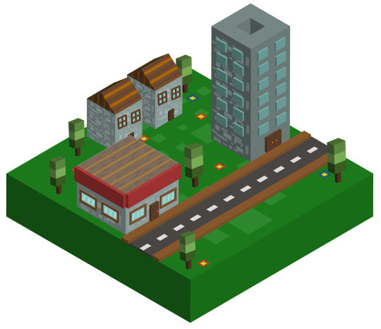
Here is the small building I made.

I found it really tricky to make my isometric design look good and I really struggled to get my head around trying to make things look more 3d, I am glad I tried it but it took a look of time to create something that dose not look that profession so I don’t think isometric design is for me.
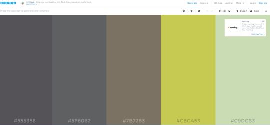
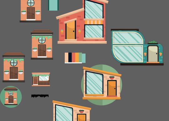
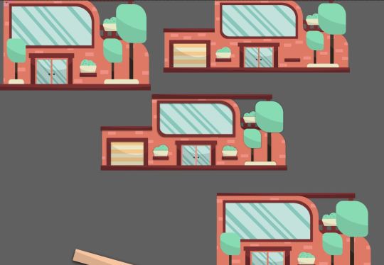
I am starting the building designs now I know what specialist techniques I am going to use. I also want to try and choose color pallets for the buildings and I could possibly make 2 buildings for each custom color pallet I make. I will be making the color pallets using a custom pallet site on google.
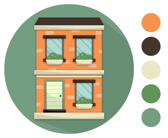
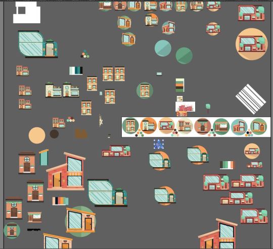
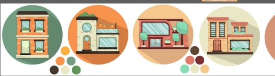
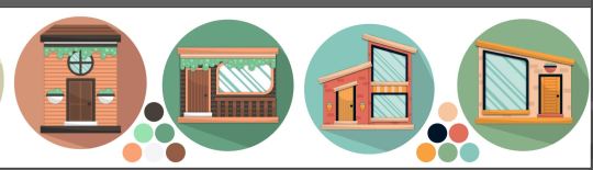
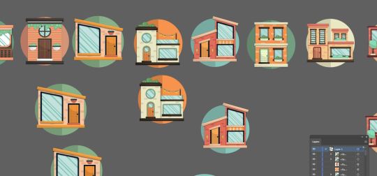
Now that I have started designing I thought it might look nice to put the buildings on a circular backdrop making them almost look like icons.
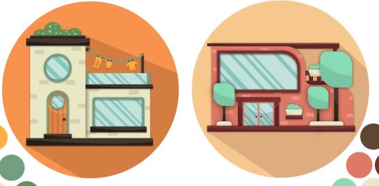
but this became a slight problem as the original idea was to create buildings at different price point so I wanted to create some large houses but when I took a large house and put it into the circular border it wouldn't look good next to the other buildings and there was too much space left in the circle.
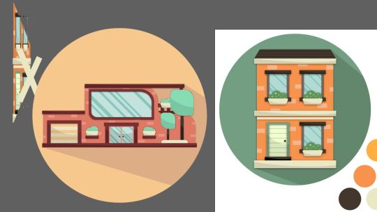
so to fix this I will keep all the houses smaller so they fit in the circle which you can see here as I made the bigger house smaller.
Because of this I am going to try and use techniques used in modernist architecture like large windows and more common geometric forms related to luxury housing so you can distinguish a house being more expensive not by the size but by how it looks.
for example here the houses are similar sizes but hopefully the house on the right looks more expensive than the one on the left.

I also intend on putting the houses in a layout of price order making it more obvious which are the more expensive and less expensive houses.
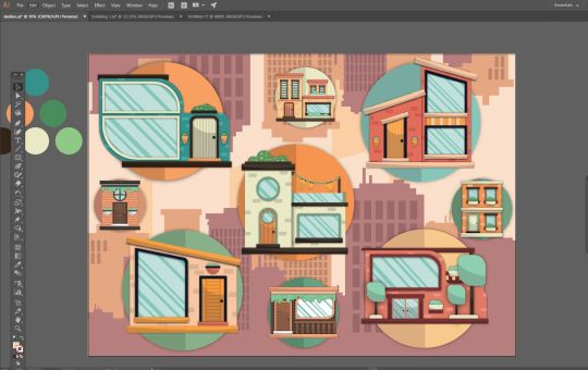
I Was told that the Icon look that I was creating was a little dated by the way the buildings have this big dark shadow coming off it so I came up with another border which was by making the circle smaller so the building is overlapping out of it and then the circle consists of two colors for each half to the circle.

I also created roofs for two of my buildings but I got rid of them because it made the buildings with roofs not fit with the others when you look at perspective.


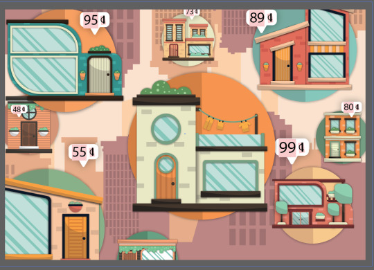
Now that I have made a couple buildings trying to make them look at different price points I need to think about how I am going to present them, I could make one large poster or present them on a road in price order. I could make an advertisement selling the houses or an info graphic piece.
I made a quick poster showcasing one of the buildings to help me work out how I want to present my designs.
Here is the poster I made in a vintage style.

I wanted to put some text on the poster so I thought I would try and do some custom typography, I have created type before bey drawing it on paper, scanning it in and turning it into a vector but I wondered if I would be able to use a wacom pen and tablet and just draw the word so I gave it a try in Photoshop.
It dose not look terrible but it looks very rough and not like a clean vector. I tried adding it to the poster but I think It didn't work and made it look bad.
After making this poster I do like the idea of creating some sort of set of vintage posters advertising a house for sale and I could possibly use unrealistic prices like 50 pence for a home. I could also split the houses into 3 or 4 categories variation in price so I could create 4 backgrounds for the houses to go on.
I could also just have a few posters for my buildings and then a generic info graphic piece displaying all the houses and prices.
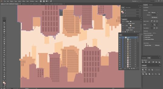
I really like the idea of having a new York looking skyline as a background so I made this simple skyline by using a minimal color pallet and mainly rectangles and squares to create a geometric clean new York looking skyline.
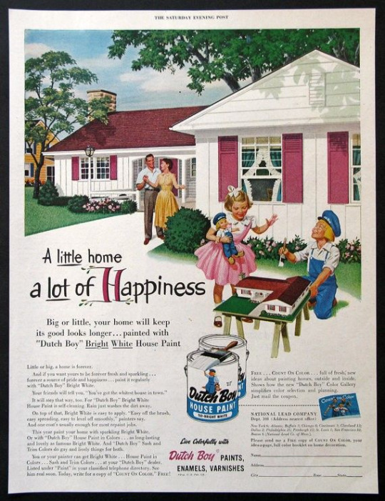
In the quick poster design I did I used the brush tool to paint on some textures that made it look a little dirty and aged, I also used to images which made it look aged and I like the vintage retro look it had at the end so this is an angle that I might want to take with my work, so I am going to look at some a vintage house advertisements as this is a road I might go down. So essentially the final piece could be an advertisement that an estate agent might put on show showing the variety of houses I have created at different price points.

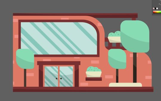
I worked in illustrator to create all the buildings taking influence from modernist architecture and buildings. I created lots of custom color pallets and used less high saturated colors because I think pastel colors are a little easier on the eyes but also when it comes to print if i was using high contrast web colors when you print it, it will look less contrasted or faded. The lighter less saturated colors also work well with the vintage style I am trying to portray.
I also created lots of designs for the houses experimenting with form and thinking about how I would portray modernism in my work. I also looked at the designs both with shadows and as flat vectors.
Whilst I was creating my buildings I was constantly getting inspiration form google and looking and different buildings and focusing on different elements of the buildings like looking at the angles of the roofs, different windows and doors, wood paneling and concrete highlighting parts of a building and other things like balconies and plants.

Because I was exploring modernist architecture I wanted to create some more complex shapes in illustrator whilst keeping it looking geometric. If you look at expensive buildings some have less square like shapes and sometimes involve more curves and rounded edges.
I learnt a new thing in illustrator which allowed me to round the edges of corners separately by simply double clicking the small section of a shape which you would drag to round a shape and this let me create more complex shapes for the buildings that were meant to look more expensive.
I then placed the buildings on the background and put them in different sizes and they look like floating bubbles.
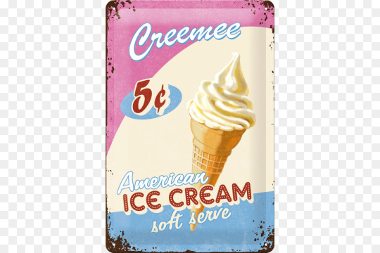
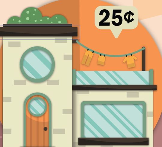
one thing that I want to do is add the prices and because I am going to add some vintage textures to the design and I have a new York style skyline background I thought I could add unrealistic pricing and make the buildings 50 cent or 25 cent like you would see in old ice cream advertisements.

But I will still represent the value of the cheap and more expensive houses by making the cheaper ones 15 or 20 cent and then the expensive house 99 cent for example.

It was suggested to me that my work looked possibly too staged and that I should try and experiment and make buildings overlap and come of the page, but my problem with this is that I think when its coming off the page it looks it doesn't look right and because this is going to displayed for the end of year show I want to display my graphics and not make them look cut up also people might think the printer as messed up or I have done a dodgy crop, basically I am not a huge fan of this idea and will go on with my other layout displaying my work.
Now that I have the design work in illustrator finished I went into Photoshop so finish by drawing some custom textures using dots and scatter brushes and then changing the blending modes and opacity so it works as a texture and dose not change the colors or vibrancy of the image.
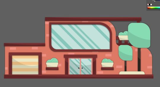
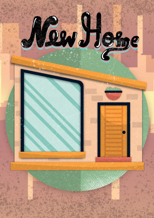
Here is my final piece.
Here it is on Behance.
https://www.behance.net/gallery/81269061/Buildings-Project
Evaluation:
Whats the final idea,
The final idea was to create an advertisement advertising a variety of buildings at different price points in a retro/vintage style. The buildings should express value by its architecture and size and the prices of the buildings will be inaccurate and will be done in cent to represent old american vintage advertisements for things like ice cream and candy.
How did you arrive at these Ideas.
To arrive at my final idea I looked into lots of specialisms and focused on elements of graphic design I enjoy. I tried lots of things out and after lots of mind mapping and idea generation like creating ideas in short amounts of time forcing myself to come up with quick good and bad ideas on different topics that I want to explore in graphic design as well as bouncing off words and looking into artists and getting inspiration.
what specific approaches did you practice?
I this project I wanted to try lots of different things until I truly knew how I wanted to create my final piece, I practiced digital drawing and vector illustration as well as trying to learn more about perspective drawing grids, and isometric artwork. But the finalized approach would be that I use adobe illustrator to create vector illustrations and would try and use simple geometric form and modernist architecture to influence my building designs as well as using gradients and shadows to try and give my flat 2d designs more depth instead of heavily relying on perspective.
What issues did I encounter?
When I was experimenting with perspective I tried to put a flat building design on the perspective grid so I could make sides and It didn't work, I was also struggling to curve edges and create complex shapes in illustrator.
How did you over come these issues?
I turned my building into a symbol and then made sure it didn't have any affects on it so it when locked onto the grid and I also learnt that I could click on section of a shape like a rectangle and curve individual corners instead of curving the whole shape, and with this simple new technique I was able to create more complex shapes with curves rectangles and ovals.
what have you learnt during this project?
I used the perspective grid in illustrator for the first time and learnt how to map pre made graphics onto it. I also learnt how to set up an isometric grid and create isometric vector art in illustrator. After doing research into modernist architecture and just looking at buildings I learnt lots about the different forms and shapes used to create windows and doors.
What do you like
I really like some of the buildings that I created especially once I designed for the higher price point as I enjoyed coming up with concepts for houses and designing them. I am also a fan of all the custom color pallets a created and then used for the buildings thinking about which colors would work well for the windows plants and other elements of the buildings. I also really like the simple new York city style skyline I created for my background as I basically used just squares and rectangles and I nice color pallet to create the skyline and I think it looks nice and works as a background complementing the building designs on top of it.
What do you not like.
Personally its a bit confusing what the final piece is or what its purpose is for and I think I could of fixed this by possibly creating a logo for an estate agents or created some custom text that said something like houses for sale. The price tags do make it understandable that its an advertisement for houses for sale but I think I could of possible communicated that better within my design. Also I am not a massive fan of all the buildings for example there are one or two that I just don’t think look as good as the other ones and I could of kept them out of the final piece and I have learnt you don’t have to use everything you create. Lastly the composition could be improved on as it looks possibly a little crammed.

0 notes