Statistics
We looked inside some of the posts by unitt2 and here's what we found interesting.
Average Info
Notes Per Post
2
Likes Per Post
2
Reblog Per Post
0
Reply Per Post
0
Time Between Posts
1 day
Number of Posts By Type
Text
17
Last Seen Tumblr Blogs


Fun Fact
Premium Tumblr themes are available from anywhere between $9 to $49.
Text
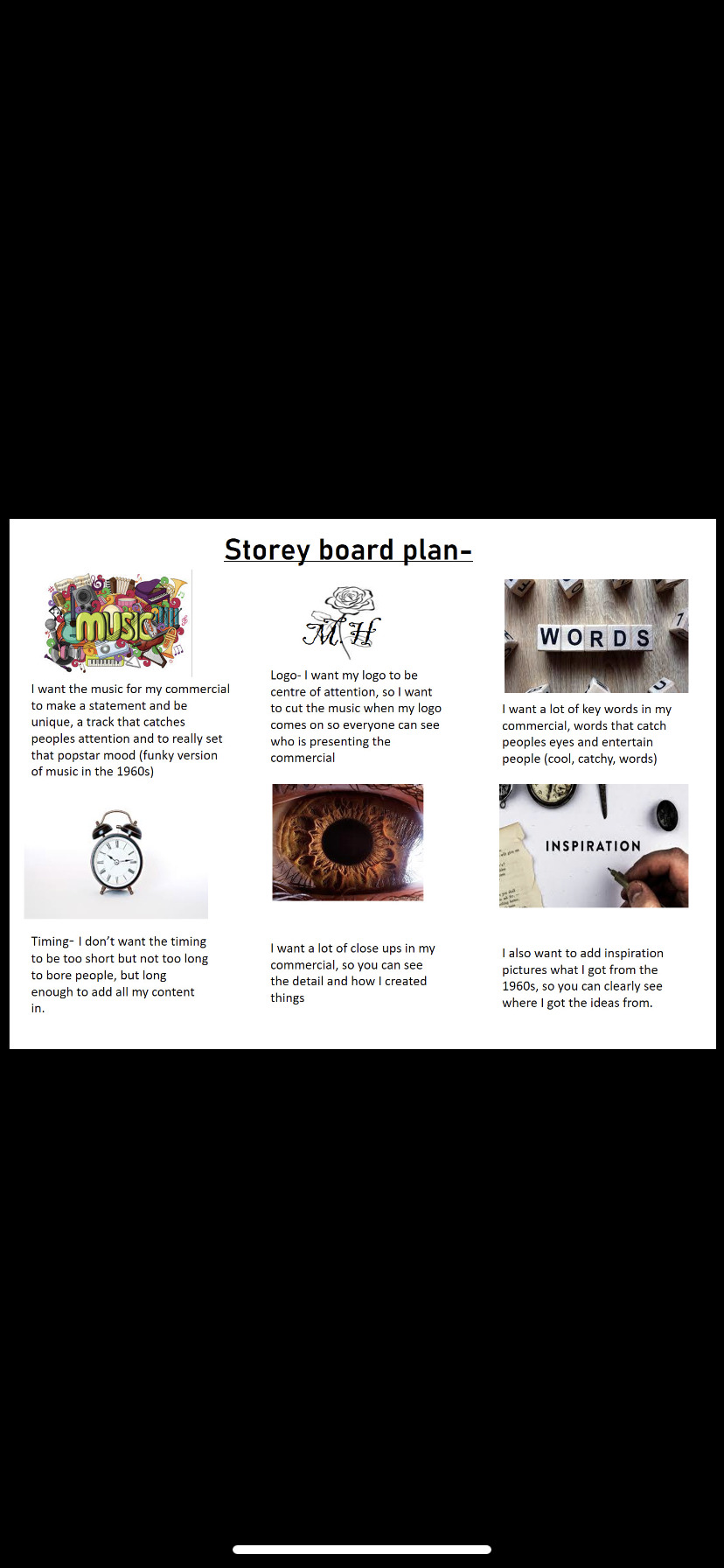
today I made a plan bored for my commercial, just some key bits I am going to do in my commercial, just a brief plan of how I want it to be like, this is going to be helpful to me so I can get good ideas when I’m creating my commercial
Find my commercial on my YouTube Channel-
https://youtu.be/SNLfU81dLJI
This is my commercial, I don’t think I have fully come to terms with how to work “iMovie” that is why I haven’t quite got the proportions off my pictures quite set up right but I managed to get all I needed on their and added some music to it.
Mia Hanson . (2022). Fashion Commercial . Available: www.YouTube.com. Last accessed 8th February 2022.
youtube
0 notes
Text
This is my illustration research (Pinterest board)
0 notes
Text


These are my 2 completed design boards with my designs added and stuck on, I feel like not adding anything behind the designs makes it just as affective as it would with more added on.
0 notes
Text


These are my 3 layout ideas for my design boards, I wanted to keep the middle of the board plain, because my designs are very bright and extra, so if I had pictures behind it, they would just merge into each-other and I want my designs to stand out more than my background, I just added some pictures of what I was inspired by for these 8 designs around the sides of my board + the colours I went for.
1 note
·
View note
Text


These are my 8 final added media designs, I am happy with my designs and what they look like, with the skin tones I think I could of gone into a little more detail and with the faces, but I am very happy with the media ideas and the colour choices.
0 notes
Text
Illustrator Mood board

this is my mood board to show what I got the inspired by for my customer, I picked a colour palate that most suited my customer, which is bright and colourful, I added objects on the mood board because if you looked at my collection you would be able to see where the shapes and designs are coming from.
1 note
·
View note
Text
This is another video for f me adding media to another one of my 8 piece designs, I really like this hark blue/ purple really stands out, but still looks really bold at the same time, I find that the colour really suits the designs of the dress.
0 notes
Text
This is a video of me adding media to my final final 8 piece collection, with this design, I really tried to make it pop and stand out, and really match up to my customer, so I thought using tin foil would really do the trick for that and it did, it just gives it a pop star vibe, which i am going for
0 notes
Text
This is me adding media to one of my final final 8 designs, I liked using the fine liner to represent feathery fur because it looks similar too it, I thought red and black really go together and the skin tone suited those two colours
0 notes
Text
This is a time lapse of me developing one of my 8 pieces for my collection to look even better, doing this final drawing made me feel a lot better about my 8 piece collection because it just looks a lot wowing now and more interesting.
0 notes
Text
These are my 8 designs, I choose to slightly develop them a bit more to make them even better and to fit my customer perfectly, I was happy with my designs before but I believed they could be even better so I just added more shapes and designs to make them more interesting, because before they were a bit bland and not much going on which definitely does not sun up my customer.


0 notes
Text
pauls finalised logo

this is my finalised logo from Paul’s lesson, my logo isn’t too complicated but looks quits sophisticated at the same time which i am happy with. To create my logo on illustrator i had to draw my logo picture out first which would be the rose, then add it to illustrator and go over it with fine lines so it crisps it up a lot more.
0 notes
Text
This is me designing a background for one of my 8 piece collections, I didn’t want to make it too complicated but make the page pop when you see it because that links back to my customer (make a statement vibe), I really enjoy decorating my pages because it really just makes the pages come to life a lot more.
0 notes
Text
draft layout press release


These are my 3 daft layouts for my press release, messing aroud and designing my layouts was enjoyable and fun to see how diffrent they look by just moving a few things around, i like the way my layouts have come out, they aren’t too in your face but have the right amount of detail on them, I wanted them to look pretty and formal at the same time.
0 notes
Text
press release mid map and press release.
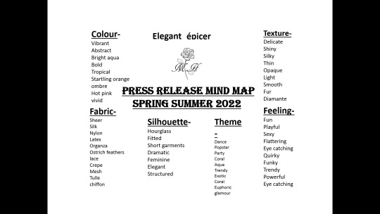

i made a mind map based on my 8 piece collection to describe it, i enjoyed making this mind map because i became a lot more familiar with descriptive words. writing my draft press release i didnt want to make it too long but just long enough to get all the important information in there.
0 notes
Text


These are my 12 draft designs for my 8 piece collection + 3 mixed design drafts. Personally I wasn’t too happy with my designs that I created so I decided to add and recreate some of my designs for my 8 piece collection and now I am much happier with my designs, with my first designs I think I made them too 3D and standard they didn’t suit my character and was a little boring, they just needed a touch up which I did.
0 notes
Text
This is me adding media to my pieces for my collection, for this dress I coloured the skin in with pro markers, I think I’m getting a little bit better with pro markers, the key to pro markers is the fading and the darker and lighter areas which is a little tricky because they like to bleed a lot, but I am definitely improving with them.
0 notes