
Don't wanna be here? Send us removal request.
Statistics
We looked inside some of the posts by usfvisualstudent and here's what we found interesting.
Average Info
Notes Per Post
0
Likes Per Post
0
Reblog Per Post
0
Reply Per Post
0
Time Between Posts
7 days
Number of Posts By Type
Text
14
Last Seen Tumblr Blogs


Fun Fact
The “We are the 99%” Tumblr blog became the slogan for the Occupy Wall Street movement.
Text
Final Project
For this final project, I knew what data set I wanted to use for it. With the increase attention on mental health, I wanted to put a focus on the suicide rates in the United States. Once I found the data set from data.gov, I wanted to address this problem. I wanted to show that there is an increase over the years and show that there needs to be a focus point on improving the overall mental health in the United States.
Code:
install.packages("ggplot2") library("ggplot2") MaleRates <- c(21.2, 20, 19.8, 19.9, 19.8, 20.4, 20.4, 20.9, 21.1, 21.9, 21.7, 21.2, 21, 21.5, 21.2, 20.5, 20.7, 20.5, 20.3, 19.8, 19.1, 18.9, 17.8, 17.7, 18.2, 18.5, 18.1, 18.1, 18.1, 18.1, 18.5, 19, 19.2, 19.8, 20, 20.4, 20.3, 20.7, 21.1, 21.4, 22.4, 22.8) FemaleRates <- c(5.6, 5.6, 7.4, 5.7, 6, 5.8, 5.5, 5.6, 5.2, 5.5, 5.3, 5.1, 4.9, 4.8, 4.7, 4.6, 4.6, 4.4, 4.3, 4.3, 4.3, 4.3, 4, 4, 4.1, 4.2, 4.2, 4.5, 4.4, 4.5, 4.6, 4.8, 4.8, 5, 5.2, 5.4, 5.5, 5.8, 6, 6, 6.1, 6.2) AllRates <- c(13.2, 12.5, 13.1, 12.2, 12.3, 12.5, 12.4, 12.6, 12.5, 13, 12.8, 12.5, 12.3, 12.5, 12.3, 12, 12.1, 11.9, 11.8, 11.5, 11.2, 11.1, 10.5, 10.4, 10.7, 10.9, 10.8, 11, 10.9, 11, 11.3, 11.6, 11.8, 12.1, 12.3, 12.6, 12.6, 13, 13.3, 13.5, 14, 14.2) years <- c(1950, 1960, 1970, 1980, 1981, 1982, 1983, 1984, 1985, 1986, 1987, 1988, 1989, 1990, 1991, 1992, 1993, 1994, 1995, 1996, 1997, 1998, 1999, 2000, 2001, 2002, 2003, 2004, 2005, 2006, 2007, 2008, 2009, 2010, 2011, 2012, 2013, 2014, 2015, 2016, 2017, 2018) Rates = data.frame(years, MaleRates, FemaleRates, AllRates) Rates1 = data.frame(years, MaleRates) Rates2 = data.frame(years, FemaleRates) ggplot(data = Rates, aes(x = years, group = 2)) + geom_line(aes(y = MaleRates, color = "Male"), size = 1.2) + geom_line(aes(y = FemaleRates, color = "Female"), size = 1.2) + geom_line(aes(y = AllRates, color = "All"), size = 1.2) + labs(title = "Suicide Rates in the United States Over the Years", x = "Years", y = "Rates") + scale_color_manual(values = c("Male" = "darkblue", "Female" = "pink", "All" = "orange")) + theme_minimal()
Output:

0 notes
Text
Module 13
Code:
install.packages("animation") library(animation)
ani.options(interval=1)
col.range <- terrain.colors(15)
saveGIF({
layout(matrix(c(1, rep(2, 5)), 6, 1))
par(mar=c(4,4,2,1) + 0.1)
for (i in 1:150) {chunk <- rnorm(100)+sqrt(abs((i)-51)) par(fg=1) plot(-5, xlim = c(1,150), ylim = c(0, .3), axes = F, xlab = " ", ylab = " ", main = "Iteration") abline(v=i, lwd=5, col = rgb(255, 0, 255, 255, maxColorValue=255)) abline(v=i-1, lwd=5, col = rgb(0, 255, 255, 50, maxColorValue=255)) abline(v=i-2, lwd=5, col = rgb(255, 0, 255, 25, maxColorValue=255)) axis(1) par(fg = col.range[mean(chunk)+3]) plot(density(chunk), main = " ", xlab = "X Value", xlim = c(-5, 15), ylim = c(0, .6)) abline(v=mean(chunk), col = rgb(200, 65, 134, 255, maxColorValue=255)) if (exists("lastmean")) {abline(v=lastmean, col = rgb(230, 67, 167, 50, maxColorValue=255)); prevlastmean <- lastmean;} if (exists("prevlastmean")) {abline(v=prevlastmean, col = rgb(250, 29, 78, 25, maxColorValue=255))} lastmean <- mean(chunk)
} })
Output:

0 notes
Text
Module 12 Assignment
install.packages("GGally") install.packages('network') install.packages('sna') library(GGally) library(network) library(sna) library(ggplot2) net = rgraph(10, mode = "graph", tprob = 0.5) net = network(net, directed = FALSE) network.vertex.names(net) = letters[1:10] ggnet2(net) ggnet2(net, node.size = 6, node.color = "black", edge.size = 1, edge.color = "grey")


I had a little bit of trouble with installing the packages with this model. In order to solve this problem, I added more code to install the proper packages. Once I did this, I was able to solve my problem and produce the network visualization.
0 notes
Text
Module # 11 assignment
install.packages(c("CarletonStats", "devtools", "epanetReader", "fmsb", "ggplot2", "ggthemes","latticeExtra", "MASS", "PerformanceAnalytics", "psych", "plyr", "prettyR", "plotrix","proto", "RCurl", "reshape", "reshape2")) library("CarletonStats", "devtools", "epanetReader", "fmsb", "ggplot2", "ggthemes","latticeExtra", "MASS", "PerformanceAnalytics", "psych", "plyr", "prettyR" "plotrix","proto", "RCurl", "reshape", "reshape2")) library(lattice) x <- mtcars$wt y <- mtcars$cyl xyplot(y ~ x, xlab="Car weight (lb/1000)", ylab="Number of cylinders", par.settings = list(axis.line = list(col="transparent")), panel = function(x, y,…) { panel.xyplot(x, y, col=1, pch=16) panel.rug(x, y, col=1, x.units = rep("snpc", 2), y.units = rep("snpc", 2), …)})

0 notes
Text
Module 10
setwd("E:/College/Intro to Data Science/Rstuido") data <- read.csv(file = "Hot Dog.csv") (library("ggplot2")) colors <- ifelse(data$Beaten == 1, "darkblue", "black") barplot(data$Eaten, names.arg = data$Year, col=colors, border=NA, main = "Time Series Example", xlab="Year", ylab="Hot dogs consumed")
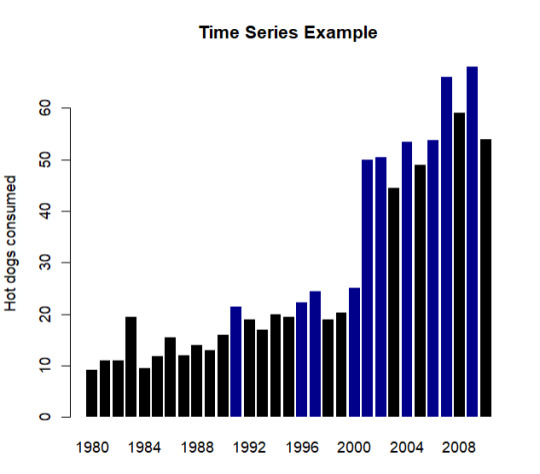
0 notes
Text
Module #9
The five basic principles of design are as followed:
Alignment Repetition Contrast Proximity Balance
To create my graph, I used the mtcars data set and ggpolt2 in RStudio to compare different cars weight, miles per hour, horse power and V/S.
library(ggplot2) summary(mtcars) ggplot(mtcars, aes(x=factor(am), y=mpg)) + geom_boxplot() ggplot(mtcars, aes(wt, mpg)) + geom_point() + geom_smooth(method="lm") ggplot(mtcars, aes(x=wt, y=mpg, col=vs, size=hp)) + geom_point()

It follows these principles by providing a connection with the different variables, having a repetition in color and shape, the contrast in colors, creating relation ships between the variables and balancing out the graph.
0 notes
Text
Module 8
For this assignment I chose to focus on the miles per gallon data and the horse power data form that data set from mtcars.
attach(mtcars) plot(hp, mpg, main="Module 8", xlab="HorsePower ", ylab="Miles Per Gallon ", pch=19)

I wanted to show the regression of the cars miles per gallon efficiency as the cars total horse power went up. There are some outliers in this graph, however, it still shows a regression trend.
0 notes
Text

MY graph fits into Few's suggestions because it is a comparisons of two paired sets of measures to determine if as one set goes up the other set goes either up or down in a corresponding manner.
0 notes
Text
Module 6
Nums = c(69,74,43,12,90) names(Nums)=c("Purple","Yellow","Orange","Pink","Black") mycolors=c("purple","yellow","orange","pink","black") barplot(Nums,col=mycolors)

For this assignment, the data set I chose was a made up set of data and randomly chosen colors. My graph fits into Few’s and Yau’s discussions on how to conduct basic visualization based on simple descriptive analysis.
0 notes
Text
Module 5

This line graph shows the progression of Time as Position is being increased.
0 notes

Text
Module 3

I posted a graphic of the state cases of COVID-19 in the United States. It shows of the amount of cases by turning the state into a darker color the more cases there are in the state.
0 notes
Text
Module 2
For this weeks assignment, I was tasked with finding a data set and creating a visual using Tableau. I selected a data set from data.gov related to United States COVID-19 Community Levels by State.

On the map, the visual indicates the higher density of cases by having the states with darker colors having more cases and the states with lighter colors having less cases.

States, such as Texas, with a higher population have more cases and are indicated by the darker color.

On the other hand, states with a lower population are indicated by the lighter color.

The only thing that I would change with this visual that I think would make it easier to understand is the distinction of the color so that it would be easier to further understand the graph.
0 notes
Text
Module 1

According to Keim et. al (2008) definition to visual analytics, "Visual analytics combines automated analysis techniques with interactive visualizations for an effective understanding, reasoning and decision making on the basis of very large and complex data sets.” This model follows that by automatically taking the data collected from the Florida Department of health and turns into data that makes it easier to analyze and understand the scale of relevance in certain areas.
0 notes