
Explorations into UX design. I'm currently embarking on a UX design immersive at General Assembly NYC, Spring 2015.
Don't wanna be here? Send us removal request.
Statistics
We looked inside some of the posts by uxplorer and here's what we found interesting.
Average Info
Notes Per Post
25
Likes Per Post
21
Reblog Per Post
3
Reply Per Post
1
Time Between Posts
4 days
Number of Posts By Type
Photo
5
Link
2
Text
9
Last Seen Tumblr Blogs


Fun Fact
When “GIF” was named word of the year in 2012, Oxford Dictionaries U.S.A. credited Tumblr for pushing the word.
Photo

Pretty amazing portfolio workshop with Abby Covert today.
2 notes
·
View notes

Photo
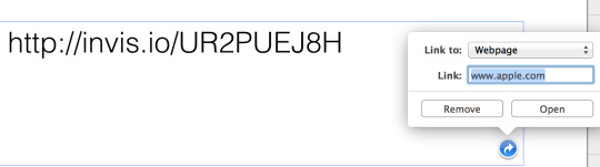
I wonder how many users are wanting to link to apple.com by default during their keynote presentations? Not delightful.
1 note
·
View note
Photo
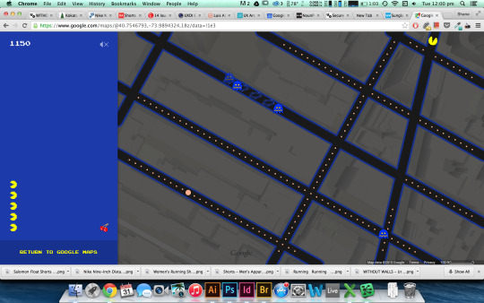
Google maps pacman is quite delightful!
2 notes
·
View notes
Photo

DIETER RAMS | 10 Principles For Good Design
Today’s lesson introduced us to the 10 Principles for Good Design by Dieter Rams.
I was happy to see this particular one: Good design is as little design as possible.
I believe in this idea of products not being “burdened with non-essentials” and in applying it to user interactions as well: users should not be burdened with non-essentials that will distract and take away from the main purpose of your site/app. Every element should be additive to this experience.
https://www.vitsoe.com/us/about/good-design
5 notes
·
View notes
Text
Week 1 - Day 3 - Sketching & Flows
Today consisted of lofi and hifi sketching, flows, storyboarding, an introduction to the outcome programming side of things and some very tasty Dig Inn!
Having predominantly jumped to hi-fi wireframed inside illustrator/indesign/photoshop, I was a little daunted trusting my ability to sketch with pen and paper, but I was surprised at the rapid idea generation that came out of todays iterations (at least 50 of them!!)


Story boarding my weather app

Initial rapid 10 second iterations


2 notes
·
View notes
Text
Week 1 - Day 2
Today I definitely felt myself slide down the slope of pessimism, as we performed user interviews on members of our group for the first project. I struggled with trying to avoid bias and asking leading questions which often meant the interviews lost momentum and stalled as I tried to rephrase and stumbled on my attempts to probe objectively.

I stumbled a little further mapping out my observations on the affinity diagram, but as my interviews progressed, I was able to make a few more connections and hopefully can identify a few problems and trends to provide features that solve them.

Hopefully sketching tomorrow presents the ladder of optimism.
2 notes
·
View notes
Text
Week 1 - Day 1 - Intro to UX
I’m usually pretty terrible with names after first introductions but we began the day and the course by playing a ridiculous circle-of-name-games featuring a magic spray bottle called Oscar, which somehow managed to get a class of 27 people to remember each others names in 10 minutes. No mean feat! After establishing some house rules and running through a quick overview of what makes UX and who practices it, we broke up into groups of 3 at lunch to undertake our first research assignment, a ‘contextual inquiry’ where we would stalk observe a bunch of users in the real world, in our groups case, people using Citi Bike.

During our observation, about 12-15 people used the bikes, mostly to return them and by far the most frequent pain point we noted was people having trouble locking the bikes into their dock. Users would ram the bikes into the slots 3 or 4 time before trying another dock, often trying up to 4 dock before either succeeding or giving up frustrated. The issue seemed to lie in the ambiguity of the docks interface, which flashed a tiny green led light if the bike was successfully returned, some docks didn’t seem to flash even when the bike was successfully returned, and some users seemed happy to assume the light had flashed when it hadn’t (I tested the bike one user had returned, and could easily pull it out of the dock!) This seems like a poor signifier for an action which if performed wrong can cost the user $1200 (the penalty for an unreturned bike)


The station kiosk instructions were vague as well, with a monotonous corporate blue citibank color scheme, which could benefit from the use of contrasting orange or red, especially around the safety and penalty information.

The maps were also unclear, which is particularly misleading to tourists to the city, a significant proportion of citibikes user base. The first map (not shown) showed a zoomed in segment of the few blocks surrounding the bike station in a standard north-south orientation. The map below it shows a few more blocks zoomed out, except this time the map is inexplicably flipped 90 degrees! And a map showing the larger area, displays an unnecessarily simplified Manhattan Island in the north-south orientation again.

One aspect which looked to be easy was the key cards for long-term members, who could skip the kiosk and simply swipe their key to release the bikes directly at the dock. From what we had observed, Citibikes is better suited to long-term users, while the bamboozling process and caveats for new users would drive all but the most determined cyclists to cross the street and catch the subway.

3 notes
·
View notes
Text
Minimum Viable Portfolio
One task I’ve been determined to get finished before the UXDI tsunami hits is to have something resembling an online portfolio. I was partially inspired by an article on uxbeginner.com. While I hope to add to it and improve it, it feels good to have that burden removed to concentrate on creating work over the next 10 weeks.
Consider it a work in progress. shanedudfield.com
1 note
·
View note
Text
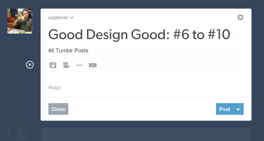
Good Design Good: #6 to #10
#6 Tumblr Posts
I’m going to get meta here and praise the tumblr post section, as a very fluid way of creating multi-media posts. The rich text formatting is quick and nasty, but it’s very clean and the hover formatting options gives priority to content creation over a traditional fixed-box tool kit.
#7 - Codecademy
I really like the format of codecademy which allows for a casual, non-intimidating introduction to programming with lots of hand holding along the way. Learning to code can be frustrating, but codecademy provides a platform that instructs and offers hints to users on the side, while introducing learners to an orthodox coding window in the center.
#8 - Product Hunt
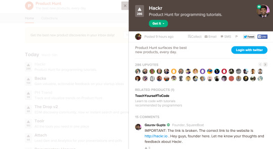
Product hunt is a new site that has quickly become of my go to sites for trending apps and sites. It has a very simple upvote-based layout, and is very community orientated. The side bar comments feature is fantastic, which allows viewers to quickly read comments and even discuss the product with the creator. One great aspect about the half-page slide out format is that it doesn’t commit users to a page full of (potentially) tedious comments, which for anyone who has read a youtube or popular news website section, can be a painful experience. With the ability to quickly click on the side or close the box, the user is able to easily navigate back to the main page with minimal effort.
#9 - Skyscanner
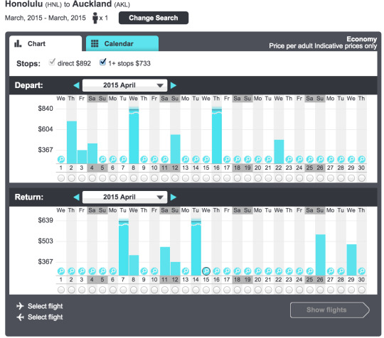
One reason I start my flight searches with skyscanner is the emphasis it places on flexibility with dates and prices. The ability to search by entire months and year is great, but the real winning feature for me is the ability to switch between chart and calendar search results, offering a great visual comparison.
#10 Airbnb
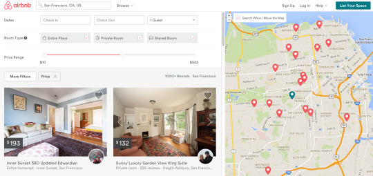
Airbnb has an amazing balance with it’s dynamic search results, providing the user with a quick visualisation of their potential stay in one screen. One suggestion i would make though would be to better to put more emphasis on the selected pin (the dark green pin fades amongst a see of red, especially for colour blind)
0 notes
Text
Good Design Good: #1 to #5
For good design examples, I've chosen a few apps and websites that I enjoy using:
#1 - MailChimp
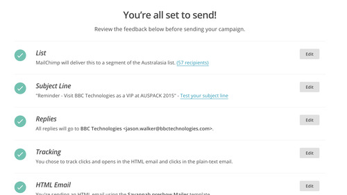
Since MailChimp redesigned its layout with a conventional header navigation menu, I really find it simple and clean to manage lists, create emails and send them out without a hassle. The flow is simple and clean, reducing a lot of forms and checklists to only the essential elements, while providing easy access to more advanced features if needed. The friendly chimp-themed tone and narrative also helps provide some levity to an often tedious exercise, while also providing solid feedback and reassurances at critical steps during the process.
#2 - Google Keep
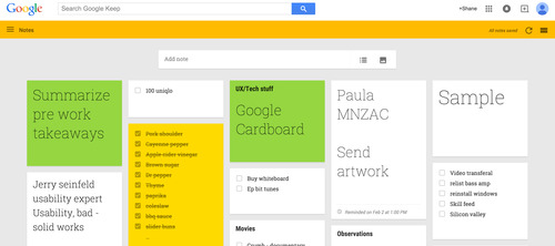
Google Keep is my go to app for dumping thoughts or creating to-do lists. Despite having tried a myriad of task orientated apps, I've been drawn to the simplicity of Google Keep and it's layout which almost mimics a loosely scattered mind. The bold colour tags help provide visual grouping, like a board of post-it notes. The creation flow is also extremely fast, so there's no chance of losing your train of thought as a result of tapping or clicking through numerous menu levels.
#3 - GrubHub
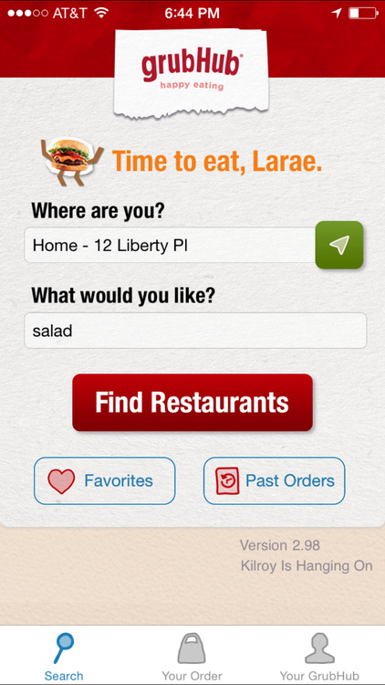
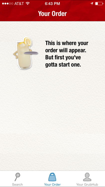
The experience of ordering food demands a lot of empathy towards users - nothing makes hungry customers more angry than making them wait. GrubHub doesn't mess around, providing the ability to easily find something you're in the mood for or quickly order an old favourite. But I also like the way it mimics good service in the real word with it's anthropomorphic burger waiters - they are friendly, jovial, but also cut to the chase.
#4 - Netflix Search function

In my bad design example post, I mentioned how I was not a fan of the Netflix front menu and the lack of an easily identifiable search function. However once you find the search menu, it's actually a good experience, even if you don't find what you're looking for. Firstly, the search results display on-the-fly as type - a godsend when your punching through remote buttons. Secondly, it's borderline genius in its ability to figure out what your looking for and even provide suggestions based on what it thinks your searching. Netflix managed to correctly figure out I was searching for Office Space, based on 'OFFI' and even though Netflix didn't have it, provided a number of alternatives in the same vein - 'Clerks' and 'The IT Crowd' particularly impressed me.
#5 - Pocket
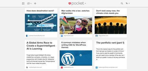
Pocket has become one of those apps I can't imagine living without - it has almost replaced bookmarks entirely for me and I love the way it reformats articles for optimized reading. The app also provides the ability to neatly tag and categorise your articles, but doesn't thrust it open you as a necessity.
0 notes
Text
Bad Design Bad: #6 to #10
Since the previous 5 examples were just generally awful, the next five examples will focus on bad UX and UI design:
#6

This is an immediate NOPE from me, I can't remember ever being interested in browsing something enough to hand over my personal information.
#7

One thing I found frustrating about first using Netflix (we don't yet have it in New Zealand) is the lack of an obvious menu bar, or even hint of it. To access it, i figured out you have to scroll up, which is frustrating if you've already frantically scrolled down with the remote trying to find a search menu. I would have suggested adding a subtle " ^" with conventional search and setting icons. when first entering the site. The search menu once you find it is rather great, which i'll elaborate on in my Good post.
#8


I find the HBO search menu frustrating. While it is easy to find, there is no autofill, an immensely useful tool when typing with a remote. I was hoping by typing 'offic', the app would figure out the rest in the search results (I was looking for 'Office Space')

From the results, it looked like it had picked up office as the key word, however the results were inaccurate, ungrouped and poorly laid out. I shouldn't have to scroll through 21 results to find what i'm looking for! Most of all didn't lead me any closer to what I was searching for. I'll show an example of how to lay out search results better in the next post.
#9
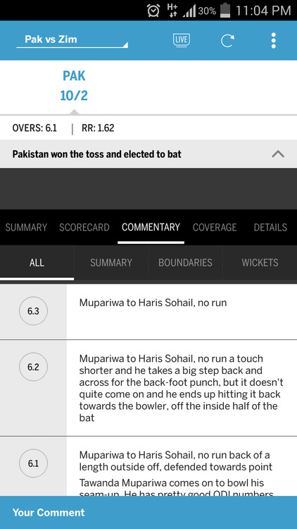
For cricket tragics like myself, reading ball-by-ball coverage on ESPN's cricinfo is the go to for keeping up with the match when you can't watch it. The cricinfo app though is terrible for numerous reasons, but i'll pick on this screenshot, where the ball-by-ball coverage is limited to displaying 3 on half of the screen (there are 300 of these events in one innings) The screen waste at the top is atrocious - i'm sure that the game stats could easily be displayed in a single thin strip at the top, while the sub-menu could be a temporary drop down or pop-out side menu to allow more space for the actual game story.
#10
Listicles and click bait titles already grind my gears, but I really hate when an article loads as a 'slideshow' with each item requiring its own page to be loaded. This is done to increase page views for advertisers, but in the long run is just turning the audience away. The good news was that in trying to find an example, I had trouble doing so, which would suggest that trend is dying a deserved death.
0 notes
Text
Bad Design Bad: #1 to #5
Since as lot folk say good design is generally 'invisible' it's obviously a lot easier point out flaws, so that's where i'll start. Here's are the first five bad examples of design across the whole spectrum:
#1

Good luck finding your room.
#2

The reason why this is bad is plane and simple.
#3
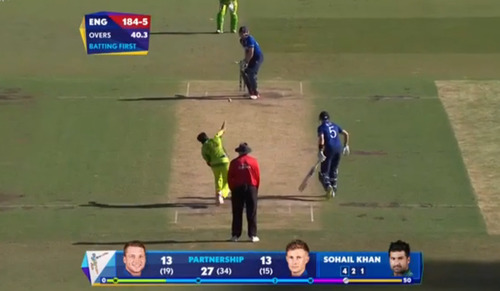
I'm a closet cricket fanatic and currently tuned into the world cup. However one thing that has bugged me is the garish graphics used by the broadcasters of this tournament. The positioning of the graphics in the centre, awful colour clashes, indecipherable graphs and charts (what does the bottom line mean to a casual viewer) and most of all, the bobble heads of players appearing during the actual gameplay are beyond infuriating!
#4

Mmmm delicious windshield cleaner, in tropical flavour (the perfect cocktail mixer!)
#5

There are stairs hidden somewhere in this carpet!
2 notes
·
View notes
Text
Back to School
I've arrived here in NYC from the perfect New Zealand summer straight into a bitterly freezing record-breaking abysmal February. Nothing like a cold plunge to shake you into action. While avoiding leaving the confines of my apartment as much as possible, I have taken the opportunity to immerse myself in the UX world, reading up on Steve Krug's 'Don't Make Me Think', Erica Hall's 'Just Enough Research' and a plethora of pocketed articles and website feeds. I've spent the last 9 years working as a graphic designer, a marketing and brand strategist, a website designer, an interface designer, a videographer, an exhibition booth designer - sometimes all at once. When people ask what I do, I usually say I'm a 'generalist', and although I am confident in my skill set, it always feels like I'm coming off as a dibbly-dobbly jack of all trades. In the last couple of years, I've felt the need to specialise more in a particular area, however I enjoy all the areas of work I do and found it hard to pick one and discard the rest.
When I started hearing about UX design as a rapidly growing field, it immediately interested me for a two reasons:
It seemed like a natural fit given my varied background - UX seemed to be an in-between skill set requiring an understanding of the bigger picture.
It offered variety within the field and accommodates both analytical and creative thinking.
I figured rather than to try and bluff my way as UX designer by virtue of experience as a graphic, web or interface designer, that the best course of action would be to dive into a full immersive course. Having recently moved to New York, I also thought G.A. would be a great place to start meeting people in the city. Through this course, I'm hoping to make some great connections, learn from some experienced practitioners and hopefully make some kick ass stuff.
0 notes