
Statistics
We looked inside some of the posts by uzo1 and here's what we found interesting.
Average Info
Notes Per Post
6
Likes Per Post
6
Reblog Per Post
0
Reply Per Post
0
Time Between Posts
7 days
Number of Posts By Type
Text
14
Last Seen Tumblr Blogs


Fun Fact
If you dial 1-866-584-6757, you can leave an audio post for your followers.
Text
Six Stunning Web Design Trends for 2021

As we are preparing to take on our final assignment, I will like to share some modern web design trends for 2021 I researched in order to let our sites keep up with today’s design requirements.
1. Parallax animation: Parallax is the optical illusion that happens when objects near to the viewer appear to move faster than objects farther away. Although we see this in everyday life, when viewing passing scenery while driving for instance, the effect on web pages comes across as equal parts real and surreal.

2. Neumorphism: Neumorphism has been gaining incredible traction recently. The style is a successor to skeuomorphism, a design approach that incorporates renderings of familiar, outdated materials into current designs, and it had its heyday on app icons everywhere in the early 2010s. This trend was largely supplanted by flat design, which simplified icons and colours in a way that was less realistic but more uniform and easily identifiable. Neumorphism represents a merging of both trends, with designs that mimic physicality through selective drop shadows while being overlaid with semi-flat colours. Most commonly, the effect resembles digital embossing or debossing. It allows designers to reclaim the tactile experience that was lost in the flat design era, and this in turn heightens the user’s connection to the design he is interacting with.

3. Abstract art compositions: Abstract shapes, especially those consisting of geometric primitives like squares and circles, can come across as simple, minimalist and restrictive. However, recently, web designers are incorporating them into complex, sprawling compositions that exude freedom. In most cases, these abstract art arrangements are taking the place of stock photography and figure illustrations. While they can include images of people, they still evoke emotion without them. Their bursting compositions feel energetic, and their many vibrant colours are infectiously warm. The result is web pages that feel expressive and alive, even in the absence of familiar human faces.
4. Comfortable colours: Due to the recent trend of working and studying from home, most people spend the majority of their time on computers. Because of this, it is not uncommon for users to experience eye strain after staring at screens for long periods of time. Web designers have been taking this into account with colour schemes that are focused on being easier on the eyes. This somewhat explains the popularity of last year’s dark mode trend, which counteracted the overwhelming whiteness that dominates screen-based media. In 2021, web designers will be thinking outside the two extremes of dark and light. They are finding middle ground in soft colour palettes, like wholesome greens, pastel blues, warm browns or light pinks. These not only make website colours less jarring than pure black or pure white, they naturally induce calm and relaxation.
This trend overall is a hopeful sign that web designers of the future may be more concerned with accessibility and comfort than dramatic innovation.
5. Scrolling transformations: When users scroll, they are doing more than navigating the page: they’re interacting. The physical actions they perform in real life like flicking their fingers over the mouse, cause a response on the screen. Interaction is a form of participation, and when users are involved in things that are happening, they are more likely to be interested and engaged. Scrolling is one of the most subtle forms of interaction, and as such, 2021’s web designers are ramping up the visual feedback users get when they scroll. This can range from full colour scheme changes to complex animated transitions to wholesale shifts in the layout. All in all, web designers are taking the time making each scroll feel like a new page, sometimes even a new website.
6. Three-dimensional colours: Colour schemes in web design have been trending towards gradients for a while now, and this year’s trend feels like the next evolution, with colour transitions becoming more lifelike than ever. Taking their cue from Apple’s Big Sur OS, we expect colours that are saturated and three-dimensional, almost like fruit you can pluck right out of the screen. This trend is accomplished through fine shading that gives a rounded feel to the flat icons of yesteryear. While we do anticipate it to appear most commonly on app icons, web designers are also abandoning the neat transitions of gradients for background blended colours that come across as more imperfect and natural. Two colours side by side might abruptly smear together or they may retain the shadows and depth of painted objects. All in all, this trend suggests that the web design colours of 2021 are aspiring to higher realms of realism.


0 notes
Text
How to Create and Sell Online Courses Using WordPress
I don’t know about you, but I love making money. It’s not enough of me to just have a website, I will also love to monetize it. Through some research, I discovered that one of the best ways to monetize a website is by selling online courses.
In this post, I want to share with you guys how you can create and sell courses online using WordPress. Usually, users have to use an online LMS (Learning Management System) platform to create and sell courses as well as manage students, but these platforms come with expensive monthly subscriptions and platforms fees. However, when using WordPress, users can avoid monthly subscription fees and platform fees to provide a smooth online learning experience for students without a hassle.

There are many great WordPress LMS plugins that can be used to get this job done. The premium plugins offer better features and come with one-time prices, but for users who can’t afford a premium plugin, there are a few free plugins that can be considered.
1. LearnPress is the most popular, free, stable, and probably the only free LMS plugin that gets updated regularly. It also comes with a beautiful design and even gives tutors the ability to use themes to customize the design of their courses to offer a better experience for their students.
2. LifterLMS is a newer WordPress LMS plugin that also features a modern design and lots of customization options for creating an effective online learning platform. This plugin also provides tutors with the ability to extend its functions with premium add-ons.
3. MasterStudy LMS is another great free plugin tutors can use to setup a learning management system in WordPress. This plugin allows users to create text, video, and slideshow-based learning programs and offers integration with PayPal and Stripe for accepting payments.
4. CoursePress is a free LMS plugin that’s most suitable for schools and colleges. It lets you create unlimited courses with automated assessments, reporting, grading, and other useful features.

It is worth noting that before getting started on setting up the learning management system, make sure that you have a fully prepared content plan for your online course.
Creating an online course is not the same as creating a blog post. Online courses require careful planning, a composition of the right content, assignments, and flowing lessons that connect with each other.
An online course is also something that your students will be carefully studying over a period of time. Which means each lesson in your course has to be full of informative and entertaining content to keep the students fully engaged throughout the course.
A great online course usually consists of multimedia content, including:
Video Lessons (you can embed YouTube videos in lessons)
Text content
Slideshows (you can embed SlideShares slides in lessons)
Quizzes
Downloadable content (PDF, reports, case studies, etc.)
Assignments and final tests.
1 note
·
View note
Text
Front End vs Back End Development: What Is the Difference?
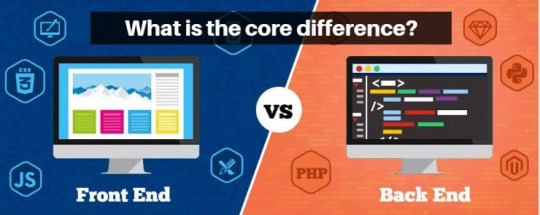
In web development, front end and back end are two of the most popular terms. They are both very crucial and quite different from each other. Each side needs to communicate and operate effectively with the other as a single unit to improve the website’s functionality.
Front End Development: This is the part of the website that user interact directly with. It is also referred to as the ‘client side’ of the application. It includes everything that users experience directly such as text colours and styles, images, graphs and tables, buttons, colours, and navigation menu. HTML, CSS, and JavaScript are the languages used for Front End development. The structure, design, behaviour, and content of everything seen on browser screen when websites, web applications, or mobile apps are opened up, is implemented by front End developers. Responsiveness and performance are two main objectives of the front End. The developer must ensure that the site is responsive i.e., it appears correctly on devices of all sizes and no part of the website should behave abnormally irrespective of the size of the screen.
Front end languages include:
1. HTML: HTML stands for Hyper Text Markup Language. It is used to design the front end portion of web pages using markup language. HTML is the combination of Hypertext and Markup language. Hypertext defines the link between the web pages. The markup language is used to define the text documentation within tag which defines the structure of web pages.
2. CSS: Cascading Style Sheets fondly referred to as CSS is a simply designed language intended to simplify the process of making web pages presentable. CSS allows you to apply styles to web pages. More importantly, CSS enables you to do this independent of the HTML that makes up each web page.
3. JavaScript: JavaScript is a famous scripting language used to create the magic on the sites to make the site interactive for the user. It is used to enhancing the functionality of a website to running web-based software.
Front end frameworks and libraries include:
1. AngularJS: AngularJS is a JavaScript open-source front-end framework that is mainly used to develop single page web applications (SPAs). It is a continuously growing and expanding framework which provides better ways for developing web applications. It changes the static HTML to dynamic HTML. It is an open-source project which can be freely. It extends HTML attributes with Directives, and data is bound with HTML.
2. React.js: React is a declarative, efficient, and flexible JavaScript library for building user interfaces. ReactJS is an open-source, component-based front end library responsible only for the view layer of the application. It is maintained by Facebook.
3. Bootstrap: Bootstrap is a free and open-source tool collection for creating responsive websites and web applications. It is the most popular HTML, CSS, and JavaScript framework for developing responsive, mobile-first web sites.
4. jQuery: jQuery is an open-source JavaScript library that simplifies the interactions between an HTML/CSS document, or more precisely the Document Object Model (DOM), and JavaScript. Elaborating the terms, jQuery simplifies HTML document traversing and manipulation, browser event handling, DOM animations, Ajax interactions, and cross-browser JavaScript development.
5. SASS: It is the most reliable, mature and robust CSS extension language. It is used to extend the functionality of an existing CSS of a site including everything from variables, inheritance, and nesting with ease.
Some other libraries and frameworks are: Semantic-UI, Foundation, Materialize, Backbone.js, Express.js, Ember.js etc.
Backend Development: Backend is server side of the website. It stores and arranges data, and also makes sure everything on the client-side of the website works fine. It is the part of the website that you cannot see and interact with. It is the portion of software that does not come in direct contact with the users. The parts and characteristics developed by backend designers are indirectly accessed by users through a front-end application. Activities, like writing APIs, creating libraries, and working with system components without user interfaces or even systems of scientific programming, are also included in the backend.
Back end languages include:
1. PHP: PHP is a server-side scripting language designed specifically for web development. Since PHP code executed on the server side so it is called server-side scripting language.
2. C++: It is a general-purpose programming language and widely used now a days for competitive programming. It is also used as backend language.
3. Java: Java is one of the most popular and widely used programming language and platform. It is highly scalable. Java components are easily available.
4. Python: Python is a programming language that lets you work quickly and integrate systems more efficiently.
5. JavaScript: JavaScript can be used as both (front end and back end) programming languages.
6. Node.js: Node.js is an open source and cross-platform runtime environment for executing JavaScript code outside of a browser. You need to remember that NodeJS is not a framework and it’s not a programming language. Most of the people are confused and understand it’s a framework or a programming language. We often use Node.js for building back-end services like APIs like Web App or Mobile App. It’s used in production by large companies such as PayPal, Uber, Netflix, Walmart and so on.
Back end frameworks include:
The list of back end frameworks includes: Express, Django, Rails, Laravel, Spring, etc.
The other back end program/scripting languages are: C#, Ruby, REST, GO etc.
0 notes
Text
Icon Fonts vs SVG Fonts
While practicing how to develop a website, I was trying to decide whether I should use icon fonts or SVG icons. After trying out the two of them, let me share what I learned so far and outline the benefits of using each of them in websites.

In modern web design, icons have become an indelible and integral part of UI design. From navigation menus to social media icons, symbols and indicators, icons feature heavily on almost every single website and app on the internet and its popularity showing no signs of waning anytime soon. Consequently, every developer has to face this decision of which icon set they should use.
Traditionally, developers had to rely on just images formats for icons. However, this leads to poor performance in terms of render quality and resolution. But now developers have 2 choices for creating icons, which are:
Icon Fonts
SVG Icons (Scalable Vector Graphics).
Originally, in the early 2000s, icons were created using image sprites. An image sprite is merely a collection of separate individual images put together to form a single image. Image sprite arranges all icons in a single GIF or PNG file and is loaded as a CSS background image.
However, in 2012 web icons came in form of icon fonts. Unlike images and sprites, icon fonts are able to scale up perfectly to any resolution without any degradation or loss of visual quality. Even though image sprites were a vast improvement, they still had tons of shortcomings. If a developer needed to change the colour or resolution of an icon, that would mean needing an entirely new image altogether. On the other hand, icon fonts are in essence simple text. We can use CSS style rules to easily change and modify colour, size/resolution, apply box-shadow, apply CSS animations and transitions.
There are a lot of websites offering free icon font packages:
Font Awesome
Icomoon
Icofont
Fontello
Flaticon
SVG icons on the other hand are used to define vector-based graphics in XML format system to ensures better performance, higher accessibility standards, high rendering quality, unmatched flexibility, and extensive customization. SVG icons are slowly becoming a new standard for web fonts and images. Instead of a font or an image, SVG is instead a block of XML code directly served to a browser which renders it in an intended manner. More and more developers are leaving behind icon fonts and are adopting SVG icons. Not only does offer SVG offer an unmatched ability to be scaled to any size without any loss of quality but also better anti-aliasing than Icon fonts. Moreover, users can edit, colour, or animate each individual bit of an SVG icon, unlike your traditional icon font. Also, since SVG icons are just a block of code, their sizes are much lower to that of image-based PNG or JPEG icons.
0 notes
Text
What is CSS Grid

CSS Grid is one of the newer developments in web design in recent times. Compared to other methods for controlling web page layout such as tables, the box model, and CSS flex box, the CSS Grid has caused a lot of excitement because it makes it easy and convenient to create grid layouts.
It is important to note that CSS Grid is still a work in progress and not an official standard according to the W3C. That means that the final version hasn’t been fully released just yet, but overall, it is supported by most of the major browsers.
CSS Grid is a system that allows for building 2-D grid layouts. While the term “2-D” doesn’t sound so ground-breaking, it absolutely is in this particular case. You see, CSS Grid will allow you to manage a page’s layout according to both columns and rows.

Flexbox, by comparison, is really just meant for columns (1-D, if you will). Using CSS Grid, designers will be able to achieve layouts that were downright difficult before. In fact, some of these things were on web developer’s wish lists since the days of table-based layouts.
With tables, it was easy enough to have a column take up multiple rows using the rowspan attribute. CSS didn’t really have a direct equivalent. That led to using multiple nested containers, floats, clearfixes, etc. to achieve the desired effect. This is exactly what CSS Grid aims to fix.
The good thing is that if you are at all familiar with Flexbox, then you’ll be off to a great start with CSS Grid. With both Flexbox and CSS Grid, things are set up via a parent container and subsequent items (children). And, like Flexbox, content order can be set via CSS. This is particularly nice when adjusting content for mobile devices. What shows up first on a desktop grid may be pushed down lower in the display order on smaller screens.
1 note
·
View note
Text
Amazing WordPress Themes for Creating a Portfolio website
So, we’ve just been given an assignment in which we are tasked with using WordPress to create a simple personal website which should contain a page showing information about ourselves, a page for our blog posts in a chronological order and a portfolio page showing our works in the field of digital media. Being new to WordPress, I looked up some free portfolio themes targeted toward creatives and I thought of sharing the best-looking ones I found.
1. FolioPress: The FolioPress is a minimal and flexible portfolio theme that displays user’s creative work in a grid layout on the homepage. It features plenty of customization options, custom social profile, and is fully responsive.
2. Oscar: The Oscar theme has multiple layout options and a filterable portfolio. On top of that, it comes with an easy to use drag and drop page builder.
3. Optics: The Optics is a clean theme suitable for anyone looking for a minimal portfolio. The theme is easy to customize and is also translation and accessibility ready.
4. Portfolio Web: The Portfolio Web is a simple, modern, and responsive WordPress theme built with designers and creatives in mind. It comes with a built-in Live customizer and a huge range of widgets that make this theme easy to use.
5. Huntington: The Huntington theme uses a nicely organized grid homepage to allow designers to showcase their past projects and portfolio pieces. The layout can be easily customized with Visual Composer and tweak the visual styles with an extensive theme options panel.
6. Shibui: The Shibui theme features masonry layout and has support for unlimited galleries. It’s fully responsive and easy to customize. On top of that, the theme supports infinite scroll, has custom widget areas, and offers several different page layouts.
7. Perfect Portfolio: The Perfect Portfolio theme focuses on typography paired with stunning featured images. The theme has wide range of customizable features including customizable sections on the front page, cross-browser compatibility, mobile friendly design, and responsive features.
8. Pistis: The Pistis theme is suitable for freelancer portfolios as well as agency portfolios. It has an elegant design with the ability to use a full-screen slider or a full screen video. Users will also find a plethora of customization options, parallax effect, and smooth scrolling.
9. StanleyWP: The StanleyWP is based on Bootstrap framework which means it’s responsive out of the box. It’s also minimal and easy to customize and features several different page templates that will make it easy to get your site up and running as fast as possible.
10. Sketch: The Sketch is a responsive portfolio theme, perfect for designers to showcase their creative talent. The theme features a clean, light design which puts the focus on user’s projects. It’s also easy to customize and supports a custom social links menu.
0 notes
Text
What is a Website Builder?
Are you one of those people who is still intimidated by writing HTML, CSS and JavaScript codes?
Well, you’re in luck because website builders help you create websites without having to write codes.
A website builder is software that allows a user to create a website online. The software will reside on a web server at a hosting company or be part of a hosted SaaS (software as a service) platform.
Or in other words, you do not use your local computer (desktop or laptop) to hold software that will build the website. Instead, you’ll build the website online via software designed specifically for website creation.
Top website builders are:
WordPress
Wix
SquareSpace
Weebly
Webflow
Drupal
Joomla
Google My Business Website Builder
Typically, website builders offer two hosting solutions;
Hosted Solution: In a hosted solution, users pay a monthly fee to have the software housed and managed by a third-party company. They don’t have to worry about finding a hosting company or software updates.
Self-Hosted Solution: Website builders that are self-hosted will require users to purchase a hosting plan from a third-party company, install the web builder software from another company, and users need perform software updates. However, there are many hosting companies that will manage software updates for users.

Things to Consider When picking a Website Builder
Custom Domain and Branding
Content Ownership
Available Design Templates
Functionality Options
Ease of Use
Lead Generation Opportunities
Customization Availability
Multimedia Support
Search Engine Optimization
Mobile Responsiveness
Speed and Performance
1 note
·
View note
Text
Optimizing a Website’s Speed
As we learned in our lecture on HTML Images, it is important to ensure that our websites load up web pages fast in order to improve the user experience. If a site is too slow, it will not only be losing visitors, but also potential patrons. Search engines like Google factor a website’s speed into account in search rankings, so when optimizing a website’s speed, everything should be taken into consideration as every millisecond counts.

After conducting some research, I have compiled a list of tips for improving the speed and overall performance of a website.
1. Defer Loading Content When Possible: Ajax allows users to build web pages that can be asynchronously updated at any time. This means that instead of reloading an entire page when a user performs an action, it can simply update parts of that page.
2. Use External JS and CSS Files: When a user first loads a web page, the browser will cache external resources like CSS and JavaScript files. Thus, instead of inline JavaScript and CSS files, it’s best to place them in external files. Using inline CSS also increases the rendering time of a web page; having everything defined in a main CSS file lets the browser do less work when rendering the page, since it already knows all the style rules that it needs to apply. As a bonus, using external JavaScript and CSS files makes site maintenance easier because users will only need to maintain global files instead of code scattered in multiple web pages.
3. Use Caching Systems: By having a caching system in place, a site will only have to create the content once instead of creating the content every time the page is visited in a browser. Popular content management systems like WordPress and Drupal will have static caching features that convert dynamically generated pages to static HTML files to reduce unnecessary server processing.
4. Avoid Resizing Images in HTML: If an image is originally 1280x900px in dimension, but you need to have it be 400x280px, you should resize and resave the image using an image editor like Photoshop instead of using HTML’s width and height attributes (i.e. <img width="400" height="280" src="myimage.jpg" />). This is because, naturally, a large image will always be bigger in file size than a smaller image. Instead of resizing an image using HTML, resize it using an image editor like Photoshop and then save it as a new file.
5. Stop Using Images to Display Text: Not only does text in an image become inaccessible to screen-readers and completely useless for SEO, but using images to display text also increases the load times of web pages because more images mean a heavier web page.
6. Optimize Image Sizes by Using the Correct File Format: By picking the right image format, users can optimize file sizes without losing image quality. For example, unless you need the image transparency (alpha layers) that the PNG format has to offer, the JPG format often displays photographic images at smaller file sizes.
7. Optimize the Way You Write Code: Look around your source code. Do you really need all the tags you’re using or can you use CSS to help out on the display? For example, instead of using <h1><em>Your heading</em></h1>, you can easily use CSS to make your headings italics using the font-style property. Writing code efficiently not only reduces file sizes of your HTML and CSS documents, but also makes it easier to maintain.
8. Load JavaScript at the End of Your Document: It’s best if scripts load at the end of the page rather than at the beginning. It allows for the browser to render everything before getting started with the JavaScript. This makes web pages feel more responsive because the way JavaScript works is that it blocks anything below it from rendering until it has finished downloading. If possible, reference JavaScript right before the closing <body> tag of HTML documents.
9. Use a Content Delivery Network (CDN): A site’s speed is greatly affected by where the user’s location is, relative to the web server. The farther away they are, the more distance the data being transmitted has to travel. Having content cached across multiple, strategically placed geographical locations helps take care of this problem. A CDN will often make your operating cost a little higher, but you definitely gain a speed bonus.
10. Optimize Web Caching: Along with using caching systems, users should create websites that utilize web caching as much as possible. Web caching is when files are cached by the web browser for later use. Things that browsers can cache include CSS files, JavaScript files, and images. Aside from the basics, such as putting CSS and JavaScript code that are used in multiple pages in external files, there are many ways to make sure that you are caching your files in the most efficient way possible. For example, users can set HTTP response headers such as Expires and Last-Modified to reduce the need of re-downloading certain files when the user comes back to a site.
0 notes
Text
What is a Website Hosting?
As I continue to write HTML and CSS codes on our editors and launching them my browser, I kept wondering how I could make my simple webpages go live on the internet. This will be particularly useful for me because it will help my check how responsive my website it when I want to view it on a different device like my smartphone. After doing some little research, I discovered website hosting.
A web hosting service is a type of Internet hosting service that allows individuals and organizations to make their website accessible via the World Wide Web. Web hosts are companies that provide space on a server owned or leased for use by clients, as well as providing Internet connectivity, typically in a data centre. Web hosts can also provide data centre space and connectivity to the Internet for other servers located in their data centre, called colocation.
The amount of space and the cost can vary depending on what a user chooses, so choosing the right size is of utmost importance for the website’s presence.
Some of the different types of web hosting include;
Website builder such as Wix, Squarespace and WordPress, which allows users to directly edit their websites without writing codes.
Shared hosting which allows users share a server with other websites.
Virtual private server (VPS) which is similar to shared hosting but the websites are separated into different virtual servers.
Dedicated server which is the most expensive but allows the user to have the server all to himself or herself.

Why is it important to choose the right web host?
Making the wrong choice for a website can cause harm in the long-run. Going with the cheapest option may work for some users on a budget, but it can lead to a slower site and ultimately, fewer visitors and there are high expectations when it comes to site speed. In fact, a lot of people will leave a website site if it takes over ten seconds to load.
0 notes
Text
What is a favicon?

Ever wonder what those small icons that appear beside the title of a webpage on the browser tabs are? Well, you are in the right place because they have a name. FAVICON
The favicon is a small icon for a website that appears next to the website’s page name or title tag.
They appear in numerous places, including:
· Browser tab
· Bookmarks
· Toolbar
· Recently visited
· Search bars
· Mobile searches
These little icons are an essential component of a website’s interface. It allows the site to have a simple, recognizable picture associated it, so users can get familiar with the brand.
A website favicon is even more helpful if someone bookmarks the site and wants to return to it later.
Many companies use a simple image, like their logo, as their favicon. Griffith College uses a simple “GC” text on its official website.
When creating a website, it is important to know the right size of a favicon. Your file size should be a multiple of 48px square. So, you can have an icon file size like 48x48px or 144x144px. Regardless of the size you use, your image will get rescaled to a 16x16px ratio.
If you plan to host your website on a website builder, your favicon sizes will differ. For example, WordPress requires 512×512 pixels for their favicon, while Squarespace requires 300×300 pixels for their favicons.
It’s also important to remember that favicons appear on browser tabs or bookmark lists. They can also appear in a frequently visited section on a browser or as a shortcut icon on a user’s desktop and must be easily scalable for these instances because the favicons will appear larger.
So why are Favicons important?
Favicons offer numerous benefits for your business, including:
· Favicons build brand recognition
· Favicons add legitimacy to a site
· Favicons help with search engine optimization (SEO)
· Favicons help users locate a page if they bookmark it
· Favicons help users locate you’re a page when multiple tabs open
0 notes
Text
CODE EDITORS FOR WEB DEVELOPMENT

As a web programmer, it is important to make use of proper code editors when writing or editing codes. A code editor is simply a text editing program specifically designed for editing source codes of websites and computer programs. While codes can be written and edited in traditional note taking applications like Notepad and word processing software like MS Word and Google Docs, code editors offer numerous advantages over those applications to a web developer. Some of these advantages include:
· Syntax Highlighting: Code editors can display texts in different colours and fonts which offers programmer visually distinct categories of their codes such as tags, attributes, elements, functions and syntax errors, which makes codes overall easier to read.
· Indentation: Indenting lines of code makes the entire source code easier to read and it conveys a better structure.
· Auto-Complete: Code editors predict what a programmer might want to type and this can greatly speed up work flow as well offering up suggestions to what a programmer might input.
· Bracket Matching: Code editors create and highlight matching brackets which could be useful when nesting elements and statements.
Luckily, we have a variety of code editors to choose from, each with their own pros and cons, determined by the needs of the programmer. Some of the best code editor for web development include:
· ATOM: Atom provides a simple minimalistic interface and is available as a desktop application which runs on Windows, Mac and Linux. It could be downloaded from here https://atom.io/
· Sublime Text: It is an open source code editor which also runs on Windows, Mac and Linux. It is fully customizable, lightweight and features autocompletion, syntax highlighting and code folding. It could be downloaded from here https://www.sublimetext.com/
· Visual studio Code: Developed by Microsoft, Visual Studio Code is a lightweight, fast and very reliable code editor and a personal favourite of mine. It features Intellisense, which is an advanced auto-completion and syntax highlighting system, native support for Git collaboration and best of all, it’s free. It could be downloaded from here https://code.visualstudio.com
Others include:
· Brackets (http://brackets.io/)
· Vim (https://www.vim.org/download.php)
0 notes
Text
WHAT IS HTML DOM?
Every now and then, I come across the term Document Object Model (DOM) in HTML and after doing some research, I will like to share some of what I’ve learned.
Document Object Model (DOM) is an application programming interface (API) for HTML and XML documents that defines the logical structure of documents and the way a document is accessed and manipulated. When a web page is loaded in the browser, the browser creates a Document Object Model of the page. The HTML DOM model is then constructed as a tree of objects that define;
· HTML elements as objects
· Events for the HTML elements
· Properties for HTML elements
· Methods for HTML elements
DOM also provides an API for JavaScript which can be manipulated to create dynamic HTML by adding, changing or removing the following;
· HTML elements from the DOM
· HTML attributes
· CSS styles
· HTML events
· And react to HTML events
The HTML DOM tree diagram is shown below.

DOM Starts at the document object, which is provided by the Browser Window object. This is the container in which a web page loads in.
Then, the page has a Root Element which is HTML <html>
This HTML element then has child elements in this example the HTML element contains 2 child elements which are –
· Head <head>
· Body <body>
Both Head and Body then have their individual child elements –
Head has a child named Title <title> that has text assigned to it – “I am a Page Title”
And, Body Element has 3 child elements named –
· Heading1 <h1> which has an attribute that align the h1 element to the centre and a text assigned to it – “I am a Heading”.
· Paragraph <p> which has a style attribute which sets red as its background colour.
· Image <img> which has a src (source) attribute that allows to define path/source of the image file.
The output of this DOM will be a HTML page with a title, heading, paragraph and an image.
0 notes
Text
HOW DO I CHOOSE THE BEST BROWSER?

What’s the best web browser?
Which one seems faster when rendering pages?
Does this browser support the plug-ins I need to carry out my work?
These are the questions I ask myself when trying to make a decision on which browser I should install whenever I get a need device. With so many browsers to choose from and each offering their own advantages over one another, simply calling one browser better than another is not as easy as one might presume.
Usually, most people’s browser of choice is selected based on the popularity of the web browser and in this case, Google Chrome by and large has the upper hand as it is the most dominant web browser in terms of market share with most people considering it the de facto web browser. That said, Google Chrome isn’t without its shortcomings. The browser has been notorious for using up large system resources which leads to occasional slows downs when a lot of tabs are open on systems with lower random-access memory or slower memory bandwidth. Other popular web browsers include Microsoft Edge, Mozilla Firefox, Opera, Safari, Vivaldi, Brave etc. I personally have tried out different browsers and I want to share my experience of what I’ve learned from them.
The process of switching from one browser to another might not be as daunting as it was once when it comes to transferring bookmarks and data such as credit card data, log-in details and passwords. Several browsers feature import options that aid users in transferring their data from another browser. Also logging in to a Google, Microsoft or Apple account also automatically signs a user into all services hosted by the respective companies.
Interface and layout of web browsers don’t really require a huge learning curve. All that really takes getting used to is the location of frequently clicked buttons like bookmarks, history, options or settings etc. since most user will mostly be interacting with the browser’s viewport when visiting websites.
Different browsers have different browser engines or have them implemented differently and that contributes largely to the perceived speed of a browser, though some web pages might have compatibility issues. Browsers such as Chrome, Edge and Opera all utilize the Blink browser engine while Firefox uses Gecko engine and Safari uses Webkit.
Finally, compatibility with some websites and plug-ins. I no doubt have run into some websites (an aptitude test website for example) that listed only specific web browsers that could be used. This alone feels like a deal breaker if a person’s browser of choice isn’t listed as supported. Also, a user might need particular browser plug-ins which are only exclusive to a particular browser.
In conclusion, it all comes down to personal preference. Depending on one’s use case scenarios, one browser could offer better advantages over another, for example, a user with limited system resources might be better off using Edge or Firefox over Chrome.
1 note
·
View note
Text
MARKUP LANGUAGE VS PROGRAMMING LANGUAGE VS SCRIPTING LANGUAGE
In our class this week, we were introduced to HTML, which stands for Hypertext Markup Language. This language is quite different from the one we were taught in our first semester, p5.js, which is a JavaScript variant of the Processing programming language. This made me wonder what’s the difference between a markup language, a programming language and a scripting language. After doing a little research, I want to share what I learned.
A markup language prepares a structure for the data or prepares the look or design of a page by annotating a document. They are most widely used in designing websites. Examples of markup languages include HTML, CSS, XAML, XML etc.
A programming language is a formal language consisting of a set of instructions or code that tells a computer what it needs to do. They are used to make software or drivers. Examples include Java, C, C++, C#.
A scripting language is basically a sub-category of programming languages which is used to give guidance to another program or control it. Examples include JavaScript, PHP, Perl, Python etc.
2 notes
·
View notes