Statistics
We looked inside some of the posts by visomnia and here's what we found interesting.
Average Info
Notes Per Post
160K
Likes Per Post
100K
Reblog Per Post
60K
Reply Per Post
123
Time Between Posts
12 days
Number of Posts By Type
Conversation
2
Photo
13
Note
1
Text
1
Last Seen Tumblr Blogs


Fun Fact
Tumblr is used by 21% of adults online aged 18-29 years.
Conversation
mood: still not over that fanfiction i read 3 years ago
24K notes
·
View notes


Photo

☆ SHADING TUTORIAL BY ONCHA ☆
hoping it will be useful for some of you! (灬╹ω╹灬) since many, MANY of you requested it, i spent a little time on this one even if it’s messy, hoping that some of you guys may find replies on their questions about “what color do i put here???”
== so, let’s start this tiny tiny lesson ==
★ i’ll start by saying that when it comes to shading, many people think that the only color that fits is black or dark grey, which is the WRONGEST thing you could ever do! even in realism, where you can see shadows that seem greyish, there is a little color, and that is because the surface you are putting shading on, reflects light, which is actually colored and has a pattern/texture on it! clothing, bandages, wood, plastic, rubber, fur, skin, lattex - everything reflects light on its own way, and so has a colored shading. in art, this thing is even more emphatized to make it look pleasing, colorful and catchy, so i drew some little examples to show how i use colors for my shading technique!
★ the first column is made by pastel rainbow colors, the second column is made of normal saturated colors, and the third one is a grey scale. i tried some different hues and palettes for each one, even if you can see that i frequently use blue and purple. those two are, in fact, the most used colos in shading, and works super well on basically everything, maybe making them darker or ligher depending if you are using pastel colors or not. my shading is based on color contrast, infact you can see that i use blues on warm colors and purple/pinks on cold colors: it creates depth and adds a nice effect to it.
★ same with grey scale! look at how colorful can grey, black and white look! it only needs a little bit of experiments, don’t be afraid to change your shading hue: colors won’t be hurt and you will be happy with the result! ^w ^
★ the same thing i do with shading, i’ll do for lights and lightspots, just with an overlay layer instead of multiply! most used are obviously pastel colors, but i often see people use white for it! instead of that, try a light pink, yellow or blue: you will be super satisfied of the result! the only colors that often don’t show well overlay layers are neon pink or red: they are too bright, and the only colors that show a little bit are light blue or yellow. Instead of an overlay, maybe try a screen or anormal type layer, just as when you are coloring pitch black!
★ THE “WARMER” ★ what i call “warmer” is just a plain peach/orangeish color that some artists use to make shading less plain. Sometimes, even if you blend and blur your shading edges, they will still be “too cold/plain” to look at - and that’s what the warmer solves! don’t worry about how cold/warm your shading is, a peachy pink will always help you: put some of it ( just a thin line or a little blurred one ) on the edges of your shading and blend it until you like the result. as shown in the picture, it will be a lot better! some examples of my art with warmer use: * pixel practice - luka (mostly used on hair and sweater) * a day at the beach! (hat shadow on hair, thighs and body in general) * stargaze used on hair and clothing.
★ GENERAL TIPS ★ *use different shading layers when you draw, don’t just stuck yourself on a single one! i am used to make two of them: one fot the basic/lighter shading, more detailed and soft, and another one for the darker parts of the shading, with a colder color such as a medium blue or a sky blue!
*mix different textures when you are shading! for example, try to add a granulated pattern/texture to your clothing layer!
*remember that different materials reflect light in different ways: you can’t shade fur the same way you shade a tshirt! tshirt will have harder shading, more defined, while skin and fur (velvety things in general) will be more blutter. Same with a ribbon, that will have soft shading and really hard light because ribbons are usually not matte, but shiny material!
*try different blendings on different layers! if for a first layer you blended your shading more to add depht to the subject, the darker/second layer could be a little sharper and defined when it comes to shading tools.
2K notes
·
View notes
Photo

#msi #tighter #tornado #hateme #jimmyurine #lynzway
2 notes
·
View notes
Photo


Since my opponent in the meme war @welcometothemalformedbox is busy with finals, I’m posting a new set of memes to entertain myself :D Here are some Uruha shower thoughts
390 notes
·
View notes


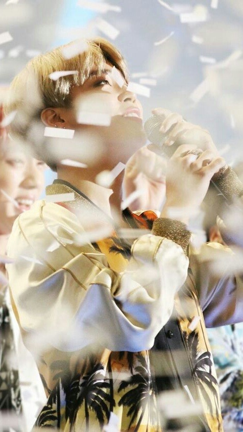
Photo


jungkook evolving: 2015 vs 2016 vs 2017
6K notes
·
View notes
Photo

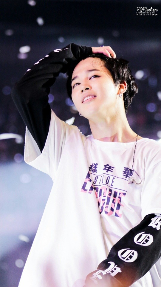
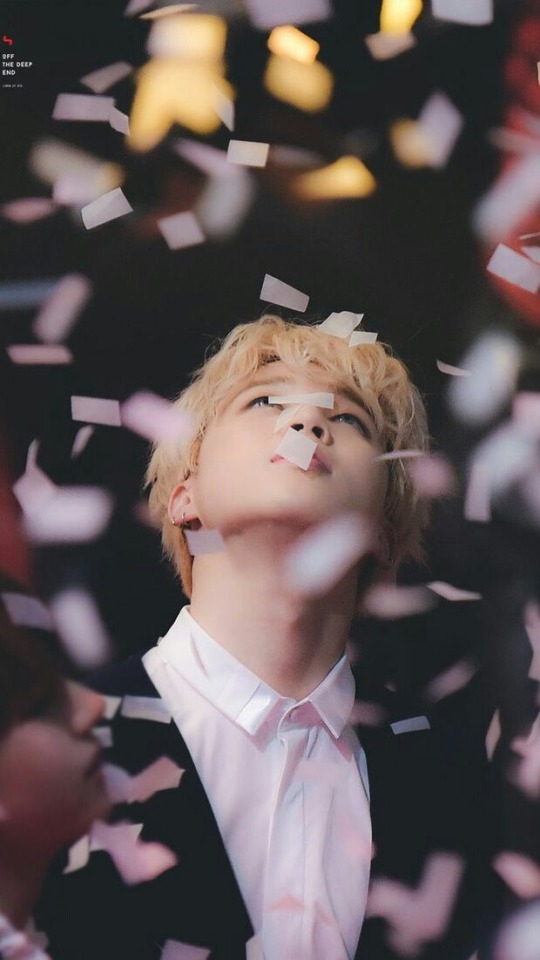
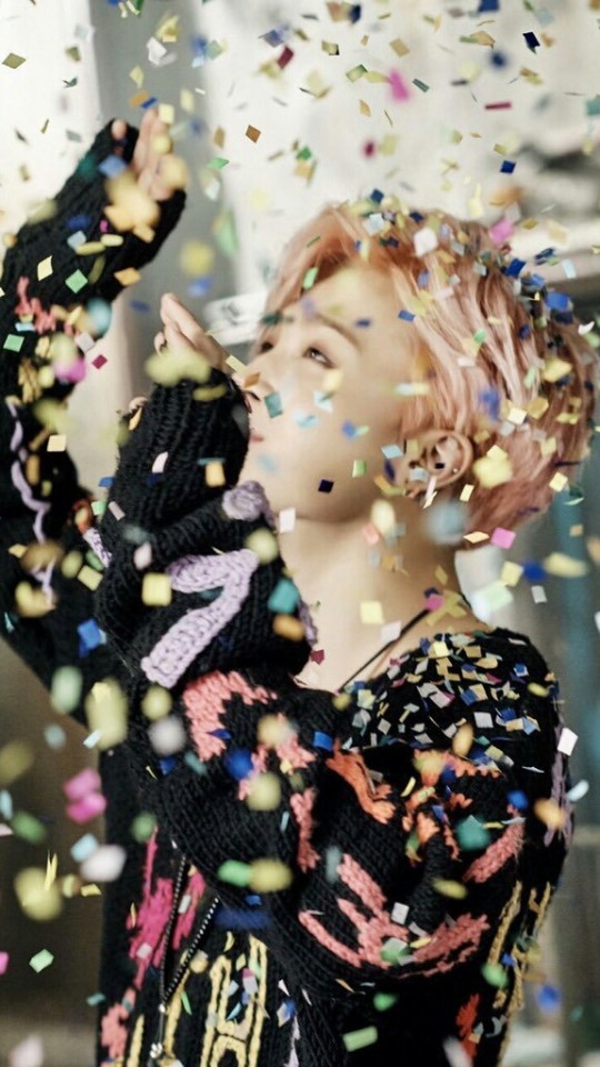
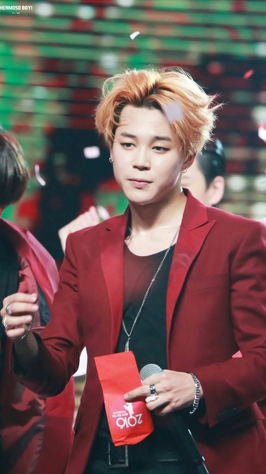
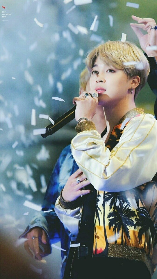
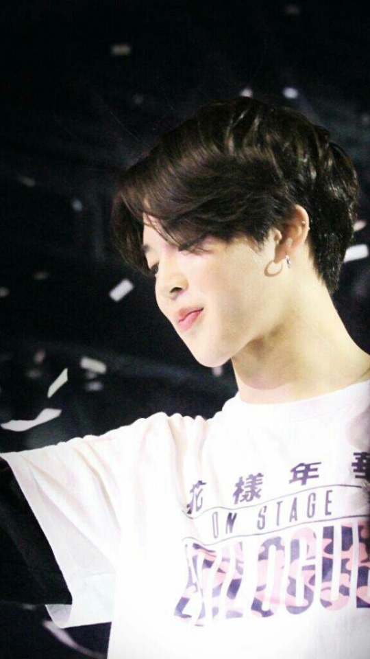
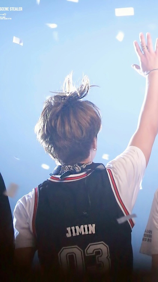
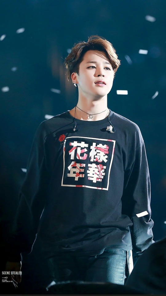
Simple confetti Jimin lockscreens Plz like or share if saved ^.^
Credits to original owners 💜
19K notes
·
View notes
Conversation
suga on every gayo ep
suga: *cheats his small ass off*
bts member: HE cheATED!!! i saw!!!
suga: that was actually your left eye being tricked by the sun's lighting, at that precise moment i was actually doing something entirely different i can't believe you would accuse me like that i raised u on my back how could u
bts member: im so sry
18K notes
·
View notes
Text
BTS members: Suga’s cheating!
Suga:

9K notes
·
View notes
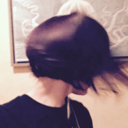
Photo


he was really feeling the techno
3K notes
·
View notes


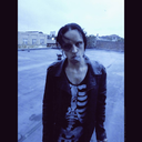
Photo


The morning will come again. Because no darkness, no season can last forever.
554 notes
·
View notes