
Don't wanna be here? Send us removal request.
Statistics
We looked inside some of the posts by visual-communication-review and here's what we found interesting.
Average Info
Notes Per Post
27
Likes Per Post
27
Reblog Per Post
0
Reply Per Post
0
Time Between Posts
2 days
Number of Posts By Type
Text
4
Last Seen Tumblr Blogs


Fun Fact
US Tumblr user growth rate is estimated to slow down to 4.1%.
Text

VISUAL DIARY - WEEK 2
The Content: Typography Manipulation Design source: Pinterest
Visual Style:
Final Thoughts:
For this design, I personally like the use of Typography to convey a message and essentially tell a story. The word is shaped into a Cigarette, and tilted at an angle that makes the image visible. i personally like the use of manipulation, it looks amusing and visually pleasing.
Attribution:
Pin page (pinterest.com)
11 notes
·
View notes
Text

VISUAL DIARY- WEEK 1
The Content: Design source: Pinterest
Visual Style:
Final Thoughts:
Although the design may seem over exaggerated, i personally like it because it tells a story around how the juice was made before being packaged and sold, it gives the viewer a notion that sunstar juice is freshly squeezed juice without preservative, and that what you're getting when consuming the product are similar to what you would get from a freshly squeezed orange.
I also like the image manipulation, seamlessly adding a tap to one side of the orange, and that it seems like the image was situated in an orange farm. The inclusion of the logo on the glass cup lets us know it's not just any juice company but its actually for sunstar brand
Attribution:
Lemonade promotional post | design by mayeoss (pinterest.com)
2 notes
·
View notes
Text


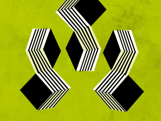
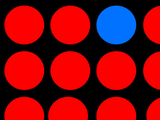
Worksheet 1 - Contrast
Image 1: Contrast by orientation, In this image, i used lines to lead the viewer eye to an intersection of lines, that formed the shape of a 3d like box.
Image 2: Contrast by size, in this image, i used circles, to convey the message of size, in the image we can see the circle getting bigger from the previous circle
Image 3: Contrast by texture, in this image, i used rectangle to create a visually appealing shape, with colours that contrast with the textured background
Image 4: in this image, theres a Contrast of colour, every other colour is red, except the blue, intended to draw your attention to that circle, it could also tell a story of how in a crowd of similar people, be different
7 notes
·
View notes
Text


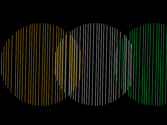
Worksheet 1 - Shape
The above designs are inspired by
Image 1: This was created using lines, carefully arranged to look like a vortex illusion, at the centre, a rectangle added to show the end point of the illusion.
Image 2: The image shows an eclipse like ring, intersecting together, this is a playful manipulation, using circles, to convey an intersection of shapes.
Image 3: In this image, i used triangles to create a circle like object, that looks somewhat like an orange, hence my use of colour, the red is used to show a distinction of shape
Image 4: I used lines to create a circle like object, intersecting with each other, and a distinct colour to indicate the point of intersection
#visualcommunication #photoshop #adobe
7 notes
·
View notes