
Statistics
We looked inside some of the posts by visualizinganddepicting and here's what we found interesting.
Average Info
Notes Per Post
11K
Likes Per Post
6K
Reblog Per Post
6K
Reply Per Post
15
Time Between Posts
3 days
Number of Posts By Type
Photo
13
Text
3
Link
1
Last Seen Tumblr Blogs


Fun Fact
Tumblr.com rank in the US is 25.
Photo


ABZzz...a Bedtime Alphabet by Thames & Hudson
Inspiration for Alphabet book from the AAPL
2 notes
·
View notes


Text
Narrative project

Fish Market (2019)
Insta | Store
221 notes
·
View notes
Photo
Narrative project


Ladoga, 20 min sketches
361 notes
·
View notes
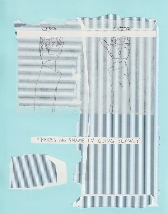
Photo
Narrative project
Color & line

untitled, 2019
linework done in pen, color done digitally
insta | shop | youtube
1K notes
·
View notes
Photo
Narratives Project

I’m researching & drawing my way through the history of the first prairie restoration, the Curtis Prairie at the University of Wisconsin Arboretum in Madison, WI. More to come! ✨💛🌾💛✨
565 notes
·
View notes
Photo

Ori Toor, “Taste Test”
Inspiration for Single Image Story
0 notes


Photo


October 1 2017 (30 Day Back-to-School Challenge)
Day 4: Study Essentials Definitely my iPad (ironically not pictured) and some graph paper with my colorful marker pens and a functioning muji pen :-) I also like to have a lot of bright light or else my eyes get tired too quickly!!
anyways here are some organic chem notes because organic chem is stupid hard
Keep reading
174 notes
·
View notes

Photo

Visualisation of words spoken between Romeo and Juliet characters
136 notes
·
View notes
Photo

US-China Trade in Goods, Visualised
44 notes
·
View notes
Photo

Brinton was ahead of his time. In designing the chart above, he wanted to acknowledge the engaging power of illustration but preserve accuracy.
If you’ve seen charts like this before, it’s because they are almost identical to the Isotype “pioneered” in the 1930s by Otto Neurath.

Brinton’s motivation was to avoid these kinds of pitfalls:

11 notes
·
View notes
Text
Function or beauty in dataviz?

While Brinton was passionate about getting things represented accurately, he wasn’t fundamentally against a cartoon approach, such as the one above. He said
“the cartoonist style should not be broadly condemned, for it has tremendous possibilities. There is a great opportunity waiting for the man who can combine cartoon methods with accuracy of numerical statement.”
Getting this balance right is one of the bigger challenges as we come to the end of the Infographic era, and it’s still being argued.
It’s also the crux of the different between, say, Stephen Few and David McCandless. The former argues for functionality first, the latter puts beauty first. Who is right? It depends.
5 notes
·
View notes
Photo

A visualisation of the length of Terms and Conditions for different social networks. It’s enough to put you off Instagram for life! HT https://twitter.com/hailmika/status/992391607302451200
6 notes
·
View notes
Photo
January 25, 2019
society6.com/abiwhales
8K notes
·
View notes