
Statistics
We looked inside some of the posts by vowism and here's what we found interesting.
Average Info
Notes Per Post
30
Likes Per Post
23
Reblog Per Post
7
Reply Per Post
0
Time Between Posts
16 days
Number of Posts By Type
Text
17
Last Seen Tumblr Blogs


Fun Fact
Mobile Tumblr US users spend an average of 4.04 minutes per session on the app.
Text
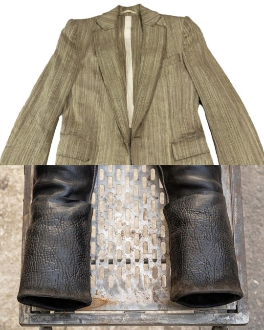
John Alexander Skelton: My work is a continuous dialogue. (Mascarar_11 , INK, JAS)

INK:
What was the inspiration behind the exclusive pattern designed in collaboration with the artist Oliver McConnie?
JAS:
The inspiration behind this pattern comes from my AW24 collection, which is my interpretation of the works of the band This Mortal Coil. Essentially, I had Oliver listen to their music and provided him with notes about the collection that he was already familiar with. Their music has a very ethereal and almost Gothic feel, which led me to explore the Gothic movement through early forms of art and architecture. This became the foundation for Oliver to create the print, but equally important is that he also brought his own world into it.
Read full in VOWI
3 notes
·
View notes
Text
Giovanni Anselmo: Arte Povera’s Master of Materiality

Giovanni Anselmo (1934–2023) was an Italian sculptor and conceptual artist renowned as a leading figure in the Arte Povera movement of the late 1960s
Across a six-decade career, Anselmo experimented with “poor” materials and natural forces to create works that blur the boundary between art and life. His sculptures and installations harness gravity, tension, magnetism, and organic decay, making visible the invisible energies that shape our world
This article provides an overview of Anselmo’s life and artistic evolution, analyzes his key works, and examines the ideas and legacy of Arte Povera’s master of materiality.
Read in full via VOWI
0 notes
Text
Archivio J.M. Ribot: Continuing to Move Forward (by Ink Clothing and Mascara )

Karim Fares
“Clothing as a gift of time, filled with history and tradition, and handcrafted into contemporary designs.” Uchronia, defined by the Greek word Utopia (u-topos: an ideal place that doesn’t exist), is used to define an “ideal time that has never existed (ou-chronos).” Forgetting, rediscovery, cycles, and recreation Karim uses Uchronia to describe his clothing. He began experimenting with different sewing techniques to modify vintage clothing ten years ago, and Archivio J.M. Ribot is a natural product of this need.
“The name comes from the first batch of vintage clothing I collected a pair of French wool trousers from the 1920s I found in Provence. Inside, there was a label with the name of the studio and the original owner’s name—J.M. Ribot.” Karim then decided not to use his own name to interpret and represent this brand’s work of “digging into the past and giving things with memories a new identity,” allowing these vintage pieces to transcend time and continue wandering after their identities are transformed.
Read in full via VOWI
#archivio j.m ribot#john alexander skelton#paul harnden#geoffrey b small#carol christian poell#maurizio altieri#cherevichkiotvichki#Aleksandr Manamis
4 notes
·
View notes
Text
Biek verstappen interview by Cristina Frasca, february 2022
nterview by Cristina Frasca, february 2022
i am really fascinated by your creations that refer to an apparently suspended time. they seem to evoke distant memories and yet they are so actual. What is your background?
I don’t have an educational background in fashion. I didn’t study it nor did I work for any other designer before I started my own brand. But my mother used to be a designer, and as a parent she put a lot of effort in our esthetic upbringing: teaching my sister, my brother and me about the worth of sustainability, the richness of natural products and the beauty of comfort and utility. Some are now very contemporary themes of course, but on those subjects, she turned out to be way ahead of her time. When we grew up, our mother had a childrens clothing brand, later she had her leather label called ‘Kai’. I guess the sum of all that has been my education. Read in full via VOWI

#biek verstappen#paul harnden#john alexander skelton#carol christian poell#geoffrey b small#maurizio altieri#p.r patterson#elenadawson
0 notes
Text
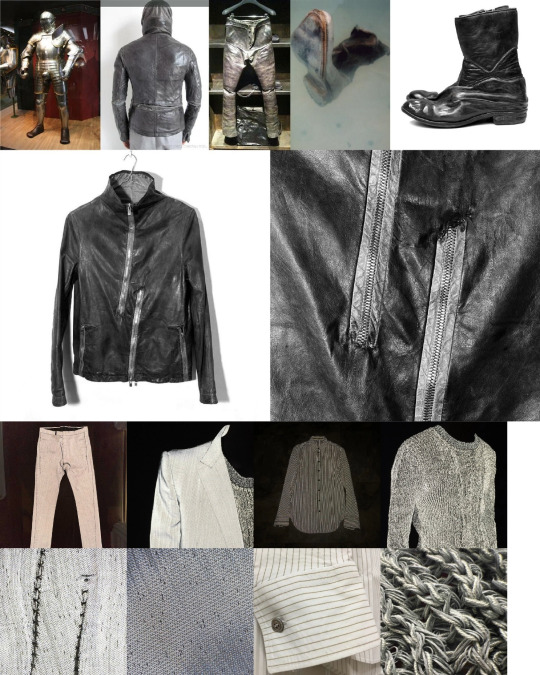
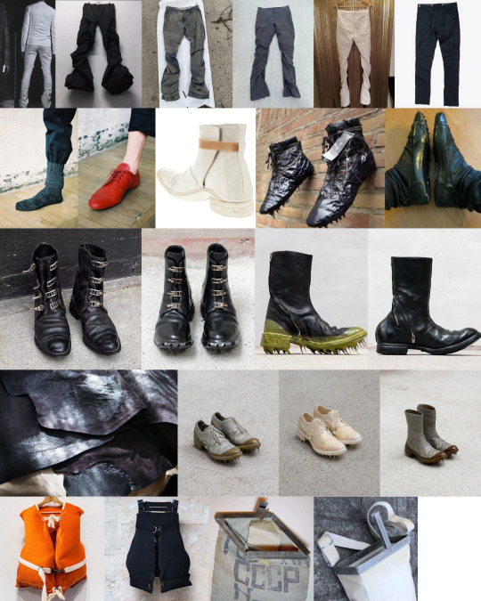
Ultimate Rick Owens Guide 2024 by Mascarar_11
Among all the distinctive designers in the fashion industry, it is hard to find someone with a more unique soul than Rick Owens (full name Richard Saturnino Owens, born on November 18, 1962. “Saturnino,” meaning Saturn or “to sow” in Portuguese, was also his great-grandfather’s middle name). From winning the CFDA Best Newcomer Award to receiving a Lifetime Achievement Award, his nearly 40-year career spans from being born in Porterville, California, to starting his rebellious journey in Los Angeles, and finally establishing himself in Paris and Italy.
With creative subversion and sharp business acumen, he has built a long-lasting, billion-dollar business empire. From his personal image and style to the unique design aesthetics characterized by draping, textures, and silhouettes, along with continuous applause-worthy creative shows, these elements form the unique language and building blocks of his vast empire. Now, on the occasion of Rick Owens’ 30th brand anniversary and following his first-ever visit to China, I present the most comprehensive guide to exploring his fascinating and eccentric world.
A: ARCHITECTURE
“Architecture has always intrigued me. Becoming an architect is exciting because you leave a monument for yourself on Earth.” (Matches Fashion, 2022)
Rick Owens has always acknowledged that architecture and utopian imagination are among the most significant influences on his work. He describes himself as looking like “logical yet brutalist architects” such as Le Corbusier, Carlo Scarpa, and Luigi Moretti. His inspirations often extend far beyond other designers’ works. Owens admits he prefers reading architecture books over fashion literature and frequently draws inspiration from architectural concepts.
Many of his runway shows pay homage to specific architectural forms, spaces, and movements. For instance, the AW12 show featured models wearing knitted ski masks dubbed “Brutalist Veils.” In AW15, he paid tribute to Frank Lloyd Wright’s ancient Mayan architectural style. The mythical Tower of Babel and the conceptual Russian constructivist Tatlin’s Tower were recurring themes throughout the SS19 collection. Perhaps most directly, the AW20 collection translated Le Corbusier’s Modulor Man, a human measurement system based on the golden ratio, into exaggerated shoulder designs.
Owens’ designs often stem from architectural references, with his iconic “slim and sharp + geometric shapes” silhouette inspired by a photograph of the Berlin Wall, which symbolized Brutalist utopias. “I am, of course, drawn to Brutalism… Its grandeur has an elegant lavishness.” (Neue Luxury, 2016) The SS18 women’s show invitation featured a print of Filippo Tommaso Marinetti’s bust sculpture by Italian artist Thayaht. Owens explained, “This Italian futurist represents an ideal Brutalist aesthetic I’ve been pursuing relentlessly.”
“When I think of figures in space or architectural lines on the body, I usually find a line or proportion. My favorite part is pattern drafting.” (Excelsior, 2007) Owens often defines clear geometric lines and divisions on garments, creating deliberate “3D views” when combined with the body’s contours. In frontal designs, the abdomen often resembles a “square plane,” while the “inverted triangle” cuts of cropped blazers in AW21 extend from the hip line, creating a slimmer and elongated visual effect. In SS24, pants extended to mop-like lengths, with high-waisted silhouettes that visually raised the waistline by at least 10 cm, forming sharp triangular structures that appeared monolithic.
In recent years, two architectural styles have become more prominent in Owens’ fashion designs:
1. Art Deco: Combining modern design with decorative aesthetics, often leaning toward a mechanical aesthetic. This style incorporates zigzag graphics, step patterns, radiating lines, bold shapes, and curved elements. Natural and metallic hues dominate, drawing inspiration from Aztec and Egyptian civilizations. Owens’ SS20 women’s collection showcased his Mexican heritage with metallic Aztec-inspired crowns and cocoon-like coat structures. The structural lines throughout his 2023 collection were reminiscent of Egypt’s Edfu and Luxor temples.
2. Bauhaus: Besides references to Le Corbusier and other architects, Owens’ most straightforward interpretation of this style is the inverted “J”-shaped pocket zipper structure, which he directly calls “Bauhaus.” The curve resembles the line turns found in Bauhaus architecture and typography.
“No one has asked me to design a hotel, and that hurts. I’m still waiting… Or maybe a gym… A beautiful monastic-style chain of gyms.” Owens dreams of one day participating in actual architectural design.
-----------------------------------
Read in full via Link
0 notes
Text
Jerry N. Uelsmann: The Dark Surrealist of Photography
Jerry Norman Uelsmann (1934–2022) was an American photographer who revolutionized the art of photography in the 1960s by creating surreal, dreamlike photomontages entirely in the traditional darkroom.
Decades before digital editing tools existed, Uelsmann blended multiple negatives to conjure hallucinatory scenes that have “more in common with Salvador Dalí and René Magritte than Ansel Adams”. His flawlessly crafted black-and-white images defied the era’s prevailing “straight photography,” presenting instead mysterious visual narratives rich with symbolic and psychological meaning. Celebrated as a “darkroom alchemist” for his mastery of analog techniques. Uelsmann opened new frontiers for photography as a medium of imaginative expression and influenced generations of artists who followed.
The early 1960s photographic establishment was still dominated by a purist philosophy (exemplified by the likes of Ansel Adams and Edward Weston) that valued sharp, unmanipulated images of the natural world. Uelsmann, in contrast, was part of a new wave of young photographers who challenged these orthodoxies. He later noted that he, Duane Michals, and Robert Heinecken were at “the forefront of photographers who challenged the accepted aesthetics back in the ’60s and ’70s and created a new paradigm of what photography could be”. ————————————————————
Read in full via link in bio
We are currently looking for editors and bloggers who publish culturally valuable content. Please sign up on the Vowi platform and send us a DM, and we will provide you with a referral code to obtain posting rights.
0 notes
Text
Biek verstappen interview by Cristina Frasca, february 2022
interview by Cristina Frasca, february 2022
i am really fascinated by your creations that refer to an apparently suspended time. they seem to evoke distant memories and yet they are so actual. What is your background?
I don’t have an educational background in fashion. I didn’t study it nor did I work for any other designer before I started my own brand. But my mother used to be a designer, and as a parent she put a lot of effort in our esthetic upbringing: teaching my sister, my brother and me about the worth of sustainability, the richness of natural products and the beauty of comfort and utility. Some are now very contemporary themes of course, but on those subjects, she turned out to be way ahead of her time. When we grew up, our mother had a childrens clothing brand, later she had her leather label called ‘Kai’. I guess the sum of all that has been my education.
tell us about your world and your visions.
I don’t have a specific goal with what I am doing. I don’t think of it too much, I work and design on intuition. I do like all good things from the past – ideas and materials that stand the test of time, that have proven to be unambiguously valuable: natural fibers, durable stitching, classic tailoring techniques. I think beauty lies in modesty and suggestively, rather than in explicitly. Clothing should underline your personality, and not take it over. It shouldn’t restrict you in any movement, and I want my clothes to be appropriate for all occasions. When you have to be representable, when you go out for diner, when you want to do some light work in the garden, when it is Sunday and you relax in front of the fireplace.
Read in full via Link
#biekverstappen#paul harnden#archivio j.m ribot#carol christian poell#cherevichkiotvichki#geoffrey b small#maurizio altieri#arte povera#john alexander skelton#deepti barth#elena dawson
0 notes
Text
Arte Povera: from historical origins to contemporary influence Arte Povera emerged in Italy during the late 1960s as a response to the growing dissatisfaction with traditional art forms and the commercialization of art. The movement sought to reject the formalities of institutionalized art and break away from the constraints of modernism. Influenced by political and social changes of the time, Arte Povera embraced experimentation and the use of non-traditional materials. The artists of this movement focused on raw, everyday objects and explored themes of impermanence and transformation, making the art itself a part of the natural processes it aimed to represent. Key artists associated with Arte Povera include Pier Paolo Calzolari, Jannis Kounellis, and Michelangelo Pistoletto. One of the movement’s central ideas was to challenge the traditional hierarchy of materials in art, favoring natural and ephemeral elements. For instance, Calzolari’s works like Soffio (1970) and Rosa e Nero (1969) exemplified the use of raw materials like salt, ice, and sulfur, emphasizing themes of transformation, ephemerality, and the passage of time. This focus on natural processes and transitory states highlighted Arte Povera’s core principle of breaking down artistic conventions by incorporating elements that were often overlooked or deemed insignificant. The influence of Arte Povera continues to resonate in contemporary art, where its legacy can be seen in the work of many modern artists who engage with the raw and authentic aspects of materials. By focusing on the transient nature of both the materials and the art itself, Arte Povera challenged viewers to rethink the value of art and its relationship to the world around us. Its emphasis on impermanence, transformation, and the sensory experience remains an essential part of how we engage with art today. Read in full via link


#arte povera#giovannianselmo#giuseppepenone#giuseppepenonesculpture#janniskounellis#donaldjudd#donaldjuddfoundation#dandlavin#josephkosuth#artepovera#dadaism#michelangelopistoletto#mariomerz#alighieroboetti#germanocelant#rosalindkrauss#pierpaolocalzolari#tommasocascella
0 notes
Text
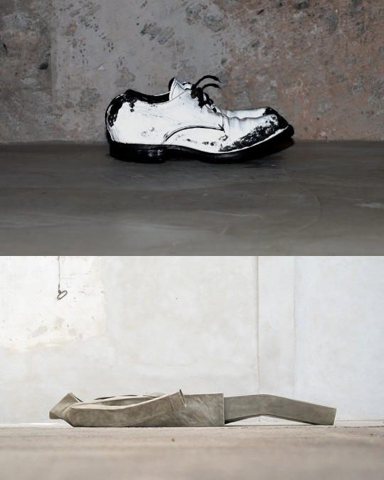
Translation version) “To be discussed” M_moriabc by Maurizio Altieri
This content is a translated version of the original content created by @inkclothing and Mascara_11.
“For me, Carpe Diem is the story of a young man who wants to create his own worldview.” After selling the highly successful Carpe Diem, Maurizio Altieri spent most of his time and energy subverting his previous design concepts, breaking through the shackles of cultural and aesthetic horizons, and the process of constantly sampling and re-sampling.
Maurizio Altieri said “For me, shoes are not just a fetish, they are a medium.” The conceptual system he proposed was M_moriabc (memento mori a b c, souvenir). The ABC series, each with 11 pairs of shoes, was based on three precious shoe lasts that he had spent years hand-carving from wood. The original intention of the project was to interpret design based on traditional craftsmanship. While constantly evolving, it also constantly challenged the shoemaking technology that was considered to have reached its limits at the time.
Read in full via link in bio


#vowi.us#maurizio altieri#carol christian poell#paul harnden#paul harnen shoesmaker#john alexander skelton#arte povera#habitus#inkclothing#mascara_11#archivio j.m ribot#deepti barth#m.a+#geoffrey b small#a1923#avantgarde fashion#elena dawson#biekverstappen#p.r.patterson#horisakicom#cherevichkiotvichki#nosapluna
2 notes
·
View notes
Text


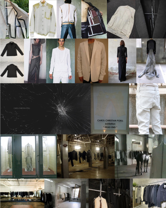
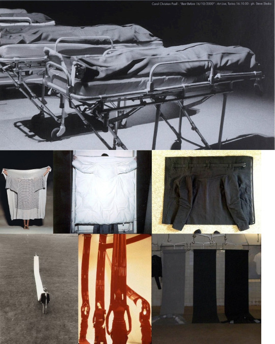


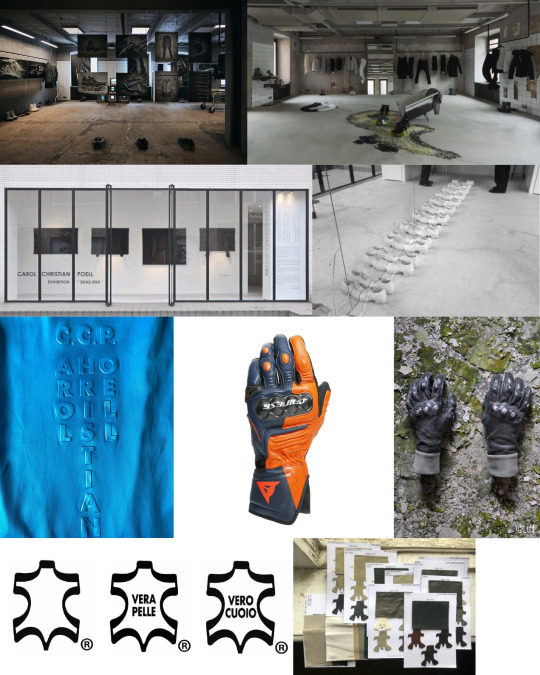

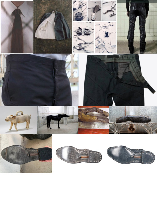


Translated version) Ultimate Guide to Carol Christian Poell 2024 by Mascarar_11 Link in bio to view this content. #vowi
https://vowi.us/ultimate-guide-to-carol-christian-poell-2024-by-mascarar_11/
#carol christian poell#maurizio altieri#M_moriabc#a1923#elenadawson#paul harnden#Deepti barth#john alexander skelton#archivio j.m ribot#uma wang#p.r patterson
11 notes
·
View notes
Text


Junichiro Tanizaki’s “In Praise of Shadows (1933)” explores the unique aesthetics of Japanese culture, emphasizing the concept of wabi-sabi, which finds beauty in imperfection and transience. Tanizaki delves into how the Japanese appreciation for shadows and subdued lighting contrasts with Western preferences for brightness and clarity.
“If light is scarce then light is scarce; we will immerse ourselves in the darkness and there discover its own particular beauty.”
In his words, “We find beauty not in the thing itself, but in the pattern of shadows, light and darkness, that one thing against another creates.” This reflects the Japanese aesthetic, which values the harmony of light and shadow to create a serene and profound beauty.
In traditional Japanese architecture, natural light is minimized, and shadows are used to enhance the ambiance of a space. Walls and ceilings are often dark-colored, with light entering indirectly to add depth and mystery to the environment. This approach contrasts sharply with Western architecture, which tends to favor open, brightly lit spaces.
The concept of wabi-sabi is central to Japanese aesthetics, celebrating the beauty found in the natural, the aged, and the imperfect. This philosophy is evident in the use of materials and finishes that age gracefully, enhancing their beauty over time. Tanizaki’s exploration of these themes in “In Praise of Shadows” provides a deep understanding of the subtle and nuanced beauty that defines Japanese culture.
Japanese art, music, photography, cinema, furniture, architecture, and design often embody the harmony of light, shadow, and darkness, celebrating simplicity and transience. The wabi-sabi aesthetic values the beauty found in imperfection, seen in the natural aging of materials over time. This approach highlights the delicate interplay of light and darkness, emphasizing the profound beauty in what is worn and imperfect.
#junichiro tanizaki#in praise of shadows#yohji yamamoto#yohji yamamoto pour homme#paul harnden#geoffrey b small#john alexander skelton#cherevichkiotvichki#marc le bihan#uma wang#ziggy chen#atelier inscrire#tadao ando
8 notes
·
View notes
Text
Roland toast 1950 by Michael Wolgensinger
1 note
·
View note
Text
Roland Bretzel, 1950 by Michael Wolgensinger
0 notes
Text


Robert Rauschenberg, born in 1925 in Port Arthur, Texas, was a pioneering figure in the American art scene who significantly influenced contemporary art through his innovative techniques and philosophical approach. He studied at the Kansas City Art Institute, the Académie Julian in Paris, and Black Mountain College, where he was mentored by influential artists such as Josef Albers and John Cage. Rauschenberg’s career was marked by his relentless experimentation with various media, ranging from painting and sculpture to photography and performance art. His diverse educational background and early influences shaped his vision of art as an evolving, interdisciplinary practice.

One of Rauschenberg’s most notable contributions to art is his creation of “Combines,” a term he coined to describe his works that merged painting and sculpture using non-traditional materials. Among his iconic works, “Monogram” (1955-1959) stands out, featuring a stuffed goat encircled by a tire mounted on a painted canvas. Another significant piece, “Canyon” (1959), includes a stuffed eagle and various found objects. These works exemplify his belief that art should break free from conventional boundaries and incorporate elements from everyday life. “Bed” (1955), another seminal work, uses his own bedclothes as a canvas, blending personal history with artistic expression, thereby challenging traditional notions of what constitutes a painting.


Rauschenberg’s art philosophy was deeply rooted in the idea of “working in the gap between art and life.” He sought to dissolve the distinctions between art and reality, believing that anything could be art if it was framed within an artistic context. This philosophy led him to use found objects and unconventional materials, creating works that were both provocative and accessible. His approach was revolutionary, rejecting the elitism of abstract expressionism and embracing a more inclusive, democratic view of art. Rauschenberg’s work emphasized the interconnectedness of different art forms and life experiences, encouraging viewers to see the world through a broader, more integrated lens.


Rauschenberg’s influence extends to many contemporary artists who continue to explore and expand upon his ideas. Jeff Koons, known for his use of everyday objects in his sculptures, and Damien Hirst, famous for his provocative and often controversial use of materials, are among those who have drawn inspiration from Rauschenberg’s legacy. Additionally, artists like Julie Mehretu and El Anatsui, who incorporate diverse materials and cultural references into their work, reflect Rauschenberg’s spirit of innovation and his commitment to breaking down traditional artistic boundaries. Through his pioneering vision, Rauschenberg has left an indelible mark on the art world, inspiring generations of artists to continually redefine the possibilities of art.


1 note
·
View note
Text


Wassily Kandinsky, a pioneering abstract artist, developed a profound art philosophy that significantly influenced modern art. He believed that art was not just a visual experience but a spiritual and emotional one. Kandinsky’s work was deeply influenced by his interest in Theosophy and other spiritual movements, which emphasized the connection between the material and spiritual worlds. He saw the artist as a visionary who could perceive deeper truths and express them through art, aiming to evoke a spiritual resonance in the viewer.


Central to Kandinsky’s philosophy was the concept of “inner necessity,” which he described as the artist’s internal compulsion to create. He argued that true art does not simply replicate the external world but expresses the artist’s inner emotions and spiritual experiences. This led him to pioneer abstract art, seeking to move beyond the literal representation of objects to convey deeper, non-material realities. For Kandinsky, the shapes and colors in his paintings were not just aesthetic choices but were imbued with emotional and spiritual significance.


Kandinsky also developed a sophisticated theory of color and form, believing that different colors and shapes could evoke specific emotional responses. He associated particular colors with certain emotions and spiritual states; for example, he saw blue as evoking peace and spirituality, while yellow represented energy and vitality. His use of geometric shapes was similarly purposeful, with circles, triangles, and squares each carrying their own symbolic meanings. Through these elements, Kandinsky sought to create a visual language that could communicate directly with the soul.


Kandinsky’s ideas were comprehensively articulated in his seminal book “Concerning the Spiritual in Art,” where he laid out his vision for a new art form that transcended the material world. He believed that by focusing on abstraction and the emotional impact of colors and forms, artists could tap into universal spiritual truths. Kandinsky’s work and writings have had a lasting impact on the development of abstract art, influencing countless artists and continuing to inspire discussions about the role of spirituality in artistic expression.

0 notes


