
w21030083-xd4005
Principles of Visual Design
Cat's virtual sketchbook (blog) for the Principles of Visual Design Module (xd4005).
The sketchbook includes: Notes from lectures, workshop classes, works in progress throughout the module and independent learning.
This blog in chronological order.
Introduction to Animation (mi4011)
Visual Language #01 (mi4012)
35 posts
Don't wanna be here? Send us removal request.
Last Seen Blogs

glcriovs
g l o r i o U S

vangoghsmoonchild
Moonflower

elmg
deep dreams

quadrantmodelquotes
Quadrant Model Quotes from 2013 Lectures

a-partistry
(AP)artisty.

Text
The Writing
My Thoughts
I’ve always had an issue with coming up with prompt-based creative writing and this project has been no different. Since I lagged pretty far behind during this project, the writing’s been pretty excruciating for me.
I thought I could work on the design aspects first and then adapt the writing around it, but this has turned out to be a bit of a mess, since it’s interfered with the original organisation and composition of the spreads I wanted to make.
I also had an issue with InDesign, where the “f”s and “L”s kept deleting themselves but multiplied during exports. I thought it was a keyboard issue since any troubleshooting made it seem as though it was, but it just turned out to be a bizarre glitch on InDesign’s end.
When I had the layout set at 100%, anything smaller than 10px was too small and unreadable, which caused a fair amount of bother when arranging the text. I had to pick-and-choose what to keep in and what to take out. However, I also had some issue filling in different areas. It was a mixed bag.
Next time, I’m writing everything I need to include first, then speed through the art and design after the fact.
THE WRITING
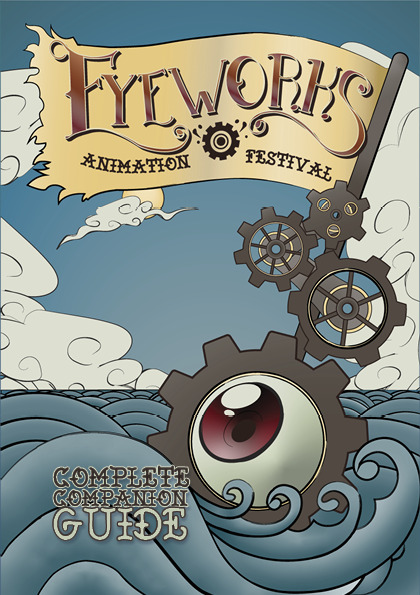
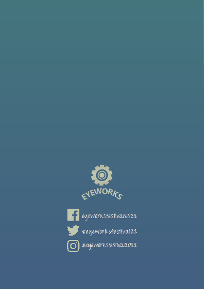
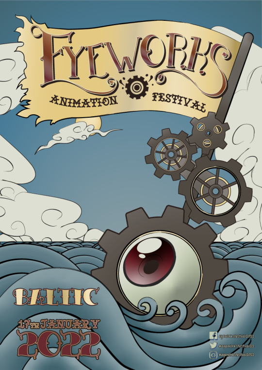
EYEWORKS ANIMATION FESTIVAL
Complete Companion Guide
Date & Venue:
17th January 2022, Baltic
Entry Fee:
£15.00 (?)
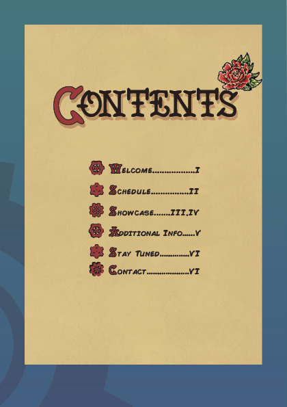
Contents
Welcome (pg 01)
Schedule (pg 02)
Showcase (pg 03, 04)
Additional Info (pg 05)
Stay Tuned (pg 06)
Contact (pg 06)
Pg 01
Intro:
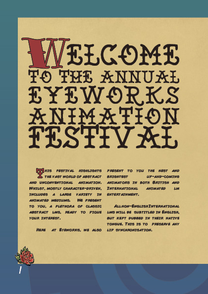
Welcome to the annual Eyeworks Animation Festival!
This festival highlights the vast world of abstract and unconventional animation. Whilst, mostly character-driven, includes a large variety in animated mediums. We present to you, a plethora of classic abstract films, ready to pique your interest.
Here at Eyeworks, we also present to you the finest and brightest up-and-coming animators in both British and International animated film entertainment.
All non-English International films will be subtitled in English, but kept dubbed in their native tongue. This is to preserve any lip synchronisation.
pg 02
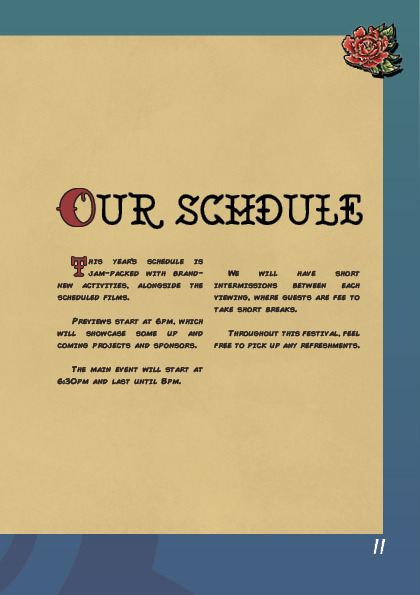
Schedule
This year’s schedule is jam-packed with brand-new activities, alongside the scheduled films.
Previews start at 6pm, which will showcase some up and coming projects and sponsors.
The main event will start at 6:30pm and last until 8pm.
We will have short intermissions between each viewing, where guests are fee to take short breaks.
Throughout this festival, feel free to pick up any refreshments.
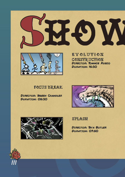
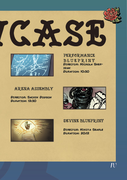
pg 03-04
SHOWCASE
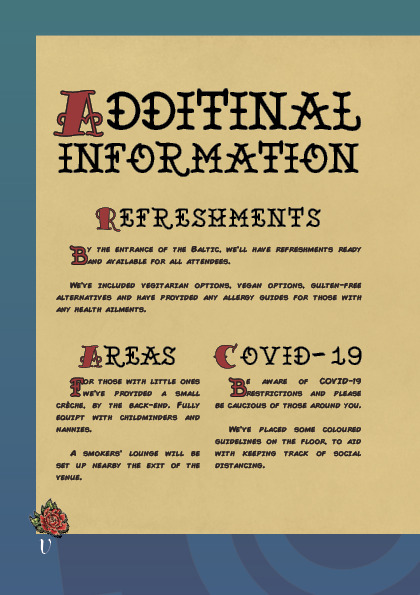
pg 05
ADDITIONAL INFORMATION
Refreshments
By the entrance of the Baltic, we’ll have refreshments ready and available for all attendees.We’ve included vegetarian options, vegan options, gluten-free alternatives and have provided any allergy guides for those with any health ailments.
Areas
For those with little ones we’ve provided a small crèche, by the back-end. Fully equipped with childminders and nannies. A smokers’ lounge will be set up nearby the exit of the venue.
Covid-19
Be aware of COVID-19 restrictions and please be cautious of those around you. We’ve placed some coloured guidelines on the floor, to aid with keeping track of social distancing.
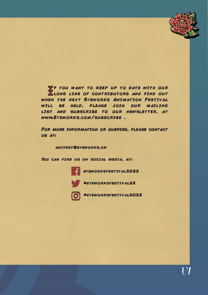
Pg 6
Stay Tuned!
If you want to keep up to date with our long line of contributors and find out when the next Eyeworks Animation Festival will be held, please join our mailing list and subscribe to our newsletter, at www.Eyeworks.com/subscribe .
For more information or queries, please contact us at:
[email protected]
You can find us on social media, at:[Facebook] eyeworksfestival2022[Twitter] #eyeworksfestival22[Instagram] #eyeworksfestival2022
0 notes
Photo
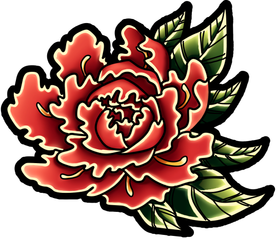


I used assets from the Poster and some initial mock-up designs, for the interior of the booklet.
The peony looks more tattoo-like than my poster.
0 notes
Photo
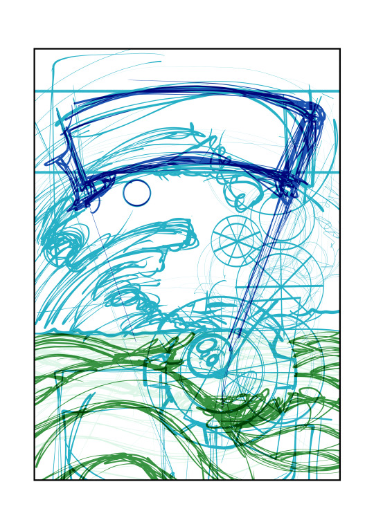

BUILDING UP THE COMPOSITION
Each Stage in Order:
Values/Silhouette
I struggled trying to find the right composition for the idea. However, once I changed my method from drawing straight onto the page, I used shapes in Clip Studio Paint and shifted the elements around until it looked pleasing in some way.
Building the elements
Using the silhouettes, I built on top using the elements from my initial sketch and creating the final design. I used perfect circles/shapes and rough lines, until it looked more tattoo-like.
Values
I added some values to the sketch, so I could gain perspective on how it’ll look.
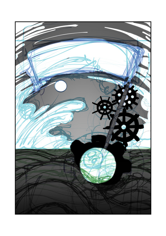
Rough Sketch with Colour
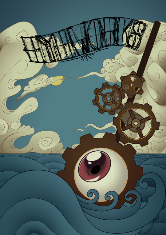
I added colour, but also some peonys/roses to complete the design and tie the colour scheme together. I decided on a warm scheme, using warm-blues and warm-greys. The warm greys wound up looking very wooden but any cooling of the colour made the cogs look too clean and vibrant and out of place. I decided to keep the wooden look since it looked more nautical.
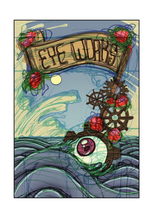
First Attempt in Illustrator
When I imported the design into Illustrator, I had to resize the image to fit the A3 structure. Despite the fact I used an A3 file on Clip Studio Paint, it changed sizes in Illustrator and that needed to be fixed up.
Tracing over the cogs started off fine and I used the Workshop lessons and Youtube Tutorials to guide me through, I kept finding myself making a multitude of mistakes that kept me from progressing. I couldn’t understand why the eraser tool was working for some shapes and not others, but also the lines kept scattering and became jagged when I joined them together. I researched why this kept happening, but results were surprisingly unhelpful and any Youtube Tutorial wouldn’t elaborate on why this kept happening. Even using the Pathfinder options didn’t aid in my favour.
I kept trying my hand at it, but I just couldn’t get it to work for me. By this point it was the Christmas break and was on my own.
Using Clip Studio Paint Instead
Defeated, I wound up drawing and colouring the whole thing within minutes on Clip Studio Paint, a Vector program I know through-and-through. I figured that it could be worth trying to import the shapes to Illustrator and work around all of the issues I couldn’t fix.
Then I tried actually importing the shapes, which didn’t work. The lineart would have jagged line that stuck out from corners.
I just coloured on Clip Studio Paint and left that be, so I could try and find fixes before the submission date.
Changing the Title
I went through a number of different title iterations. I used Nautical typefaces and fonts as a basis and even got rid of the sail, but I couldn’t make any of them look just right.
I finally found a design I really liked and I progressed quite far into the design. Then my laptop died before I saved it.
I tried to mimic what I came up with, but I couldn’t replicate what I had. I wound up simplifying it and leaving it be.
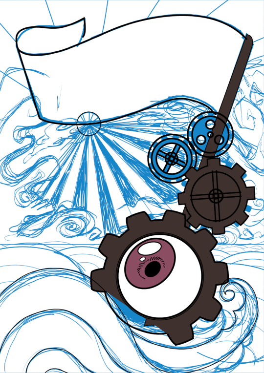
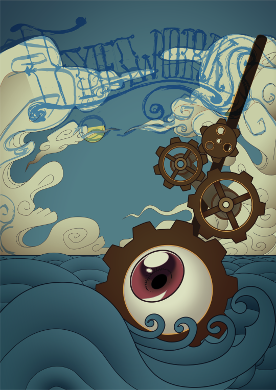
Realising I still have to use Illustrator
I went through the Brief again and I came to the realisation that I wouldn’t be able to submit a poster made using a program that we didn’t directly learn from class.
I was going to have to figure out Illustrator.
After a lot of painstaking trial-and-error, I finally got through and figured out what I was doing wrong and why tutorials didn’t bother explaining where I was going wrong.
I breezed through the cogs and the ocean, but I struggled massively with how to use the colour scheme I picked (which just kept becoming more vibrant and cool-toned, rather than the muted warm tones I needed). I directly copied the HEX codes from Clip Studio Paint and each value for RGB and CMYK, but the colours still changed. Changing the document to fit different display colours didn’t help much either. I managed to find a close enough colour for each, but it didn’t look the way I wished it could.
I utilized the Tones and one Pantone colour.
I tried tracing my cloud designs, but since Illustrator works best using full shapes, it didn’t look quite right and each gradient I added just looked jittery and spotty. I got one cloud to look passable, so I just copied and pasted that cloud and used it as clip art in the background.
I found some brush addons online and altered the widths and strength of some of the lines, but only the clouds and ocean took to the brush styles. The cogs I went back-and-forth on, but decided to use the default circle brush for their lines.
When tracing the title, I simplified the font even more so it would be easier. It didn’t look that bad when it was just black, but adding any kind of colour just looked as though I pulled it out from an early 2000��s comic book graphic. I wound up adding the sail back onto the mast and added some tatters onto the sail, which, now used to Illustrator, didn’t take too long.
I added some more title text and altered the kerning and swapped some glyphs around, but kept the early 2000′s metallic gradient look as the colour. I’m not overly convinced that the 2022 looks readable from a distance, however.
I think I need more practice with Illustrator, as I’m very much unhappy with the result, compared to the Clip Studio Paint iteration of the poster. The restrictive colour and shape-based nature of the software is very far out of my comfort-zone and still feels very alien to me. I like having more control over my markmaking, especially when I use my stylus to draw.
It feels weird that I struggled so much to replicate an image that took me about half an hour to draw using another software. As much as I’m aware that Illustrator is an industry-standard software and that I’ll probably have to use it frequently in the future, I cross my fingers that I won’t have to use it in a professional manner in the near-future.
Even though I tried my hand at a simplistic design, it was still quite a lot for me. Next time, I’ll just use simpler shapes and more vibrant colours.
0 notes
Text
Tutorial with Claire
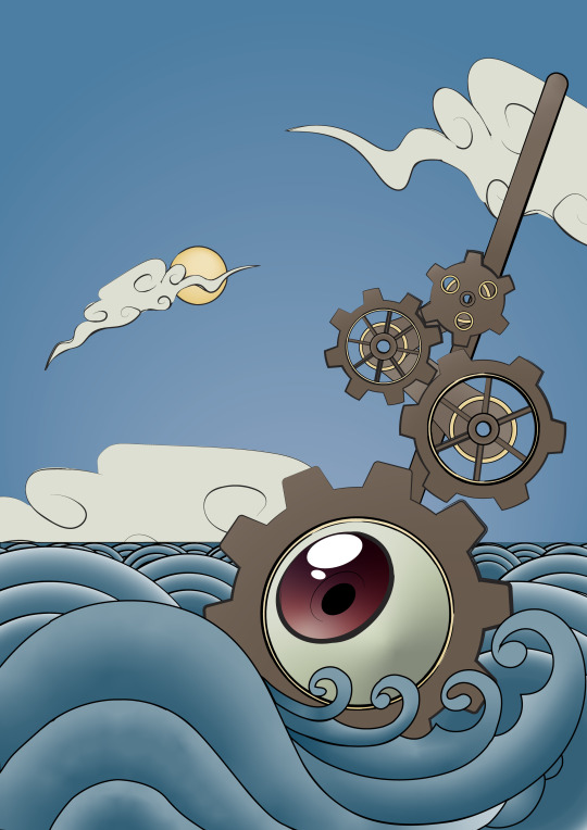
I showed Claire my work and the new direction with the roses
Claire let me know that my brown cogs look more akin to the cogs and wheels of ships. I think I'll head in this direction.
I could stick with the current colour scheme, specifically the blues. I could make the clouds lighter but Claire recons that the muted yellow works very well against the other whites and colours.
0 notes
Photo
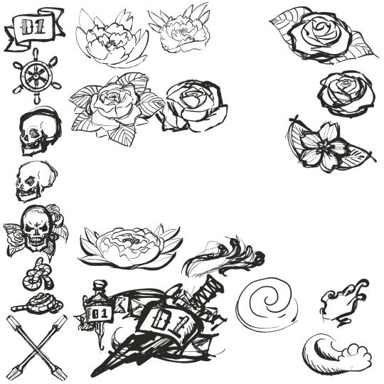
PAGE IDENTS
Too keep the tattoo theme, I figured it would be interesting to add a little flourish of sorts to the inside of the leaflet. I tried out numerous traditional tattoo designs, but the rose seems like the one contrasting idea that might fit in with the book.
When looking into how to design this, the traditional Japanese peony tattoo came up and is s staple used in old Japanese tattoos (which is the inspiration for Nautical and modern tattoos), so I changed the rose into a Peony.
0 notes
Photo
LAYOUT
Some prototype layouts for the poster. I’m not really keen on either of them, but I thought they were worth noting.
0 notes
Text
Pantones
Spot Colours and Pantones are more expensive than Process colours.Pantone colours are general colours, used globally by multiple printer types. 1,042 ColoursWe checked out the Pantone (The Series PLUS) colour swatch booklet.
https://www.pantone.com/uk/en/
0 notes
Photo
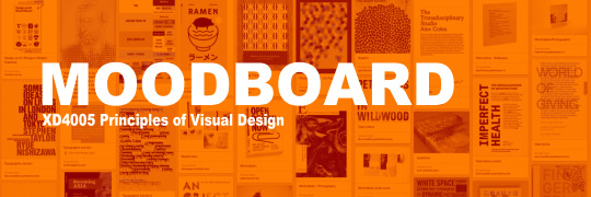

MOODBOARD
I’ve drawn up a moodboard of Animation Film Festival posters, from the past. I’ve chosen the ones I’ve found the most interesting, and the ones I find the most unappealing, but relate the most to the Eyeworks prompt (in that they’re surrealist.)
0 notes
Photo
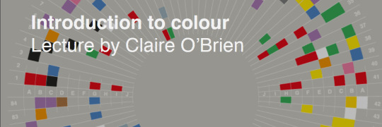
INTRODUCTION TO COLOUR
Working with Colour - Understanding colour what looks good and what does it communicate?
Understanding Colour
In order for us to see anything we need light
We have natural sunlight and artificial light which we think of as white light
‘White light’ contains the full rainbow spectrum of colours as seen when
refracted through a prism
In a physical sense, colour is understood as electromagnetic wavelengths (or frequency) and its intensity.
Red is longer than blue, hence the hues of the sunset being different reds.
Each colour seen in the rainbow is a defined part of the spectrum.
In a psychophysical sense, colours are a ‘learnt’ concept.
We learn what the word ‘red’ refers to where the hue sits in the spectrum.
However, there are many different types of ‘red’ due to variations in pigments and lights.
Warmer is redder, cooler is bluer/greener
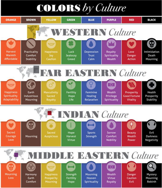
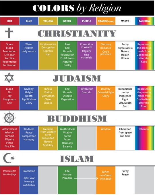
Colours in Culture
Colours have different meanings in other cultures. Some tend to overlap.
Colour Theory
Primary Colours
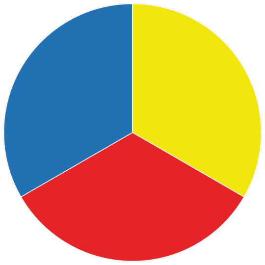
Secondary Colours
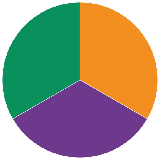
Tertiary Colours
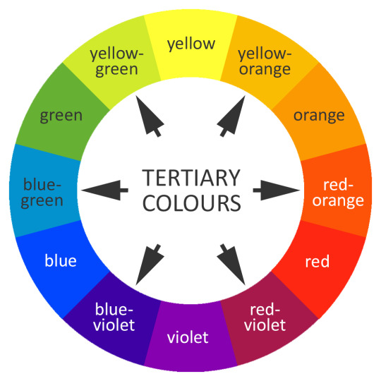
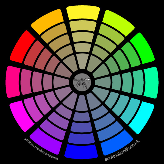
Colour Wheel
Basic Terminology
Hues (or colour)
Hue is the actual colour of the image or object.
Red, Orange, Yellow, Green, Cyan, Blue, Purple and Pink.
Are black & White colours? We debated whether they would be, since black is the absence of colour and white is all colour through light. Making hue, local colours.
Monochromatic
One (mono) singular hue.
Saturation (or chroma)
Saturation refers to the intensity of the Hue and Desaturation.
Highly saturated images look very vivid and desaturated look muted.
Saturation is the key to mood and emotion in a hue.
Value (or brightness)
Value refers to the brightness of a hue.
You can think about it in terms of light and shadow, different values are achieved by mixing the hue with different amounts of black or white.
High key; Low Key in photography. High Key is mostly light tones, Low Key is mostly dark tones.
It’s highly recommended that artists work with up to seven values (including black and white) though five is
best.
Drawing materials, computer screens and photography don’t have as great
a range of values as our eyes see, so we have to use value relative to our
materials
Colour Systems
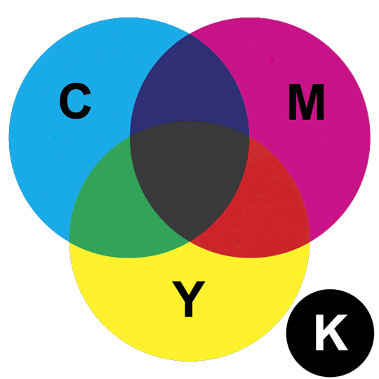
CMYK (Subtractive Colour)
Cyan, Magenta, Yellow, Key (Black) colours are used to mix for print. Print press use these colours.
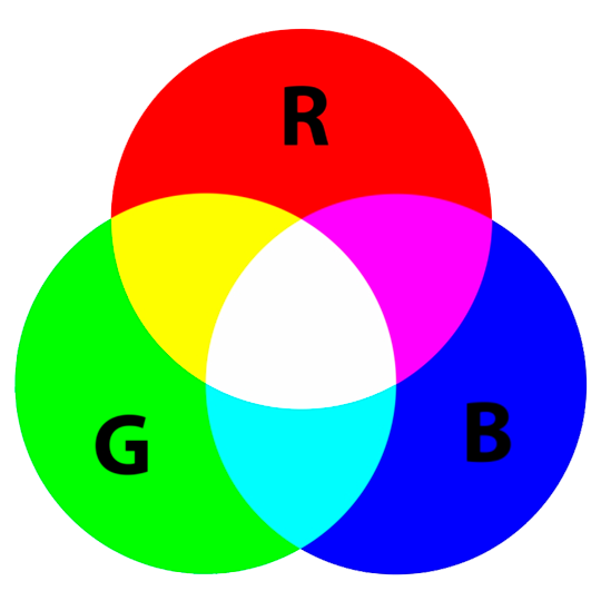
RGB (Additive Colour)
Red, Green, Blue colours are used to mix for screens.
Screen – RGB
Refers to Red, Green and Blue – additive colours.
Colours are represented in HTML as hex triplet, a six-digit three byte hexadecimal number.
Each byte (number) refers to either red, green or blue with a range of 00 to FF or 0 to 255 (decimal notation)
#FFFFFF (white)
255,255,255
#000000 (black)
0, 0, 0
#333333 (grey)
51, 51, 51
Comics/Illustrations for books, tend to request artists to use RGB, so the publishers can convert to CMYK, themselves
Colour Selection
Why is colour important?
What colours do you associate with these brands?
Coca-Cola - Red
Starbucks - Green
Easyjet - Orange
NHS -Blue
How to select the most appropriate colours?
There are now a many different tools available to help you select the most
appropriate colour combination and palettes.
For e.g. in Adobe Illustrator, you can use the ‘Colour Guide’ panel (accessible from the Window menu) to help you find colour schemes based on your current requirements.
How to select the most appropriate colours? Alternatively, use online resources to find or create colour schemes:
Readability
Resources
Ambrose, G. & Harris, P. (2008) Basics Design: Grids (2nd ed). Lausanne: AVA Books
Sherin, A. (2011) Design Elements, Colours Fundamental: A Graphic Style Manual for Understanding Colour in Design. Massachusetts: Rockport Publishing
Steane, J. (2014).The Principles and Processes of Interactive Design.
London: Bloomsbury.
www.colourmatters.com
http://www.lawton-pd.co.uk/print-info.html
paletton.com
colorlovers.com
https://www.interaction-design.org/literature/topics/color-theory
0 notes
Photo
SESSION 02
In this session, we’re learning about Effects and Paragraph Styles.
Object Effects
Transparency
Drop Shadow
Inner Shadow
Outer Glow
Inner Glow
Bevel and Emboss
Satin
Basic Feather
Directional Feather
Gradient Feather
Pagination
In which applicable corner (bottom right, in our case), create a Textbox (doesn’t need to be filled in), select the Type option, Insert Special Character, Markers and select Current Page Number. Double-click the current page, then the text box should automatically fill.
Switch to Paragraph Styles, in the Master Page, New Paragraph Style and go down to Indents and Spacing. Click which alignment needed, change the indent style where ever needed.
The file should have a functional Pagination.
Object Attributes
Open the Links window (Through the Windows option), Options icon, Panel Options, scroll down to Actual PPI and Effective PPI, tick both boxes and press OK.
I have no idea what PPI is.
0 notes
Photo
TYPOGRAPHY
Typography applies to the styles,
Imagery can be created using lettering.
The written word is universal.
Typography is important, as:
It gives the impression about the message even before they’ve read the written word.
Type has personality.
It can evoke an emotional response from the viewer.
Lowercase is softer and more informal. Capitals invokes a sense of urgency and is bold in nature.
Serif is more traditional and San Serif is more modern.
Cursive and italics are seen as feminine and sharp edges and straight lines are seen as more masculine.
Calming fonts tend to be bland and do not stand out. Distortion is more chaotic as it breaks up what is the norm.
Life and Death?
Road signs and prescriptions require sensible typography, in order to convey their message quick, clear and concise.
The Evolution of Typography
Calligraphy
Moveable metal types, where they would use woodcut and stencils to type
Desktop publishing
The Letterpress
Letterpress, developed by and her contribution is credited as far back as 1440.
Letterpress left a legacy of vocabulary that influenced typography.
Fonts were stored in drawer of cases
We’ve moved on from Paper-based to an interactive digital medium
Type Classification
Serif
San Serif
San Serif for children’s media due to the complexity of certain Serif character readings.
Symbols (Dingbats)
Non-Western
Anatomy of Letter Forms
Text will sit on the Bassline.
Descenders will drop below
Ascenders will rise above.
Strokes are the lined components that form the character
Adobe - Use tracking to alter all text
Sizes
How Typography is used
Connotative
Denotative
Logotypes
TASK
Experiment with typography. Fonts, Size, Typeface, etc.
What would work well with EyeWorks? What will work with my ideas?
SKILLSHARE
Kerning & Tracking
“Customising Type”
We tried to watch one of Aaron Draplin’s Skillshare videos after the lecture. Unfortunately we couldn’t get the sound to work and the projector kept exploding, so instead we were given a summary.
Basically: Don’t use the default or our favourite fonts. Play with the tracking, kerning, etc. Explore and experiment, rather than being static.
Now that we’ve learned most of the theory, we’ll be bringing all the components together to create our piece.
0 notes
Photo
INDESIGN
CREATING A NEW DOCUMENT
To start off, we created a new Document, using custom dimensions.
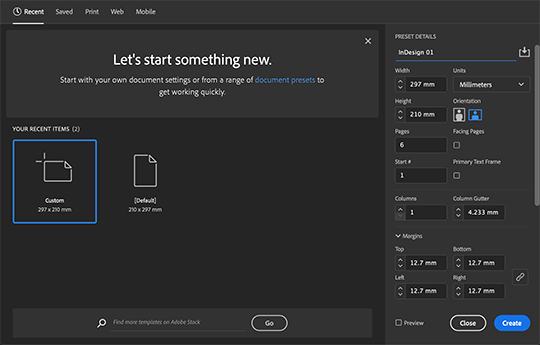
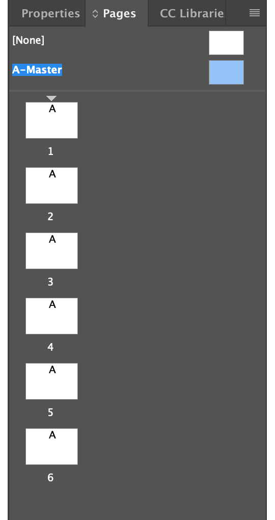
Double-click the A-Master sheet, letting us customise the layout for every page, not just one.
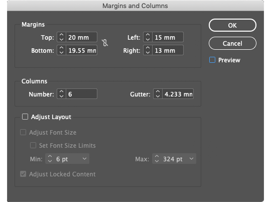
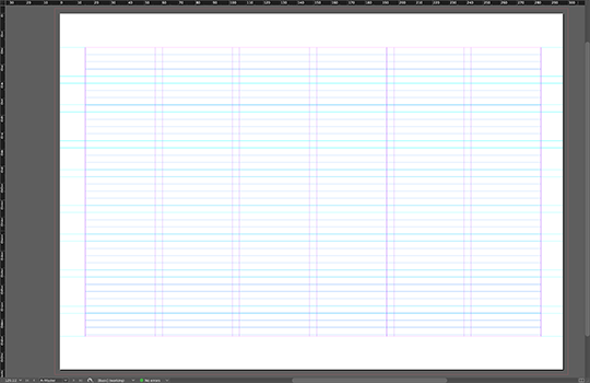
To create our page grid, we selected Layout - Margins and Collums. Here, we customised the table to suit our practice layout.
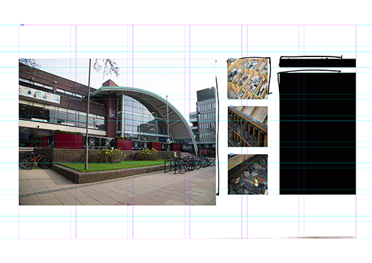
Place - Our Downloaded object. To place within the table, left-click the cursor point at the top left-hand corner.
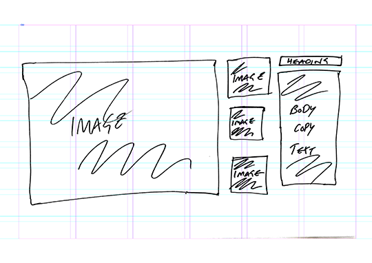
When placing an object, there are two different scaling options: Crop and Resize. To crop the image, just scale the corners as any image-editing software. To Resize,
We’re using the Image from Blackboard, as a stencil for our page layout. In front of the image, we drew over with boxes and customised their sizes and where to place them.
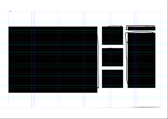
When adding objects, InDesign will automatically show guidelines for distance and placement. Eg, if I wedge a box between two objects, InDesign will show the area where the box will be equal distance between the objects.
We can add images within objects, by selecting an image and dragging them into an object box. They will automatically fit within the dimensions. We can use the Frame Fitting option to customise further.
Align
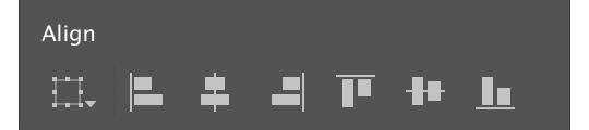
Align to Selection
Align Left Edges
Align Horizontal Centres
Align Right Edges
Align Top Edges
Align Vertical Centres
Align Bottom Edges
Frame Fitting
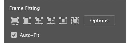
Fill Frame Proportionally
Fill Content Proportionally
Fit Content to Frame
Fit Frame to Content
Centre Content
Content-Aware Fit
Hot Keys
0 notes
Photo
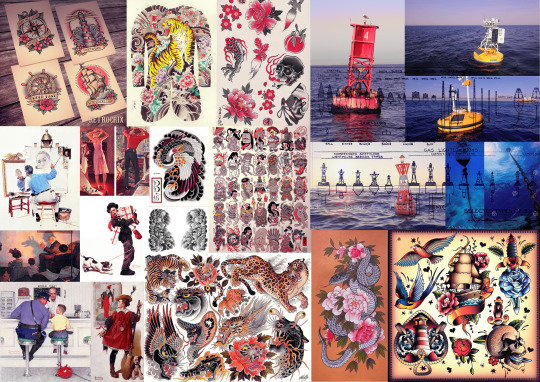
MOODBOARD
Following Claire’s advice, I researched different Tattoo art styles (mostly nautical), Norman Rockwell and of ocean buoys.
After looking at this imagery, it set in stone that Ocean Construct has my investment, more than the other ideas.
I could explore the other ideas, but I’m also a tad pressed for time.
0 notes
Photo
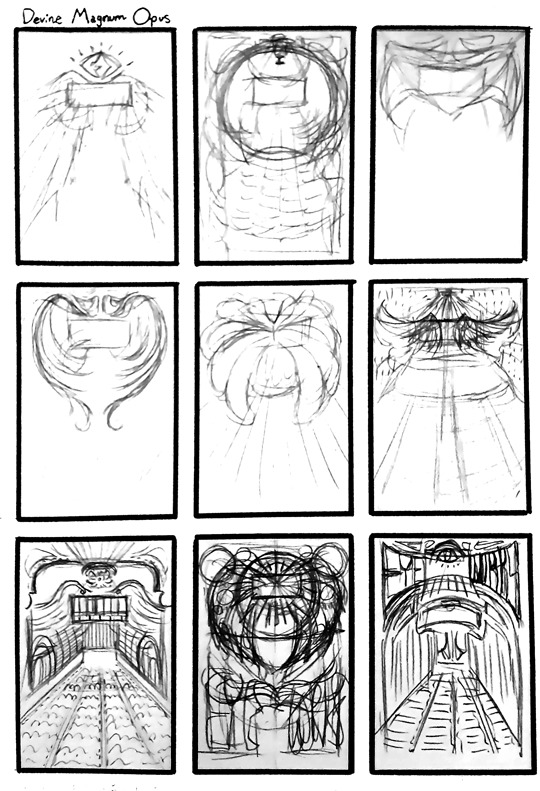
DEVINE MAGNUM OPUS
Task
When I looked back at the “Devine Magnum Opus” thumbnail, I felt a bit of an Art Deco and Art Nouveau vibe, so I used those art movements as a visual inspiration. I picture golds, browns and whites involved in the colour scheme, so I kept that in mind.
I looked up different Art Deco-styled wings and even architecture, as the thumbnails developed.
Feedback
I asked Claire if she had any artists or visuals she’d recommend for this idea. She recommended Charles Rennie McIntosh, Alphonse Mucha and Ikon.
I used these artists as a reference to build upon the thumbnails.
What Should I do Next?
After experimenting with this idea, I realised that I’m not very invested in it. I like the idea of designing something Art Deco or Art Nouveau, more than the actual idea.
This might have been more of a contender, if Ocean Construct wasn’t more visually interesting and wasn’t more linked to the overarching theme.
0 notes
Photo
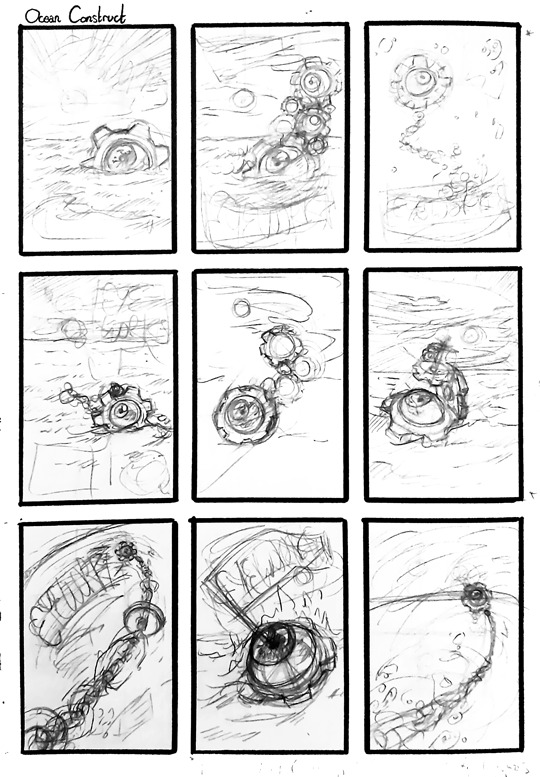
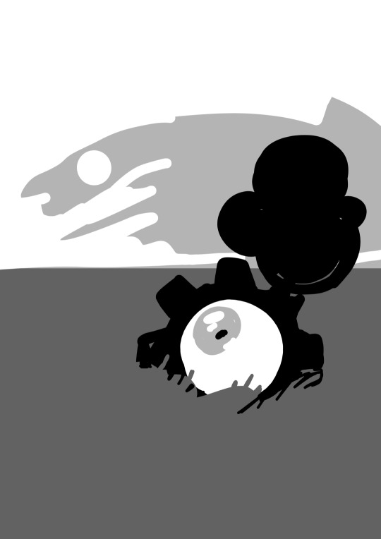
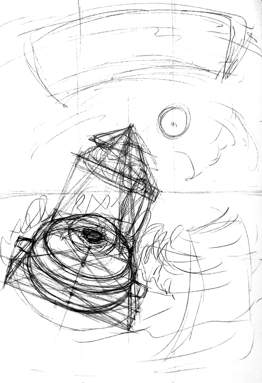
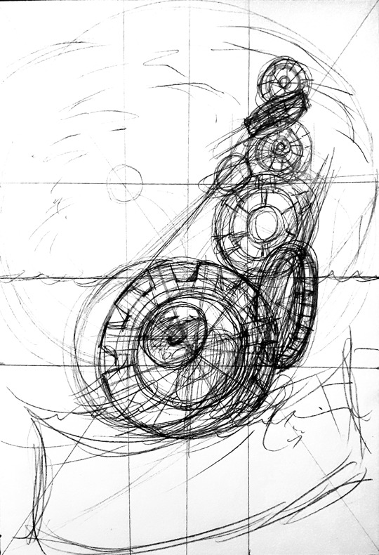
OCEAN CONSTRUCT - Thumbnail Concept
Task
I took the thumbnail from “Ocean Construct” and expanded the idea into nine different thumbnails.
I tried to explore different compositions, perspectives, different buoy types and shape language.
Feedback
I asked for Claire’s opinion on my thumbnails and which stick out to her the most.
Claire told me that the second, third, sixth and eighth thumbnails, stuck out to her the most.
Due to my art style and nautical theme, Claire mentioned envisioning some of these in the style of traditional nautical tattoo. Since I used similar imagery (particularly the flag-like titles,) I can definitely see what she means.
She also thought the sixth thumbnail, was a diagonal perspective piece, when my intent was to have the cogs simply reduce in size as the buoy gained in height. That being said, I liked the idea of the illusion and might explore that further.
In addition, Claire also suggested I could look into colour schemes that highlight one specific colour in the piece. She suggested Norman Rockwell, as his pieces tend to be vibrant and colourful, yet highlight one specific colour.
What Should I do Next?
I’m going to take on Claire’s advice and explore the visuals she recommended. And as I mostly agree with her picks, I’ll try to explore those four thumbnails more.
0 notes