
Don't wanna be here? Send us removal request.
Statistics
We looked inside some of the posts by webauthoring-meganftzsimons and here's what we found interesting.
Average Info
Notes Per Post
0
Likes Per Post
0
Reblog Per Post
0
Reply Per Post
0
Time Between Posts
2 days
Number of Posts By Type
Video
5
Text
12
Last Seen Tumblr Blogs


Fun Fact
Tumblr has 4 main sources of revenue.
Text
Responsive web design
What is Responsive?
Responsive is a term pertaining to a website that can be displayed in a compatible way with all browsers (with respect to browser size).
Responsive Web design strategy suggests that design and development should respond to the user’s behaviour and conditions dependent on screen size, platform and orientation.
The practice consists of a mix of flexible grids and layouts, images, and creative CSS media queries. As the user switches from their laptop to iPad, the website should automatically shift to accommodate for resolution, image size and scripting abilities.
In other words, the website should have the technology to respond to the user’s preferences automatically. This will eradicate the need for a different design and development period for each new device on the market.
Characteristics of Responsive websites
While designing a website in the conventional style, designers habitually take a pixel (px) to compute the dimensions of a web page, while applying the Responsive techniques designers often use % to determine the sizes to optimize website’s display. It allows the code to refine the layout of the website as quickly as possible for different devices.

Conclusion
Responsive is an inevitable trend in web design technology. They help the website appear in many devices with just one interface and a link (important element in SEO) and improve website loading speed. This allows the website to become more professional and a better opportunity to approach customers.

0 notes

Text
Padding and Margins

I recently got some comments back from my first web assignment in college. I did pretty well but I did have one major error. When I was coding I noticed that a lot of my elements were squashed beside each other. I wanted to create something easier to read with more white space.
To do this I wrongly used <br> in between my sentences. However this is not the way to do this correctly. There is two ways to do this. Either a put each part of my content inside a article or section container (which I will write another blog post about) or put some space between content with padding and margins.
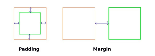
Margin is an element’s personal space — how much distance the element wants to keep with other elements around it.
Padding is how much an element is away from itself — how much distance an element wants to keep with the elements inside it.
What Is Padding?
They both are used to create space around elements, but they differ in the way they create the space. Margin accommodates the gap by pushing neighbouring elements away from it, while Padding provides the space by either growing its own size or by contracting the size of the content inside it.
By default, padding will grow the size of the element to accommodate the space. But I have learnt that if you set “box-sizing: border-box” on the element, then it will shrink the size of the content inside the element to accommodate the gap.
Use padding when:
You don’t want your content to touch the edges of the container. Example: you have a bunch of <p> elements inside a div and you don’t want the text inside <p> elements to touch the div’s border:

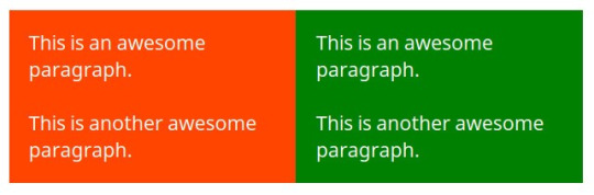
You want the background of the element to be displayed in the produced gap. Example: you have a blue and a yellow div adjacent to each other, and you want both divs to touch each other, but don’t want their texts to touch each other:
You want to increase the size of the element. Example: if you want to increase the size of a button:
Use margin when:
You want to have some space around an element, or you don’t want the element to touch other parts around it:

You want to centre an element. If you give “margin: auto” to an element with a fixed width, it will centre that element horizontally.

0 notes

Text
What is flexbox and why it’s awesome!
Flexbox or CSS Flexible Box Layout Module is a layout mode used almost completely in responsive websites, that provides for a more desirable arrangement of all of the page elements that behave in a predictable mode. Flexbox accommodates said elements inside flexible boxes securing that every feature in your web page is displayed properly, in any screen size or resolution.
According to Tab Atkins Jr., the primary author of the Flexbox and Grid “My goal in doing Flexbox and later Grid was to replace all the crazy float/table/inline-block/etc hacks that I’d had to master as a webdev. All that crap was (a) stupid, (b) hard to remember, and (c) limited in a million annoying ways, so I wanted to make a few well-done layout modules that solved the same problems in simple, easy-to-use, and complete way”
*I like the way he puts it so plainly :)
In a nutshell: Flexbox and Grid were created explicitly to replace float and table layout hacks
Flexbox Layouts Go in One Direction
Flexbox lays items out in a single row or column.

Image credit: Flexbox Cheatsheet
A Flexbox layout consists of a flex container that holds flex items. The flex container can be laid out horizontally or vertically. This is referred to as the main axis.
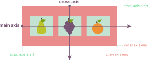
The direct children of a flex container are laid out along the main axis. These children can “flex” their sizes, growing to fill unused space in the container, or shrinking to avoid overflowing.
By nesting multiple flex containers with different orientations, you can achieve complex layouts.
.flex-container { display: flex; }
The above one line of code does:
Treats .flex-container as a flex container.
Treats all direct children of .flex-container as flex items.
Flex items will be laid out in a horizontal line.
Flex items will be laid out in source order.
Flex items will be laid out starting from the left side of the flex container.
Flex items will be sized based on their regular width properties.
If there’s not enough space for all the flex items, they will be allowed to shrink horizontally until they all fit.
If they need to shrink, each item will shrink equally.
Flex items will all stretch vertically to match the height of the tallest flex item. Ref) https://spaceninja.com/2015/08/24/what-is-flexbox/
0 notes
Text
5 Cool HTML Elements
I’ve heard the sentiment “HTML is easy” more times than I can count. And while I would agree that HTML is perhaps easier to learn than other programming languages, you shouldn’t take it for granted.
HTML is a powerful markup language which can be used to give our web applications structure and provide powerful accessibility benefits, but only when used appropriately.
Thus, today we’ll discover ten HTML elements you might not have known existed in the hopes that you can create more accessible, and structurally-sound web applications.
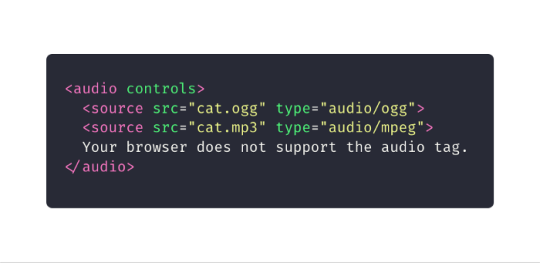
Audio
The <audio> tag defines a sound, such as music or other audio streams. There are three currently supported file formats: MP3, WAV, and OGG.
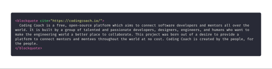
Blockquote
The <blockquote> tag specifies a section that is quoted from another source.
Output
The <output> tag represents the result of a calculation. You can use the plus sign and equal symbol to indicate that the first and second input values.

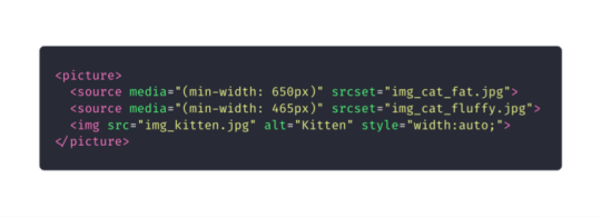
Picture
The <picture> tag allows you to specify image sources. Instead of having an image which you scale up and down depending upon the viewport width, multiple images can be designed to fill the browser viewport.
The picture tag contains two different tags: one or more <source> elements and one <image> element.
The source element has the following attributes:
srcset (required): Defines the URL of the image to display
media: Accepts any valid media query that you might define within CSS
sizes: Defines a single width value, a single media query with width value, or a comma separated list of media queries with a width value
type: Defines the MIME type.
The browser uses the attribute values to load the most appropriate image; it uses the first <source> element with a matching hit and ignores the subsequent source elements.
The <img> tag is used to provide backwards compatibility if a browser doesn’t support the <picture> element or if none of the <source> tags match.
Word Break Opportunity
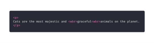
If you have a long block of text, or a long word, you can use the <wbr> tag to specify where in a body of text it would be ideal to break. This is one way to ensure the browser, upon resize, doesn’t break your text in a strange spot.
https://medium.com/@emmabostian/10-html-tags-you-didnt-know-you-needed-2f9d288707ec
0 notes
Text
HTML5 Semantics

The main semantic tags you should know for larger document outlines are, from top to bottom:
header
nav: a navigation bar - it should not belong to the main outline of the HTML doc and aren’t usually rendered by assistive technologies
aside: a sidebar - it should not belong to the main outline of the HTML doc and aren’t usually rendered by assistive technologies
section: “A section is a thematic grouping of content, typically with a heading” (W3S), such as:
Introduction
content
contact information
article: a “Independent, self-contained, complete composition in a document, page, application, or site, which is intended to be independently distributable or reusable (e.g., in syndication)” (MDN) - such as
a forum post
magazine article
blog entry
must be identified by a heading within the article element
Key points about document outlining
Each section, i.e. body, section, article, aside, nav can have their own header and footer tags!
Tags You Should Stop Using
Elements such as center, font, big, and attributes such as align on imgand background on body have been depreciated - for a good reason!
If we maintain the philosophy that HTML is all about organization of content, and CSS as purely styling, then elements that were purely presentational don’t belong within HTML
footer
0 notes

Text
Best Web Development Tools & Technologies in 2021
https://hamo.tech/best-web-development-and-design-tools-and-technologies-in-2021/
0 notes
Text
Fundamentals of font
The CSS properties used to style text generally fall into two categories,
Font styles: Properties that affect the font that is applied to the text, affecting what font is applied, how big it is, whether it is bold, italic, etc.
Text layout styles: Properties that affect the spacing and other layout features of the text, allowing manipulation of, for example, the space between lines and letters, and how the text is aligned within the content box.
Fonts
<h1>Tommy the cat</h1> <p>Well I remember it as though it were a meal ago...</p> <p>Said Tommy the Cat as he reeled back to clear whatever foreign matter may have nestled its way into his mighty throat. Many a fat alley rat had met its demise while staring point blank down the cavernous barrel of this awesome prowling machine. Truly a wonder of nature this urban predator — Tommy the cat had many a story to tell. But it was a rare occasion such as this that he did.</p>
The color property sets the color of the foreground content of the selected elements (which is usually the text, but can also include a couple of other things, such as an underline or overline placed on text using the text-decoration property).
color can accept any CSS color unit, for example:
p { color: red; }
This will cause the paragraphs to become red, rather than the standard browser default black, like so:

0 notes
Text
The importance of Semantic HTML
Semantics is the study of language meaning. For language this is the words we use to communicate, and for HTML it’s the tags we use to mark a document.
For example, a <p> tag indicates a paragraph.This tag is semantic and presentational because people understand what paragraphs are and browsers know how to display them. On the other hand tags like <b> and <i> are not semantic, because they define only how the text should look (bold or ) and do not provide any additional meaning to the markup.
Why is it important that our HTML is semantic?
Well, for example, when it comes to finding a page on the internet, search engines ‘see’ the page without styles and the only way to understand which elements are more important is through marking.
If I put the page's name inside a ‘<p>’ (paragraph) tag, it can be lost in other content and not show up in the search engine results. But if we place it inside a ‘<h1>’ (header 1) tag, the search engines know that they have to give it more attention. Hence, search engine optimization is a perfect reason to use semantic markup.
This is Semantic markup

This is not

1. Clearer code and easier to maintain
For example, why use a <nav> tag to contain your navigation bar, if you can use a <div> tag?
Multiple of these tags will not express any difference in the distribution of content or in the way in which the text is presented. Using semantics instead of a <div> practice allows our code to make more sense, and to be closer to a natural language, where each element uses adequate words.
Also, as a website grows, adding more pages and more lines of code, the presence of semantic tags helps stay organized
2. Help your site be accessible
A substantial number of people users depend on a screen reader software to navigate the internet and surf the internet.
So making sure that screen readers can read each element, and that each of them can be accessed through the keyboard is ESSENTIAL. We have to code for all users.
Semantic HTML is not only about using the new semantic tags, but about using the correct tags for each element, so that it is easy to navigate for all users.
3. Improve your SEO positioning
Your SEO positioning can be influenced, positively or negatively depending on determinants such as: the way in which the content is written, a ‘responsive’ design or that the site is accessible.
When it comes to Google, they use an algorithm that analyzes our website's code and uses the markup and the labels used to understand the purpose of the page better.
In this way, if we use a semantic mark, we will facilitate the positioning algorithm's task to reach more users. And in turn, our website will be more accessible.
The bottom line is that learning semantic markup will make your life easier and your code better.
0 notes
Text
Web safe fonts
There are only a certain number of fonts that are generally available across all systems and can therefore be used without much worry. These are the so-called web safe fonts.
Most of the time, as web developers we want to have more specific control over the fonts used to display our text content. The problem is to find a way to know which font is available on the computer used to see our web pages. There is no way to know this in every case, but the web safe fonts are known to be available on nearly all instances of the most used operating systems.
The list of actual web safe fonts will change as operating systems evolve, but it's reasonable to consider the following fonts web safe, at least for now.

https://developer.mozilla.org/en-US/docs/Learn/CSS/Styling_text/Fundamentals
0 notes